As part of the furniture retail industry, the IKEA and Wayfair apps present a whole new set of challenges. Customers are used to seeing the furniture and decor in person before purchasing, so the apps from these companies need to overcome this hurdle to prove effective.
Every aspect of an app can be integral to its overall UX, from the onboarding to the checkout process. Even the tiniest of details, like letting the users manually choose their desired region and language, can play a crucial role in making the user experience better.
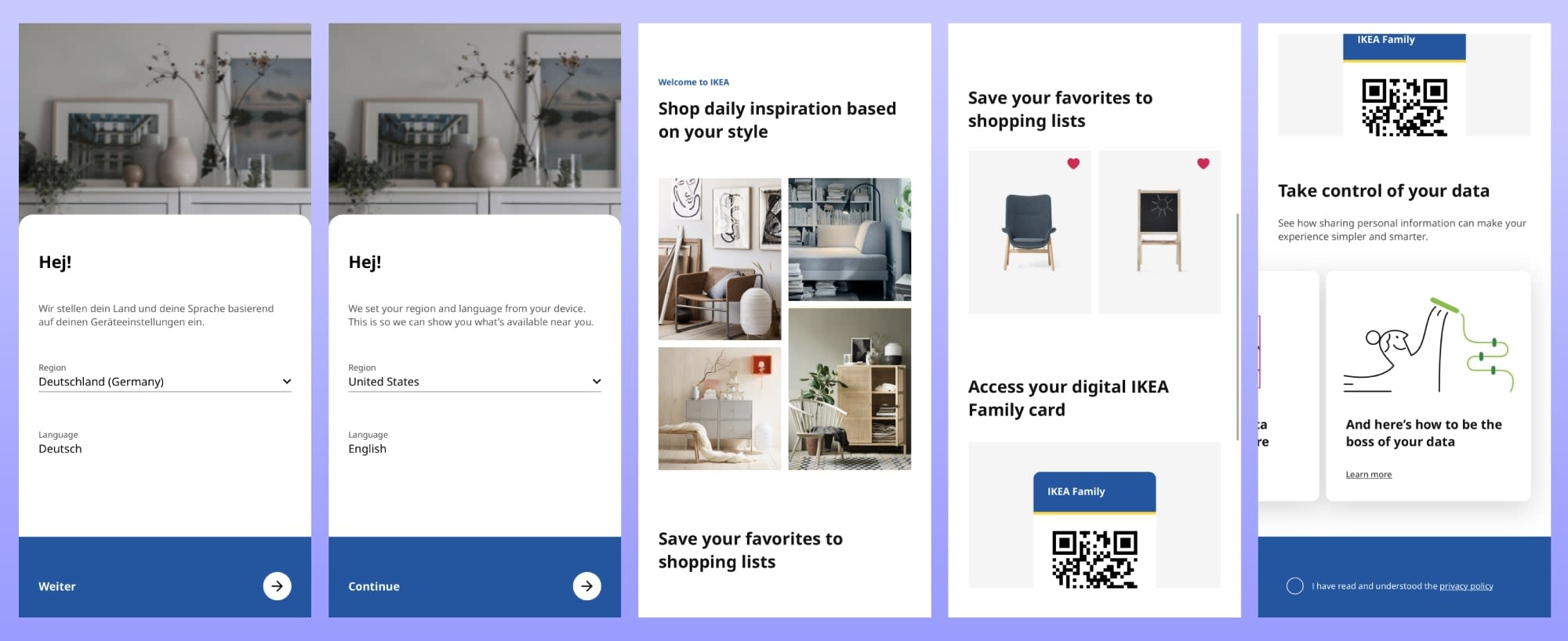

The IKEA app onboarding
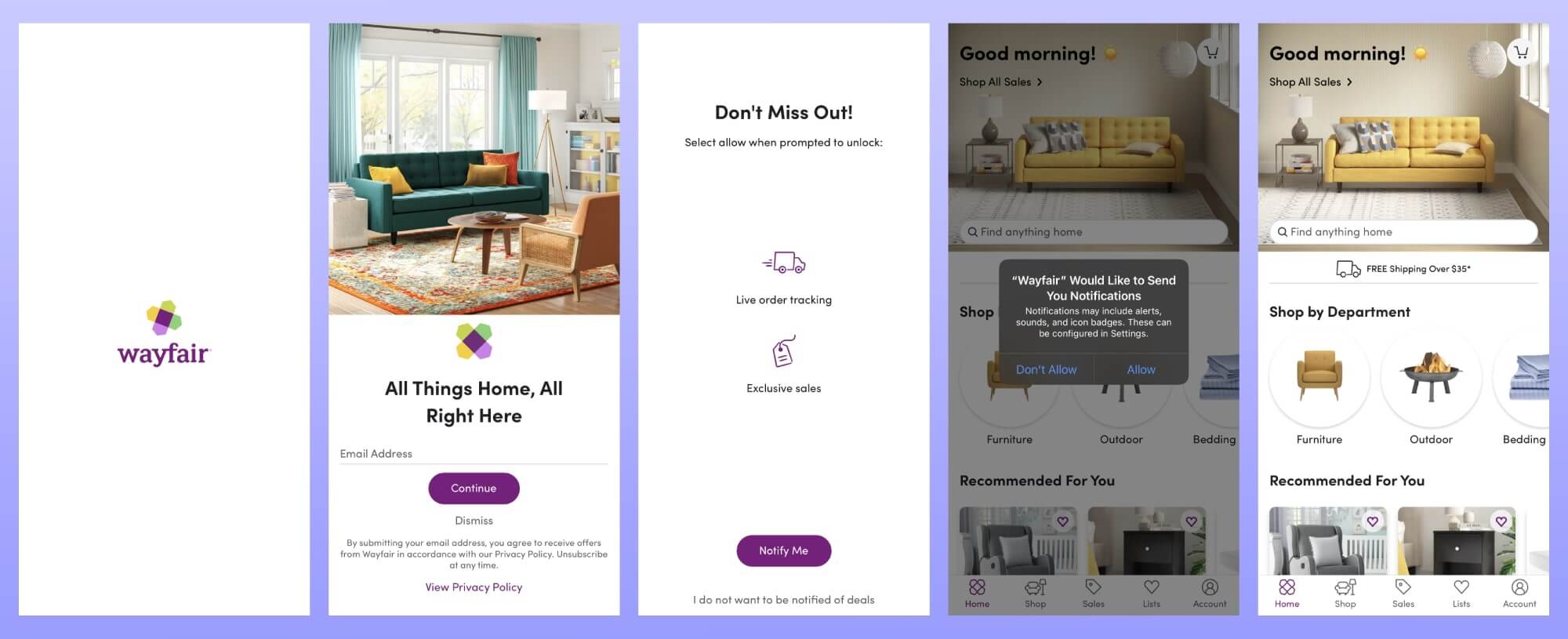

The Wayfair app onboarding
Do these apps succeed in replacing the real-life experience of going into a furniture store? Or do they fall short in doing anything more than offering the option to order your goods directly from your phone?
To access the full UX app analysis, download your copy by clicking on the following button or image.
More app analyses:
AUTHOR
Ángela Gómez Sánchez
Passionate about linguistics and helping you deliver the perfect app experience.

Related articles
Curated List
7 Best AB Testing Tools for Mobile Apps
Learn with examples how qualitative tools like funnel analysis, heat maps, and session replays complement quantitative...

Jane Leung
Product Analytics Expert
UX design
12 UX Metrics to Measure and Enhance User Experience
Unlock product success by tracking the right UX metrics. Learn 12 essential metrics, how to measure them, avoid common pitfalls, and take action with tools like...
UX design
10 Top UX Design Best Practices & How to Implement Them
Discover 10 proven UX design best practices to improve usability, boost retention, and create user-centric products. Actionable tips for product...

Tope Longe
Product Analytics Expert


