When evaluating the best product analytics software, it’s important to compare the leading platforms to see which one fits your needs. This article examines several top solutions – UXCam, Mixpanel, Amplitude, Heap, Smartlook, FullStory, and Google Analytics – and highlights their strengths and differences.
Quick Summary
This guide reviews the best product analytics tools, covering what they are, why they matter, and how top platforms like UXCam, Mixpanel, Amplitude, Heap, Smartlook, FullStory, and Google Analytics compare in features, pricing, and use cases.
Here's our pick of the best product analytics software:
UXCam - Best all-in-one product analytics
Google Analytics - Best for website analytics
Amplitude - Best for predictive product analytics
What is product analytics software?
Product analytics software tracks and measures how users interact with your digital product. It collects behavioral data such as clicks, taps, scrolls, and navigation paths to show how people use your app or website.
Unlike marketing analytics, which focuses on traffic sources, product analytics helps you see what happens after users arrive. It lets you answer questions such as:
Which features do people use most often?
Where do users drop off during onboarding or checkout?
What changes improve retention or conversion rates?
These insights help you make informed product decisions without guessing what users want.
Why is product analytics software important?
Identify user pain points: Spot where users struggle and resolve those issues quickly.
Measure feature impact: Track how new features influence engagement and retention.
Compare cross-platform behavior: Understand how users interact across devices and operating systems.
Turn insights into action: Convert behavioral data into clear design and development decisions.
Align teams with data: Give product managers, designers, and engineers a shared view of what’s working, and what’s not.
The best product analytics softwares in 2025
| Tool | Best for | Setup effort | Starting price |
|---|---|---|---|
| UXCam | All-in-one product analytics (web + mobile) | Very low | Free (3k sessions) |
| Mixpanel | Event tracking and funnels | High | ~$20/month |
| Amplitude | Behavioral analysis and cohorts | High | $49/month |
| Heap | Automatic data capture | Low | Free (10k sessions) |
| Smartlook | Web + mobile replays and funnels | Low | ~$55/month |
| FullStory | UX-focused session replays | Medium | ~$199/month |
| Google Analytics 4 | Website and app traffic analysis | Medium | Free |
| Pendo | Feature usage + in-app guidance | Medium | Custom pricing |
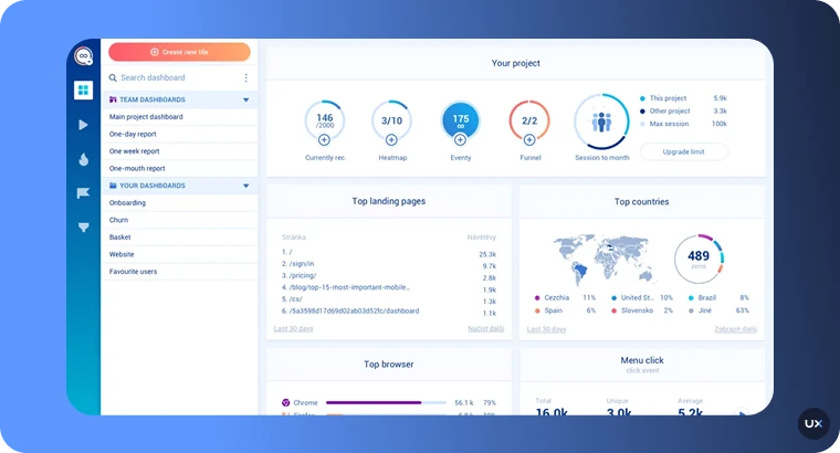
1. UXCam
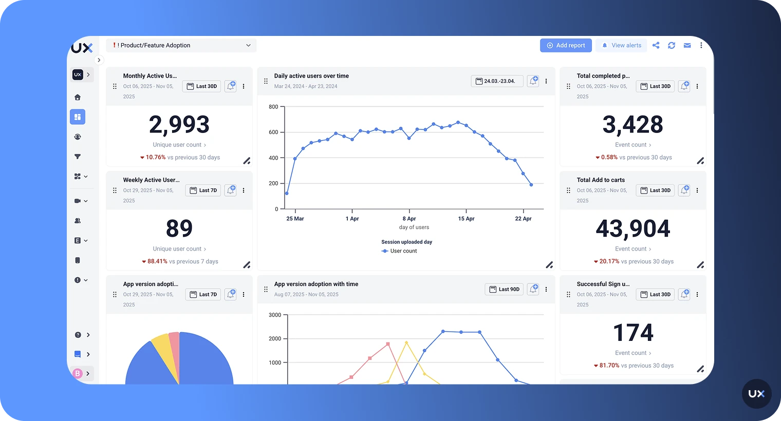
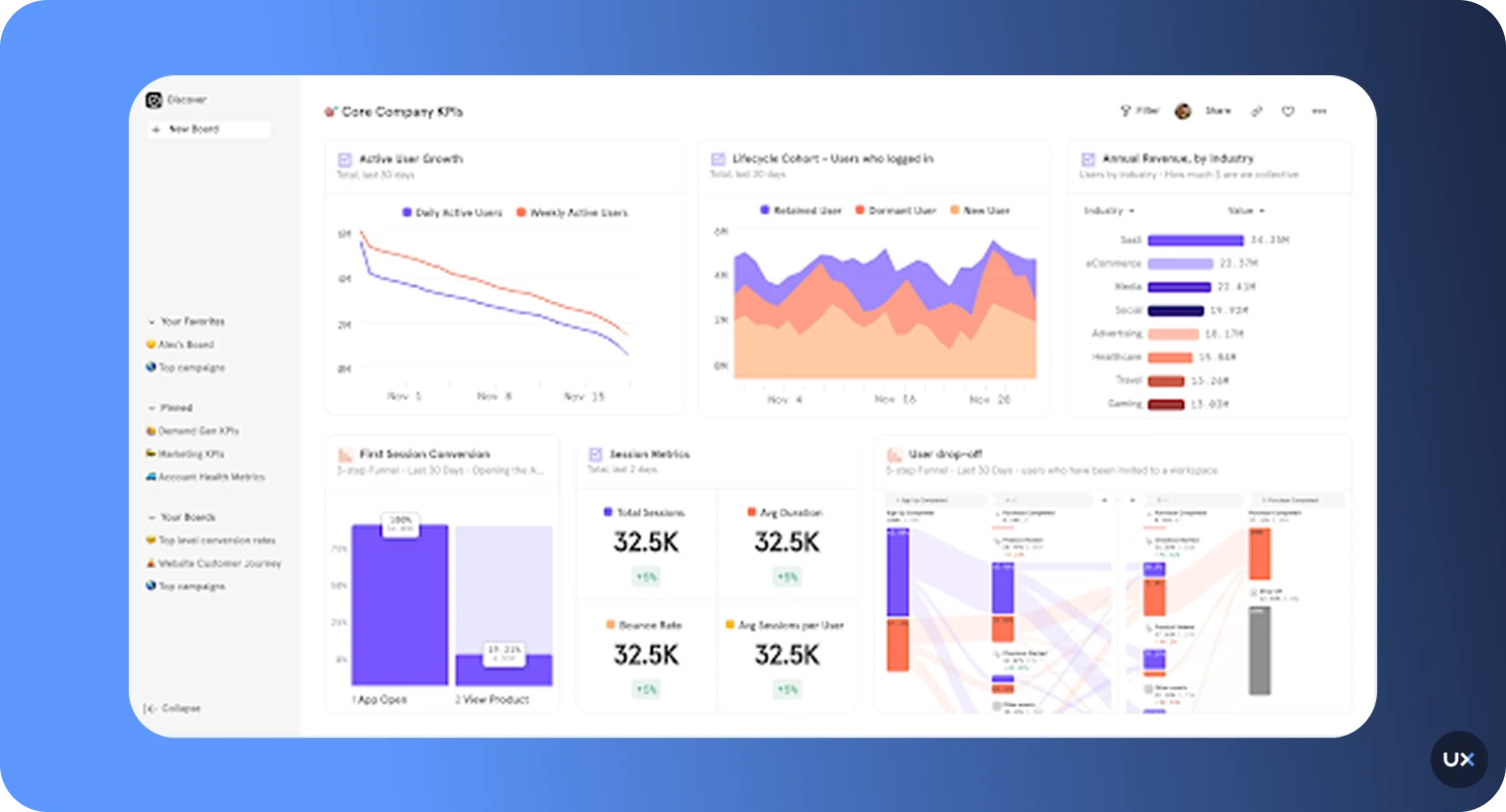
UXCam is a complete product analytics platform that helps you see how users experience your app or website. Our tool automatically captures every gesture, screen, and technical event so you can understand what happens inside your product without manual setup. It combines qualitative tools like session replays and heatmaps with quantitative analysis such as funnels, retention, and segmentation to provide you with the best insights into your users.


Key features
AI analyst (Tara): Summarizes user sessions, flags frustration signals, and identifies behavioral patterns automatically.
Session replay and heatmaps: Watch how users tap, scroll, and move through your app to spot usability issues faster.
Autocapture technology: Collect every screen, gesture, and event instantly without manual setup or complex tracking.
Funnels and retention analysis: Measure conversion rates, track user engagement over time, and pinpoint drop-offs.
Segmentation and filtering: Analyze behaviors by device type, platform, or user cohort to reveal hidden trends.
Privacy-first design: Fully compliant with GDPR, CCPA, HIPAA, and SOC 2 Type 2, with automatic masking for sensitive data.
Pros
Combines numbers with visual insights for complete understanding
Quick setup using lightweight SDK and automatic data capture
AI analyst saves time and simplifies analytics
Works across mobile and web platforms
Advanced retention, issue, and funnel analysis
Global compliance and strong data protection
Cons
Some advanced customizations may require technical setup
Why Choose UXCam?


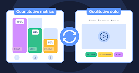
At UXCam, we combine quantitative and qualitative analytics to give product teams a complete picture of user behavior.
On the quantitative side, our platform includes customizable dashboards and detailed product metrics. But what truly sets us apart is our qualitative analysis, the ability to see how real people use your product through session replays, heatmaps, and funnels.
These features help teams move beyond charts and numbers to understand the why behind user behavior in real time.


What makes UXCam stand out:
Smart events: Track key user actions automatically without coding.
User journey visualization: See common navigation paths and unusual patterns to refine user flows.
Retention analytics: Measure user loyalty over time and identify return behaviors across key periods.
Fast setup: Integrate UXCam with just a few lines of code and start analyzing sessions within minutes.
Ease of use: Product managers, designers, and engineers can all access data without SQL knowledge or technical setup.
Comprehensive insights: View high-level trends and granular user actions in one dashboard—no need for multiple tools.
Complete analysis: Unlike tools focused only on numbers, UXCam combines data with real visual context to reveal both what happened and why.


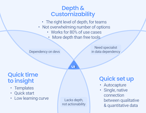
Compared to platforms that rely on complex manual tracking or technical configuration, UXCam provides quick insights and out-of-the-box value.
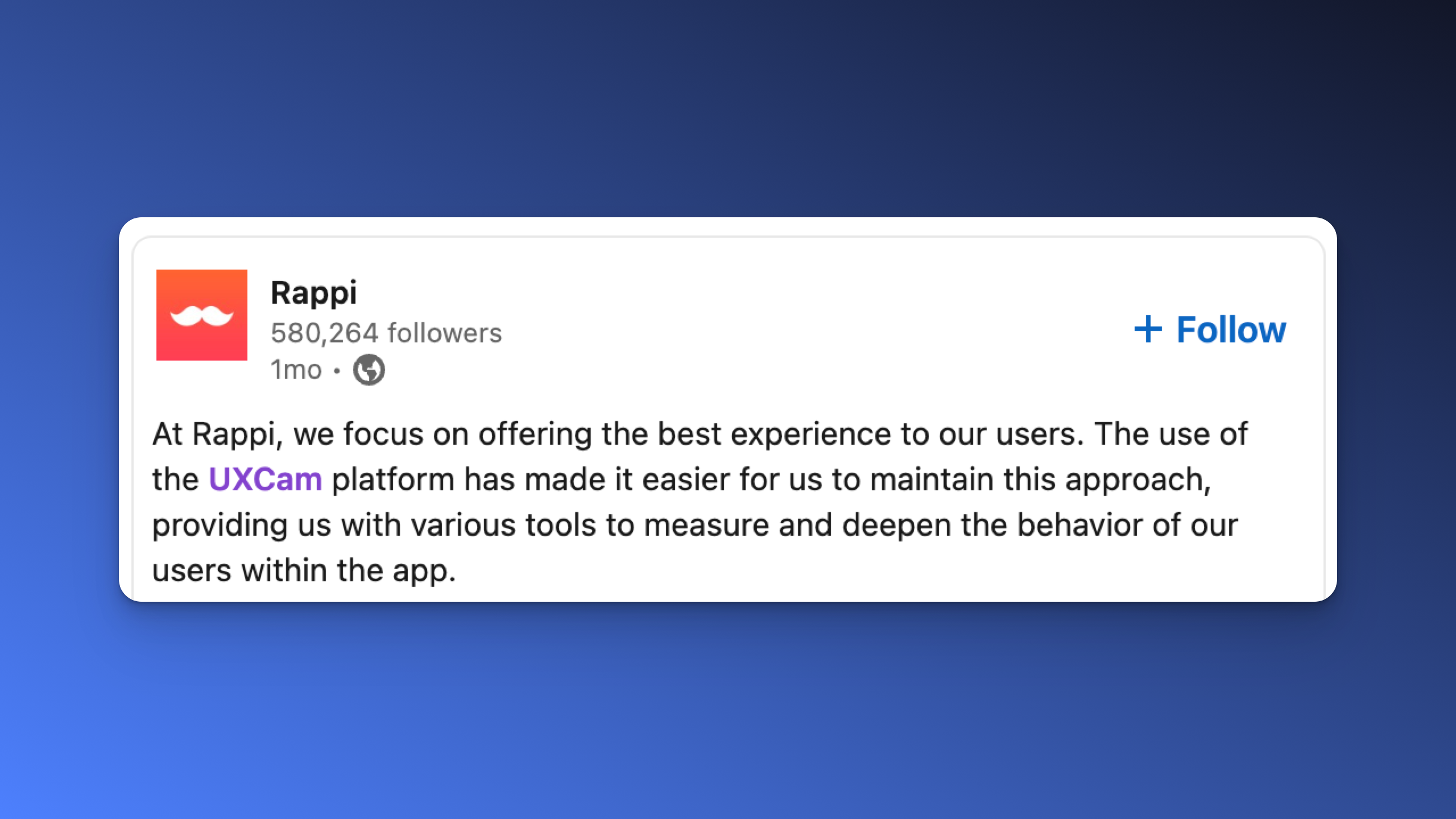
Real-World Impact
Many of our customers have seen tangible business improvements after using UXCam.
For example,
Costa Coffee, the UK’s #1 coffeehouse chain, used UXCam to improve its loyalty app onboarding.
The team discovered that 15% of users were dropping off during signup.
With session replays and behavioral analytics, they found exactly where friction occurred.
After fixing those issues, loyalty sign-ups increased by 15%.
These experiences show how UXCam helps teams quickly uncover friction, improve usability, and build smoother product experiences.


UXCam Pricing
We offer a free plan with up to 3,000 sessions/month. Paid plans are session-based (Starter, Growth, Enterprise) and require custom pricing. Contact us for a 1:1 demo.
2. Mixpanel
Mixpanel is an event-based analytics platform that tracks user actions to help teams understand behavior, optimize product flows, and improve conversions. It tracks every in-app action so teams can see what drives engagement and where users drop off. Known for its flexibility and speed, Mixpanel enables product and growth teams to make informed decisions without relying on engineers or SQL queries.


Key features
Funnel analysis: Identify where users abandon the journey and optimize conversion paths.
Segmentation: Break down data by user type, device, or behavior for deeper insights.
Retention analysis: Measure user return rates and understand which features encourage loyalty.
Custom dashboards: Build visual, shareable reports that track KPIs in real time.
Predictive analytics: Use historical data to forecast churn and high-value user behaviors.
Pros
Reliable, fast analytics engine for high-volume data
Strong funnel and cohort analysis
Real-time dashboards with instant filtering
Predictive modeling for churn and retention
Cons
Requires manual event tracking setup
No session replay or qualitative analytics
Can become costly as data grows
Pricing
Mixpanel offers a free plan with core analytics and data history, plus its Growth plan that starts at $0.28 per 1k events.
3. Amplitude
Amplitude is a behavioral analytics platform built for teams that want to understand user behavior at scale. It connects every click, event, and funnel step to show how users move through your product, and what drives engagement or churn. With predictive analytics and behavioral cohorts, Amplitude helps teams make confident product decisions that improve retention and revenue.


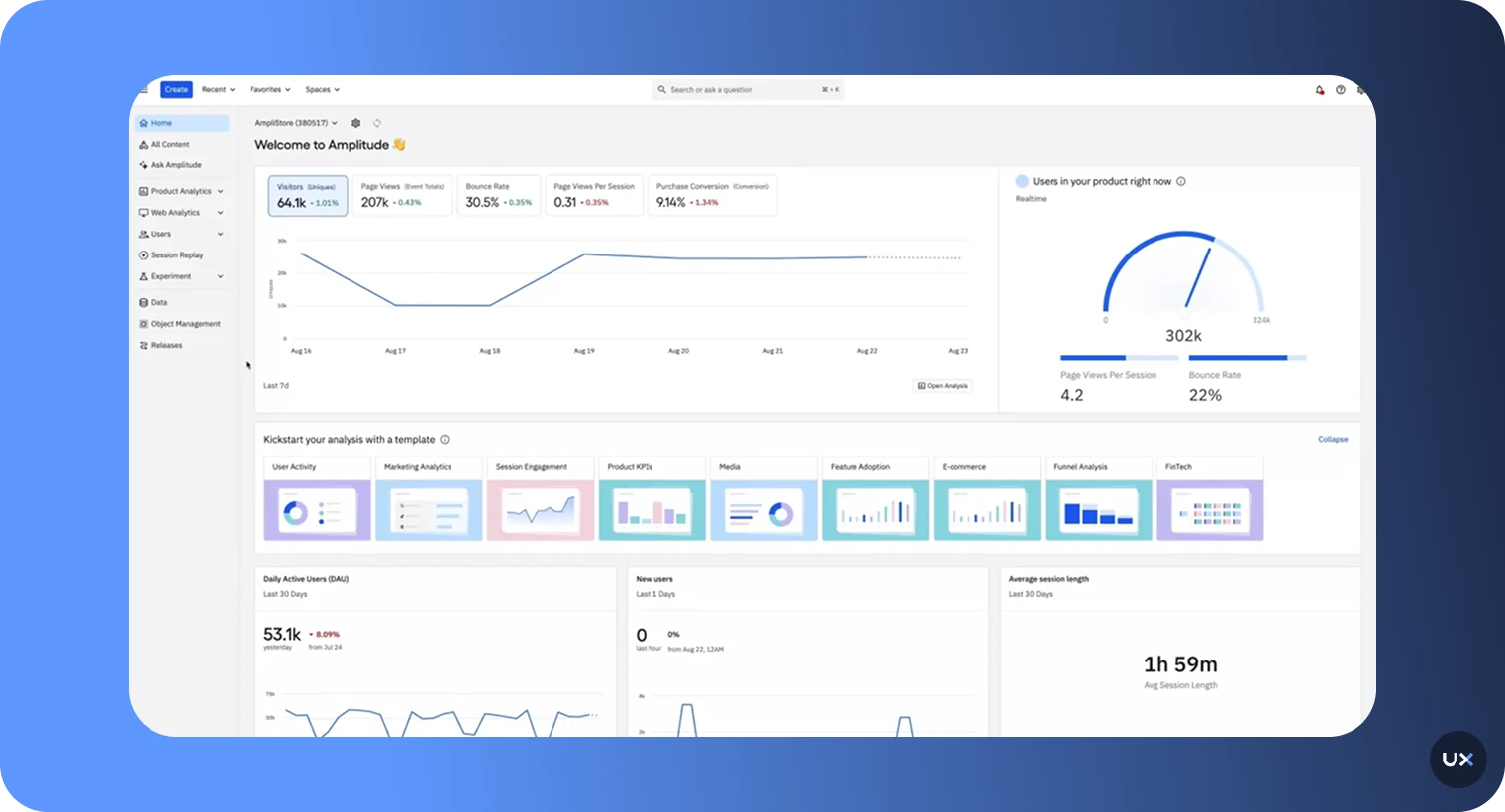
Key features
Behavioral cohorts: Group users by shared behaviors, engagement levels, or lifecycle stage for targeted analysis.
Funnel analysis: Identify conversion barriers and measure the success of onboarding or feature adoption flows.
Pathfinder analysis: Visualize the most common user paths to discover patterns and friction points.
Predictive analytics: Use machine learning to forecast churn, conversions, and lifetime value.
Custom dashboards: Tailor visual reports for different teams and objectives.
Pros
Excellent for advanced behavioral analysis
Scales easily for enterprise data sizes
Cohort tracking reveals key engagement drivers
Real-time analytics for product decisions
Cons
Requires manual setup for events
Steeper learning curve for beginners
No built-in qualitative analytics
Pricing
Amplitude offers a free plan with up to 10 million monthly events, while paid plans start at around $61 per month. Enterprise pricing is customized based on event volume, data needs, and advanced analytics features.
4. Heap
Heap is a product analytics platform that automatically captures every user interaction without requiring manual event tagging. This autocapture approach makes it one of the most user-friendly tools for product, UX, and growth teams that want insights fast. Heap helps teams understand how users navigate, where they drop off, and which actions drive conversions—all without needing developer support.


Key features
Autocapture: Automatically records all user interactions, saving time and reducing human error.
Retroactive analysis: Access historical data, even for events that weren’t originally tracked.
Journey maps: Visualize user paths and find the moments that lead to drop-offs or conversions.
Funnel and retention reports: Measure engagement trends and long-term user behavior.
Session replay integration: See exactly how users interact, adding qualitative context to your data.
Pros
No manual setup for most events
Great for non-technical teams
Fast to deploy and easy to use
Retroactive data tracking saves time
Cons
Pricing rises quickly with event volume
Real-time processing can have short delays
Mobile analytics less detailed than web
Pricing
Heap offers a free plan with up to 10k monthly sessions. Paid plans are based on data volume and include advanced reporting, integrations, and governance controls. Contact their team for a custom pricing.
5. Smartlook
Smartlook is a qualitative analytics and session replay platform that helps teams understand how users interact with their websites and mobile apps. It goes beyond traditional analytics by pairing numbers with visual context, allowing teams to see why users behave a certain way. From session recordings to heatmaps and event tracking, Smartlook gives product, UX, and development teams the tools to uncover friction, debug faster, and improve user experiences.


Key features
Session recordings: Watch real user interactions to identify usability issues and bottlenecks.
Heatmaps: Visualize clicks, taps, and scrolls to understand engagement patterns.
Event tracking: Define and track custom user actions without needing developer input.
Funnels: Identify where users drop off in key flows and measure conversion success.
Crash reports: Rewatch sessions leading up to crashes for faster debugging.
Pros
Combines behavioral data with visual insights
Quick setup and easy interface
Works seamlessly on web and mobile
Funnels and event tracking are intuitive
Cons
Fewer advanced filters than larger tools
Occasional playback bugs in replays
Limited depth in predictive analytics
Pricing
Smartlook offers a free plan with up to 3,000 monthly sessions. For advanced features and more monthly sessions, reach out to their team for custom pricing.
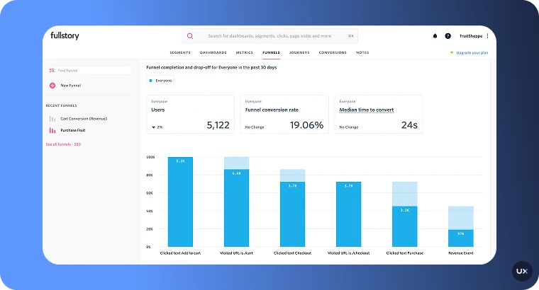
6. FullStory
FullStory is a digital analytics tool designed to help teams understand how and why users behave the way they do. It captures sessions, events, clicks, scrolls, and interactions across web and mobile, then layers those with AI-driven insights to uncover friction, sentiment, and opportunity. Unlike tools that just log metrics, FullStory empowers you to watch real user journeys and link them directly to business outcomes.


Key features
Session replay & interaction capture: Record every click, swipe, scroll, and input across your digital product.
Autocapture technology (“Fullcapture™”): Automatically collect all user interactions without manual tagging.
Heatmaps & journey maps: Visualize how users move, where they hesitate, and where they drop off.
Behavioral and sentiment analytics: Surface rage clicks, frustration signals, copy/paste behavior, zooms, and other subtle cues.
Funnels & conversion metrics: Understand how users progress (or don’t) through key flows and features.
Pros
Excellent for UX and usability research
Detects frustration patterns automatically
Smooth integrations with product and support tools
Visual analytics for quick debugging
Cons
Expensive for high-traffic sites
Limited advanced data analysis features
Lacks predictive or deep behavioral reporting
Pricing
FullStory offers a free-tier plan that supports up to 30,000 sessions/month, with basic analytics and a one-year retention window for sessions and analytics data.Paid plans are quote-based. Reach out to their team for an accurate price.
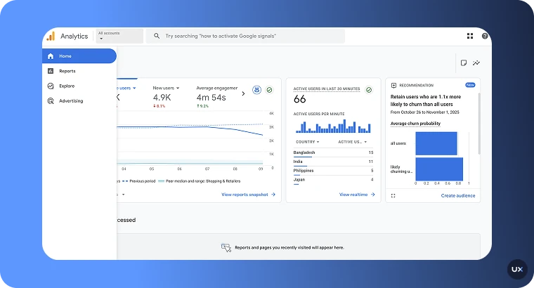
7. Google Analytics 4 (GA4)
Google Analytics 4 (GA4) is Google’s analytics platform that unifies website and app data into a single property. Unlike Universal Analytics, GA4 is fully event-based, offering a flexible way to measure user interactions across devices and sessions. It’s designed to give marketers, analysts, and product teams a deeper understanding of the customer journey, from acquisition to engagement, monetization, and retention, while maintaining strong privacy and compliance features.


Key features
Event-based tracking: Track every user interaction (scrolls, clicks, video plays, etc.) without session-centric limitations.
Cross-platform analytics: Combine website and app data into a single property for full-journey visibility.
Enhanced monitoring: Automatically tracks key events like page views, scrolls, and file downloads.
Predictive insights: Uses machine learning to forecast churn probability and revenue potential.
Audience builder: Create dynamic audience segments for remarketing and personalized targeting.
Pros
Easy integration with Google’s ecosystem
Customizable event tracking
Real-time reporting and audience insights
Reliable for web traffic and conversion tracking
Cons
Complex setup for advanced features
No qualitative insights like session replays
Sampling and data privacy limits in some regions
Pricing
GA4 offers a free standard version for most businesses. For enterprise needs, Google Analytics 360 (GA4 360) provides enhanced data limits, SLAs, and advanced integrations.
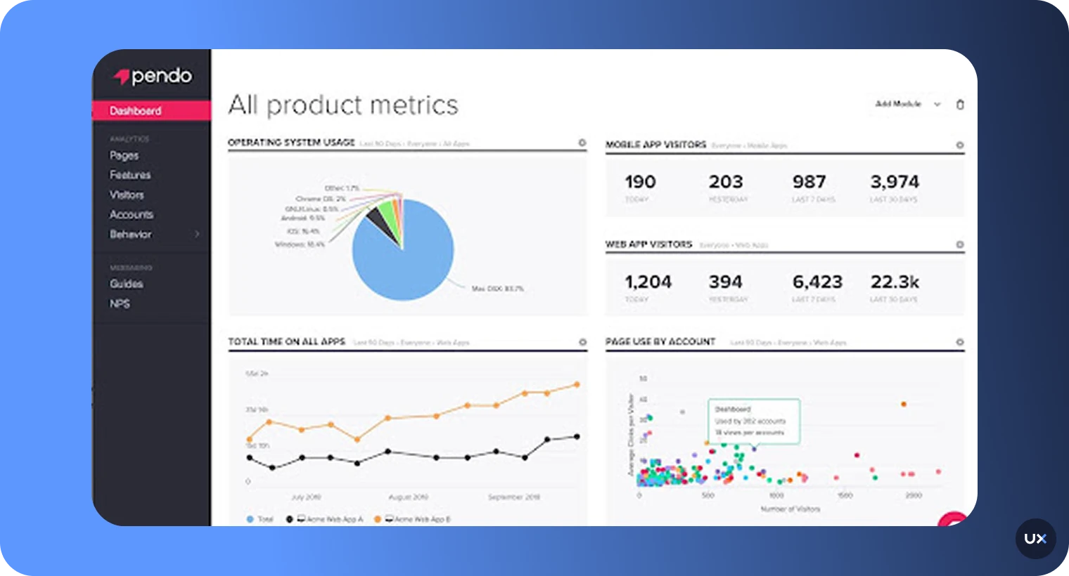
8. Pendo
Pendo is a product experience and analytics platform that tracks feature usage and user behavior to help teams understand how users adopt and engage with their product. It is tailored for product-led companies that want both analytics and user guidance.


Key features
Feature usage metrics: Monitor which features users adopt (or ignore) and surface hidden friction points.
In-app guides & onboarding flows: Create tooltips, walkthroughs, banners, and in-product messaging to improve user onboarding and adoption.
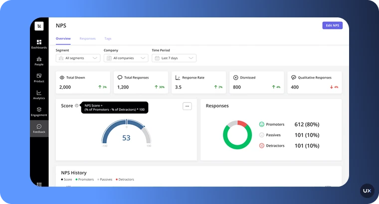
Feedback and NPS surveys: Collect user sentiment, feedback, and feature requests directly within the product.
Journey analytics & segmentation: Visualize user paths, build cohorts, segment by behavior or property, and spot drop-offs.
Product roadmaps & adoption insights: Link analytics and user feedback to roadmap decisions and prioritize based on real usage data.
Pros
Useful for understanding feature adoption and product-led growth
Easy to integrate with product and marketing tools
Supports both web and mobile apps
Enables teams to engage users within the product
Cons
Pricing may scale significantly as active users increase
More focused on guidance and adoption than deep behavioral pathing
Requires setup of in-app elements and may need product team resources
Pricing
No fixed public starting price; pricing is custom based on active users and features. Free trial available for initial evaluation.
Best practices for product analytics
Start with a clear goal: Track the actions that matter most to your product outcomes, such as sign-ups or feature use.
Combine quantitative and qualitative data: Numbers show trends, but replays and heatmaps explain behavior. Use both for balanced insight.
Review funnels regularly: Check where users drop off and adjust designs quickly to keep them moving forward.
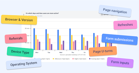
Segment your users: Group users by device, geography, or behavior to see different engagement patterns.
Share insights across teams: Encourage product, design, and engineering teams to review analytics together.
Prioritize privacy: Always mask personal data and stay compliant with GDPR, CCPA, or HIPAA requirements.
Iterate continuously: Use findings to make small, measurable improvements rather than one-off changes.
Start measuring what matters with UXCam
The best products are built on understanding, not assumptions. With the right product analytics software, you can see what users do, why they do it, and how to create experiences they’ll love. From spotting drop-offs to refining key features, the right tool turns data into action, and that’s exactly where UXCam shines.
UXCam unifies session replays, heatmaps, funnels, and retention analytics in one powerful, easy-to-use platform. It gives your team a crystal-clear view of real user behavior, helping you eliminate friction, boost engagement, and make confident product decisions backed by evidence.
Start your free trial with UXCam today and see your product through your users’ eyes.
You might also be interested in these articles;
How to Record User Behavior on Websites (and Why It Matters)
How to Convert Website Visitors into Customers
User Session Recording on Websites - A Detailed Guide
21 Website Visitor Tracking Tools with Top-Rated User Reviews


Related articles


Analytics
Best Product Analytics Software [2026]
Discover top product analytics tools to elevate your business. Which software will transform your data into actionable insights? Explore our expert picks...

Jonas Kurzweg
Product Analytics Expert