User Analytics Dashboard Examples and How to Use Them
As a stakeholder in mobile app development, you know how important data is. But raw data alone doesn’t tell you much. What you need are insights—clear, actionable insights that help you make informed decisions.
That’s where user analytics dashboards come in.
These dashboards give you a high-level overview of how users interact with your app. They break down complex data into easy-to-read visuals, making it easier for you and your team to spot trends and opportunities for improvement.
Whether you're a product manager tracking feature adoption, a UX designer analyzing user flow, or an engineer fixing crashes, dashboards provide real-time and historical insights that drive better product decisions.
But not all dashboards are created equal. The most effective ones are tailored to your specific role, helping you zero in on the metrics that matter most to you and your team.
For example, while an engineer may care about crash reports, a product manager might focus on user engagement and retention. Dashboards let each team member track what’s most relevant to their goals.
In this post, we’ll dive into practical examples of user analytics dashboards, showing how each one can improve your app’s performance. You’ll also discover how to leverage UXCam to make these dashboards even more powerful.
Let’s get started.
Summary - User analytics dashboard examples
Below is a breakdown of different types of user analytics dashboards and what each is best used for:
| Dashboards | Best used for |
|---|---|
| Onboarding Funnel dashboard | Identifying steps where new users drop off during the onboarding process. |
| Engagement bashboard | Understanding what keeps users active, how often, and how long they stay. |
| Retention & churn dashboard | Measuring long-term user loyalty and reducing drop-offs over time. |
| Crash & performance dashboard | Tracking app crashes, slow load times, and stability issues across devices. |
| Feature adoption dashboard | Evaluating how new features are used and whether they improve user retention. |
| User journey dashboard | Visualizing user navigation paths to find friction points and improve flow. |
| Conversion rate dashboard | Measuring how effectively users complete key actions like sign-ups or purchases. |
Onboarding funnel dashboard
The onboarding process is your users' first real experience with your app, and getting it right is critical for long-term retention. Tracking how users move through each step helps you identify where they're dropping off or getting stuck.
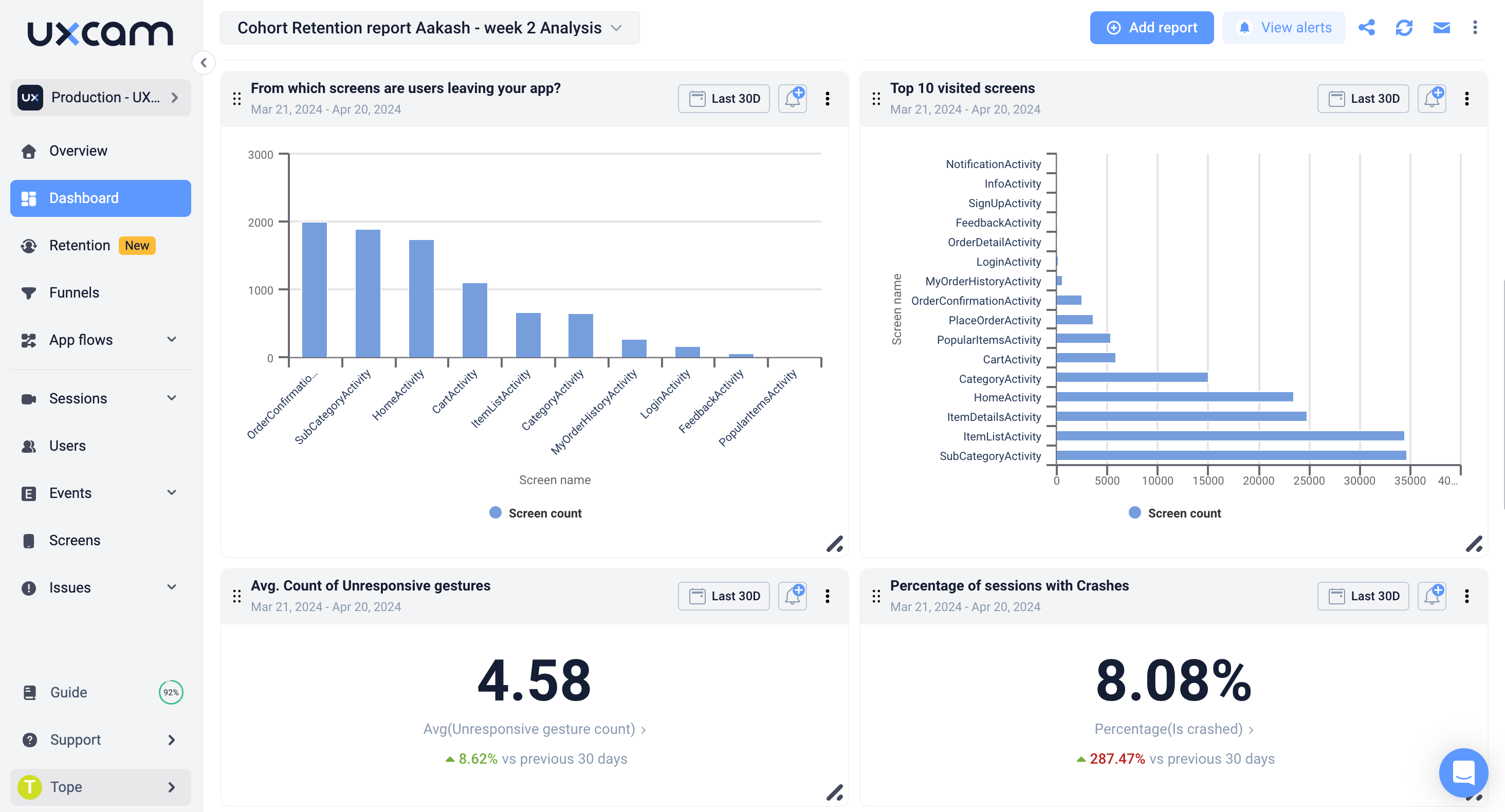

Key metrics to track
Completion rate: How many users complete the onboarding process.
Drop-off rate: Where users abandon the process.
Time to complete: The average time users spend completing onboarding.
Benchmark information
For SaaS products, aim for an overall onboarding completion rate of 40-60%, while keeping drop-off rates below 20% between each step. Ideally, the onboarding process for mobile apps should take under 5 minutes to maintain user interest.
Action items based on dashboard insights
High drop-off at email verification? Consider offering social sign-up options to streamline the process.
Long completion times? Break the onboarding flow into smaller, more manageable steps.
Low tutorial completion rates? Gamify the tutorial process to boost engagement and completion rates.
UXCam Pro-Tip: Use UXCam’s Funnel Analysis to zero in on the exact steps where users are dropping off. Pair it with Session Replay to observe user interactions and uncover specific onboarding issues, such as confusing UI or long load times.
How to combine insights from other dashboards
Onboarding metrics are crucial for long-term retention. Compare onboarding data with retention rates to evaluate how well onboarding sets users up for success. Additionally, link onboarding completion to customer lifetime value to measure the return on investment for refining your onboarding process.
Tailoring your dashboard (industry examples)
Fintech: Track whether users complete identity verification or link their bank accounts during onboarding.
E-commerce: Include the user’s first purchase as the final step of onboarding.
Healthcare: Monitor whether users complete profile setup and provide medical history or insurance information.
Engagement Dashboard
Understanding how long users stay in your app and what they do while they’re there is critical. The Engagement Dashboard gives you insights into session length, frequency, and feature usage, helping you focus on what keeps users engaged.
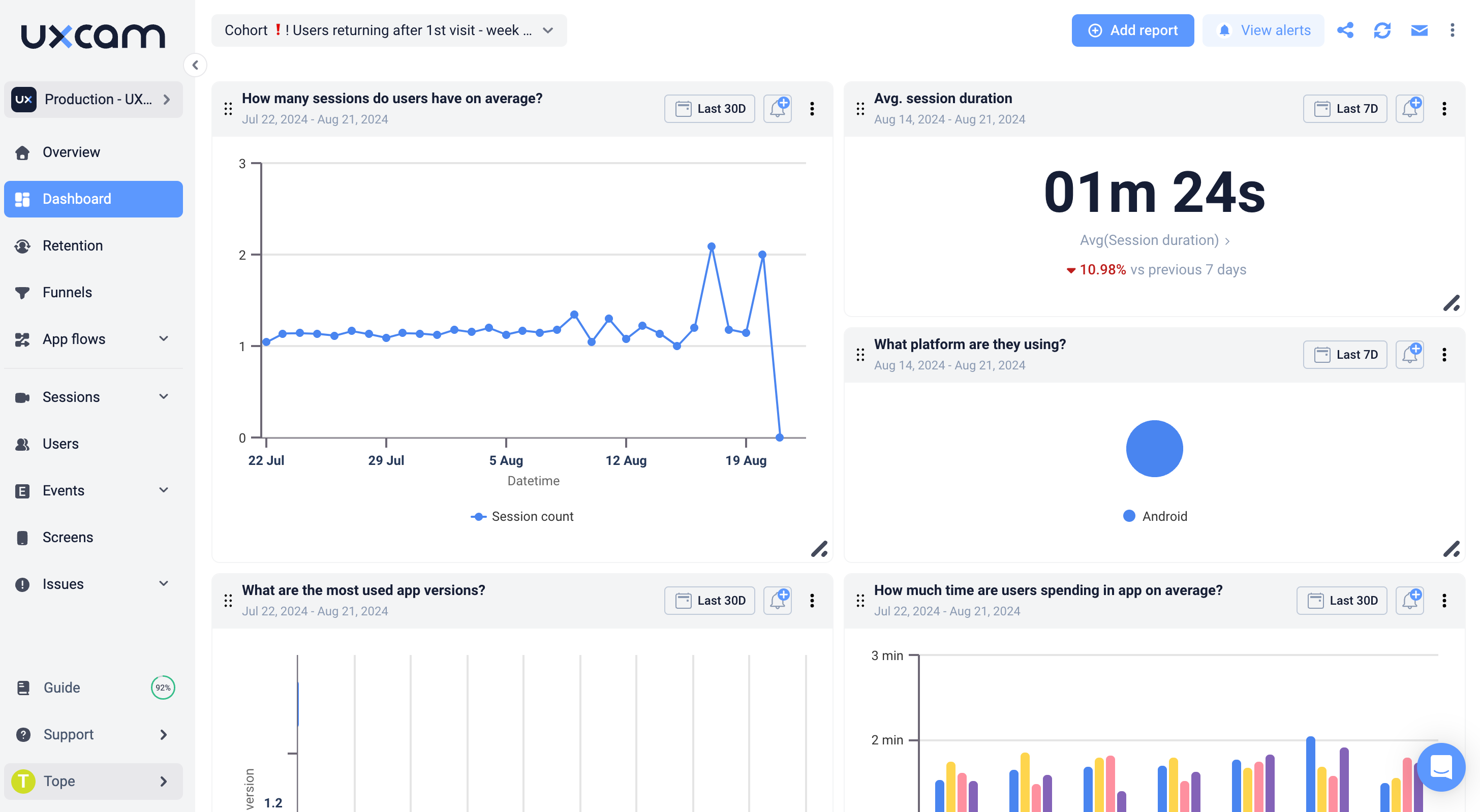

Key metrics to track
Session Duration: Average time users spend in the app.
Session Frequency: How often users return to the app.
Feature Usage: Which features are most and least used.
Active Users: Track Daily Active Users (DAU) and Monthly Active Users (MAU).
Benchmark Information
For mobile apps, strive for a session duration of at least 5-10 minutes and aim for a DAU/MAU ratio of around 20-30% to ensure users are engaging frequently.
Turn insights to action
Short session durations? Simplify navigation or add more engaging content to increase time spent in the app.
Low feature usage? Rethink UI placement for underused features or implement better in-app messaging to introduce them.
UXCam Pro-Tip: Use Heatmaps to visualize exactly where users are tapping, scrolling, or interacting with your app. This helps you understand how they navigate and identify overlooked or confusing UI elements.
How to combine insights from other dashboards
Engagement metrics can be highly informative when cross-referenced with conversion rate metrics. High engagement without conversions may indicate that users are exploring but not taking action, offering opportunities to refine your funnel or call-to-actions.
Tailoring your dashboards (industry examples)
Fintech: Track engagement with budgeting tools or investment features.
E-commerce: Measure how long users spend browsing before making a purchase.
Food Delivery: Monitor interactions with menu items or repeat orders to track customer preferences.
User retention and churn dashboard
Retention is a key indicator of long-term app success. This dashboard helps you track how well you're keeping users engaged over time. Understanding when and why users leave can significantly reduce churn.
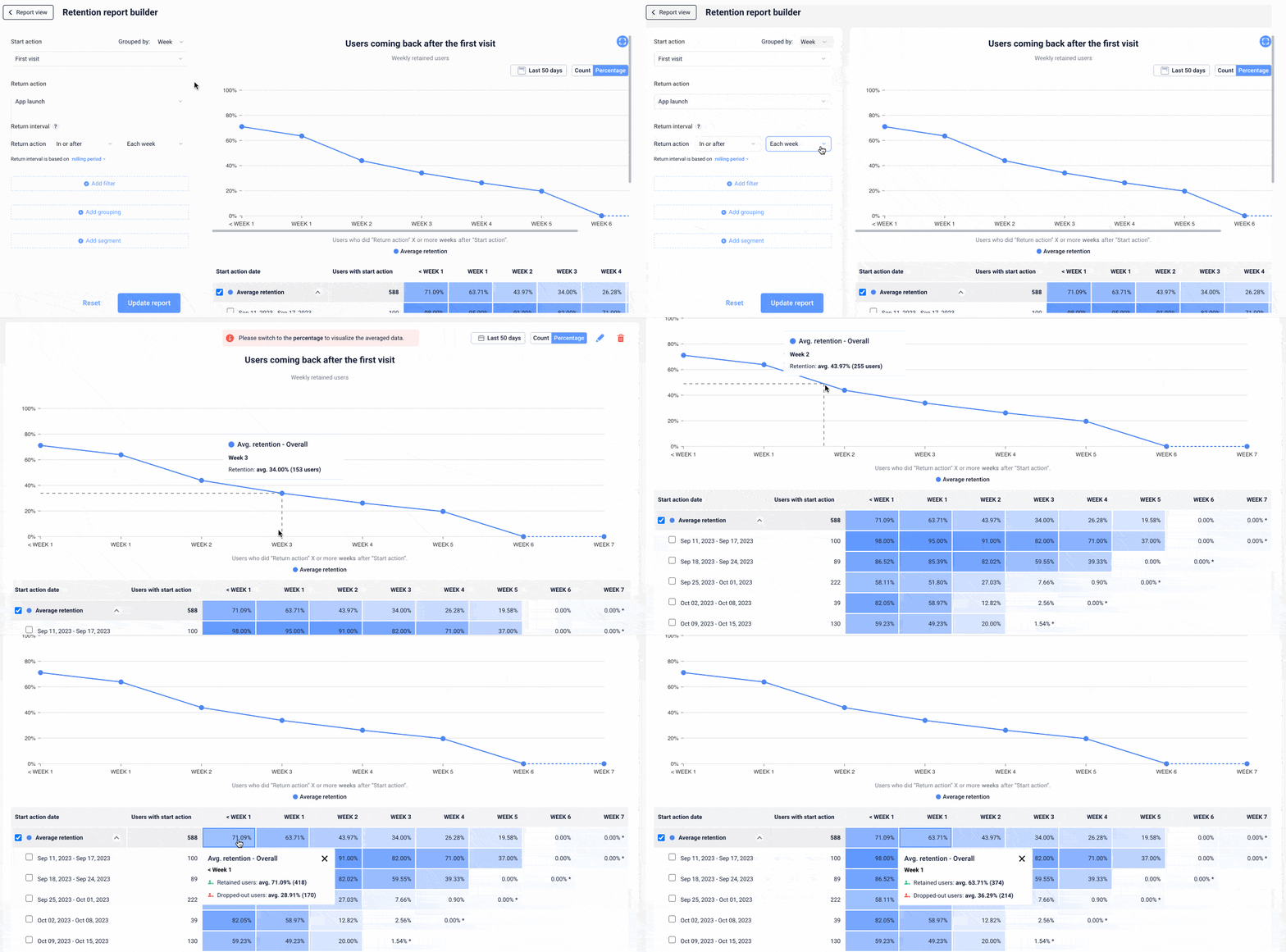
Key metrics to track
Retention Rate: Percentage of users returning after a specific period.
Churn Rate: Percentage of users who stop using the app.
Cohort Analysis: Group users based on common characteristics and see how they behave over time.
Benchmark information
Aim for a Day 1 retention rate of at least 40% and Day 30 retention of 20-30% for mobile apps. Maintaining a churn rate under 5% per month is essential to sustaining a healthy user base.
Turn insights to action
High churn after a week? Review the user journey for friction points, such as confusing features or overwhelming choices.
Low retention in specific cohorts? Segment users to launch targeted re-engagement campaigns like personalized push notifications or in-app offers.
UXCam Pro-Tip: UXCam’s Segmentation Filters allow you to analyze retention for different user cohorts—like new users or high-value users—so you can adjust strategies based on group behaviors.
How to combine insights from other dashboards
Analyze retention rates alongside feature adoption to determine if certain features lead to higher retention. Additionally, compare retention metrics with crash analytics to see if app stability is affecting your ability to keep users.
Tailoring your dashboard (industry examples)
Subscription-Based Apps (e.g., Fintech, Healthcare): Focus on retention rates after free trials end or when users convert from free to paid plans.
Retail Apps: Track retention rates of users who make repeat purchases versus those who browse but don’t buy.
Education Apps: Measure retention for users who complete courses versus those who drop out early.
Crash and performance analytics dashboard
App stability is critical. Crashes and performance issues can drive users away faster than any other factor. This dashboard tracks your app’s health by monitoring crashes, load times, and other key performance indicators.
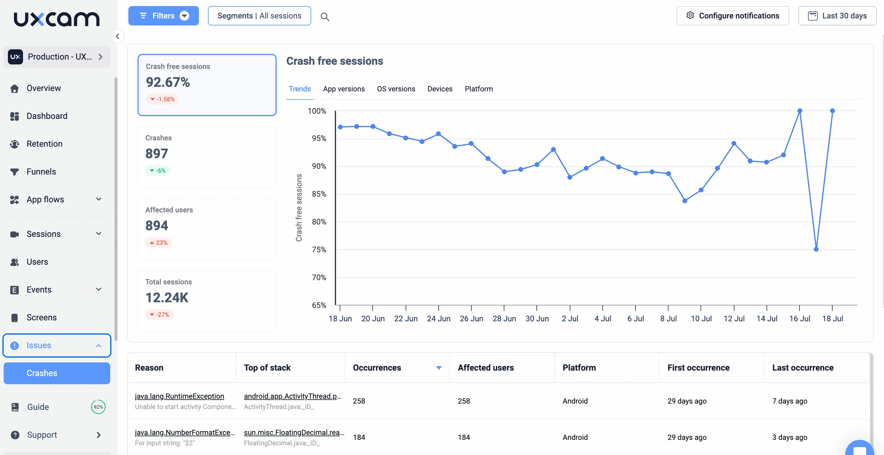
Key metrics to track
Crash Rate: Number of crashes per session.
Load Time: Time it takes for the app to load.
Affected Devices/OS: Track performance across different devices and operating systems.
Benchmark information
Keep your crash rate below 1% and ensure load times are under 2 seconds to avoid user frustration and drop-offs.
Turn insights to action
High crash rate on specific devices? Prioritize testing and optimization for those devices or operating systems.
Slow load times? Consider optimizing server responses, reducing image sizes, or streamlining code.
UXCam Pro-Tip: Use Session Replay alongside crash reports to understand exactly what users were doing when the app crashed. This helps you debug faster and identify the root cause of performance issues.
How to combine insights from other dashboards
Compare crash data with user retention—high crash rates often lead to increased churn. Cross-reference performance metrics with engagement—slower apps typically see shorter session durations.
Tailoring your dashboard (industry examples)
E-commerce: Monitor performance during high traffic periods like sales events or product launches.
Healthcare: Track load times and app stability during critical moments, such as telemedicine appointments or prescription refills.
Food Delivery: Ensure smooth performance during peak meal times to handle high demand without crashes or delays.
Feature adoption dashboard
Tracking the adoption of newly launched features is critical for understanding their impact. This dashboard helps you measure which features resonate with users and how often they’re being used.


Key metrics to track
Adoption Rate: Percentage of users who interact with the new feature.
Frequency of Use: How often users engage with the feature.
Retention of Feature Users: Do users who engage with the new feature stick around longer?
Benchmark information
Aim for a 30-40% feature adoption rate within the first week of launch. Also, track repeat feature use to ensure it provides value beyond the first interaction.
Turn insights to action
Low feature adoption? Improve feature discovery through better onboarding or UI placement.
High adoption, but low repeat use? Refine the feature based on user feedback and in-app behavior.
UXCam Pro-Tip: Pair Feature Usage data with User Journey Analytics to see where in the app users are interacting with new features. If users are not discovering it, you may need to adjust the feature’s visibility or placement.
How to combine insights from other dashboards
Compare feature adoption with retention data to determine if new features contribute to long-term user engagement. Also, track feature adoption alongside conversion rates to assess if the new feature is driving business outcomes like purchases or sign-ups.
Tailoring your dashboard (Industry examples)
Fintech: Track the adoption of new financial tools such as savings planners or investment trackers.
E-commerce: Monitor whether users engage with personalization features, like curated shopping experiences.
Healthcare: Track the adoption of features like virtual consultations or health tracking tools.
User journey dashboard
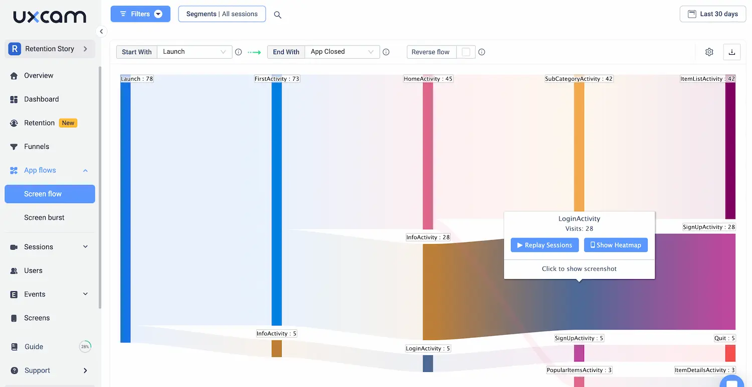
This dashboard visualizes how users navigate your app, from the first interaction to the last. It helps you understand the flow of user behavior and highlights friction points where users drop off.
Key metrics to track
Path Analysis: The most common user paths through the app.
Drop-off Points: Where users exit the app.
Screens per Session: How many screens users navigate during a session.
Benchmark information
Aim for fewer than 2 major drop-off points in key user journeys, and look for drop-off rates below 30% between major steps.
Turn insights to action
High drop-offs after the homepage? Simplify navigation or highlight key content more clearly.
Low screen exploration? Encourage deeper engagement with prompts, recommendations, or better UI flows.
UXCam Pro-Tip: With UXCam’s User Flow Dashboard, you can track the most common paths users take. If a significant portion of users are exiting unexpectedly at certain points, you can analyze the flow and make adjustments to improve navigation.
How to combine insights from other dashboards
Compare user journey data with conversion rates to identify where users drop off before completing key actions. Also, link journey insights with retention to assess whether complex user journeys lead to higher churn.
Tailoring your dashboard (industry examples)
E-commerce: Track the entire checkout process and see where users abandon their carts.
Fintech: Measure the user journey from account setup to first transaction.
Healthcare: Monitor the path from appointment scheduling to consultation completion.
Conversion rate dashboard
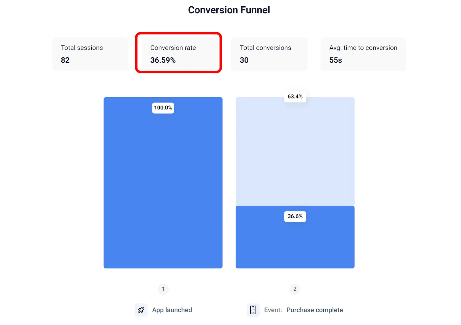
Your app’s success often hinges on key actions like sign-ups, purchases, or specific goal completions. This dashboard tracks how well users are converting through your funnels and where they’re dropping off.
Key metrics to track
Conversion Rate: Percentage of users completing the desired action.
Funnel Drop-off: Where users abandon the process before completion.
Bounce Rate: Percentage of users who leave the app without taking any action.
Benchmark information
For SaaS products, aim for a 5-10% conversion rate for free-to-paid sign-ups. Keep your funnel drop-off rate under 50% for multi-step processes like checkouts.
Turn insights to action
High drop-off during sign-ups? Simplify the form, offer social log-ins, or reduce required fields.
Low conversion rate on free trials? Introduce in-app prompts to highlight the benefits of upgrading to paid plans.
UXCam Pro-Tip: Use Conversion Funnel Analytics with Session Replays to see where users are dropping off and why. You can analyze behavior at each step and refine your flow to improve conversion rates.
How to combine insights from other dashboards
Cross-check conversion data with engagement metrics—are highly engaged users more likely to convert? Additionally, compare funnel data with crash analytics to identify if performance issues are affecting conversions.
Tailoring your dashboard (industry examples)
E-commerce: Track conversion rates from product view to purchase.
Subscription Apps (e.g., Healthcare, Education): Measure conversions from free trials to paid plans.
Retail Apps: Monitor conversion rates of users completing in-store pickups after online purchases.
Best practices for using user analytics dashboards
When it comes to user analytics dashboards, simply gathering data isn’t enough. You need a strategic approach to make sure the data leads to actionable insights. Here are some best practices that will help you get the most out of your dashboards.
Set clear goals
Before diving into the data, it’s essential to define clear objectives. What are you trying to improve? Whether you want to boost user retention, optimize a specific feature, or reduce churn, having a goal in mind will help you focus on the right metrics.
For example, if your goal is to improve onboarding completion rates, focus on the steps where users drop off the most. By aligning your dashboard with your objectives, you ensure the data works toward driving specific outcomes.
Customize your dashboards
Not all stakeholders need the same data. Engineers will be focused on app performance—things like crash rates and load times. Product managers, on the other hand, might care more about user flows, feature adoption, and engagement metrics.
Tailoring dashboards to each role ensures that everyone on your team has quick access to the data that matters most to them. This not only saves time but also helps each team member make better decisions faster.
Every team member, from product managers to engineers, can get the most out of user analytics dashboards by customizing them to track the metrics that matter most to their specific role.
Product Managers: Focus on feature adoption, user retention, and conversion rates. They need to understand how users engage with features and how new launches impact overall performance.
UX Designers: Prioritize engagement metrics like session duration, user flow, and heatmaps to ensure the app is intuitive and users can navigate easily.
Engineers: Focus on crash analytics, load times, and performance metrics to ensure the app runs smoothly across all devices.
Marketing Teams: Track active users, conversion rates, and A/B testing results to refine campaigns and increase user acquisition and engagement.
Automate reporting
Manually checking dashboards every day is time-consuming. By setting up automated reports, you can get regular updates on key metrics without lifting a finger. Weekly reports sent straight to your inbox help keep teams aligned and on track with their KPIs.
For example, a product manager could receive a weekly report on feature adoption and user engagement. This helps them stay informed without constantly needing to check the dashboard themselves.
Cross-reference multiple data points.
To get a fuller picture, you should cross-reference multiple data points. Relying on just one type of data can lead to incomplete conclusions. For example, session durations alone won’t tell you why users drop off—combining session times with heatmaps and crash data might.
A practical example would be using heatmap insights along with engagement metrics. If users frequently tap on a non-clickable area, this could indicate a usability issue that’s impacting their experience, which would have gone unnoticed with only one data source.
A/B testing and experimentation
Dashboards are a valuable tool for tracking the success of A/B tests and experiments. Use them to compare how different variations of a feature or flow perform. Metrics like conversion rates, engagement, and retention are key indicators of what’s working and what’s not.
For instance, a product manager could experiment with two different onboarding flows. By analyzing the conversion and drop-off rates for each flow, they can determine which version leads to more successful user onboarding.
Conclusion: Actionable Insights Through Dashboards
User analytics dashboards are more than just data collection tools—they’re your guide to making informed, impactful decisions. By regularly reviewing your dashboard data, you can spot trends, identify opportunities for improvement, and make data-driven changes that enhance your app's performance.
Whether you’re optimizing user flows, improving retention, or solving performance issues, these insights help you stay ahead. The key is to make iterative changes based on what the data tells you, continuously refining the user experience to meet evolving needs.
With UXCam’s powerful dashboard features, you can go beyond basic metrics. From session replays to heatmaps, UXCam helps you see the story behind the numbers, giving you deeper insights into user behavior. This empowers you to make smarter decisions and improve your app’s user experience.
Ready to take your app to the next level? Try UXCam for free and discover how real-time analytics can help you optimize every aspect of your mobile app. Get started today and unlock the full potential of your data! You might also be interested in these; Best Web Analytics Tools You Must Know
How to Figure Out Why Your Apps Keep Crashing
Best Practices for Error Handling in React Applications
How to Find Bugs in Mobile Applications
Customer Analytics Dashboard Examples and How to Use Them
Flutter Performance Optimization Techniques & Best Practices
AUTHOR
Tope Longe
Product Analytics Expert
Ardent technophile exploring the world of mobile app product management at UXCam.

Related articles
Dashboards
User Analytics Dashboard Examples and How to Use Them
Discover how user analytics dashboards drive product success. Learn to leverage key metrics, visualize user behavior, and make data-driven decisions to enhance...

Tope Longe
Product Analytics Expert