

Let’s be honest—shipping features isn’t the goal. Driving real user value is. And the only way to know if you’re doing that? Tracking the right UX metrics.
You already know the basics of UX design. But if you're not measuring user experience with the same rigor you apply to growth or retention, you're flying blind.
The difference between product noise and product wins lies in the UX signals you choose to measure. It’s about knowing which metrics matter at each stage—adoption, engagement, retention—and using them to drive confident, customer-backed decisions.
In this guide, we’ll walk you through the 12 most important UX metrics to track for product wins. You will also learn like how UXCam helps your measure these metrics with ease so you can turn raw behavior data into actionable insights.
Let’s cut through the noise and get tactical.
User experience metrics cheat sheet
| User Experience Metric | Why it matters | How UXCam helps |
|---|---|---|
| Task Success Rate | Validates usability on core flows. | Filter UXCam session replays by failed events to watch friction instantly. |
| Time on Task | Reveals efficiency vs. confusion. | Overlay heatmaps to pinpoint hover-loops |
| Error Rate | Quantifies avoidable frustration. | Auto-detect UI freezes & logs |
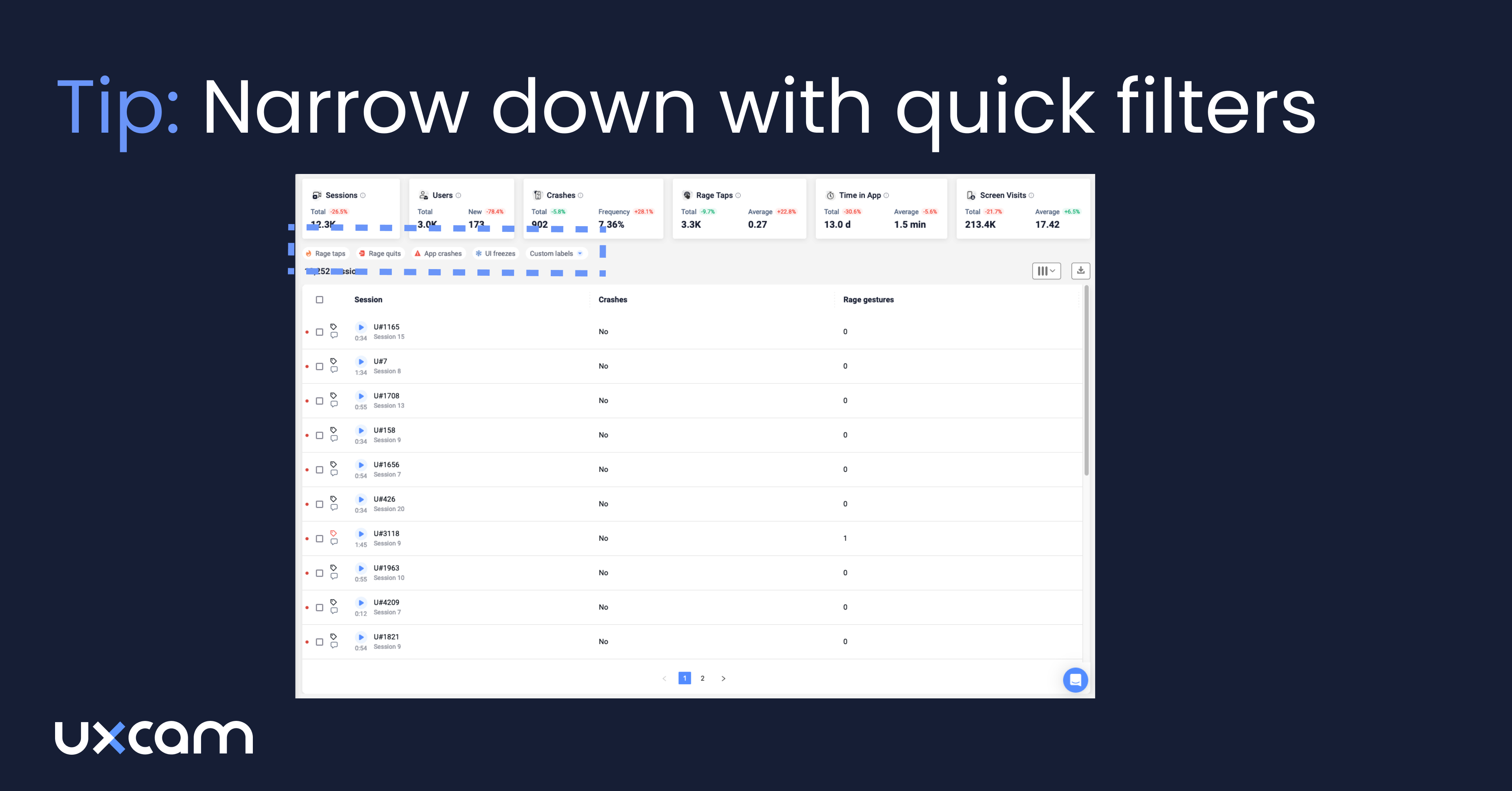
| Rage-Tap Frequency | Fast proxy for anger moments. | UXCam tags events out-of-the-box. |
| Screen Quit Rate | Spot abandonment points. | Use “high quit rate” screen list in UXCam. |
| Adoption / Activation | Measures first-week “aha!” | Combine funnel + cohort in UXCam. |
| Feature Engagement (DAU/WAU per feature) | Prioritises roadmap bets. | Segment replays to see “how”. |
| Retention & Churn | Core business health. | UXCam retention charts & replay drill-down. |
| CSAT & NPS | Sentiment check. | Trigger survey after replay-flagged friction. |
| Customer Effort Score (CES) | Predicts churn risk. | Tie CES answers to exact sessions. |
| Load & Interaction Latency | Perceived performance. | Overlay latency markers on replays |
| Crash-Free Sessions | Quality baseline. | Crash stack traces in UXCam dashboard. |
What are UX metrics?
UX metrics are signals that tell you how users actually experience your product—beyond what they say in surveys or what your team assumes in planning meetings.
They answer critical questions:
Can users complete key tasks?
Are they getting stuck, frustrated, or dropping off?
Which parts of your product deliver value and which parts are dead weight?
In simple terms: UX metrics measure the usability, efficiency, and satisfaction of your product’s experience. These are not just numbers for dashboards, they're insights into how your product fits into someone’s life.
Now, let’s clear something up: UX metrics and UX KPIs are not the same.
A UX metric is something you track, like time on task, rage taps, or screen quit rate. These are diagnostic signals that help you understand what’s happening and where things might be breaking down.
A UX KPI is something you commit to improving, like activation rate or feature adoption. It’s the metric you put on your OKRs, because moving it means you’ve actually delivered better user outcomes.
Here’s a simple way to think about it:
| UX Metric | UX KPI |
|---|---|
| Session replay views | Activation rate |
| Task success rate | Customer Effort Score (CES) |
| Rage tap frequency | Feature engagement |
You may also hear related terms like usability metrics, product experience metrics, or behavior analytics. They all roll up to the same goal: understanding how people interact with your product, and how those interactions affect their journey.
Why you must track UX metrics
Here’s the thing: User experience metrics aren’t “nice to have.” They are direct levers on outcomes every PM is responsible for, retention, revenue, satisfaction, and growth.
If users can't complete a core task or consistently run into frustrating bugs, they’ll churn. If your new feature isn't intuitive, they won’t adopt it. If you’re not measuring these things, you’re guessing, at best.
UX metrics give you a real-time pulse on what’s working and what’s not. They let you course-correct before an NPS drop turns into a retention crisis, or before a confused onboarding experience tanks activation.
They also bridge the gap between qualitative insights (like interviews or usability tests) and hard data. They turn “I think users are frustrated” into “30% of users rage-tap on this screen within 5 seconds.”
And that’s powerful. Because when you’re sitting in a roadmap review or trying to justify engineering resources, it’s much easier to rally your team around evidence than assumptions.
Want to improve LTV? Reduce churn by fixing the top UX friction points.
Trying to improve CAC payback? Boost activation with smoother onboarding.
Need to move NPS? Start by watching where loyal users spend time—and where detractors struggle.
Framework for choosing the right UX metrics
If you’re thinking, “Okay, this all makes sense, but which UX metrics should I track?” you’re asking the right question.
The answer depends on three things:
Where your product is in its lifecycle
What user behavior you care about right now
How easy it is to measure that behavior
Let’s start with lifecycle.
In the early days of a product or feature, you care most about task completion, onboarding success, and early adoption. Later, your focus shifts to retention, engagement, and efficiency.
This is where proven frameworks come in:
HEART (Google): Happiness, Engagement, Adoption, Retention, Task success. Great for UX-focused product teams looking to tie emotions to behavior.
AARRR (Pirate Metrics): Acquisition, Activation, Retention, Referral, Revenue, Ideal for growth-minded PMs aligning UX to monetization.
Here’s how to map this in planning:
| Stage | Primary Goal | Best UX Metrics |
|---|---|---|
| MVP / Beta | Usability | Task success rate, error rate |
| Post-launch | Activation | Time on task, screen quit rate |
| Growth | Retention | Feature engagement, rage taps |
| Maturity | Optimization | CES, latency, crash rate |
And of course, consider effort vs. value. If your team is small or your analytics setup is basic, start with metrics you can autocapture, like screen flows, session replays, and taps, then layer on survey data as you scale.
Don’t try to track everything. Track what matters right now, tie it to real outcomes, and make sure it’s actionable. That’s how you use UX metrics to actually drive product wins.
12 UX metrics every product team should track
Here’s a breakdown of the 12 metrics to track and measure, with real-world context and how you can track them effectively using UXCam.
Task Success Rate
Time on Task
Error Rate
Rage Tap Frequency
Screen Quit Rate
Feature Adoption Rate
DAU/WAU per Feature
Retention Rate
Net Promoter Score (NPS) & Customer Satisfaction (CSAT)
Customer Effort Score (CES)
Load & Interaction Latency
Crash-Free Sessions
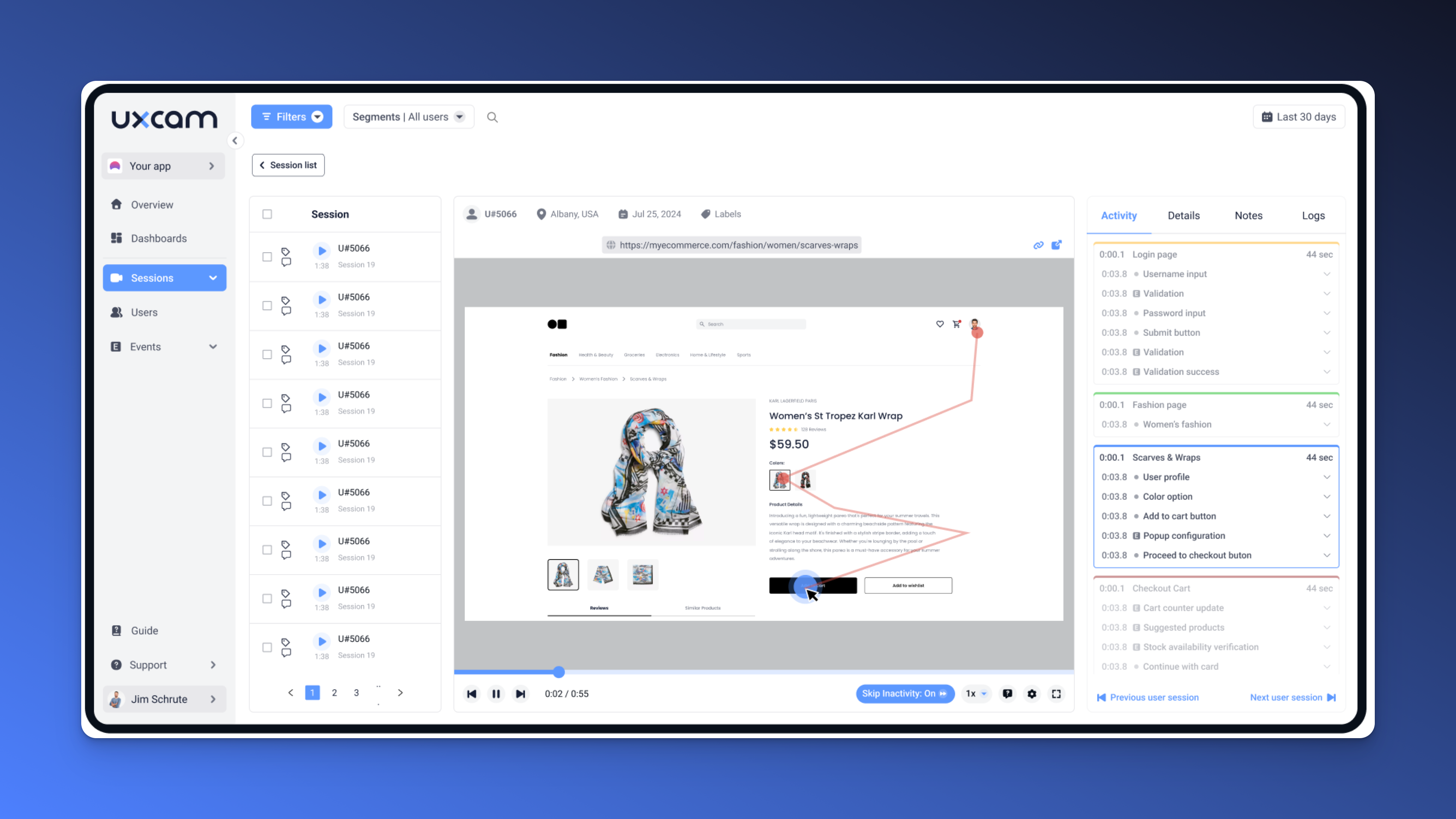
1. Task success rate - The core signal of usability
You built the flow. You QA’d it. You released it. But the real question is, can users actually complete it?
Task success rate is the most foundational UX metric you’ll ever track. If users can’t finish what they came to do—sign up, book a session, place an order—then nothing else matters. Not your pixel-perfect UI. Not your growth loops. Not even your retention strategies.
We’ve seen this play out many times. You’d pour months into a new feature, only to find 40% of users never made it past step two. Why? The call-to-action was below the fold. Or the form reset on error. Or worse, you didn’t realize users thought they completed the task, but missed a final confirmation step.
That’s what this metric catches.
How to measure it:
Take a clearly defined task—say, completing a profile or submitting a payment. Then calculate:
Successful completions ÷ Total attempts.
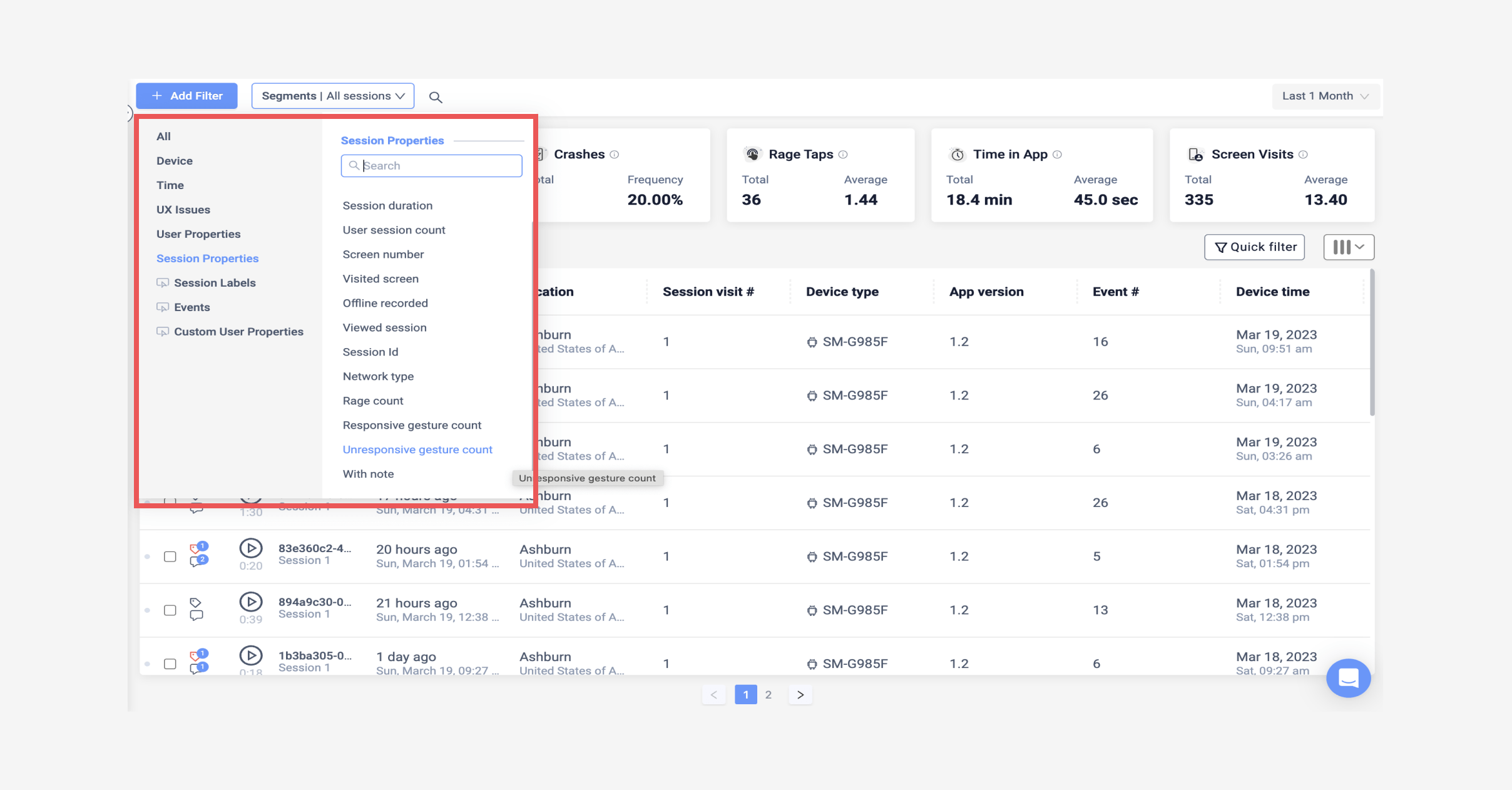
With UXCam, you don’t have to guess what went wrong. You can filter for incomplete sessions, watch exactly where users drop off, and tag those pain points.


What to look for:
Sudden exits before task completion
Loops or hesitations in a flow
Users backtracking between screens
This is your canary in the coal mine. If your task success rate is below 80% on a core journey, pause the roadmap and fix that flow first. You’re bleeding value every minute you don’t.
2. Time on task - Speed isn’t the goal, clarity is
Don’t fall into the trap of thinking more time = more engagement. Sometimes, it just means confusion.
Time on task measures how long it takes users to complete a specific action or journey. It’s less about the clock and more about effort. A two-minute signup might seem fast, until you realize users are spending 90 seconds figuring out what a field is asking for.
We once watched users spend nearly five minutes trying to complete a three-step onboarding flow we thought was “self-explanatory.” We assumed they were reading carefully. In reality, they were stuck.
That’s what makes time on task so useful. It shows you where users are slow, and whether that’s intentional or caused by friction.
How to measure it:
Track the time from the user’s first step to final completion (or abandonment) of the flow.
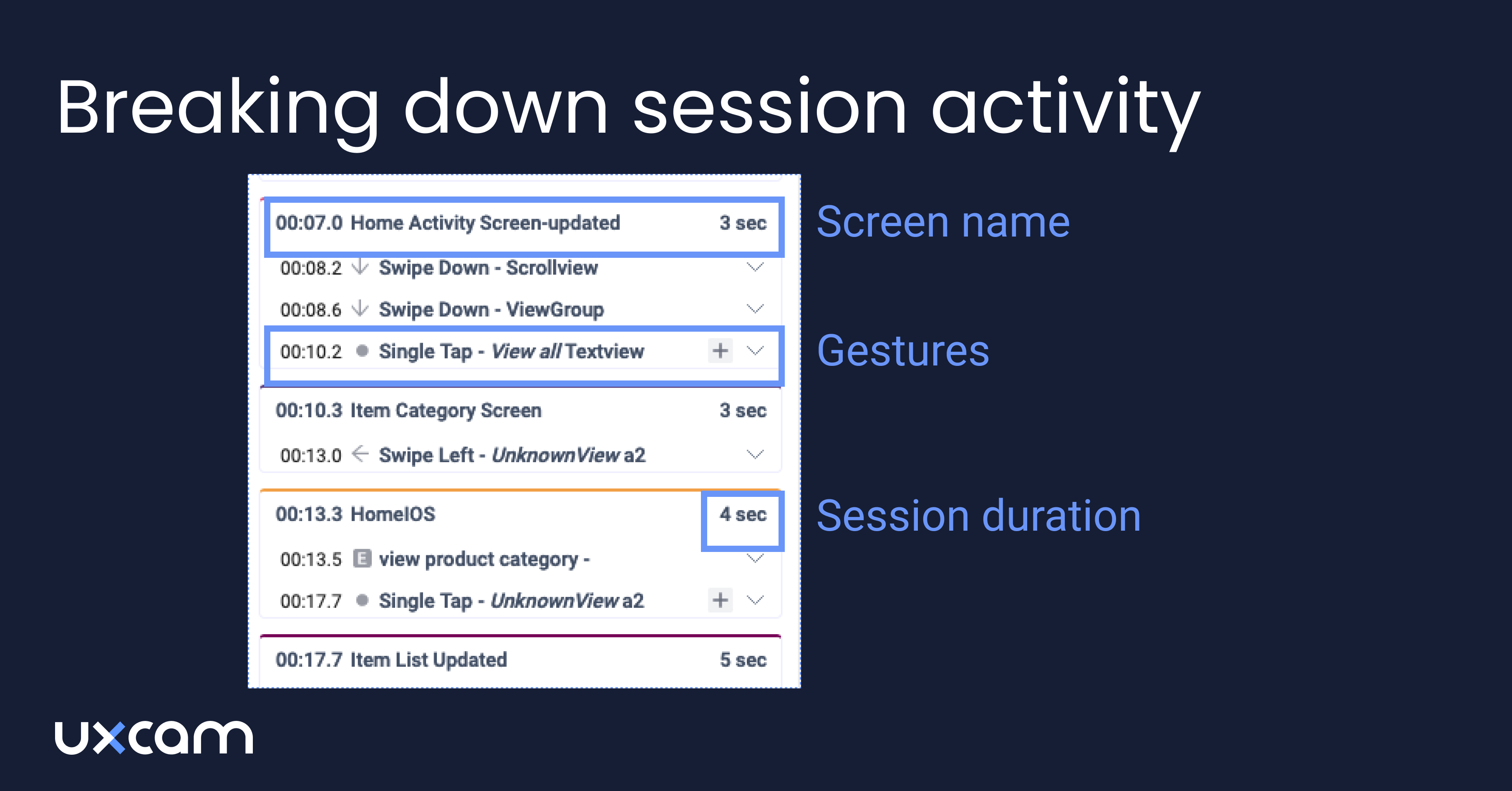
With UXCam, use session timelines or funnel tools to identify where drop-offs or long pauses occur. Then dive into the replay.


Pair this metric with heatmaps or screen interaction data. If users are circling a screen with repeated taps, scrolls, or hesitations, it’s usually a sign the UX isn’t doing its job.


Shorter time isn’t always better, but consistent time across user segments usually means clarity. Big variances? That’s where you dig deeper.
3. Error Rate - Trust dies on a failed click
Errors aren’t just bugs, they’re broken promises.
When users click “next” and nothing happens, or a form error message appears but doesn’t say why, that’s when frustration sets in. And frustration breaks trust. Once you lose that, users don’t just leavethey don’t come back.
Your error rate tells you how often users hit a wall during critical flows.
Here's a recent experience, we noticed a sharp drop in onboarding completion. Turns out, an edge-case API call failed on slow networks. We wouldn’t have found it without tracking error sessions. And we wouldn't have prioritized it without knowing how widespread it was.
How to measure it:
Number of user-facing errors ÷ Total attempts or interactions in a defined flow.
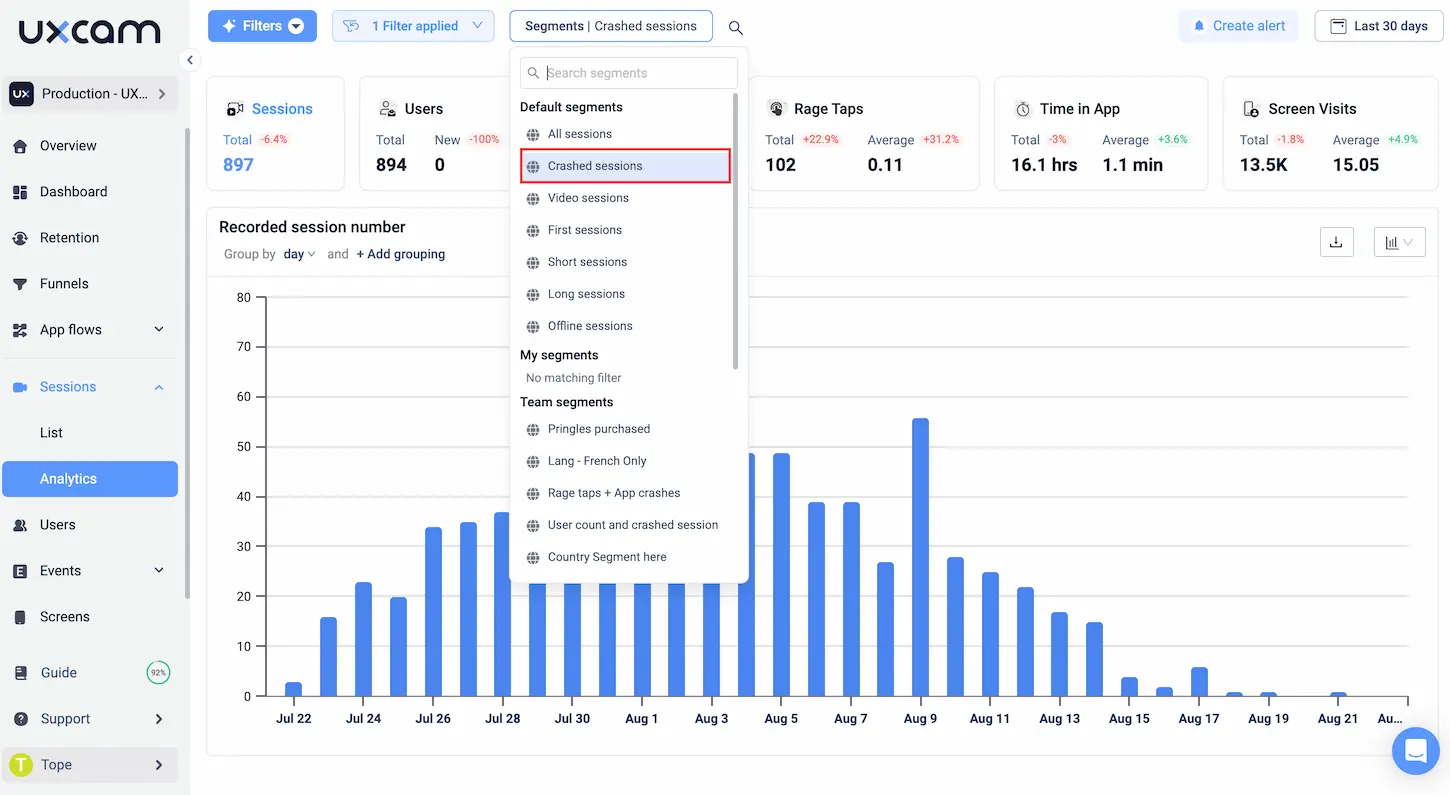
With UXCam, error events (like failed submits or crash points) can be auto-logged. Even better, you can jump straight to the replays that show the crash or bug in action.


What to watch for:
Validation errors with poor messages
App freezes or UI lock-ups
Network failures or session crashes
This metric isn’t just for engineers. It’s a PM’s superpower for advocating bug fixes that drive real user impact.
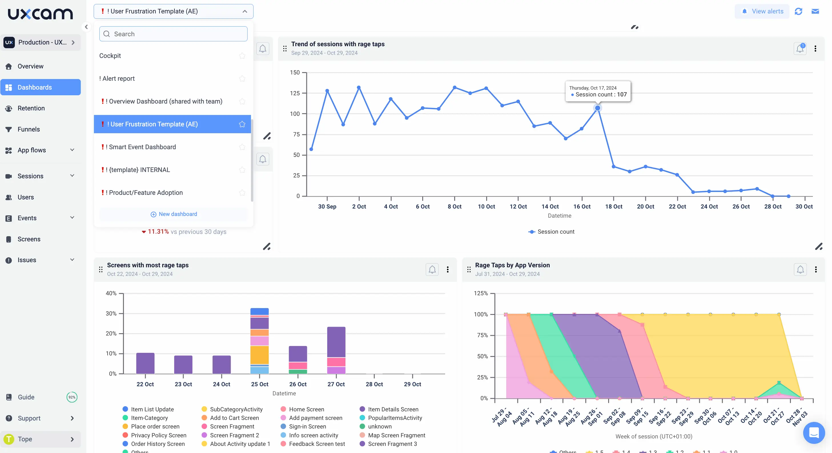
4. Rage tap frequency - Quantifying frustration in real time
You don’t need a user interview to know when someone’s pissed off, you can see it in the data.
A rage tap is what happens when a user taps the same spot rapidly, multiple times, in frustration. Maybe a button didn’t respond. Maybe it looked tappable, but wasn’t. Or maybe your app froze for half a second too long. Either way, the user is telling you, this sucks.
These taps are emotional reactions—and they’re golden signals for any product manager who cares about delight.
One of our customer once had a checkout page where users rage-tapped the “Confirm” button. They assumed it was a network delay. But replays showed something better: users were hitting a disabled button because they missed a required field, and we didn’t highlight the error well enough. A one-line fix led to a 12% increase in conversions.
How to measure it:
Number of rage taps ÷ Total sessions, tracked over time.
UXCam flags these moments automatically. They appear in session timelines with a fire icon so you can jump to the exact moment of frustration.


Why it matters:
It’s not about fixing every micro-annoyance. It’s about finding patterns—places where users are consistently let down.
Rage taps are raw user emotion, captured in clicks. And as a product manager, you don’t get that level of honesty very often.
5. Screen quit rate - Where users say “I’m out”
This one hurts, but it’s necessary.
Screen quit rate shows you the moments where users silently walk away. No rage tap. No error message. They just… leave. And the worst part? If you’re not measuring this, you might never realize you lost them.
W’ve seen this firsthand. In one app, we had a beautiful onboarding screen with slick animations and thoughtful copy. But users were dropping off right there. When we dug in, we found the screen was taking too long to load on slower networks. No bugs. Just impatience.
That’s what screen quit rate helps you uncover.
How to measure it:
Number of exits from a screen ÷ Total visits to that screen.
With UXCam, you can sort screens by quit rate and instantly jump into session replays to see what happened just before the exit.


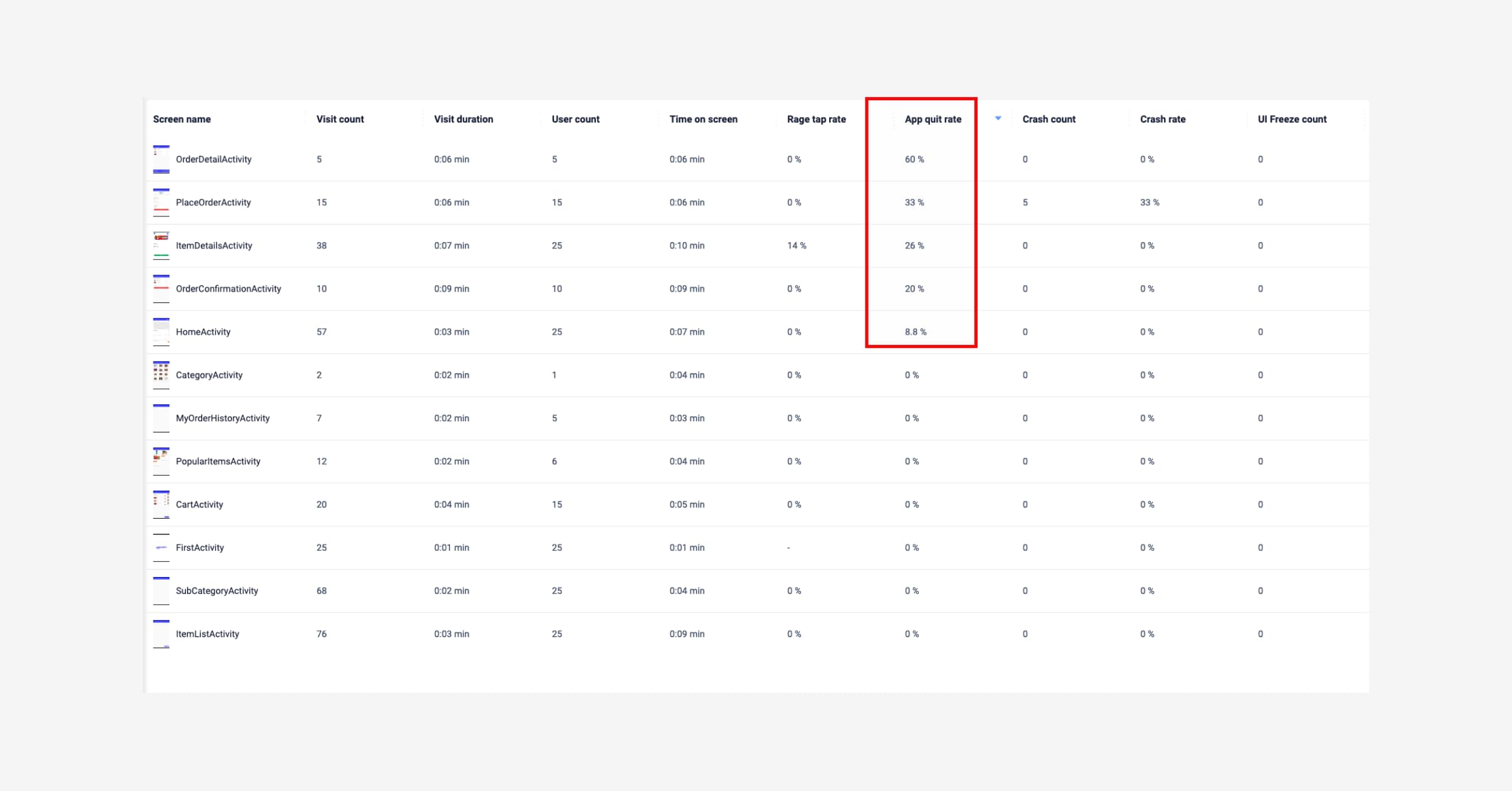
Why it matters:
A high quit rate usually means one of three things:
The screen is confusing (unclear next step or too much friction)
The screen is disappointing (user expected something different)
The screen is slow or buggy (perceived performance)
Don’t try to fix everything. Just start with your top three quit-rate screens. Even small changes, like adjusting copy, improving speed, or simplifying layout, can lead to big improvements in flow completion.
6. Feature adoption rate - Are your launches landing?
Shipping features no one uses is a PM's silent nightmare.
We’ve all been there, you plan, spec, align with engineering, release... and then nothing. Crickets. Feature adoption rate is how you know whether a new capability is truly delivering value—or if it's sitting untouched behind a hidden menu or vague button.
It’s a painful but necessary check.
We've once seen a customer work hard on a “smart save” feature designed to automate user input. The tech worked. The design looked good. But the adoption rate? Less than 8%. Turns out, most users didn’t even know the feature existed. One tool-tip added post-launch bumped usage to 30%.
How to measure it:
Users who engage with a feature ÷ Total active users, tracked weekly or monthly.
With UXCam, you can tag feature-specific events (like tapping a certain button or screen) and see how that engagement changes over time.


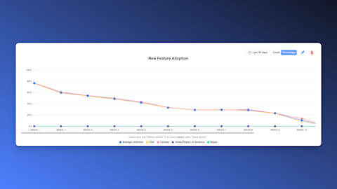
Why it matters:
Adoption is proof of utility. If users don’t adopt it, either:
They don’t see it
They don’t understand it
They don’t need it
Each one points to a different problem, discovery, UX clarity, or product/market fit. Knowing which one is at play helps you take the right next step.
7. DAU/WAU per feature - How sticky are your Features really?
Overall engagement metrics can be misleading. A user might log in daily, but only to check a single feature, while ignoring everything else.
That’s why you need to measure DAU/WAU per feature. It’s your way of separating what’s truly sticky from what’s just noise.
I worked with a growth team once that kept pushing a dashboard revamp. They were convinced it was a core driver of retention. The DAU/WAU data told a different story, users opened it once, maybe twice a week. Meanwhile, a tiny secondary feature we had deprioritized was getting daily usage from power users.
That changed our entire roadmap.
How to measure it:
Daily (or weekly) active users of a feature ÷ Total DAU or WAU.
Use UXCam to segment session data by event or screen tied to a specific feature. You’ll get a clear view of how often it’s used—and by whom.


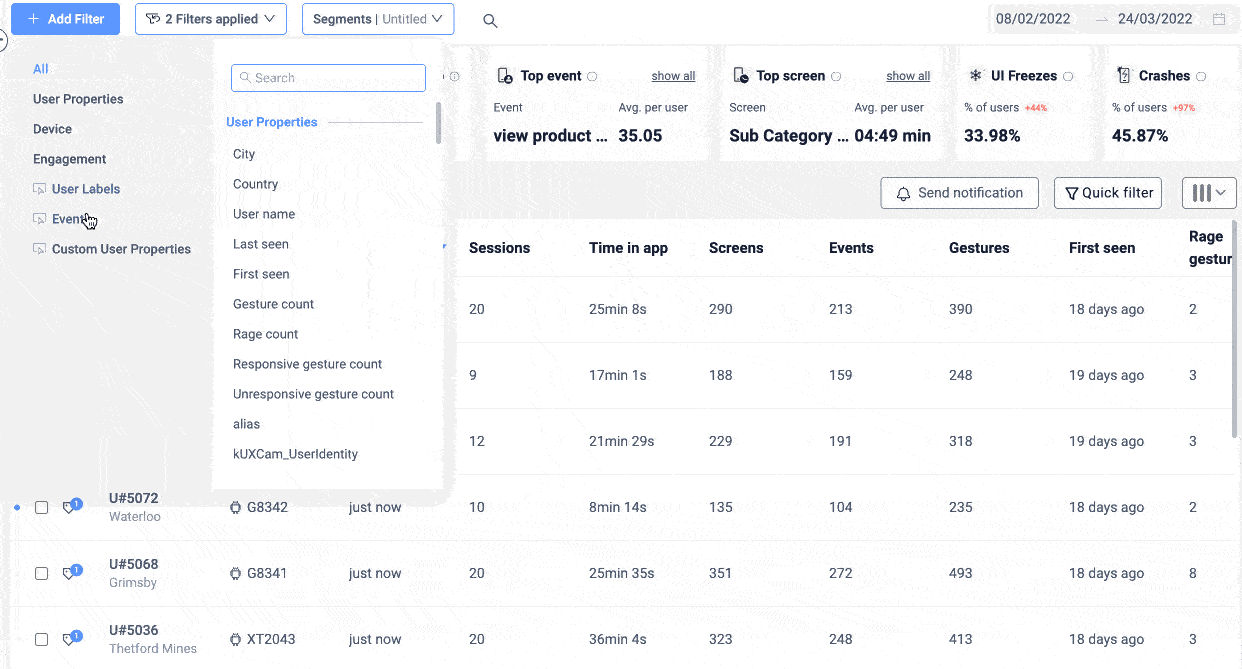
Pro tip:
Compare adoption across different user cohorts:
New vs. returning users
Free vs. paid users
Region or platform splits
This gives you deeper context on who finds the feature valuable, and where to double down.
8. Retention Rate: The Truth About Long-Term Value
Retention is the final boss of UX metrics. It’s your lagging, but loudest indicator of whether users really find value in your product.
You can drive installs. You can spike engagement. But if users don’t come back? You don’t have a product—they just had an experience.
The key insight here: retention problems almost always start with UX problems.
Onboarding is confusing
First value takes too long
Key flows aren’t intuitive
How to measure it:
Cohort analysis: track how many users return on Day 1, 3, 7, 14, 30, etc.
In UXCam, you can build cohort retention charts and layer on behavior patterns—what users did in their first session that correlates with long-term stickiness.


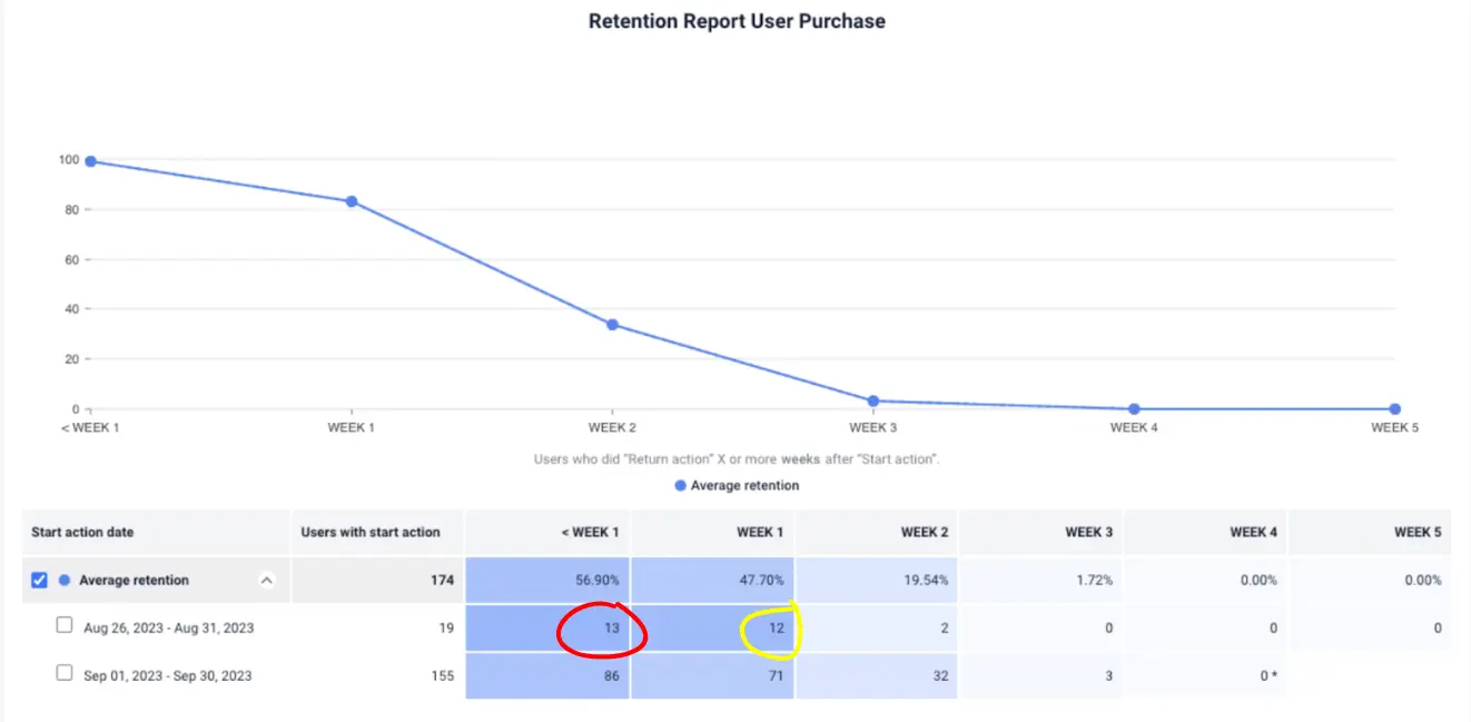
Why it matters:
Retention isn't just about loyalty. It’s your best proxy for:
Product-market fit
Perceived value
UX clarity
If you see a drop-off between Day 1 and Day 7, start by reviewing the user’s first 10 minutes. That’s where the real story usually starts.
9. Net Promoter Score (NPS) & CSAT - The voice behind the numbers
You’ve probably used NPS and CSAT before. Maybe even made a few roadmap calls based on them. They’re the go-to survey-based metrics for understanding how users feel about your product.
But here’s the truth no one tells you early on: NPS and CSAT alone are not enough. They’re sentiment snapshots. And without behavior to back them up, they’re just opinions without context.
As a PM, you need to go a step further.
Let me give you an example: we rolled out an NPS prompt two weeks after signup. Our score dropped, and leadership hit the panic button. But when we linked the scores to user sessions using UXCam, we found a pattern: users who got stuck on a specific settings screen were scoring us a 5 or lower. Everyone else? 8 and above.
That changed the conversation. Instead of arguing about product direction, we fixed a broken UX and saw the score climb within a week.
How to measure it:
NPS: “How likely are you to recommend us?” (0–10 scale)
CSAT: “How satisfied are you with your experience?” (usually 1–5 or 1–7)
Trigger these surveys in context—after key flows, not randomly. And with UXCam, you can tie individual scores to full session replays, so you can see the exact behavior that led to a 2 or a 10.


Don’t waste hours analyzing open text feedback. Watch a sample of low-score sessions instead and you’ll spot patterns faster than any sentiment analysis tool ever could.
10. Customer Effort Score (CES) - Measure the invisible friction
Here’s a rule I’ve learned the hard way: effort kills loyalty faster than bugs.
Even if your product works, if it feels hard to use, if users have to think too much, hunt too long, or jump through hoops, you’ll lose them.
Customer Effort Score (CES) is how you quantify that. It asks the user, in plain language:
“How easy was it to complete [this task]?”
You have to track this metric because it’s often more actionable than NPS. You’re asking about a specific moment, not a general opinion.
We once tested two versions of an in-app flow for document uploads. NPS didn’t budge. But CES told us everything: one version had a 6.2 average score; the other had a 3.8. That told us where the cognitive load was, and it gave the UX team something concrete to fix.
How to measure it:
Trigger a quick CES question immediately after a core task (e.g., onboarding, booking, checkout):
“How easy was that?” (1–7 scale)
With UXCam, you can map that response back to the session. If someone says “3,” watch their journey. See where they hesitated, tapped multiple times, or abandoned and came back.


Why it matters:
Low effort = higher likelihood of repeat usage
CES is a leading indicator, fixes here often boost retention downstream
It helps you prioritize UX polish work that might otherwise get deprioritized
11. Load & interaction latency - UX is speed too
You’ve heard the phrase: “Performance is product.”
And it’s true. No matter how elegant your design is or how seamless your flow feels in a prototype, if it lags in production, users notice. And they remember.
Latency, both in loading screens and tap response time, is one of the most overlooked UX metrics. And the irony? It’s also one of the easiest to measure and fix.
How to measure it:
Track P95 (95th percentile) load times (how long the slowest 5% of loads take) and tap-to-response delays.
You can overlay these metrics on your replays in UXCam, so you don’t just see that something was slow; you see where it happened and how it impacted behavior.
Pro tip:
Don’t aim for perfection everywhere. Focus your performance tuning on:
Onboarding flows
Checkout or payment screens
High-traffic or high-exit pages
That’s where slowness hurts the most and where gains compound.
12. Crash-free sessions - The non-negotiable metric
Let’s end with the obvious, but critical one: crash-free sessions.
You might not think of this as a “UX” metric, but from your user’s perspective, a crash is the most disruptive, unforgiving kind of experience. It’s a dead end. It signals unreliability. It tells the user: “Don’t trust this.”
No matter how polished your UI or how innovative your features, if your app crashes, you lose.
This metric tracks how many sessions are completed without a crash. You want this number as close to 100% as humanly possible.
How to measure it:
100 – (Crash sessions ÷ Total sessions)
With UXCam, issue analytics are automatically flagged. You can drill into replays and see what led up to the failure, and even grab the technical stack trace. This makes triage easy, and makes cross-functional conversations with engineers more productive.


Why it matters:
Crashes are the fastest way to lose trust
They disrupt flow, create confusion, and make re-engagement harder
You can’t fix UX if the user never makes it past the error screen
Common mistakes to avoid when tracking UX metrics
We’ve seen dozens of teams start strong with UX metrics, only to end up overwhelmed, misled, or just plain stuck. The intent is always good. But when execution slips, metrics can turn into noise instead of clarity.
Here are the most common mistakes and how you can avoid them.
Mistake #1: Metric overload without prioritization
Tracking everything isn't a strategy, it’s a distraction.
When you try to monitor every metric all at once, it’s easy to drown in dashboards and miss what actually matters. Your team gets buried in numbers, and no one’s sure which insights are actionable or worth pursuing.
What to do instead: Pick 3–5 core UX metrics based on your product stage and current goals. For a new feature, that might be task success rate, time on task, and CES. For a mature product, it might be screen quit rate, rage taps, and DAU per feature.
Keep it lean. If a metric isn’t driving action, cut it—or park it until it matters.
Mistake #2: Ignoring outliers or qualitative signals
It’s tempting to trust the averages. They feel clean, definitive, reliable.
But the truth is, your most important insights often live in the exceptions.
One user rage-tapping a screen 8 times in 3 seconds? That’s a bug you didn’t catch. A single session with a 7-minute onboarding? That’s a broken flow, not a power user.
And when you ignore session replays, customer support logs, or heatmaps, you’re missing the human side of the story.
What to do instead: Use your metrics as filters, not final answers. If your time-on-task is spiking for 5% of users, watch a few of their sessions. The "why" is usually obvious when you see it play out.
Mistake #3: Chasing high scores without fixing root causes
We’ve seen teams focus so much on improving their NPS or CSAT scores that they forget the scores are just symptoms, not solutions.
Nudging a user to leave a higher score doesn’t improve the experience. Fixing the onboarding flow that caused the low score does.
High numbers on a slide deck won’t matter if they’re disconnected from the real work of improving the product.
What to do instead: Don’t just measure the what, invest time in discovering the why. Every low NPS or CES score should trigger a quick session review or friction analysis.
Delight doesn’t come from surveys, it comes from consistently removing pain.
Mistake #4: Mistaking engagement for satisfaction
Just because users are spending time in your app doesn’t mean they’re happy.
I’ve seen dashboards where time spent is climbing, tap counts are up, and leadership is thrilled—until we realize users are looping the same screen trying to find what they need. That’s not engagement. That’s frustration dressed up as a metric.
What to do instead: Correlate engagement metrics with qualitative ones like CES, rage taps, or screen quit rate. If time-on-screen goes up but CES drops, that’s a red flag, not a win.
Satisfaction shows up in task completion, repeat usage, and friction-free flows, not in bloated usage charts.
Conclusion
The best product managers don’t just track UX metrics. They use them to tell stories. Stories about what users are trying to do, where they’re getting stuck, and what needs to change to deliver real value.
UX metrics are your fastest path to better decisions, more impactful releases, and a product your users actually want to come back to.
You don’t need a massive team or a full-time analyst to get started. What you need is focus. Start small. Prioritize a few key signals. Fix the flow, not the frame.
Because when you improve the user experience, even slightly, you see compounding returns across activation, retention, and revenue. Every tap saved, every second shaved, every frustration removed, it all adds up.
And if you want a tool that makes all of this easier, UXCam can help. You’ll get session replays, rage tap alerts, feature adoption tracking, and more, all in one place, without needing to instrument everything manually.
Start tracking what matters. Try UXCam for free and start building data-informed, user-obsessed products your customers will love.
You might also be interested in these;
10 Top UX Design Best Practices & How to Implement Them
14 Website Analytics Metrics to Track for Product Teams
UX Audit - How to Conduct One (Steps, Templates & Checklist)
AUTHOR
Related articles


Curated List
7 Best AB Testing Tools for Mobile Apps
Learn with examples how qualitative tools like funnel analysis, heat maps, and session replays complement quantitative...


Jane Leung
Product Analytics Expert

UX design
12 UX Metrics to Measure and Enhance User Experience
Unlock product success by tracking the right UX metrics. Learn 12 essential metrics, how to measure them, avoid common pitfalls, and take action with tools like...


UX design
10 Top UX Design Best Practices & How to Implement Them
Discover 10 proven UX design best practices to improve usability, boost retention, and create user-centric products. Actionable tips for product...


Tope Longe
Product Analytics Expert