
You may have noticed some fresh blue upholstery and new curves on our website. Today we’re launching UXCam’s brand refresh. The logo, color palette, typeface, and more have all been given a style evolution, and we’re giving you a peek behind the scenes to understand what this means for our customers and us.
We’re growing up
Our original UXCam logo started as a doodle on the back of a Berlin boarding pass at the airport in Kathmandu. Silvanus Alt, our CTO, was waiting for a flight with founder and CEO Kishan Gupta. Five years ago, the two budding entrepreneurs were doing their very first branding exercise while flying from Nepal back to Germany after visiting our engineering team.


Original vs new UXCam logo.
That was back when UXCam was just a session replay tool and the Berlin team was working out of a former pediatrician office in a residential flat in Friedrichshain.
Therefore, our brand evolved too. We want to celebrate our transformation from a startup to a full-blown mobile app insights company with this new visual identity. A bright, energetic visual language that is both friendly and adaptable.

The original blurple (blue and purple) and spring green were a testament to our youth and the bursting energy we wanted to bring to our customers. Five years down the road, our technology has evolved, and so has our team — we’ve tripled our headcount since then.
The beautiful, structured data that our namesake tools like session replay, heatmaps and funnel analytics automatically captured paved the way to create a more robust product roadmap that generates even more value for our users.


From blurple and washed out gray to an optimistic sky blue and sophisticated midnight.
Our product team is constantly evolving the UXCam platform to make it easier for mobile app teams to understand and analyze data. We’re developing stronger capabilities, enabling teams to capture more granular insights, and continuing to use machine learning to help them optimize their mobile apps faster.
The original washed-out gray was tweaked to a richer hue — conveying trust and stability, with an edge of sophistication.
Therefore, our brand evolved too. We want to celebrate our transformation from a startup to a full-blown mobile app insights company with this new visual identity. A bright, energetic visual language that is both friendly and adaptable.
Setting up to stand out
When I set out to redesign the brand, I first interviewed key internal stakeholders to get a better idea of how we wanted to be perceived. “Professional with personality” came up a few times. We wanted to be unique, more contemporary.
Then, I looked at our competitors in the market and how we fit in. We admit, our previous visual brand story — while a humble nod to our startup roots — needed some improvements, just a little tidying up. We wanted to have more consistency to establish trust in our product.
First impressions matter
The brand refresh started with bidding adieu to our beloved blurple, the screaming, loud child of blue and purple that brought us to where we are today.
Color plays a significant role in audience recognition and has a psychological impact on consumers' moods. Therefore, we switched from a loud purple to a sky blue to evoke a sense of clarity and positivity — the core of our product and our company vision: To make every app experience in the world a positive and effortless one.
We also gave a bolder treatment in the letter weight to reinforce stability and trust in a purely visual way.
The original washed-out gray was tweaked to a richer hue — conveying trust and stability, with an edge of sophistication.
From smiley to sleek
If you didn’t know before, the curve beneath “UX” in UXCam was a smiley face. While we’re still all smiles on the team, we dropped the curve for a sleeker look, as our product vision also evolved and we are becoming “more than just a session replay tool.”


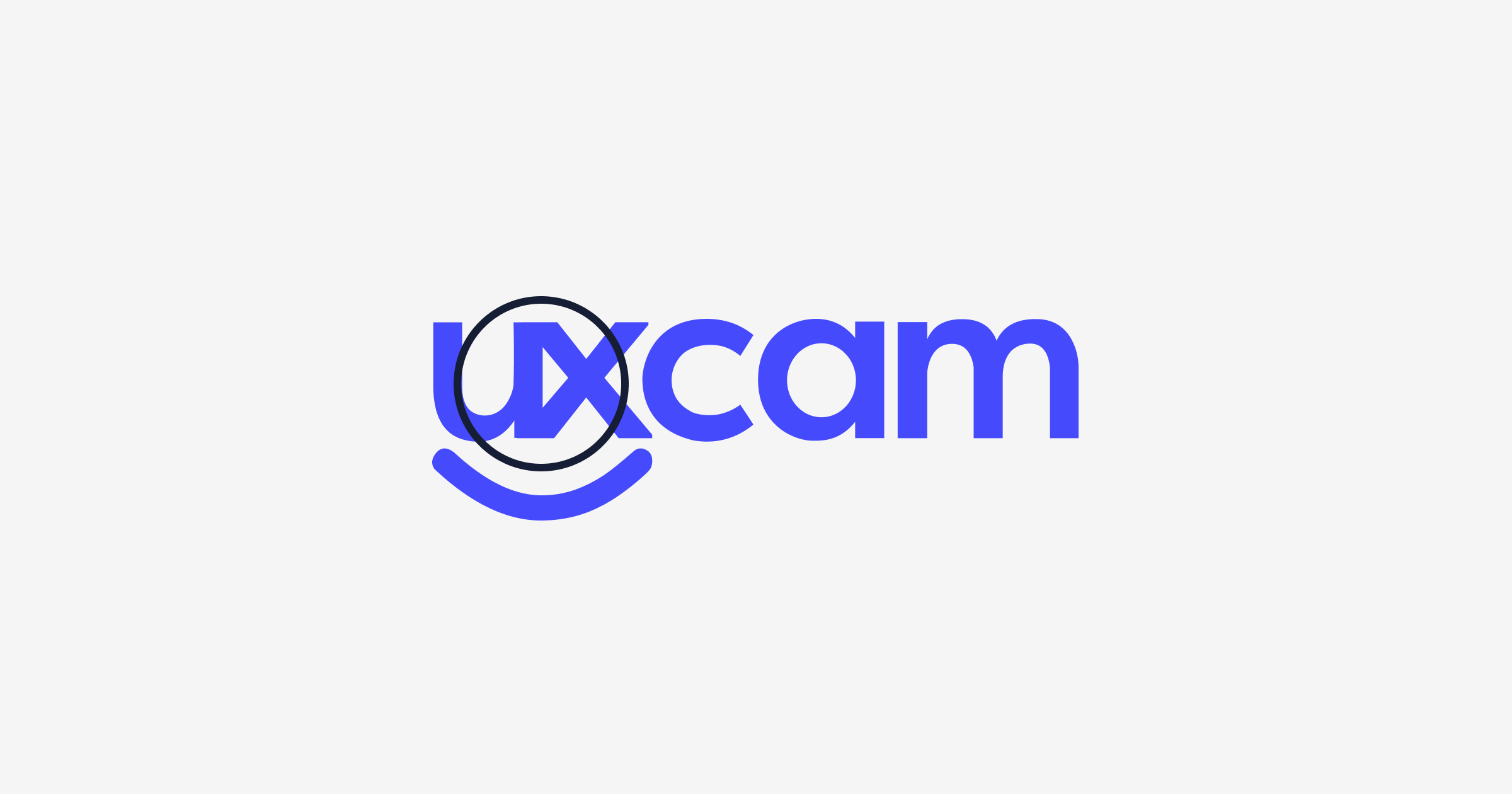
Old logo highlighting the play button between the UX.
We deconstructed the old logo and created a customized wordmark. The more rounded typeface conveys movement and flow. Think raking through a zen garden — going back to the positive energy and being more approachable and balanced than ever before. As the single source of truth for mobile app insights, we wanted to help users find clarity in the data chaos. This energy is reflected in this flow.
Color plays a significant role in audience recognition and has a psychological impact on consumers' moods. Therefore, we switched from a loud purple to a sky blue to evoke a sense of clarity and positivity — the core of our product and our company vision: To make every app experience in the world a positive and effortless one.
We also gave a bolder treatment in the letter weight to reinforce stability and trust in a purely visual way.


Customized wordmark conveys movement and flow.
As our vision is to provide positive and effortless mobile app experiences, we wanted the logo to also look effortless, simple and professional. The sky blue and the contrasting gray in the “X” represent our unique intersection — we give transparent insights to mobile teams and are helping them move forward together.


Our new logo.
With the wordmark established, it was then broken down into standalone shapes that can be used as individual storytellers placed in an effortless and playful way throughout our website and other communications — representing our key values and offerings.


Here’s what each letter represents:
U - Uncover hidden insights and pitfalls in our customers’ apps.
X - Experience is the core of our product strategy.
C - Continuous iteration of your mobile app in the product life cycle.
A - Analyze key product metrics and app performance.
M - Bridge. It’s not a typo. The “M” looks like a little bridge that bridges the gap between mobile product teams.


At the core of our brand refresh, we wanted to achieve the following:
Clarity and consistency.
Bold simplicity in functional shapes and visual messaging.
Less is more.


A human touch
If you’re a customer of UXCam, you may already be familiar with our friendly faces over Zoom. We want to show the world the people behind the product.
As we are supporting real product teams who are building apps for real people, we’ve decided to start introducing more photography featuring real people in the work environment — teams interacting and collaborating — letting go of the stock standard illustrations.
So there you have it. We still have the tenacity of a young startup and the friendliness of the smiley under our old logo, but we’ve grown up.
We have developed the capabilities to deliver more value to our customers, and we continue to improve our product. We want to give a big thank you to our customers who have stood by our side from day one and continue this journey with us to bring the world more positive and effortless app experiences.
Thank you for reading, and keep watching this space as we build out our new visual story!
AUTHOR
Charlene Walton
Related articles


UXCam
Why UXCam has one of the best performing SDKs on the market
Discover how UXCam's SDK stands out in the market with its exceptional...


Jane Leung
Product Analytics Expert


UXCam
Free Course: Master Mobile App Product Management
The UXCam Academy is a new online learning platform dedicated to helping people learn the skills they need to succeed. Our first course, Master Mobile App Product Management, is a comprehensive guide to everything you need to know to build successful mobile app...


Jonas Kurzweg
Product Analytics Expert


App Analytics
UXCam is now an experience analytics solution
A reflection on...
Jonas Kurzweg
Product Analytics Expert