
Tinder is, unequivocally, the champion of dating apps. Many have tried imitating it — their swiping left and right has become a popular way of making decisions — because it revolutionized the dating market like online dating websites did in the 90s.
Bumble showed up out of nowhere and achieved what others couldn’t: focusing on connections — romantic or otherwise — and founded by Tinder’s former co-founder, Whitney Wolfe. It quickly became a fierce competitor that goes beyond dating.
Both apps seek to serve as a bridge to connect users. UX plays a huge role in how effectively they fulfill their purpose.


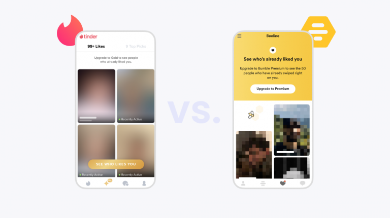
The “Likes” section on the Tinder app versus the “Beeline” on the Bumble app


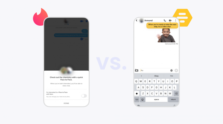
Video chat on the Tinder and the Bumble apps
How did these two apps change the world of online dating forever? What features and design choices facilitate the ability to make a connection? And, of course, how do the UI and the UX of these lifestyle apps compare? Let’s find out.
We’ll cover areas like onboarding, setting up your profile, usability, liking, and engagement. Whether you work on a lifestyle app or not, you’ll be able to get UX takeaways applicable to your product.
To access the full UX app analysis, download your copy by clicking on the following button or image.


More app analyses:
AUTHOR
Ángela Gómez Sánchez
Passionate about linguistics and helping you deliver the perfect app experience.


Related articles


UX design
User Experience Optimization: 10 Steps to Improve UX in 2026
User experience optimization is the iterative process of removing friction, improving clarity, and raising the conversion and retention signals on a...


Silvanus Alt, PhD
Founder & CEO | UXCam


UX design
We Reviewed the Top 19 UX Tools for 2026
The 19 best UX tools for 2026, tested across research, wireframing, prototyping, flowcharts, and handoff. Honest pros, cons, and pricing from a...
Silvanus Alt, PhD
Founder & CEO | UXCam


UX design
Customer Experience Dashboard Examples and the Metrics That Actually Matter
A customer experience dashboard turns scattered signals into one view. See examples, the metrics that matter, and how to build one that drives...
Silvanus Alt, PhD
Founder & CEO | UXCam