12 Android Login Screen Design Examples To Copy Today

It’s all about making a good first impression.
Don’t you want users to fall in love at first sight? In the first few minutes of using your app, your users should feel welcome.
An important part of the onboarding process is the login screen that your users see when they first want to use your app.
Your android login page design should be simple and clear. People can quit your app when they have to fill in a lot of information or when they are not quite sure what information is being asked for.
But, what is the best way to create such a screen?
Best Android Login Screen Design Examples
To find out, I created a list of 12 android login screen design examples. Which login page design in Android app do they master, and which parts can they improve on?
LinkedIn is a social network to share your professional experience and get in contact with other colleagues and potential employees in your work field.
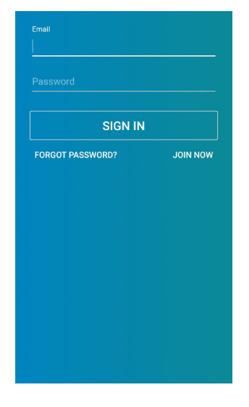

LinkedIn definitely scores points in its minimalistic design. This is about as minimalistic as it can get. But, on the contrary, because of this type of design, you can’t recognize the app properly.
LinkedIn uses their brand colors, but it’s hard to see at a glance that this is the LinkedIn mobile app login screen. Especially for new users who are not familiar with the colors used by LinkedIn.
A small, well-recognizable LinkedIn logo would keep the design intact, but give users the confidence to know what they’re signing up for.
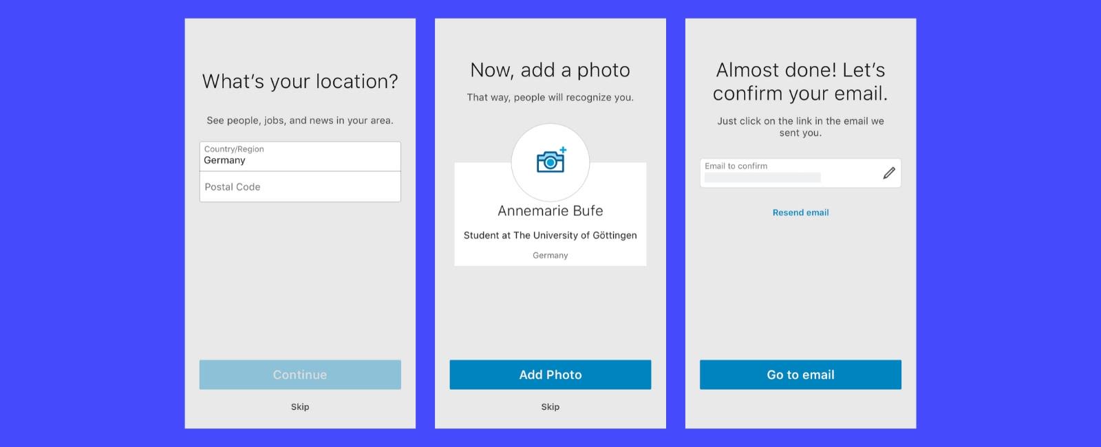
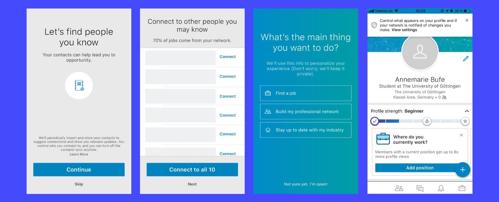
Here’s how the onboarding of LinkedIn continues:


Let’s continue this list with the login screen design example of the most downloaded Android app: Facebook.
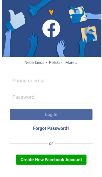

At the top of the screen, Facebook tries to immediately direct the user towards the app’s goal: connecting with friends by liking, commenting and sharing.
This reminds the user of why they downloaded the app. However, the busy top can distract the user from the screen’s goal: getting the user to log in.
The login form is clear and simple. There are two options to enter the app: to sign in with your email and password or to create a new account.
Those who want to rent an apartment or earn extra money by renting out their apartment have heard of Airbnb.


The first android app login page design is focused on new users.
AirBnB highlights two options: to continue with Facebook or to create a new account. If you want to log in with your existing account, you have to look for the login button at the top right corner.
The design is clean and recognizable. Especially for new users, reaching the goal of signing up is easy, clear, and free of distractions.
Twitter lets you engage with people through tweets, retweets, comments, and likes.
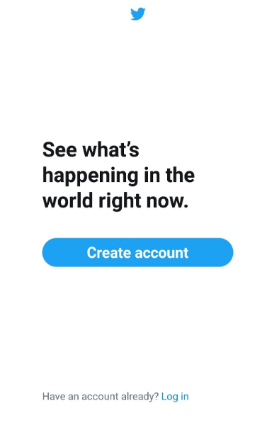

Twitter masters the art of simplicity.
It’s clear how to proceed if you don’t have an account. If you just want to log in, you have to search for it.
Twitter doesn’t provide the option to log in with third-party services like Facebook, which makes it “harder” for the customer to sign up.
The fewer clicks, the better. Being able to sign up with an account that already includes all your personal information grants your user a quicker and easier option.
You have probably heard about this e-commerce company.


The benefits of Amazon are immediately clear on the app login screen, which makes this an amazing login UI design example on android.
Amazon shows you the pros of signing into your personal account before introducing their three options: to sign in, create an account, or skip the sign-in.
The logo makes the brand recognizable, as well as the hint of color used in the design.
The disadvantage of this design is the amount of text, especially when compared to some of the other screens we have seen. If you design a login screen yourself, try to reduce the amount of text and be clear.
Let’s take a look at another e-commerce giant: eBay.
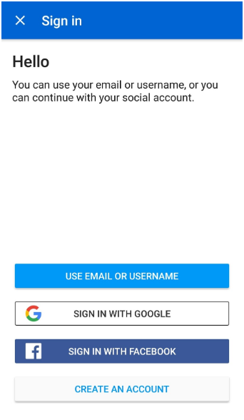

At the bottom of the page are the sign-up options to choose from. Users can easily identify what would suit them best. This is a big pro about this minimalistic design.
What could be improved: as soon as you open the app, there’s no sign of eBay anymore. The app has lost its recognition. The white space feels empty, and the tone of voice is robotic.
For those who may not know Dropbox, it’s an online web storage service where you can share your documents with others and access them when you are connected to the internet.


Dropbox’s login screen design has a similar approach to that of Facebook. By showing three different frames alternately, Dropbox explains the core benefits to its users. The lines are short and clear, with a small illustration to get the customer’s attention. The distinctive buttons guide the user to the next step.
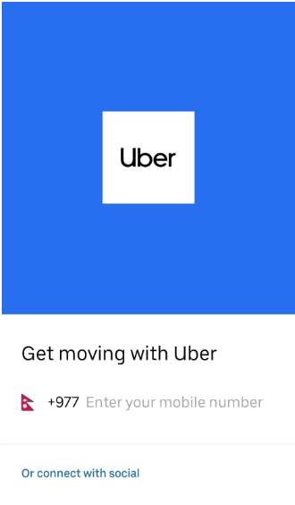

It’s immediately clear that you are using Uber. The name and color block takes over almost two-thirds of the entire screen. It can be distracting from letting their users sign up but has a positive effect on brand recognition.
As you can see, Uber only provides two options for signing up: sign up with your phone number or one of your social accounts (Google or Facebook).
It’s clear that Uber wants you to put in your phone number by highlighting the option.
Pinterest is an app that helps you out when you are looking for new ideas. It displays photographs of styles or ideas you might be interested in, which you can save.


Their login screen design is easily recognizable because of the logo in the middle.
Besides, the pictures on the top of the page give you the same feeling as when you use the actual app: you scroll through the pictures and like styles and ideas that speak to your mind. The design is not minimalistic because a lot is going on, but it doesn’t feel overly crowded or like it’s screaming at you.
The routes you can take are also very clear. The three options to continue are presented in different colors and clear, short explanations.
Adobe Lightroom helps you edit, organize and store your pictures.
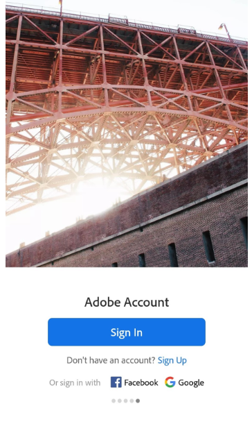

The picture on the top refers to the app’s goal, but it’s maybe too prominent. However, you can easily identify the sign-in button, and the user has options to log in with either their Facebook or Google account.
Skype is a way to keep in contact with friends, family, or colleagues that are not able to meet you in person.
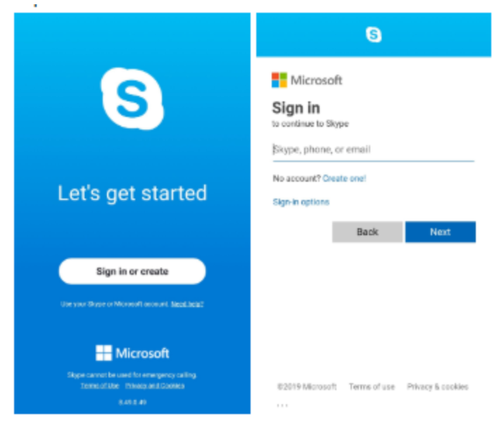

Unlike some of the examples above, you can’t log in with your Google or Facebook accounts, but it’s connected to your Microsoft account. The design is recognizable and still clear: there’s only one button to push on the first screen, hard to miss.
SHAREit is an app that makes it possible to transfer files between different devices and users.


Unlike the other apps mentioned in this article, users don’t have to log in at SHAREit with any of their personal information or with a personal account.
Users only need creativity because they have to come up with a nickname to use. They can upload a photo from their device or choose a standard illustration on the screen.
Logging in with a nickname has the advantage that users don’t have to fill in any personal information — which in turn has the disadvantage that no data gets collected to stay in touch with users.
Users still have to think about a nickname instead of just filling in standard information. For the ones amongst us that are not that creative — or think they aren’t — this could be an extra hurdle to jump before signing up.
Conclusion about the Android Login Screen Design Examples
Obviously, like all screens, the login screen design should be user tested. You can do that with our solution, UXCam.
To keep your customers interested in your app and sign in after they download your app, make sure your login screen is simple and precise.
Clearly present the different options your customer has. Less is more. But also keep in mind that it has to be recognizable to your readers.
My favorite from the list above? Airbnb has a minimalistic, clean design, but it’s still recognizable and distinctive. It also has the option to login with Facebook. An option that Twitter — the master of recognizable simplicity -— doesn’t have. This makes Airbnb my favorite.
Related Articles
AUTHOR
Danique Bos
Dog lover. Working at UXCam. Feel free to leave any comments!

Related articles
Product best practices
How to Increase Mobile App Engagement: 10 Best Strategies
Ten mobile app engagement strategies ranked by real impact, with honest notes on what works, what's overrated, and how UXCam's session replay reveals...

Silvanus Alt, PhD
Founder & CEO | UXCam
Product best practices
5 best user behavioral analytics tools for mobile app teams
Behavioral analytics offers deep insights into user interaction. Learn about the best behavioral analytics tools to optimize the user experience on your mobile...

Jonas Kurzweg
Product Analytics Expert
Product best practices
Top 11 Remote Usability Testing Tools You Can Use Now
Usability testing tools that will put your mind at...

Jonas Kurzweg
Product Analytics Expert
