
Mobile UX design is the practice of designing mobile apps and websites that users can navigate fluidly on small screens using thumb-driven input, often in distracted environments, across a wide range of device capabilities. It's adjacent to visual design but bigger than it: mobile UX covers everything from information architecture and interaction patterns to performance, accessibility, and how the app feels when you use it in landscape on a crowded subway.
I've reviewed thousands of session replays across 37,000+ apps on UXCam and the single pattern I see most often is that mobile UX decisions which look fine on a designer's laptop break down on the mid-range Android phone a typical user actually holds.
The best mobile UX design is grounded in real device usage, real user behavior observed in replays, and real testing on phones that nobody on the product team owns. The ux app patterns that work in 2026 are different from the ux design for mobile patterns that worked in 2020, and the difference shows up in retention.
Key takeaways
Mobile UX is not shrunk-down web UX. Thumb-driven input, unpredictable attention, intermittent connectivity, and varied device capabilities make mobile design a distinct discipline that benefits from its own principles rather than desktop heuristics applied to a smaller screen.
The five biggest mobile UX mistakes I see: tiny tap targets (below 44pt), input-heavy forms with no mobile-specific keyboards, modals that interrupt flows, poor error recovery, and performance regressions on mid-range Android devices.
Design decisions should be validated with session replays of real users, not just usability tests in a lab. Lab tests miss the distraction, latency, and device variance of actual usage.
UXCam's Issue Analytics automatically flags UX problems like rage taps, UI freezes, and unresponsive gestures, giving designers a direct feedback loop from production usage.
Good mobile UX is measurable. Track rage-tap rate, task completion rate by screen, time-to-activation, and day-7 retention. Improvements in those numbers are the real validation.
What is mobile UX design?
Mobile UX design (user experience design for mobile apps and websites) is the practice of shaping how users interact with a product on a phone or tablet. It covers information architecture, interaction patterns, visual design, typography, motion, haptics, error handling, performance, and accessibility. The "experience" in UX design is the sum total of how using the product feels, not any single design element.
Mobile UX differs from web UX because mobile usage differs from desktop usage. Users are more distracted, often in public, using one hand, on variable network quality, and moving between other apps and notifications. Good mobile UX design accounts for this context, not just the screen size.
Why mobile UX design matters
Retention: users drop apps with bad UX within the first session. A single frustrating interaction often ends the relationship.
App Store ratings: negative UX shows up in reviews, which affect organic discovery and installs.
Support costs: bad UX generates support tickets. Recora reduced support tickets by 142% after UXCam surfaced a press-and-hold-vs-tap confusion among elderly users.
Revenue: for monetized apps, UX friction at conversion points (checkout, subscription, upgrade) translates directly to lost revenue.
Word of mouth: users recommend apps that feel good to use. The "feels good" part is UX.
Desktop vs mobile UX: the differences that matter
1. Input method
Mouse and keyboard on desktop; thumb and touch on mobile. Tap targets need to be bigger (at least 44pt per Apple's Human Interface Guidelines on iOS, 48dp per Material Design on Android) because fingers are less precise than cursors. Hover states don't exist on mobile.
2. Screen orientation
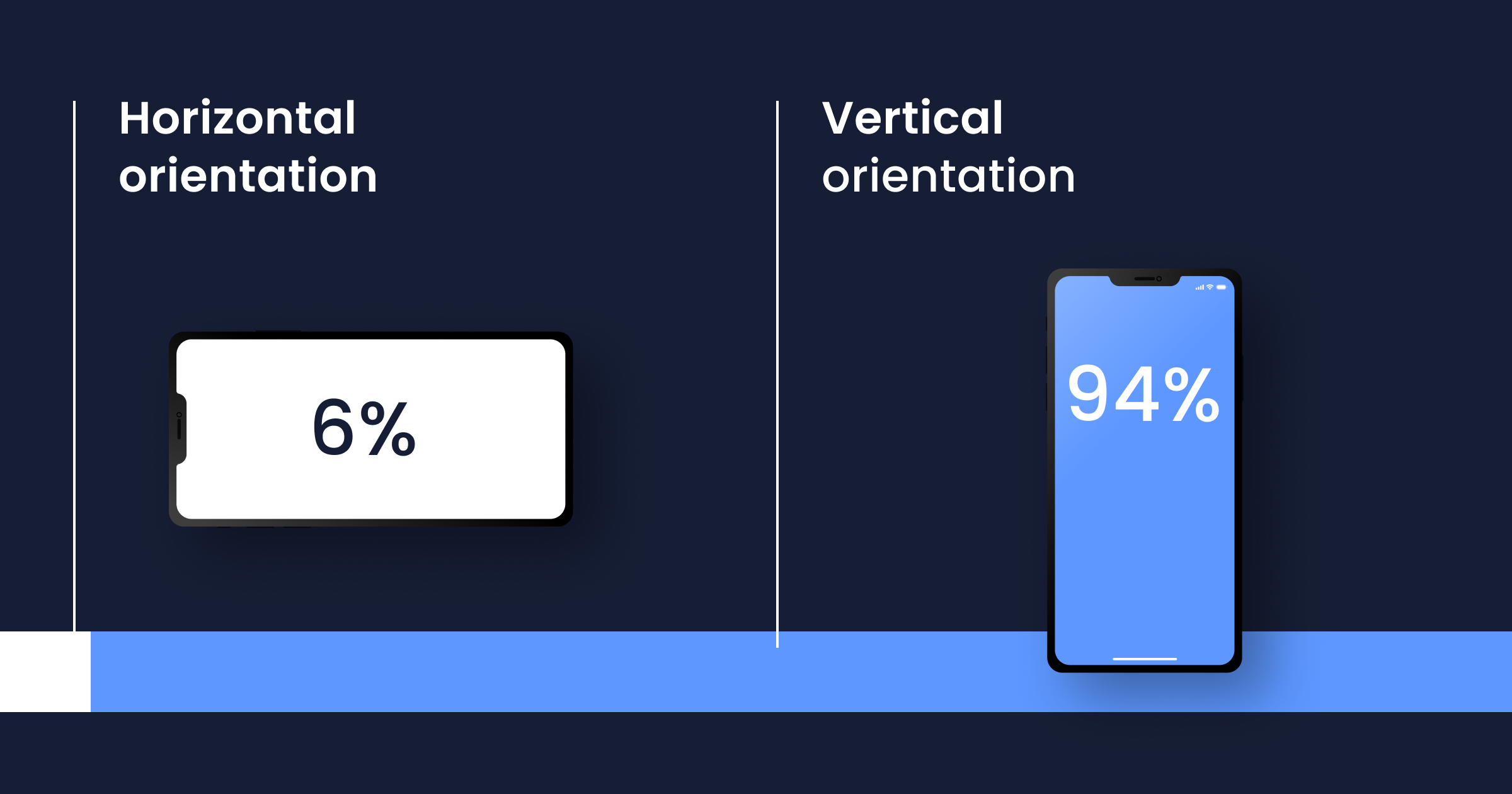
Most mobile usage is portrait. Design for portrait first. Landscape is a special case, not a default.


3. Screen size
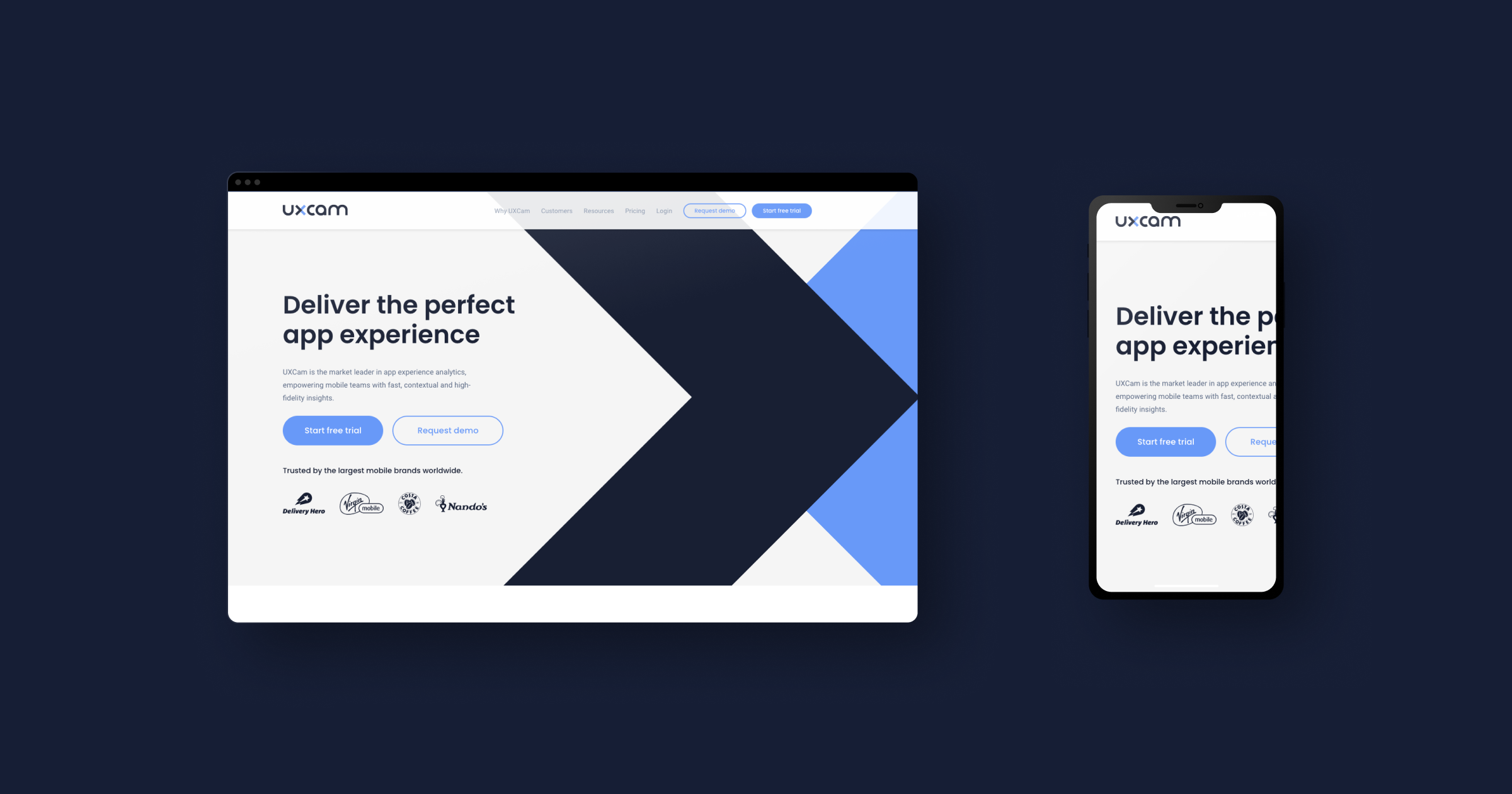
Mobile screens are 4-7 inches, not 13-27. Critical content must fit above the fold without scrolling. Secondary content goes below. Navigation that works on a 27-inch monitor (side drawers, mega menus) usually doesn't translate to mobile.


4. Navigation and input
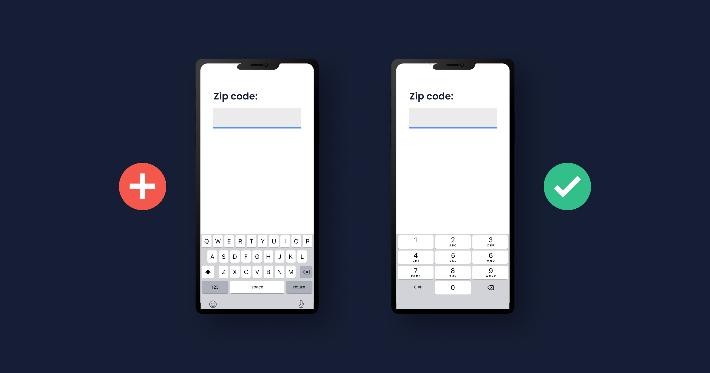
Thumb-driven navigation means bottom tabs work better than top tabs on mobile (thumbs reach the bottom more easily). Forms need mobile-specific keyboards (numeric for numbers, email for emails, etc.) to avoid extra taps. Swipe gestures are mobile-native; drag-to-scroll on desktop is not a mobile pattern.


5. Environment
Desktop users are typically in a controlled environment (office, home). Mobile users are often distracted, in public, interrupted by notifications, multitasking. Design for shorter attention spans and frequent interruptions.
6. Performance
Mobile networks vary. Cellular connections are slower and more variable than wired. Cached-first design, progressive loading, and offline handling matter more on mobile than web.
7. Symbols and affordances
Mobile has its own visual language: the hamburger menu, the pull-to-refresh, the swipe-to-delete. Users expect these patterns; unfamiliar affordances create friction.
8. Visual hierarchy
Mobile screens have less room for hierarchy, so every decision matters more. One primary action per screen. Secondary actions clearly secondary. No third-level navigation fighting for attention.
10 mobile UX design principles that matter in 2026
1. Understand your actual users
Not who you think they are. Actual users: what devices they have, where they use the app, what else is going on. Session replays from production are the most honest source of this data.
2. Design for the thumb zone


Primary actions should fall in the bottom two-thirds of the screen where thumbs reach easily. Top corners are reserved for navigation and less-frequent actions. This is especially true for one-handed phone use, which research consistently shows is the majority use case.
3. Minimize input friction
Every field a user has to type is a chance to lose them. Use appropriate keyboards (numeric for phone numbers, email for email addresses). Offer autofill where supported. Default to social login or passkeys before asking users to create a password.
4. Cut onboarding to the minimum
Each extra onboarding screen drops completion. Target 3-5 screens maximum for most apps. Get the user to a first meaningful action within 60 seconds of opening the app.
5. Respect the back button
Android users expect the system back button to work. Don't break it with custom navigation that doesn't respond to hardware or gesture back. iOS users expect swipe-from-edge to go back. Respect both.
6. Performance is UX
A 3-second cold start feels worse than a 1-second one, even if the final screen is identical. Budget cold-start time as part of the design, not an engineering afterthought. Users notice.
7. Handle errors gracefully
Every error message should tell users what went wrong, why it happened (if useful), and what to do next. Generic "something went wrong" is the most common mobile UX failure I diagnose in session replays. Specific, actionable error copy lifts completion rates measurably.
8. Design for intermittent connectivity
Mobile networks drop. Apps that assume constant connectivity fail badly in the real world. Cache aggressively. Queue writes for retry. Show users what's offline vs syncing vs synced.
9. Respect attention and interruptions
Users open mobile apps for seconds at a time, often interrupted. Save state generously so users can resume. Don't require completion of multi-step flows in a single sitting unless the flow is genuinely under 30 seconds.
10. Measure what users actually do
Opinions about UX are infinite. Data is finite. Track task completion rate per screen, time to activation, rage taps, UI freezes, and day-7 retention. Watch session replays weekly. The replays reveal what lab tests miss.
Common mobile UX mistakes I see repeatedly
Tap targets below 44pt / 48dp: users hit neighboring targets, creating rage-tap patterns
Tiny text: below 14pt is hard to read on small screens; users zoom, squint, or leave
Modals that steal focus: consent banners, upsell popups, permission prompts interrupting core flows
Inconsistent gestures: a swipe that means "dismiss" in one screen and "open" in another
Hidden navigation: hamburger menus for primary navigation hurt discoverability
Forms that reject valid input: date pickers that don't match user format, phone number fields that reject international formats
No pull-to-refresh on content feeds: users expect this; absence creates friction
Premature permission prompts: asking for location, notifications, or camera access before the user sees value
How to validate mobile UX with data
Watch production session replays
The single highest-ROI UX validation activity for most teams. Pick a high-intent screen (checkout, signup, key feature), filter for sessions from the last 7 days, and watch 20 of them. Patterns emerge fast.
Track rage taps and dead clicks
UXCam Issue Analytics automatically surfaces rage taps (4+ taps in a second on the same spot) and dead clicks (taps on elements that aren't interactive). Both are diagnostic gold. A rage-tap pattern on a specific button means users expect it to do something it isn't doing.
Measure task completion rate by screen
For each key task (sign up, complete purchase, create content), measure the completion rate and time to complete. Watch replays of users who didn't complete to find the specific friction.
A/B test risky changes
Don't redesign an entire flow in one shot and hope. Use an experimentation platform (see the A/B testing tools guide) to validate changes with a cohort before rolling out broadly.
Conduct usability tests on real devices
Lab tests miss a lot, but still catch things replays can't (qualitative user verbalization, moderator probing). Do both. Never either alone.
Improve your mobile UX with UXCam
UXCam is a product intelligence and product analytics platform that automatically captures every user interaction on mobile apps and websites, no manual event tagging. Session replay shows what users actually experience, heatmaps reveal tap and scroll patterns, issue analytics flag rage taps and UI freezes in real time, and Tara, UXCam's AI analyst, processes sessions to surface the highest-impact UX issues and recommend specific actions.
Recora reduced support tickets by 142% after UXCam revealed elderly users pressing-and-holding instead of tapping. Inspire Fitness boosted time-in-app by 460% and cut rage taps by 56%. Housing.com grew feature adoption from 20% to 40% by watching 50-100 session replays daily.
Installed in 37,000+ products, mobile-first, web-ready. Request a demo to see it for your app.
Frequently asked questions
What is mobile UX design?
Mobile UX design is the practice of designing mobile app and website user experiences for small screens and thumb-driven input. It covers information architecture, interaction patterns, visual design, performance, and accessibility. Good mobile UX is short, clear, and respects the context users are actually in (distracted, often in public, one-handed).
What makes a good mobile UX?
A good mobile UX gets users to value quickly, respects thumb-zone ergonomics, uses mobile-appropriate input methods, handles errors clearly, performs well on slower devices and networks, and adapts to intermittent connectivity. The best mobile UX designs feel fast, predictable, and forgiving of mistakes.
What's the difference between mobile UX and desktop UX?
Mobile UX accounts for smaller screens, thumb-driven input, distracted contexts, variable network conditions, and wider device variance. Desktop UX assumes more controlled environments, keyboard and mouse input, larger screens, and stable networks. Patterns that work well on desktop (hover states, complex navigation, dense information) often fail on mobile.
How do I measure mobile UX effectiveness?
Track task completion rate by screen, time to first meaningful action, rage-tap rate, UI freeze rate, day-7 retention, and App Store rating. Watch production session replays regularly. Tools like UXCam automate much of this measurement. The best measurement combines quantitative metrics with qualitative observation via replays.
What are mobile UX best practices?
Understand actual users via session replay, design for the thumb zone, minimize input friction, keep onboarding under 5 screens, respect system back gestures, treat performance as UX, handle errors with specific actionable copy, design for intermittent connectivity, save state aggressively, and measure what users do (not what you think they do).
What's the most common mobile UX mistake?
Tap targets that are too small. The second most common: error messages that don't explain how to recover. Both cause measurable drop-off in session replays. Fixing tap targets to meet platform guidelines (44pt iOS, 48dp Android) and rewriting error messages to be specific and actionable often produces outsized wins.
Is mobile UX design different from mobile UI design?
Yes. UX (user experience) is the whole journey: how the user feels, how they navigate, how errors are handled, how fast things feel. UI (user interface) is specifically the visual and interactive surfaces: buttons, colors, typography, layout. UI is part of UX. You can have good UI with bad UX (a beautiful app that's confusing to use) or good UX with unfashionable UI (a utilitarian app that works perfectly).
AUTHOR
Silvanus Alt, PhD
Founder & CEO | UXCam
Silvanus Alt, PhD, is the Co-Founder & CEO of UXCam and a expert in AI-powered product intelligence. Trained at the Max Planck Institute for the Physics of Complex Systems, he built Tara, the AI Product Analyst that not only analyzes user behavior but recommends clear next steps for better products.


Related articles


UX design
User Experience Optimization: 10 Steps to Improve UX in 2026
User experience optimization is the iterative process of removing friction, improving clarity, and raising the conversion and retention signals on a...
Silvanus Alt, PhD
Founder & CEO | UXCam


UX design
We Reviewed the Top 19 UX Tools for 2026
The 19 best UX tools for 2026, tested across research, wireframing, prototyping, flowcharts, and handoff. Honest pros, cons, and pricing from a...
Silvanus Alt, PhD
Founder & CEO | UXCam


UX design
Customer Experience Dashboard Examples and the Metrics That Actually Matter
A customer experience dashboard turns scattered signals into one view. See examples, the metrics that matter, and how to build one that drives...
Silvanus Alt, PhD
Founder & CEO | UXCam
What’s UXCam?