45 Mobile App Best Practices: The Ultimate List 2026

The journey toward a successful mobile app is difficult. You don’t always know what to improve. The 45 following mobile app best practices make life easier for you.
Mobile App UX Design Best Practices
An intuitive UX Design directly translates to an increase in all product metrics and revenue.
According to Forrester, investing in UX can result in an ROI of up to 9,900%.
Here are mobile app UX best practices that’ll improve the KPIs of your mobile app:
#1 Gather Demographic Data
Let’s start with the basics:
Do you know in which countries, age groups, at what time, etc. your app is being used?
The demographic of your users should influence the UX of your app.
Learn from this example by Audible:
When Audible redesigned their app, they wanted to give it a modern look. The app had a gray design that appeared outdated.
So the team decided to give the app a white and minimalistic look. The resulting design was gorgeous — but it didn’t fit to the user.
Here’s why: A lot of truck drivers use Audible. They listen to audiobooks during their drives at night. The new white Audible app was so bright that it was distracting the drivers.
You’ll avoid mistakes like this if you gather demographic data of your users.
#2 Test your app on different device sizes & classes
There are hundreds of Android devices on the market. And if your app is working great on one device, it doesn’t guarantee that it’ll work on all other ones, too.
Obviously, you can’t test your app on all of them — but you should test your app at small, medium, and large-sized Android phones.
#3 Analyze your funnel
Create a funnel to track where users drop out of the flow.
You can use tools like Firebase, Mixpanel or UXCam to do so.
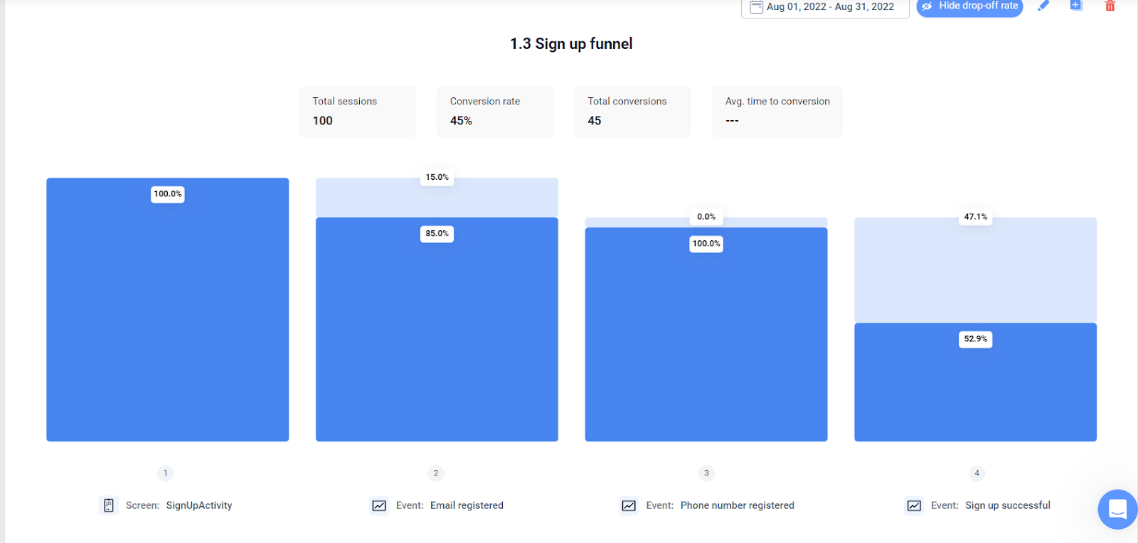

UXCam’s Funnel Analytics
#4 Understand gestures
Do you clearly understand which type of gestures the user should use?
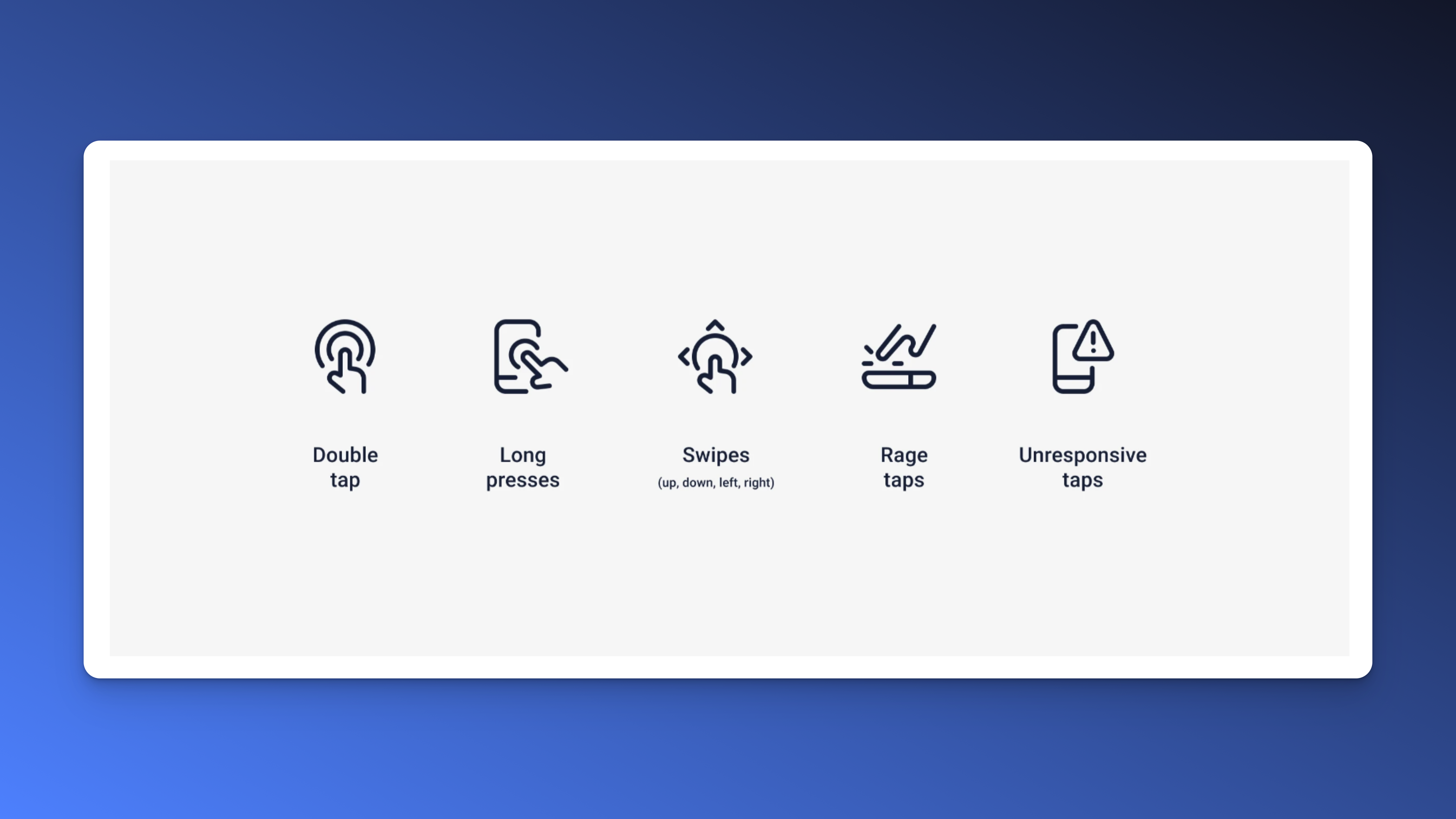

There are multiple gestures that users can perform on any given screen.
You should track when users perform which gestures or if they might misuse a feature because they use the wrong one.
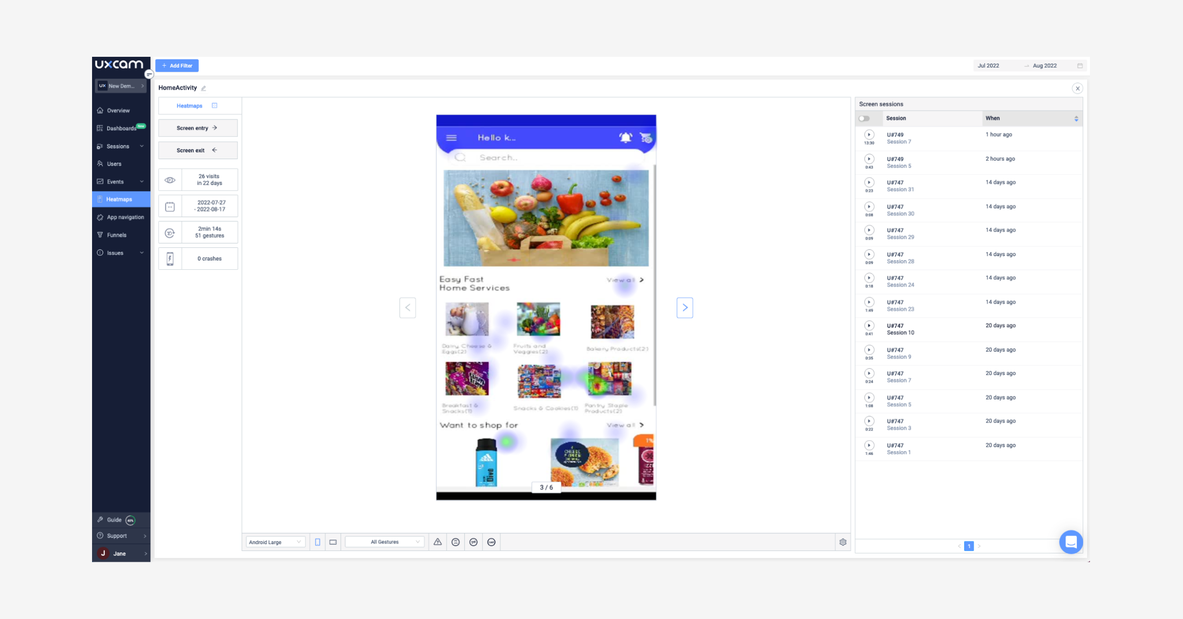
#5 Read heatmaps
Generate touch heatmaps to find out where users tap on each screen.

#6 Use short forms
Keep forms as short as possible.
Studies show that the longer a form is, the lower the conversion rate will be.
If you add a form field, make sure that it’s absolutely needed.
You can also increase the conversion rate of your form by making it easier to fill out, for example using drop-down options instead of a text field.
#7 Use common symbols
Use common symbols that are easily recognizable.
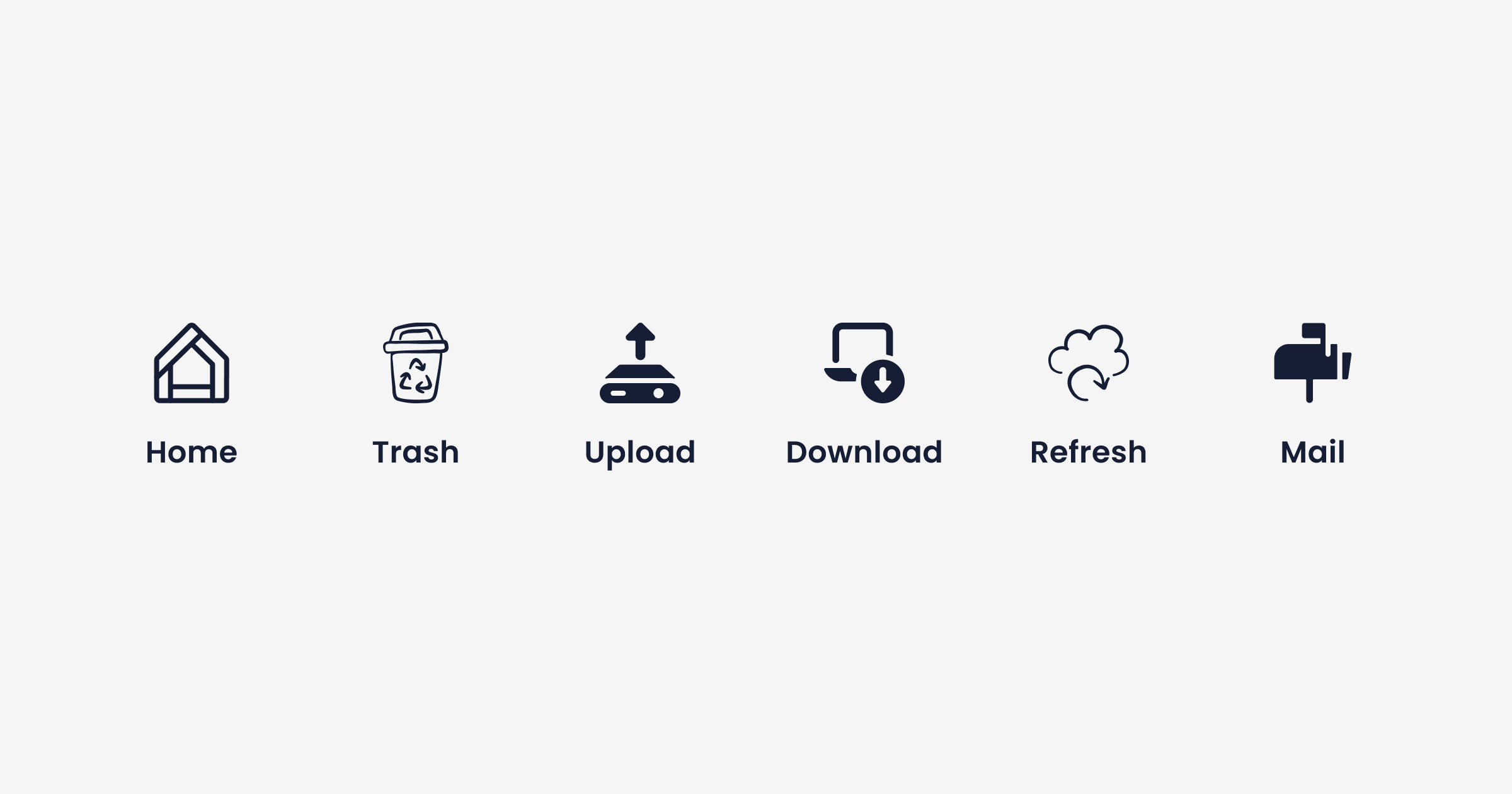

If you’ve read the book “Don’t make me think”, you know why. Your users should be able to intuitively navigate your app.
If they find new symbols and don’t know what they mean, it’ll confuse them. This results in a worse experience.
#8 Segment users
Segment users (new, one-time, returning, loyal, etc.) and compare their user journey.
Ideally, you want all your users to become power-users. How do you achieve that? Consider the following suggestions:
Seamless and educational onboarding
Interactive tutorials or guided tours
Personalization and customization
Gamification elements
Incentives or rewards for frequent usage

Ideally, you want all your users to become power-users. How do you achieve that? First, take a look at
#9 Think about the UI heuristics
The 10 usability heuristics is a list of characteristics for an intuitive user interface:
Visibility of systems status
Match between system and real world
User control and freedom
Consistency and standards
Error Prevention
Recognition rather than recall
Flexibility and efficiency of use
Aesthetic and minimalist design
Help users recognize, diagnose and recover from errors
Help and documentation
Employing Nielsen’s 10 heuristics for mobile app design has many advantages, like improved usability and UX, time saved during the development phase, and increased user adoption and retention.
#10 Think about UX writing
Is your copy clear and first to the tone of voice of your brand?
For most apps, copy is an afterthought. This results in texts like “ok” or “continue” that don’t add personality or feelings to the interaction with your app.
If you reflect on the copy of your app, you’re already a step ahead of most other apps.
#11 Focus on intuitive navigation
Your users should be able to move through your app without confusion.
Keep the UI design familiar using bottom navigation bars, hamburger menus, or tab bars for straightforward and user-friendly navigation.
#12 Prioritize performance and speed
Achieve quick loading times and smooth interactions by optimizing your apps’ performance.
Users have no time to waste and expect superfast and responsive apps. Minimize things like unnecessary animations and optimize images to reduce loading times.
#13 Create a consistent and unified design
Keep your design elements like typography, color schemes, iconography, and UI components consistent throughout the app. Consistency helps make it easier for your users to learn how to use your app.
#14 Implement user feedback channels
Offer different ways for users to provide feedback and engage with your app.
Make it convenient for them to share their opinions by strategically placing in-app surveys, feedback forms, rating prompts, etc., within the app. Be sure to listen to user reviews and comments on app stores and social media to gather more insights.
#15 Accessibility is key
Brands that don’t design their apps to be digitally accessible lose money. So make sure your app is accessible to users with disabilities.
The WCAG (Web Content Accessibility Guidelines) also applies to mobile apps—follow the guidelines to make your app usable by people with diverse needs. Features like alternative text for images and voice-guided navigation allow you to cater to a broader audience.
Mobile App Onboarding Best Practices
First impressions matter. Onboarding is a key moment in the user journey and can make or break your app.
Think about the following best practices and you’ll gain an edge over the competition.
#16 Lead to the AHA-moment
After downloading, lead users to the most popular feature of your app to create an AHA-Moment.
The AHA-Moment is the moment when the user experiences the value of your app for the first time.
Often, your business and your users don’t share the same goals. As a business, you want to get contact information and payment details — but as a user, you just want to use the app.
During the onboarding, cut the business goals as much as possible and lead users to the AHA-moment instead!
#17 Use framing techniques
Frame the onboarding process according to the AHA-Moment.
Read this article to find out more about framing.
#18 Explain benefits
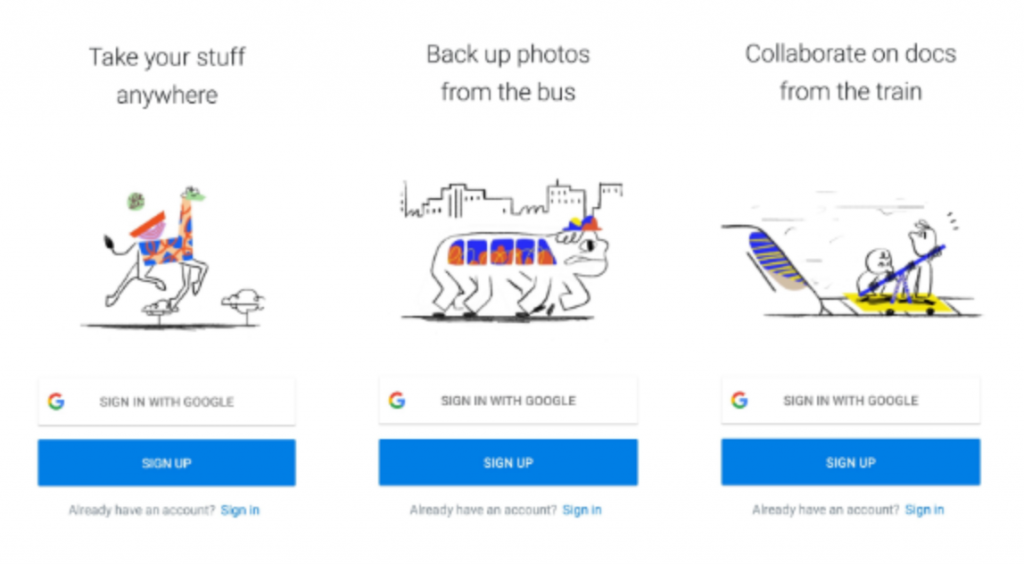

Dropbox explains its benefits immediately
Lead users to the first commitment (e.g. sign-up, first post) by thoroughly explaining the value of your app.
#19 Create an emotional connection
Do you create an emotional connection with your user through product personality?
When we build an app, we are putting a part of ourselves out there and users on the end want to feel this.
They want to feel that there is a person on the other side. That’s why your app needs personality.
Slack’s Slackbot is a good example for this :


Here are four ways to build product personality:
Tone of voice
Faces for your product
Attention to detail
Humor
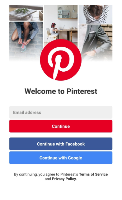
#20 Greet the user
Do you greet your user instead of leaving him with a blank app? It’s an onboarding best practice to greet the user, e.g. with a “welcome!”

#21 Give quick wins
Give quick wins. This increases the likelihood of users to come back and motivates them to continue going through your onboarding flow.
Examples include:
Progress indicators and milestones for a sense of accomplishment
Interactive and engagement elements throughout like relevant mini-games
Unlocking immediate benefits or rewards for completing specific steps
#22 Remove unimportant information
Remove unnecessary information that loses the users’ interest.
Your user has limited time and no patience to learn about every detail of your app. Instead, let him jump to the action quickly.
#23 Provide examples
Provide sample data & texts to give your user a direction.


#24 Do proper expectation setting
Do you under or oversell the value of your app?
It might be tempting to overpromise in your advertisements and app store descriptions. But try to be honest.
After the app download, you have the opportunity to start a relationship with your new user, and you don’t want to start with disappointment.
#25 Interactive tutorials and walkthroughs
Include interactive tutorials or step-by-step walkthroughs to guide users through your apps’ primary features and functionality. Add to their understanding by allowing them to use the app at the same time.
#26 Progressive onboarding
Consider implementing progressive onboarding, where users are introduced to advanced features over time based on their engagement level or completing specific tasks.
Don’t overwhelm them with too much information in one go.
#27 Clear and concise messaging
Use simple language and visual cues to make sure your onboarding messages are clear, concise, and easily understandable.
#28 Personalization and customization
Let users personalize their onboarding experience based on their interests or preferences. Simple self-selection options can go a long way in helping users feel in control of the process.
You can break these onboarding flows into simple categories like common use cases or user characteristics.
#29 Contextual guidance and help
Add tooltips, pop-ups, or contextual prompts that appear when users encounter specific features or functionalities for more assistance.
#30 Feedback mechanism
Also, add a feedback system during onboarding to gather insights regarding their onboarding experience.
Let them provide feedback, report issues encountered, and ask questions so that you can keep improving it.
Mobile App Analytics Best Practices
One of the most important mobile app best practices is a solid implementation of analytics and reporting. The next steps set out a good base for mobile analytics best practices.
#31 Install analytics SDKs
How Analytics SDKs work
Analytics SDKs help you to perform sophisticated analysis of your app and prevent you from “flying blind”.
Learn why UXCam has the best SDK in the market.
#32 Track conversion rates
Calculate the current conversion rates of your app.
This could be sign-up conversion rates, check-out process conversion rates, or micro-conversions. Which specific flows you want to track depends on the nature of your app.
Actively tracking conversion rates will give you a better feel for where your app is performing well and where it needs improvement.
#33 Set goals
Set realistic, but ambitious goals, e.g. for the optimization of your conversion rate.
You can read this ebook to find out more about data-informed goal tracking.
#34 Optimize the conversion flow
Does your conversion flow have unnecessary steps?
Remove them and see if your conversion rate increases.
In some cases, it might even make sense to add steps to the conversion flow. For example, a confirmation about the benefits could motivate users to proceed.
#35 Visualize the user flow
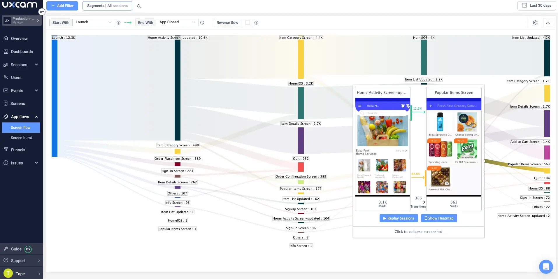
UXCam’s Screen Flow
Did you fully visualize the optimal user flow?
You might want to revisit it with an analytics tool. You want to confirm that the flow that you thought of matches the way that users behave in your app. Often you’ll find some unusual flows that need to be fixed.
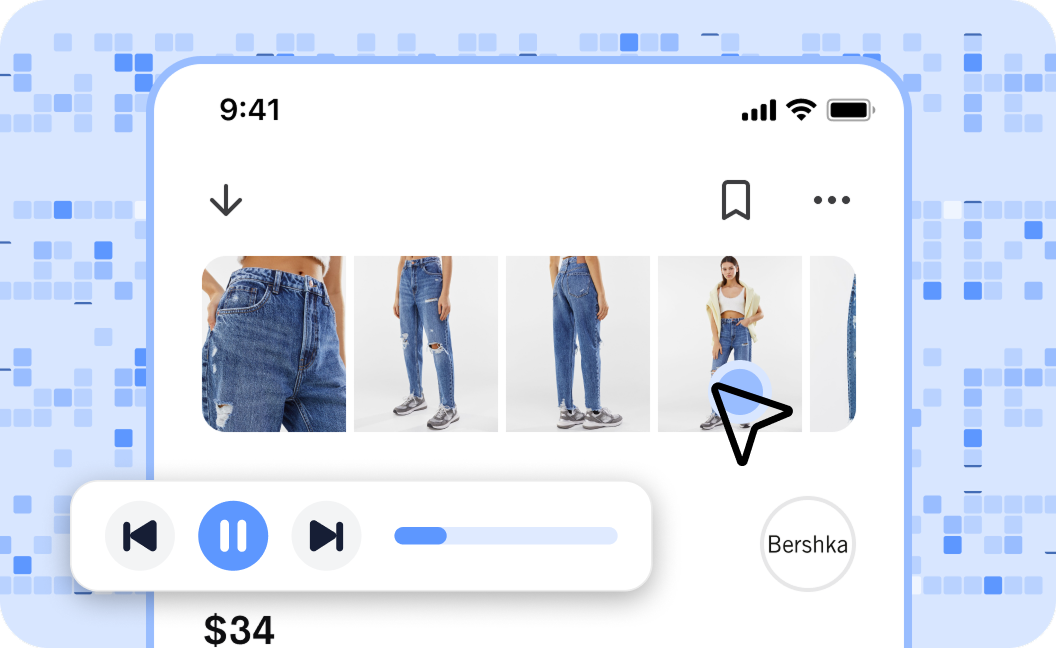
#36 Watch session replays
Watch sessions of successful power-users to understand how they use the app.
It’s an analytics best practice to not only focus on quantitative data, but also keep the qualitative data in your mind. Videos of user sessions can be a form of qualitative data that will make it easier for you to understand user behavior.

#37 Use performance monitoring and optimization
This involves:
Tracking app responsiveness: Monitor how responsive the app is to the user's interactions, as slow or unresponsiveness can impact user satisfaction and retention.
Monitoring resource usage: Monitor how the app uses device resources (CPU, memory, battery). When apps are resource-heavy, they can negatively impact UX on devices that can’t handle it.
Tracking key metrics: Analyze metrics like startup time, API response times, and screen transition times to identify bottlenecks
Understanding UX: Utilize analytics to learn how performance metrics correlate with UX, then prioritize those improvements.
#38 Retention rate monitoring
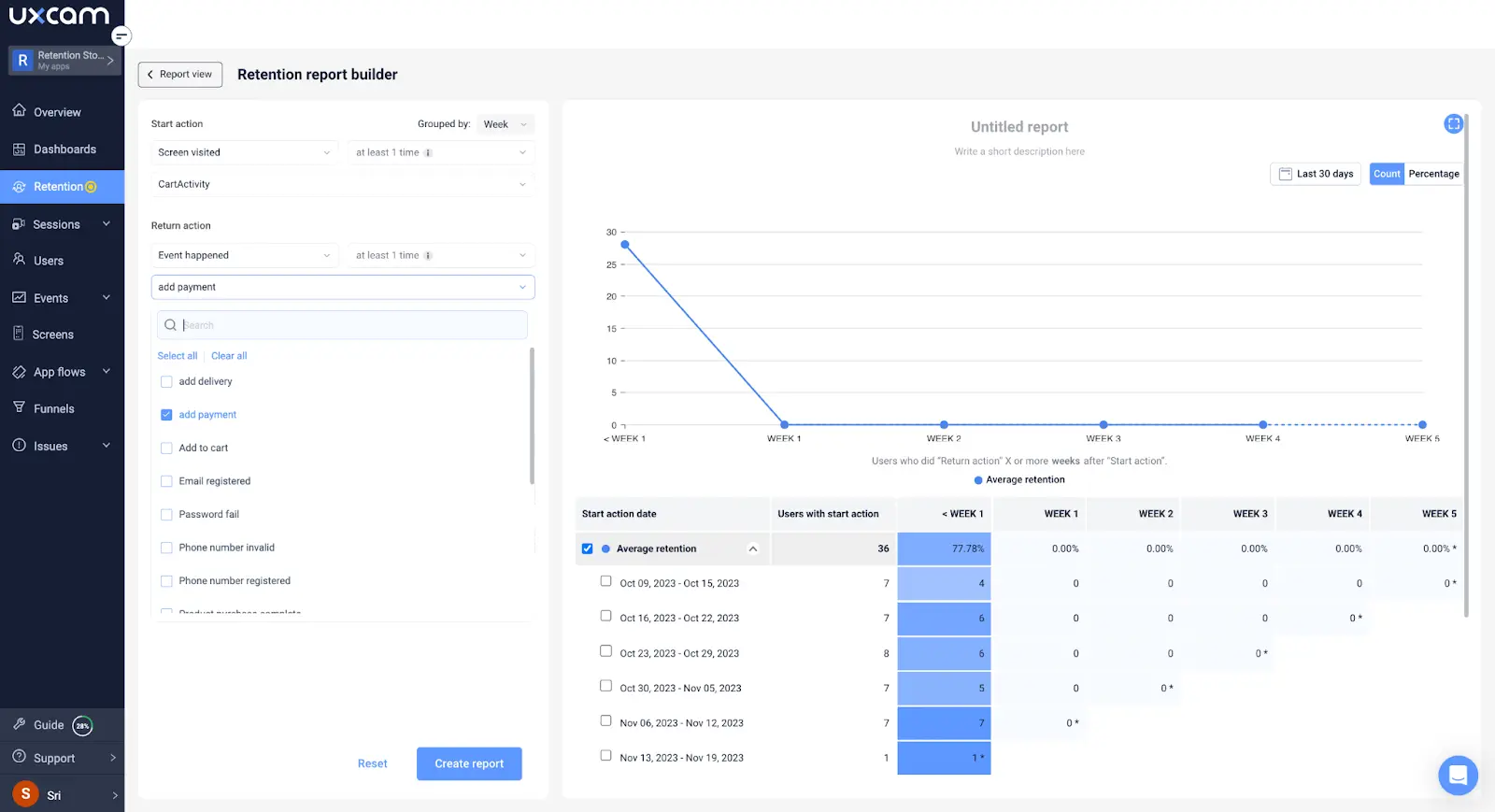
UXCam’s Retention Monitoring
Focus on customer loyalty by tracking user's return rates over time. Investigate the reasons behind drop-offs and devise a plan to improve retention.
#39 Feature adoption tracking
Monitor the uptake rates of new features and updates.
See how your users engage with the changes and iterate designs based on their feedback.
#40 Funnel analysis
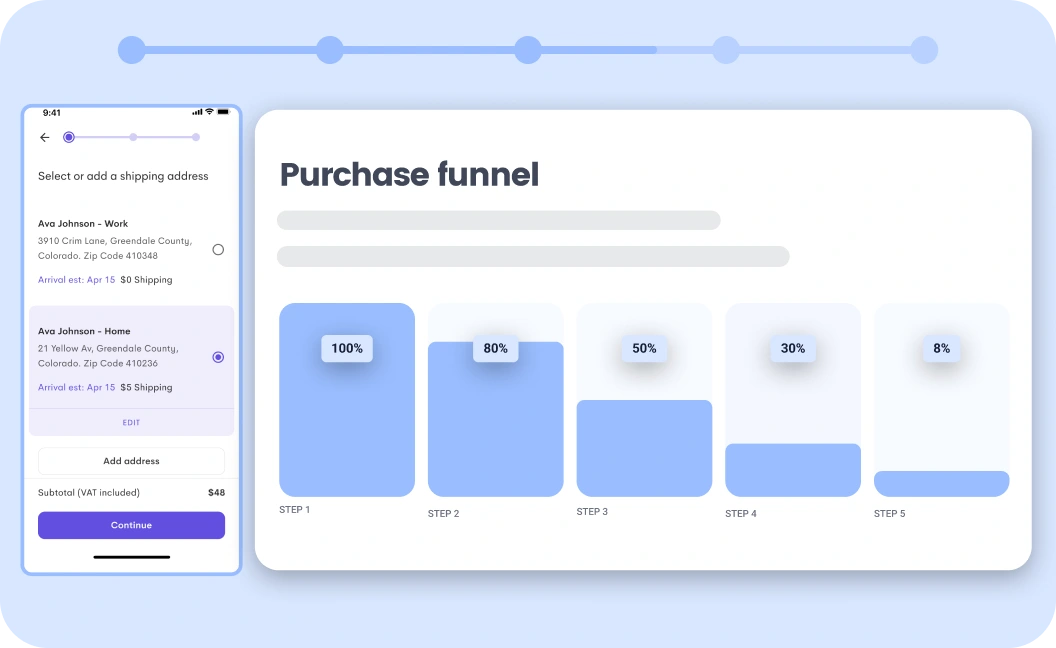
UXCam’s Funnel Analysis
Apart from conversion rates, map out several funnels within your app for different user actions. Pinpoint where users drop-off, then optimize those steps to improve UX.
#41 A/B testing insights
Continuously compare different versions of app features with A/B testing. Then use the results to back design decisions that enhance engagement.
#42 Error and crash reporting
Users want to use reliable and stable apps, so keep an eye on overall app performance. Monitor and analyze errors and crashes, and prioritize fixing critical issues impacting UX.
#43 Analyze user feedback
Analyze feedback to learn user sentiment, preferences, and pain points for user satisfaction and loyalty.
#44 Geolocation and demographic analysis
Leverage geolocation and demographic data to learn where your users are based, and tailor experiences based on regional preferences or cultural differences.
#45 User journey mapping
Create detailed user journey maps. Use them to understand user behavior, touchpoints, and pain points to optimize UX throughout the app.
Conclusion
Building an audience of regular users for your mobile app is complex and takes patience. We hope that the best practices mentioned in this article will make the road to success easier for you.
You might also be interested in these;
The only 10 slides you need to present session replay findings
How to analyze session recordings
CRO for Mobile: 7 Ways to Increase mobile conversion rate
UX Optimization: 4 Steps to deliver a better user experience
Related articles
Product best practices
How to Increase Mobile App Engagement: 10 Best Strategies
Ten mobile app engagement strategies ranked by real impact, with honest notes on what works, what's overrated, and how UXCam's session replay reveals...

Silvanus Alt, PhD
Founder & CEO | UXCam
Product best practices
5 best user behavioral analytics tools for mobile app teams
Behavioral analytics offers deep insights into user interaction. Learn about the best behavioral analytics tools to optimize the user experience on your mobile...

Jonas Kurzweg
Product Analytics Expert
Product best practices
Top 11 Remote Usability Testing Tools You Can Use Now
Usability testing tools that will put your mind at...

Jonas Kurzweg
Product Analytics Expert


