Sitting on the sofa or laying in the bed? Chips or chocolate? Desktop, Smartphone or TV? What do you prefer while watching a series on Netflix?Netflix beats its competitors in usability on all devices.
Have you ever wondered why the usage of Netflix is this intuitive and easy? Possibly because your mind understands the big picture before you recognize every single element which is implemented in the app. This phenomenon is called Gestalt Principles.
This app study is dedicated to the analysis of the Netflix mobile app in consideration of the Gestalt principles. You can give your users the same experience with your app.
Review of the Gestalt Principles
Law of Proximity: Elements which near together seem to be related.
Law of Closure: The human mind tries to fill unfinished information.
Law of Similarity: Similar looking elements are understood as a group.
Law of Common Region: Elements which are are together in a close region will be understood as a group.
Law of Continuity: Elements that are aligned linear seem to be more related then randomly ordered elements.
Law of Figure and Ground: People instinctively recognize if elements are in the foreground or background.
Law of Symmetry: Symmetric elements give the user the feeling that everything is ordered.
Law of Common Fate: Elements which move in the same direction are considered to belong to each other
If you haven’t heard about Gestalt Principles yet, you should read this article.
A closer look at the Netflix mobile app
You have to know one important thing before we start: Don’t just focus on one of the Principles! You’ll find a combination of Gestalt Principles on every screen and in every other app. This combination makes the app intuitive and loved by users.
Now we can have a closer look at the screens you find in the Netflix app:


You’ll see this screen when you open the app for the first time.
How many illustrations can you see here?
The dots on the bottom show you that you will find three more pictures when you scroll to the left. You understand the four dots on the bottom of the page as belonging together and similar in functionality. This is because of the law of continuity and similarity!
Let’s log in and search for some cool series – and Gestalt Principles 😉


At the moment ATYPICAL seems to be the new series Netflix wants to promote. Have you seen it yet?
Have a closer look at the design of the promotion. It looks organized, you can go with your eyes over the page quick and smooth. Nothing special to find. Really? No, just perfectly planned and describable with the Gestalt Principles. The Netflix logo, the title, and the play button are vertically centered, other information like the check and the “i” are ordered symmetrically next to the Play button. The symmetric design and with this the Law of Symmetry gives you the feeling that everything is normal and ordered.
Are you more interested in action series, comedy or romances? No problem! You can scroll down to find some more series.
The previews of the next series are not completely shown. Described with the Law of Closure your mind understand that you can scroll down before you have to think about where you’ll find the next series. But why? Because it tries to fill the missing information (the cut part of the preview).
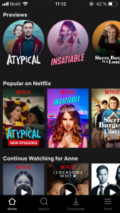

The same goes for the page you’ll see when you scroll down. Here you’ll find more previews summarized in different categories, the genre written directly over the pictures. The Law of Proximity describes that you understand that elements which are close together seem to belong together.
Do you want to watch a specific genre? Scroll to the right in all the genres you want to and you will see more series. The Law of Common Fate describes that elements which move in the same direction seem to belong together. Well sure, it would be difficult to let the elements in one genre move in different directions.
Haven’t found your genre yet? Scroll down. You know that you can do it, we have already talked about this law 😉
This series looks interesting! If you don’t like it, no problem, the pages look the same for every series





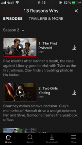

Let’s have a closer look at the series – and the more or less hidden Gestalt Principles.
When you scroll down you’ll find an overview of all episodes per season. The Law of Proximity works the same as on the page before. Title, video, and description are close together and seems to belong together. Between two episodes there is a gap to show which description belongs to which title and video. The half cut video, and with this, the Law of Closure shows you that there must be more information or episodes when you scroll down.
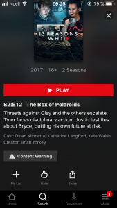

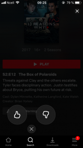

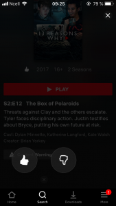

This series was really great, right? Or really boring? Show everybody what you think about it. Click on the rating button and you’ll find one more Gestalt Principles: the Law of Figure and Ground. I’m sure you’ll look at the two thumbs now and not on the background anymore – this is what this law describes.
During all the screens, have you recognized, that the navigation bar on the bottom of the screen was in a black box? Maybe not, but you knew that these four icons don’t belong to the title pictures, episode descriptions or rating buttons. The Law of Common Region describes this phenomenon. Netflix has designed this very nondescript and in the same color as the background.
Related Articles:
AUTHOR
Annemarie Bufe
Product Analytics Expert
Passionate hobby dancer. Working at UXCam.

Related articles
Curated List
7 Best AB Testing Tools for Mobile Apps
Learn with examples how qualitative tools like funnel analysis, heat maps, and session replays complement quantitative...

Jane Leung
Product Analytics Expert
UX design
12 UX Metrics to Measure and Enhance User Experience
Unlock product success by tracking the right UX metrics. Learn 12 essential metrics, how to measure them, avoid common pitfalls, and take action with tools like...
UX design
10 Top UX Design Best Practices & How to Implement Them
Discover 10 proven UX design best practices to improve usability, boost retention, and create user-centric products. Actionable tips for product...

Tope Longe
Product Analytics Expert

