Web Design Examples: 6 Inspirational Websites

A website's first impression can be pivotal. Your brand's online presence should be both captivating and intuitive, setting you apart from the competition. Today, we're exploring some of the best web design examples that innovate when it comes to conversion optimization.
"Design is not just what it looks like and feels like. Design is how it works." – Steve Jobs
Let's dive into the following web design examples and discover what makes these designs so impactful and how they can inspire your next digital project.
AI Web Design Example: ChatGPT


| Website | What they do | Why it converts |
|---|---|---|
| chatgpt.com | Focus on action | Users get an aha-moment as fast as possible |
The ChatGPT website showcases a minimalist and highly functional design, prioritizing ease of use and immediate engagement. Here's how it effectively turns visitors into users:
1. Simple and Direct Messaging
The central question, "What can I help with?", sets the tone for the site. It’s approachable, user-focused, and invites interaction. This clarity instantly communicates the purpose of the platform while encouraging visitors to engage.
2. Focus on Action
The design integrates seamlessly with the primary function—messaging ChatGPT. The empty text input field is placed at the center of the screen, inviting users to start typing. Secondary CTAs like “Create account” and “Log in” are non-intrusive, giving new users a clear pathway to sign up while letting existing users quickly access their accounts.
3. Minimal Distractions
The ultra-clean layout keeps the focus entirely on the core interaction—messaging the AI. There are no unnecessary visuals or content blocks, reducing cognitive load and ensuring that users can immediately understand and act.
4. Accessible Features
Pre-configured shortcuts like "Create image," "Code," "Summarize text," "Make a plan," and "Brainstorm" showcase some of the platform’s capabilities right from the homepage. These clear labels help users understand what ChatGPT can do without the need for additional explanation.
5. User-Centric Design
The website adopts a “less is more” philosophy. The lack of visual clutter and the focus on the input field make it easy for users to engage without confusion. The design prioritizes the user’s task: to start a conversation.
6. Professional Aesthetic
The clean and modern design, paired with a neutral color palette, conveys professionalism and reliability. It creates an environment where users feel comfortable and confident in the product.
ChatGPT.com’s design is a perfect example of how minimalism and functionality can drive conversions. With its clear messaging, intuitive CTAs, and focused user experience, the site ensures visitors understand the value of the platform and are encouraged to engage immediately. This is a masterclass in designing for simplicity and action.
E-Commerce Web Design Example: Shein

| Website | What they do | Why it converts |
|---|---|---|
| shein.com | Maximalist design | Attention-grabbing & gamified elements |
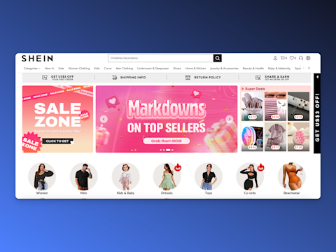
SHEIN demonstrates how a dynamic, visually rich e-commerce platform can drive sales by creating an engaging shopping experience. Here's what makes the website effective:
1. Attention-Grabbing Promotions
The homepage prominently features banners like “Sale Zone” and “Markdowns on Top Sellers” with bold, colorful designs. These banners instantly catch the user’s eye and convey urgency with phrases like “Super coupons every day” and “Grab them NOW.” The use of vibrant colors and playful visuals encourages users to explore deals immediately.
2. Clear Navigation
The navigation bar at the top is comprehensive and organized, with categories like Women Clothing, Men Clothing, Kids, Curve, and more. This makes it easy for users to find exactly what they’re looking for without getting overwhelmed.
3. Personalized Product Highlights
By showcasing “Super Deals” and popular categories like Women, Men, Kids & Baby, and Dresses, the site tailors the shopping experience to customer interests. Highlighting discounts and trending products creates a sense of FOMO (fear of missing out), encouraging immediate purchases.
4. Trust-Building Features
Key trust elements like “Shipping Info,” “Return Policy,” and “Share & Earn” are prominently displayed at the top of the page. These features reassure customers and reduce hesitation about making a purchase.
5. Strong Visual Hierarchy
The site uses a clear visual hierarchy, with large banners for key promotions, followed by smaller sections for deals and product categories. This layout ensures that users’ attention flows naturally from one section to the next, guiding them toward exploring products and offers.
6. Emphasis on Savings
Price tags on the Super Deals section are highly visible, with products starting at under $1. This makes the platform appear affordable and accessible, appealing to budget-conscious shoppers.
7. Interactive and Engaging Design
The inclusion of “hot” tags on trending items, rotating banners, and clickable elements creates an interactive experience that keeps users engaged. These elements also give the site a lively and dynamic feel, encouraging longer browsing sessions.
SHEIN succeeds by combining a vibrant, engaging design with clear calls to action and trust-building features. Its focus on promotions, easy navigation, and affordability ensures a seamless shopping experience that keeps visitors engaged and encourages them to make purchases. For designers, it’s an excellent example of balancing aesthetics and functionality to drive conversions.
Fintech Web Design Example: Stripe


| Website | What they do | Why it converts |
|---|---|---|
| stripe.com | Clear design | Clear value propositions & product previews |
Stripe's homepage is a prime example of how clear messaging, professional design, and effective use of visuals can drive engagement and conversions. Here’s what makes it so effective:
1. Strong Value Proposition
The headline “Financial infrastructure to grow your revenue” is bold and to the point. It highlights Stripe’s primary benefit—helping businesses increase their revenue through its financial tools. The supporting text reinforces this by emphasizing Stripe’s versatility, appealing to businesses of all sizes and needs.
2. Real-World Application Preview
The visual of a working payment system (Apple Pay and card payment options) provides a live example of how Stripe works. Alongside this, the dashboard preview showcases revenue data, graphs, and key metrics, helping visitors visualize the value Stripe brings to their business operations.
3. Clean, Modern Design
The gradient background adds a vibrant yet professional feel, keeping the design visually appealing without distracting from the core message. The overall layout balances visuals and text perfectly, ensuring the page is both informative and easy to navigate.
4. Trust and Credibility
The phrase “Join the millions of companies of all sizes” builds trust by showcasing Stripe’s widespread adoption. Additionally, including logos of accepted payment methods (Visa, Mastercard, etc.) reassures users of Stripe’s reliability and compatibility.
5. Emphasis on Business Growth
By focusing on outcomes like revenue growth and profitability, Stripe appeals directly to its target audience of business owners. This results-oriented messaging creates a compelling reason for users to explore the platform further.
6. Clear Navigation
The navigation bar at the top provides easy access to essential areas like Products, Solutions, Developers, Resources, and Pricing. This structure ensures visitors can quickly find the information they need, whether they are technical users or decision-makers.
Stripe’s homepage combines clear messaging, practical visuals, and user-friendly design to create an effective conversion funnel. It highlights the product’s benefits while building trust and credibility, guiding visitors to take the next step—whether signing up immediately or reaching out for more information. For web designers, Stripe is a great example of how to seamlessly blend function, form, and focus to drive conversions.
SaaS Web Design Example: Wiz


| Website | What they do | Why it converts |
|---|---|---|
| wiz.io | Interactive design | The design tells a story |
Wiz.io stands out as a cloud security platform by leveraging an interactive and visually engaging homepage to captivate its target audience and communicate its value proposition effectively. Here’s how it achieves this:
1. Powerful, Relatable Messaging
The tagline “The switch to cloud creates a new world of security challenges” immediately resonates with the target audience of IT professionals and security teams. It acknowledges their pain points while subtly positioning Wiz.io as the solution. The phrase “SHIFT HAPPENS” adds a clever, memorable touch, reinforcing the dynamic nature of the challenges the platform addresses.
2. Interactive Storytelling
The interactive elements on the site enhance the storytelling experience. Visitors are guided through a journey, with animations or clickable elements, that explain how Wiz.io helps tackle modern cloud security challenges. This approach engages users more deeply than static content, keeping them interested and encouraging exploration.
3. Visual Metaphors
The imagery, such as the wrench and cracked shapes, likely serves as a metaphor for identifying and solving complex cloud security problems. These visuals subtly communicate the platform's purpose without overwhelming users with technical jargon.
4. Dynamic, Future-Oriented Message
By stating “The environment is more dynamic and complex than ever before,” Wiz.io positions itself as a forward-thinking solution for rapidly changing security needs. This appeals to its audience, who are likely grappling with these exact challenges.
Wiz.io successfully combines interactive storytelling, relatable messaging, and clean design to create an engaging experience. By focusing on the user’s pain points and offering clear solutions, the website effectively captures interest and encourages deeper exploration. This site is a great example of how interactivity can turn a potentially complex topic like cloud security into a visually appealing and engaging experience.
PLG Web Design Example: Miro

| Website | What they do | Why it converts |
|---|---|---|
| miro.com | Focused design | The sign up is the natural next step |
Miro demonstrates how thoughtful design and clear messaging can make all the difference. Here’s how they succeed:
1. A Standout Call-to-Action
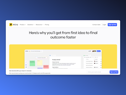
The “Sign up free” button is hard to miss. Its bold blue color contrasts with the neutral background, naturally drawing the eye. Pair this with the simple email input field, and the process feels effortless. Using the word “free” in the CTA lowers resistance, making visitors more likely to take the first step.
2. Focused and Minimal Design
The website’s clean layout avoids distractions, keeping the focus on signing up. While secondary actions like “Contact Sales” and “Login” are available, they’re subtly placed to avoid overshadowing the primary CTA. This simplicity ensures users stay on track without feeling overwhelmed.
3. Building Trust Through Design
Trust is critical for conversion, and this website achieves it in subtle ways. The mention of “Miro AI” reinforces the platform’s innovation, appealing to users looking for cutting-edge solutions. The overall professional design, combined with modern visuals, gives the impression of a credible, reliable tool.
4. Benefits Over Features
Rather than overwhelming visitors with a list of features, the website focuses on the end result—helping teams move faster from ideas to outcomes. By emphasizing what users can achieve with the platform, it makes the product’s value easy to understand.
5. Creative Yet Professional Visuals
Playful touches, like dotted patterns and small arrows, bring a sense of creativity without feeling unprofessional. These elements subtly appeal to designers, teams, and creatives while maintaining a polished and trustworthy aesthetic.
Miro demonstrates that effective conversion is all about balance. It combines a strong message, a prominent and simple CTA, and a clean, focused design to guide users toward action. By emphasizing outcomes, building trust, and keeping distractions to a minimum, it makes signing up feel like an easy, natural next step.
For web designers, it’s a masterclass in how thoughtful design can create a seamless path from visitor to user.
Banking Web Design Example: Revolut

| Website | What they do | Why it converts |
|---|---|---|
| revolut.com | Relatable design | The young target audience can see themselves using the product |
Revolut’s homepage is a great example of modern, user-focused web design. It blends bold messaging, a clean layout, and subtle interactivity to appeal to its audience. Here’s how the site succeeds at converting visitors:
1. Bold and Aspirational Headline
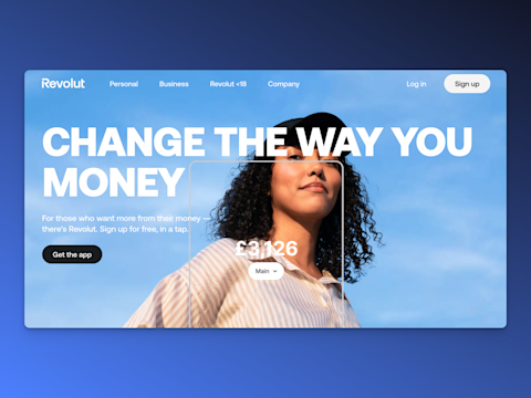
The headline “Change the way you money” immediately captures attention with its bold typography and a play on words. It’s aspirational and appeals to users looking for innovative ways to manage their finances.
2. Strong Visual Impact
The full-screen background image of a confident individual looking upward conveys empowerment and aligns with the brand's focus on ambition and growth. The minimalist design allows the image to take center stage while keeping the text and CTAs easily accessible.
3. Clear Call-to-Actions
The CTAs are direct and action-oriented:
“Get the app”
invites users to download Revolut immediately, aligning with the platform’s mobile-first approach.
“Sign up”
in the top-right corner ensures a clear, easy path for new users. Both CTAs are simple, highly visible, and well-placed.
4. Engaging Dynamic Elements
The live mockup of the account balance and a salary deposit visualized on the homepage allows users to imagine themselves using the app. This feature builds excitement and helps potential users see the platform as relevant to their financial goals.
5. Value-Driven Subtext
The supporting copy, “For those who want more from their money — there’s Revolut. Sign up for free, in a tap,” speaks directly to the audience’s desire for better financial management. The mention of “free” reduces barriers to entry, while “in a tap” emphasizes simplicity and convenience.
6. Clean and Focused Design
The homepage follows a minimalist approach, with minimal distractions and a focus on the headline, CTAs, and visuals. The clean design ensures users aren’t overwhelmed and can immediately grasp the core offering.
7. Tailored Navigation
The top navigation bar clearly separates options for Personal, Business, and Revolut <18 users, ensuring different audience segments can easily find their respective offerings. This segmentation showcases Revolut’s versatility while simplifying navigation.
8. Emphasis on Trust and Modernity
The confident branding, modern design, and aspirational imagery create a strong sense of trust and innovation. This positioning appeals to users looking for reliable yet forward-thinking financial solutions.
Revolut’s homepage is a masterclass in blending bold branding with user-focused design. It captures attention with aspirational messaging, engages users with relatable visuals, and drives conversions through clear CTAs and an intuitive layout. It’s an excellent example of how to design for a modern audience seeking empowerment and simplicity in their financial tools.
How you can make your website convert
First and foremost, clarity is key. Ensure that your website is easy to navigate and that visitors can effortlessly find the information they're looking for. Think of each element on your site as a piece of a larger puzzle, creating a seamless journey from the homepage to the final call-to-action.
Next, focus on speed. Page load time is crucial; a slow website can significantly tarnish the user experience and drive potential customers away. Utilize optimized images, leverage browser caching, and consider a reliable hosting service to keep things running smoothly.
Visual appeal is another significant factor. Invest in a professional design that aligns with your brand and resonates with your target audience. Remember, your website is often the first impression someone has of your business, so make it count!
Moreover, your website should be responsive, adapting beautifully to all devices. In today's mobile-driven world, providing a consistent experience across smartphones, tablets, and desktops is essential for maintaining engagement and encouraging conversions.
Don't forget about strong, concise CTAs. Encourage visitors to take the next step with clear, compelling messages that prompt action. Whether it's signing up for a newsletter, making a purchase, or downloading a resource, your CTAs should be strategically placed and unmissable.
Finally, empower your website with analytics. Understanding how users interact with your site can offer invaluable insight into what's working and what might need tweaking. Use digital analytics to make informed decisions and continuously improve your site's performance and conversion rates.
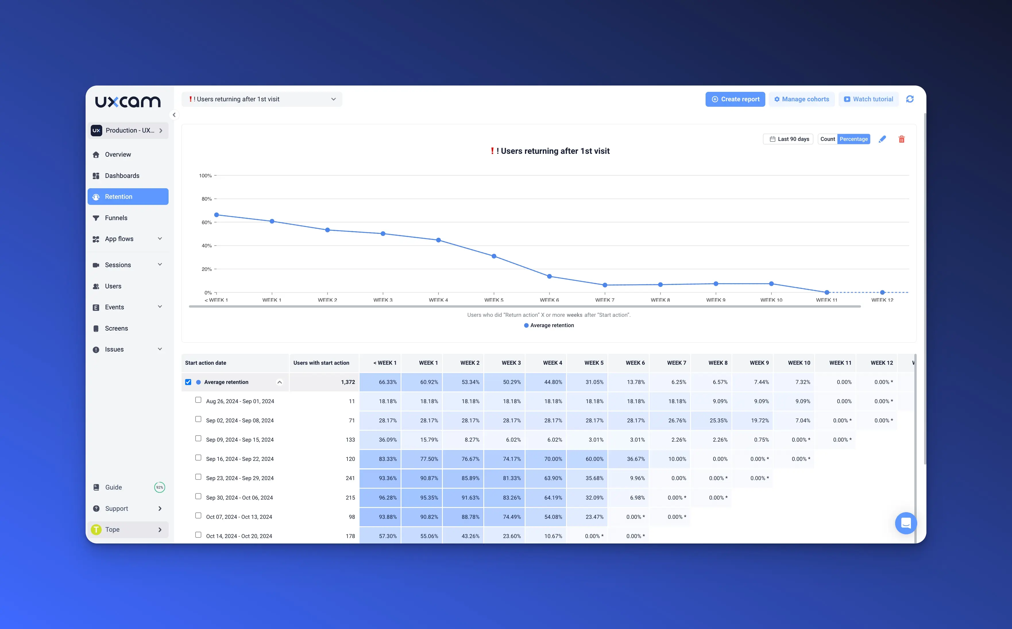
With tools like UXCam, you gain detailed insights into user behavior by capturing every click and scroll on your website. UXCam's heatmap feature visually represents the most and least engaged areas of each page, allowing you to prioritize design improvements and enhance user experience effectively. This comprehensive analysis not only helps in refining your site's layout and content but also assists in making data-driven decisions to boost conversion rates.
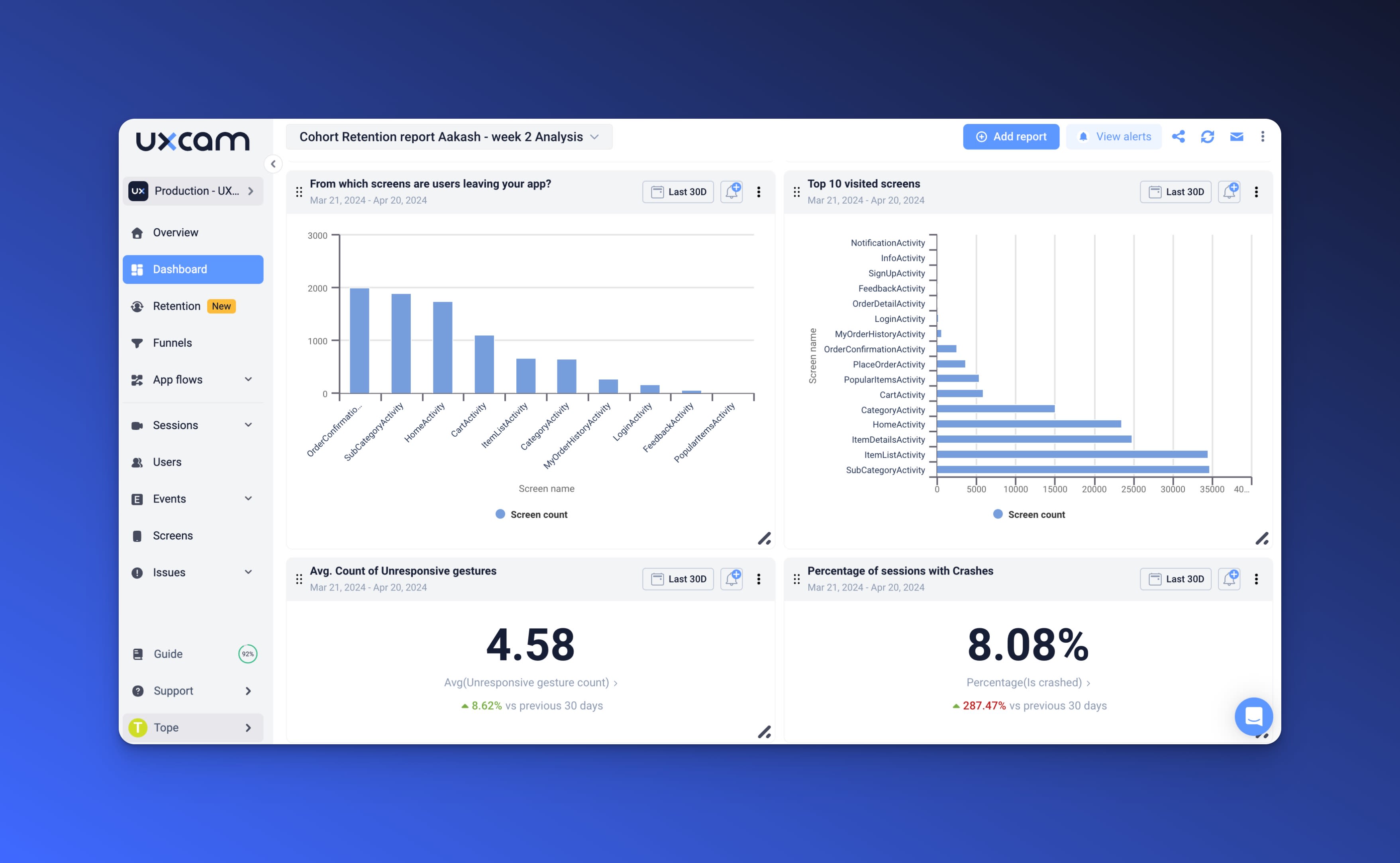

Moreover, UXCam offers clear analytics dashboards that track critical performance metrics, ensuring you stay updated on your website's performance. With this information, you can better understand your users' journey, tailor the website to meet their needs, and create a seamless online experience that keeps visitors coming back for more.
Related articles
Website Optimization
Conversión web: qué es, cómo medirla y cómo moverla
Conversión web explicada. Qué es, cómo medirla correctamente, los 12 patrones que la mueven, las diferencias entre mobile y desktop, y cómo el análisis...

Silvanus Alt, PhD
Founder & CEO | UXCam
Website Optimization
Conversão de Site: O Que É, Como Medir e Como Movimentar
Conversão de site explicada, o que é, como medir corretamente, os 12 padrões que movimentam o número, diferenças entre mobile e desktop e como a análise...

Silvanus Alt, PhD
Founder & CEO | UXCam
Website Optimization
Website Conversion: What It Is, How to Measure It, and How to Move It
Website conversion explained — what it is, how to measure it properly, the 12 patterns that move it, mobile vs desktop differences, and how AI session...

Silvanus Alt, PhD
Founder & CEO | UXCam
