8 Mobile App Onboarding Best Practices

App onboarding is the first impression of an app – just like a handshake with a stranger. If it’s dubious you leave.
To not let your onboarding process be like a dubious handshake you should care about some small but important mobile app onboarding best practices.
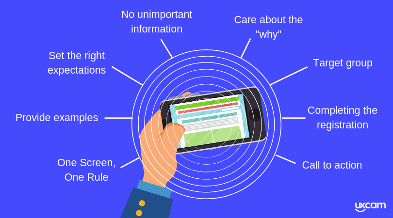

1 Know your target group
Every mobile app should have a target group. It is important that you know who your target group is and that you speak directly to it. Every group has their own preferences and issues that you have to care about while designing your onboarding process.
Here is the first mobile app onboarding best practice and some examples for target groups:
The tech beginner
These users are not comfortable with technical stuff. The onboarding process should help them to understand the basics of your app. Keep it simple and don’t overwhelm them with fancy control elements. Just focus on what’s important and helpful for them.
The advanced user
These kind of users are familiar with technical stuff and understand most of the common UI and app interactions and elements. You can be creative with control elements for your app and even your onboarding process.
The business user
You can expect that these users know how to work with a smartphone and that they understand the common UI and app interactions and elements, too. For this target group, you should focus on the value the app offers.
Want to see real app onboarding examples? Check out 10 apps with the best user onboarding flow
2 Care about the “why”
While designing the onboarding process, ask yourself if the information you show your users is useful or not. After users have downloaded your app, it’s not sure that they will stay with your app. You have to show them the values and advantages of your app. Show them why you are special and unique.

3 Get rid of unimportant information
Your app can be complex, full of great features and important functions, no question! But the onboarding process is the first impression the users get from your app – and your users are impatient. Make sure that you show them the most important features without taking to much of their time.
You should especially focus on the features that the users will use the most.
Design your message to be short and clear. Give them just enough information to get started and have fun with your app. Further information, less used features or special elements can be described later.
You can use popups or further descriptions for this (e.g. “information buttons” or further walkthroughs through the special pages).
Mobile app onboarding best practice: Instead of a function-oriented onboarding you could think about a progressive onboarding.


4 One Screen, One Rule
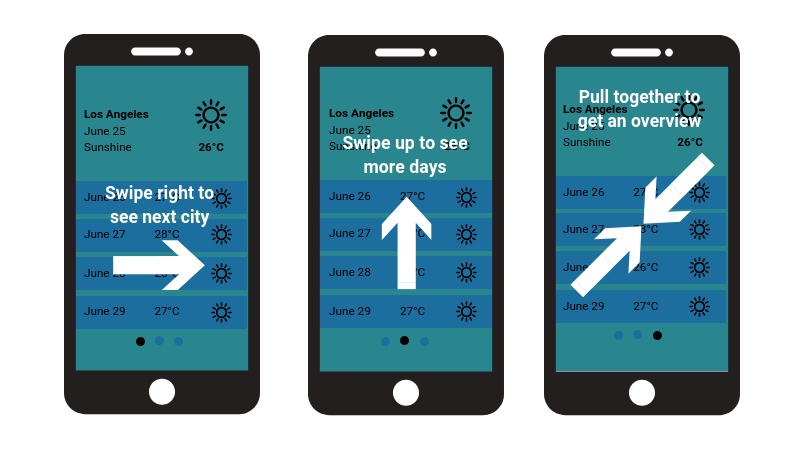
Users will understand information easier if the information is focused. The onboarding process should reduce the most important information as much as possible and present them in a precise way. Don’t overload your users with information on one screen, better use one screen per information, especially when you decide for benefit-oriented or function-oriented onboarding.

5 Provide examples
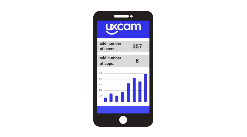
My personal favourite mobile app onboarding best practice is: Using Examples!
If your users start your app the first time they’ll feel warmly welcomed and have a much easier start if you provide them some sample data in your app (especially in complex apps or e.g. finance apps). They can have a look at how the data should be inserted and can easily insert their own data.
You don’t have to use this for number driven apps, you also can provide your users sample pictures in picture apps or sample texts in a social app. Just be creative and give your users a warm welcome when they join your app the first time.

6 Set the right expectations
You’ve implemented everything I told you, you’ve focused on the most important features and the most valuable benefits of your app and your users still quit your app after a few days?
Try to change your point of view and analyze your onboarding process through your users’ eyes. Is it possible that you’ve tried to oversell your app?
When you promise your users features or values, but can’t deliver them, your users will be disappointed and quit your app. Make sure that you set the right expectations and don’t promise to much.
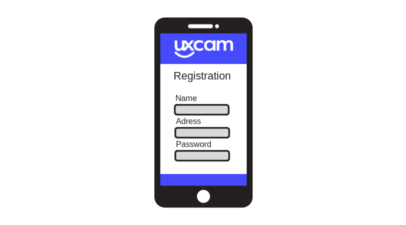
7 Complete the registration
Your users know what the core values of your app are and how to use your app. You’ve created a great onboarding process and convinced them to stay with your app. Congratulations! But now there are some aspects you have to still think about.
The users just got a small glance at what your app can offer to them. They have no experience with your app and may be scared of annoying push notifications or data security. To complete the registration process successfully, you have to care about all these small things during the registration process.
Pay special attention to timing when asking your users for permissions like camera access and location. Display such requests only when you really need them.

8 Call to action
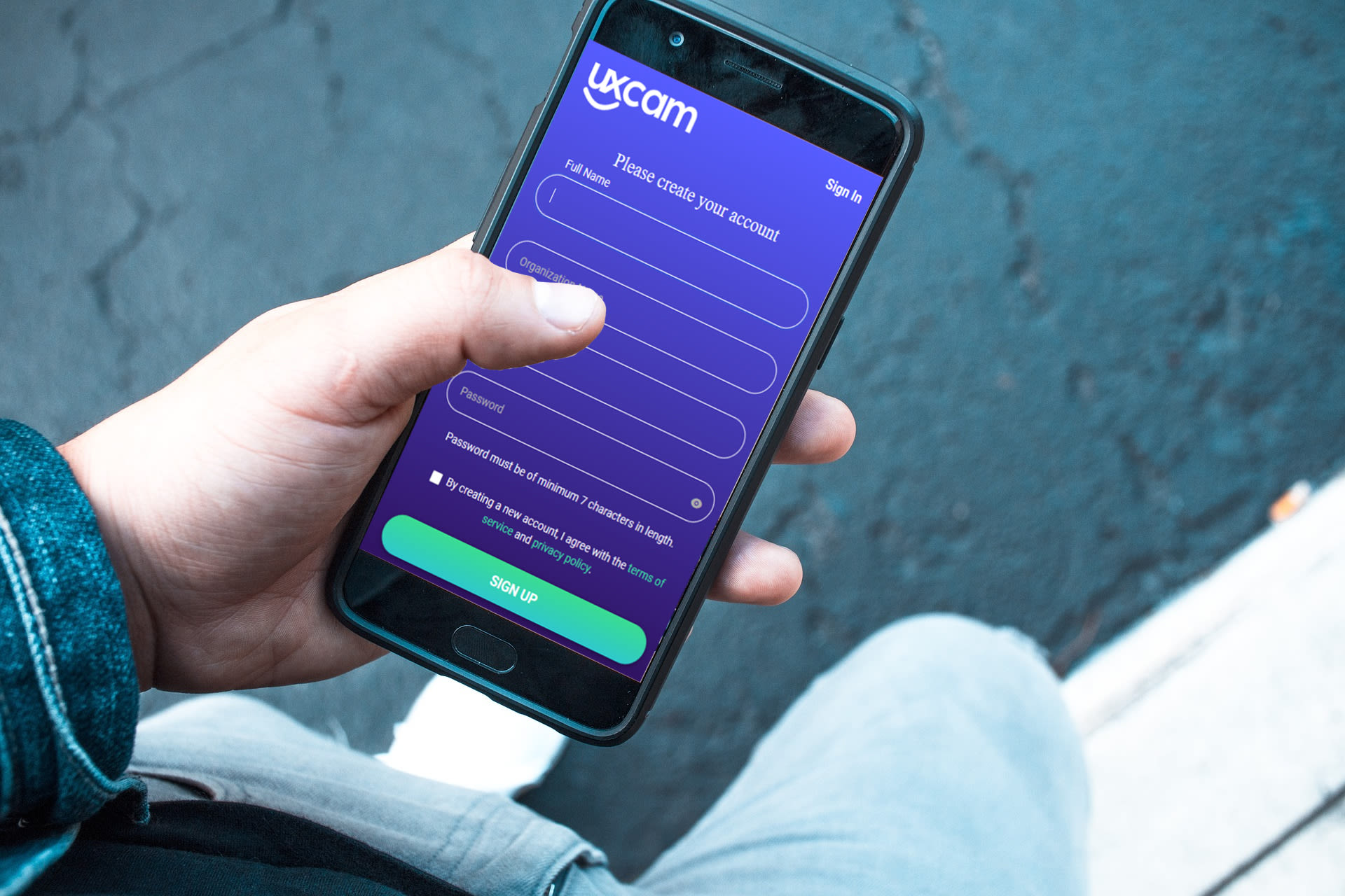
After your users have finished the onboarding process (doesn’t matter if they have watched or skipped it) don’t let them be alone. Motivate them to keep using your app. With a clear call to action (e.g. login and sign in) users are more likely to become part of your app and come back!
If your users don’t want to sign up- don’t let them go! Give them the chance to try your app without a registration. Let them have a great experience before signing up.

Conclusion about the mobile app onboarding best practices
Mobile Onboarding is like the first handshake with a stranger. You have a few seconds to prove that it’s not dubious.
It doesn’t matter for which type of onboarding you decide on, or if you mix them up. By focusing on some small but effective aspects you can convince your users to stay with your app.
Don’t overwhelm your users with unimportant information. Be focused and make the onboarding process short and easy.
Be creative and unique. Give your users a great first impression of you and your product.
Don’t let your users be alone. Motivate them to sign up and stay with your app.
Be honest. Tell your users just what you can deliver and set the right expectations.
Related Articles:
AUTHOR
Annemarie Bufe
Product Analytics Expert
Passionate hobby dancer. Working at UXCam.

Related articles
Product best practices
5 best user behavioral analytics tools for mobile app teams
Behavioral analytics offers deep insights into user interaction. Learn about the best behavioral analytics tools to optimize the user experience on your mobile...

Jonas Kurzweg
Product Analytics Expert
Product best practices
Top 11 Remote Usability Testing Tools You Can Use Now
Usability testing tools that will put your mind at...

Jonas Kurzweg
Product Analytics Expert
Curated List
7 Best AB Testing Tools for Mobile Apps
Learn with examples how qualitative tools like funnel analysis, heat maps, and session replays complement quantitative...

Jane Leung
Product Analytics Expert


