Ecommerce Conversion Rate Optimization (CRO) - Ultimate Guide


Most eCommerce brands don’t struggle with traffic; they struggle to turn that traffic into buyers.
If you are spending money on ads or SEO but conversions are not growing, you are likely dealing with friction points you can’t see yet. That’s where conversion rate optimization (CRO) comes in.
This guide cuts through the fluff and gives you proven, expert-backed strategies to fix the hidden gaps in your funnel and dramatically boost conversions, without guessing or gimmicks.
Let’s get right to it.
What is ecommerce conversion rate optimization?
eCommerce Conversion Rate Optimization (CRO) is the process of systematically improving your online store to increase the percentage of visitors who complete a desired action, such as making a purchase, signing up for a newsletter, or adding a product to the cart. It involves analyzing user behavior, identifying friction points, and testing changes to improve the customer journey and boost sales.
eCommerce conversion rate optimization (CRO) is improving your online store so more visitors take action. Instead of driving more traffic, CRO helps you get more value from the traffic you already have.
The main elements include:
Product page views to add-to-cart rate: Are visitors convinced enough to take the first step?
Add-to-cart to checkout start: Are people confident enough to move forward, or are doubts creeping in?
Checkout start to completed purchase: Are you losing buyers at the final step because of friction or hesitation?
Click-through rate (CTR) on key CTAs: Are your buttons and calls to action compelling enough?
Bounce rate and time on page: Are users finding what they expect, or leaving too soon?
Mobile vs desktop performance: Are you optimized where most of your traffic comes from?
Calculating your eCommerce conversion rate: What’s normal & what’s great?
To calculate your eCommerce conversion rate, use this simple formula:


For example, if your store had 50 purchases and 1,000 visitors last month, your conversion rate is:
(50 ÷ 1,000) × 100 = 5%
That is your overall conversion rate.
You can also calculate micro-conversions like add-to-cart or checkout initiation rates using the same formula but tracking different actions.
How to interpret your conversion rate


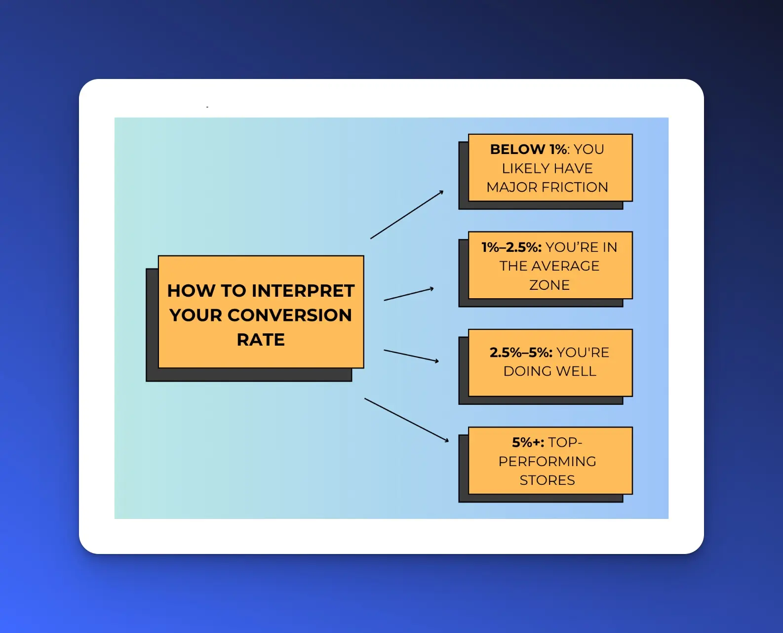
Most eCommerce stores average between 1% and 3%. But context matters:
Below 1%: You likely have major friction: unclear value props, slow site speed, or wrong traffic. At this point, analyze your product pages and the checkout process. Use heatmaps or session recordings to spot the friction.
1%–2.5%: You’re in the average zone. Here, you can run A/B tests on your CTA copy, layout, and messaging. Improve mobile UX and page speed.
2.5%–5%: You're doing well. Keep testing and refining.
5%+: Top-performing stores. Focus on upsells, bundles, personalized recommendations, and post-purchase flows to boost AOV and retention.
Benefits of e-commerce conversion rate optimization
Lower customer acquisition cost
When you’re converting a larger proportion of your user base, you need a smaller user base to achieve the same results. This means you can spend less on acquiring new customers (an infamously expensive activity) and allocate those resources towards other areas of your business.
Enhanced user experience and product insights
CRO allows for a deeper understanding of user behavior and preferences within the app, enabling businesses to identify which product or UX changes have the most substantial impact on conversions. For businesses managing deliveries or logistics, implementing route optimization can significantly improve efficiency and enhance the overall user experience.
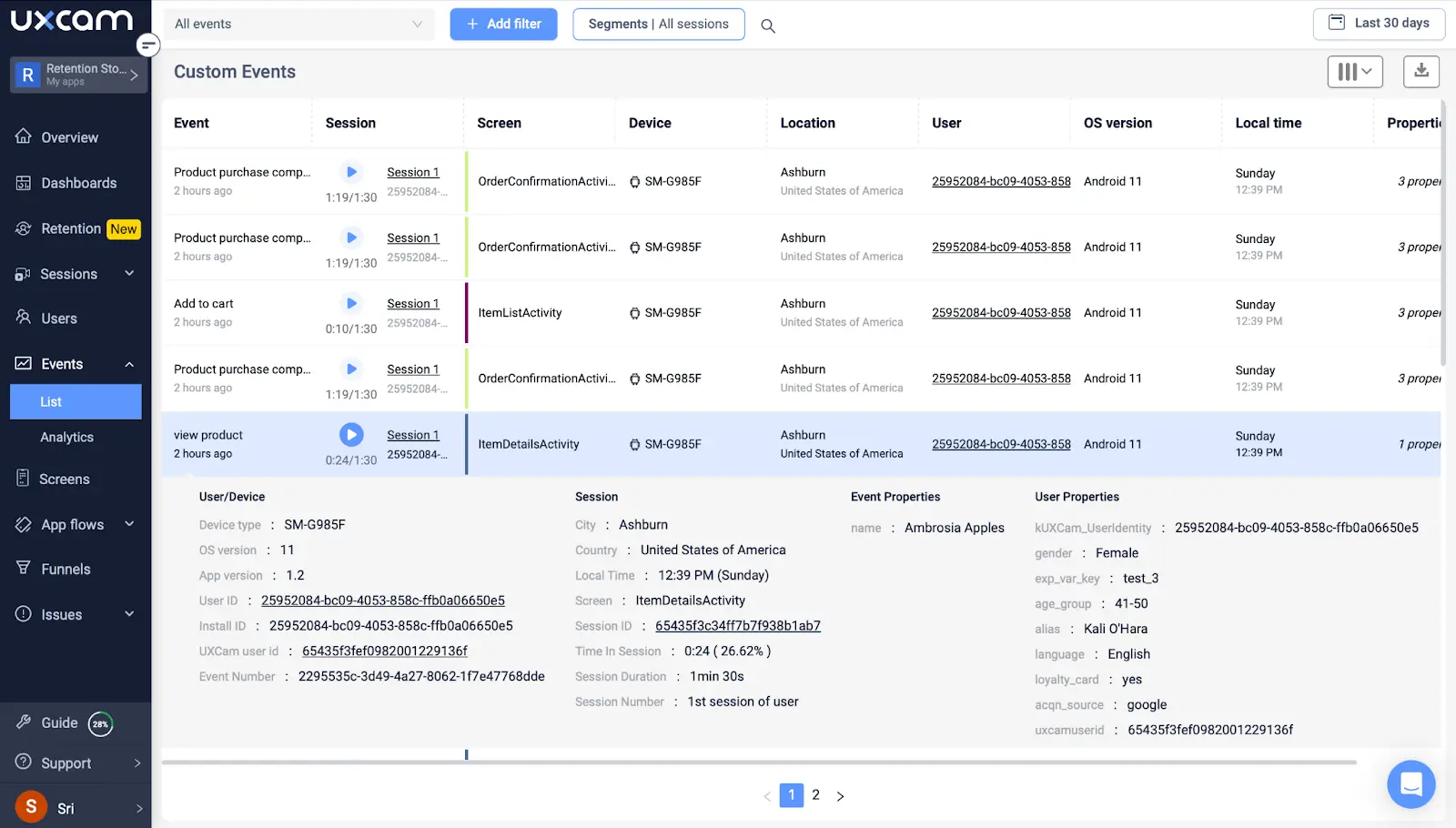
Tools like UXCam that offer granular views of user behavior, like session replays and funnel analytics, are invaluable for pinpointing the exact features or screens where users are most likely to convert or drop off.
Competitive advantage
In a market flooded with apps, standing out is hard. Mobile CRO isn't just about optimizing for conversions, it's about optimizing for customer satisfaction and loyalty.
With the right approach, businesses can significantly enhance the user experience, thereby increasing user retention and engagement, which are critical in a highly competitive environment.
10 eCommerce CRO strategies to drive real results
Start with one strategy, test it, and build from there. It’s easier to manage and measure instead of doing everything at once.
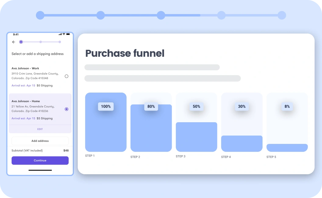
1. Identify high-intent leaks with conversion funnel micro-metrics
This strategy shows you where potential buyers are dropping off, not just that they are. Instead of focusing on your overall conversion rate, break the journey into smaller steps and figure out exactly where the friction starts.
Use this strategy when your store gets consistent traffic from paid ads, email, or SEO but sales are not keeping up. It’s especially useful after you’ve made site changes, launched a new product, or invested in SEO services like this and want to see if that traffic is actually converting.
What to do:


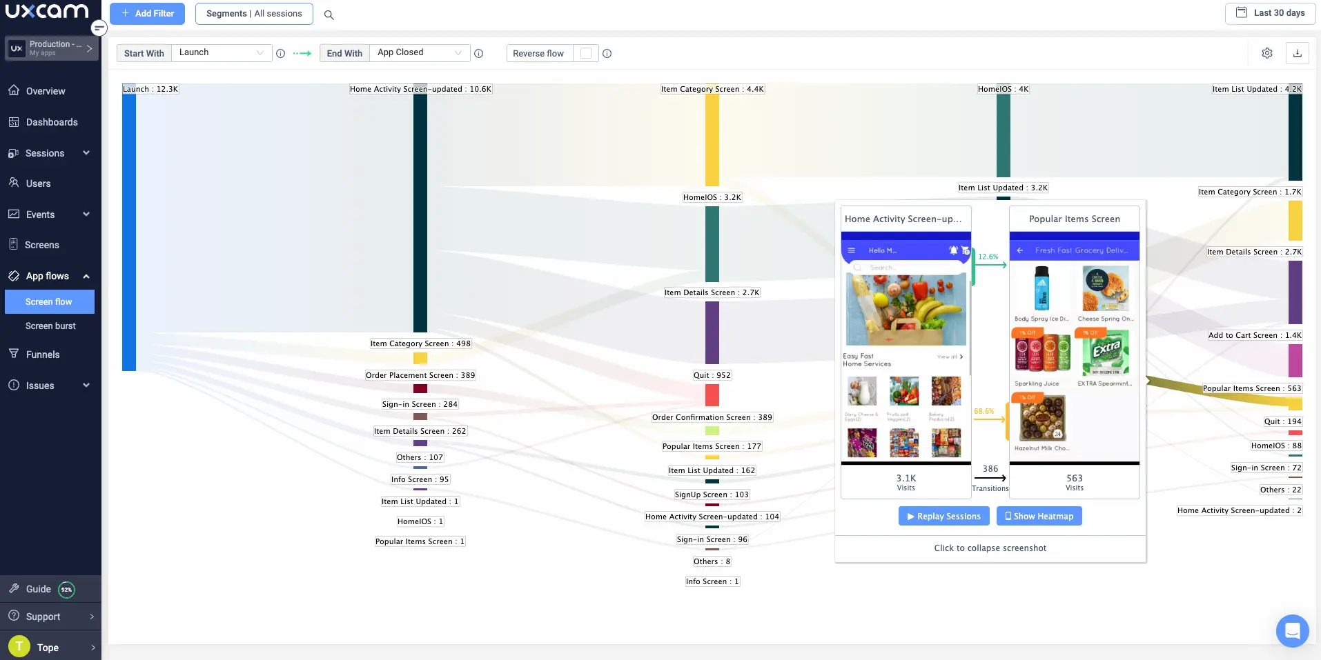
Use UXCam funnel analytics to create a custom funnel.
Set up the key stages of your eCommerce funnel: Product view -> Add to cart -> Begin checkout -> Complete purchase
Review the conversion rate between each step and look for sharp drop-offs (e.g., 60% view, only 8% add to cart).
Prioritize fixing the stage with the biggest drop. For example, if many users add to cart but few start checkout, focus there.
Segment your data by device and traffic source to uncover patterns.
Layer in session recordings and UXCam heatmaps to understand what might be causing hesitation (unclear shipping info, lack of trust signals like credible links, or confusing layouts).
Example: How Jabra boosted sales by addressing a hidden drop-off
Jabra noticed that shoppers were dropping off because they were not sure if the headphones would feel comfortable. So they updated their homepage banner to speak directly to those concerns and added real customer reviews from trusted sites like TechRadar. These changes helped answer doubts early and build trust right on the product page and increased sales by 76.9%.
2. Build a hypothesis engine using zero-click & scroll behavior
This strategy removes guesswork by showing you where users get stuck, confused, or uninterested, even if they don’t click anything. Instead of asking what to A/B test, ask why users aren’t engaging in the first place.
Here is what you should do:
Track user scroll depth, hover activity, and rage clicks.
Watch where users pause, hesitate, or move on without interacting.
Spot zero-click sections (areas users see but never touch).
Identify scroll drop-offs. If most users leave before reaching your CTA, move it up or rework your hook.
Turn these friction points into testable hypotheses (e.g., “Users aren’t engaging with the benefit section. Maybe the copy is too vague or too long”).
Focus on changes that make the offer clearer, easier to act on, or more compelling to engage with.
3. Diagnose message mismatch using landing page attribution
This helps you spot disconnects between what your ad promises and what your page delivers. When your landing page does not match the ad’s angle, offer, or tone, visitors bounce, no matter how good your product is.
Use this strategy when you are running paid campaigns but seeing low on-page engagement or high bounce rates, especially from cold traffic.
Here is what you should do:
Review your paid ads and note the specific angles you are using (e.g., “clean ingredients,” “perfect gift,” “limited-time offer”).
Create UTM-tagged URLs for each ad variation so you can track performance by message.
Adjust landing pages to match each angle, visually and verbally.
Trace ad clicks to conversion behavior.
If bounce rate is over 60% or the scroll depth is under 50%, there’s likely a message mismatch.
Align your headline, imagery, and first CTA with the promise that got the click.
Example: How Juliette Armand boosted conversions by aligning ads with landing pages
Juliette Armand, a beauty and skincare brand, noticed their ad campaigns were not converting as expected. They realized the issue was a disconnect between their ad messages and the landing pages users were directed to.
So the team updated their landing pages to match each ad’s promise more closely, with tailored headlines and product highlights. That simple switch helped turn more clicks into actual customers.
4. Remove buyer friction by matching the decision stage to the page structure
Not every visitor is ready to buy the moment they land on your product page. Some want quick answers, while others need time to explore details or compare options before they trust your brand. If your page only serves one type of buyer, you risk losing the rest.
Use this strategy when you are getting solid product page traffic but low add-to-cart rates or short time-on-page.
Here is what you should do:
Structure your product detail page to serve both fast and slow decision-makers.
For fast buyers, put the key info above the fold: product title, price, benefits, trust badges, and a clear “Buy Now” button.
Add a “Why we made this” or “Our story” block to build emotional connection and brand trust.
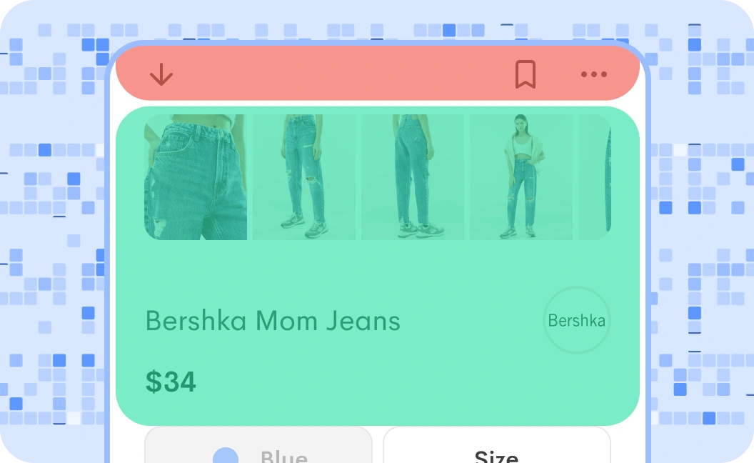
For slower buyers, include expandable sections or tabs for deeper info like ingredients, how-to-use, reviews, and FAQs like what Infrascale did here:


5. Trigger conversion levers based on buyer readiness signals
Some visitors are just exploring, others are comparing options, and a few are ready to buy. The problem is, most stores show them all the same experience. When you treat every visitor the same, you miss easy chances to move them one step closer to converting. Small, timely nudges based on intent can make the difference between a bounce and a sale.
Here is what you should do:
Track real-time behavior like scroll depth, return visits, cart opens, and clicks on key info (like shipping or reviews).
Use those signals to group users by intent: window shoppers, problem-aware, or purchase-ready.
Trigger smart nudges based on those groups:
Window shoppers → product benefit popups or banners
Problem-aware → highlight comparison charts or trust badges
Purchase-ready → show urgency messages, exit offers, or free shipping reminders
Example: How Caraway boosted conversions by tailoring messages to shopper behavior
Caraway, known for its eco-friendly cookware, noticed that their ad campaigns were hitting a plateau. Instead of blasting the same message to everyone, they worked with creators to tailor content for those just browsing, comparing options, or ready to buy.
This hit the right note with each audience segment and generated nearly 1.3 million paid views and over 35,000 organic views, and achieving a return on ad spend of 2.77.
6. Pressure-test your checkout UX with real-user behavior
What feels easy to you might be confusing for your customers, especially during checkout. The fastest way to spot what’s slowing them down is to watch real people go through the process and hear their thoughts as they try to buy.
Use this strategy when you notice a high drop-off at checkout or just made changes and want to make sure nothing's getting in the way.
Here is what you should do:
Run usability tests with real people.
Ask testers to talk through their thoughts out loud as they move through your checkout flow.
Pay attention to where people pause, get confused, or second-guess like during shipping, account creation, or payment.
Identify fields or steps that feel unnecessary or unclear.
Remove any optional fields that don’t directly support fulfillment or conversion.
7. Build CRO-ready offers that do more than discounting
Discounts can grab attention, but they are easy to copy and hard to scale. Strong offers, on the other hand, make your product feel more valuable without cutting into your margins. The goal is to give people a reason to buy now, without relying on the same old 10% off.
You can use this strategy when your current promotions aren’t moving the needle or you want to boost average order value (AOV) without training customers to wait for a sale.
Here is what you should do:
Test offers like product bundles, buy-2-get-1 deals, free gift tiers, or post-purchase upsells.
Test thank-you page offers or one-click add-ons after checkout.
Make sure your offer matches your AOV goal. For example, offer a freebie at $75 if your current AOV is $60.
Avoid using blanket discounts by default. Structure offers around perceived value instead.
Rotate different offer types to see what resonates best with your audience.
Example: How Lively boosted sales bundle deals
Lively, a clothing store, wanted to encourage customers to buy more without just slashing prices. They introduced a simple yet effective bundling strategy: offering a slight discount when customers purchased 2 or 3 undergarments at once. This approach led to over a 50% increase in sales, significantly boosting their average order value.
8. Replace social proof with intent-aligned testimonials
Most reviews are written to celebrate the purchase, not to help someone decide if they should buy in the first place. Generic praise like “Love it!” looks nice, but it doesn’t answer the doubts running through a buyer’s mind before they click “Buy Now.”
To convert hesitant shoppers, you need testimonials that speak directly to the specific objections they’re weighing like concerns about quality, skin sensitivity, fit, or shipping.
Use this strategy when your product page has plenty of reviews but conversion rates are flat, or when you’re seeing high product views but low add-to-cart behavior.
Follow these steps:
Use interactive polls to make finding problems feel fun, not like a chore.
Highlight reviews that answer common objections or doubts (e.g., “I have eczema and this didn’t irritate my skin”).
Group reviews by themes like use-case, skin type, fit, results, or concerns and show them where they Are most relevant.
Place those testimonials near the section they support (like size guidance, ingredients, or shipping).
Tag and filter reviews by topic.
Avoid crowding the page with praise, prioritize clarity over quantity.
9. Reduce cognitive load by reordering content hierarchies
Sometimes it’s not what’s on the page, it’s where it shows up. If your most persuasive content is buried too far down, a lot of people will miss it. Buyers shouldn’t have to hunt for key info like guarantees, delivery times, or size guides especially when they’re on the fence.
Use this strategy when users are landing on your product pages but bouncing quickly, or when scroll tracking shows they’re not making it far down the page.
Here is what you should do:
Use scroll-depth and click tracking tools to see how far people are scrolling and where they are clicking.
Look for high-value content (trust badges, shipping details, or fit guides) that gets little to no interaction.
Move those elements higher on the page, ideally just before or after the “Add to Cart” button.
Test different content orders to see what leads to a longer time on page or more conversions.
On mobile, make sure you are not pushing key info below long images or large headers.
Example: How Taylor Stitch boosted engagement by reordering page content
Taylor Stitch, a men’s clothing brand, realized their product pages looked clean but shoppers were missing key info like sizing and shipping details. Most people weren’t scrolling far enough to find what they needed to feel confident buying.
The team moved that info higher on the page, right below the product images and price, and brought customer reviews closer to the “Add to Cart” button. The result? A smoother shopping experience and stronger engagement right where it mattered most.
10. Run pre-mortems before launching major CRO changes
A lot of CRO tests don’t fail because the idea was bad, they fail because something slipped through the cracks. Maybe the layout breaks on mobile, the tracking doesn’t fire, or the change accidentally makes something else harder to use. A quick pre-mortem helps you spot those issues before they mess with your results. It’s about thinking ahead, not just testing fast.
Here is what you should do:
Before launching, ask: “If this test fails, why would it fail?”
Check for hidden issues like slow page speed, broken mobile layouts, or incomplete tracking.
Run a quick CRO checklist: does your test work across devices, is tracking firing, is the flow smooth end to end?
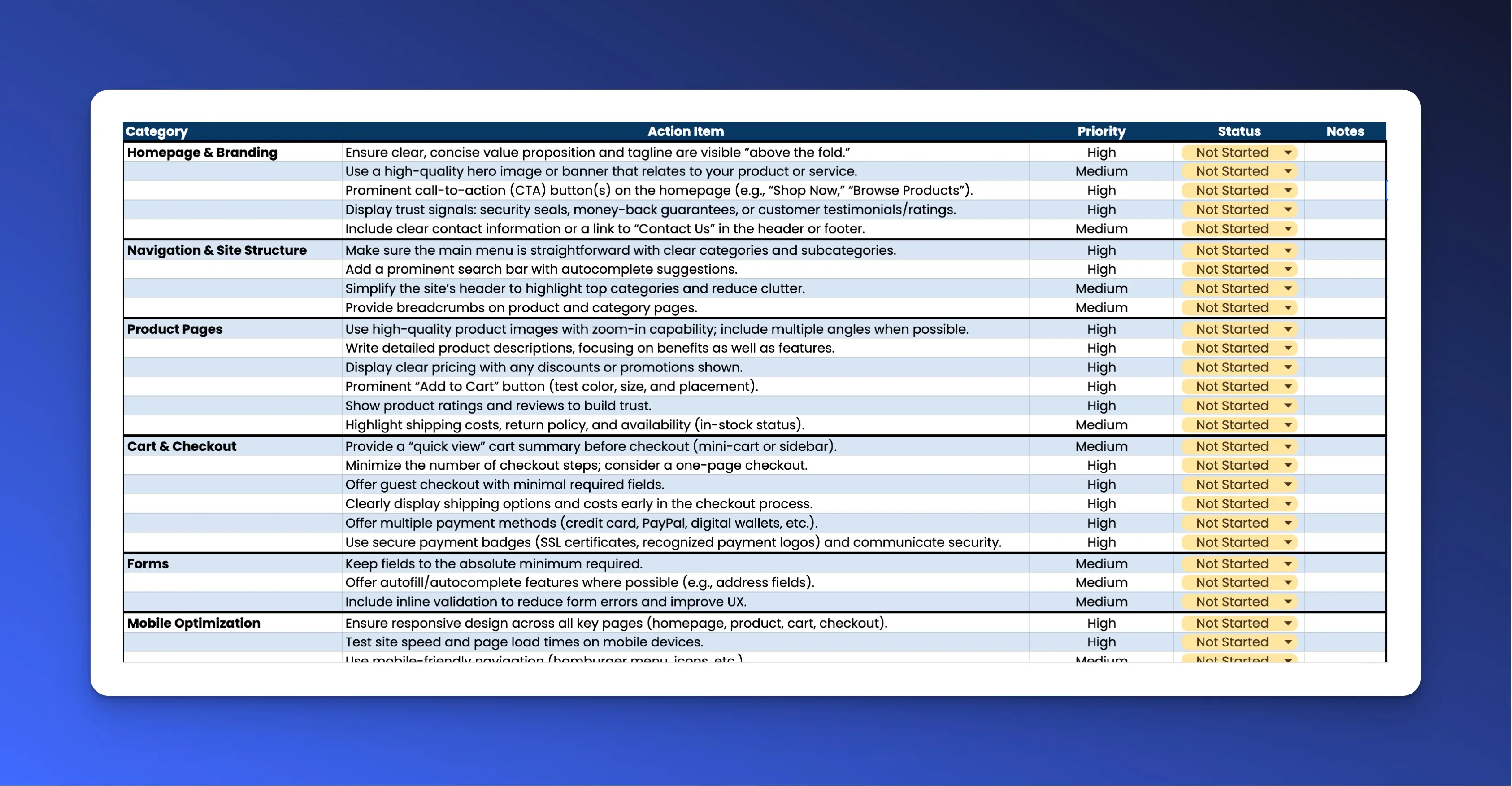
You can download a copy of this ecommerce conversion rate optimization checklist here
Work with your developer to spot broken tracking tags, slow load times, layout shifts, or CTAs that aren’t tappable on mobile.


Always double-check your control vs variant setup in A/B tools to avoid misconfigured tests waste time and data
Best practices for e-commerce conversion rate optimization
1. Streamline navigation
Make sure your mobile app's navigation is intuitive and user-friendly.
Simplify the user journey by organizing products and categories logically. Implementing a straightforward navigation flow enhances user engagement and encourages seamless exploration of your product offerings.


UXCam provides insights into user behavior and navigation patterns within your app, helping you make sure that your app’s navigation is intuitive and user-friendly. For example, our screen flow feature allows you to visualize the various paths that users take within your app, including where they exit or stop using it.
2. Use responsive design
Responsive design means your app is always optimized for any screen size—whether it's a smartphone, tablet, or desktop. This allows your users to have a consistent and seamless experience across all devices.
Not building responsively leads to all kinds of issues, like:
Inaccessible checkout buttons
Difficult navigation
Squished or stretched content
These are conversion rate killers and can lead to frustrated users abandoning your app.
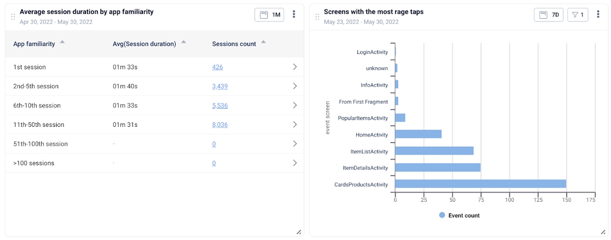
With UXCam, you can easily segment users based in device type, platform, and screen size to identify patterns in conversion rates. Are iPhone 14 Pro Max users converting 20% less often than iPhone 14 users? There’s likely a design issue that needs to be addressed.


You can then use tools like heatmaps and session replays to zoom in on this segment and find the root cause.
3. Design an efficient checkout process
Friction at checkout is a leading cause of abandoned carts. To minimize it, you need to focus on making the process as quick and painless as possible—from adding payment methods to completing the order.
How? Here are a few checkout features you should think about implementing:
Guest checkout
Save card and address details
Autofill forms from account details
Social login options (Google, Facebook, etc.)
1-tap payment options (Apple Pay, Google Pay, etc.)
BNPL options (Klarna, Affirm, etc.)
And as a general rule, minimize the number of checkout screens users need to navigate through. This (combined with the features above) will keep your checkout process lean and effective.
4. Optimize for loading speed
Apps that load quickly convert better than apps that load slowly—it really is that simple. While there isn’t much reliable data on mobile apps, data on mobile sites shows that every second of load time can decrease your conversion rate by 20%.
To avoid this, you should regularly monitor your mobile app for:
Loading times
Frustration signals
You can achieve the former with a performance monitoring tool like Firebase. For the latter, you’ll need a specialized user behavior monitoring tool like UXCam.


With UXCam, you can easily monitor all kinds of in-app issues—from rage taps and dead taps to UI freezes, crashes, and more. Looking for patterns in this data will help you spot problem screens and flows, quantify impact, and prioritize your efforts.
5. Personalized user experience
Finally, make sure your app makes users feel valued and understood.
There are tons of (relatively) simple ways to do this, like:
Implementing personalized push notifications based on user behavior or preferences
Using in-app messaging to offer targeted promotions or content
Offering a personalized onboarding experience for new users
Customizing the app's interface based on user settings or past interactions
UXCam provides detailed insights into user behavior, enabling you to implement personalized recommendations and targeted promotions based on user behavior and preferences.


For example, using UXCam’s analytics feature, start by identifying which features are used the most and the least. Then, measure how often users come back to your product or specific features. Finally, check for user segments that are not interacting with certain features as anticipated.
Conclusion
Optimizing e-commerce mobile apps for increased conversions is a multifaceted approach that involves streamlining user experience, leveraging data analytics, and embracing responsive design. By prioritizing intuitive navigation, personalized recommendations, and efficient checkout processes, businesses can significantly enhance user satisfaction and, consequently, boost conversion rates.
Ready to transform your app's performance? Sign up for free with UXCam to unlock a wealth of user-centric analytics tools.
FAQs
FAQ
What is a good ecommerce conversion rate?
A good ecommerce conversion rate typically ranges from 2% to 3%, but this varies by industry, device, and traffic source. High-performing stores can achieve 5% or higher by continuously optimizing the user experience and checkout process.
What tools and technologies help with ecommerce conversion rate optimization?
Product analytics Tools like UXCam helps track user behavior, run A/B tests, and uncover friction points. Heatmap tools visualize engagement patterns, while analytics platforms like Google Analytics monitor conversion metrics. Email marketing tools such as Klaviyo and Customer.io help re-engage visitors and reduce cart abandonment.
What are the best strategies to improve ecommerce conversion rates?
To improve ecommerce conversion rates, optimize product pages, simplify navigation, speed up the site, reduce checkout steps, use clear CTAs, build trust with reviews and guarantees, and personalize the experience using data.
Do I need to be tech-savvy to implement CRO?
Not at all. Many CRO tools are beginner-friendly and don’t need coding. You can start with simple A/B testing or use heatmaps to guide changes.
You might also be interested in these;
E-commerce customer analytics - How to drive growth with data
Ecommerce product management guide for mobile product teams
Top 5 best e-commerce analytics tools
AUTHOR
Burkhard Berger
Burkhard Berger is the founder of Novum™. He helps innovative B2B companies implement revenue-driven SEO strategies to scale their organic traffic.


Related articles


Product Management
Say hello to new funnels: Analyzing app conversion rates just got easier
UXCam's updated funnels make analyzing conversions easier than ever with new conversion criteria and funnel...


Jane Leung
Product Analytics Expert


Conversion Analysis
React Native Performance Monitoring Guide 2026
Master React Native performance monitoring. Track JS thread stalls, dropped frames, and bridge lag with AI insights from Tara to ship a faster, smoother...


Tope Longe
Product Analytics Expert


Conversion Analysis
Top 51 Mobile App KPIs: Ultimate List 2026
51 mobile app KPIs — determine the KPIs and metrics that matter the most for your...


Jonas Kurzweg
Product Analytics Expert