Top 51 Mobile App KPIs: The Complete List for 2026

TABLE OF CONTENTS
- Key takeaways
- The 10 KPIs that matter most
- What are mobile app KPIs?
- General mobile app KPIs
- App engagement metrics
- Revenue mobile KPIs
- User experience KPIs
- Mobile app marketing KPIs
- App Store Optimization (ASO) KPIs
- 13 KPI Patterns and Pitfalls
- KPIs by industry
- Mobile KPI tools by category
- 10 mistakes teams make with mobile app KPIs
- KPI Program Maturity Model
- How to choose the right mobile app KPIs
- Tracking KPIs with AI
- Track the right mobile app KPIs with UXCam
Mobile app metrics are the quantitative measurements of how users discover, adopt, engage with, and pay for a mobile app. The full list below covers 51 of them across six categories, from acquisition (installs, cost per install) to engagement (DAU, session length) to revenue (ARPU, LTV) to technical (crashes, load time). Most product teams track far more of these than they need to.
Here's the unpopular truth about mobile app KPIs: tracking 51 of them will not make your product better.
Tracking the right 10 will. Most teams I audit have dashboards crowded with vanity metrics and miss the three or four that actually predict retention and revenue. So this guide is a reference (if you need to know what "eCAC" means, it's here), but the more useful part is the top-10 list of KPIs that actually matter for most mobile product teams.
How this list was compiled: I drew from three sources.
First, the standard mobile analytics literature for the canonical metric definitions.
Second, real dashboards from 15+ mobile teams I've worked with in 2025-2026 to identify which metrics actually get reviewed weekly vs. which collect dust.
Third, UXCam's own product intelligence data across 37,000+ apps to validate which metrics correlate most strongly with retention and revenue outcomes. The top-10 ranking at the top reflects my judgment on which metrics most reliably inform product decisions for a typical mobile team.
Key takeaways
Track 10 metrics well, not 50 metrics poorly. The 10 I'd pin for any mobile product team are below, and they cover acquisition, activation, retention, engagement, and revenue. Everything else is context for those.
The single most predictive mobile KPI is day-30 retention for new install cohorts. Almost every other metric follows from that one.
Vanity metrics (downloads, registrations, MAU) are easy to move but don't reliably predict business outcomes. Always pair acquisition metrics with quality metrics (activation rate, day-7 retention).
Instrument for specific decisions, not "just in case." Every event you track costs engineering time, vendor money, and analyst attention.
Tara, UXCam's AI analyst, surfaces metric anomalies automatically and tells you which specific user behaviors are driving the numbers up or down. That turns a KPI dashboard from a scorecard into an actionable diagnostic tool.
The 10 KPIs that matter most
Day-1, day-7, day-30 retention (by install cohort)
Daily active users (DAU) and DAU/MAU ratio
Activation rate (% of new users completing your defined activation event)
Crash-free user rate
Conversion rate at each step of your key funnel
Average revenue per user (ARPU) or lifetime value (LTV)
Customer acquisition cost (CAC) and the LTV:CAC ratio
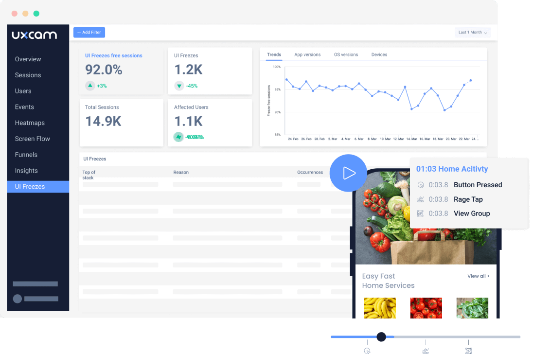
Rage-tap rate and UI-freeze rate (UX performance)
App store rating and review volume trend
Time to first meaningful action (activation speed)
These 10 cover acquisition, activation, retention, engagement, revenue, and UX in one view. If I had only 10 charts on a mobile dashboard, these are the ones.
What are mobile app KPIs?
Mobile app KPIs (key performance indicators) are quantitative measurements used to track and evaluate how a mobile app is performing against business and user-experience goals. They span six broad categories: general app health, engagement, revenue, user experience, marketing, and app store optimization (ASO).
The distinction between "metric" and "KPI" is about intentionality. A metric is anything you measure. A KPI is a metric you've decided drives a business decision. Every KPI is a metric; not every metric is a KPI. Most teams have more metrics than KPIs, which is fine until the dashboard clutter obscures the signal.
General mobile app KPIs


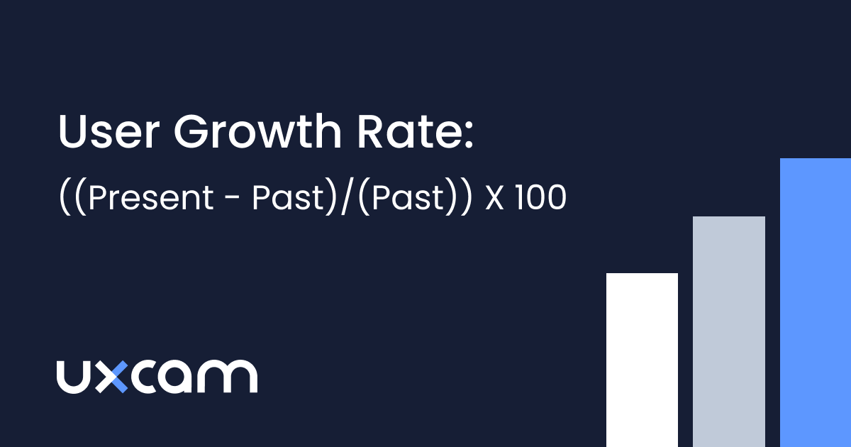
User Growth Rate
The percentage change in total user count over a given period. Formula: (users at end - users at start) / users at start × 100. Useful as a top-level trend, but ignores churn quality (growth via low-quality acquisition masks retention issues). I like to pair it with a net-new active users view, which excludes reactivations and exposes whether you're genuinely growing or just recycling users.
Mobile Downloads
Count of App Store and Google Play downloads over time. The most vanity-prone KPI on this list. Useful for ASO-driven questions but not for product decisions. Focus on installs → active users conversion instead. The gap between install and first session is often 10-20% on Android and smaller on iOS, and it tells you something about store-page promise versus product reality.
Retention Rate


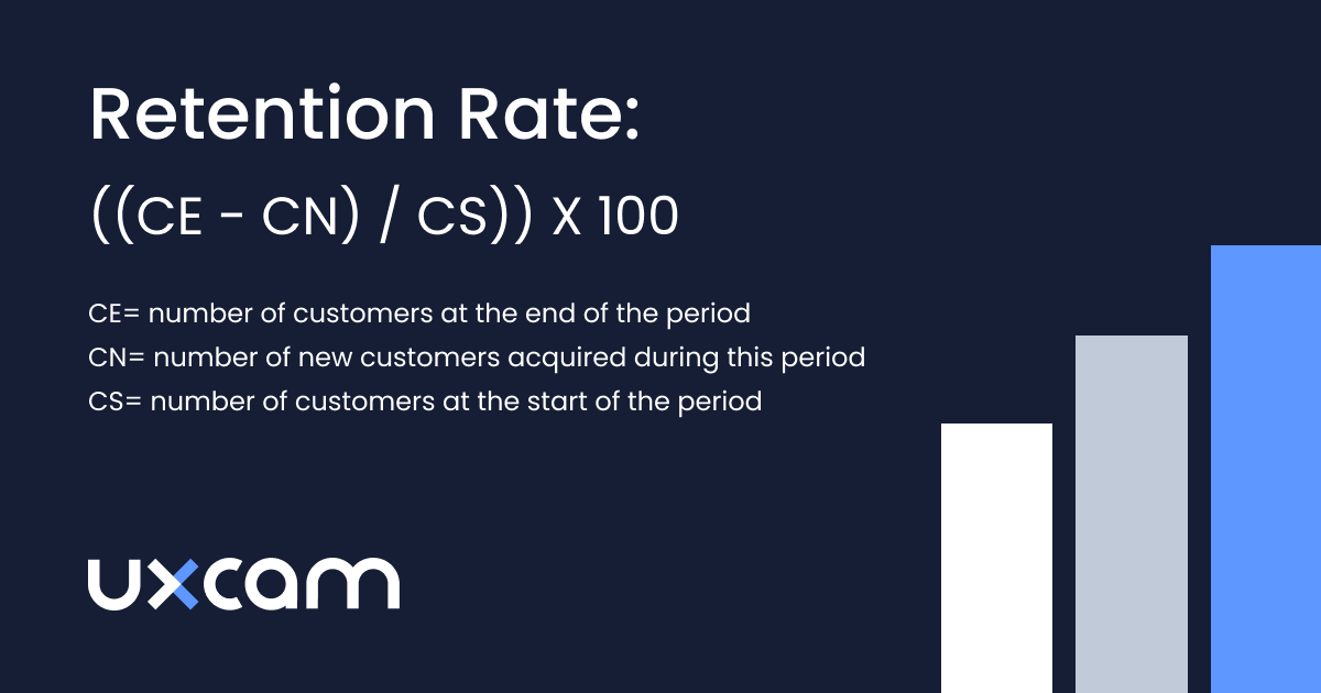
Percentage of users from a given install cohort who return after day 1, 7, 30, etc. The single most predictive metric for most mobile products. Always measured cohort-by-cohort, not aggregate. Mixpanel's benchmarks put median day-30 retention for consumer apps around 6%, and top-quartile around 20%, which gives you a rough target.
Install Trend
Daily or weekly install velocity. Spikes usually correlate with marketing campaigns, seasonal patterns, or app-store featuring events. Combine with retention data to assess install quality.
Uninstall Trend
Count of users who removed the app. Hard to measure precisely (iOS doesn't always fire an uninstall signal), but worth tracking to spot regressions after bad releases. Firebase and attribution platforms surface uninstall rate most accurately.
Registrations
Count of users who created an account. A sub-metric of install → activation funnel. Track registration rate (signups / installs) rather than absolute registrations, because absolute numbers conflate with install volume.
Subscriptions
For subscription apps, the count of paid subscribers. Pair with subscription conversion rate (paid / trial users) and subscription retention (renewal rate). RevenueCat's State of Subscription Apps report publishes category benchmarks you can use to calibrate.
Crashes


Count and rate of unhandled exceptions. Track crash-free user rate (target >99%) and crash-free session rate (target >99.5%). Use Firebase Crashlytics, Sentry, or Bugsnag.
Upgrades
Percentage of users running the latest version of your app. Slow upgrade adoption is a signal that your update prompts aren't working or that users are hitting paid Wi-Fi limits.
Net Promoter Score (NPS)
"How likely are you to recommend this app?" on a 0-10 scale (see the original NPS framework). A 30 is considered good, 50 is great. Useful directionally, less useful for diagnosing specific issues. Always pair with open-ended feedback.
App engagement metrics


Sessions
Count of user sessions over time. A session starts when the user opens the app and ends after a defined period of inactivity (usually 30 minutes).
Session Length
Average duration of a session. Longer isn't always better (a user stuck on a confusing screen has a long session too). Pair with task completion rate.
Session Interval
Time between sessions for a given user. Shorter intervals mean higher habit formation. Useful for comparing cohorts.
Session Depth
Average number of screens or actions per session. Tells you whether users are engaging deeply or bouncing quickly.
Average Screens Per Visit
Similar to session depth but measured specifically in screen views. A proxy for how much of the app users actually explore.
Daily Active Users (DAU)
Unique users active in a single day. Covered in detail in the mobile app engagement guide.
Monthly Active Users (MAU)
Unique users active in a 30-day window. Most useful paired with DAU as a ratio (DAU/MAU is the classic "stickiness" measure).
Social Shares
Count of times users shared something from your app. Strong signal of real value for content-driven apps. Irrelevant for most utility apps.
Brand Awareness
Usually measured via survey (unaided and aided recall). Soft metric. Useful for large consumer brands, distraction for most product teams.
Churn Rate


Percentage of users who stopped using your app in a given window. Inverse of retention. Measure as the complement of cohort retention, not an aggregate.
Revenue-focused mobile KPIs


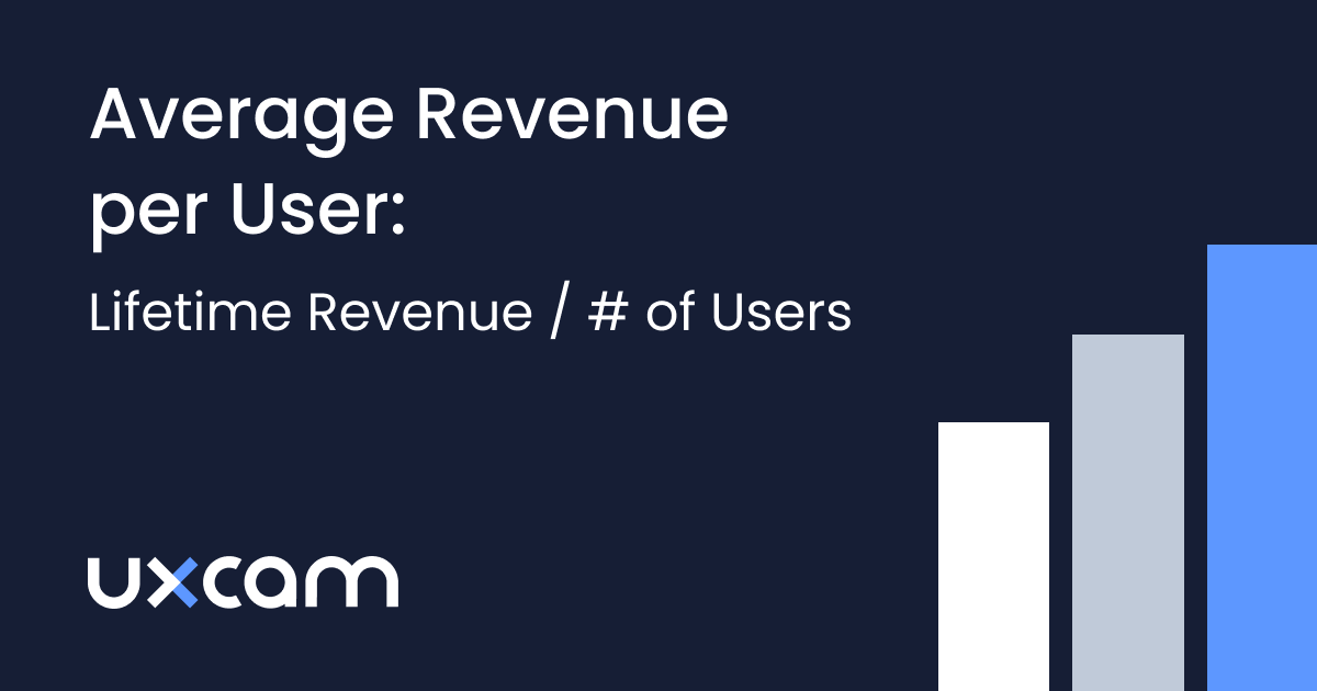
Average Revenue Per User (ARPU)
Total revenue / total users over a period. The simplest monetization metric.
Lifetime Value (LTV)
Projected total revenue from a user over the lifetime of their relationship with the app. Usually calculated as ARPU × average customer lifespan.
Time To First Purchase
Days or sessions between install and first paid conversion. A leading indicator of LTV. Apps that get users to first purchase in under 3 days tend to have much higher LTVs than apps where time-to-first-purchase is longer.
Purchases
Count of paid transactions. Track purchase frequency (purchases per paying user per period) alongside absolute purchase count.
Customer Acquisition Cost (CAC)
Total acquisition spend / new users acquired. Blend paid and organic for a fair picture, or split them by channel.
Cost Per Acquisition (CPA)
Usually interchangeable with CAC in practice. Some teams use CPA for paid-channel-only, CAC as the blended number across paid and organic.
Customer Lifetime Value (CLV)
Same as LTV in most usage. LTV:CAC ratio above 3:1 is the standard benchmark for profitable growth.
eCAC (Effective Customer Acquisition Cost)
CAC adjusted for lifetime retention. More predictive than raw CAC for subscription apps.
eCPM (Effective Cost Per Mille)
Ad-revenue metric: revenue per 1000 ad impressions. Mostly relevant for ad-supported apps.
Paid Conversion Rate
Percentage of free users converting to paid. For freemium and trial apps, this is the central revenue metric.
Organic Conversion Rate
Conversion rate among organic installs (non-paid). Usually higher than paid conversion; tells you whether your product markets itself.
Return On Investment (ROI)
Revenue generated / cost spent. Useful at the campaign level. Misleading if used as a single top-line number for the whole business.
Cost Per Install (CPI)
Paid acquisition spend / installs delivered. Pair with install-to-active conversion to avoid optimizing for low-quality installs.
User experience KPIs
Load Time
Time from app launch to fully interactive UI. Cold start target: under 2 seconds. Warm start: under 1 second.
Devices
Distribution of user devices (iPhone 15, Samsung A54, Pixel 8, etc.). Essential for understanding who your users actually are. Mid-range Android is usually where performance problems hide.
Carriers
Distribution of network carriers. Matters for apps that depend heavily on connectivity (video, calling, large file transfers).
OS
iOS vs Android split and version distribution. Affects which SDK features you can rely on and where your support matrix lives.
Screen Dimensions/Resolution
Distribution of device screen sizes. Essential for responsive design and for catching layout bugs on uncommon aspect ratios.
Permissions Granted
Percentage of users granting location, notification, camera, contacts, etc. permissions. iOS ATT opt-in rate is a particularly important subset in the post-2021 era.
API Latency
Time from request to response for your backend APIs. Latency spikes are the most common silent performance regression.
Mobile app marketing KPIs
Install Source (Attribution)
Which channel drove the install. Tools: AppsFlyer, Adjust, Singular. Post-ATT attribution is harder than it used to be, so cohort-level modeling matters more than individual attribution.
Virality and K Factor
Number of invitations each user sends × conversion rate of those invitations. K > 1 means your app is growing without paid acquisition. Rare, but when it happens it's a strong signal.
Channel Breakdown
Performance of each acquisition channel (paid social, paid search, organic search, referral, ASO, partnerships). Segment retention and ARPU by channel to find quality vs quantity trade-offs.
Geo-metrics
Performance by country or region. Retention, conversion, and engagement often differ dramatically between geographies for the same app.
Demographics
Age, gender, language. Useful for B2C apps. For behavior-driven segmentation, prefer cohorts based on what users actually do in-app over demographic groupings.
Cohort Analysis
Comparing user groups based on install date, acquisition channel, or feature behavior. The only reliable way to assess retention and LTV.
Behavioral Metrics
Events users trigger inside the app (feature used, screen visited, action completed). Your product analytics foundation. Covered in detail by Event Analytics.
App Store Optimization (ASO) KPIs
Keywords
App Store and Play Store keyword rankings. Tools: Sensor Tower, AppFollow, App Radar. Rankings drive organic install volume.
App Store Category Ranking
Your app's rank in its category charts. Category ranking at top 20 drives meaningful organic discovery; below that, the impact falls off sharply.
Views To Installs
Conversion rate from listing view to install. Affected by your screenshots, icon, title, and first-impression-critical description. The single highest-leverage ASO optimization is usually the hero screenshot.
Reviews
Count and sentiment of user reviews. Respond to negative reviews promptly (the response often affects the rating more than the review itself does).
Ratings
Average app store rating (out of 5). Apps above 4.5 stars see noticeably better category ranking and organic install conversion than apps at 4.0-4.4.
13 KPI Patterns and Pitfalls
After years of auditing mobile analytics setups, the same mistakes and the same winning patterns keep surfacing. These are the ones worth internalizing.
1. Always cohort retention by install week, not by calendar period
Aggregate retention numbers lie. If you shipped a bad release in week 3, it will poison your blended retention for months. Cohort users by install week and you can see exactly which release class had the problem. Amplitude's retention guide is the cleanest primer on this.
2. Track activation as a specific event, not "opened twice"
An activation is the first moment a user experiences your product's core value. For Recora, it was completing a first recovery session, which correlates with their 142% activation lift. For a banking app it might be adding a card. "Opened the app twice" is not activation.
3. Define a North Star metric, then instrument around it
One number that captures whether users are getting value. Spotify tracks time spent listening. Airbnb tracks nights booked. Sean Ellis popularized this framing, and it cuts through dashboard noise fast.
4. Pair every quantitative KPI with qualitative evidence
A drop in funnel conversion tells you something broke. Session replays tell you what. Inspire Fitness paired their funnel dashboard with UXCam session replays and drove a 460% activation improvement by finding the specific UI confusion behind their drop.
5. Use the DAU/MAU ratio as your stickiness proxy, but know its limits
Above 0.2 is healthy for most apps, above 0.5 is exceptional (games and messaging apps cluster here). But a news app with 0.15 DAU/MAU can be perfectly healthy. Benchmark against your category, not the industry average.
6. Separate leading from lagging indicators
LTV is lagging. Day-7 retention is leading. Revenue is lagging. Activation rate is leading. Dashboards that only show lagging metrics make you reactive. Dashboards with both let you intervene in time.
7. Watch for Goodhart's Law in every KPI
"When a measure becomes a target, it ceases to be a good measure." Optimize session length and you'll get users stuck on confusing screens. Optimize downloads and you'll get low-quality installs. The fix: always pair a volume metric with a quality metric.
8. Measure time to first meaningful action in seconds, not days
Housing.com went from 20% to 40% conversion after compressing their time-to-first-search. Read the Housing.com case study for the specifics. The playbook generalizes: find the first "aha" moment in your funnel and treat every second between install and that moment as a churn risk.
9. Segment every KPI by acquisition channel
Paid social users almost always retain worse than organic search users. If you're not segmenting by source, your blended retention number is hiding a quality problem. Singular's post-SKAN attribution guide is the current reference on doing this in the post-ATT world.
10. Put rage taps and UI freezes on the main dashboard
Most teams bury UX performance metrics in a tech-debt tab nobody reads. But rage-tap rate is one of the fastest early-warning signals for UX regressions. Costa Coffee used UXCam's issue analytics to surface a checkout friction point and lifted conversion 15%.
11. Stop celebrating MAU spikes without a retention chart next to them
A 2x MAU spike from a TikTok moment or an App Store feature is meaningless if none of those users stay. Always ship the retention curve alongside the acquisition report or you will mislead your team.
12. Instrument crashes by screen, not just globally
A 99.2% crash-free rate sounds fine until you notice the 0.8% is concentrated on your checkout screen. Sentry's screen-level crash reporting and UXCam's session replay for crashed sessions let you see exactly which flows are bleeding users.
13. Kill any dashboard metric nobody has mentioned in 30 days
If your PMs and growth leads haven't asked about a number in a month, it's not a KPI. It's furniture. Cut it. Analytics tooling bills and cognitive load scale with the number of metrics you maintain, not the number you use.
14. Review paid vs organic retention curves side by side every month
Paid cohorts typically retain 30-50% worse than organic at day 30, and if that gap widens you're either overbidding or ad creative is attracting the wrong audience. A monthly review of the two curves on the same chart catches quality erosion before media spend compounds the damage.
15. Treat permission grant rates as product KPIs, not platform quirks
Notification permission drives re-engagement. Location drives relevance for on-demand apps. ATT drives attribution fidelity. AppsFlyer's ATT benchmarks are a useful reference for where your opt-in rate should sit. If a permission grant rate drops 5 points after a release, something in your prompt or pre-prompt copy regressed.
KPI considerations by industry
The same metric definition changes meaning across verticals. A 10% day-30 retention rate is a disaster for a banking app and a triumph for a dating app. Here's how the priorities shift.
Fintech and banking
Retention targets run high (40-60% at day 30 is achievable for primary banking apps) because users have strong switching costs. Focus on activation velocity (time to first transaction), crash-free user rate (trust breaks fast when money is involved), and permission grant rates (especially biometric auth). Fraud-related churn is a distinct category worth separating from natural churn. Regulatory friction (KYC, document upload) is usually the biggest activation drop-off, and it's worth measuring as its own funnel.
E-commerce and retail
Conversion rate at cart and checkout is the central KPI. Average order value (AOV), repeat purchase rate, and time to second purchase matter more than session length. Heatmaps on product detail pages are high-leverage, because a confusing CTA on a PDP costs real money per visitor. Session intervals tend to be long (weekly or monthly), so DAU/MAU ratio is a weaker signal than in daily-habit apps. Baymard Institute's checkout research consistently puts mobile checkout abandonment around 70%, which sets a realistic benchmark.
Health, fitness, and wellness
Streak metrics, weekly active users, and activation completion (first workout logged, first meal tracked) dominate. Subscription conversion and trial-to-paid rates are the monetization levers. Inspire Fitness's 460% activation lift came from getting users to their first guided session faster. Pay close attention to the first-week drop-off, which is almost always where wellness apps hemorrhage users. January cohorts in fitness apps behave very differently from May cohorts, so seasonal cohort analysis is mandatory, not optional.
Media and content
DAU, session depth, and time spent are the meaningful KPIs. Social shares matter here in a way they don't elsewhere. eCPM and ad fill rate drive revenue for ad-supported models; subscription conversion drives it for paid ones. The tension between session length and content quality is real: pair time spent with subjective content ratings so you don't optimize toward doomscrolling.
SaaS and B2B mobile
Weekly active users often beats DAU as the cadence metric, because B2B usage patterns are workweek-shaped. Feature adoption rate per account, seat activation rate, and time to team activation (multiple users active within a company) are the KPIs that predict expansion revenue. Churn is measured at the account level, not the user level.
Travel and on-demand
Conversion rate from search to booking, search-to-book time, and booking-to-review loop completion are the core KPIs. Geographic segmentation is essential (a travel app performs radically differently in different countries). Session intervals are long and seasonal, so cohort analysis by travel season matters more than rolling averages. For on-demand categories like food delivery and rideshare, time-to-first-order after install is the single best predictor of six-month LTV.
Mobile KPI tools by category
Pick one tool per category. Stitching more than that together wastes engineering time and introduces reconciliation headaches.
Product and behavioral analytics. UXCam for product intelligence with session replay, heatmaps, and funnels on one data layer for mobile apps and web. Mixpanel and Amplitude for event-based quantitative analytics. Heap for autocapture-first analytics. PostHog for open-source teams.
Crash and performance monitoring. Firebase Crashlytics is the free default. Sentry and Bugsnag add better release-health dashboards and alerting. Instabug bundles crash reporting with in-app bug reports.
Attribution and marketing analytics. AppsFlyer, Adjust, Singular, Branch, and Kochava are the main options. AppsFlyer has the biggest market share; Singular has the strongest post-ATT modeling.
ASO and app store intelligence. Sensor Tower, data.ai (formerly App Annie), AppFollow, and App Radar for keyword tracking and competitive intelligence. Asodesk is a lighter-weight option.
Qualitative and user feedback. UserTesting and Maze for moderated and unmoderated research. Survicate and Delighted for in-app NPS. UXCam's session replay covers the "watch what users actually did" layer.
Revenue and subscription analytics. RevenueCat is the dominant subscription infrastructure, with strong built-in analytics. Qonversion and Adapty are alternatives. ProfitWell (now Paddle Metrics) for subscription revenue analysis.
A/B testing and experimentation. Statsig, LaunchDarkly, and Optimizely are the major players for feature flagging and experiment analysis. Firebase Remote Config covers basic experimentation needs for teams already in the Google stack.
10 mistakes teams make with mobile app KPIs
1. Tracking everything the SDK offers by default
Every autocaptured event is technical debt. Define your event schema intentionally and cut the rest.
2. Reporting aggregate retention instead of cohort retention
A single "retention: 22%" number tells you almost nothing. Always cohort by install week.
3. Celebrating MAU growth without checking DAU/MAU
MAU grows easily with acquisition spend. Stickiness is what tells you the product is working.
4. Using app store ratings as a product KPI
Ratings lag product reality by weeks and are skewed by review-prompting logic. Useful for ASO, not for product decisions.
5. Optimizing session length as if longer always means better
A long session can mean deep engagement or deep confusion. Always pair with task completion rate.
6. Ignoring the post-ATT attribution reality
iOS attribution is probabilistic now. Teams still running campaign-level ROI reports on deterministic attribution are fooling themselves. Move to incrementality testing and cohort-level modeling.
7. Setting KPI targets without a counterbalancing metric
Every KPI target should have a guardrail. Conversion rate up, but refund rate holding steady. DAU up, but crash rate not rising.
8. Treating NPS as a diagnostic tool
NPS tells you directional sentiment. It does not tell you why. Always pair the score with open-ended feedback and session replay.
9. Not segmenting KPIs by platform
iOS and Android users behave differently, convert differently, and retain differently. A blended number hides both stories.
10. Measuring what's easy instead of what's useful
The easiest metrics to instrument are usually screen views and button taps. The most useful are multi-step funnels and cohort retention curves. Invest in the hard ones.
KPI Program Maturity Model
Most teams I audit are somewhere between Level 1 and Level 2 but think they're at Level 4. Here's the honest progression.
Level 1: SDK installed, default dashboard. You have Firebase or equivalent running. You can see downloads, DAU, and crashes. There's no cohort analysis, no custom events, and no funnel work. Useful for existence proof, not for decisions.
Level 2: Custom events and funnels. You've instrumented your signup, activation, and purchase flows as named events. You have conversion funnels for each. You can answer "where are users dropping off" but not "why." This is where most teams live.
Level 3: Cohort retention and segmentation. Every metric can be sliced by install cohort, acquisition source, platform, and user segment. You run weekly retention reviews. You've defined a North Star metric and an activation event. You know your LTV:CAC ratio by channel.
Level 4: Quantitative plus qualitative on one platform. Every number on your dashboard links to the underlying sessions. When conversion drops, you watch 20 replays within an hour and find the cause. Rage-tap and UI-freeze rates are top-level KPIs. This is where UXCam customers like Inspire Fitness and Housing.com operate, and it's where step-change improvements (460% activation, doubled conversion) come from.
Level 5: AI-assisted analysis and proactive anomaly detection. An AI layer watches your KPIs continuously, flags anomalies before you notice them, and explains the user behavior behind each change. Tara reads session replays at scale and surfaces the specific UX issues driving metric shifts. This is the frontier, and the teams getting here early are compounding the advantage.
The practical path: pick the level above where you actually are, build the missing capability, and don't jump two levels at once. Most "advanced analytics" initiatives fail because the underlying instrumentation at Level 2 was never clean. A useful self-test is whether you can produce a cohort retention curve segmented by acquisition channel in under 10 minutes. If that takes a day and a data engineer, you're still at Level 2 regardless of what the vendor contract says.
How to choose the right mobile app KPIs
Three questions for every metric you consider tracking:
What decision will this metric inform? If you can't name a specific decision, don't track it.
Who owns the decision? If the metric isn't the responsibility of a specific person, it won't be acted on.
How often will it be reviewed? Metrics nobody looks at are dead weight on your analytics bill.
Tools that help you track the right KPIs: UXCam for product + behavioral analytics in one platform, Mixpanel and Amplitude for quantitative-only, Firebase Analytics for free baseline tracking, and your attribution platform (AppsFlyer, Adjust) for acquisition metrics.
From dashboards to AI: where KPI work is heading
The dashboard era of KPIs is ending. Not because dashboards are wrong, but because they have always answered "what happened" without answering "why" or "what to do next." The teams shipping fixes fastest in 2026 are the ones that pair their KPI dashboards with an AI session analyst sitting on top of the underlying behavioral data.
Tara inside UXCam is that analyst layer. When activation drops three points, Tara does not just flag the metric; it watches the sessions, clusters the friction, and recommends the specific UX changes most likely to recover the number. The KPI review meeting changes shape. Half the time previously spent debating what the dashboard shows now goes to deciding which of Tara's top three flagged issues is worth this sprint.
The shift is most useful for teams operating across both mobile and web. KPI definitions diverge sharply between the two (cold start versus TTFB, in-app session length versus page time, deep-link conversion versus URL conversion) and reconciling them by hand is where most cross-platform measurement programs quietly die. A single AI layer reading both surfaces produces a unified prioritization queue without forcing the team to translate between two metrics languages.
If your KPI work still ends with a Slack message saying "the number moved, somebody investigate", the next move is connecting your replay data to your dashboard and layering AI on top. That is the shape of KPI work going forward, and the teams that adopt it earliest tend to compound the fastest.
Track the right mobile app KPIs with UXCam
UXCam is a product intelligence and product analytics platform that automatically captures every user interaction on mobile apps and websites, with no manual event tagging. Funnels, retention cohorts, segmentation, session replay, and heatmaps all point at the same underlying data. Every KPI in your dashboard is backed by real user sessions: see a number move, click into the sessions that explain why.
Tara, UXCam's AI analyst, watches sessions at scale and surfaces the UX issues that are driving metric changes, recommending specific actions so teams get answers without waiting on analysts.
Installed in 37,000+ products, working across mobile apps and the web. Request a demo to see it for your app.
Frequently asked questions
What are mobile app KPIs?
Mobile app KPIs (key performance indicators) are the quantitative measurements used to evaluate how a mobile app is performing against business and user goals. They span six categories: general app health (retention, crashes), engagement (DAU, session length), revenue (ARPU, LTV), user experience (load time, rage taps), marketing (CAC, attribution), and app store optimization (ratings, keyword rankings). Tracking the right 10 matters more than tracking 50.
What's the difference between a mobile app metric and a KPI?
A metric is anything you measure. A KPI is a metric you've decided drives a business decision. Every KPI is a metric, but not every metric is a KPI. A team with 100 metrics and 10 KPIs is usually better off than a team with 100 metrics and no clear priorities.
Which mobile app KPIs matter most for retention?
Day-1, day-7, and day-30 retention by install cohort. Paired with time to first meaningful action (activation speed) and DAU/MAU ratio. These three metrics together describe the retention curve and its most predictive cause.
How do I calculate LTV for a mobile app?
LTV = ARPU × average customer lifespan. A subscription app with $10/month ARPU and an average lifespan of 14 months has an LTV of $140. For non-subscription apps, calculate revenue per user cohort over a fixed window (6 or 12 months) rather than projecting lifetime.
What's a good conversion rate for a mobile app?
Depends on what you're converting. Install-to-active conversion: 25-40% is healthy. Trial-to-paid conversion: 3-7% is typical for freemium, 10-20% for strong products. App-store listing view to install: 20-30%. Check your numbers by channel, not in aggregate, because paid channels usually convert worse than organic.
How many mobile app KPIs should I track?
10 core KPIs on your primary dashboard. Another 10-20 for specific diagnostic work when something moves. Beyond that, you're building a data graveyard. If nobody has looked at a metric in 30 days, remove it from the dashboard.
What's the most important mobile app KPI?
Day-30 retention by install cohort. It's the single most predictive metric for long-term business outcomes, because it reflects both acquisition quality and product-market fit. Every other metric either follows from retention or explains why retention is what it is.
How often should I review mobile app KPIs?
Weekly for core KPIs (retention, activation, conversion, crash rate), monthly for revenue and LTV trends, quarterly for strategic metrics like market share and NPS. Daily dashboards invite overreaction to noise. If a metric is noisy enough that weekly review misses important changes, rethink the metric, not the cadence.
How do I set realistic KPI targets for a new app?
Benchmark against your category using Mixpanel's Product Benchmarks or AppsFlyer's performance index, then set a target at the 50th to 75th percentile of your category for the first year. Quarter-over-quarter improvement matters more than hitting absolute benchmarks early.
What's the difference between DAU/MAU and stickiness?
They're the same ratio, expressed differently. DAU/MAU gives you a decimal (0.2, 0.4) and stickiness is often expressed as a percentage of that ratio. 0.2 is healthy for most apps, 0.5 is exceptional. What matters more is the trend over time for your own app, not the absolute number.
How should I measure KPIs across mobile and web?
Use one platform that captures both on the same data layer, so cross-device user journeys stay intact. UXCam, Amplitude, and Mixpanel all support this. If you use separate tools for mobile and web, you'll spend most of your time reconciling user IDs instead of analyzing behavior.
Do KPIs need to change as my app matures?
Yes. Early-stage apps should obsess over activation and day-7 retention because they indicate whether the product is working at all. Growth-stage apps shift focus to LTV:CAC and expansion metrics. Mature apps care about ARPU expansion, churn reduction, and category dominance signals like share of category time spent.
How does Tara change how I work with KPIs?
Traditional dashboards show you numbers. Tara watches the sessions behind the numbers and tells you what users are actually doing to cause the changes. When activation drops 5%, Tara surfaces the three specific UX issues driving it and recommends actions. That cuts the time from "metric moved" to "we know why and what to do" from days to minutes.
Are vanity metrics always bad?
No. Downloads, MAU, and registrations are legitimate inputs for investors, marketing forecasts, and quarterly reports. They become vanity metrics only when they're treated as outcomes rather than inputs. Pair every vanity metric with a quality metric and they stop being vanity.
What's the single fastest win for a team drowning in metrics?
Delete half your dashboard. Keep only the KPIs tied to a named decision and a named owner. The ones you kept will get more attention, and the ones you cut won't be missed. I have never seen a team regret this exercise.
AUTHOR
Silvanus Alt, PhD
Founder & CEO | UXCam
Silvanus Alt, PhD, is the Co-Founder & CEO of UXCam and a expert in AI-powered product intelligence. Trained at the Max Planck Institute for the Physics of Complex Systems, he built Tara, the AI Product Analyst that not only analyzes user behavior but recommends clear next steps for better products.


TABLE OF CONTENTS
- Key takeaways
- The 10 KPIs that matter most
- What are mobile app KPIs?
- General mobile app KPIs
- App engagement metrics
- Revenue mobile KPIs
- User experience KPIs
- Mobile app marketing KPIs
- App Store Optimization (ASO) KPIs
- 13 KPI Patterns and Pitfalls
- KPIs by industry
- Mobile KPI tools by category
- 10 mistakes teams make with mobile app KPIs
- KPI Program Maturity Model
- How to choose the right mobile app KPIs
- Tracking KPIs with AI
- Track the right mobile app KPIs with UXCam


Related articles


Conversion Analysis
React Native Crash Reporting + Best Tools and Techniques
Learn how to improve your mobile app's stability with effective React Native crash reporting. Explore the top techniques and tools for monitoring and managing...


Tope Longe
Product Analytics Expert


Conversion Analysis
Flutter Performance Monitoring - Best Tools and Techniques
In this article, we'll introduce you to the top Flutter performance monitoring tools and demonstrate how UXCam can help you monitor your app's performance with...
Tope Longe
Product Analytics Expert


Conversion Analysis
How to measure, analyze, and reduce app churn
All the user acquisition in the world won't matter if you've got a high churn rate on your app. If you want to know why users are uninstalling or unsubscribing, tools like screen flow, heatmaps, and screen recordings can get users loving — instead of leaving your...
Tope Longe
Product Analytics Expert