12 Mobile App Analytics Metrics That Actually Matter in 2026
TABLE OF CONTENTS
- Key takeaways
- The 12 most important mobile app analytics metrics
- The core 12 metrics
- Expanded metrics catalog by category
- How to pick 5-8 KPIs for your product stage
- Benchmarks by industry
- Metric anti-patterns to avoid
- How to build a metrics dashboard that gets read
- Analytics tools by metric category
- The metrics maturity model
- Mobile-specific instrumentation pitfalls
- Common mistakes in mobile app analytics
- Track the Right Metrics with UXCam
Mobile app analytics metrics are the quantitative signals product and marketing teams use to measure how a mobile app is performing against business and user goals. The full list across every analytics platform runs past 50 metrics, and most of them are either duplicates or vanity. The ones below are the ones I actually track and recommend, ranked by how reliably they inform product decisions.
I've worked with dozens of mobile teams on their analytics setups, and the pattern is consistent: the teams that ship faster and make better decisions track fewer metrics but review them more often. The teams with overloaded dashboards rarely act on any of the numbers. This guide covers the metrics worth tracking, how to calculate them, the reference ranges and industry benchmarks I rely on, and the common mistakes I see in how teams use each one.
Key takeaways
Track 12 metrics well, not 50 metrics poorly. Dashboard bloat is the enemy of action.
Day-30 retention by install cohort is the single most predictive metric for long-term mobile app success. Every other metric either follows from retention or explains why retention is what it is.
Vanity metrics (downloads, registrations, raw MAU) are easy to move but don't reliably predict business outcomes. Pair acquisition metrics with quality metrics.
Qualitative signals (rage taps, UI freezes, session replay observations) matter alongside the quantitative metrics. Numbers tell you something moved; replays tell you why.
The 12 most important mobile app analytics metrics
Day-1, day-7, day-30 retention rate (by install cohort)
Active users (DAU, WAU, MAU)
DAU/MAU ratio
Conversion rate at each funnel step
Average revenue per user (ARPU)
Lifetime value (LTV)
Customer acquisition cost (CAC) and LTV:CAC ratio
Crash-free user rate
Rage-tap and UI-freeze rate
Average session length
Time to first meaningful action (activation speed)
App Store rating and review volume trend
Beyond the core 12, the rest of this guide covers another 15+ metrics grouped by category, plus benchmarks by industry, a selection framework, a maturity model, and mobile-specific instrumentation pitfalls.
The core 12 metrics
1. Retention rate (day-1, day-7, day-30)
Retention is the single most important mobile app metric, and I calculate it cohort by cohort: the share of users from a given install cohort who are still active on day N, expressed as a percentage. Tracking it cohort by cohort rather than as an aggregate is non-negotiable, because otherwise growth in new installs can mask retention decline for months. Retention drives almost everything downstream, including revenue, word of mouth, and acquisition payback period.
A strong performer usually lands around 30-40% on day 1, 10-15% on day 7, and 5-8% on day 30, though category effects are huge. The pitfalls I see most often are aggregating cohorts when install volume is growing (which hides a declining trend), defining "active" as a raw app open (which inflates the number), and ignoring seasonal cohort effects. A Black Friday install cohort behaves nothing like a February cohort, and averaging them together teaches you nothing.
UXCam captures retention natively, as do Amplitude, Mixpanel, and Firebase. Category-specific ranges differ significantly; see the mobile app retention benchmarks guide and AppsFlyer's State of App Marketing for full breakdowns.
2. Active users (DAU, WAU, MAU)


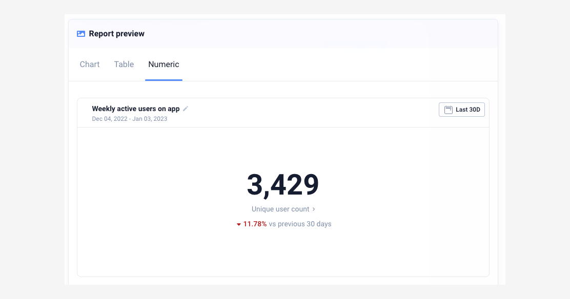
DAU, WAU, and MAU count the unique users who performed a qualifying action in a day, a rolling 7-day window, or a rolling 30-day window respectively. The critical detail is how you define "active." A meaningful action (logged a workout, sent a message, completed a task) gives you a number that reflects real engagement. Counting opens inflates it without telling you anything useful.
Three traps to watch for: double-counting users across iOS and Android when your ID strategy isn't unified, counting iOS background pings as activity, and forgetting to exclude internal and QA users. UXCam, Firebase, Mixpanel, and Amplitude all handle the counting well once you've defined the qualifying action properly.
3. DAU/MAU ratio
DAU divided by MAU, times 100, is what the industry calls "stickiness." It tells you what share of your monthly users return daily, which is a decent proxy for habit formation. High ratios mean habit-forming usage; low ratios mean sporadic usage.
Reference ranges vary sharply by category. Drawing on data.ai State of Mobile and AppsFlyer benchmarks, social apps run 50%+, productivity 25-35%, ecommerce 10-20%, and fintech 15-25%. The important thing is that stickiness isn't a goal for every app. Tax filing and travel apps are supposed to be used infrequently, and judging them against a social benchmark will send you optimizing for the wrong outcome.
4. Funnel conversion rate
Funnel conversion is simply the share of users who reached step N that also completed step N+1, measured at each step of critical flows like signup, checkout, onboarding, and upgrade. For most product teams this is the highest-leverage metric on the list, because funnel drop-off points at the exact friction to fix. UXCam Funnel Analytics surfaces this automatically with session replays attached to each drop-off, which is what turns a number into a fix.
The customer numbers here are unusually clear. Recora used funnel analytics combined with session replay to improve conversion 142%. Inspire Fitness used the same approach to grow onboarding conversion 460%. Housing.com pushed signup conversion from 20% to 40%. Costa Coffee found a 15% lift after fixing a checkout step surfaced by funnel drop-off analysis. The one pitfall worth flagging: if you define funnel steps inconsistently across platforms, iOS and Android numbers can't be compared, and you'll waste months arguing about a measurement artifact.
5. Average revenue per user (ARPU)


ARPU is total revenue in a period divided by total users in the same period, and it's the simplest monetization metric on the list. Aggregate ARPU hides important differences between user groups, so I always segment by acquisition source and cohort before drawing any conclusions.
ARPPU (average revenue per paying user) is the close cousin: strip out the free users and you see how much your monetizing segment is actually worth. For freemium apps both numbers matter, because ARPU tells you about the whole base and ARPPU tells you whether the paying behavior itself is healthy.
6. Lifetime value (LTV)
LTV is ARPU multiplied by average customer lifespan, expressed in the same period unit, and it projects the total revenue from a user over their relationship with the app. It's essential for calculating acquisition cost efficiency through the LTV:CAC ratio.
The pitfall with LTV is that early-stage apps tend to over-project it because they haven't observed enough user lifespan to know the real curve. Predictive LTV from a tool like Adjust or AppsFlyer can help, but use it with caution and always report the confidence window alongside the point estimate.
7. Customer acquisition cost (CAC) and LTV:CAC ratio
CAC is total acquisition spend in a period divided by new users acquired in the same period. LTV:CAC is just LTV divided by CAC. The industry benchmark for sustainable growth is LTV:CAC above 3:1. Below 1:1 means every acquired user costs more than they return, and the range between 1:1 and 3:1 usually signals a leaky retention or monetization problem that paid acquisition alone can't fix.
The common mistake is counting only paid CAC and ignoring the organic acquisition cost that comes from content, ASO effort, and referral programs. That makes blended CAC look artificially low and misleads the whole growth conversation.
8. Crash-free user rate
The crash-free user rate is the share of users who did not experience a crash in the period, and I target above 99% daily. Crash-free sessions are worth tracking separately at a higher bar of 99.5%+. The reason this directly affects retention: one crash in a user's first session multiplies their churn rate by about 3x.
For tooling, Firebase Crashlytics, Sentry, Bugsnag, and Instabug all handle the reporting well. UXCam Issue Analytics adds the session replay leading into the crash, which is the difference between a stack trace and a reproducible bug.
9. Rage-tap and UI-freeze rate


Rage taps (4+ taps in a second on the same UI element) and UI freezes (the app stops responding to input for 2+ seconds) are the qualitative-turned-quantitative signals I rely on to diagnose friction. UXCam's Issue Analytics surfaces both automatically and ranks by business impact. A rage-tap cluster on a specific button is one of the fastest diagnostic leads you'll find.
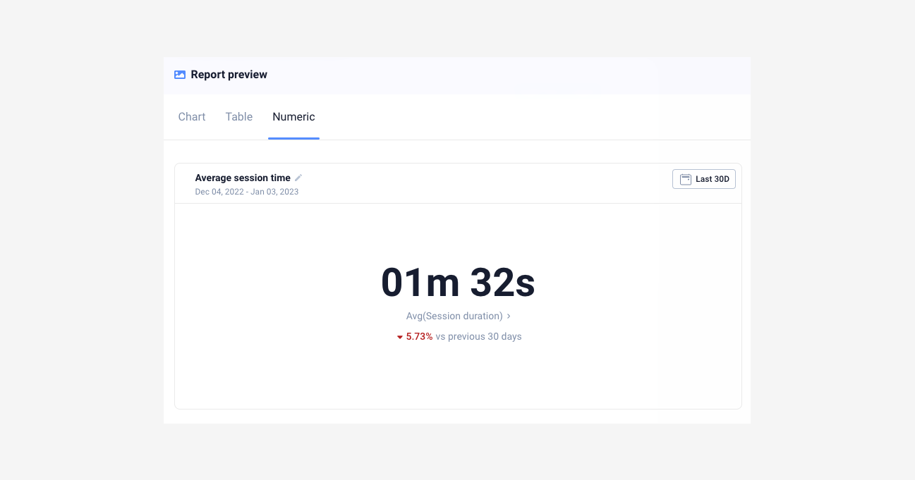
10. Average session length
Session length is total session time divided by total session count. The trick is narrowing it to the span between the first meaningful in-app action and the last, so you're measuring engaged users rather than people who opened the app and got distracted. Longer isn't always better either: a user stuck on a confusing screen has a long session too, so I always pair this with task completion rate before drawing conclusions.
11. Time to first meaningful action (activation speed)
This is the median time from app open to a defined activation event, where the activation event is the single in-app action that best predicts day-30 retention (logged a workout, created a playlist, completed the first task). Users who hit it in under 60 seconds of session one retain at dramatically higher rates than users who don't, which is why shaving seconds off the first-session experience is usually one of the highest-return investments a mobile team can make.
12. App Store rating and review volume
Two numbers matter here: the weighted average of user ratings out of 5 stars, and how many new reviews you're receiving per week.


Apps rated above 4.5 stars have noticeably higher category rankings and organic install conversion than apps at 4.0-4.4. Review volume trending up means your app has recent engagement worth talking about, which is a real growth signal. AppFollow, Sensor Tower, and data.ai all track this reliably.
Expanded metrics catalog by category
The core 12 cover most teams' needs, but depending on your stage and category, the metrics below belong in the conversation.
Acquisition metrics
13. Install conversion rate
Install conversion is installs divided by store page views, and it measures how well your store listing converts visitors into users. Low conversion typically points at screenshots, description, icon, or rating problems. Both Google Play Console and App Store Connect report this natively, and a healthy range is 25-35% on the App Store versus 15-25% on Google Play (Play counts more lower-intent page views, which depresses the number).
14. Organic vs paid install mix
This is organic installs divided by total installs, as a percentage. A high organic share usually indicates product-market fit and efficient growth. When paid share grows faster than organic, acquisition is subsidizing weak word of mouth, and that's a warning sign worth taking seriously. AppsFlyer, Adjust, Branch, and Singular all report the split.
One caveat: iOS 14.5+ ATT changes made paid attribution noisier, so organic-vs-paid splits from before and after the change aren't directly comparable. Don't trend across that boundary without annotating the break.
15. Cost per install (CPI) by channel
CPI is channel spend divided by channel installs. It's useful for comparing channels, but misleading in isolation: a $2 CPI channel that retains at 2% is worse than a $6 CPI channel that retains at 12%. Always pair CPI with cohort retention or predictive LTV by channel before making budget decisions. Current AppsFlyer CPI benchmarks put global average CPI at roughly $1.50-5 depending on category and geo.
Activation metrics
16. Activation rate
Activation rate is the share of new users who completed the activation event. Activation is the action that best predicts retention, and finding yours means correlating first-session actions with day-30 retention and picking the strongest signal. For Facebook it was historically "7 friends in 10 days." For a workout app, logging the first workout. Ranges vary widely, but as a rule of thumb, doubling activation rate usually doubles day-30 retention.
17. Onboarding completion rate
Onboarding completion is the share of users who finished onboarding out of those who started. It's worth measuring separately from activation because onboarding is usually the first place users churn. Long onboardings with more than 5 steps typically lose 15-25% per step, which compounds fast.
Engagement metrics
18. Screens per session
Total screen views divided by total sessions. High screen counts can mean engagement or confusion, so use this with session replay to interpret. Navigation loops and backtracking show up in screens-per-session before they show up anywhere else.
19. Session frequency
Sessions per user per week, which tells you how much habit formation has taken hold. For a daily-use app, target 5+ sessions per week per active user. For weekly-use categories, 1-2 sessions per week is essentially the ceiling.
20. Feature adoption rate
Feature adoption is the share of active users who used a specific feature in the period. It's critical after shipping a new feature: if adoption stalls below 20% at week 4, the feature is either poorly discovered or solving a problem users don't have. UXCam Heatmaps show whether the entry point is being seen at all, which usually separates the two failure modes.
Retention and churn metrics
21. Churn rate
Churn is the inverse of retention, typically reported monthly for subscription apps and calculated as the drop in users over a period divided by users at the start. Healthy SaaS mobile churn sits at 3-5% monthly; consumer subscription apps typically run 5-10%.
22. Resurrection rate
Resurrection rate is the share of previously dormant users (usually defined as no session in 30+ days) who returned during a period. A healthy resurrection rate on top of strong retention is a sign of brand recall or effective win-back campaigns.
23. Stickiness trend (not just point-in-time DAU/MAU)
Rather than staring at a single DAU/MAU number, plot it weekly over 12 weeks. A declining trend is a leading indicator for churn 30-60 days later, which is plenty of time to intervene if you're watching for it.
Monetization metrics
24. Trial-to-paid conversion rate
Users who converted to paid divided by trial starts, as a percentage. For subscription apps, this is the single most important monetization metric. RevenueCat's 2024 State of Subscription Apps reports median trial-to-paid conversion at 28-32% for productivity and 40%+ for health and fitness.
25. Subscription renewal rate
Subscribers who renewed divided by subscribers due to renew. Annual plans typically renew at 50-60%; monthly plans at 80-90% each cycle, but compound churn on monthly is higher over a year.
26. Paying user rate
Paying users divided by active users. Freemium benchmarks: 2-5% is typical, 5-10% is strong, and above 10% is exceptional.
Performance and quality metrics
27. App launch time (cold start / warm start)
Median time from app tap to first interactive frame. Target under 2 seconds cold start and under 1 second warm start. Google's Android Vitals flags apps as "slow" above 5 seconds cold start, which hurts Play Store ranking directly.
28. API response time (p50, p95, p99)
Always measure percentiles, not averages. A 200ms average hides the 2 second p99 that's making 1% of sessions miserable, and those users churn at exceptional rates. New Relic, Datadog RUM, and Sentry Performance all report percentiles properly.
29. ANR rate (Android application not responding)
ANR events divided by sessions, as a percentage. Target below 0.47% per Google Play's "bad behavior" threshold. Cross it and Play Store rankings suffer immediately.
Product health metrics
30. NPS and in-app CSAT
In-app micro-surveys triggered after a completed task work best, and pairing them with session replay lets you see what happened before a detractor score gave their rating. Tools I've used here include Delighted, Qualaroo, and SurveyMonkey.
31. Support ticket rate per 1,000 sessions
Support tickets divided by sessions per thousand. A rising ticket rate after a release is the fastest signal that something broke for real users, often before it shows up in crash reporting at all.
How to pick 5-8 KPIs for your product stage
Not every metric above applies at every stage. Picking the wrong ones wastes engineering time and, worse, focuses the team on the wrong decisions.
The North Star metric
Your North Star is the single metric that best captures the core value your product delivers to users. Spotify's is time spent listening. Airbnb's is nights booked. Your activation event candidate from metric 11 is usually the closest input to it, and everything else is either an input metric (leading indicator) or a diagnostic metric (explains why the North Star moved). This framing comes from Sean Ellis' original North Star work and the Amplitude North Star playbook.
Pre-launch (beta, closed testing)
Focus on qualitative signals and technical stability. The metrics that matter are crash-free rate, ANR rate, onboarding completion, support ticket rate, and session replays reviewed per week. Retention curves aren't useful yet because the cohorts are too small.
0 to 1 (first 12 months post-launch)
You're hunting product-market fit. Track day-7 and day-30 retention by cohort, activation rate, time to first meaningful action, and NPS. Do not optimize CAC yet: if retention is weak, paid acquisition is pouring water into a sieve.
Growth stage
Retention is stable, now you scale efficiently. Watch LTV:CAC, organic/paid mix, funnel conversion at each step, DAU/MAU ratio, and feature adoption for key launches.
Scale stage
You're optimizing unit economics and defending retention. The relevant metrics are cohort retention by segment and channel, ARPPU, subscription renewal rate, resurrection rate, and p95 latency.
Maturity
Defending against churn and finding new growth loops. Track churn rate by segment, feature adoption decay, NPS by cohort, support ticket rate per 1,000 sessions, and win-back conversion.
Benchmarks by industry
Absolute benchmarks are dangerous in isolation, but they tell you if you're playing a different game than the category leaders.
Fintech
Drawing on AppsFlyer fintech benchmarks and Adjust's mobile app trends, day-30 retention typically lands at 10-15%, DAU/MAU at 15-25%, and average CPI at $4-8 in developed markets. The crash-free rate bar is unusually high (99.8%+) because trust is part of the product.
E-commerce
Per data.ai State of Mobile and the CleverTap e-commerce report, day-30 retention sits at 3-6%, cart-to-checkout conversion at 35-50%, checkout-to-purchase at 50-65%, and session length at 2-4 minutes.
Social and messaging
Per data.ai and Statista mobile app data, expect day-30 retention of 15-25%, DAU/MAU of 50%+, and 8-15 sessions per day for top performers.
Gaming
Per GameAnalytics benchmarks, day-1 retention runs 35-40% for hyper-casual and 40-50% for mid-core. Day-30 retention is 3-8% hyper-casual, 8-15% mid-core. ARPDAU is $0.05-0.15 for hyper-casual and $0.50+ for mid-core.
News and media
Per Adjust benchmarks, day-30 retention is 8-15%, sessions per week for engaged users run 5-8, and session length is 3-5 minutes.
SaaS mobile (B2B)
Day-30 retention is 20-30% (higher because workflow apps are embedded in the job), paying user rate is 50%+ when mobile is part of a paid SaaS package, and DAU/MAU runs 30-50% for core workflow apps.
Health and fitness
Per RevenueCat's State of Subscription Apps, trial-to-paid conversion is the highest of any category at 40%+, day-30 retention is 8-12%, and annual renewal rate sits at 55-65%.
Metric anti-patterns to avoid
1. Vanity metrics
Downloads, raw MAU, and registered users are easy to move with a paid push and weakly tied to retention or revenue. Pair every acquisition metric with a quality metric such as retention of that cohort, conversion rate, or activation rate.
2. Over-instrumentation
Tracking 200+ events because "we might need it later" is a common failure mode. If a metric isn't viewed in 30 days, remove the event. Event bloat also drags down app performance and inflates vendor bills.
3. Correlation treated as causation
"Feature adoption users retain 3x better, so the feature drives retention." Maybe, or maybe engaged users are both more likely to adopt the feature and retain. Run a proper A/B test or look for natural experiments before claiming causality.
4. Seasonal blindness
Comparing November DAU to July DAU and calling the lift a win is a classic mistake. Compare year-over-year or against an equivalent period, and annotate dashboards with known seasonal events.
5. Sampling bias
Session replay sampled at 10% misses rare bugs that affect 1% of users but cause 20% of churn. Sample at 100% for critical flows (onboarding, checkout, first session) and lower elsewhere.
6. Cross-platform double counting
Counting iOS and Android as separate users when they're the same human with the same account distorts every downstream metric. Unify on a user ID, not a device ID, for any metric tied to revenue or retention.
7. Average-only reporting
"Average session length is 3 minutes" hides a bimodal distribution of 30 seconds and 6 minutes. Report median and p95 alongside averages.
8. Dashboard sprawl
Fifteen dashboards, none of them owned. Every dashboard needs a named owner and a weekly review cadence, or it should be archived.
9. Funnel step redefinition
Changing a funnel step's event definition and then comparing to prior periods produces garbage. When you redefine, restate historical data or start a new chart and annotate the break.
10. Ignoring qualitative signals
High DAU but falling NPS, plus rage-tap clusters you aren't reviewing, is a classic pattern where the quantitative dashboard looks green while users are leaving. Session replay review has to be a weekly habit, not an on-demand tool.
How to build a metrics dashboard that gets read
Most dashboards fail not because the metrics are wrong, but because nobody knows what to do when a metric moves.
Layer the dashboard
At the top, show the North Star with a 12-week trend and annotations for releases. In the middle, place the 3-5 input metrics that drive the North Star (retention, activation, conversion). At the bottom, put the diagnostic metrics that explain why an input moved (funnel drop-offs, crash rate by screen, feature adoption).
Match cadence to decision type
Real-time monitoring belongs to crash rate, ANR rate, and p95 latency, with alerts on threshold breach. Daily glances cover DAU, key funnel conversion, and support ticket rate. Weekly deep-dives are for cohort retention, feature adoption, and NPS in a product review meeting. Monthly reviews look at LTV:CAC, trend lines, experiment summaries, and release impact. Quarterly means strategic review and KPI reselection if the business has shifted.
Assign ownership
Every metric has a named owner, and the owner writes one sentence per week on what moved and why. This is the step most teams skip, and it's what separates a dashboard that informs decisions from one that decorates a Slack channel.
Analytics tools by metric category
No single tool covers everything. A typical mobile stack runs 4-6 tools across the following categories:
Product analytics: UXCam, Amplitude, Mixpanel, Firebase Analytics, Heap.
Crash and performance: Firebase Crashlytics, Sentry, Bugsnag, Instabug.
RUM and APM: Datadog RUM, New Relic Mobile, Embrace.
Store intelligence: Sensor Tower, data.ai, AppFollow.
Survey and feedback: Delighted, Qualaroo, Instabug surveys.
The metrics maturity model
Where is your team on this curve? Each stage unlocks different kinds of decisions.
Stage 0: no tracking
A crash reporter, App Store rating, and gut feel. Product decisions are made from customer support tickets and HiPPO opinions. You can ship, but you can't tell if a change worked.
Stage 1: install and session tracking
Firebase or similar installed, counting installs, sessions, and MAU. You know the app is growing or shrinking, nothing more. Retention curves don't exist yet.
Stage 2: cohort retention and funnels
A product analytics tool is in place, with custom events tracked for key flows. You can see where users drop off and which cohorts retain. This is the threshold where product-led decisions become possible.
Stage 3: qualitative + quantitative integrated
Session replay, heatmaps, and issue analytics sit alongside quant metrics. You see both what happened and why. Most UXCam customers operate here, and this is where most of the 460% and 142% conversion wins come from.
Stage 4: experimentation-driven culture
Every significant product change is A/B tested, with pre-registered hypotheses and clear success criteria. You've closed the loop between observation, hypothesis, test, and ship. Few teams reach this stage and sustain it.
Mobile-specific instrumentation pitfalls
Mobile analytics is harder than web analytics for reasons most teams don't account for until they get burned.
SDK initialization timing
If the analytics SDK initializes after the first screen renders, you lose the first few events of every session, including the ones that matter most for activation measurement. Initialize in
(Android) or (iOS), before any screen logic.Cold-start attribution
First-install events have to fire before attribution resolves, but after the SDK has a chance to receive install referrer data. Getting this wrong causes organic installs to be miscounted as paid, or vice versa, and the numbers look plausible enough that the bug can sit in production for months.
Background session length
iOS and Android handle background differently. A session that "lasts 4 hours" is usually the OS not killing the app, not a user engaged for 4 hours. Cap session length at 30 minutes of inactivity or use foreground-only timing.
Push notification attribution windows
Default windows vary: AppsFlyer defaults to 7 days click and 24 hours view, Adjust differs. If you compare channel attribution across tools, confirm the windows match or you'll draw wrong conclusions.
iOS 14.5+ ATT and IDFA effects
Only 25-30% of iOS users opt in to tracking according to Adjust ATT data. SKAdNetwork postbacks are delayed and aggregated, which makes paid iOS attribution noisier than paid Android attribution, and this gap persists. Don't compare iOS paid CPI before and after April 2021 as like-for-like.
Firebase Analytics event limits
Firebase caps at 500 distinct event names and 25 parameters per event on the free tier. Hit the limit and new events silently drop. Audit your event taxonomy quarterly.
Screen name consistency
If iOS uses
and Android uses , your cross-platform funnel breaks. Agree on a platform-neutral screen naming convention before instrumentation, not after.Consent-based event gating
GDPR and CCPA require event gating behind user consent. If the consent banner loads after your SDK, pre-consent events may be illegal to store. Configure SDKs for delayed initialization or a default-off consent state.
Common mistakes in mobile app analytics
A few patterns come up in almost every team I work with. Teams track everything, forgetting that each event costs engineering time and vendor money; if nobody opens the dashboard in 30 days, the metric should be removed. They confuse correlation with causation, treating two metrics moving together as evidence that one caused the other, when without an experiment or a strong causal mechanism correlations are hypotheses rather than conclusions.
The other recurring issues are over-indexing on vanity metrics like pageviews, downloads, and raw MAU (easy to move, weakly tied to business outcomes), skipping the qualitative layer so you know something moved but not why, and reporting only aggregates so averages hide the patterns that segmentation would reveal. Segment every important metric by device, acquisition source, and cohort to find the real signal.
Track the Right Metrics with UXCam
UXCam is a product intelligence and product analytics platform that automatically captures every user interaction on mobile apps and websites, with no manual event tagging. Every metric on this list is tracked out of the box, and session replay, funnels, retention analytics, segmentation, and issue detection all point at the same underlying data. See a drop-off, click to watch the sessions that explain it.
Recora grew conversion 142% using this exact workflow. Inspire Fitness grew onboarding conversion 460%. Housing.com took signup conversion from 20% to 40%. Costa Coffee found a 15% lift after a single checkout fix.
Tara, UXCam's AI analyst, processes sessions at scale to surface metric anomalies and recommend specific actions, giving product teams the answers they need without waiting on analysts.
Installed in 37,000+ products, mobile-first, web-ready. Request a demo to see it for your app.
Frequently asked questions
What are mobile app analytics metrics?
Mobile app analytics metrics are the quantitative signals used to measure how a mobile app performs against business and user goals. They span general health (retention, crashes), engagement (DAU, session length), revenue (ARPU, LTV), user experience (rage taps, UI freezes, load time), and marketing (CAC, attribution). Good analytics focuses on a small set of metrics tied to specific decisions, not an exhaustive catalog.
Which mobile app metrics matter most?
The 12 in this guide, ranked roughly by reliability of informing decisions. If I had to pick three, I'd take day-30 retention by cohort, conversion rate at each funnel step, and rage-tap rate. Those three together cover retention, acquisition efficiency, and UX friction, which is most of what matters for most mobile apps.
How do I choose the right mobile analytics metrics?
For each candidate metric, ask three questions: what decision will this inform, who owns the decision, and how often will they review it. If you can't answer all three, don't track the metric. Most analytics bloat comes from "we might need it later," and later rarely comes.
What's a good retention rate for a mobile app?
It depends on category. Day-30 retention above 5% is healthy for most B2C apps, 15%+ for social, 10-15% for fintech, and 3-6% for ecommerce. See the mobile app retention benchmarks guide for full breakdowns.
What tools should I use to track mobile app metrics?
UXCam covers product intelligence with all 12 core metrics out of the box, plus session replay and an AI analyst on top. Firebase Analytics or Mixpanel handle the quantitative-only side if that's all you need. Your attribution platform (AppsFlyer, Adjust) covers acquisition metrics. Most teams need one product analytics tool plus one attribution tool, and the rest is situational.
How often should I review mobile app metrics?
A daily glance at the 5-7 primary KPIs catches anything clearly wrong. Weekly deep-dives on conversion funnels and cohort retention belong in the product review. Monthly retrospectives cover trends, experiment results, and release impact. Quarterly is for strategic review tied to roadmap decisions, including whether the KPI set itself still fits.
What's the difference between DAU and retention?
DAU measures today's active users. Retention measures whether users from a past install cohort come back over time. You can have stable DAU with declining retention if you're acquiring new users faster than old ones churn. That's an unstable pattern, and looking at only one of the two will hide it.
How do I measure user engagement on mobile apps?
Primary quantitative metrics are DAU/MAU ratio (stickiness), session length (engaged time), session depth (actions per session), and task completion rate. Qualitative signals include rage taps and session replay observations. The combination is how you diagnose engagement changes, not just detect them.
What metrics should a pre-launch app track?
Skip retention curves (cohorts are too small to mean anything) and focus on technical stability plus qualitative feedback. Track crash-free rate, ANR rate, onboarding completion, and support ticket rate per session, and review session replays weekly. Once you've got a few thousand installs, add day-7 retention.
How are B2B mobile app metrics different from B2C?
B2B mobile retention is typically 2-3x higher because workflow apps are embedded in the job, and DAU/MAU of 30-50% is achievable. Paying user rate is often 50%+ when mobile is part of a paid SaaS. The metrics that matter shift toward feature adoption by account, seat-level engagement, and support ticket rate per account, because the buyer and user aren't the same person.
How do I do privacy-compliant mobile analytics?
Gate events behind consent (ATT on iOS, GDPR/CCPA globally), avoid storing PII in event properties, and use session replay tools that mask sensitive fields by default. UXCam masks input fields and PII automatically. Align with your privacy team on data retention windows and cross-border transfer constraints before you start instrumenting, not after.
How should I handle iOS 14.5+ attribution in my metrics?
Treat SKAdNetwork postbacks as directional, not precise, and break iOS paid metrics out separately from Android. Use probabilistic attribution where your vendor supports it, but label it as such in dashboards. Don't trend paid iOS CPI across the April 2021 boundary. Start a new series and annotate.
What do I do when two metrics contradict each other?
DAU is up but retention is down, or conversion is up but ARPU is down. This usually means aggregate is hiding a segment story. Break both metrics down by cohort, acquisition source, and device, and one of them will reveal where the split is. If no segment explains it, pull session replays from the period both metrics moved and look for the product change that caused it.
How often should I revisit my KPI selection?
Quarterly at minimum, plus after any major product or strategy change such as a pivot, new monetization model, or new audience. KPIs that made sense at 10k users rarely still fit at 1M. The reselection should include killing metrics that no longer inform decisions, not just adding new ones.
Is session length a good engagement metric?
On its own, no. A user stuck on a broken screen has long sessions. A power user who completes a task in 30 seconds has short ones. Session length only means engagement when paired with task completion rate or a specific value event like a workout logged or message sent. In isolation it's one of the most misleading metrics in mobile analytics.
AUTHOR
Silvanus Alt, PhD
Founder & CEO | UXCam
Silvanus Alt, PhD, is the Co-Founder & CEO of UXCam and a expert in AI-powered product intelligence. Trained at the Max Planck Institute for the Physics of Complex Systems, he built Tara, the AI Product Analyst that not only analyzes user behavior but recommends clear next steps for better products.


TABLE OF CONTENTS
- Key takeaways
- The 12 most important mobile app analytics metrics
- The core 12 metrics
- Expanded metrics catalog by category
- How to pick 5-8 KPIs for your product stage
- Benchmarks by industry
- Metric anti-patterns to avoid
- How to build a metrics dashboard that gets read
- Analytics tools by metric category
- The metrics maturity model
- Mobile-specific instrumentation pitfalls
- Common mistakes in mobile app analytics
- Track the Right Metrics with UXCam


Related articles

Mobile app analytics
12 Mobile App Analytics Metrics That Actually Matter in 2026
Mobile app analytics metrics are the quantitative signals product teams use to measure performance, engagement, and...
Silvanus Alt, PhD
Founder & CEO | UXCam


Mobile app analytics
Mobile App Retention Benchmarks by Industry (2026)
Mobile app retention benchmarks for 2026, broken down by industry. Day-1, day-7, day-30 retention rates for fintech, ecommerce, social, gaming, and more,...
Silvanus Alt, PhD
Founder & CEO | UXCam


Mobile app analytics
Sentry vs Datadog: Features, Pricing, and Which One Fits Your Production Stack
Sentry vs Datadog compared head-to-head on features, pricing, and the production stacks each one...
Silvanus Alt, PhD
Founder & CEO | UXCam