


A UX audit is like a diagnostic tool to carefully examine the layers of your apps’ UX and UI design, identify usability issues, and discover untapped opportunities. It's vital in developing user-centric products, necessary to thrive in today’s fast-paced digital landscape.
At UXCam, we know how invaluable a UX audit is to stay competitive, so we’ve stepped in to help. This article breaks down UX audits into clear steps, shares best practices, helpful templates to get started quickly, and a practical checklist to guide your evaluation.
So, let's dive in!
Summary - How to do a user experience audit
| Steps | Action |
|---|---|
| 1. Align with stakeholders | Meet with cross-functional teams to gather context, align priorities, and understand business goals. |
| 2. Define goals and scope | Identify goals, metrics, and set a focused audit scope. |
| 3. Create user personas | Build data-informed personas to understand user goals and pain points. |
| 4. Evaluate UI & interactions | Review usability, flows, and design using heuristics and replays. |
| 5. Analyze your data | Spot patterns, track metrics, and investigate root causes of issues. |
| 6. Formulate a hypothesis | Interpret findings to explain problems and propose user-focused fixes. |
| 7. Compile and share findings | Report insights with visuals and give clear, actionable recommendations. |
| 8. Implement, monitor, and iterate | Launch improvements, track impact against baseline metrics, and plan follow-up audits for continuous UX improvement. |
TLDR; If you like to jump right in, you can grab a copy of the UX audit checklist at the bottom of this page.
What is a UX audit?
A UX audit is a systematic, data-driven assessment of a product’s overall usability and accessibility.
It involves identifying areas of user experience that could be improved and brainstorming concrete suggestions to do so. A comprehensive UX audit should cover all aspects of the user journey—from onboarding to navigation to the check-out process—and identify any trouble spots that could potentially cause friction or confusion.
This could range from anything:
Simplifying navigation
Fixing broken links or buttons
Improving readability
Signposting and providing more information
It's all about understanding the users’ needs and preferences so that you can create an optimal digital product for them.
What happens during a UX audit?
A UX audit involves systematically examining how (and how effectively) users engage with different elements of the product. It entails evaluating the interfaces, flow, and overall usability of an existing product, analyzing all the user interactions with it.
At a minimum, a UX audit should include:
A review of product structure.
Product monitoring and analytics to observe user behavior.
Session replays and heatmaps to understand user interactions.
Usability tests to identify usability issues and collect qualitative feedback.
How do you do this? Usually with a monitoring and comprehensive product analytics tool like UXCam.


Our platform captures the quantitative and qualitative data required for comprehensive UX audits based on real-time in-app behavior. Use it to make confident design decisions and learn how to improve engagement empathically.
But more on what we do later.
Benefits of a UX audit
Here are some of the advantages you’ll gain by performing a comprehensive UX audit:
Identify the design flaws disrupting user journeys and conversions.
See what parts of your design work well.
Gain design ideas on how to enhance user satisfaction by meeting your customer’s goals and expectations better.
Learn how to boost conversion rates through enhanced designs to support goal achievement.
Gain a better understanding of the metrics you should be monitoring.
Verify how well your product aligns with business goals.
Gain a competitive edge in the market over businesses yet to invest in UX audits.
How to conduct a UX audit
Align with Stakeholders
Define your goals and scope
Create user personas
Evaluate the user interface and interaction design
Analyze your data
Formulate a hypothesis
Compile and share findings
Implement, monitor, and iterate
Step 1 - Align with Stakeholders
Before you define your goals, scope your audit, or open your analytics dashboard, take a step back and talk to your team. Seriously, don’t skip this.
A UX audit isn’t just about fixing screens. It’s about solving real problems that matter to the business and to your users. That means you need input from the people closest to those problems.
Think of this step as setting the stage. It’s where you uncover hidden priorities, sync up with your team, and make sure everyone’s rowing in the same direction before the deep dive begins.
Why it matters
Stakeholder alignment ensures your audit is grounded in reality, not just best practices. Every team has a different view of the product.
Product managers might be thinking about conversion rates and upcoming launches.
Designers might have concerns about usability or inconsistencies in UI patterns.
Customer support likely has a mental list of the top five user frustrations.
Marketing could be hearing feedback from prospects that never make it into the app.
Pulling all of these perspectives together early on, you avoid running an audit in a vacuum. You’ll also get valuable context that could completely reshape your assumptions about what’s worth fixing.
How to drive stakeholder alignment
You don’t need a long strategy session. A quick 30- to 60-minute discovery meeting is usually enough. The goal is to ask the right questions and listen carefully to what each team brings to the table.
Here are a few simple prompts to guide the conversation:
What are the top complaints we hear from users?
Are there specific parts of the product that feel outdated or clunky?
Which features are most critical to our success over the next 6 months?
What do we already suspect might not be working—but haven’t had time to investigate?
Are there any product goals or launches coming up that this audit should support?
If possible, bring real examples. Support tickets, NPS comments, churn reasons, feature usage stats, anything that paints a clearer picture of what’s happening in the product today.
Then, based on what you hear, identify a shortlist of top priorities. These should inform your audit goals in the next step and help you determine where to dig deeper.
Once your audit is done and you’ve compiled recommendations to circle back with the same group. Show them what you found, confirm you’re solving the right problems, and get buy-in before implementing changes.
Step 2 - Define goals and scope
Before diving into session replays, usability tests, or funnel data, take a step back. A successful UX audit doesn’t start with screens, it starts with clarity. You need to know why you're doing the audit and what success looks like when it's all said and done.
That might sound basic, but this step sets the tone for everything that follows. Without it, your audit can quickly turn into a rabbit hole of interesting, but ultimately unfocused findings.
Start with the "Why"
Think about the core problem you're trying to solve or the opportunity you're hoping to explore. Here are a few examples:
Are users dropping off during key flows? Then your goal might be to reduce churn or improve task completion.
Is a specific feature underperforming? You may want to boost engagement or make it easier to discover.
Are support tickets piling up? You’re probably looking to remove friction or confusion in the experience.
Are you gearing up for a redesign or launching in a new market? You might be validating assumptions before making bold changes.
The more specific you can get, the better. Instead of a vague goal like “make the app easier to use,” try something like:
“Improve the task completion rate for creating a new project.”
“Identify what’s causing users to abandon the checkout process.”
“Pinpoint the pain points for first-time users during onboarding.”
Specific goals give you a clear finish line, and make the audit far more useful when it’s time to implement changes.
Set success metrics
Once you've defined the goal, the next step is to figure out how you’ll measure success. That means choosing the right metrics or KPIs.
Here’s how that might look depending on your goal:
| Goal | What to measure |
|---|---|
| Reduce churn | Retention rate, session frequency, feature stickiness |
| Improve feature engagement | Daily/weekly active users, time spent on the feature, number of actions taken |
| Increase conversions | Drop-off rates in the funnel, form completion rates, CTA click-throughs |
| Lower support queries | Volume of tickets, FAQ views, repeated complaints or confusion points |
If you're using a tool like UXCam, this is where you can dig into things like:
How often specific features are used
How long users take between taps or screens
Where users are dropping off in a session
Don’t go overboard. One or two primary KPIs, with a few supporting ones, is plenty. The goal here is to focus your audit—not to track everything under the sun.
Define the scope
Now that you know the "why" and the "how" it's time to answer the "where."
Not every part of your product needs to be audited right now. Decide what’s in and what’s out based on your objectives and available resources.
Here are a few questions to help define your scope:
Which user flows are most critical to your goal? (e.g., onboarding, search, checkout)
Which platforms matter most right now? (Are you auditing iOS, Android, web or all three?)
Will you analyze the full journey, or focus on specific touchpoints?
How much time and how many people can you realistically allocate to this audit?
A narrow scope might look like: “Evaluate the onboarding flow for new users on iOS.”
A broader one might be: “Audit the full user journey for power users across both mobile and web platforms.”
Either is fine, just make sure your scope matches your goal and resources.
Write a purpose statement
Once you’ve defined your goal, metrics, and scope, summarize everything in one sentence. It sounds simple, but having a clear statement of purpose keeps everyone aligned and avoids scope creep later on.
For example:
Increase the new-user activation rate in the onboarding flow from 40% to 60% within three months by identifying usability issues and behavior patterns.

Share it with your team. Refer back to it when new requests come up. And use it as your north star throughout the audit process.
Step 3 - Create (or refine) user personas
Once your goals are clear and your stakeholders are aligned, it’s time to think about who you’re designing for. Because let’s face it, not all users are the same. What works beautifully for one group may completely confuse another. That’s where user personas come in.
Personas help you step outside your own perspective and evaluate the product through your users’ eyes. They represent key segments of your audience, capturing their needs, motivations, and frustrations. And when they’re done well, they can be your secret weapon for running a focused, insightful UX audit.
Start by identifying distinct segments
A good persona starts with good segmentation. Think about:
Demographics (age, job role, location)
Behaviors (how often they use the app, what features they rely on, what platforms they prefer)
Psychographics (goals, attitudes, lifestyle factors)
For example:
Jamie is a 32-year-old working parent who uses the app in short bursts during their lunch break or right before bed. They want a quick, no-friction way to track workout progress and stay motivated.
You don’t need a long biography. Just enough to help your team picture who Jamie is, and how they might experience your product differently from someone like Alex, a 22-year-old student who’s logging in daily to build a consistent fitness routine.
Use data to back them up
You don’t need to invent these personas from scratch. In fact, you shouldn’t. Let real user data guide you.
If you’re using a tool like UXCam, now’s the time to dig into segmentation. You can create segments based on:
Session frequency
Time of day users are most active
Which features they use (or ignore)
How long their average sessions last
These insights help you build personas that aren’t just imaginative—they’re grounded in reality.


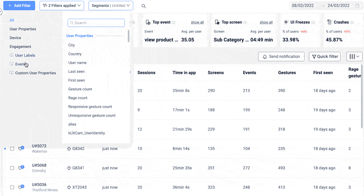
UXCam’s Segmentation feature is incredibly helpful at this stage—you can segment your data using any characteristic tracked by the SDK. These segments can be named, saved, and monitored to add significant data to your user personas.
Understand goals and pain points
Once you’ve identified your segments, get inside their heads.
What are they trying to achieve with your product? (Speed, convenience, entertainment, savings?)
What tends to frustrate or slow them down? (Confusing navigation? Long load times? Hidden settings?)
Write these down. You’ll refer back to them throughout the audit to understand why certain issues matter more to some users than others.
Don’t keep personas tucked away in a research file. Share them with your product, design, support, and marketing teams. A well-defined persona should act as a shortcut for empathy, helping everyone think more clearly about who you’re serving and what matters to them.
Step 4 - Evaluate the user interface and interaction design
Now that you know who your users are, it’s time to see how well your product actually supports them. This is where you put on your UX detective hat and start digging into the actual experience.
Start by choosing one persona to focus on. Walk through the product as if you were them. What would they try to do first? What path would they take? Where might they get stuck?
Watch the flow, not just the screens
Sometimes, the biggest problems don’t show up on a single screen, they hide in the transitions.
Maybe users don’t understand what happens after they finish onboarding. Maybe they get lost switching between features. Or maybe they’re missing a key CTA that connects one part of the app to the next.
These are journey-level issues, and they can seriously impact engagement and retention.
When you only look at isolated flows, we miss the big picture. A button might work perfectly on its own, but if users don’t know why they should click it, or what happens after they do, it’s not doing its job.
Journey mapping helps you:
Spot drop-off points between steps
Understand user intent at different moments
Identify when users are looping back or getting stuck
Start by choosing a goal (e.g., “complete a purchase” or “set up a profile”), then use tools like UXCam’s Journey Analysis to visualize how users actually move through the app.


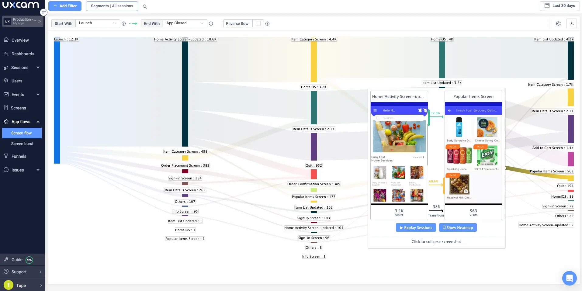
Look for:
Entry points (where users begin)
Exit points (where they abandon)
Loops or dead ends (where they seem stuck or confused)
Do this for each major persona if possible. What works for one group might completely fail for another.
Use heuristics to spot common issues
Bring in a structured lens by applying Nielsen’s 10 usability heuristics. These include things like:
Consistency and standards (are similar actions labeled the same way?)
Visibility of system status (does the app show loading states or success messages?)
Error prevention (is it easy to make a mistake?)
This helps you move beyond “something feels off” to “this violates a known UX principle.”
Run usability tests (and use session replays)
Whenever possible, observe real users interacting with the product. If you can’t run live usability sessions, tools like UXCam’s session replays are invaluable.


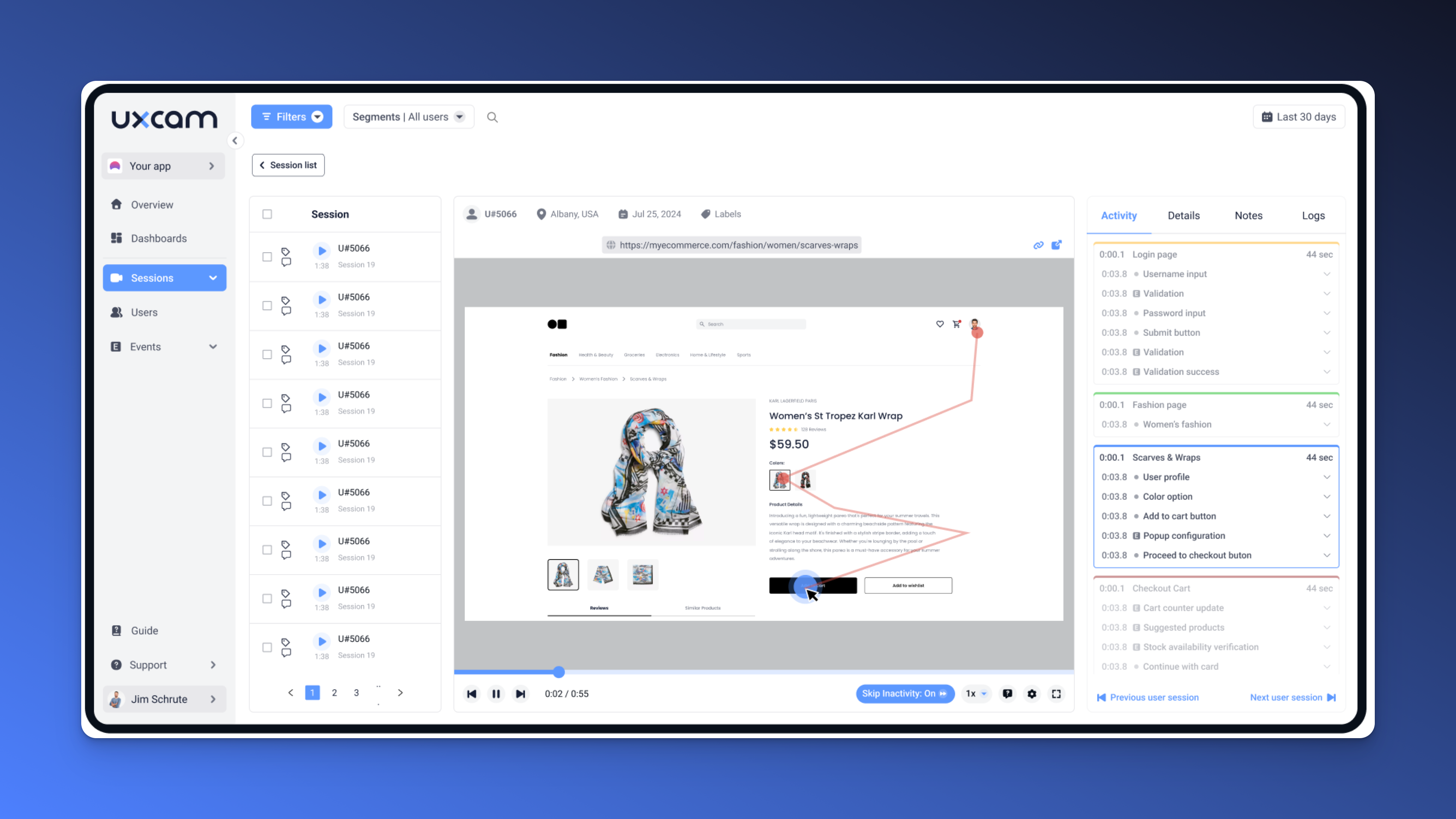
Look for frustration signals like:
Rage taps
Repeated back-and-forth between screens
Abandonment after key moments
These are often clues that something’s unclear or not working as intended.
Don’t overlook visual design
Visual clarity is a core part of UX. Assess whether:
The design is aligned with your brand
Typography is readable and consistent
Color choices support accessibility and legibility
There’s enough whitespace to guide the user’s attention
A visually noisy interface can overwhelm users—even if the interaction model is sound.
Make sure it’s accessible
Use WCAG 2.1 guidelines as a baseline. That means:
Sufficient color contrast
Properly labeled buttons and inputs
Keyboard navigability
Support for screen readers and text resizing
Accessibility isn’t just about compliance, it’s about making sure everyone can use your product.
Gather feedback directly
To round out your evaluation, talk to users. Surveys, interviews, and support ticket reviews can reveal gaps that data alone won’t catch.
Ask questions like:
What do you find confusing or frustrating?
What do you wish the product did differently?
When was the last time you got stuck?
Look for patterns, not one-off complaints.
Step 5 - Analyze your data
At this point, you've walked through your product as a user, captured usability issues, and reviewed session replays. Now it’s time to step back, make sense of what you’ve found, and start connecting the dots.
The goal here is to move from raw observations to actionable insights. That means looking for patterns, separating one-off glitches from widespread issues, and using data to figure out what’s really going on.
Group your findings into themes
Start by reviewing everything you’ve uncovered; frustration points, navigation snags, UI inconsistencies, confusing interactions, etc. and sort them into clusters.
Think in terms of recurring pain points, like:
“Navigation confusion”
“Unclear CTA labels”
“Overwhelming visual clutter”
“Unresponsive touch targets”
You’ll start to notice that many seemingly different problems are actually symptoms of a broader issue. Grouping them into themes helps you prioritize the underlying problem instead of just patching surface-level symptoms.
Use segmentation to spot patterns
Here’s where things get interesting. Not all issues affect all users equally. That’s where segmentation comes in.


Using a tool like UXCam, you can filter behavior based on real user traits. For example:
Do new sign-ups get stuck more often than returning users?
Are users on Android experiencing more rage taps than those on iOS?
Does a particular feature confuse first-time users but not power users?
Segmentation helps you move beyond averages and understand who is struggling—and why.
Monitor key funnels
If your audit goal involves a conversion funnel (signup, onboarding, checkout, etc.), now’s the time to dig into drop-off data.


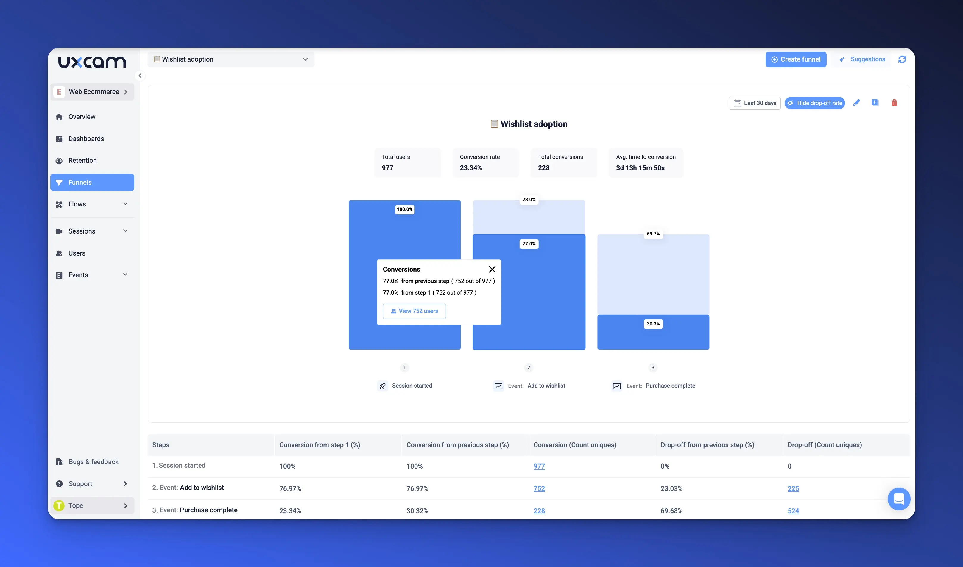
Set up funnels to track:
Where users abandon tasks
Which screens cause the most friction
How long users spend on each step
This data can reveal critical breakpoints that aren’t obvious just by watching a few session replays.
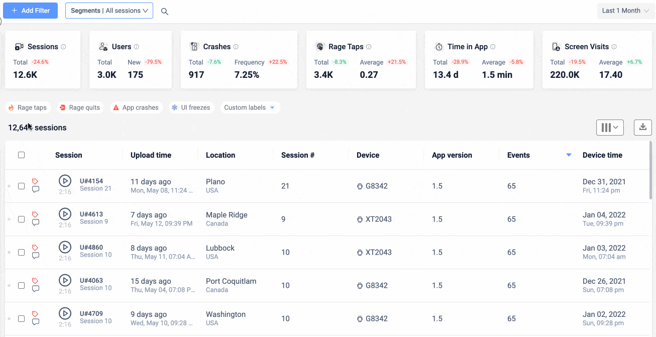
Build dashboards to track progress
Create dashboards or reports for your most important metrics. Depending on your goals, you might track:
Task completion rates
Time on task
Form error rates
Tap and scroll patterns
This gives you a baseline to measure against after changes are made—and keeps the team focused on what matters most.
Drill down with high-fidelity tools
When you spot something unusual in the metrics, go deeper.
Watch Session Replays to see exactly what users did before dropping off.
Use Issue Analytics to identify how often the same frustration pops up across sessions.


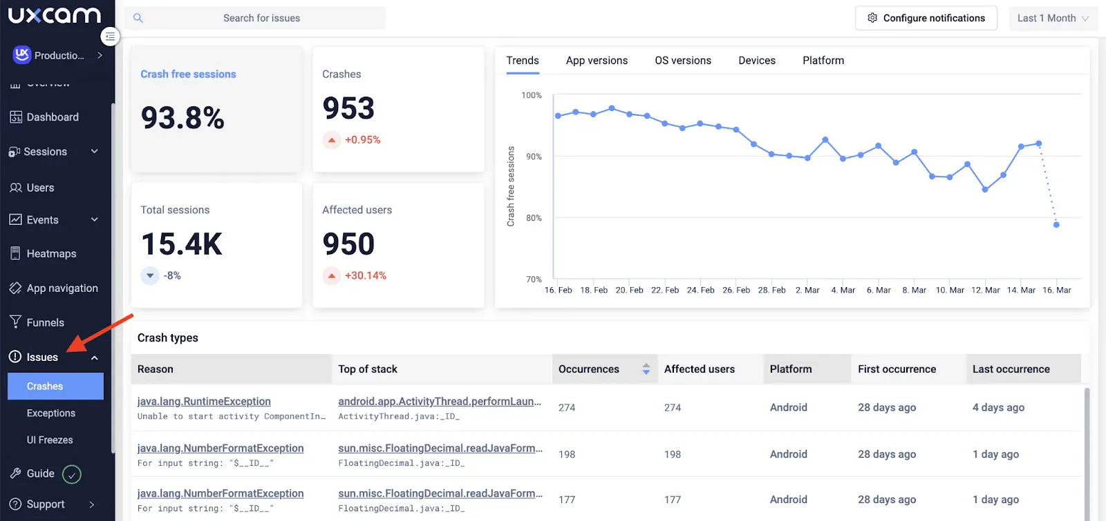
High-fidelity tools let you explore the “why” behind the “what”—so you’re not just guessing at what needs fixing.
Make your insights easy to share
As you collect insights, start documenting them in a centralized, easy-to-navigate place. A spreadsheet works but a shared dashboard works better.
Include:
A short description of the issue
Supporting evidence (e.g., session replay timestamps, screenshots, heatmaps)
Severity level (high/medium/low)
Related persona or user segment
Potential impact on business metrics
This makes it easy for designers, engineers, and other stakeholders to see the problem clearly—and trust your recommendations.


Step 6 - Formulate a hypothesis
Once you’ve identified and analyzed the major issues, the next step is to make sense of them. Why are these things happening? And more importantly—what should you do about it?
This is where you start forming hypotheses.
Start with three key questions. Every solid UX hypothesis begins by answering:
Why is this happening?
What are my users trying to achieve?
What can I do to help them succeed?
These questions help you step into the user’s shoes—and start identifying the underlying cause, not just the symptom.
Use cause-and-effect thinking
Turn each insight into a cause-and-effect statement:
“If we do [X], then we expect [Y] to happen, because [Z].”
For example:
“If we add a press-and-hold function to the main button, then we’ll reduce confusion and support tickets by 30%, because users currently think they need to hold the button—even though the action only supports taps.”
This structure forces you to be specific. It also sets you up to test the idea later, which is what makes a UX audit truly useful.
Ground your hypotheses in real data
A good hypothesis doesn’t just sound logical—it’s backed by evidence. That means:
Referencing drop-off points in your funnel
Quoting real user feedback from interviews or surveys
Pointing to behavioral patterns in session replays or analytics
It’s easy to make assumptions in UX. What sets a great audit apart is showing that your theory is based on what users are actually doing—not what you think they might be doing.
Prioritize based on impact and effort
By now, you’ll likely have multiple hypotheses. Don’t try to solve everything at once.
Instead, prioritize based on:
Impact: How many users are affected? How badly does it hurt their experience?
Effort: How complex is the fix? Can it be implemented quickly, or does it require structural changes?
Start with high-impact, low-effort changes—these are your quick wins. Save the bigger bets for later sprints once you’ve proven some results.
A real-world example
Let’s say your team is flooded with support tickets about a product feature that “doesn’t work.” But when you test it, everything functions perfectly.


That’s exactly what happened to Recora. They used UXCam to analyze the issue and discovered that users were trying to press and hold a button that was designed to be tapped. After implementing the change, support tickets related to that issue dropped by 142%. For this example you can write the hypothesis like this;
Hypothesis: If we enable a press-and-hold interaction on this button, we’ll reduce confusion and support tickets by 50%
Result: After implementing the change, support tickets related to that issue dropped by 142%.
This is what happens when hypotheses are grounded in behavior, not guesswork.
Tie every hypothesis to a measurable outcome
Whether it’s fewer support tickets, improved task success, or higher conversions, always define how you’ll know your hypothesis was correct. If you can’t measure it, you can’t improve it, and you certainly can’t justify investing resources in it.
Step 7 - Compile and share your findings
You’ve done the deep work—walked through the product, watched users struggle (and succeed), reviewed your data, and formed clear hypotheses. Now it’s time to pull it all together and present your insights in a way that drives action.
A UX audit is only as valuable as your ability to communicate what you found and what needs to happen next.
Structure Your Audit Report Clearly
A messy or overly complex report can bury your best insights. Structure it like a story—with a clear beginning, middle, and end:
Introduction: Start with a quick summary of why you ran the audit and what you focused on. Keep it short—this is your north star.
Methodology: Build credibility by explaining how you gathered your insights. Did you use heuristic reviews? Session replays? Funnel analysis? User interviews? Let readers know the tools and techniques you relied on.
Findings: This is the heart of your report. Clearly highlight the biggest usability issues, patterns in user frustration, and any positive surprises you uncovered. Be honest—this isn’t about blaming anyone, it’s about surfacing opportunities to improve.
Recommendations: For each finding, suggest a clear, actionable fix. Think in terms of specific steps, like:
“Add clearer labels to the navigation icons.”
“Enable press-and-hold on the main CTA button.”
“Reorganize the onboarding flow to highlight top user benefits sooner.”
Avoid vague advice like “Make the UI more intuitive.” Instead, tell people exactly what they can do.
Use visual aids and data references
People process information faster when they can see it.
Include screenshots that show the problem areas.
Link to session replays that demonstrate confusion or drop-off.
Quote user feedback to bring the human voice into your report.
The goal is to make issues feel real and undeniable—not abstract or theoretical.
For example:
“30% of new users struggled to find the sign-up button. In session replays, many hovered near the top right corner and eventually abandoned the flow.”
That kind of evidence makes it a lot easier to get buy-in for changes.
Present to stakeholders (tailored to their needs)
Not everyone on your team will care about the same level of detail.
Executives want to know the business impact. Focus on outcomes like increased activation rates, reduced churn, or improved engagement.
Designers want specifics about layout, interactions, and user behavior.
Developers will want to understand feasibility and edge cases.
Tailor your presentation to your audience, but always end with clear next steps and ownership. Who’s doing what, and by when?
Plan follow-up audits
UX isn’t one-and-done. Once you’ve shipped your improvements, you’ll want to go back and make sure they actually worked.
Set a baseline before changes go live.
Define success metrics and monitor them after launch.
Plan to re-audit the updated flow to confirm that pain points have been resolved.
This shows that you’re not just suggesting ideas, you’re driving results.
Step 8 - Implement, monitor, and iterate
The audit is done, the recommendations are clear, and your team is ready to take action. But your work isn’t quite finished yet.
The final (and often overlooked) step is to measure what happens after the fixes go live. Otherwise, you’re left guessing whether your improvements actually worked.
UX changes don’t exist in a vacuum. Even small tweaks can have unexpected effects. If you don’t track outcomes, it’s impossible to know:
Which changes moved the needle
Which had no impact
Which may have created new friction
What to do
Set a Baseline: Before launching any updates, capture your current metrics—drop-off rates, task success, session duration, whatever matters most.
Monitor Post-Launch Metrics: After rollout, keep an eye on those same metrics. Are they trending in the right direction?
Re-Audit the Flow: Run a mini follow-up audit of the affected areas. Are users still confused? Has engagement improved? Are support tickets dropping?
UX is never “done.” Use what you’ve learned to guide the next round of improvements—and schedule regular check-ins to keep momentum going.
UX audit templates
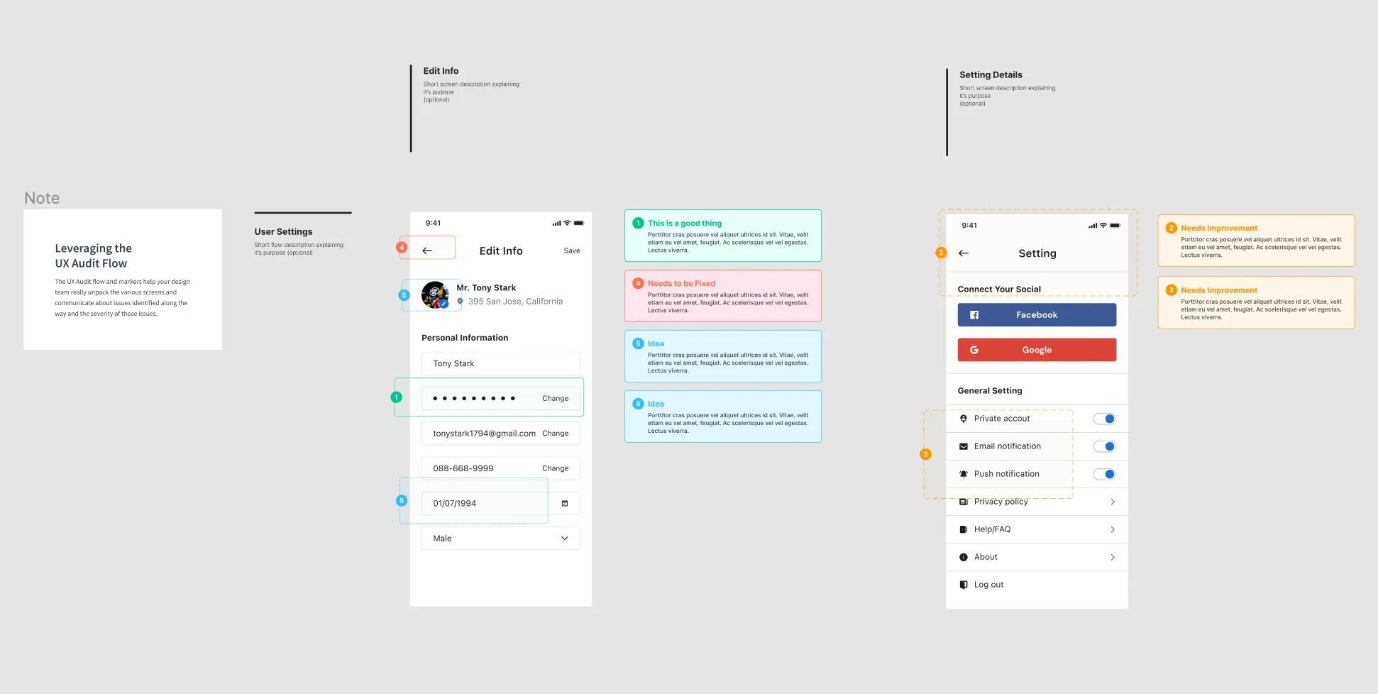
1. Factory Pattern
Factory Pattern’s template is ideal for beginners. It’s highly detailed and includes a handy checklist to track resolved items. This template is suitable for various domains, but particularly best for e-commerce websites.


2. HubSpot
HubSpot offers this comprehensive and uncomplicated UX audit template ready to share with your stakeholders. It effectively organizes and presents audit insights, making the information easier to grasp.


3. Figma
The community over at interface design tool Figma created this user-friendly template with a sleek and modern design. If you use Figma, you can access it for free by copying and adding it to your Figma project.


UX audit checklist
Here is a general guideline for a checklist that you can adapt to your product and audience. You can download a Google sheet version of the checklist here
Getting Started
Audit preparation — define scope and objectives.
Create a user persona.
Overall UX and UI Design Evaluation
Perform Nielsen’s 10 Heuristic analysis.
Access the simplicity and usability of navigation and the information architecture.
Evaluate the inclusivity and accessibility.
Check visual elements for consistency and coherence.
Evaluate the value and relevance of information and content. Review the readability of typography and text.
Platform Performance and Security
Assess platform responsiveness, performance, and stability.
Assess the functionality and responsiveness of interactive elements.
Assess compatibility and responsiveness on different devices and browsers.
Evaluate privacy and security considerations.
Customer Journey
Identify strong and weak points of the customer’s journey.
Evaluate onboarding and other instruction experiences.
Evaluate the effectiveness of in-app help and support features.
Analytics
Review pages with the highest and lowest conversion rates and drop-offs,
Review common exit points, rage clicks, gestures etc
Analysis
Review product alignment with user’s goals and expectations.
Analyze findings—focus on usability flaws, pain points, and common hindrances.
Report
Create recommendations and a plan of action.
Use UXCam for a complete UX audits
A UX audit thoroughly evaluates your product’s design, functionality, and overall UX. It discovers what needs rethinking, what works well, and new design ideas to meet your customer’s needs.
UXCam provides a deep level of understanding you need to help make sense of your findings.
Are you ready to evaluate your apps’ UX for design insights that will help revolutionize the user experience? See how the UXCam platform will help you get there by signing up for a free account or requesting a demo.
FAQs
UX audit FAQs
What is a UX audit?
A UX audit is a process of evaluating a digital product’s user experience to identify usability issues, improve user flows, and align design with business goals. It uses analytics, heuristics, and user feedback to guide design improvements.
Why is a UX audit important?
A UX audit helps uncover friction points in the user journey, reduce drop-offs, and increase conversions. It enables data-driven design decisions that enhance usability, boost customer satisfaction, and align with business objectives.
What tools are used for a UX audit?
Tools like UXCam, Hotjar, Google Analytics, and Figma support UX audits by capturing behavior data, user flows, heatmaps, and design elements. These tools help identify usability gaps and validate design changes.
What is the difference between UI and UX audit?
A UI audit focuses on visual elements like layout, colors, typography, and consistency, ensuring the interface looks and feels cohesive. A UX audit goes deeper, analyzing how users interact with the product, identifying usability issues, and evaluating the overall user journey and satisfaction.
You might also be interested in these;
React native mobile app analytics tool: UXCam
How to get mixpanel session replay with UXCam integration
Mobile app redesign - How to redesign an app UX
UX insights examples - Ideas to improve user retention
UX optimization: 4 Steps to deliver a better user experience
AUTHOR
Tope Longe
Product Analytics Expert
Ardent technophile exploring the world of mobile app product management at UXCam.


Related articles


Curated List
7 Best AB Testing Tools for Mobile Apps
Learn with examples how qualitative tools like funnel analysis, heat maps, and session replays complement quantitative...


Jane Leung
Product Analytics Expert


UX design
12 UX Metrics to Measure and Enhance User Experience
Unlock product success by tracking the right UX metrics. Learn 12 essential metrics, how to measure them, avoid common pitfalls, and take action with tools like...


UX design
10 Top UX Design Best Practices & How to Implement Them
Discover 10 proven UX design best practices to improve usability, boost retention, and create user-centric products. Actionable tips for product...
Tope Longe
Product Analytics Expert