Finance app product managers share the same user research challenges as every other product manager: the struggle to collect, prioritize and validate product feedback on a budget.
On top of that, fintech apps have higher requirements for protecting sensitive user information like bank loan applications, income details, bank account details, and so on. Before we provide answers on scaling user research, let’s take a look at typical research struggles in fintech mobile app development.
Time management. These days, banking apps are constantly one-upping each other to be the next super app — rapidly releasing new features like rewards, partnership discounts, spending management, insurance deals, crypto trading, savings vaults… product teams want to move fast and it can take months to validate the need for such features.
Misalignment of user needs and business KPIs. What users ask for often hardly matches the feature backlog - which might be more driven by short-sighted conversion optimization and pushing users into new monetization streams. Stakeholders care about cost per install, engagement, customer lifetime value, and conversion, and it’s tough to connect the reported user research pain points to these goals. Either PMs aren’t data savvy enough, or they don’t have the right tools to ‘triangulate’ insights by using multiple UX research methods.
High cost. Detailed, qualitative insights are critical for product development, but fintech stakeholders are particularly numbers driven and struggle to trust small numbers. Instead of the typical 5 to 8 participants, a PM might need qualitative insights from 50 or more users before their stakeholders can be convinced. This requires tens of thousands of dollars of research budget (which PMs don’t have), not to mention the time invested.
Unnatural behavior. Test participants might not behave naturally in a lab environment, e.g., the presence of a moderator often affects how carefully they are reading small print and instructions they would normally ignore. On top of that, a tester asked to imagine they were transferring money or applying for a loan might treat it like a game of Monopoly - because they are testing with hypothetical scenarios, not risking real money, real personal data, or their own credit scores. Which of the learnings about user needs are valid and which behaviors are just test effects can only be understood when cross-matching (a.k.a. triangulating) them with real behavioral data.
Recording of sensitive data. When using real financial products, you can’t record the user behavior as you would on say, a language learning app. This is only possible with a mobile app analytics tool with advanced blurring and masking features that are compliant with international privacy laws, e.g. Europe’s GDPR or India’s Personal Data Protection (PDP).
Given these challenges, it feels impossible to collect user behavior insights at scale for fintech apps, but the secret is validating hypotheses from user testing with mobile app behavior insights. To move the needle on the roadmap, stakeholders want your assumptions backed by user behavior data. In this article, you’ll learn how to:
Validate hypotheses from quantitative and qualitative user research at scale.
Protect user information without compromising on observing real behavior.
Create dashboards that help you prioritize user pain points and demonstrate to stakeholders you have the numbers to back them up.
Whether you’re an enterprise or a startup, user testing for fintech apps is time-consuming, very expensive, and the data can’t always be trusted. Here’s a summary of what you can do instead:
Combine user interviews and surveys with mobile app analytics. When dealing with financial apps, interview or conduct surveys with users that are already using your product. For them, it’s not just monopoly money on the line, they are using your app under real conditions ‘in the field’.
Once you have a hypothesis about your new feature on an existing product, you can validate them at scale with a mobile app analytics tool.
2. Validate user behavior trends with large volumes of mobile app data. There are 3 key reasons why mobile app analytics can help scale your user research:
Autocapturing user behavior data saves time in the gathering of user behavior data.
Larger volumes of user sessions can also deliver more data points which will help validate hypotheses gathered from qualitative user feedback on a quantitative level.
With dashboards, you’ll be able to use user behavior insights to set up dashboards stakeholders care about such as retention, engagement, and conversion.
3. Make privacy and compliance part of the user research toolkit: Use customized screen blurring and occlusion to protect data like IBANs, bank pin codes, and security questions when recording user behavior. Look for customizable capabilities so you can still see screen gestures and heatmaps of the screen without compromising user privacy.
But first, if you’re a little green on the powers of user behavior analytics, read our pocket guide on mobile app analytics.
Let’s look at 3 steps to scale your user research without breaking the bank.
Strategically recruit existing users, validate hypotheses with app analytics
If you’re interviewing existing users
When it comes to getting feedback for a new feature on an existing financial app, work with users who are already familiar with your app and can report real-life experiences with it.
We know it’s a slog to get people to say yes to giving feedback, so here are some tips:
Agree with your team on a magic number of users: Since you’ll be corroborating your user testing with mobile app analytics, you’ll only need a modest sample. Jakob Nielsen recommends 5 to 8 users per segment for usability tests but admits that if stakeholders are uncomfortable with qualitative data, a few more participants can help credibility.
Identify and segment your ideal testers: Do you want to get users who are frustrated with your app or ones who are power users to give feedback on your latest features? Consider their level of engagement with your product and if they’ve given any feedback in the past.
Create an email campaign with a clear CTA: Send a personal email to the users you’ve chosen who have consented to receive emails. The CTA can lead to a feedback survey, or for qualitative studies, to your preferred appointment booking tool (e.g., Calendly, Google Calendar, or Hubspot).
Offer incentives: If you’re on a budget there are still ways to give freebies to your users such as early access to new features, free upgrades, or extra credits.
Give clear instructions: Make it easy for users to provide feedback and make it clear what specific aspects of the product you want them to test.
Follow up with rewards and thank you’s: Make sure to follow up with users to show how they have positively influenced your product development.
If you’re testing with users who have never used your app
Recruit through online communities like Reddit, LinkedIn, or even Facebook.
Is your app for people interested in cryptocurrencies? People who frequently travel? Or private investors flipping houses as a hobby? Look for the online communities they turn to. There are lots of communities out there with people willing to help others. You can advertise your study in these communities to get feedback, engage with users, and even build brand awareness.
Validate your hypothesis
Let’s say you want to investigate why users aren’t engaging with a new feature in your app. The purpose of the new feature is to allow users to create separate Spaces, but not necessarily create savings accounts.
For those who don’t know, Spaces are sub-accounts in a mobile bank. They are like savings accounts—spaces can hold your money aside–but you aren’t charged interest, they are used for organizing money. You can auto-transfer money easily from main accounts to a space.
Users can use Spaces to save for summer vacations or just goal amounts. You begin to ask questions like:
Which users aren’t using our new Spaces feature?
Why aren’t users using Spaces?
Which users are creating Spaces but not using them?
To understand how to set this up, let’s look at this deeper in the next step.
Compliment user interviews with experience analytics
Before getting into how user research findings can be validated, let’s talk about automation and why it will help you scale your research. Autocapturing user behavior data will save you:
The time it takes to recruit users and watch them use your app.
The human resources of engineering and BI teams who don’t have to instrument and test new events, or generate detailed reports.
Segment users based on feature adoption
By plugging your app into an analytics tool like UXCam, you’ll automatically capture screen names, navigation patterns, user frustration events like rage taps or unresponsive taps, and bugs. With screens logged, you can map out which steps a user has to see to successfully convert to using a new feature.
Let’s go back to our mobile banking Spaces setup example. Let’s assume that the successful creation of a space includes the viewing of four screens:
Screen 1 - The Spaces homepage
Screen 2 - Spaces purpose
Screen 3 - Spaces saving goal
Screen 4 - Space successfully created
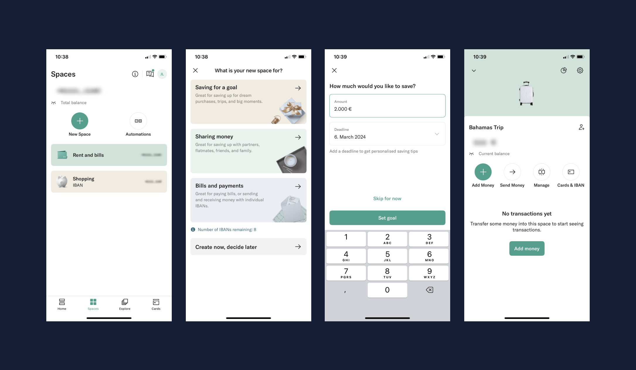

The “Spaces” setup process from mobile banking app, N26
Since the screen names are automatically logged, you can segment the list of users who have completed or not completed viewing the entire sequence of screens.
Saving time with user behavior segments, filters and session replays
You can create a funnel just based on the screen names to see where the drop-off is happening. Let’s say you see most people are dropping off at the [Spaces savings goal] screen.
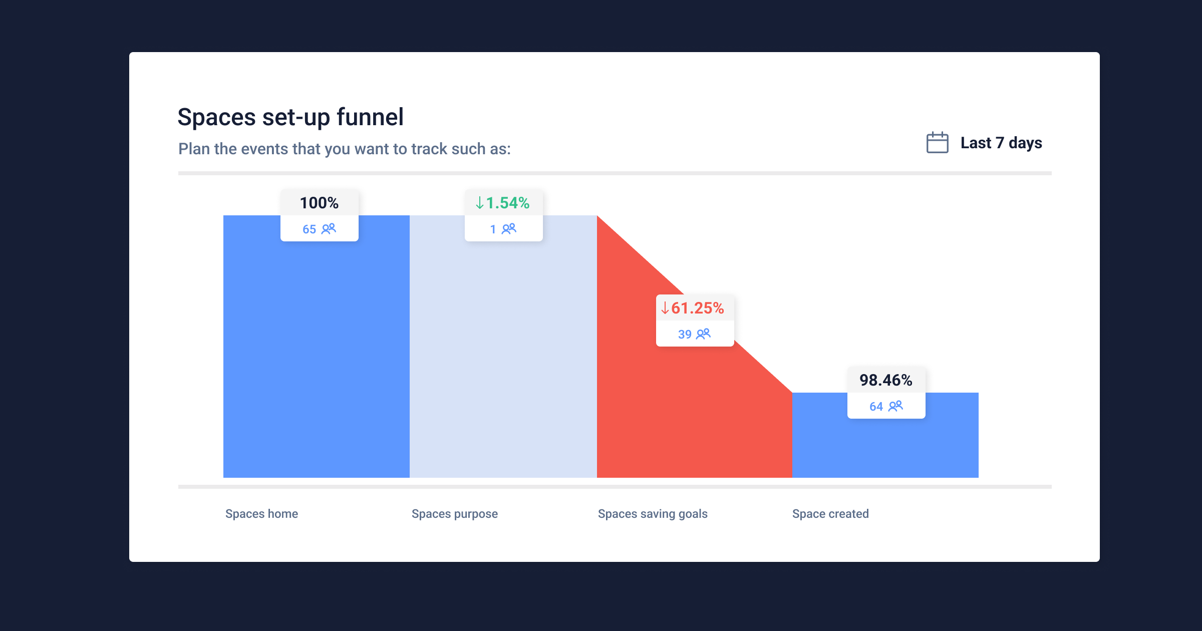

Example of a spaces setup funnel in UXCam
UXCam funnels allow you to click on the users who dropped off at a specific point (see the red area example above in the funnel). Just click on the number of users on the funnel who dropped off.
Now you will be able to see all relevant sessions and users. We recommend saving these users as a segment, to keep track of how the number of users dropping out changes over time. This will be useful when you want to analyze the impact of a design update.
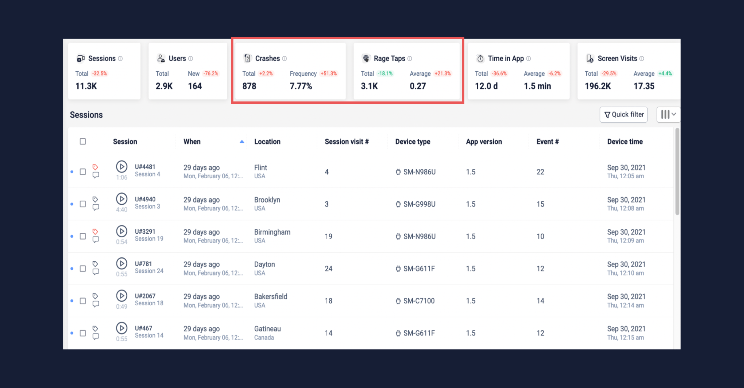

Crashes and rage taps filter in UXCam sessions
Let's assume that you have 5,000 sessions in this group. That’s a large number that you won’t have time to watch.
You can narrow it down further by adding an extra filter for users who:
Let's assume that you have narrowed down the number of sessions to 500. We recommend that you take a sample of at least 10%. Make sure the sample contains users with different important parameters, such as:
device and screen size
app version
OS (Android or iOS)
Now you can dive into 50 sessions, see what users experienced, and the reasons behind drop-offs.
Need to generate insights even faster?
You can also use heatmaps. Your funnel has already revealed the screen or screens where users mostly drop off. You can review the heatmap of these screens, and filter down to specific user interactions.
Heatmaps will show you which parts of the screen users made rage taps or unresponsive taps. This can already empower you with insights about what elements of a screen could be confusing for users.
But, as we are speaking about validation, we still recommend that you dive into session replay to have the full picture.
Keep track of feature adoption over time
As we mentioned before, it is good to save users who drop off at specific screens as segments.
However, in case you want to be more precise about tracking the adoption of a specific feature like spaces, custom events will help you to have a more precise view of users who successfully set up spaces, or interacted with the feature.
You could set up the following events for example:
Space setup completed
Transferred money to space
Transferred money out of space
This will allow you to easily create reports that will not only help you track feature adoption on a high level but also learn if some user groups or segments are adopting the new feature more than others.
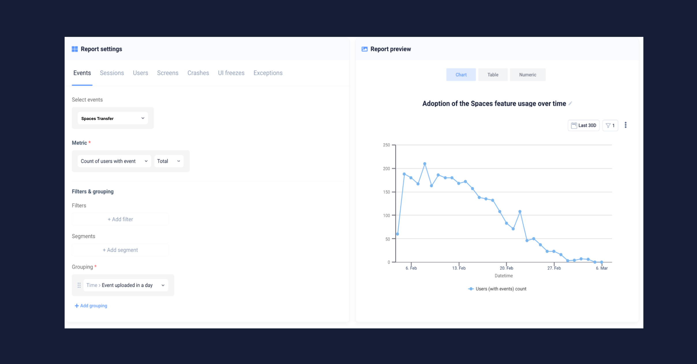

Example of a report in UXCam
Besides validating features, there’s another aspect of using mobile app analytics in your user research:
Segment your users and understand different behaviors
Circling back to user segmentation, UXCam provides you with out-of-the-box segments like:
New users
One time users
Returning
Loyal
Engaged
Slipping away
As we mentioned at the start, one of the biggest challenges of user research is the prioritization of which user issues to help first. Auto-captured segments will provide you with a quick snapshot of how different user groups are adopting your new feature based on engagement.
If you spot that loyal users are adopting spaces more than other groups, your user research team will be able to dive into samples of session replay and see which paths these users take. Perhaps they get into creating spaces after performing specific actions. This could provide you with insights on how and when you could re-engage other user groups to try this feature.
You can of course take segmentation to a more advanced level as well. Most finance apps have free and premium subscription tiers, or various club memberships.
If this is also true for your app, we recommend that you also set up custom user properties like:
Premium member
Free user
Club member
Having such properties will allow you to visualize how premium vs. free users are adopting your new feature, and how actively they use it.
We also recommend adding user properties such as dark or light mode. This will help you to spot potential usability issues that dark mode users could be facing.
Combining these properties with the custom events we discussed before, your research team will be able to study the behavior of these different user groups and find patterns that could inspire your next update or redesign.
Empowered with this depth of user segmentation and adoption behavior, your research teams will be able to generate insights faster and more cost-effectively.
This will enable them to invest more time into research projects focused on other future projects and potential opportunities.
Make privacy part of the user experience
With mobile fintech data, you’re dealing with information that consumer or gaming apps don’t have to deal with. Users may be applying for loans, credit cards, mortgages, or trading large sums of money. You’ll need to be able to understand the user experience, yet at the same time hide sensitive information, like:
IBAN details
Credit card details
Monthly mortgage payments
Home addresses
Income amounts
And much more sensitive data that needs to be protected
Controlling the blurring radius of a mobile app screen is the most effective way to see user gestures, and understand the experience, all while protecting user information.
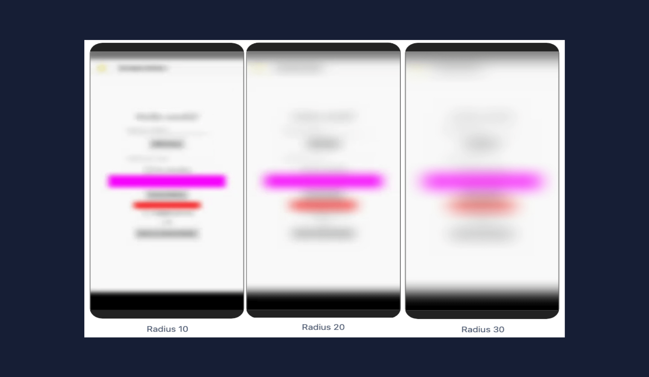

Example of screen blur in UXCam
You can also block only sensitive text fields where users fill out passwords and other private information. This will in no way impact the way you see the user behavior. If you need to, you can also block entire pages.
By combining user interviews and mobile app analytics, you’ll be able to scale the insights into the needs and preferences of your users. Financial apps are tricky compared to e-learning or e-commerce apps, but there is technology out there to protect your user’s information.
It’s your turn to empower your user research team with user behavior insights.
These days, only some stakeholders trust the data. There are either too few data points or too many sources that are disconnected. Combining your user research hypotheses with a product like UXCam, you’ll be connecting your research to a single source of truth for mobile app user behavior.
In this article, we talked about features like:
Read on to learn more about how to use them and how they’ll benefit your app experience. If you’d like to test out UXCam, our free trial includes all our features.
Related articles:
FinTech's customer support issue and how to stand out
6 tips for building your app around your user
How to retain users during a recession with UXCam
How to set up mobile app event tracking
Funnel analysis example: Improving app conversion and retention
AUTHOR
Jane Leung
Product Analytics Expert
Jane is the director of content at UXCam. She's been helping businesses drive value to their customers through content for the past 10 years. The former content manager, copywriter, and journalist specializes in researching content that helps customers better understand their painpoints and solutions.

Related articles
Curated List
7 Best AB Testing Tools for Mobile Apps
Learn with examples how qualitative tools like funnel analysis, heat maps, and session replays complement quantitative...

Jane Leung
Product Analytics Expert
UX design
12 UX Metrics to Measure and Enhance User Experience
Unlock product success by tracking the right UX metrics. Learn 12 essential metrics, how to measure them, avoid common pitfalls, and take action with tools like...
UX design
10 Top UX Design Best Practices & How to Implement Them
Discover 10 proven UX design best practices to improve usability, boost retention, and create user-centric products. Actionable tips for product...

Tope Longe
Product Analytics Expert

