Building an app users love takes more than a great product. You need an amazing user experience, too. And that’s where UX design gamification comes in.
UX gamification is an effective way to level up your user experience by introducing playful, game-like elements to your app.
Giving users gamified type rewards releases dopamine in the brain, which keeps them engaged. It’s simple yet powerful, which is why we are starting to see more retail and e-commerce gamification as brands engage with customers in a playful way to boost sales and loyalty.
Rewards, quests, cartoon characters, and digital badges can be a fun and effective way to motivate users to complete a task, purchase a product and keep using your app.
How to use UX gamification to improve app engagement
Today, more and more mobile apps are introducing gaming elements for their UX, to boost user engagement and make users come back over and over again.
Let's take a look at best practices from how some of the most popular and successful apps use gamification to drive engagement and keep users hooked.
Research Your Audience
It is important to carefully consider the needs, desires, and personality of your app community. As a result, you will better understand how to introduce gaming elements within the app.
For example, you can send a survey to current or potential users asking them which mobile games they typically play and what they like most about them. A study by Marc Hulsebosch organizes players into four key types:
Achievers: those who focus on achievements within the game context.
Explorers: those who try to experience as much of the game world as possible.
Socializers: those who use the game to communicate with other players.
Killers: those who see other players as competitors and aim at fighting with them.
Select the Most Appropriate Game Mechanics
You can use the gamer types described above to reveal which gaming mechanics should be incorporated into your app. For example, if your audience consists mostly of achievers, try using achievement-based mechanics like badges that visually represent the users’ accomplishments.
Here are the most common and effective gamification examples that are already used in non-game apps:
1. Internal currency: awards that can later be used to buy in-game benefits, e.g., extra lives. Example: Duolingo, a language learning app, awards internal currency — lingots — for the completion of various activities.
2. Levels: parts of the game world with different complexity. Example: Todoist, a productivity app, allows users to unlock levels by earning karma points for completing daily tasks.
3. Badges: a visual representation of users’ achievements within the app. Example: Fitbit, a fitness tracking app, awards badges for completing certain activities, such as walking 10,000 steps a day.
4. Journeys: a way of leading users through the app in a personalized way, gradually unlocking new features as users get more experienced with the product. Example: Singify, an app for those who want to learn to sing through karaoke, takes its users on a music journey by providing handy tutorials that help users progress within the app.
5. Progress dashboards or progress bars: graphical representation of the user’s progress within the app. Example: Khan Academy, an educational app, shows progress as a galaxy-themed achievement system.
6. Leaderboards: player rankings according to scores that show leaders in specific activities. Example: Peloton, an app that gives access to various fitness classes, allows its users to see who else is doing the same workout and compare the performance against others in real-time. 7. Points: the most basic rewards that users get for each accomplishment within the game. Example: Todoist awards users with karma points that they can then use to unlock the next levels of the app.
8. Social interaction: a way to enable communication between users, i.e., in-app chats, user groups, or sharing. Example: MealLogger, a nutrition and fitness journaling app, enables its users to join groups and discuss their experiences.
9. Challenges: events within an app that are dedicated to reaching a certain goal. Example: Snapchat awards its users the so-called trophies for achieving specific goals, often unexpected ones, such as sending a video Snap without audio or sending a Snap between 4 and 5 a.m.
Keep the Balance
Having started with gamification, it may become hard to resist the temptation to gamify your app more and more until it actually looks like a game. Therefore, it is important to know the limits and to avoid trying to completely transform the product into a game. Your key goal is to learn from the gaming industry and implement only the necessary elements.
For example, if your app’s target audience is users that need to quickly find or learn something, do not overload it with difficult tasks and levels. When users get stuck on one of those levels, they can lose interest and quit. Make the gaming elements optional, as not everyone may be interested in collecting points and earning badges.
Game elements can also distract users from the actual value of your product. To avoid this, focus on how gamification examples can support your users in their journey through your app, rather than offering them a distraction for the sake of entertainment. This can be done with the help of the cognitive flow principle that game developers use.
According to this principle, low-skill levels combined with difficult tasks result in anxiety. On the contrary, simple tasks combined with high-skill levels lead to boredom. When the skill and difficulty levels are proportional, people enter the state of the flow — and this balance is what you should go for when implementing gamification in your product.
Do Not Forget To Test the App
Mobile games are thoroughly tested at the development stage, and you should follow this pattern as well. Before you release the first gamification examples in your app, make sure that they are seamlessly integrated and perform well.
Remember that it is not necessary to release all the planned mobile app gamification examples at the same time. Do it gradually and see how they impact the user experience, engagement, and retention.
A good idea is also to beta test the new features with a small segment of your app’s target audience. By the way, you can also add game elements like awards to the beta testing process as well, so users can become engaged from the very beginning.
Best App Gamification Examples
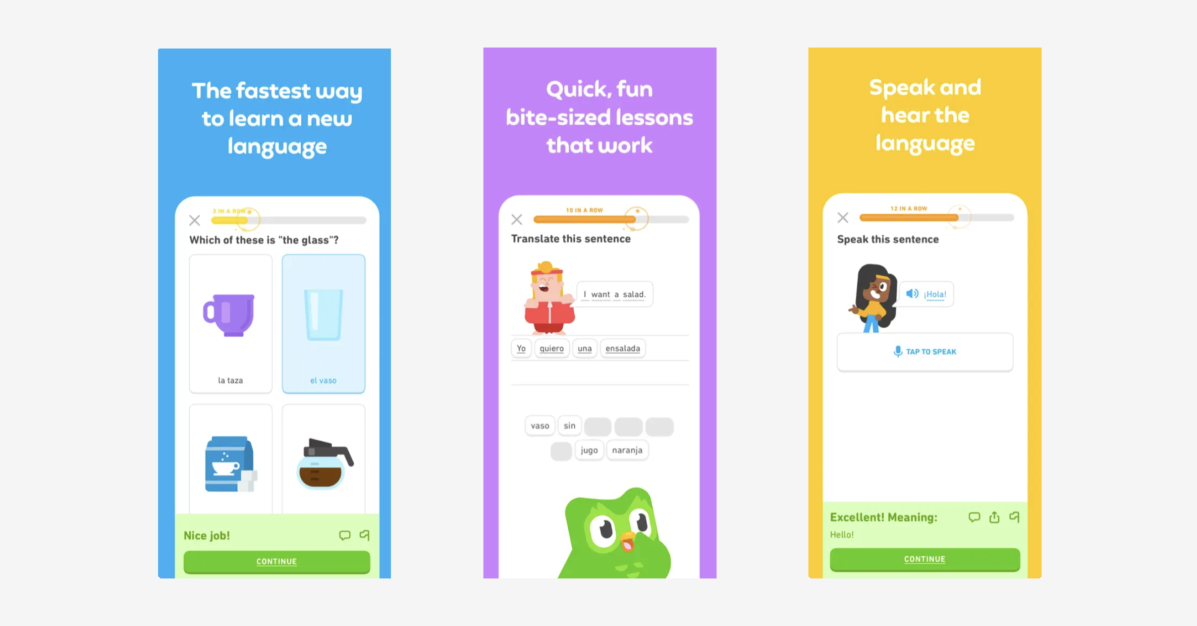
Duolingo
Not everyone enjoyed their foreign language lessons in school, but Duolingo is one of the most popular apps out there, with over 6 million worldwide. What makes the language learning app so popular?
Duolingo uses a variety of clever UX gamification techniques to keep users engaged and interested as they learn a foreign language, track their progress and practice their skills.
Why It Works
Learning a foreign language is hard, so Duolingo is careful to keep users motivated by making it as fun as possible.
Users pick an intensity level ranging from “casual” (five minutes per day) to “insane” (20 minutes) and learn their chosen language with fun exercises. The user progresses through humorously-titled levels like “Scholar” and “Sharpshooter,” to unlock rewards for their achievements and reach a “streak” when they keep practicing for three days in a row.
This fulfills our psychological need for positive reinforcement and makes us feel good, which keeps us coming back for more.

Piggy Goals: Money Saving
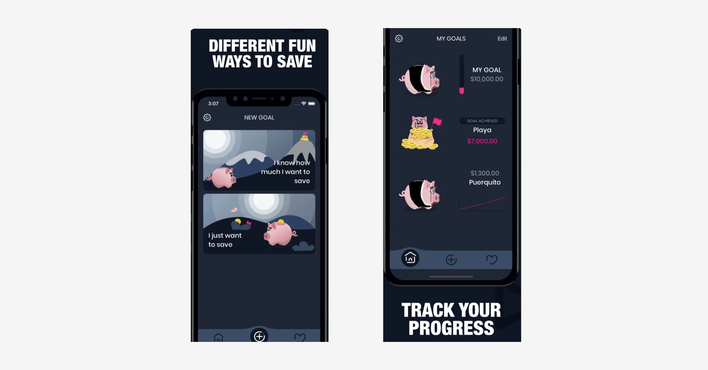
We all know we should save money, but spending it is more fun, right? The Piggy Goals app aims to change that by incentivizing people to meet their financial goals.
Users can set up a piggy bank to save cash and create daily, weekly or monthly goals. The app tracks your progress and sends push notifications to remind you about your money-saving objectives.
Why It Works
Users can visualize their progress with graphs and animations, which gives them a sense of achievement. Once they realize how well they are doing, they will want to stay on track and keep making progress toward their financial goals.
This is basic psychology — if we are proud of ourselves and feel we are doing well, we want to keep doing well. Brands can tap into this by giving their customers a status tied to their loyalty, rewarding regular purchases, and reminding customers to stick around.

Skip the Dishes
Skip The Dishes Restaurant Services Inc. is a Canadian online restaurant ordering and food delivery app generating C$312 million per year in revenue. There are a lot of food delivery apps out there, but this one has a particularly solid UX gamification strategy.
Why It Works
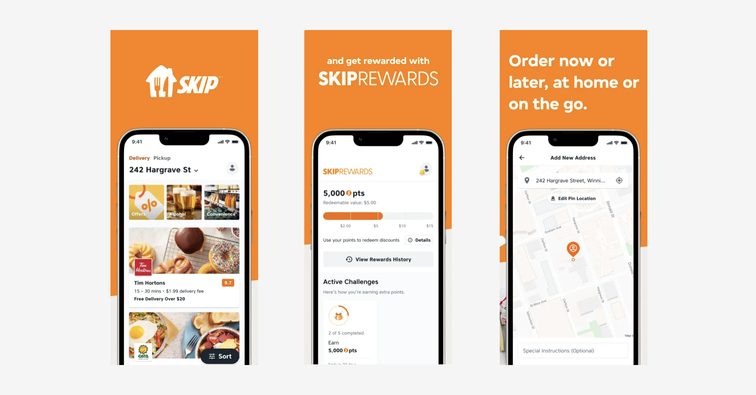
Like most food delivery apps, Skip the Dishes’ users can browse the menus of various restaurants, order their meal using the app, and track the progress of the delivery. What makes this app special, though, is the clever use of gamification.
Customers collect points with every order and level up when they have enough points. Gold status customers earn 10 points per dollar spent, and on-screen messages tell customers how many points they need to unlock gold status.

UX Gamification Separates Good UX From Great UX
Competition is fierce due to the abundance of great apps out there — especially in segments such as banking, e-commerce, and food delivery. Making the user experience fun and rewarding loyalty is a powerful way to stand out from the competition, boost customer retention and increase customer lifetime value.
You might not be in a position to rework your entire product into an adventure game (or perhaps you are?!). But even incorporating some subtle gamification elements, like points and rewards, can make a big difference in how users engage with your app.
Keen to level up your UX? Sign up for a free UX analysis of your mobile app.
Related Articles:
AUTHOR
Hannah Squire
Product Analytics Expert
Hannah is working at UXCam. For the past few years, she’s been working on creating more valuable and useful content for SaaS companies and their users.

Related articles
Curated List
7 Best AB Testing Tools for Mobile Apps
Learn with examples how qualitative tools like funnel analysis, heat maps, and session replays complement quantitative...

Jane Leung
Product Analytics Expert
UX design
12 UX Metrics to Measure and Enhance User Experience
Unlock product success by tracking the right UX metrics. Learn 12 essential metrics, how to measure them, avoid common pitfalls, and take action with tools like...
UX design
10 Top UX Design Best Practices & How to Implement Them
Discover 10 proven UX design best practices to improve usability, boost retention, and create user-centric products. Actionable tips for product...

Tope Longe
Product Analytics Expert
