4 Key Points That Matter When Comparing Mobile Analytics

The Need for Analytics
If you’re reading this, then you likely either have, or will soon have, an app on the market.
In today’s market, new apps appear by the thousands every day, so how do you keep your app from becoming lost in the crowd and bring it to the top of the charts?
With so many competitors, do everything you can to ensure that your app is at the top of the line and give the customer the best experience possible.
As the famous saying goes from Peter Drucker “If You Can’t Measure It, You Can’t Improve It”.
A great mobile app analytics tool (or even multiple) is essential to make this happen.
Where to Start?
As discussed above – you need one or more analytics tools.
When you compare mobile analytics tools, you will notice pros and cons. The key is to find the one that fits best with your business objectives.
Although every company has different needs, there are a handful of features that one would expect in a good analytics tool. It’s these key elements that we will look at more closely and discuss why these features should be important to you.
Key Things That Matter When Comparing Mobile Analytics Tools
We have identified 4 key points that matter to you in the quest to find the right analytics tools:


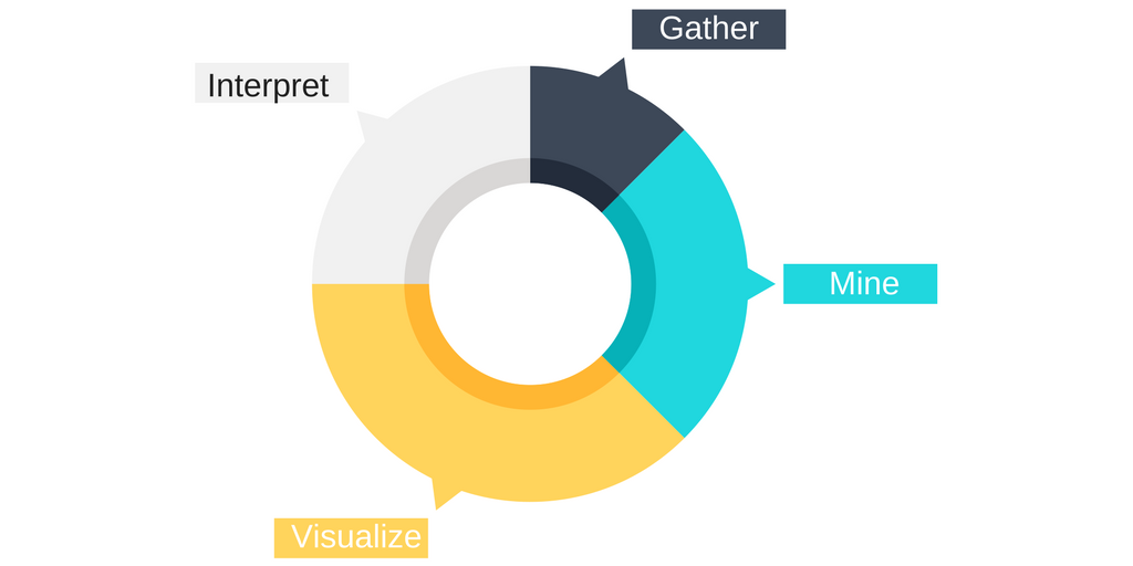
1. Gather
To perform an analysis, a tool needs to gather the data.
You can collect this data in 2 formats: Quantitative or Qualitative Data.
Quantitative Data:
Quantitative data points are numerical.
We aggregate the collected numerical data, and this helps us to see the baseline, decide and track progress.
Examples of quantitative tools are: Google Analytics, Mixpanel and Amplitude.
Qualitative data:
You capture qualitative data points such as Screen Recordings, touchpoints and user feedback.
Qualitative data allows you to make better decisions on the User Experience of your app by enabling you to evaluate opinions that surface in your team.
We refer to this as UX analytics.
Examples of qualitative tools are: UXCam, FullStory and ClickTale.
One key part of the gathering process is the ease of implementing an analytics tool.
Some programs can have extensive procedures for learning the software and implementing it into your app.
This is an added cost to you because of the man-hours required for the switch, the cost of training, and let’s not forget the time to install, during which your system may be down.
This seems like a small thing at first, but it will lead to a low amount of active use of the software.
To avoid this headache, look for a program that has a simplified implementation process that doesn’t cost as many resources to switch over too.
For example, at UXCam we have worked to make this easy for you with two lines of code that can be applied in seconds.
2. Mine / Analyze
“Analysis” comes from the ancient Greek work ἀναλύω, which means “I unravel.”
An analytics tool uses the collected data and mines/analyzes this data using various techniques to create results.
It can aggregate this data and show the results – or use sophisticated machine learning and artificial intelligence to find patterns. Tools such as Mixpanel use these methods to predict user conversion.
This complexity of analysis is an important factor when finding the right analytics tool for you as one means digging deeper and the other means making it easy for you to interpret the output.
It is important to note that some tools, such as Snowplow analytics, also allow you to analyze the data yourself.
This can be an important decision factor if you have a large quantity of data and if you would like to do an advanced analysis that is not possible by custom tools.
3. Visualize
We as humans are inherently lazy.
An analytics tool that does most of the work by enabling us to analyze data easily and decide quickest has a winning bet.
There are various ways that we use analytics tools to visualize the data:
Clear and Measurable Reports
Reports and data received from the tool should be precise and clear to read.
Without easily interpreted data, you will not see the problems that you need to fix, or get enough context to understand how to fix a problem.
This makes the process more stressful and less effective than it should be.
Advanced Filtering
An analytics tool should be able to allow filtering the data precisely and easily.
You’ll want an analytics tool that not only has this but can make these features easy to use and understand.
This may include visuals, being able to sort data in different ways and the ability to run specific searches for particular data.
Without being able to see historical data and do advanced filtering, you get stuck with a large amount of data, i.e. “data-overload”.
Heatmaps
One of the newer and arguably most useful features that an analytics tool can have is heatmaps.
A heatmap is an analytics method that allows you to see what spots on the screen the user touches most often during the use of your app.
Heatmaps show this with the use of a range of colors to represent the different frequency of touches. You can read more about heatmaps and how it works here.
4. Act
Finally, analytics tools should enable you to act quickly.
A lot of tools enable you to decide on data automatically.
An example of this is an A/B testing feature of an analytics tool that enables you to choose the winner of an A/B test automatically.
Many tools use collaboration techniques, enabling you to collaborate with your team members.
For example, our analytics solution UXCam enables you to download recordings and Heatmaps. That way, you can share it with your colleagues easily.
We hope this guide will help you understand the things that matter to find the right analytics tools for you.
Related Articles:


Related articles


Mobile app analytics
12 Mobile App Analytics Metrics That Actually Matter in 2026
Mobile app analytics metrics are the quantitative signals product teams use to measure performance, engagement, and...


Silvanus Alt, PhD
Founder & CEO | UXCam


Mobile app analytics
Mobile App Retention Benchmarks by Industry (2026)
Mobile app retention benchmarks for 2026, broken down by industry. Day-1, day-7, day-30 retention rates for fintech, ecommerce, social, gaming, and more,...
Silvanus Alt, PhD
Founder & CEO | UXCam


Mobile app analytics
Sentry vs Datadog: Features, Pricing, and Which One Fits Your Production Stack
Sentry vs Datadog compared head-to-head on features, pricing, and the production stacks each one...
Silvanus Alt, PhD
Founder & CEO | UXCam