Gestalt Principles - The Complete Overview
Are you under the impression that you are in complete control of what you choose to focus on?
Think again. The reality is that there are certain principles that influence how our brains process visual information. Whether you realize it or not, these principles impact your own perceptions and those of your users.
Don't overlook the crucial role that visual elements play in capturing and retaining attention. Discover how to optimize your visuals and effectively engage your audience.
When you understand the Gestalt principles, you know how to create a better UX. You design more user-friendly apps and direct the users’ attention to the right place and critical information. They look at what you want them to look at.
After reading this article, you will realize that many apps are aware of these Gestalt laws, and maybe — consciously or unconsciously — you are too. More importantly, you will be able to apply the Gestalt theory consciously and benefit from it.
What are the Gestalt Principles?
The Gestalt theory — which takes its name from the German word for form and shape — was founded by German psychologists in the 1920s. Gestalt psychologists found out how people naturally organize, understand, and perceive visual elements.
The whole is something else than the sum of its parts. — Kurt Koffka
The human mind — and therefore your user — sees the whole picture of the app before it recognizes specific elements. The Gestalt principles define and explain how the human mind perceives differently arranged elements.
Users become irritated and unfocused on the important elements when a certain design differs from their expectations. However, if you fulfill their natural expectations, you can draw the users’ attention to individual elements.
Why You Should Think About the Gestalt Principles
Choose the most effective design elements: Understanding the Gestalt laws — and therefore the human perception of thinking — will help you decide which design elements you should use in each situation.
Influence user behavior: You can influence visual perception. In doing so, you lead the users to specific points on your website or app.
Meet user needs: The principles will help you design websites and apps that meet the users’ needs. You can create a website or app that’s beautiful, intuitive, and usable.
Gestalt Principles of Visual Perception
Let's dive into all the Gestalt laws and how to apply the Gestalt theory consciously and use it to improve your app UX.
Law of Proximity
People tend to group together elements that are near each other. It doesn’t matter if these elements have different shapes, sizes, or colors.


Proximity is more potent than similarity or colors.
Look at the next picture. What are your first thoughts?


You probably think that there are three groups of circles: left, middle, and right.
On second thought, you may identify two groups of light and dark blue circles. At first glance, the law of proximity dictates your interpretation.
How To Use the Law of Proximity
Bring elements that belong together closer together e.g., pictures with descriptions or buttons with texts. Use white spaces to show when elements are unrelated.
Be careful when putting elements close to each other when they don’t actually belong together. Users will automatically group them together.


Remember: Proximity is more potent than similarity or colors.
Law of Closure
People have the tendency to literally try to see the whole picture. If there are any gaps in a figure, the human brain will still understand the bigger context by ignoring the gaps. These will be filled with information even if it isn’t actually there.


How To Use the Law of Closure
This law is often used to design icons. With its help, it’s possible to design simple icons and pictures. You can decrease the number of elements needed for the users to understand what you’re showing them.
Think about this law while designing your company or app logo. Be creative and see what works and what you like.
You should also keep this law in mind when you want to show elements with missing parts e.g., when you want your users to know that there is more if they scroll down a list. Whenever you show your users that the last element they see on the list is incomplete, they will understand that there are more elements coming.


Law of Similarity
Users understand elements that follow a similar pattern or appear to belong to a group.


Because of this law, it looks like there are four columns. If all the elements had the same shape and color, you wouldn’t think about four separate columns but rather a single group.
How To Use the Law of Similarity
Because users interpret similar-looking objects as a group or a pattern, you can help them understand your website or app better.
Elements with the same meaning, function, or hierarchy level should be designed in a similar fashion. Users will recognize the function of a given element and know that a similar-looking one has a similar function, meaning, or hierarchy level.
If you design two elements with the same functionality in different ways or design elements with different functionalities in the same way, your users may get confused.


Law of Common Region
This law explains that elements that are put together in the same closed region will be understood as a group.


How To Use the Law of Common Region
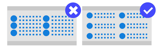
Give related elements a frame to show that they belong together. If you define a clear border, you will be showing your users that the elements within it work as a group.
Cards are often used in UX design. Pictures, descriptions, prices, or CTA buttons are placed within one closed region. Users understand the card and everything inside it as separate from the card next to it.


Law of Continuity
Individual elements that are positioned in a continuous line or a soft curve seem more related to one another than elements that are positioned randomly or in a sharp curve.


How To Use the Law of Continuity
Paying attention to this law while designing your website or app will make your users look at the different elements of your product without thinking twice about it. Their eyes will automatically hover over the design and content.
Besides the lack of effort needed on their part, you can guide your users through the segments. When the continuity of the elements is disrupted, the users realize that a new segment has started. This helps them make their way through the different sections within your product.


Other examples of this on both apps and websites are user registrations and purchases. If the different steps towards these goals are put in order, users understand that they go together and need to be taken before they can complete the action. This way, it’s also easy for users to get an overview of what needs to happen.
Law of Figure and Ground
This law shows that people instinctively recognize if elements are in the foreground or background. Users also know that the foreground is more important than the background.


How To Use the Law of Figure and Ground
You can influence where users focus. By designing your website or app with an explicit foreground and background, you help your users decide where they should focus and what information is incidental.
You can combine beautiful background pictures with important elements like buttons and fields. Your users will recognize the beautiful design but still focus on the important elements.
Be careful though: Make sure that the foreground differs significantly from the background. Otherwise, it won’t work. If you use similar colors, the foreground gets less attention than if you use dissimilar ones.


Law of Symmetry
Symmetric elements give users the feeling that everything is organized, meaning that symmetry makes them feel comfortable with the design of your website or app. If the elements are asymmetrical, your users will waste a lot of time trying to find out the logic behind the asymmetry. They will be left feeling like something’s wrong, missing, or out of balance.


How To Use the Law of Symmetry
You don’t have to try to design your product in complete symmetry. More often than not, this isn’t even possible.… And it would make your app or website look boring.
You have to find the balance between symmetry and asymmetry. Don’t arrange the elements randomly.
Background pictures, matching colors, and other elements will bring balance to your product design if used properly.
Asymmetric elements in a symmetric website or app can take your users’ attention to one specific point of your preference.


Law of Common Fate
The law of common fate says that elements that move in the same direction are more likely to be considered to belong together than those that move in opposite directions or don’t move at all.


How To Use the Law of Common Fate
Because of this law, users expect associated elements to move in the same direction, and vice versa.
This is why to get the most out of this law and fulfill the users’ expectations, you should ensure that the elements that belong together move in the same direction and at the same speed.
You can use this principle when designing drop-down menus or when illustrating a process like user registration. In those cases, the movement is implied through the process.


Conclusion and further reading
If you want to know more about the Gestalt principles or see some real live examples, take a look at our case study. In this app study, we analyze the Netflix app. We show you how the Gestalt principles were used in designing it and the difference that they make on the overall UX of the app.
On the other hand, if you want to know if there are any flaws in the design of your app, use our heatmap tool to figure out where your users are tapping.
If your app design is leading them to think there are clickable areas where there aren’t, or if they’re getting frustrated by certain design elements, you’ll want to know ASAP so you can redesign these screens to improve your UX.
Start a free trial today and take control of your app’s user experience.
You might also be interested in these;
8 Gestalt Principles To Improve Your App Design (Infographic)
What You Can Learn From Netflix Concerning Gestalt Principles
AUTHOR
Annemarie Bufe
Product Analytics Expert
Passionate hobby dancer. Working at UXCam.

Related articles
Product best practices
5 best user behavioral analytics tools for mobile app teams
Behavioral analytics offers deep insights into user interaction. Learn about the best behavioral analytics tools to optimize the user experience on your mobile...

Jonas Kurzweg
Product Analytics Expert
Product best practices
Top 11 Remote Usability Testing Tools You Can Use Now
Usability testing tools that will put your mind at...

Jonas Kurzweg
Product Analytics Expert
Curated List
7 Best AB Testing Tools for Mobile Apps
Learn with examples how qualitative tools like funnel analysis, heat maps, and session replays complement quantitative...

Jane Leung
Product Analytics Expert


