How to Convert Website Visitors into Customers


Many B2B websites struggle with low conversion rates due to unclear messaging, poor user experience, or weak calls to action. If visitors don’t find value quickly, they leave.
This guide will show you practical strategies to turn website visitors into paying customers. Plus, you’ll learn how website analytics tools like UXCam can help you track user behavior, spot friction points, and improve conversions.
Strategies for converting website visitors to sales
| Strategy | Key Actions |
|---|---|
| Optimize first impressions | Prioritize clarity, load fast, mobile optimize, analyze session replays. |
| Craft high-converting CTAs | Use strong action words, test placement, create urgency in CTAs. |
| Reduce signup & checkout friction | Shorten forms, enable one-click options, use progress indicators. |
| Use personalization | Show dynamic content, AI chatbots, behavior-based recommendations. |
| Leverage retargeting & follow-ups | Run retargeting ads, send emails, use exit-intent pop-ups. |
| Build trust & credibility | Display social proof, security badges, industry recognition. |
| Analyze & improve continuously | Identify drop-offs, use session replays, A/B test improvements. |
Optimize for first impressions
First impressions determine whether a visitor stays or leaves. If your website fails to engage users immediately, they won’t stick around long enough to convert. A cluttered layout, slow loading times, or poor mobile experience can drive potential customers away before they even explore your offerings.
Your goal is to capture attention within seconds and create a seamless experience that encourages deeper engagement. Users should instantly understand what your business offers and why they should care. If they have to search for clarity, they’ll likely move on to a competitor.
1. Prioritize above-the-fold clarity
The most critical elements of your website should be visible without scrolling. Visitors should immediately see:
A clear value proposition that explains what you do and how it benefits them.
A compelling headline that aligns with their needs or pain points.
A concise subheading that reinforces the message.
A primary CTA that guides them to the next step, whether it's signing up, booking a demo, or exploring features.
Your headline, subheading, and call-to-action (CTA) should be clear, specific, and benefit-driven. Instead of vague corporate jargon, use direct, engaging language that speaks to your audience’s needs.
For example, instead of: "We offer innovative solutions for businesses."
Try: "Increase conversions with user behavior insights. See UXCam in action."
If your above-the-fold content is cluttered, vague, or missing a clear CTA, users may abandon your site before engaging further.
2. Ensure fast-loading pages
Page speed directly impacts conversion rates. If your site takes more than a few seconds to load, potential customers will leave. Slow pages not only frustrate users but also hurt your search engine rankings, making it harder for new visitors to find you.
Ways to improve speed include:
Compressing images without losing quality.
Using browser caching to store elements for repeat visitors.
Minimizing code by removing unnecessary scripts and plugins.
Choosing a fast hosting provider with a strong infrastructure.
By improving load times, you reduce friction and keep users engaged from the first click.
3. Optimize for mobile responsiveness
More than half of web traffic comes from mobile devices. If your website isn’t optimized for different screen sizes, potential customers will struggle to navigate, causing high bounce rates and lost conversions.
To ensure a seamless mobile experience:
Use responsive design that adapts to all screen sizes.
Ensure buttons and CTAs are easy to tap without zooming in.
Optimize content layout to avoid excessive scrolling.
Test across multiple devices to catch inconsistencies.
Mobile-friendliness is no longer optional—it’s a necessity for conversion-driven websites.
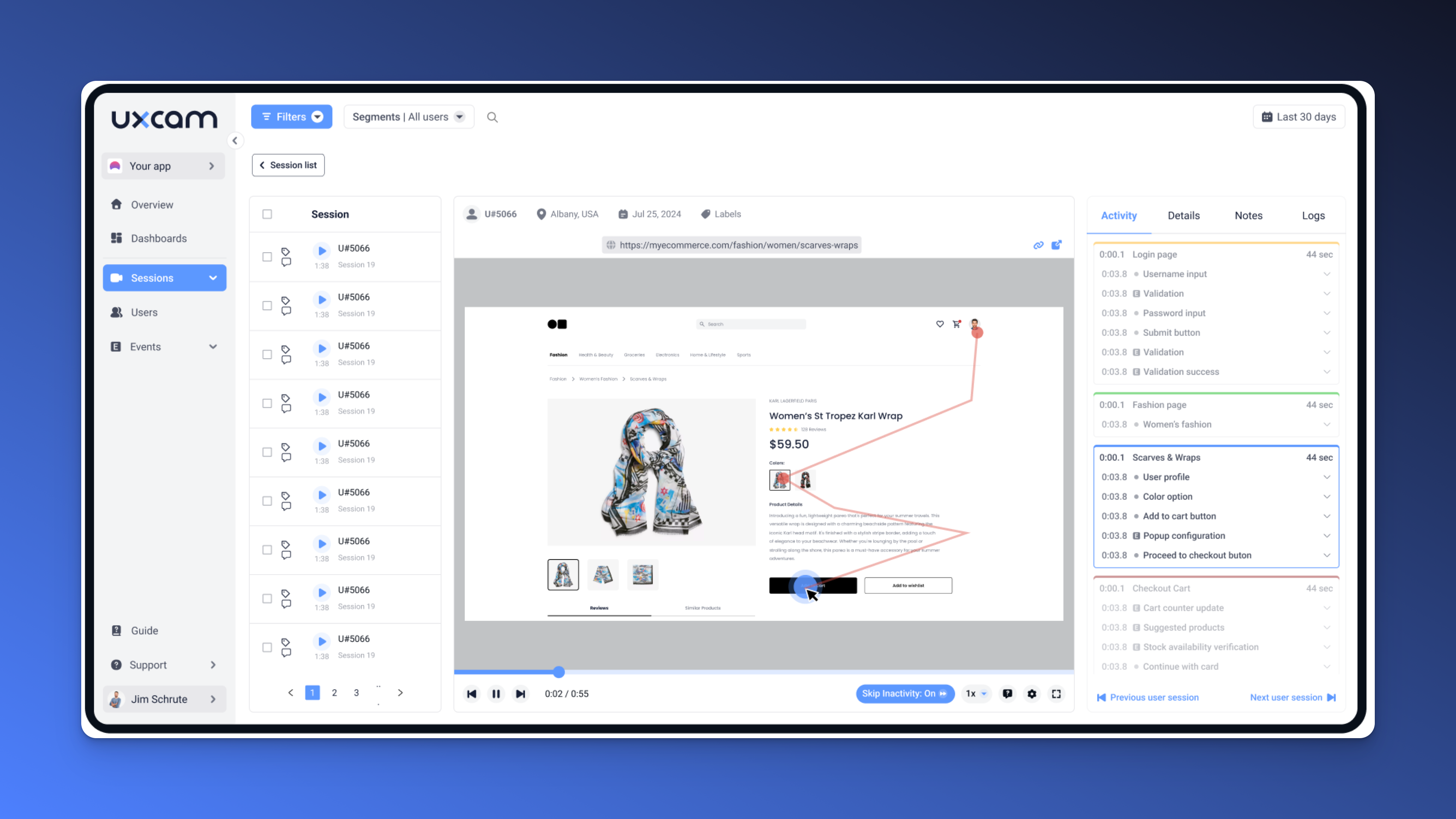
UXCam’s session recordings allow you to see exactly how users experience your site. If visitors hesitate, struggle to navigate, or abandon pages unexpectedly, you can pinpoint usability issues and make data-driven improvements.
By analyzing session replays, you can understand how real users interact with your first-touch experience and optimize accordingly to keep them engaged.


Craft a high-converting call-to-action (CTA)
A weak or confusing CTA leaves visitors uncertain about their next step, often causing them to leave without converting. Your CTA should act as a guidepost, directing them toward the action that benefits both them and your business. It should be impossible to miss and compelling enough to click.
Here’s how to craft a CTA that captures attention and drives conversions.
1. Use Power Words and Strong Action-Oriented Language
Your CTA is only as effective as the words you choose. Weak or vague phrases won’t drive action. Instead, your CTA should be clear, direct, and compelling, making it obvious what users will gain by clicking.
To make your CTA more persuasive, use words that highlight the benefit of taking action rather than just giving an instruction. Compare these examples:
“Submit” → “Get My Free Demo”
“Learn More” → “Discover How It Works”
“Sign Up” → “Start Your Free Trial Now”
These phrases set clear expectations and create a natural motivation to click.
You can also tap into exclusivity to make your offer feel more valuable. People are more likely to act when they feel they’re getting special access. Try:
“Unlock Exclusive Insights” instead of “Download Now”
“Get Instant Access” instead of “Sign Up”
Strong action-oriented language eliminates hesitation and nudges visitors toward conversion.
2. Test CTA placement for maximum visibility
It’s not just what your CTA says but also where you place it that makes the difference. If visitors can’t find it quickly, they won’t click. A well-placed CTA ensures users always have a clear next step, no matter where they are on the page.
High-converting CTA placements include:
Above the fold so it's visible immediately without scrolling.
At the end of a value-packed section to reinforce the decision to act.
Exit-intent pop-ups to capture users about to leave.
Sticky navigation bars to keep the CTA in view at all times.
A/B testing helps optimize CTA placement, but real user insights make the difference.
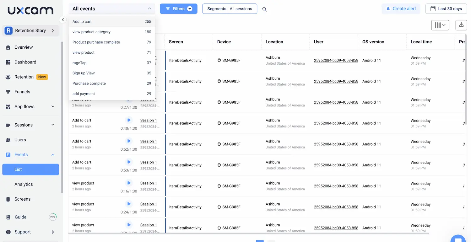
With UXCam’s event tracking, you can measure CTA engagement across pages and devices, identifying where users click, hesitate, or ignore CTAs. If a bottom-of-page CTA underperforms, repositioning or reinforcing it may be necessary.
By combining event tracking and session recordings, you can adjust CTA positioning based on real behavior, ensuring higher visibility and engagement.
3. Add urgency elements to drive immediate action
Visitors often delay taking action, assuming they’ll return later, but most never do. Creating a sense of urgency encourages them to act now instead of postponing their decision.
Here are a few ways to add urgency to your CTAs:
Time-sensitive offers: “Limited-time discount, ends tonight!”
Scarcity messaging: “Only 5 spots left for this month’s free consultation.”
Instant gratification: “Sign up now and get immediate access.”
Urgency works because it taps into basic human behavior. People act faster when they fear missing out on an opportunity. A deadline removes the option to delay, pushing them to decide now rather than later. When faced with a time-sensitive choice, they are more likely to take action rather than risk losing out.
Incorporating urgency into your CTA can significantly increase click-through rates, turning hesitant visitors into engaged users.
With UXCam’s event tracking, you can measure engagement across pages and devices, compare CTA performance, and analyze where users hesitate before clicking.
By leveraging real user behavior, you can refine wording, placement, and urgency to maximize conversions.


Reduce friction in the signup and checkout process
Getting visitors to click on your CTA is a great first step, but if your signup or checkout process is frustrating, you risk losing them right before conversion. The harder it is to sign up or complete a purchase, the more likely users are to give up and leave.
Think about it—have you ever abandoned a signup form because it asked for too much information? Or left an online store because the checkout process felt like a hassle? Your users feel the same way. The goal is to remove unnecessary obstacles, making the process smooth, fast, and intuitive.
1. Shorten form fields
Every extra form field creates friction, making users pause and reconsider whether signing up or making a purchase is worth the effort. A long, complicated form can feel overwhelming, increasing the chances of abandonment.
Before asking for information, consider what’s truly essential. Do you really need a phone number, company size, or job title right away? The fewer fields users have to fill out, the smoother the experience. To make forms easier;
Only ask for what’s necessary to complete the signup or purchase.
Use auto-fill and pre-populated fields to save time.
Apply progressive profiling—collect additional details over time instead of all at once.
A simple, short form removes resistance and encourages more users to complete the process.
2. Offer one-click options
People expect speed and convenience, especially when signing up or making a purchase. If your process feels complicated or time-consuming, users will look elsewhere—often choosing a competitor that offers a smoother experience. Every extra step you require increases the likelihood of abandonment.
To reduce friction:
Enable social login (Google, LinkedIn, Facebook) so users don’t have to create and remember another password.
Allow guest checkout so first-time buyers don’t feel forced to make an account.
When signing up or checking out can be done in a single, effortless step, users are far more likely to complete the process without hesitation. Making conversion easy is the difference between winning or losing a customer.
3. Use progress indicators
When a signup or checkout flow has multiple steps, transparency matters. Users want to know where they are in the process and what’s left to do. Without this, they might assume it’s too long and leave.
Here’s how to keep users engaged:
Add a progress bar to show how many steps remain.
Break long forms into sections so users don’t feel overwhelmed.
Offer a summary page before final submission, allowing users to review their details easily.
A clear, structured journey reduces uncertainty and makes users more likely to complete the process.
Even with a well-optimized signup or checkout flow, some users will still drop off. But where—and why?
With UXCam’s session replay, you can see exactly where users hesitate, struggle, or abandon the process. Are they stopping at a specific form field? Closing the page before submitting? Spending too much time on a single step? These insights help you identify problem areas and make data-driven improvements.


Use personalization to speak directly to your visitors
Not all visitors are the same, yet many websites treat them like a one-size-fits-all audience. The problem? Generic experiences don’t convert well. If a visitor doesn’t feel like your website is speaking to their needs, they’ll lose interest and leave.
Personalization helps users feel understood. When they see relevant content, recommendations, and offers tailored to their needs, they’re more likely to stay engaged and take action.
1. Use dynamic content
Your messaging should adapt to who’s visiting and what they’re interested in. A one-size-fits-all approach can feel generic and unengaging, making it harder to connect with potential customers. Instead of showing the same content to everyone, tailoring the experience makes it more relevant, increasing the chances of engagement and conversion.
Here’s how you can personalize content effectively:
Show industry-specific case studies to B2B visitors so they see success stories relevant to their field.
Personalize product recommendations based on what users have previously browsed, keeping them engaged with offerings that match their interests.
Adjust homepage messaging depending on the visitor’s location, industry, or past interactions, making the experience feel more customized and intuitive.
When users see content that speaks directly to their needs and pain points, it builds trust and keeps them engaged. The more relevant the experience, the more likely they are to stay, explore, and ultimately convert.
2. AI-driven chatbots for instant personalization
Users don’t want to dig through your site to find answers. They want immediate, personalized assistance. AI-powered chatbots can provide that real-time help by:
Answering common questions instantly, reducing the need for support tickets.
Guiding visitors to the right product, demo, or feature based on their browsing behavior.
Offering proactive help when users hesitate on a page for too long.
A well-designed chatbot keeps users engaged, removes friction, and increases conversions by making the experience feel personal and interactive.
3. Behavior-based recommendations
When visitors interact with your site, their behavior provides valuable clues about their interests and intent. Instead of treating every visitor the same, you can use these insights to create a more intuitive experience that naturally leads them toward conversion.
Here’s how to personalize recommendations effectively:
Highlight relevant features or plans based on what users previously viewed.
Adjust homepage content for returning visitors, showing them what’s new or relevant.
Display targeted CTAs based on past behavior, guiding users toward actions they’re most likely to take.
Instead of making users search for what they need, behavior-based personalization puts the right options in front of them—increasing engagement and conversions.
With UXCam’s behavioral tracking, you can see exactly how visitors navigate your site. Track what they click on, how they move between pages, and where they hesitate or drop off. These insights allow you to segment users based on their actions, helping you tailor messaging and recommendations that match their intent.


Leverage retargeting & email follow-ups
Not every visitor converts on their first visit. Many browse, compare options, and leave—often with the intention to return but never do. Without a follow-up strategy, those potential customers may forget about your brand entirely or choose a competitor instead.
To bring them back, you need to stay visible and relevant with personalized reminders and incentives.
Use email remarketing to send automated follow-ups tailored to their last interaction. If a user abandoned a free trial signup, a well-timed email with additional benefits or customer success stories can reignite their interest.
Run retargeting ads across platforms like Google, Facebook, and LinkedIn to keep your brand top of mind. When high-intent visitors see relevant messaging, they’re more likely to return and complete their action.
Implement on-site retargeting with exit-intent pop-ups that offer an exclusive discount or free demo. A well-placed offer at the right moment can convince hesitant users to stay and take the next step.
Not all returning visitors are the same. Some need a gentle reminder, while others need a stronger incentive to act. With UXCam’s behavioral tracking, you can analyze returning visitors' browsing patterns, past interactions, and drop-off points to refine your retargeting efforts.
By tracking engagement, you can adjust your email sequences, retargeting ads, and exit pop-ups to align with user intent—making your follow-ups more effective and personalized.
Optimize for trust and build credibility
Even if visitors are interested in your product, doubt can stop them from converting. Unanswered questions about quality, security, or reliability can create hesitation, especially for first-time buyers. If users don’t trust your brand, they won’t commit.
To eliminate uncertainty and build confidence, make trust signals highly visible throughout the user journey.
Show social proof with real customer testimonials, case studies, and client logos. Seeing others have succeeded with your product reassures potential buyers.
Highlight security assurances like money-back guarantees, privacy compliance badges, and secure payment icons. These signals reduce perceived risk and make decisions feel safer.
Display industry recognition by featuring awards, partnerships, and expert endorsements. If trusted brands vouch for your product, new users will feel more confident choosing you.
When visitors feel reassured that your product delivers on its promises, they are far more likely to convert.
Use data-driven insights to improve conversion rates
Optimizing your website for conversions isn’t a one-time task—it’s an ongoing process. What works today may not work tomorrow as user behavior changes. To stay ahead, you need to continuously analyze performance and make data-backed improvements rather than relying on guesswork.
Identify where users drop off
Even a well-designed conversion funnel can have weak spots. If users are abandoning a signup, checkout, or demo request, something is creating friction.
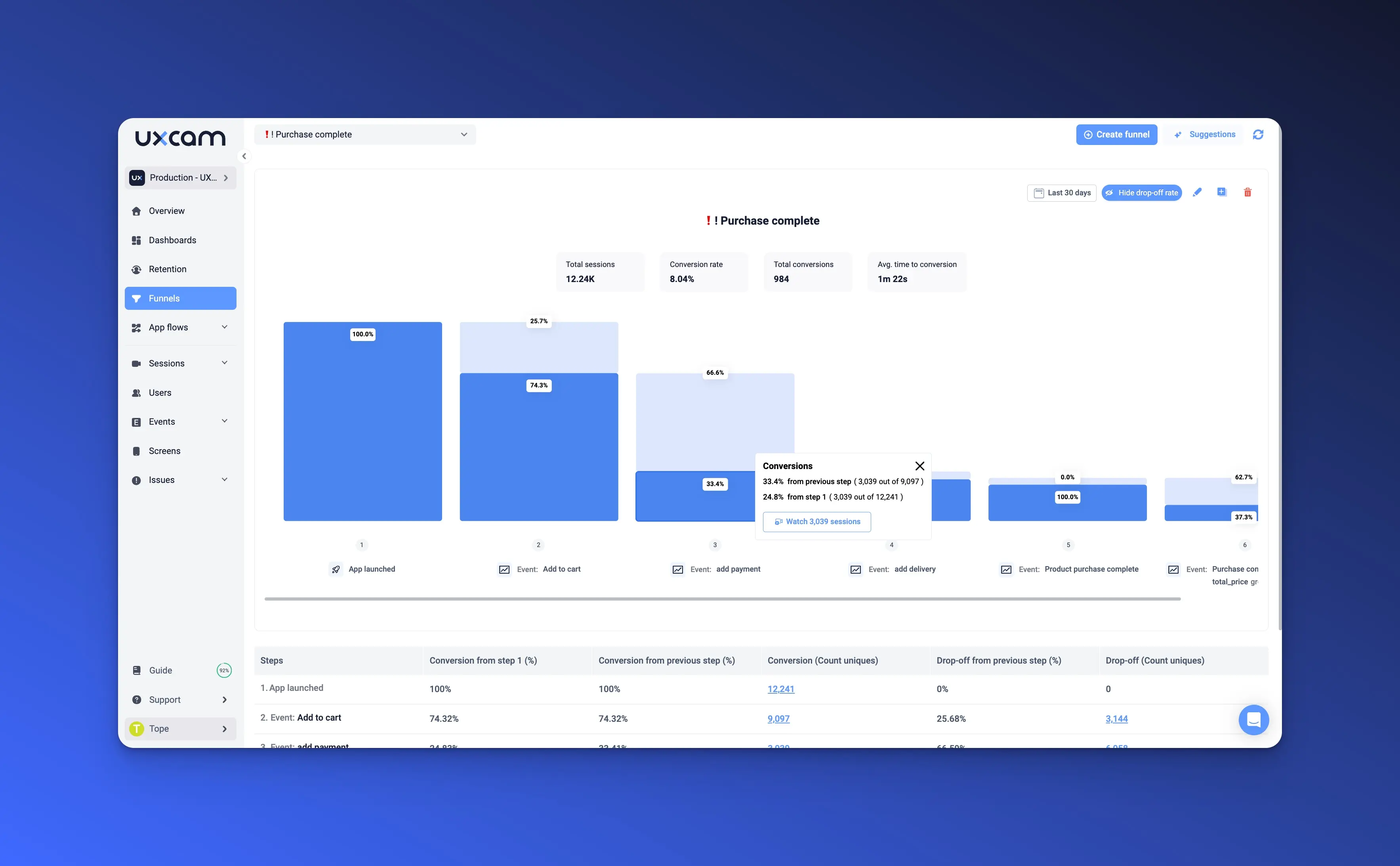
Analyze conversion funnels to see exactly where users are dropping off. Are they leaving right before completing a form? Are they navigating away from a pricing page without clicking?
Identify bottlenecks and make targeted improvements instead of blindly redesigning your site.
When you know where users are losing interest, you can focus on why—and fix it.
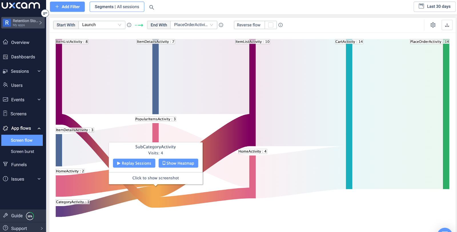
Spot usability issues with session recordings & heatmaps
Sometimes, users drop off not because of the offer but because of the experience. Confusing navigation, broken elements, or hard-to-find CTAs can silently kill conversions.
Session recordings let you watch real user interactions, revealing hesitation points, misclicks, and frustration.
Heatmaps show which parts of the page attract the most (or least) attention, helping you understand whether key content and CTAs are getting noticed.
With these insights, you can refine your site to remove friction and create a smoother user journey.
A/B test changes based on data, not assumptions
Making website changes without data is a gamble. Instead of guessing what might work, A/B testing allows you to compare variations and see what actually improves conversions.
Test different CTA placements, wording, and colors to see what drives the most clicks.
Experiment with form length, checkout steps, or page layouts to find the most user-friendly version.
Measure the impact of trust signals, social proof, or urgency messaging on user decisions.
By continuously testing and refining, you create a website that adapts to user behavior and consistently improves over time.
Conclusion and next steps
Boosting conversions requires a strategic approach that removes friction, personalizes experiences, and continuously improves based on real user behavior. Even small enhancements in clarity, trust, and usability can significantly impact whether visitors stay, engage, and take action.
To see real results, you need data-driven insights, not guesswork. UXCam helps you track how users navigate, where they drop off, and what drives engagement, so you can fine-tune your site for maximum impact.
Don’t let potential customers slip away. Start tracking visitor behavior with UXCam today and turn insights into higher conversion rates. Try UXCam for free and see the difference yourself.
You might also be interested in these;
What is Web Analytics? Definition, Metrics & Best Practices
Conversion Funnel Analysis - How to Spot and Fix Drop-offs
Web Analytics Reporting - How to Create Actionable Reports
8 Best Conversion Rate Optimization Tools for Web Apps
User Session Recording on Websites - A Detailed Guide
Website Visitor Tracking - A Comprehensive Guide
Top 10 Digital Analytics Tools You Need to Know
AUTHOR
Tope Longe
Product Analytics Expert
Ardent technophile exploring the world of mobile app product management at UXCam.


Related articles

Website Analysis
21 Website Visitor Tracking Tools with Top-Rated User Reviews
Discover the 21 best website visitor tracking tools, featuring top-rated user reviews to help you choose the perfect solution for understanding and enhancing your site’s...
Tope Longe
Product Analytics Expert


Website Analysis
14 Website Analytics Metrics to Track for Product Teams
Discover 14 essential website analytics metrics every product manager should track to improve user experience, boost conversions, and drive product...


Website Analysis
Top 14 SaaS Product Usage Metrics and How to Improve Them
Discover the top 14 SaaS product usage metrics to track, including engagement, retention, and conversions, plus actionable strategies to optimize and drive...
Tope Longe
Product Analytics Expert