How to Improve User Experience on Website


As a product manager, you already understand the value of great UX. But when users drop off or bounce, it’s not always obvious what went wrong or where to look.
Was it a slow page load? A confusing flow? A broken element on your signup page?
Those answers often hide in the user experience itself. And that’s a problem, because 88% of users won’t return after just one bad user experience.
In this article, we break down how to improve user experience on your website with a sharper, data-driven lens. You’ll learn practical ways to find UX issues fast, using tools like UXCam for Web to go beyond assumptions and into action.
Let’s dive in.
Summary - How to improve user experience on website
| How to improve website UX | What to do |
|---|---|
| Improve page load speed | Use PageSpeed tools and UXCam funnels to spot slow points. |
| Optimize core web vitals | Focus on LCP, INP, CLS and validate with replays. |
| Simplify navigation and reduce click depth | Audit journeys and use UXCam paths to find drop-offs. |
| Make mobile experience a priority | Test flows on real devices and segment by UXCam data. |
| Fix broken UX flows and rage clicks | Use session replays to find and fix hidden issues. |
| Improve content clarity and readability | Use scroll maps to see if users engage or drop off. |
| Create a consistent visual hierarchy | Watch sessions to spot hesitation and UI confusion. |
| Add microinteractions and feedback cues | Add loading states and success cues; validate with replays. |
| Reduce form friction and optimize CTAs | Shorten forms and analyze field-level drop-offs. |
| Continuously test and iterate UX changes | Monitor updates with funnels and replays regularly. |
What is website user experience (UX)?
When we talk about website UX, we’re talking about how people feel when they interact with your site—not just how it looks, but how easily they can navigate, find value, and complete tasks without friction.
In a product-led world, that experience is your product. It’s not an afterthought—it’s what drives adoption, conversion, and retention.
A clean interface (UI) matters, but UX goes deeper. UI is the layout and visuals. UX is whether the flow makes sense. Does the user know what to do next? Are they confident, or confused? Are you helping them succeed—or silently losing them?
Great UX makes the user journey effortless. Bad UX? It introduces doubt, frustration, and drop-off points—often in places you didn’t expect.
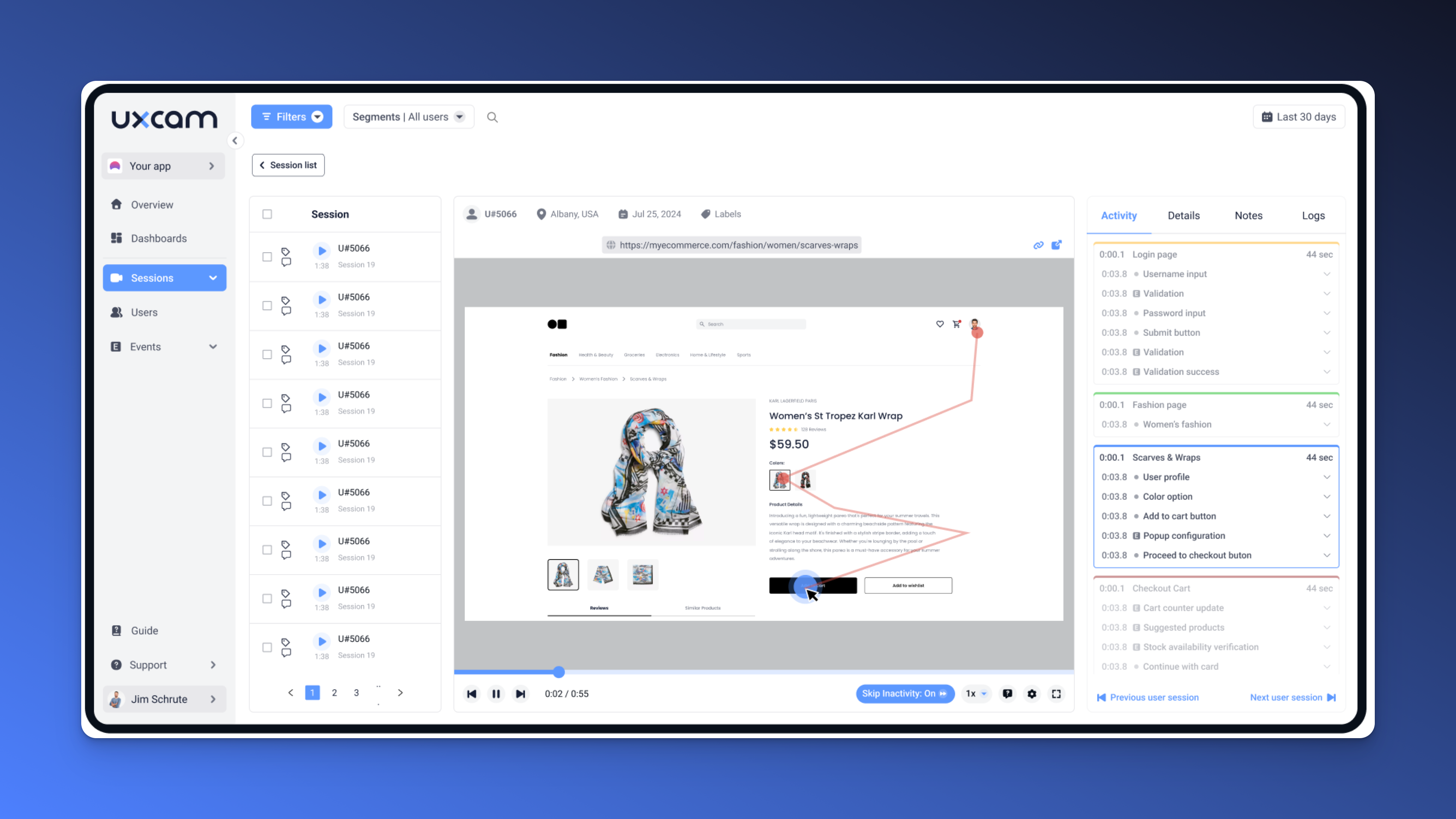
And that’s where most teams struggle: you can’t fix what you can’t see. You may think the login flow is simple… until you watch session recordings where users fumble through it.
As a PM, that level of visibility is a game-changer. You move from assumptions to clarity. From guessing to prioritizing the right fixes.
How to measure user experience on a website
Improving website UX starts with understanding it and that means measuring more than pageviews or bounce rates.
You need to know where users struggle, hesitate, or leave entirely.
As a PM, measuring the right metrics shine a light on friction points. The wrong ones? They just make you feel busy.
Here are the key signals your have to look at to measure website UX effectively:
Task completion rates – Can users actually do what they came to do?
Drop-off points – Where exactly in the journey are they exiting?
Time on task – Are they getting through key flows efficiently?
Interaction patterns – Are they clicking what we want them to click or something else entirely?
Session replays and rage clicks – These show frustration you can’t see in dashboards alone.
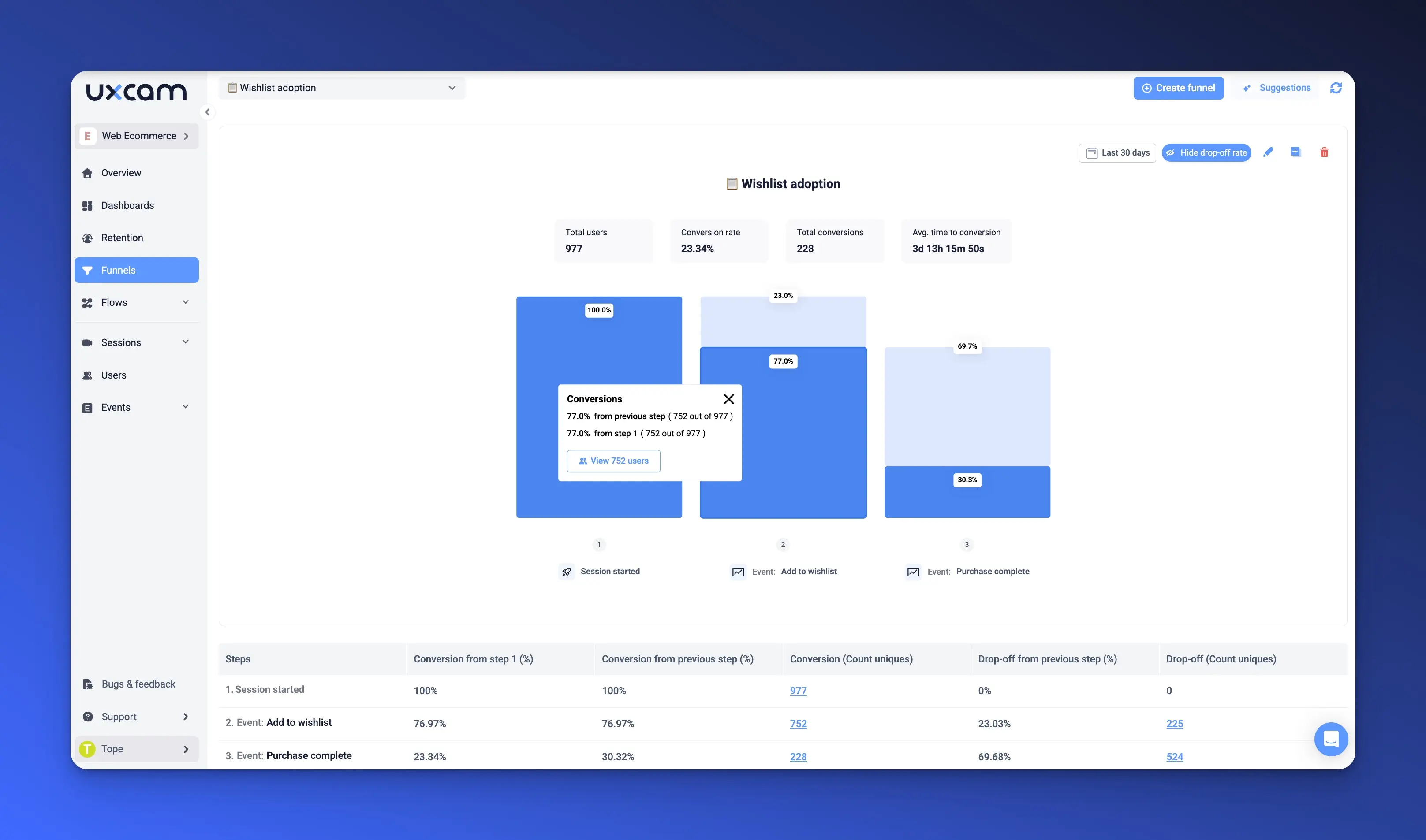
This is where tools like UXCam for Web really help. Instead of just showing a drop in your signup funnel, UXCam shows why. You can watch sessions, identify friction, and see patterns across user segments.
You don’t need to guess. With the right behavioral insights, you can fix what matters, before it impacts conversion or retention.
10 proven ways to improve website UX
Improve page load speed
Optimize core web vitals
Simplify navigation and reduce click depth
Make mobile experience a priority
Fix broken UX flows and rage clicks
Improve content clarity and readability
Create a consistent visual hierarchy
Add microinteractions and feedback cues
Reduce form friction and optimize CTAs
Continuously test and iterate UX changes
1. Improve page load speed
Let’s start with the obvious one, page load speed.
You already know slow load times kill user patience. But what you may underestimate is how much it affects trust. A slow site frustrate users and makes your product feel unreliable. Especially on mobile.
We’ve seen teams spend months refining UX flows, only to lose users before the page even loads. That’s wasted effort.
Start with the basics: run Google PageSpeed Insights or Lighthouse on your core pages. Prioritize LCP (Largest Contentful Paint) and Time to Interactive. Shave seconds, even milliseconds, where you can.
But here's the thing: speed is meaningless without context. That’s where UXCam comes in. Use funnels to correlate drop-off rates with page load times. Watch session replays of users bouncing in the first few seconds. Are they dropping off before content even renders? Are mobile users suffering more than desktop?


The insight isn’t just that speed matters but where it matters most in the journey. Prioritize those bottlenecks.
2. Optimize core web vitals
You’ve probably heard the term “Core Web Vitals” thrown around, especially if you’re working closely with SEO or front-end engineering. But as a PM, you need to understand how these metrics connect directly to real user experience.
Let’s break them down:
LCP (Largest Contentful Paint): How fast the main content loads
INP (Interaction to Next Paint): How quickly your page responds after a user interacts
CLS (Cumulative Layout Shift): How stable the layout is while loading
These aren’t just technical metrics, they’re user-centric indicators of how smooth or frustrating your site feels.
Slow LCP? The page feels broken or unfinished. Poor INP? The user taps or clicks—and nothing happens for a moment. That delay creates doubt. High CLS? The layout shifts, and the user misclicks something critical—like “Delete” instead of “Submit.”
Start by auditing your Core Web Vitals with Lighthouse or PageSpeed Insights. Then partner with your dev team to dig into asset loading, third-party scripts, and layout structure.
But remember: those lab tools give you synthetic data. They don’t show you what users are actually experiencing.
Use session replays in UXCam to observe users scrolling through slow-loading pages, mis-tapping shifting buttons, or clicking multiple times out of frustration. It gives you the qualitative proof to back the metrics and helps you prioritize fixes based on actual user behavior.
You’re not just chasing performance scores, you’re removing invisible blockers in your user journey. And that’s the difference between “technically fast” and actually usable.
3. Simplify navigation and reduce click depth
If users can’t find what they need fast, they leave. It’s that simple.
You might think your information architecture is clean. But users don't read menus, they scan and guess. And every extra click adds friction.
The best practice here is conducting quarterly navigation audits. Map out your user’s top tasks and see how many clicks it takes to complete them. Your goal? Keep it under three.
But structure alone doesn’t tell the whole story.


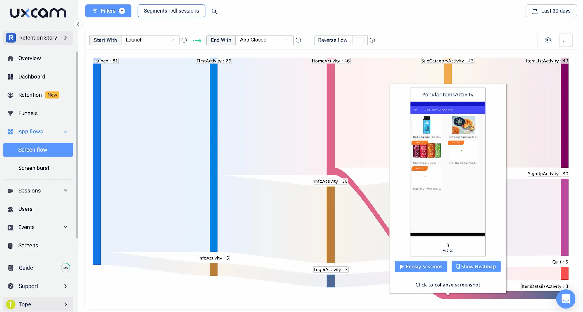
This is where UXCam earns its keep. Watch session replays to see how users actually move through your site. Are they looping back and forth between pages? Getting stuck in dead ends? Rage clicking your main menu?
You can also use UXCam’s path analysis to visualize real user flows and not just what you think the journey should be. That insight helps you identify which links, buttons, or pathways need simplifying.
Make navigation intuitive, not clever. The best website UX often feels invisible and that’s exactly what you want.
4. Make mobile experience a priority
If you're still treating mobile as a second-class citizen, you're already behind.
Over half of your traffic, if not more, is coming from mobile devices. And mobile users behave differently. They tap instead of click. They scroll more. Their screens are smaller, and their patience is shorter.
A flow that works beautifully on desktop can fall apart on mobile. Maybe a button is too small. Maybe a modal gets cut off. Maybe the page scrolls awkwardly because of a sticky footer.
Here’s what we’ve learned the hard way: Never assume your responsive design is enough. Always test critical flows, signup, onboarding, checkout on actual devices.


This is where UXCam becomes a real asset. With UXCam for Web, you can segment session data by device type, OS, screen resolution, and even browser. This lets you spot trends, for example maybe users on chrome are dropping off more than Safari, or maybe users on older iPhones keep rage-clicking a button that’s misaligned.
You can also watch session replays to see what’s actually happening on those screens. That level of insight helps you prioritize mobile fixes that matter, not just guess what might be broken.
Make mobile a first-class experience. Your users already expect it to be.
5. Fix broken UX flows and rage clicks
Broken UX flows are silent killers. They don’t show up in crash logs or error trackers. Instead, they show up in frustration, confused users, abandoned sessions, and lost conversions.
We’ve seen it too often: a form that doesn’t submit, a “Next” button that leads nowhere, or a modal that won’t close. You might never catch these bugs through QA or UAT. But your users will, within seconds.
Users won’t report these issues, they’ll just leave.
That’s why session replay and behavior tracking are so powerful. They give you visibility into what’s actually breaking the experience, not just technically, but emotionally.
UXCam makes this super easy. It automatically detects rage clicks and broken flows, when users repeatedly tap or click something that doesn’t respond. That’s not just a UI issue, it’s a trust issue. And it often signals something is broken or unclear.


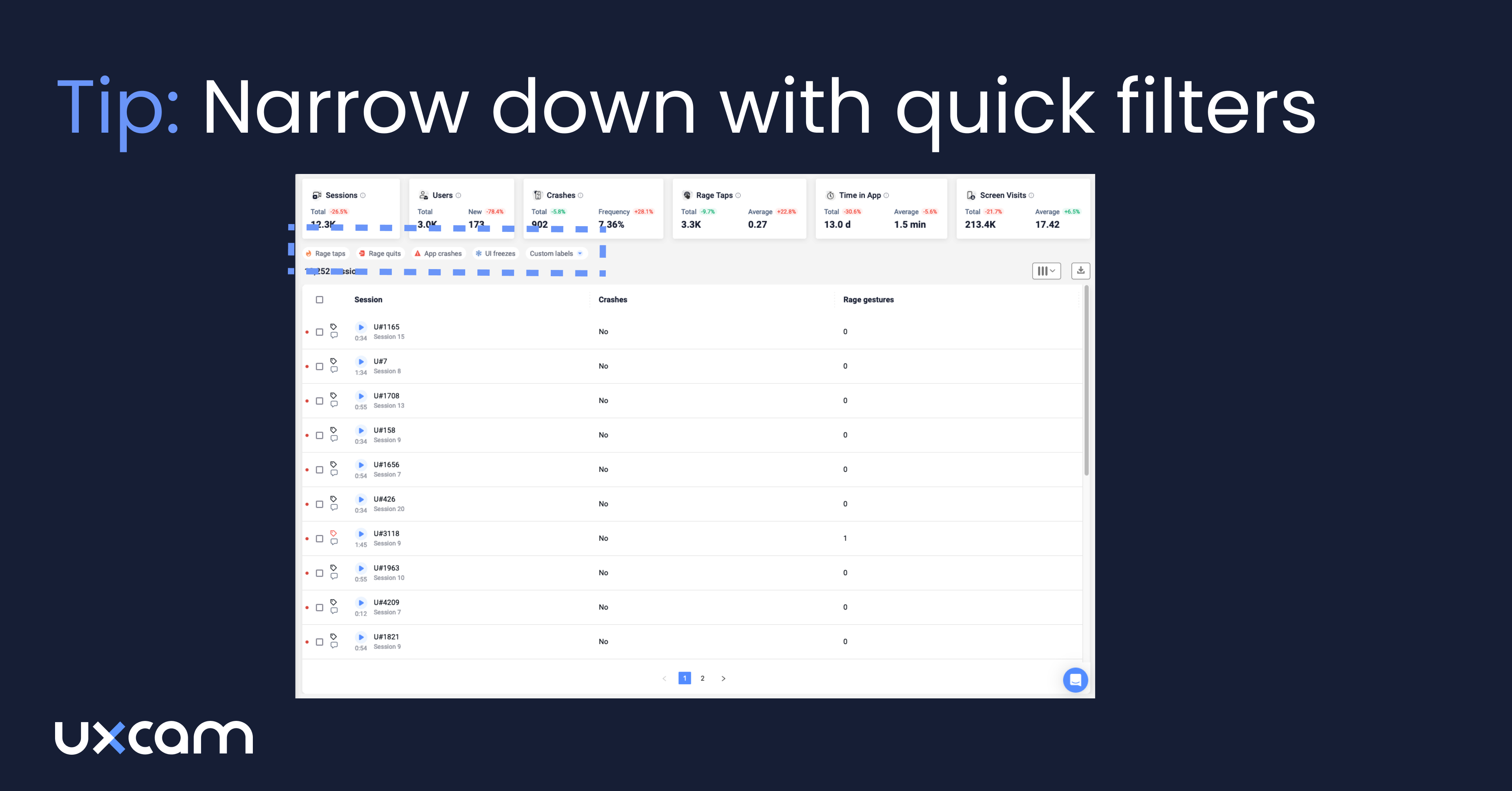
You can filter by rage taps or session errors and immediately watch what happened. No guesswork. No waiting for angry support tickets.
Once you find the pattern, fix it fast and watch your conversions bounce back. If you do nothing else, start here. These are your quickest UX wins with the highest impact.
6. Improve content clarity and readability
Design pulls people in, but content moves them forward.
If your copy is unclear, bloated, or hard to scan, users will bounce, even if the rest of the experience is flawless. Especially on mobile.
Words matter as much as layout. The best content is clear, actionable, and written for how people actually read online, fast, distracted, and usually on the go.
So how do you know if your content is working?


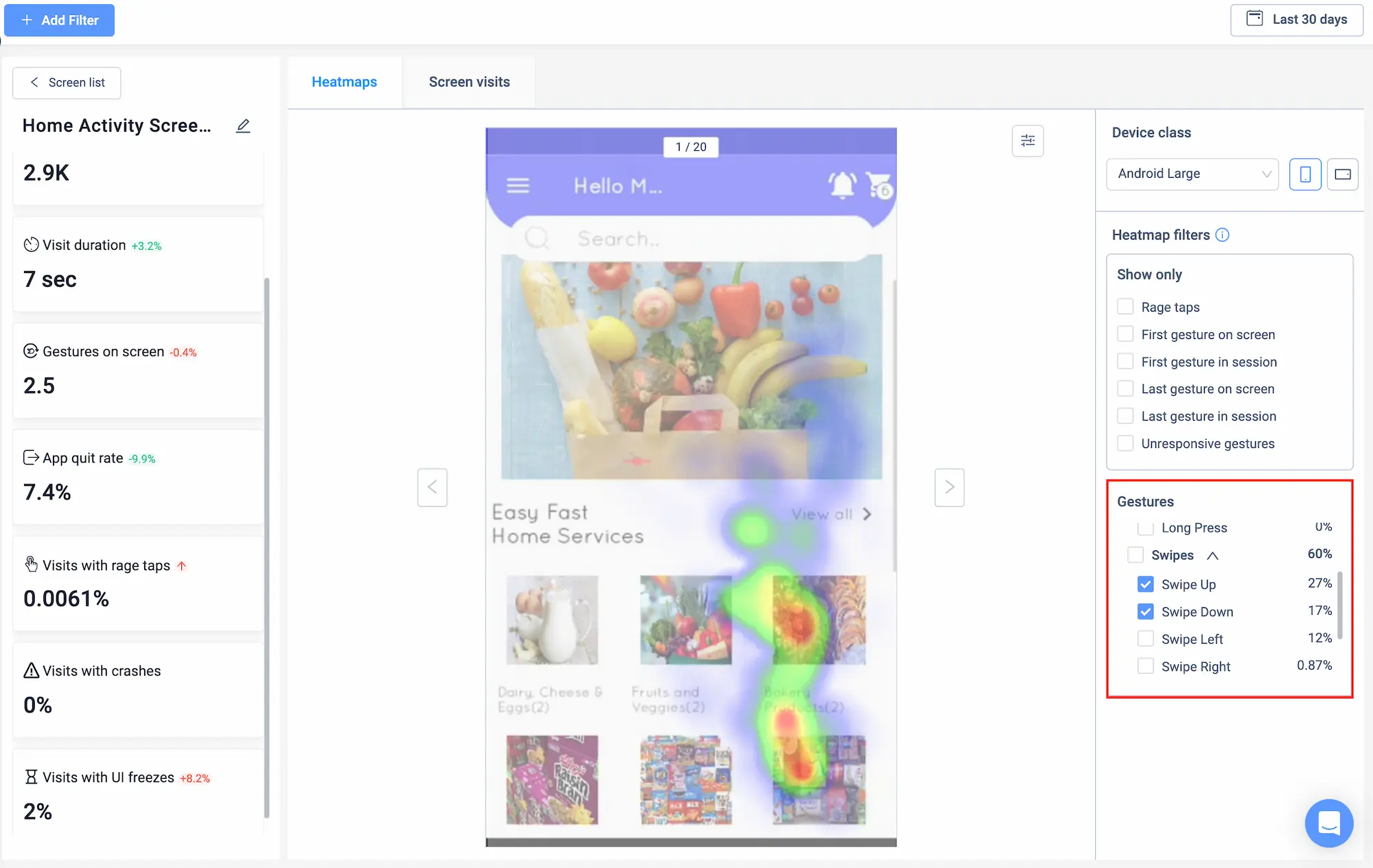
Use scroll maps and heatmaps. These show you how far users scroll, where their attention drops off, and which parts of the page they ignore completely.
With UXCam, you can see where users stop reading, skim past CTAs, or hover endlessly without clicking. Combine that with session replays, and you’ll start to understand the why behind the scroll behavior.
Once you spot the weak points, test changes:
Shorten dense paragraphs
Break up content with headers and bullets
Make your calls-to-action bold, clear, and benefit-driven
This isn’t about writing better, it’s about communicating better. When users understand what to do next, they move forward. And that’s the heart of great UX.
7. Create a consistent visual hierarchy
A confusing visual hierarchy creates cognitive load—and cognitive load kills momentum.
If users have to stop and think, “Where do I look first?” or “Is this clickable?”, then you’ve already lost them.
Your job isn’t to show off every design element, it’s to guide attention. Show users what matters most, and do it fast.
From our years of helping happy customers build and scale products, we know: inconsistent spacing, misaligned elements, and clashing colors create subtle friction. It may not crash your app, but it erodes trust and usability.
So how do you spot these issues at scale?
Use UXCam to watch session replays to see where users hesitate, scroll back up, or misclick something that looks interactive but isn’t.
That hesitation? That’s your signal.
Clean, consistent visual hierarchy helps users predict what comes next. Headlines stand out. CTAs feel clickable. Supporting text fades into the background. Everything just flows.
Build a design system. Stick to it. And use UXCam insights to validate whether your visual decisions are working or quietly costing you conversions.
8. Add microinteractions and feedback cues
Here’s something we wish more teams prioritized: feedback.
When a user taps a button, submits a form, or uploads a file, they need reassurance that something’s happening. A simple animation. A spinner. A checkmark. Anything to signal: “You’re on the right track.”
Without feedback, people assume the worst. They double-click. Refresh. Or worse—leave.
This is where microinteractions helps. These tiny animations and cues reduce uncertainty and boost user confidence.
But how do you know where these are missing?


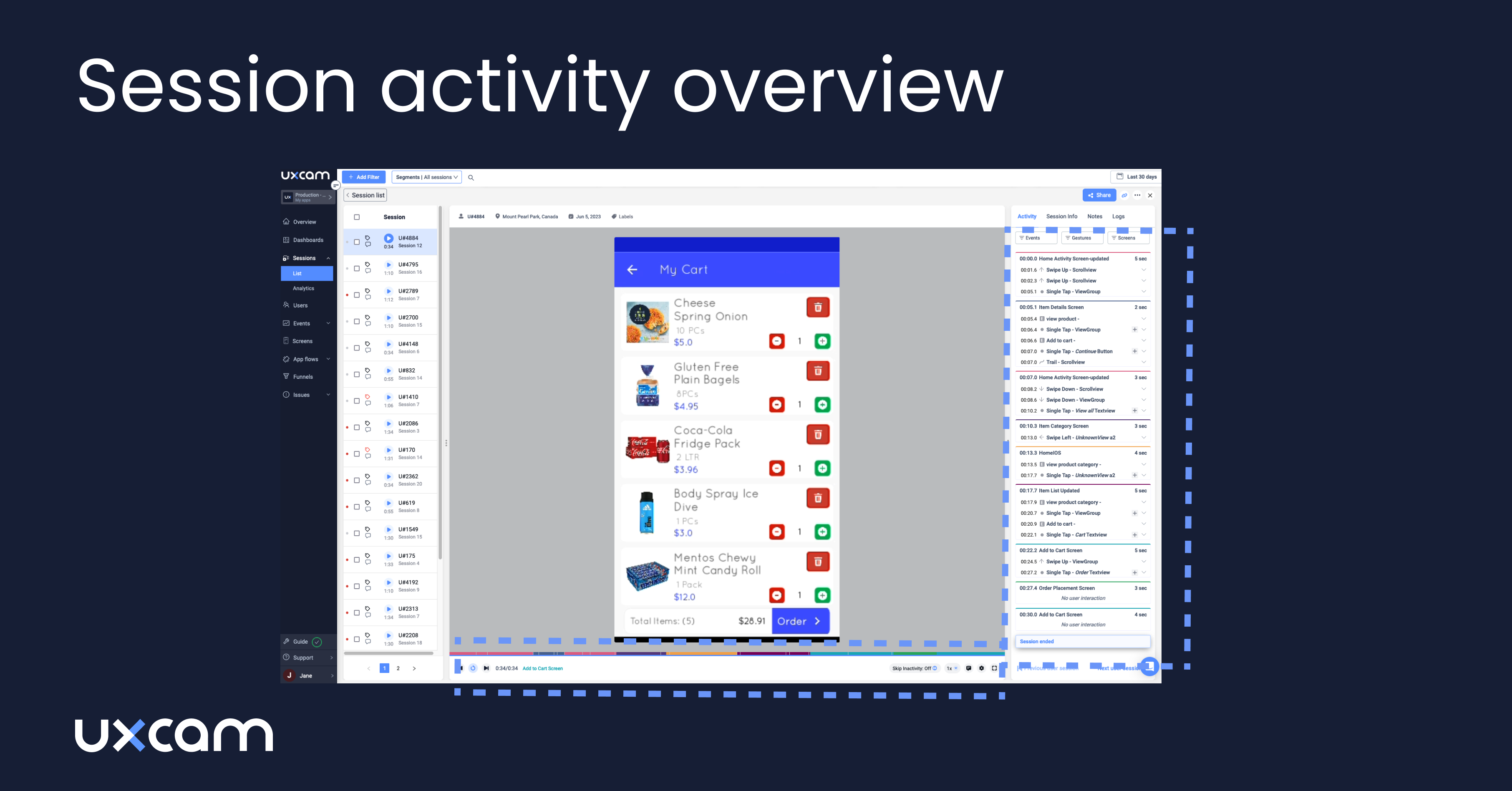
Once again, with UXCam's session recordings, you can literally watch users click a button and then click it again… and again. That’s your sign: they didn’t get feedback. Maybe the loading state is too subtle. Maybe the page didn’t scroll as expected.
Fixing these tiny gaps can drastically improve perceived performance, even if the actual speed doesn’t change.
So here’s the tip:
Add visual cues to every major action
Validate them with real user sessions
And when in doubt, over-communicate progress
9. Reduce form friction and optimize CTAs
Forms are where intent becomes action, signups, checkouts, demo requests. But they’re also where a lot of good users silently drop off.
Long forms, unclear labels, bad validation logic… these issues don’t feel like “bugs,” but they bleed conversions every day.
Here’s our rule of thumb after years of watching form data and user sessions: every extra field is a chance to lose someone. And every vague CTA is a missed opportunity to guide them forward.
Start by auditing your forms. Ask yourself:
Do we really need all this info right now?
Are we guiding the user through each step?
What happens when they make a mistake?
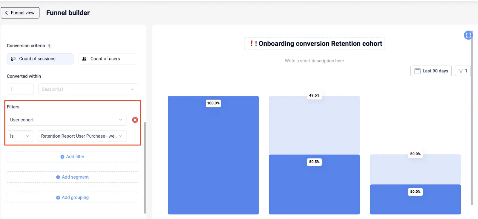
Now add behavior data to the mix. UXCam shows you exactly where users abandon forms. You can filter sessions by drop-off, watch where they get stuck, and even pinpoint which field they gave up on.
Maybe the phone number field isn’t formatting properly. Or maybe the password criteria are too strict and poorly explained. You won’t see that in Google Analytics or traditional analytics solutions but you will see it in UXCam.


While you're at it, tighten up your CTAs:
Be specific (“Get My Free Report” beats “Submit” every time)
Position the benefit front and center
Test button placement and color if necessary, but test copy first
Reducing friction here is one of the highest-leverage UX improvements you can make. It directly impacts signups, revenue, and retention.
10. Continuously test and iterate UX changes
The best UX isn’t built once, it’s constantly improved.
Too many teams ship a redesign, feel good for a quarter, and move on. But user expectations evolve. Device types change. What worked six months ago might not work tomorrow.
The most successful product teams I’ve worked with treat UX like a living system. They’re always testing, watching, learning, and refining.
You don’t need to run A/B tests on every button color. But you do need a feedback loop:
Quantitative data to spot where people drop off
Qualitative data to understand why


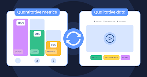
UXCam gives you both. Funnels and heatmaps show you where users lose momentum. Session replays give you the story behind it.
You can test a new flow, then watch real users interact with it, without having to wait for support tickets or NPS surveys.
And here’s the kicker: even small improvements compound over time. A 5% lift here, a 3-second improvement there… that adds up to happier users and better business results.
So make UX iteration part of your roadmap, not a side project. Build. Measure. Watch. Improve. Repeat.
Conclusion
At the end of the day, user experience is a product decision, and that puts you, the PM, right at the center of it.
You’re not just prioritizing features or managing timelines. You’re the voice of the user in every meeting, every sprint, and every roadmap discussion.
And the best way to advocate for users? Bring the data. Not just numbers, but evidence. Real user sessions. Real drop-offs. Real frustration.
That’s how you move UX from subjective opinion to actionable insight. That’s how you win buy-in from stakeholders. And that’s how you build products people actually enjoy using.
UXCam for Web gives you the visibility you need to lead with confidence. From session replays to funnel analysis to rage tap detection—you’ll understand what’s happening, why it’s happening, and where to focus next.
Start making smarter, faster UX decisions—backed by data, not guesswork.
Try UXCam Web and turn user insights into real product wins today.
You might also be interested in this;
10 Top UX Design Best Practices & How to Implement Them
UX Testing - Methods & Tools to Test User Experience
Mobile UX Design - The Ultimate Guide
19 Best UX Tools To Design a Better User Experience
UX Optimization - 4 Steps to Deliver a Better User Experience
14 Best Product Development Software for Every Team
AUTHOR
Tope Longe
Product Analytics Expert
Ardent technophile exploring the world of mobile app product management at UXCam.


Related articles


Website Optimization
10 Best Landing Page Optimization Tools
Boost conversions with the 10 best landing page optimization tools. Compare features, pricing, and use cases for growth-focused...
Tope Longe
Product Analytics Expert


Website Optimization
10 Proven Web Analytics Best Practices for Product Teams
Discover 10 proven website analytics best practices to boost product performance, improve user insights, and drive growth—plus a free UXCam Web...
Tope Longe
Product Analytics Expert


Website Optimization
12 Actionable Strategies to Improve Website Engagement
Boost user engagement with 12 proven strategies. Learn how to use website analytics, session replays, and behavior insights to improve conversions and...
Tope Longe
Product Analytics Expert