Adaptive vs. Responsive Design: How to Optimize Your Website

Life has been a lot easier before the invention of smartphones, tablets and laptops in every imaginable size – at least in terms of design and programming.
There are different ways to optimize the design of a website for different screen sizes.
A mobile-optimized website is important!
Why?
The usage of smartphones rose from 17% of adults who owned a smartphone in 2008 to 78% in 2018, the tablet usage rose from 2% in 2011 to 58% in 2018. And new inventions like wearables are coming, or have already reached the market.
Do you think desktop PC’s are still important?
Sure, but the number of users is falling. While 69% of the adults owned a desktop PC in 2008, just 28% owned one in 2018.
Still not convinced that you have to think about a mobile-optimized website? Have a look at what Google found out.
“¾ of mobile users say they’re more likely to revisit mobile-friendly sites” – Google
Now let’s start from the beginning, the differences between the most common techniques: adaptive and responsive design.
I’ll explain the advantages and disadvantages of both and help you to decide which is the best for you.
But be aware, I can’t give you a general blueprint when you have to use which type, but I can give you everything you need to understand the differences and benefits of both designs so that you can decide which is the best for you.
Adaptive Web Design
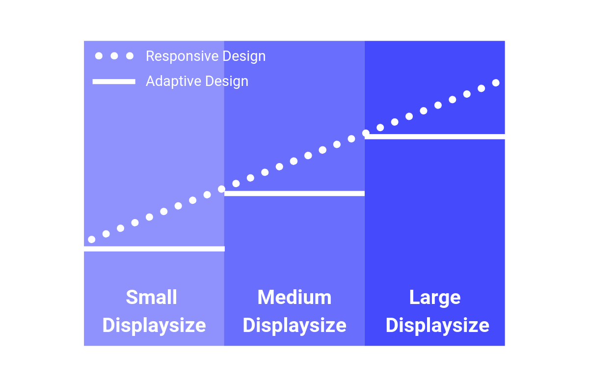
Adaptive design offers different fixed layouts for multiple (but not all) screen sizes. The layout used depends on the device and screen size.
Generally, you would design adaptive layouts for the six common screen widths: 320px, 480px, 760px, 960px, 1200px and 1600px.
In essence, the website is optimized for different devices.
How does this work?
The website recognizes the screen size and selects the best fitting layout size. Resizing the browser window doesn’t change the layout constantly like a responsive design would. It changes when the screen size crosses the border to another layout size.
For example, there are three different layouts for desktop, tablet and smartphone. When opening the site it was detected which device or screen size was used and the fitting layout was delivered.
If the device on which the website loads, the website has the exact screen size for which the layout was optimized, then the presentation is perfect. If the screen size is bigger or smaller than the presentation is not perfect. A display which is wider than the layout means a waste of space. A smaller display means it’s harder to optimize presentation. In the worst case, it loads the wrong layout (e.g. it loads the smartphone layout on a small tablet).
Pros of Adaptive Web Design:
Because of the fixed dimensions of the layouts it is easy to plan and design different layouts with the help of wireframes and sketches
Technically easy to implement
Content just has to be arranged on the designed dimension, it hasn’t to arrange automatically
One layout is faster to implement than a responsive layout
Cons of Adaptive Web Design:
The layout is just optimized for a given number of devices
It does not cover uncommon screen sizes
The layout is just optimized for fixed dimensions
Frequent misrepresentation of deviating sizes
Need to analyze the target group and the commonly used devices of the target group
Probable waste of space if the device is bigger than the layout
In worst case it loads the wrong layout
Less flexibility than a responsive design
To cover all common screen sizes, you have to design six different layouts
Responsive Web Design
Responsive Design provides the optimal viewing experience of a website, no matter what size or type of device is used.
The website grows and shrinks according to the range of the device or browser window. The design is flexible so that the available space is always optimally used. It adjusts the placement of the elements to fit the available screen size. When you change the size of the browser window, the content elements rearrange itself dynamically and automatically in the given space.
Pros of Responsive Web Design:
Optimized presentation for every screen size
Good user experience on every device
No waste of space
It covers new devices and screen sizes too (no need to design a new layout like in an adaptive layout)
It covers very uncommon screen sizes
More flexible than an adaptive design
Cons of Responsive Web Design:
Implementation is more complex
Implementation needs more time
It’s harder to design the layout with wireframes or sketch notes because the dimensions are not fixed
Full design control is not possible, wrong presentation of content is possible


What design is the best for me?
A responsive design is the best option if you want to make sure it will show your website in a mobile friendly way, doesn’t matter which device or screen size your users use. Especially when your company reaches out to a larger target group, focus on this design.
However, if you focus on one special target group which uses mostly one type of device and screen size, the adaptive design will be easier to make an option for you. With this you can make sure that your personal website looks good or minimally acceptable on different devices. You can save on designing and programming resources and focus on your main website. But take in mind that when you want to cover all the common screen sizes, you have to design 6 different layouts.
If you want to take control over how the content is delivered on the most important devices, the adaptive design is probably the best solution for you.
If you want to cover all screen sizes and make sure that your website looks good or if your target group uses a wide range of mobile devices, the responsive design is a great option for you.
No one can tell you which is the 100% perfect solution. It is just about finding out what is the best solution for you and your customers. Weigh the pros and cons, compare the costs of time and money with the benefits and focus on your target group.
It doesn’t matter which design you choose, just make sure you are mobile!
Related articles:
AUTHOR
Annemarie Bufe
Product Analytics Expert
Passionate hobby dancer. Working at UXCam.

Related articles
UI/UX Design
10 Best App Design Practices for App Development in 2026
If you're developing an app, you need to keep UX in mind if you want it to succeed. Check out these 10 best app design...

Anastasiia Lastovetska
User Onboarding
4 Actionable Tips on App Onboarding by David Jones
Why you should focus on the...

Jonas Kurzweg
Product Analytics Expert
UI/UX Design
5 UX Mistakes App Developers Unknowingly Make
We've thought of five typical UX mistakes developers make so you don't have...

Jonas Kurzweg
Product Analytics Expert


