Mobile App KPI Dashboard Examples and How to Use Them
What is a mobile app KPI dashboard?
A key performance indicator (KPI) dashboard is a visual representation of data that quantifies how well a team is performing against its goals. If you're not sure what mobile KPIs are, check out the top mobile app KPIs.
A mobile app KPI dashboard is a convenient way to view key mobile analytics at a glance. Dashboards allow you to digest insights and act on them with confidence. As more industries adopt a mobile-first approach and there's more mobile app data than ever before, look for a mobile app analytics dashboard tool that's easy for your entire team to use.
How do I create a mobile app KPI dashboard?
Before jumping into building a dashboard, brainstorm:
Your audience: Who are you building these dashboards for? What are the goals of the target audience?
Your objective: What decisions do you want to make from this data or is it just a status report? Which app metrics are essential in your job role?
Your metrics: Which problems are you trying to solve and which mobile app metrics can help tell that story? Do you want to track specific custom events or more generic ones?
Now that you’ve got an idea of the foundation of your dashboard and who you want to show, it’s time to find a dashboard solution.
The ease of creating a mobile app metrics dashboard will depend on what software you’re using.
If you’re new to dashboards, look for features that will make your experience easier such as:
Template library of widgets to get started faster
Smart widget builder to customize and dig deep into the data source
Easy share functionality to show off the stakeholders and team members
Real-time data so you don't have to wait ages for an update
What app metrics should a mobile KPI dashboard have?
Interpreting different types of user behavior requires dashboards tailored to the needs of your specific role and audience.
They should reflect high-level and low-level goals. Here are popular mobile app KPI dashboards based on roles in a mobile app team, primarily product managers, engineers, and designers, along with many examples.
Product manager KPI dashboard
For product managers, the importance of a KPI dashboard lies in its ability to serve these objectives:
Monitor product growth and health
To analyze patterns over time
To make adjustments along the way and
To make conscious, data-backed strategic decisions.
KPIs vary from team to team. And different teams track different KPIs. However, the overall success of the product depends on how well the teams and their KPIs are aligned. That's where product managers come in.

For product teams, it's essential that KPIs tell the complete story of product usage and performance, not only from a tech standpoint but also from the value it gives customers.

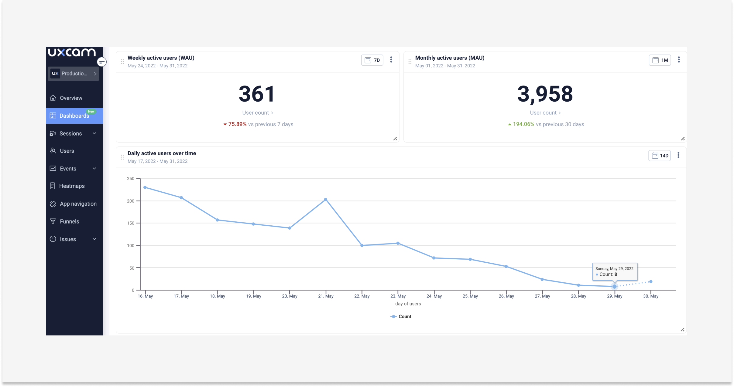
KPIs such as the number of sessions per user, session duration, retention rate, daily active users (DAU), monthly active users (MAU), etc. show the product's engagement level with the user. This is the front end of the product.


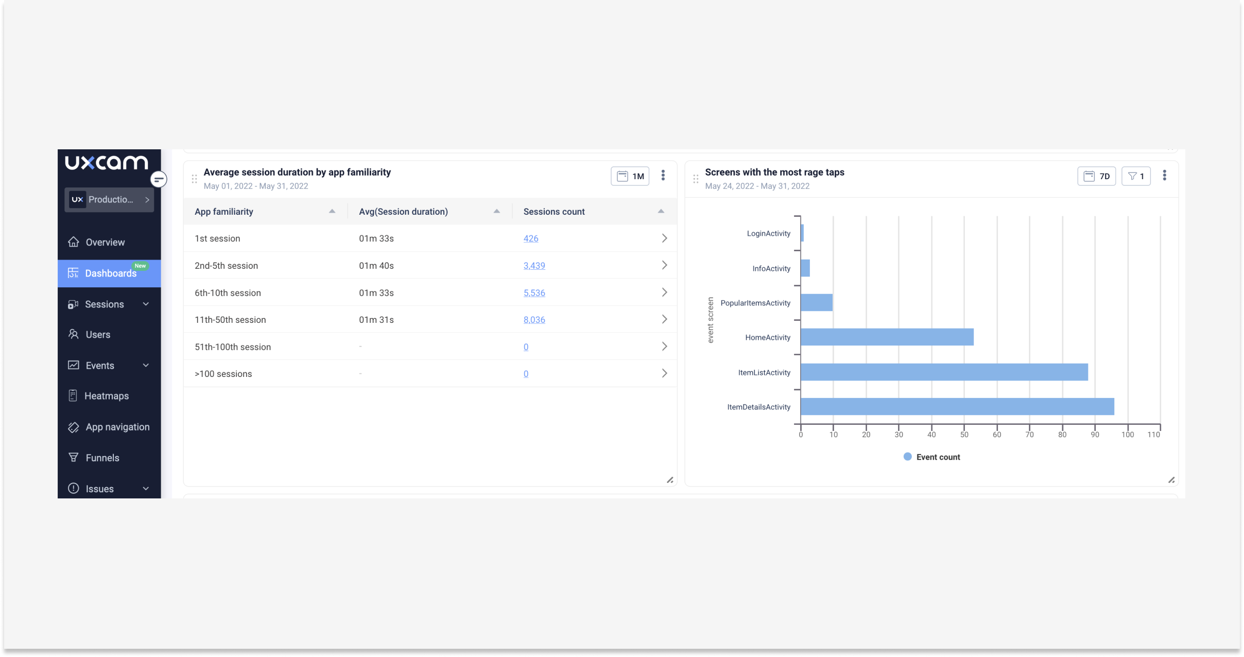
On the other hand, KPIs like Rage Taps, UI Freezes, App Crashes, Unresponsive Gestures, etc. give the technical capability and performance that is the backend. Both of these types of KPIs are important for product teams to track.
Mobile app metrics dashboards help PMs collect all these KPIs and bring them together in a single platform to easily and efficiently understand the performance, which is critical to making any product decision.
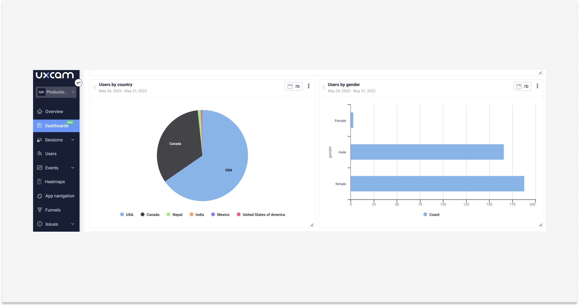

Here’s an example of some KPIs you can build on your dashboard.
Weekly active users
Monthly active users
Daily active users over time
Users by country
Users by gender
New users by acquisition source
Users returning after the first visit by acquisition source
App version adoption
Top events by occurrence
Total visited screens
Top device models among your users
Average session duration by app familiarity
Screens with the most rage taps
Conversion based on the type of membership (loyalty vs regular)
Average purchase value per age group
Engineering KPI dashboard
Tracking issues like freezes, bugs, and crashes allows you to decrease the total testing and debugging time by correlating issues with other factors, such as device types and OS versions at scale.
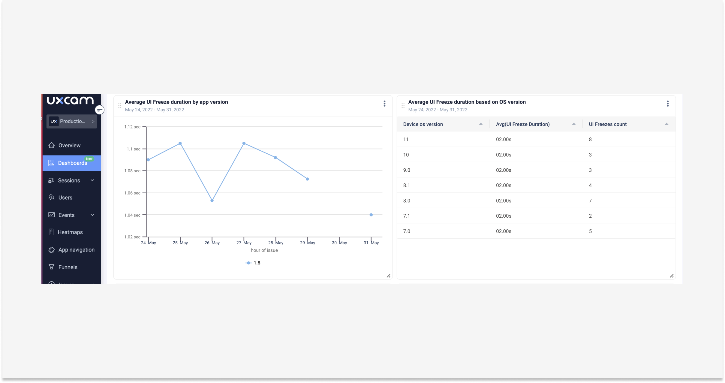

Setting the maintenance of these are your KPIs and lets you observe how your app behaves in real scenarios, as opposed to controlled testing settings.
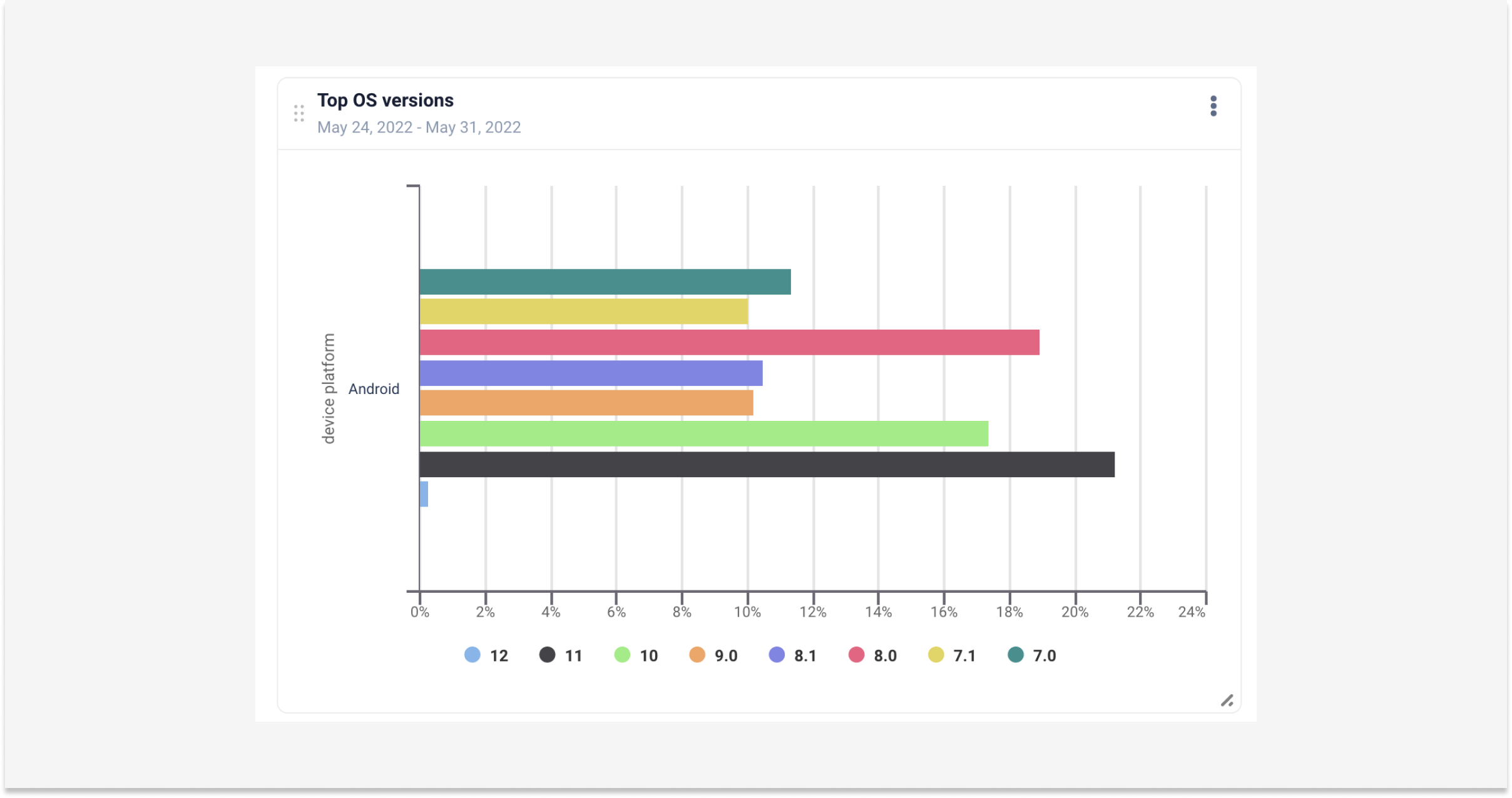

In general, engineering is a pretty broad category so we’re just going to generalize here with engineers who work on maintaining a mobile app and ensuring its performance. Engineering managers use these metrics to measure the progress to keep their teams on schedule.
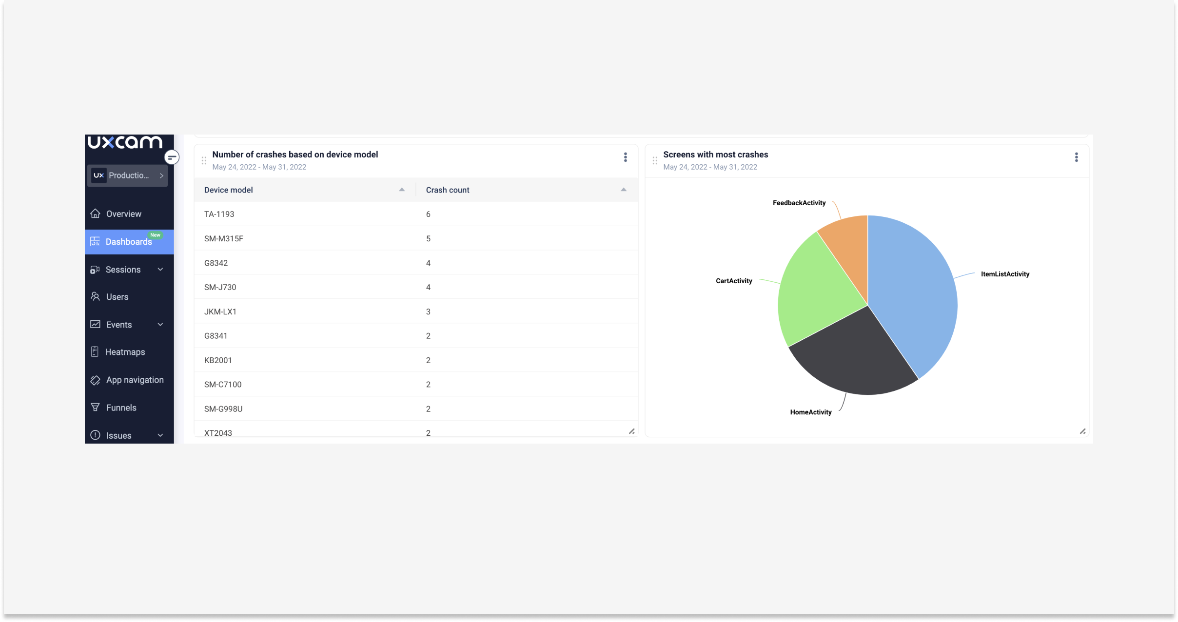

Unstable apps keep mobile engineers up at night. The number of crashes over time will give you an indicator.
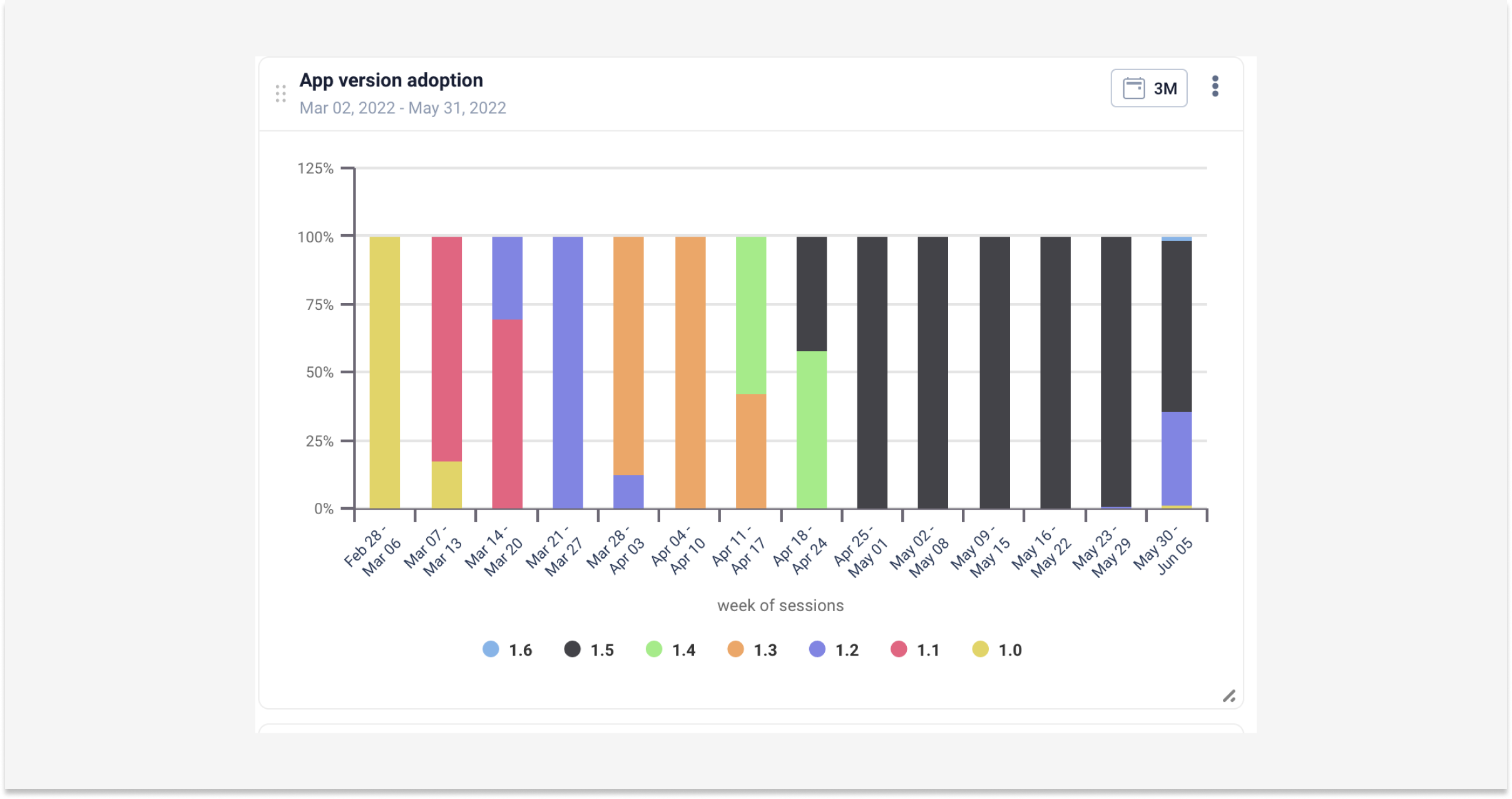

Crashes cause frustration, uninstalls, and are an absolute app killer. Providing a stable and smooth experience should be a KPI of every mobile app engineer.
Here are some engineering KPIs you can use to build your dashboard:
Number of crashes over time
Distribution of crashes by platform
OS versions with more crashes
Evolution of crashes by app version
Unique users affected by crashes based on app version
Number of crashes based on device model
Screens with most crashes
Number of UI freezes over time
Average UI freeze duration by app version
Average UI freeze duration based on OS version
Distribution of UI freeze per device model
Screens with the most UI freezes
Product Designer KPI dashboard
Typically, product designers use a combination of app usage metrics to understand how their product is actually being used, which features are working and which aren’t, and so on.
This way they can decide — in combination with real feedback from real customers, UX research — and prioritize what areas we should improve, remove or double down on to design experiences that help people discover these features.
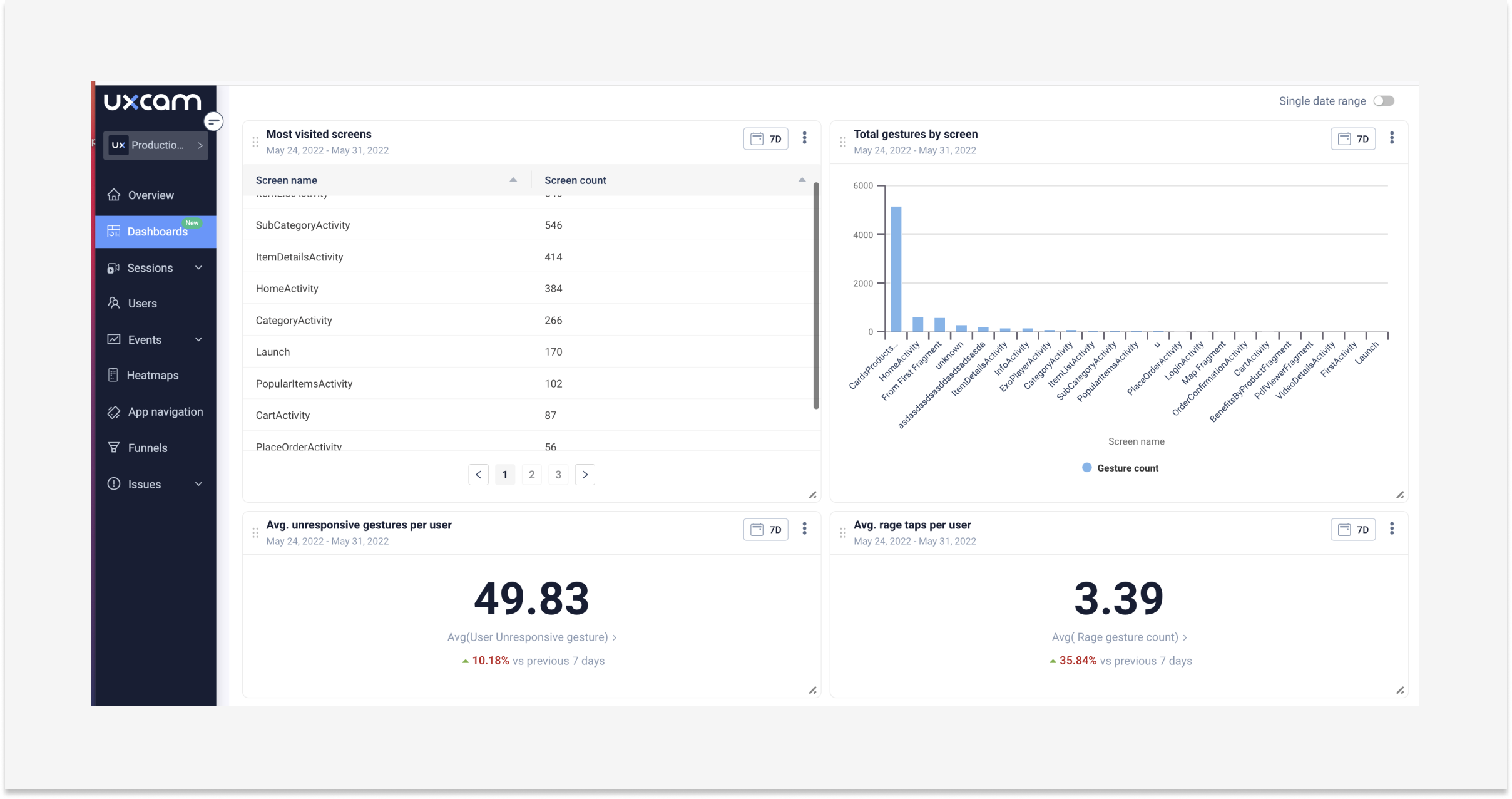

Metrics and shared dashboards help designers speak the same language as product and business people. It's important for product designers to care about how a product is used, just like everyone else in the organization.
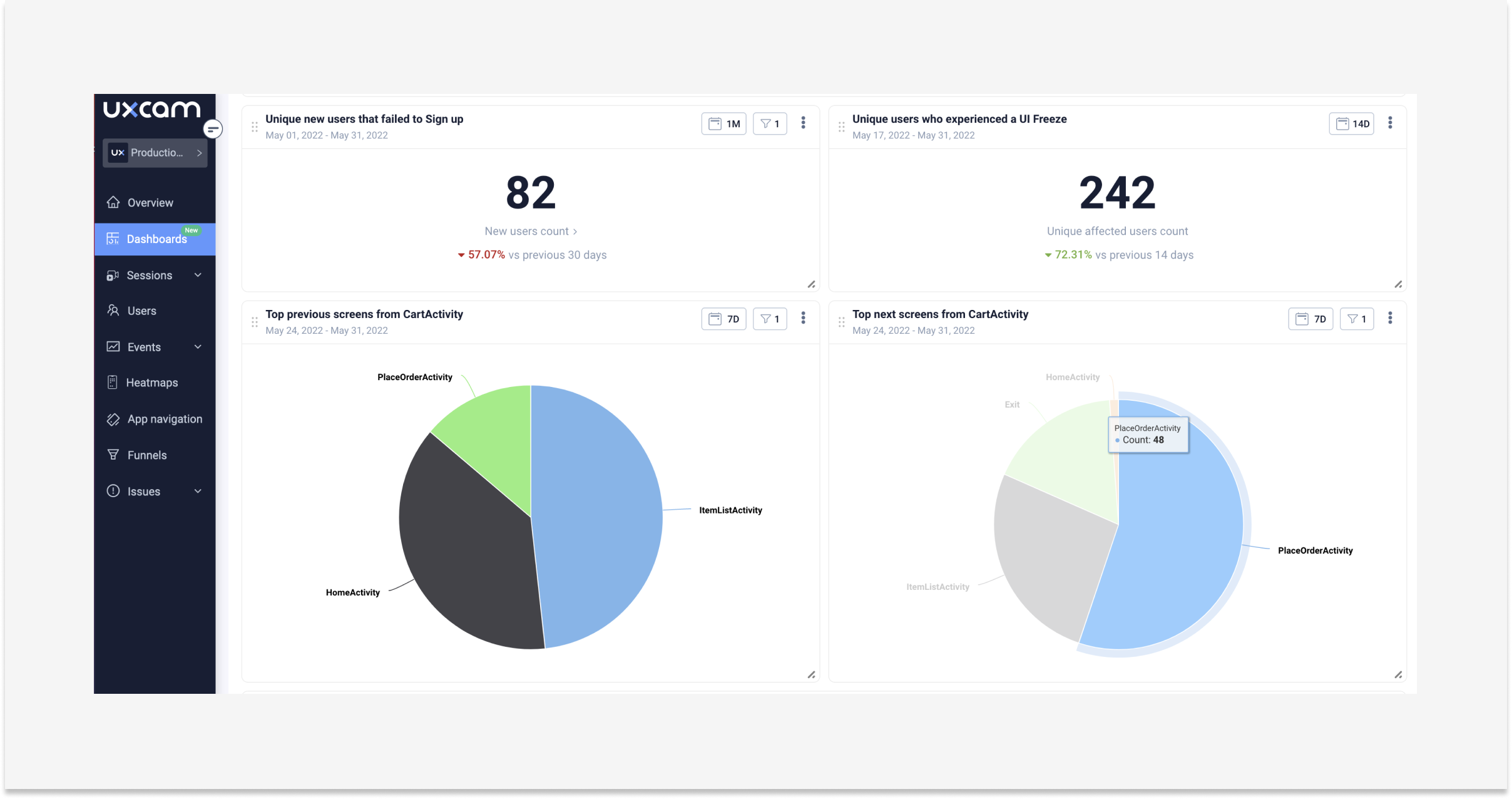

One more thing, app KPIs allow designers to also work with success criteria from the start of a project/task, e.g. design with metrics in mind (and if not existing, to ask those questions from stakeholders requesting the piece of work).
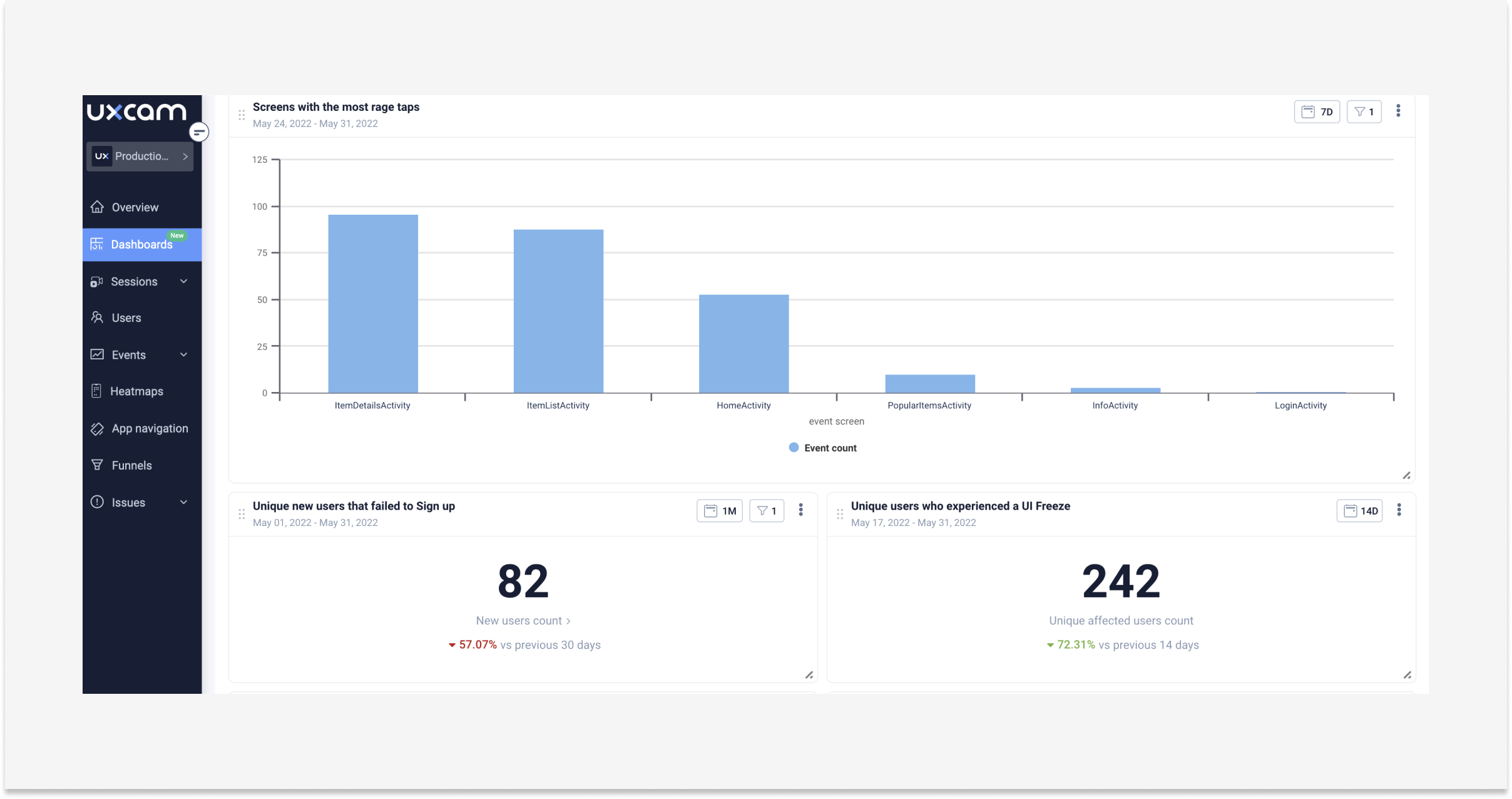

This further creates tighter alignment during the product design phase and allows you as a designer to make decisions and tradeoffs. You have a decision-making framework in place.
Here are just a few examples of common KPIs that real UX designers track:
Most viewed screens
Total gestures by screen
Screens with the most rage taps
Unique users that fail to sign up
Unique users who experienced a UI freeze
Top previous screens from Cart Activity
Users that added products to the cart vs users that completed the purchase
Products removed from the cart
% of sessions with login fails and successes
Number of crashes over time
OS versions with more crashes
Most visited screens
Total gestures by screen
Average unresponsive features
Screens with the most rage taps
Unique users that failed to sign up
Unique users who experience a UI freeze
Track what you should, not what you can. Having all your key app metrics in one place will make it easier to check the health of your app and business. So what are you waiting for? Start building that dashboard today and start impressing stakeholders.
Ready to get started? Try a free trial with UXCam and check out the new Team Dashboard. UXCam's dashboard has a template library so you can create a full dashboard in minutes.
You might also be interested in these User Analytics Dashboard Examples and How to Use Them
Customer Analytics Dashboard Examples and How to Use Them
AUTHOR
Jane Leung
Product Analytics Expert
Jane is the director of content at UXCam. She's been helping businesses drive value to their customers through content for the past 10 years. The former content manager, copywriter, and journalist specializes in researching content that helps customers better understand their painpoints and solutions.

Related articles
Product Management
Say hello to new funnels: Analyzing app conversion rates just got easier
UXCam's updated funnels make analyzing conversions easier than ever with new conversion criteria and funnel...

Jane Leung
Product Analytics Expert
Conversion Analysis
React Native Performance Monitoring Guide 2026
Master React Native performance monitoring. Track JS thread stalls, dropped frames, and bridge lag with AI insights from Tara to ship a faster, smoother...

Tope Longe
Product Analytics Expert
Conversion Analysis
Top 51 Mobile App KPIs: Ultimate List 2026
51 mobile app KPIs — determine the KPIs and metrics that matter the most for your...

Jonas Kurzweg
Product Analytics Expert
