Say hello to new funnels: Analyzing app conversion rates just got easier
In the past few months, we’ve been rolling up our sleeves, crunching numbers, and well, throwing out the kitchen sink, to build you an easier and more intuitive funnel experience.
Your feedback has been our guiding light, and we recognize that you wanted funnels to be more effortless to build, analyze, and customize.
We heard you loud and clear and are so excited to finally announce big improvements in three major categories:
1. New conversion criteria: Confidently identify steps to conversion with powerful new filters and parameters Understand better why users are converting with the introduction of conversion criteria. By setting specific filters on what counts as a conversion, you’ll be able to better understand how long it takes and which steps actually lead to conversions like a signup, checkout, or subscription upgrade.
Define the steps to a conversion with set order funnels
Customize your conversion window
Track time to conversion
2. Funnel suggestions: Eliminate the guesswork out of common journeys to conversion
With new suggested funnels and next-step suggestions, just give us your goal and we’ll build your funnel. Using machine learning algorithms, we suggest the common paths taken by users to help you map out the real user journey while you just have to refine steps.
See most common conversion journeys with suggested funnels
Use the most common funnel paths with suggested paths
Preview your funnel as you create it with the funnel builder
3. Improved UX: Visualize your wins and drop-offs loud and clear
Now that you’re building more accurate funnels, we cleaned up the interface, put metrics front and center, and made grouping possible — so you can tell your story better. To do this, we’ve removed the hurdles from distinguishing drop-off points and seeing successful conversions.
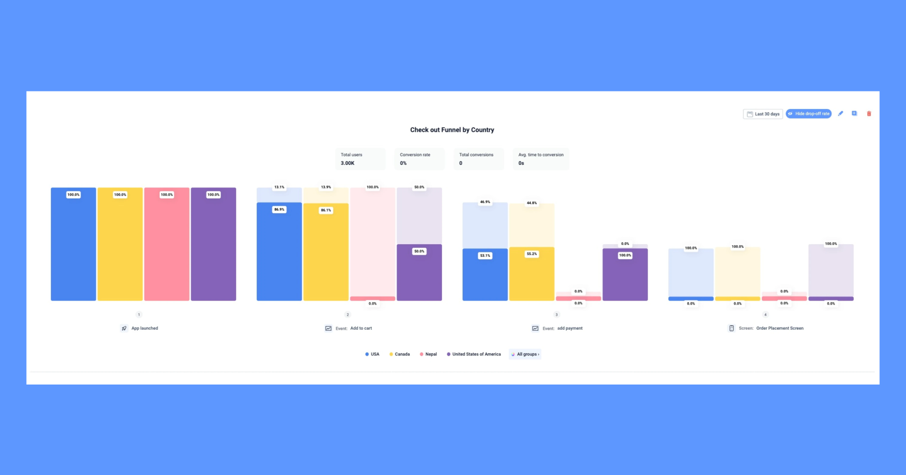

Compare conversions of different segments by grouping results
See your most important conversion KPIs with the highlights bar
Now here’s a closer look at some of the biggest updates:
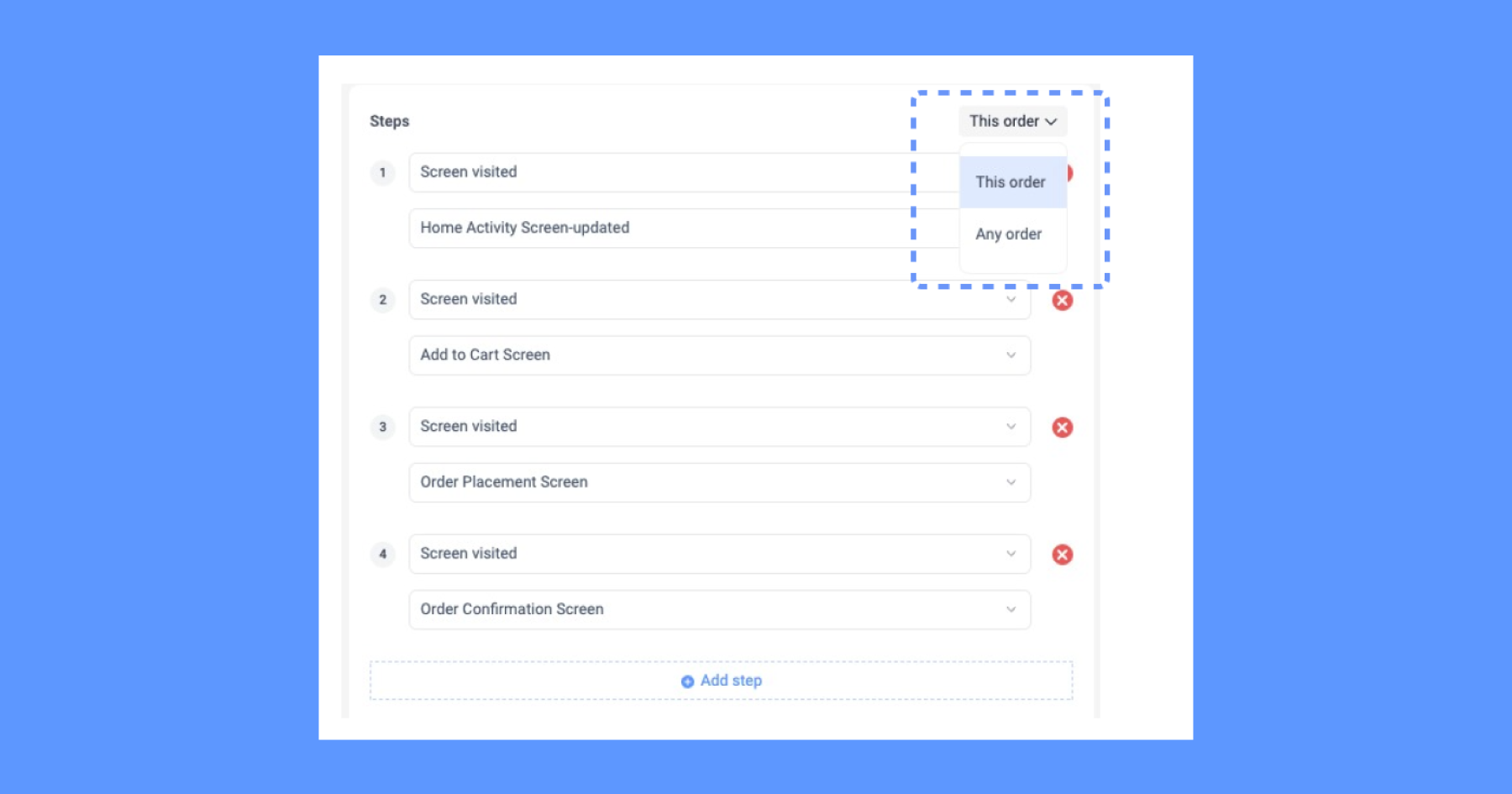
Set order logic
Previously, you could complete a conversion by entering the funnel at any step and it didn’t have to follow a particular sequence, and you wanted more accuracy of what counts as a conversion.
This order funnel requires app users to fire the events you selected in the order you specified. Steps need to be completed in the order defined in the funnel.
Any other actions can happen in between. By setting up the order in which users navigate through app screens or perform actions, you’re improving the accuracy of data provided by your funnels.
You can still choose between ‘Any order’ and ‘‘This order’ in your funnels. Read more about funnel orders.

Why you’ll love it:
Set order funnels ultimately answer the question, ‘What does it take for a user to convert?’.
If you are measuring checkout, and the user opens the app and immediately goes directly to checkout without any previous steps, you haven’t really learned anything about that conversion.
Let’s demonstrate: To be considered a conversion, ”First users have to”:
Open the category page
Then select a product
Then go to the order summary
Then go to the checkout page
Then you have a better idea of how each of these 4 pages is performing.
Setting conversion time windows
We understand that conversion windows can vary across different apps and industries and it can be hard to understand the time users need to convert. Setting a conversion window limit sets how long you have to wait before considering an action a conversion.
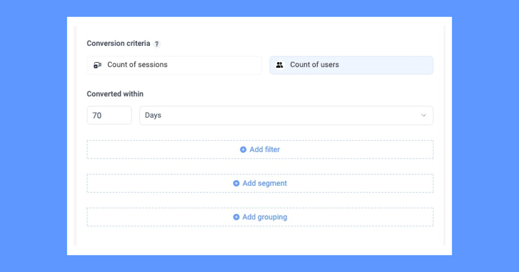

Shortening the conversion window will show you who went through the funnel in a short space of time, widening it will show you people who went partially through the funnel left, or came back later to complete the conversion.
Whether you're targeting quick purchases or assessing longer consideration periods, you can now analyze user conversions within your desired timeframe.
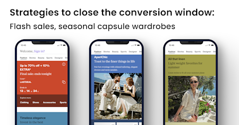

Why you’ll love it: For an ecommerce app, let’s say you have the challenge of users adding items to their carts but not completing purchases. To address this, you can set conversion time windows of 24 hours to measure the time between cart addition and purchase completion.
Here’s what the results can help you discover:
High-intent buyer: Some users completed purchases quickly, showing high intent. To encourage this behavior, you can offer time-limited discounts.
Cart is being used as a wish list: Some users just use the cart for browsing or price comparison. You can introduce a wishlist feature or somewhere users can ‘heart’ a product they like, or release price comparison tools to enhance their experience.
Delayed decision-makers: Many users didn't convert within 24 hours but returned later to complete purchases. To support these users, implement personalized reminders and notifications.
By setting conversion time windows, you can gain valuable insights into user behavior and tailor strategies accordingly.
Average time to conversion
With the average time to conversion, you can view the average time to convert in seconds, minutes, hours, or even days. This valuable metric will be calculated based on the funnel you create, whether it's for sessions or users.
The average time to conversion will allow you to understand how long different user segments take to perform your selected conversion action. A long average time to conversion may indicate usability issues or user confusion in specific steps of the funnel
By using filters, you could for example see if users on certain device sizes convert faster, or if loyal users behave differently to new users before a checkout for example. These insights can help in surfacing friction points in your user journeys.
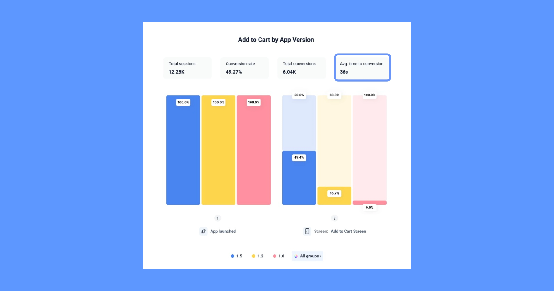

Why you’ll love it: With data on the average time to conversion, you can personalize the user experience further. For instance, you can tailor messages, offers, or reminders based on how long a user has been in the funnel, which may increase the likelihood of conversion.
Let’s say it takes an average of 12 minutes for a user to register their email for a health app, knowing a large segment of users drop off after 8 minutes, you can remove or shorten some steps to reduce their time to conversion to increase successful registrations.
Funnel suggestions
Funnel path suggestions and recommendations
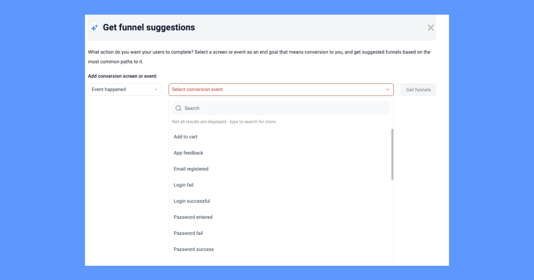

We know it can be a challenge to know all the common paths that users take to get to a conversion. To avoid room for error, now you can go to ‘Suggestions’ in the funnels and set the conversion you want to track. You’ll see the most common paths users take before conversion, based on your existing customer data.
Once you view the funnel, the builder will automatically be populated, and you can add more steps and build based on these suggestions.
Why you’ll love it: Let’s say you’re working at a mobile bank and you want to increase the adoption of the bank's credit card offerings. However, you notice that many users who start the credit card application process don’t complete it, leading to a low conversion rate.
The funnel suggestion tools suggest the most common paths taken by customers to complete the credit card application based on previous user behavior.
Through these different paths, you may identify different patterns of different credit card applicants. Through suggested funnels, you could find:
The direct applicants' path: Some users complete the credit card application in a single session without any interruptions. They fill out the form quickly and submit it, showcasing high intent to acquire the credit card.
The research-driven users' path: Another commonly suggested pathway takes a more cautious approach. The user initiates the application process but navigates away to conduct research, comparing credit card benefits and rewards. These users eventually return to complete the application.
The assistance seekers: Some users get stuck at specific stages of the application. They seek assistance through the app's customer support or FAQ section before proceeding with the application.
The abandoners: Unfortunately, a small group of users starts the application process but abandon it entirely without completing the form. You can use your funnel to identify certain points of drop-off.
Through these different paths, you can optimize the different common paths.
Next step funnel suggestions
To avoid putting unnecessary steps or too many steps in your conversion funnel, we've introduced a powerful Funnel Suggestions tool.
Leveraging machine learning, next step funnel suggestions, found beneath your filters, analyze commonly taken steps, and recommend funnels based on the top common paths that lead to your desired conversion event or screen. This intelligent feature saves you time and provides valuable insights into the most effective user journeys, helping you create more accurate funnels.
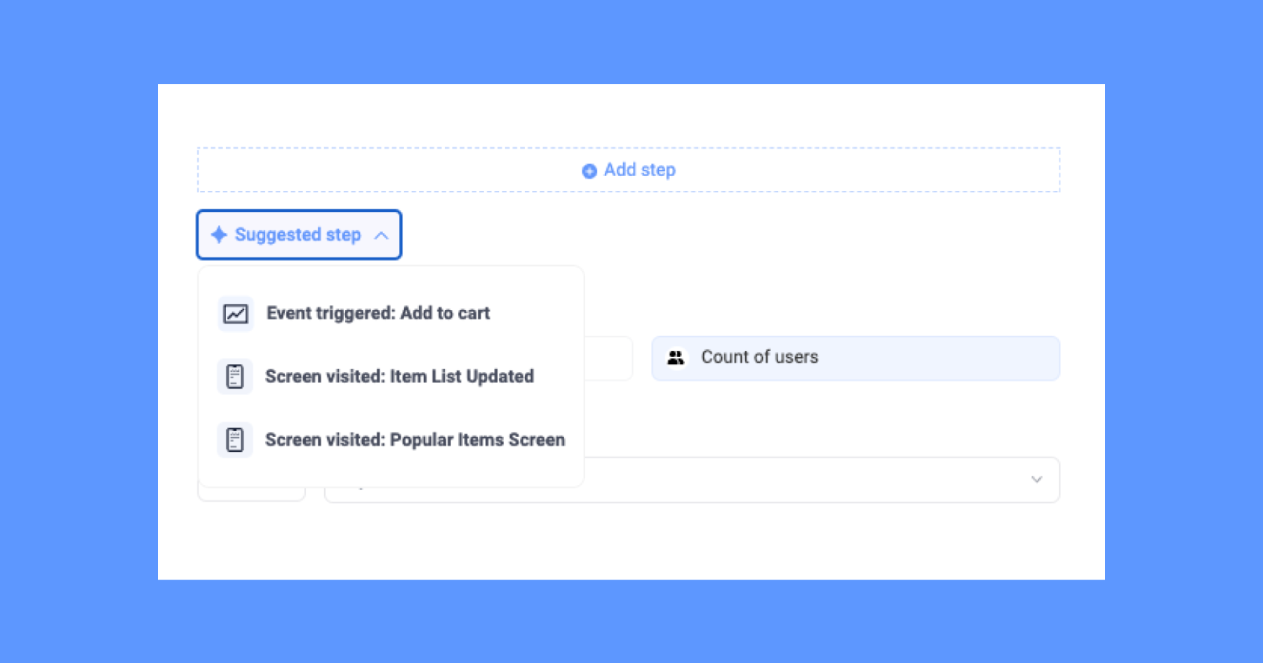

Why you’ll love it: Knowing the most popular steps to conversion means you can optimize your app to direct users towards a certain, more successful path.
Let’s say you have a health app and you want users to go from free to a premium paid account. You’re building your funnel but aren’t sure which step to put next. Our funnel suggestions tool analyzes data from previous app users who successfully converted to premium subscriptions.
For example, completing a certain amount of workout classes leads to more conversions. You could recommend offering them a free fitness consultation as the next step. This could enhance their experience and entice them towards the premium subscription.
Preview funnels
The preview feature allows you to visualize funnels better by providing a real-time representation of how changes to the funnel parameters impact the overall user journey.
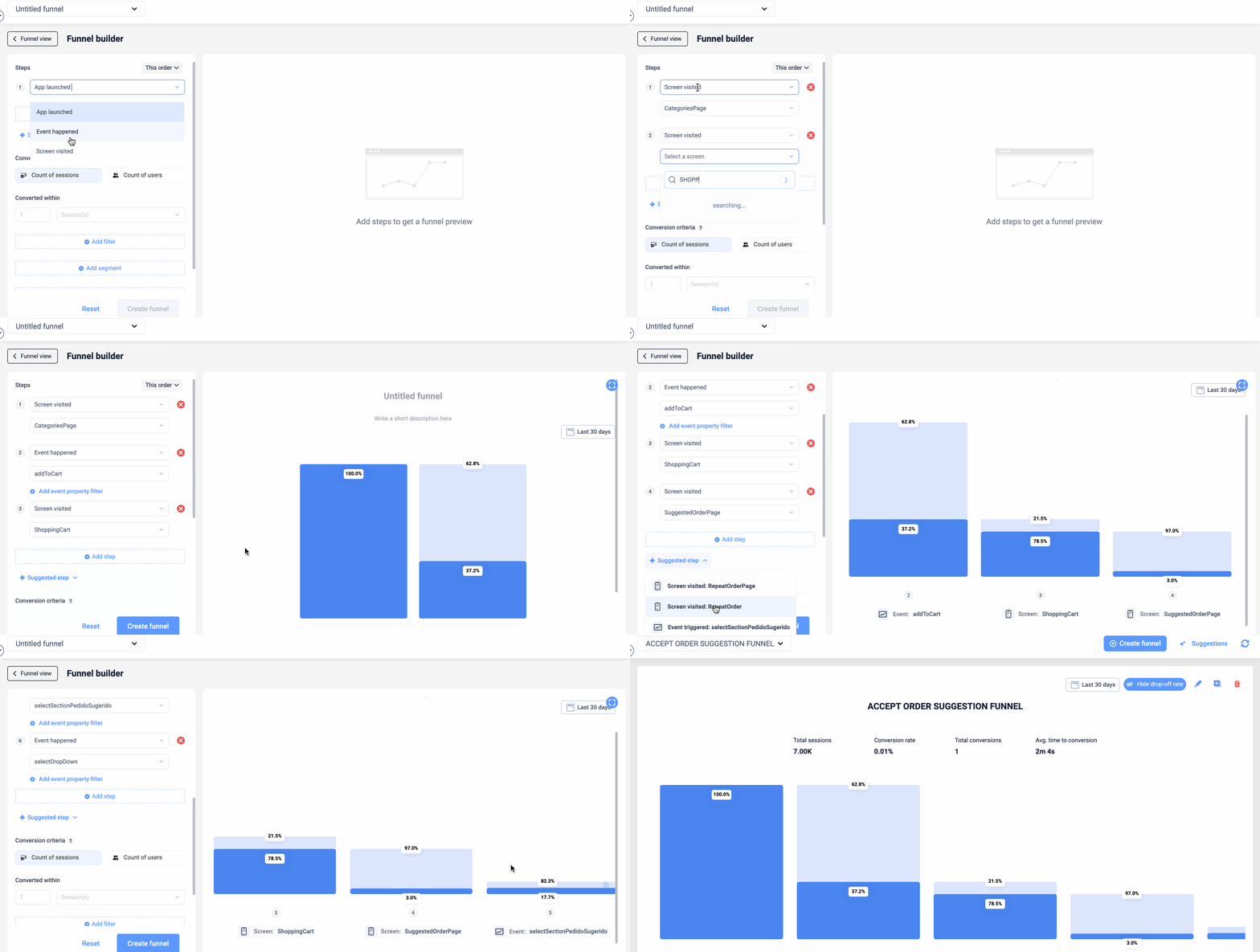
Why you’ll love it: Building funnels can be time-consuming, there is a lot of back and forth seeing if your funnel is accurate and whether the steps inputted make sense. Without a preview, you have to create different versions and check each iteration. Instead of optimizing your conversions, you’re spending too much time just building a funnel with the correct steps.
The preview in the funnel builder will save you loads of time as you’ll see your funnel while you are building it. Seeing the preview allows you to fine-tune the funnel as you are building it and allows you to save your efforts to enhance user engagement and increase conversion rates efficiently.
Improved UX
Compare different segments with funnel grouping
Identifying patterns, trends, and variations in conversion performance is easier than ever with groups. By segmenting your funnels, you’ll be able to see a more in-depth analysis of user behavior across different sections or features of your app. Now you can:
Compare group conversions in the funnel or table view
Hover to highlight a group across your funnel
Interact with groups to add or remove results
Click on any groups to see the conversions and drop-offs.


Why you’ll love it:
Let’s say you have an app that allows users to buy, sell, and manage cryptocurrencies. One of your primary goals is to increase conversions of new users to active traders on the platform. You create three groups based on user interactions: 'New Users,' 'Crypto Buyers,' and 'Active Traders.'
The 'New Users' group includes users who recently signed up but haven't made any transactions yet
The 'Crypto Buyers' group consists of users who have made their first cryptocurrency purchase
The 'Active Traders' group includes users who regularly buy and sell cryptocurrencies.
You can now compare the conversion rates of each group in the funnel view. You can observe that the 'Crypto Buyers' group has a higher conversion rate to 'Active Traders' compared to the 'New Users' group.
This indicates that the onboarding process is successful in converting new users into buyers, but there might be opportunities to enhance engagement to convert more 'Crypto Buyers' into 'Active Traders.'
Clicking on the 'Crypto Buyers' group reveals detailed conversion data for these users. You can analyze the user activity, such as the average time between their first and second purchases. Armed with this information, you can develop targeted strategies to encourage repeat transactions and increase trading frequency.
Highlights bar
The highlights bar above the funnels allows you to view essential KPIs without having to go through detailed reports or charts. It offers an immediate understanding of the funnel's health, enabling you to identify potential issues or successes quickly. You can see:
Total sessions
Conversion rate
Total conversions
Average time to conversion
You can also hover over different parts of the funnel to see the drop-off from the previous step and even click in to see the session replay to watch those specific sessions.
Why you’ll love it:
There are a few ways to use the performance bar:
Quick performance assessment: Identify successful user journeys and areas that require improvement with just a glance.
Focus on key metrics: Keep focused on the most critical KPIs for each funnel, helping prioritize efforts and resources where they matter the most.
Real-time decision-making: Sudden drops in conversions can indicate a UX/UI or technical problem that needs immediate attention.
Optimization and A/B Testing: Track the impact of app optimizations and A/B tests on conversion rates.
Celebrating milestones: This positive reinforcement fosters a sense of accomplishment and motivates your team to think up new ways to keep those conversions up.
Get started with your new funnels today
Once again we want to give a big thank you to everyone who gave us feedback to build this new funnel experience. All customers who have a UXCam account and all free trial members can access the new funnels today. If you are a first-time funnel user, this is your chance to get acquainted with a powerful tool that will help boost revenue and engagement.
Try new funnels today for free.
Chat to an expert about increasing your conversion rate.
Bonus fun fact:
Did you know that our funnel colors were inspired by the colors of the Tibetan prayer flags? Our product designers in Kathmandu saw the clear color combinations that stood out against the mountain sky blue — and thought that our users would also benefit from a color scheme that signifies balance.

AUTHOR
Jane Leung
Product Analytics Expert
Jane is the director of content at UXCam. She's been helping businesses drive value to their customers through content for the past 10 years. The former content manager, copywriter, and journalist specializes in researching content that helps customers better understand their painpoints and solutions.

Related articles
Product Management
Say hello to new funnels: Analyzing app conversion rates just got easier
UXCam's updated funnels make analyzing conversions easier than ever with new conversion criteria and funnel...

Jane Leung
Product Analytics Expert
Product Management
5 Free Online Product Management Courses [2026]
Enhance your product management skills with these 5 free online courses and unlock new opportunities to stay ahead in the competitive job...

Tope Longe
Product Analytics Expert
Product Management
13 Best Product Management Tools 2026 & When to Use Them
Find out the top tools that the best product managers use daily to perform better at...

Jane Leung
Product Analytics Expert