Product Performance Analysis - A 7-Step Playbook with UXCam


You don’t need another dashboard full of charts.
What you need is clarity, what’s working, what’s breaking, and what’s silently hurting your product. Product performance analysis is now table stakes; executives want evidence of impact, not another dashboard of vanity metrics.
It's no longer optional. If you’re shipping features without understanding how they impact real behavior, you’re flying blind.
In this post, we’ll walk you through a proven 7-step playbook, backed by real-world examples and powered by UXCam for Web, to help you uncover the “why” behind the numbers.
Summary - Product performance analysis strategies
| Step | What you do |
|---|---|
| 1. Define Your Product Goal | Set a clear, measurable objective tied to a business outcome. |
| 2. Identify Metrics That Matter | Choose metrics that reflect behavior and drive success—not vanity stats. |
| 3. Instrument Your App | Use autocapture and tag key events for clean, reliable data. |
| 4. Segment for Clarity | Break down data by user type, device, region, or behavior. |
| 5. Analyze Funnels & Drop-Offs | Map key journeys to find where users lose interest or fail. |
| 6. Understand the Why | Use session replays and heatmaps to uncover usability issues. |
| 7. Take Action & Close the Loop | Implement changes, measure impact, and share results with your team. |
What is product performance analysis?
Product performance analysis is a structured process that quantifies how well a product delivers user value and business outcomes. It combines outcome metrics like conversion rate and retention with behavioral diagnostics such as session replays, heatmaps, and funnel analysis.
You already track your performance KPIs. You probably have a dashboard with conversion rates, feature usage, and maybe even retention cohorts. That’s your outcome layer, it tells you what happened.
But the truth is, outcome metrics alone don’t tell you why those things happened.
At its core, product performance analysis connects two critical layers:
Outcome metrics — Think conversion rates, feature adoption, retention, churn, or NPS. These are the results that get reported up the chain.
Behavioral diagnostics — Tools like session replays, heatmaps, rage tap tracking, and funnel analysis help you understand why those results look the way they do.
Product performance analysis involves layering outcome metrics with behavioral diagnostics to understand what users actually experience. This is what separates surface-level reporting from deep product understanding.
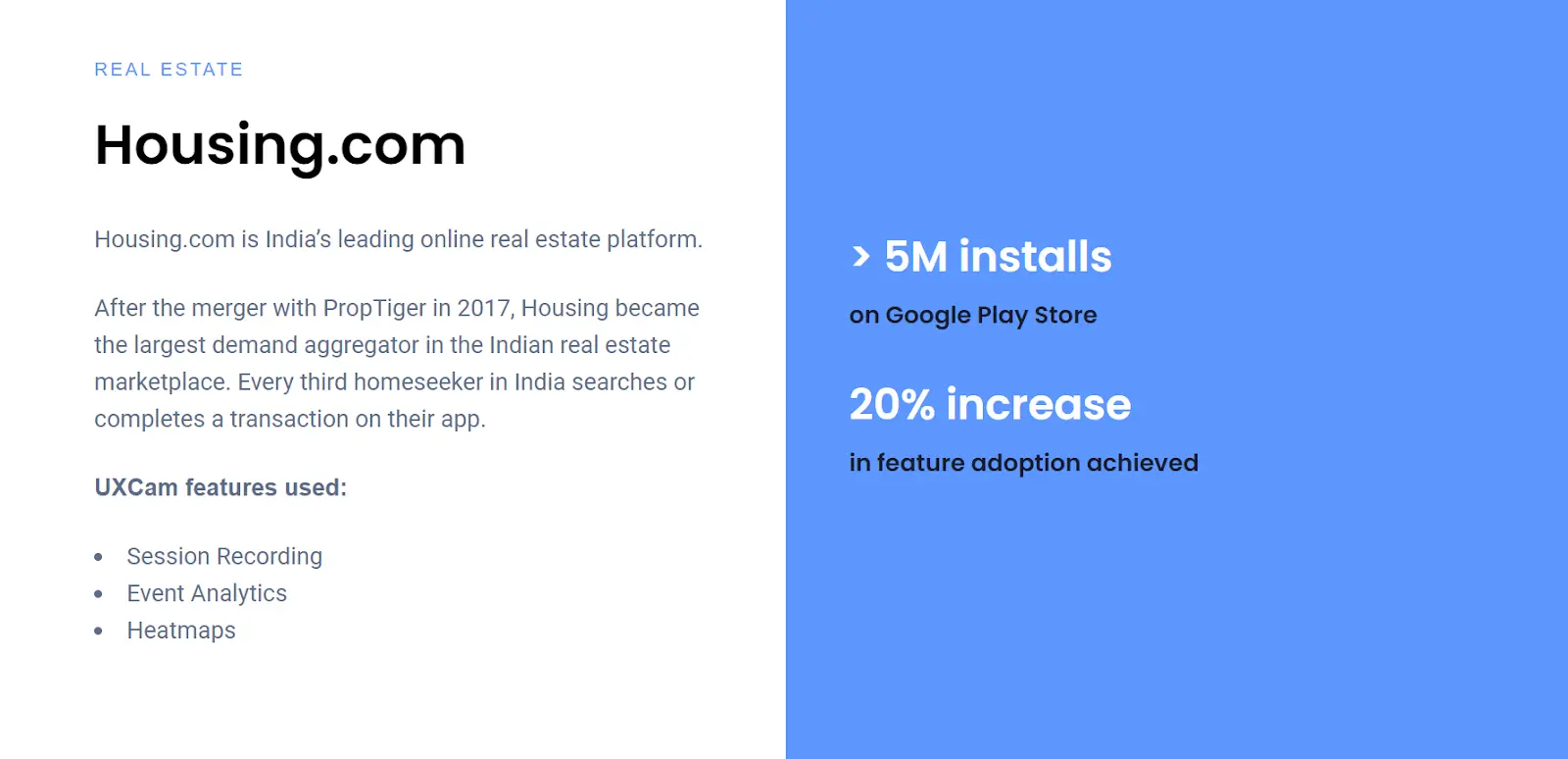
In practice, this means combining tools from across product analytics, user-behavior analytics, and digital experience analytics into one continuous workflow. You move from “our sign-up drop-off is 42%” to “users on mobile rage-tap the submit button because it’s hidden behind a keyboard.” For example, Housing.com rolled out a redesigned in-app search bar. On the surface, the quantitative data looked fine—but adoption remained unexpectedly low. To uncover why, the team turned to UXCam and began reviewing real session replays. They quickly identified a key issue: users were rage-clicking and dropping off when trying to add multiple locations. It became clear that users wanted to search across multiple cities but found the design too difficult to navigate. After redesigning the search experience and validating improvements with heatmaps, the feature’s adoption rate doubled—from 20% to 40%—making it one of the app’s most-used features.


When you apply product performance analysis as a discipline, not a one-time audit, you start spotting friction faster, fixing the right things sooner, and connecting your product work to outcomes leadership actually cares about. That’s the difference between managing a backlog and leading a product.
Why product performance analysis Matters
When you lead a product team, your job isn’t to ship features, it’s to create meaningful outcomes. But outcomes don’t happen by accident. They’re the result of clear strategy, focused execution, and a constant feedback loop. Let's explore the benefits of product performance analysis
Performance analysis helps you bet smarter and bigger
Every roadmap is a series of bets. You're choosing where to invest time, people, and resources. But here's the thing, most bets fail, not because the ideas were bad, but because they weren't validated properly.
Performance analysis helps you de-risk those decisions. You can validate the size of a problem before solving it. You can spot where users drop off in a flow before overhauling it. You can replay actual user sessions and see the friction for yourself before spec’ing a redesign.
This approach doesn't slow you down, it saves you from wasting entire sprints building the wrong thing.
We've seen teams kill entire projects just by watching 50 user sessions and realizing, “We’re solving the wrong problem.” That kind of clarity changes how you build.
It aligns your teams to the metrics that matter
As a PM, you’re probably working toward a North Star Metric, whether it’s weekly active users, activated accounts, or retained teams. But your engineers and designers are focused on sprint tickets and features. Without a performance lens, there’s a disconnect.
Performance analysis closes that gap.
Let’s say your North Star is “Weekly Active Teams.” Your onboarding squad owns activation. Your collaboration squad owns shared usage. Your billing team owns conversion. Everyone plays a role but you need a clear line of sight between what’s being built and how it contributes to that North Star.
By analyzing how real users move through each flow, you can show your team what matters and why. You can say, “Fixing this drop-off on invite-sharing will lift our active teams by 5%.” That’s how you tie sprint-level execution to company-level outcomes.
The hidden cost of skipping it
Skip performance analysis, and things look fine, until they’re not.
You’ll start shipping features that sound smart but don’t get used. You’ll see adoption plateau and not know why. You’ll run experiments with flat results and no clue what to do next.
Here’s what that looks like over time:
Feature bloat: more functionality than users need or use.
Churn: frustrated users who never find value.
Lost revenue: leaky funnels and poor upgrade flows hiding in plain sight.
We've worked with startups and enterprises that burned through quarters building in the dark. They had the tools, but not the practice. The cost wasn’t just technical debt, it was missed opportunity.
The 7 steps for actionable product performance analysis
Let’s get tactical. This is the exact playbook that has helped product teams—startup to enterprise—to bring clarity and speed to product decision-making. It's designed to help you move from reactive reporting to confident, outcome-driven execution. Each step connects strategy to execution and highlights how UXCam for Web can sharpen your visibility into user behavior.
Define your product goal
Identify metrics that matter
Instrument your app
Segment for clarity
Analyze funnels & drop-offs
Understand the why
Take action & close the loop
Step 1: Define your product goal
If you don’t know exactly what you’re trying to improve, you’ll end up chasing data without ever driving results.
As someone who's led product teams across both scrappy startups and enterprise environments, I can’t overstate this: Clarity beats quantity when it comes to product data. You don’t need 50 metrics—you need one clear goal that aligns your team and guides your analysis.
Start by asking: “What is the most important user behavior we want to influence right now?”
It might be onboarding completion. It might be adoption of a new feature. It might be getting inactive users back into the app. Pick just one for now.
Then, zoom out and connect that goal to the bigger picture—your business objectives. This isn’t about vanity OKRs. This is about real impact: Are you driving activation? Are you improving retention? Are you helping users reach their "aha!" moment faster?
Let’s say you’re building a fitness app. You’ve noticed that users download the app, start the onboarding process, and then ghost you after two days. That’s your red flag. So, you define a goal: Increase Week 1 retention from 25% to 35%.
Now you’ve got a direction. Everything else you do, what data you look at, what features you prioritize, how you slice user segments, should serve this goal.
How UXCam helps:
You can use Funnels to map out the entire user journey: onboarding → account creation → first workout. If 75% of users drop off before hitting that “Start Workout” screen, you’ve just found your bottleneck.


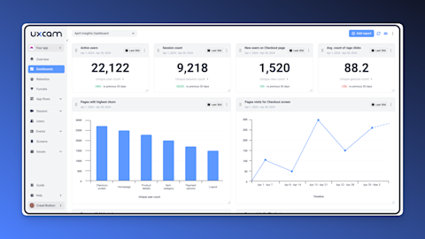
Want to track that over time? Set up a Dashboard to monitor that funnel every week. Add supporting metrics like number of sessions, rage taps during onboarding, or even crash rates.


UXCam doesn’t just show you where users drop, it gives you the context you need to understand why. That’s critical when you’re under pressure to ship improvements that actually move numbers.
Step 2: Identify metrics that matter
Once you’ve defined your goal, the next step is choosing the right metrics to measure progress. And here’s the truth: most product teams look at too much data, and the wrong kind.
When I was early in my career, I’d fall into the trap of tracking everything: total sessions, time spent in-app, button clicks, you name it. But over time we've learned that just because you can measure something doesn’t mean it matters.
You want to focus on metrics that reflect user behavior tied to outcomes. Not just what users are doing, but whether they’re succeeding.
Let’s break this down with our earlier fitness app example. If your goal is Week 1 retention, meaningful metrics might include:
Did the user complete onboarding?
Did they start their first workout?
How many screens did they visit in their first session?
Did they rage tap out of frustration or run into a crash?
Notice how each of these gives you insight into a success path or a blocker.
How UXCam helps:
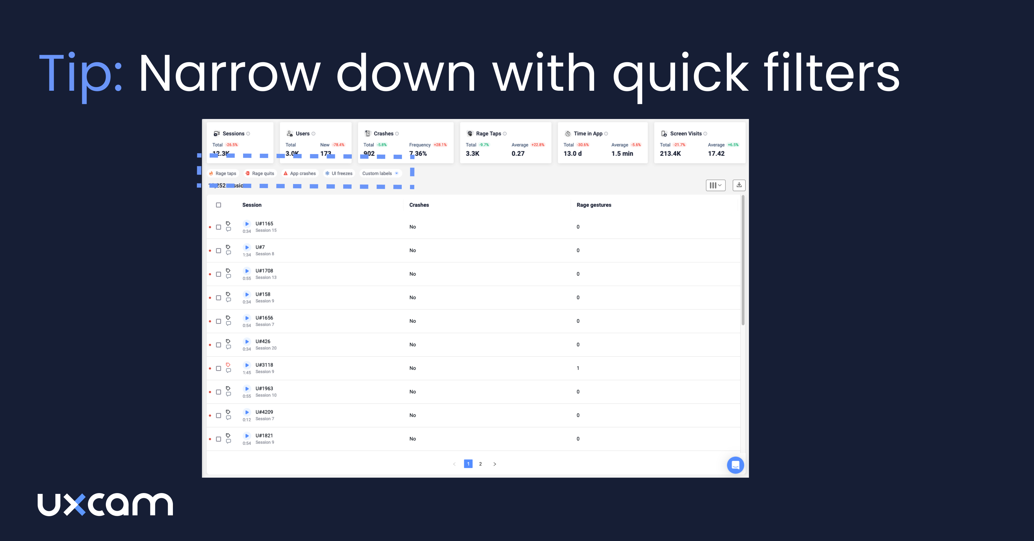
UXCam simplifies this by autocapturing the essentials: screen visits, gestures, taps, and frustration signals like rage taps and UI freezes. You don’t need a dev to tag every button.


You can also define custom events for things like “Workout Started” or “Goal Set” so you can zero in on the most critical behaviors.
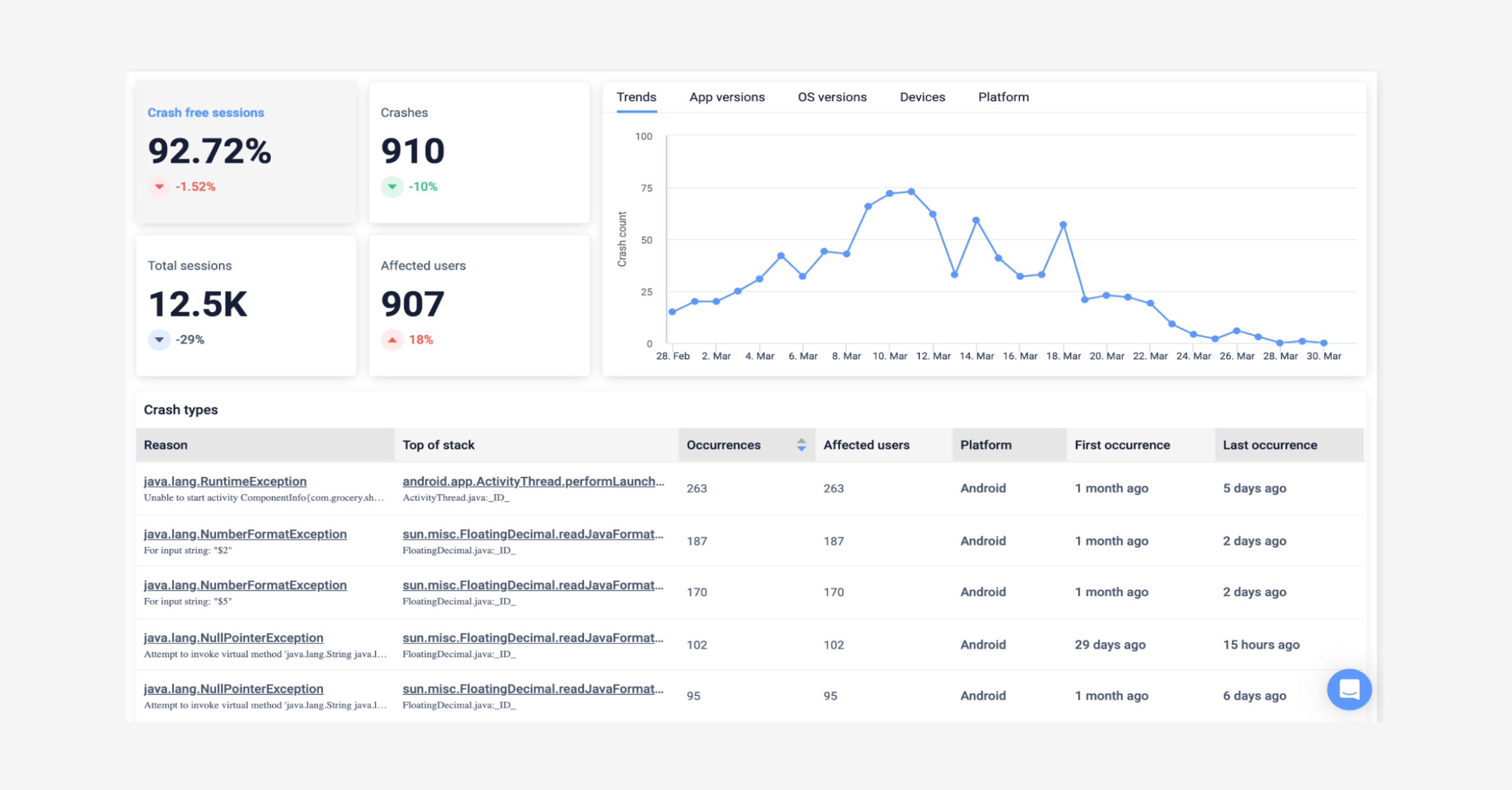
And here’s something a lot of teams miss: app performance is a product metric. If your app crashes or lags during onboarding, it doesn’t matter how great your feature is, it’s a broken experience.
UXCam also captures error analytics and crash reporting for mobile apps. It helps you spot where performance issues might be driving users away, even if your UX looks perfect on paper.


Pro tip from experience: Always trace every metric back to your goal from Step 1. If it doesn’t help you understand progress or failure toward that goal, you’re wasting time.
Step 3: Instrument your app
Let’s be real for a second: if your product data isn’t trustworthy, your analysis is useless. You can run all the funnels and build all the dashboards in the world, but if key actions aren’t tracked, you’re flying blind.
I’ve seen teams spend weeks defining events in spreadsheets, only to end up with broken analytics because one screen wasn’t tagged or a key tap was missed. And then you’re back to chasing bugs and second-guessing every insight.
That’s why this step is critical: you need clean, reliable tracking—but you also need to move fast.
Start by asking: “Which screens and actions are essential for tracking our product goal?”
If you’re optimizing onboarding, focus on screen transitions and major interaction points like “Start Trial,” “Skip Intro,” or “Allow Notifications.” You don’t need to track every swipe or menu open—just the high-value interactions.
How UXCam helps:
UXCam's autocapture gets you ~80% of the coverage out of the box. It records every screen view, gesture, tap, and navigation path—without needing a full tracking plan upfront.


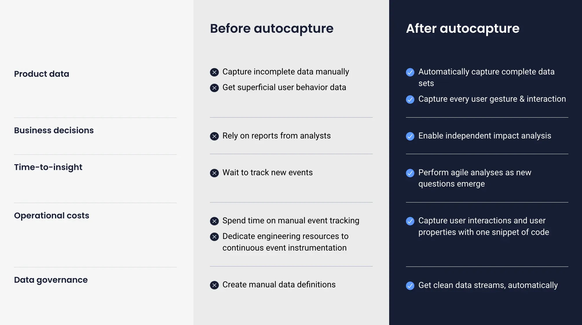
That means even if you forgot to manually tag something, there’s a good chance it’s already in the system.
Need more granularity? You can custom-tag screens and events to give extra context to specific flows or actions that matter for your goal.
And setup? It’s refreshingly simple. The SDK is lightweight and works across iOS, Android, React Native, Flutter, and Unity. Your engineers don’t need to invest a sprint just to get started. We’ve seen teams deploy UXCam in a day and start watching real user sessions the same afternoon.
Pro tip: Don’t try to track everything on day one. Over-instrumentation leads to noise, not clarity. Start with the 3–5 most important screens for your current product goal. Expand as needed.
Step 4: Segment for clarity
Here’s something we’ve learned after years in product: aggregated data hides your problems.
You could have a “healthy” average conversion rate, but if you dig into segments, you might find that new users are struggling badly while power users are carrying the metrics.
That’s why segmentation is non-negotiable if you want meaningful insights. You need to break down behavior by the who, not just the what.
Ask yourself:
Are first-time users behaving differently than repeat users?
Do Android users drop off more than iOS?
Is there a performance gap between users on older devices?
Are users in one country completing the flow, while others are abandoning it?
These differences can mean the difference between solving the right problem… or shipping changes that don’t help anyone.
How UXCam helps:
UXCam makes this easy without needing to build custom reports from scratch.


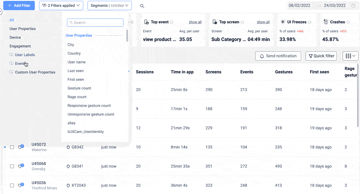
You can filter sessions, funnels, and heatmaps by segment: app version, platform, user type, location, device specs, or any custom property you’ve set. You can even create cohorts—say, “users who completed onboarding but never started a workout”—and dig into their sessions to see what’s holding them back.


It’s one thing to know your onboarding completion rate is 52%. It’s another to realize that new Android users on version 10.0 are only converting at 28%, while everyone else is fine. That’s an insight worth acting on.
Segmenting lets you move from blurry averages to sharp focus. And once you do that, you’re in a much better position to prioritize improvements that actually matter.
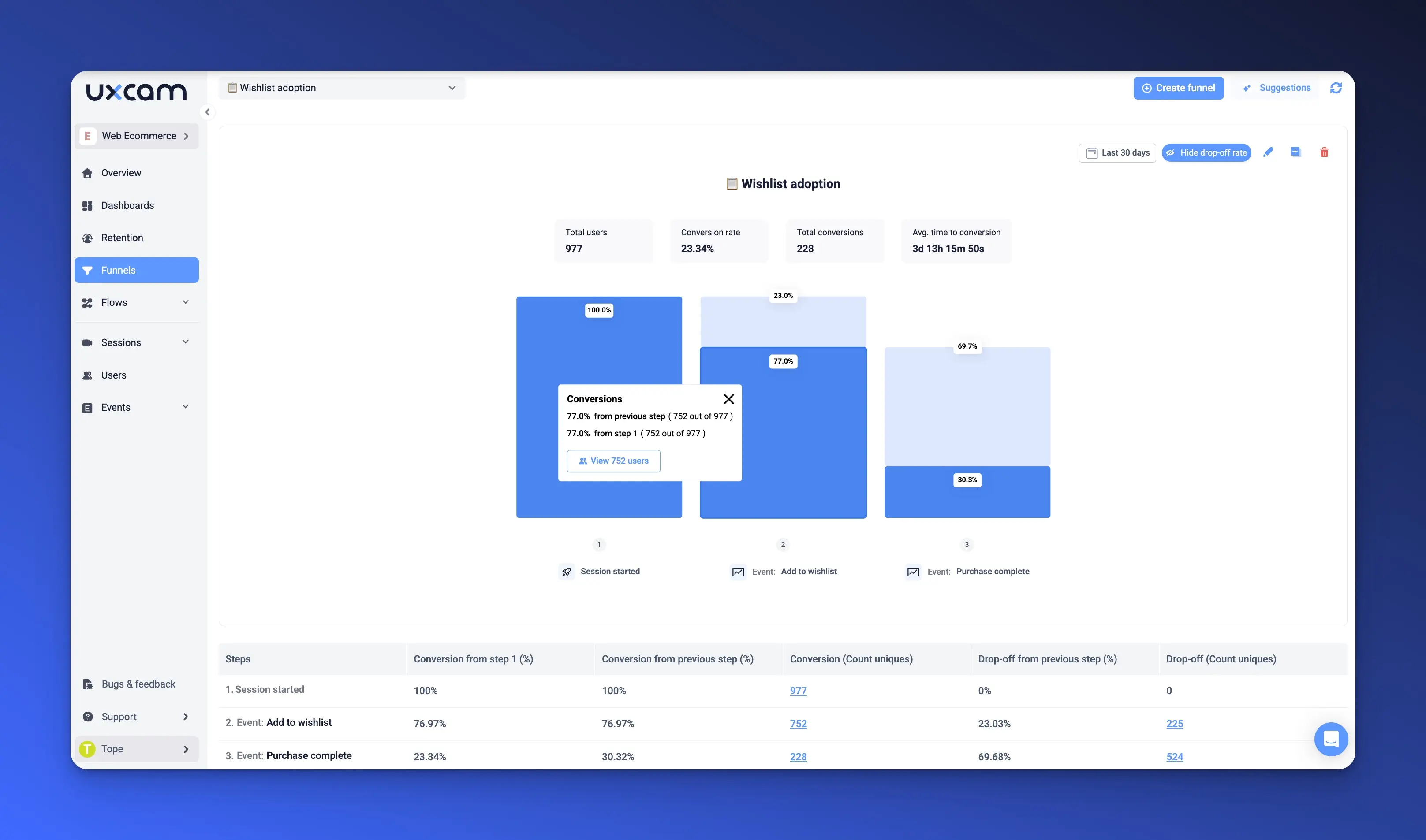
Step 5: Analyze funnels & drop-offs
Once you’ve got your app properly instrumented and your users segmented, it’s time to connect the dots: Where exactly are people falling off the journey?
We’ve seen dozens of product review meetings where someone says, “We think users aren’t converting because the feature isn’t prominent enough.” Then we dig into the funnel, and it turns out users are reaching the feature—they’re just confused about what to do once they get there.
Funnels don’t lie. They show you how users actually move through your app, step by step. And more importantly, they reveal the exact screen or action where people drop off.
So here’s what you do: Pick the user journey that ties directly to your product goal. If your goal is activation, your funnel might be:
App Opened
Onboarding Completed
First Key Action (e.g., Added First Task / Started Workout / Made First Transaction)
Then, track the conversion rate between each step.
If 70% complete onboarding but only 30% take the first key action, that middle section becomes your focus. That’s your gap.
How UXCam helps:
UXCam makes building these funnels dead simple. You can create custom funnels using either screens (like "Signup Screen" → "Home Screen") or custom events (like "Account Created" → "Profile Updated").


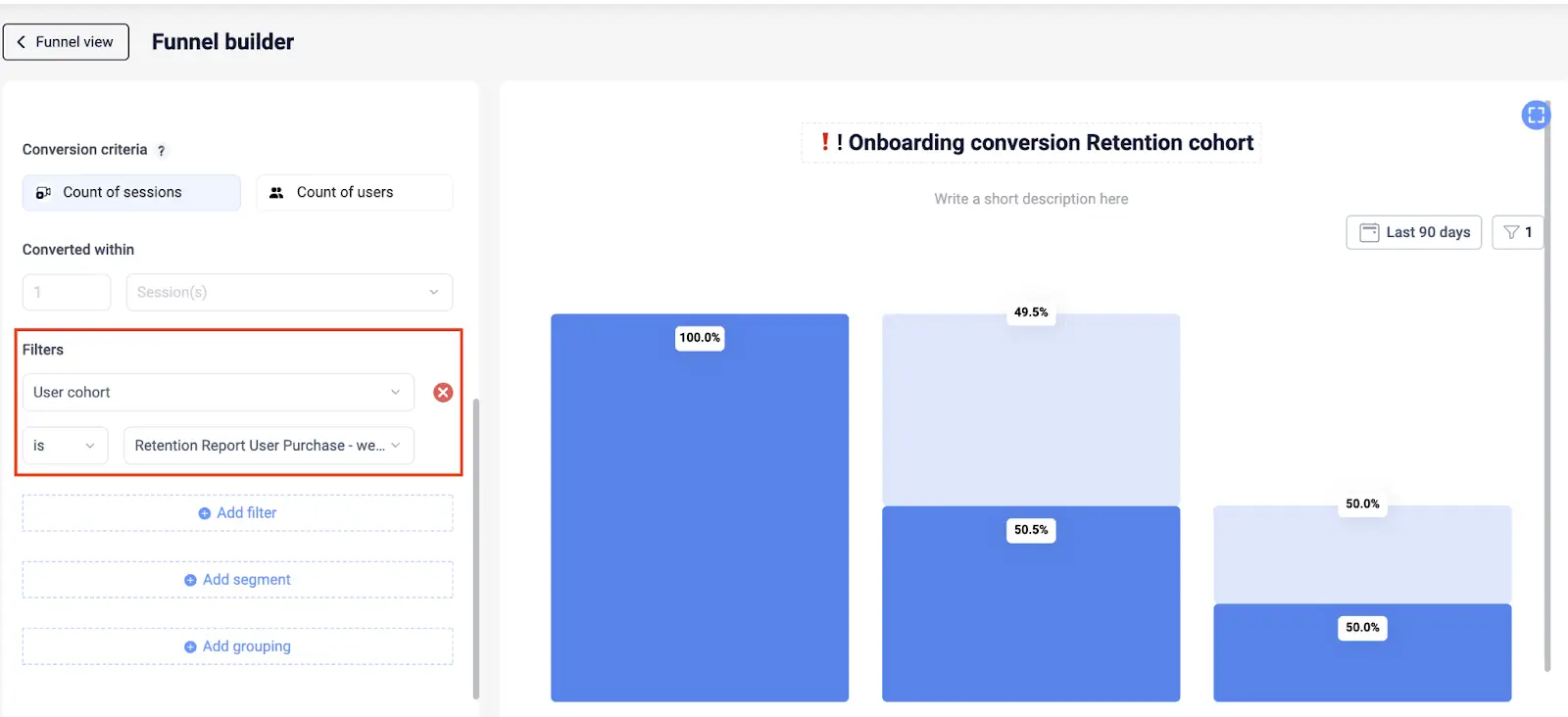
For example, you build a funnel for your checkout process and notice a huge drop between “Enter Shipping Info” and “Place Order.” You click through to sessions from that step and see users hesitating, going back, or rage tapping on the address field. That’s a usability issue you can fix.
Once you set up the funnel, UXCam will automatically calculate step-by-step conversion and drop-off rates. You’ll immediately see where friction lives.
Even better, it’s not just numbers on a chart, you can jump straight into session replays from any step to see how users behaved before dropping off.
💡 Tip: Annotate your funnel when you ship an update. That way, you can directly see how conversion changes post-release.
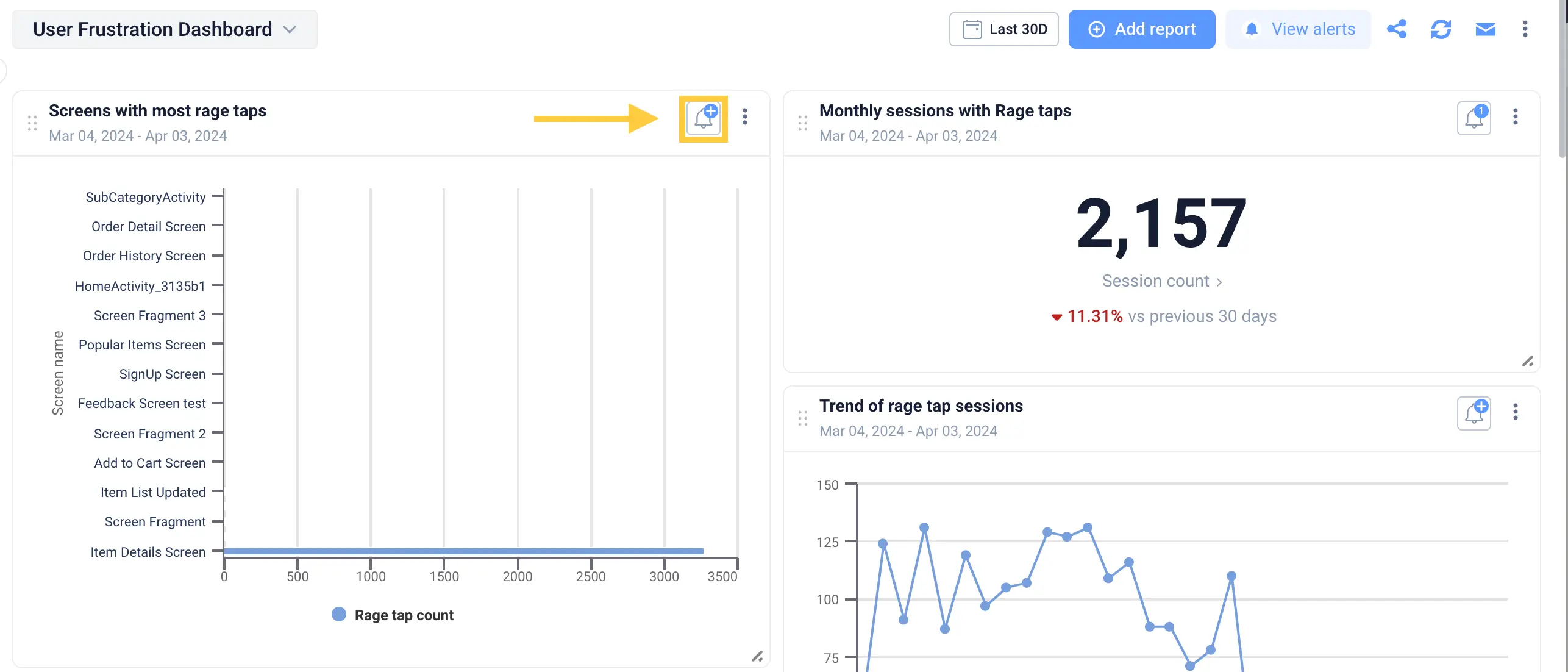
Step 6: Understand the "Why" with session replays & heatmaps
Funnels are great for showing you what is happening, but they don’t explain why. And if you’re serious about making product decisions with confidence, you have to understand the story behind the data.
That’s where qualitative insights come in.
You’ve probably seen this: a funnel shows that 40% of users drop off before completing onboarding, but nobody knows why. Is it a bug? Is the UI confusing? Are users expecting something else?
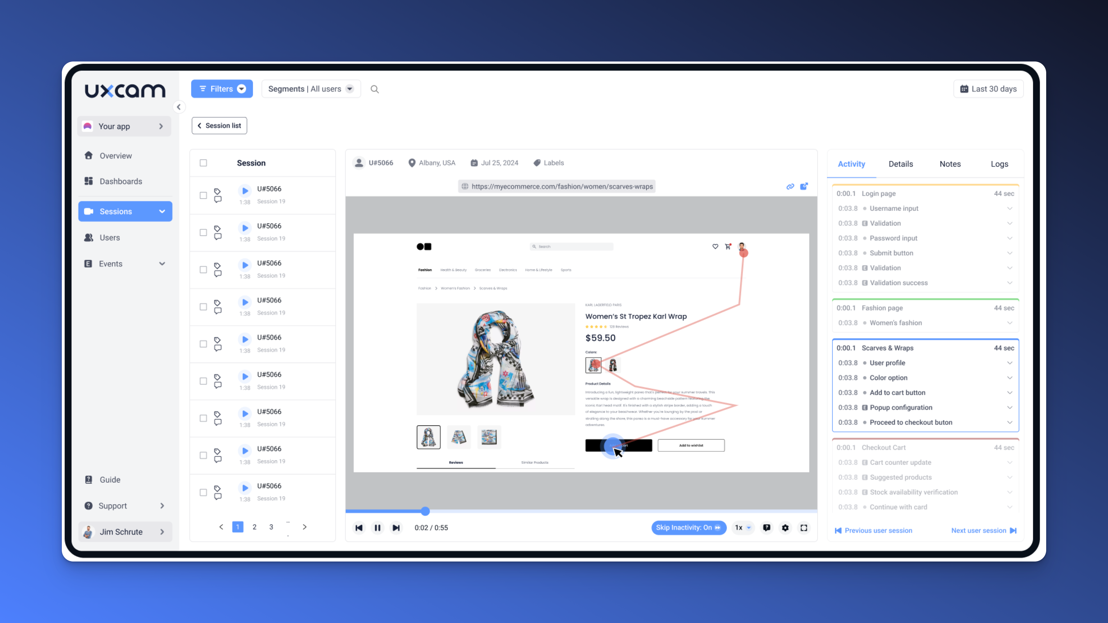
Instead of guessing, you watch it happen.
With session replays, you see exactly what the user saw. You can watch them land on the screen, hesitate, scroll around, maybe rage tap a few times, and then quit. It’s like sitting over their shoulder as they use the app—without needing a usability lab.


How UXCam helps:
With UXCam, you can filter for sessions with drop-offs, rage taps, UI freezes, or specific events. This lets you skip the noise and jump straight to the moments that matter.


Watching just 5–10 replays from a funnel drop-off can uncover issues your analytics dashboard will never show.
And if you want a higher-level view, UXCam’s heatmaps give you a quick way to see how users interact with a specific screen—where they tap, scroll, or ignore. It’s incredibly useful for spotting UX dead zones or areas of unexpected attention.


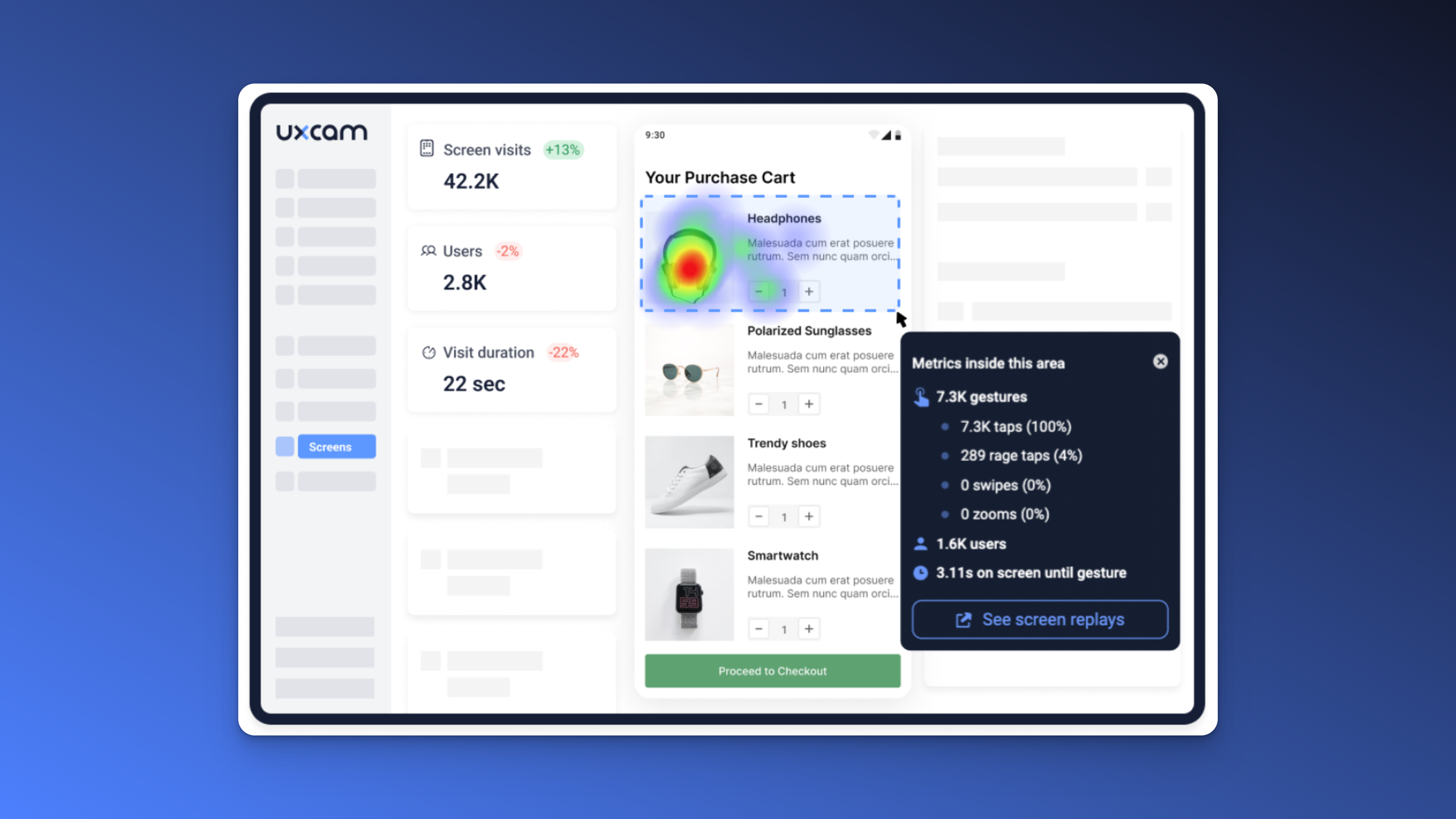
Your funnel shows users are bailing at the final step of checkout. Replays show they’re trying to paste a discount code, but the input field doesn’t support it. That one small issue was killing conversion—and you would’ve missed it in the numbers alone.
Pro tip: Combine funnel analysis with session replay as a routine. Every time you notice a spike in drop-off, go watch the user sessions. You’ll walk away with an actionable fix 9 times out of 10.
Step 7: Take action and close the loop
Here’s where most teams drop the ball: they do the analysis, find some great insights… and then forget to follow through. They ship a fix, celebrate, and move on, without ever checking if it actually worked.
But insights are only valuable if they lead to real change.
If you’ve gone through the steps to define your goal, track the right data, segment users, analyze funnels, and understand the “why” behind user behavior, now it’s time to act.
This is your moment to go from insight to impact.
Maybe you redesign a confusing screen, remove friction from your onboarding flow, or patch a performance bug. Whatever the fix, your job isn’t done at release. You need to close the loop by tracking whether your change actually moved the needle.
And not just for yourself, your entire product team needs visibility into what worked, what didn’t, and why.
How UXCam helps:
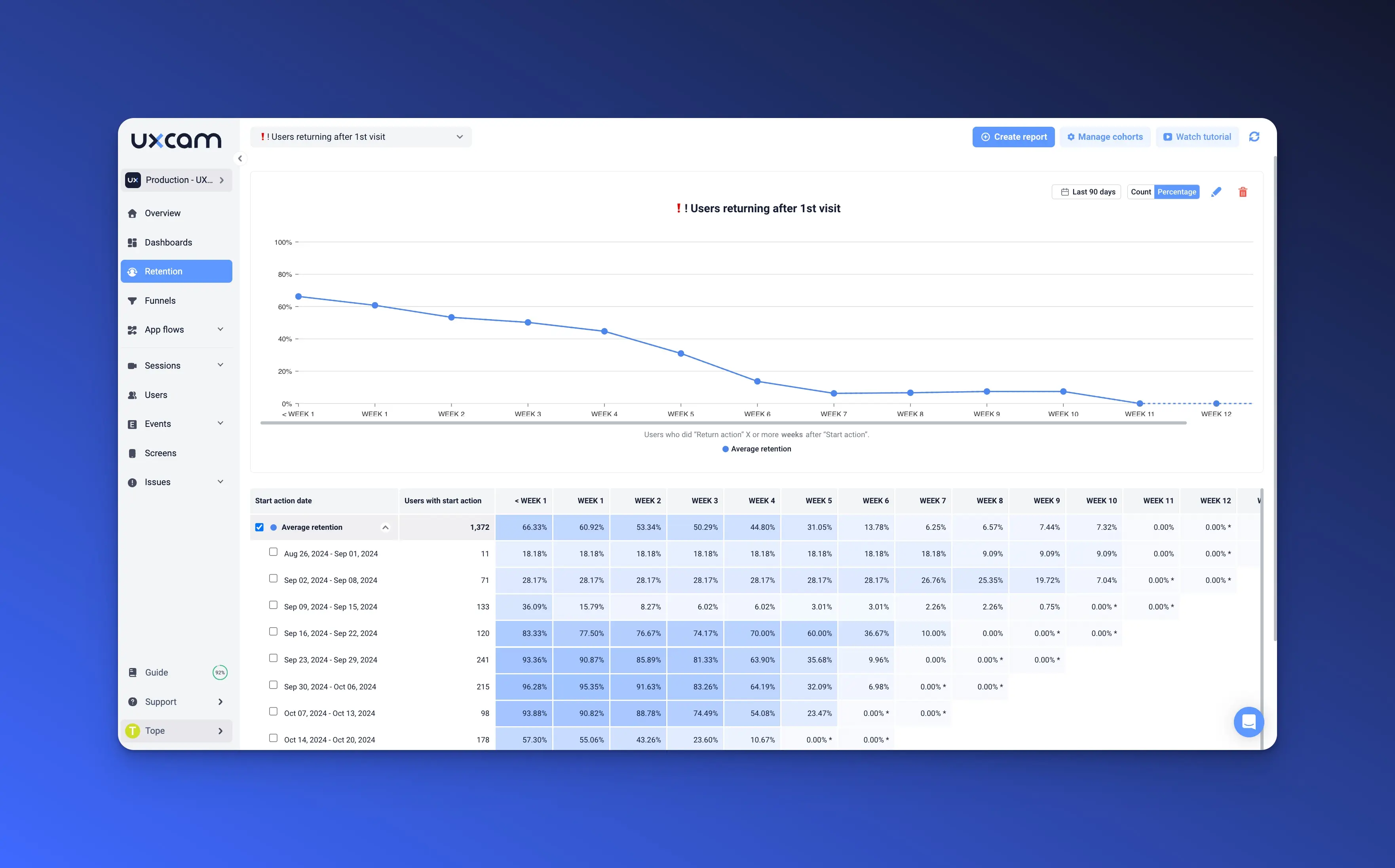
After you ship an update, use Dashboards to track before-and-after performance. Did your new onboarding flow improve completion rates? Are users still dropping off at the same point?


You can also monitor session patterns over time to see if frustration signals (like rage taps or UI freezes) have decreased. And if something still feels off, you can go right back into session replays to watch user behavior and spot new issues.
UXCam make team collaboration easy. You can share links to specific sessions or funnels with Design, Engineering, or Support. No exporting, no guesswork, just click, watch, understand.
Pro tip: Document the change and results in a shared playbook or release notes. It builds institutional knowledge and helps your team get better at spotting patterns over time.
Conclusion
You don’t need to guess where your users are getting stuck. You don’t need to ship blind. And you definitely don’t need to drown in dashboards with no clear direction.
With this 7-step playbook and with UXCam as your analytics engine, you can confidently analyze product performance, uncover hidden friction, and take action based on real user behavior.
It’s a system you can repeat every sprint, every quarter, every time your app evolves.
Ready to see it in action? Start a free trial of UXCam and you’ll be watching real sessions within 1 hour, building funnels, and finding your first actionable insight.
You might also be interested in these;
Product management KPI dashboard examples & how to use them
How to analyze session recordings
Product analytics dashboard examples (+ how to use them)
14 Best Product Development Software for Every Team
8 Important product management templates for mobile app teams
Product management and user experience - How to collaborate effectively
AUTHOR
Tope Longe
Product Analytics Expert
Ardent technophile exploring the world of mobile app product management at UXCam.


Related articles


Product best practices
5 best user behavioral analytics tools for mobile app teams
Behavioral analytics offers deep insights into user interaction. Learn about the best behavioral analytics tools to optimize the user experience on your mobile...


Jonas Kurzweg
Product Analytics Expert


Product best practices
Top 11 Remote Usability Testing Tools You Can Use Now
Usability testing tools that will put your mind at...
Jonas Kurzweg
Product Analytics Expert


Curated List
7 Best AB Testing Tools for Mobile Apps
Learn with examples how qualitative tools like funnel analysis, heat maps, and session replays complement quantitative...


Jane Leung
Product Analytics Expert