Push Notification UX Design: The Ultimate Guide 2025

Push notifications get the direct attention of your users.
If you design your push notifications right and send them at the right time to the right target group, they are a valuable tool.
Yet, "a push notification a week leads to 10% of users disabling notifications, and 6% to uninstalling the apps," according to Business of Apps. This means there is a disconnect between the designer of the notifications and the user.
Luckily, there is an easy way to turn this poor UX pattern into something useful and valuable for you and your users.
What Is Push Notification UX?
A push notification is a text message which is sent by an app on your smartphone. There are push notifications on desktops sent by web browsers too, but this article focuses on mobile apps.
Push notifications are sent for several reasons. These are some of them:
Highlights from the app, e.g., coupons or news.
Important information.
Reminders.
A new activity, e.g., from friends who use the same app.
Before you send a push notification out, you should ask yourself two questions:
Would I want to get this notification?
Would I send this notification to someone I care about?
Types of Push Notifications
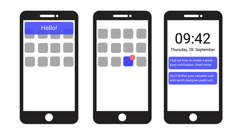
Push notifications can be classified into four different categories:
Banners: They appear for a short time on the screen and disappear after.
Badges: Small and usually red circles you can find on the corner of an app.
Alerts: Messages that pop up on the screen and require an action from the user to either open or close them.
Sound: They are mostly combined with other notifications but sometimes exist without them.

Push Notification UX Best Practices
When optimized for UX, push notifications can enhance user engagement, increase retention, and drive conversions. Here are some best practices for push notification UX:
Get the Opt-In
You need your users’ permission before you can send them push notifications.
A blank default request says absolutely nothing about the value your app provides or the reason why users should permit you.
What you should do instead is provide context before asking for permission. Let the users know the importance and the value of your push notifications. Make them feel good about this decision.
Your chances of receiving a yes from their end will increase.
Try to find the right moment to ask your users for permission. Do not ask them directly after opening the app for the first time or they will refuse. Remember, context is crucial.
What To Say?
Use your words wisely!
The character count that fits in a push notification accounts for about 10 words, so you have very little room to pique their interest and motivate them to react to your notification. How can you make an impact in just 10 words?
By adding a call-to-action, such as “slide for more information”, “have a look”, “share” or “read more.”
You have to create a short, motivating, and brief notification. Keep the 10-word rule in mind to ensure that your text will fully fit in the push notification.
Personalization
Personalized push notifications are four times more likely to be opened than non-personalized ones.
Being friendly and kind is not enough.
Let users think that this message is just for them. Lead them to believe you’re only interested in the particular user reading the notification.
Don’t make the message general enough that it looks like it was sent en masse.
Are you now wondering how you can personalize your push notification UX? Don’t worry, it’s not like you have to send these notifications one by one.
Try to personalize the messages by looking at the user journey. Split your users into groups or segments and create dedicated messages for each one of these segments.
For example, let’s say your product is a gaming app. You could send different notifications depending on the level the users are in.
Another option would be to send transactional push notifications. Behaviorally triggered push notifications are nine times more likely to be opened than regular push notifications.
Some notifications get sent to single users. These are perfectly personalized. Examples of these notifications are special situations in the users’ accounts, e.g., a completed purchase or a shipped package.
For more information about personalization and customization, this article about app personalization may be of interest to you.
The Landing Page
When your users open the push notification, you should lead them to the right page or the right part of your app.
Your users will end up annoyed if the notification takes them to the main screen of the app or, even worse, to an unrelated one.
When To Send a Push Notification?
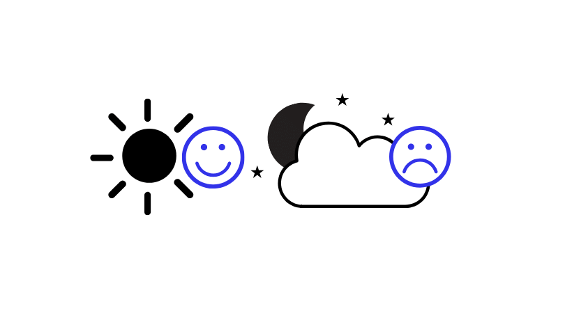

NOT when your users are sleeping.
They will be annoyed if they don’t set their smartphone to a do-not-disturb mode. Besides, most users don’t read the push notifications they get during the night.
To avoid this, you should take into account the local time zone of your users. Around 8 p.m. seems to be the user peak for most apps. It’s best to utilize the 6 p.m. to 10 p.m. time slot if you want to make sure your users see your push notifications.
Urgent Information
There is one exception concerning the time to send push notifications.
If something important happens during the night, your users won’t want to wait until the next evening to find out. Make sure that the information you believe to be urgent is also considered as such by your users.
Keep in mind that notifications should generally be sent during the day or evening. And urgent notifications — 10% off coupons don’t qualify as such — whenever relevant and needed.
How Many Notifications Are Okay for a Good UX?
This depends on what kind of app you have and what content you provide.
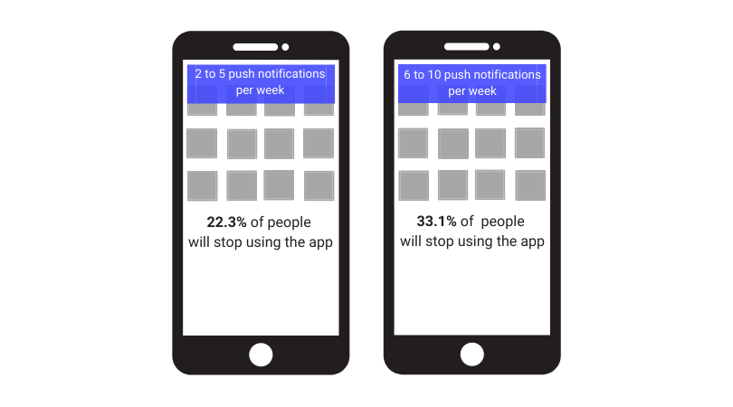
If you want to inform users about new products in your shop, set a daily limit for notifications. Spamming your users is never a good idea — they will most definitely delete your app.
This isn’t to say that limits are always necessary. After all, imagine how you’d feel if the messaging app you use had a limit of 5 push notifications per day. You’d want to be notified about every new message you receive, right?
There’s no one-size-fits-all answer to this question. Think about what your users would want and make it happen.

Don’t Send Unimportant Notifications
Your users get no value if you offer them a flight to London that they already booked hours or days ago. They’ll know that you send these messages randomly or will think that you don’t care about them at all.
Offer them a hotel in London instead, or a coupon for their next flight. Think about the user journey.
Duplicate Your Notifications Within the App
This may sound strange, but it will help your users.
When your users open your notifications, they may not have read the full text yet — either because you didn’t stick to the 10-word rule or because they clicked on it too quickly. They won’t know what the notification said unless you give them the chance to read it one more time.
Give your users the option to read the push notifications once they open the app.
Clear the Badge
Users find it annoying when they see a red circle — a badge — on the corner of one of their apps if they don’t know how it got there.
Many users don’t like to have unopened badges. Give them the chance to clear them by simply opening your app. Don’t make them tap around your app until they find the screen that makes the badge disappear. This won’t make your users see your content: All it will do is frustrate them.
Test Your Push Notification UX
A simple way to find out if your push notification UX fits the needs of your target group is testing.
Either test your push notification or make an A/B test. You can send two different versions of it to a segment of your users and see which version generates more revenue.
This leads to you finding the most effective version of your notification. It also prevents you from sending notifications that generate little to no revenue.
Don’t Limit Yourself to Push Notifications!
Push notification UX is key when getting in touch with your users.
Don’t just stick to push notifications. Select your notification method based on the urgency of the information and the target group.
FAQ
What types of push notifications exist?
Push notifications can appear in the form of banners, badges, alerts or sound.
Do push notifications cause uninstalls?
Push notifications can cause uninstalls if they are badly executed. 71% of users claim to uninstall apps because of push notifications.
However, push notifications do have a positive impact on your app’s metrics if they are implemented properly.
What are notifications UX best practices?
The UX best practice for mobile push notifications, is to personalize your messages and delay all types of notifications until users have had the chance to explore the app a little bit.
Related Articles:
Mobile UX: What You Should Know
AUTHOR
Annemarie Bufe
Product Analytics Expert
Passionate hobby dancer. Working at UXCam.

Related articles
Product best practices
5 best user behavioral analytics tools for mobile app teams
Behavioral analytics offers deep insights into user interaction. Learn about the best behavioral analytics tools to optimize the user experience on your mobile...

Jonas Kurzweg
Product Analytics Expert
Product best practices
Top 11 Remote Usability Testing Tools You Can Use Now
Usability testing tools that will put your mind at...

Jonas Kurzweg
Product Analytics Expert
Curated List
7 Best AB Testing Tools for Mobile Apps
Learn with examples how qualitative tools like funnel analysis, heat maps, and session replays complement quantitative...

Jane Leung
Product Analytics Expert


