The $2M UX mistake: How a single form field killed checkout conversions


There's a form field somewhere in your app right now that's costing you money. Maybe it's not $2 million. Maybe it's "just" $50,000. Or maybe it's worse.
The thing is, you probably don't know it's broken. Your analytics dashboard looks fine. Your crash reports are clean. Users are reaching the form. Some are even filling it out. Everything appears normal.
But here's what you can't see: the hundreds of users every week who tap that field, start typing, then quietly abandon your app forever.
This is the story of how one e-commerce app discovered they were hemorrhaging millions because of a single form field. More importantly, it's about how they finally found it—and how you can find yours before it's too late.
The mystery of the disappearing customers
Let's call them ShopFast (not their real name, but the story is very real). They're a mid-sized e-commerce app with about 2 million monthly active users. Good product, decent prices, solid brand recognition. Everything was going reasonably well.
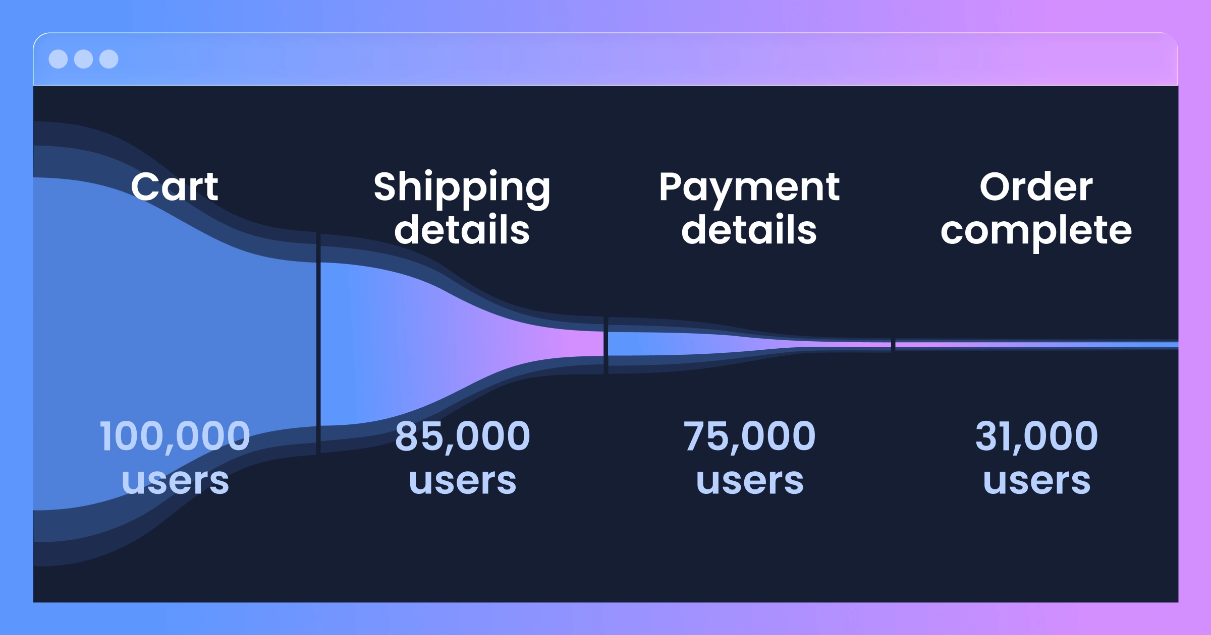
Except for one nagging problem: their checkout completion rate was stuck at 31%.
Now, 31% isn't terrible for mobile e-commerce. Industry average hovers around 35-40%, so they were slightly below the benchmark. But slightly below the benchmark, when you're doing millions in GMV, translates to a lot of money left on the table.
Their team had already tried everything:
Simplified the checkout flow from 5 steps to 3
Added Apple Pay and Google Pay
Optimized page load times
A/B tested button colors, copy, placement
Implemented exit-intent surveys (spoiler: nobody filled them out)
Nothing moved the needle.
Their analytics told them that users were dropping off at the "Payment Details" screen, but that's where the trail went cold. Mixpanel showed them the numbers. Amplitude showed them the funnel. But neither could show them why.


The data that doesn't lie (but also doesn't tell the whole truth)
Here's what traditional analytics showed:
Users reaching payment screen: 117,236/month Users completing payment: 30,567/month Users abandoning: 68,452/month
That last number haunted them. 68,452 people every month got all the way to payment and then... vanished. These weren't window shoppers. They'd added items to cart, filled out shipping addresses, and were literally one step away from buying.
The product team had theories:
"Maybe our payment processor is too slow"
"Maybe people don't trust entering card details"
"Maybe we need more payment options"
"Maybe the form is too long"
But theories without evidence are just expensive guesses. And they'd already burned through their quarterly experimentation budget testing those guesses.
That's when their VP of Product made a decision that would eventually save them millions: "We need to actually see what users are doing, not just track where they go."
They implemented UXCam for session replay.
What session replay revealed
The first session replay their PM watched was eye-opening. And frustrating. And honestly, a little heartbreaking.
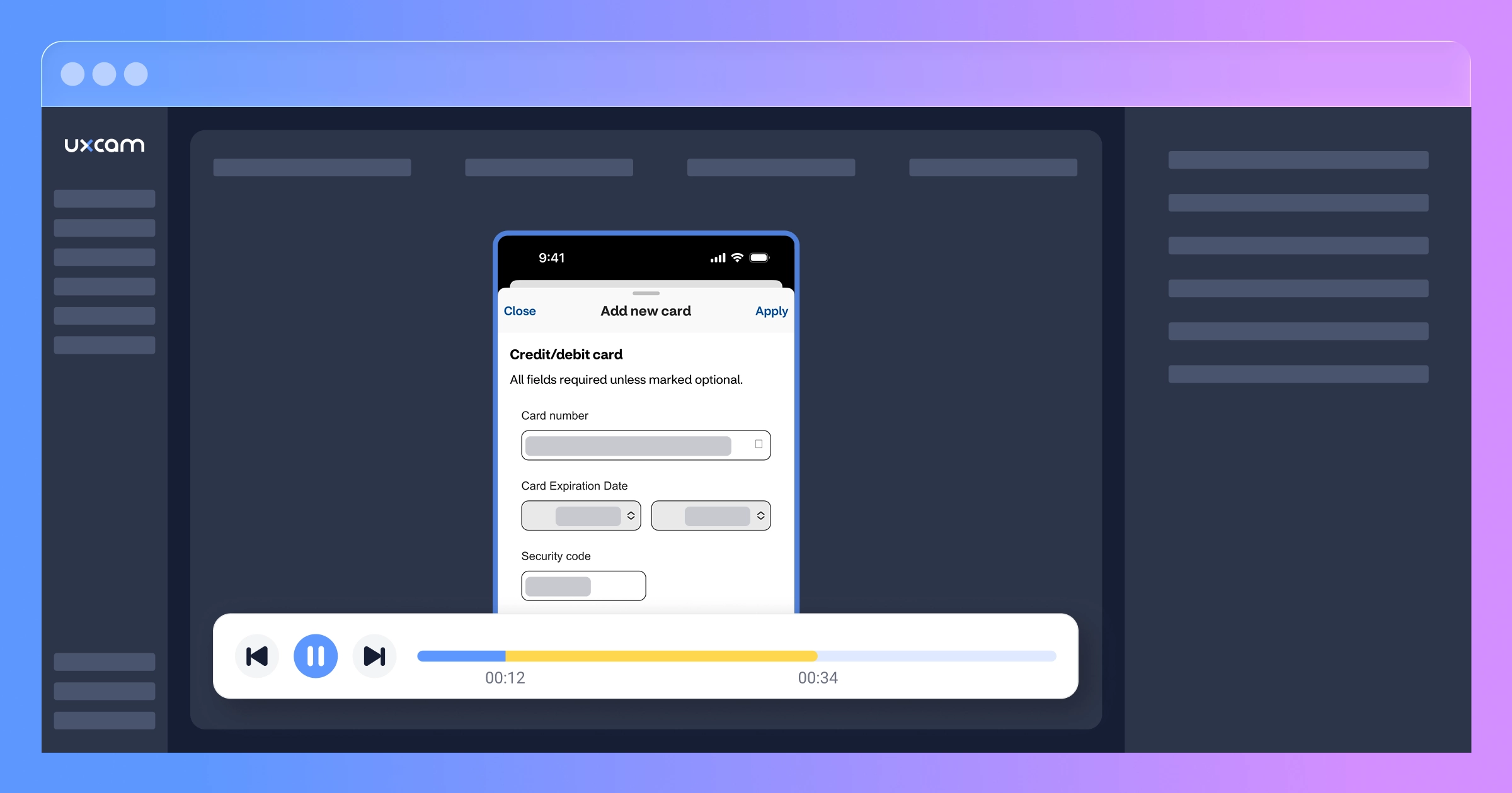
A user had spent 3 minutes browsing. Added four items to cart (cart value: $247). Proceeded to checkout. Filled out shipping details. Arrived at payment.
Then they tapped the "Card Number" field.


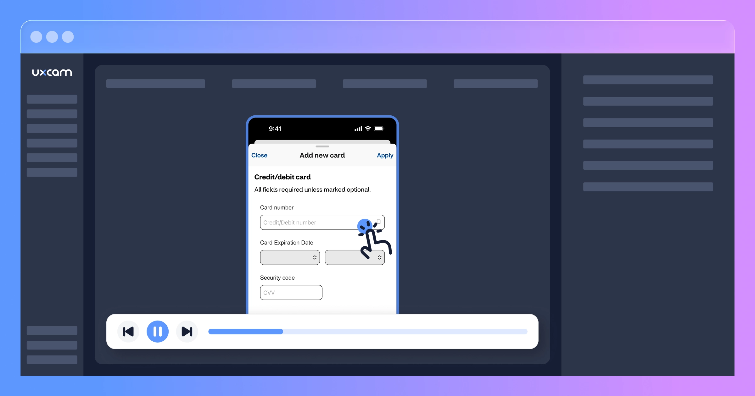
The mobile keyboard appeared. They started typing...
Then they stopped.
They tapped the field again. Nothing happened. They tapped it a third time.
Then they closed the keyboard, scrolled down, scrolled back up, tapped the field again, and... the cursor was blinking in the "CVV" field instead of the card number field.
The user backspaced, trying to clear it. That didn't work. They tapped the card number field again—this time the keyboard had switched to the alphabetic layout instead of numeric.
After 47 seconds of struggling, they force-quit the app.


The PM watched 12 more sessions that afternoon. The pattern was unmistakable.
The $2M form field
The card number input field had three separate bugs that were working together to create the perfect storm of abandonment:
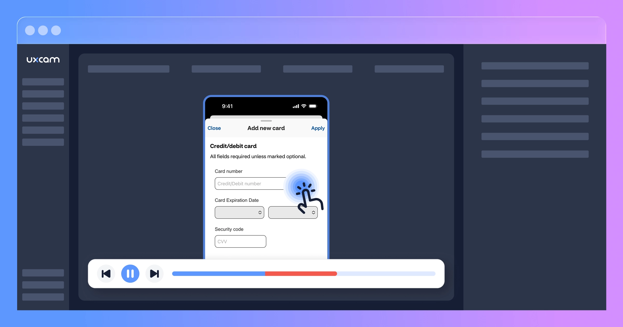
Bug #1: Focus jumping
When users tapped the card number field and the keyboard appeared, the form would sometimes auto-scroll slightly (to keep the field visible above the keyboard). This scroll would occasionally trigger a focus change, moving the cursor to a different field entirely. Users would start typing their card number, only to realize they were typing into the CVV field or expiration date field instead.
Bug #2: Input type switching
The field was configured to show a numeric keyboard on iOS but a regular keyboard on certain Android devices. When users tapped the field multiple times (trying to fix the focus issue), the input type would sometimes switch between numeric and alphabetic. Users would look down after typing four digits, see letters, and panic that they'd entered something wrong.
Bug #3: Invisible cursor
Due to a CSS issue with their white-labeled payment form, the text cursor was white text on a white background. Users literally couldn't see where they were typing. Combined with the focus jumping issue, this meant users often had no idea which field was active.


Individually, each bug was annoying but survivable. Together? They created an experience so frustrating that users assumed the app was broken and gave up.
Here's the financial impact:
Monthly abandonment at payment: 68,452 users Sessions with card field issues: ~42% (based on UXCam replay analysis) Users affected by the bug: ~28,750/month Average cart value: $73 Expected conversion if form worked: ~70% (based on industry benchmarks for users who reach payment details) Monthly revenue loss: 28,750 × $73 × 0.70 = $1,469,125
Over the 14 months this bug existed (undetected): $20.6 million in lost revenue.
We're being conservative by saying $2M in the headline. The real number was likely much, much higher.
Why traditional analytics missed this
You might be wondering: why didn't their analytics catch this?
The brutal truth is that event-based analytics are blind to behavioral problems.
Here's what their event tracking saw:
User_Viewed_Payment_Screen
User_Tapped_Card_Field
User_Dismissed_Keyboard
User_Left_App
Everything fired correctly. Every event was tracked. Their event logs looked perfectly normal. From the perspective of Mixpanel or Google Analytics, users simply chose to leave. There was no error to catch, no crash to report, no failed event to flag.
The bugs were "silent failures"—problems that don't generate error logs because, technically, everything is working as coded. The code was running correctly. The events were firing. The app wasn't crashing.
It just wasn't usable.
This is the gap that exists in most mobile app analytics stacks. You can see what happened (user left) but not why (because they couldn't enter their card number after 8 attempts and gave up.
How Tara AI found the pattern by watching sessions
ShopFast's team had thousands of session replays to review. Manually watching them all would take weeks. But they needed answers fast.
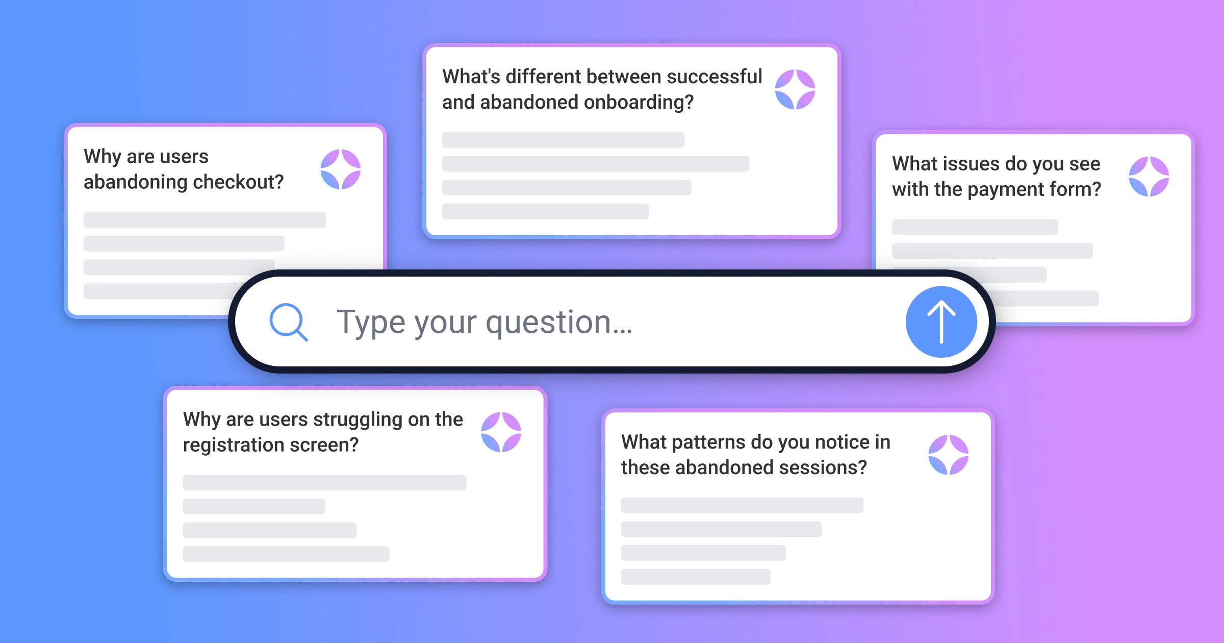
So they opened Tara AI and asked her one simple question:
"Why are users abandoning checkout?"


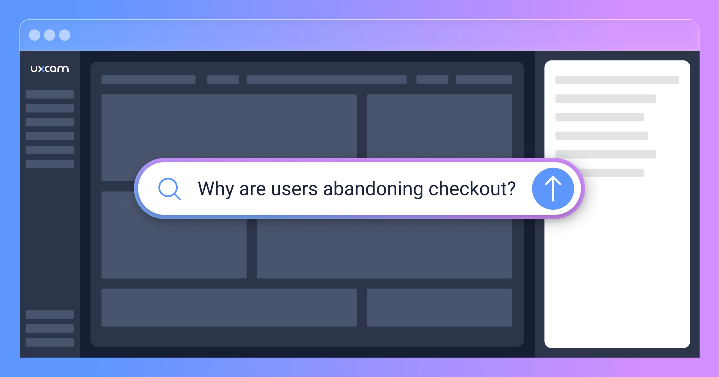
Tara automatically pulled relevant abandoned checkout sessions, watched them, and came back with her analysis:


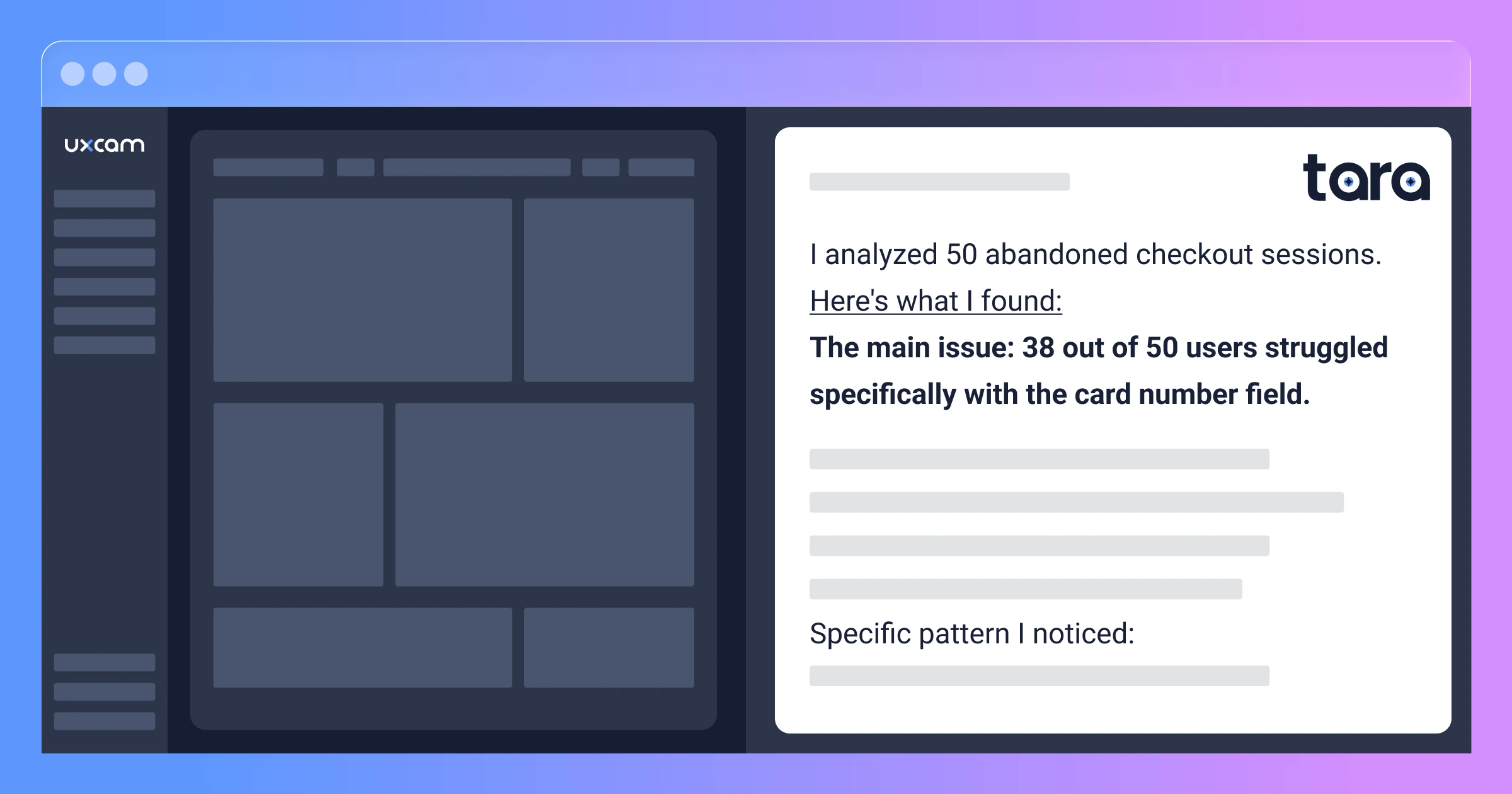
Tara AI Response:
I analyzed 50 abandoned checkout sessions. Here's what I found:
The main issue: 38 out of 50 users struggled specifically with the card number field.
What I'm seeing in these sessions:
Users tap the card number field multiple times before successfully entering data
When the keyboard appears, the cursor often ends up in the wrong field (usually CVV or expiration date)
Users attempt to backspace and correct, but the keyboard switches between numeric and alphabetic layouts
Many users try tapping the field 4-5 times before giving up entirely
Specific pattern I noticed: User taps card field → keyboard opens → starts typing → realizes they're in the wrong field → taps card field again → keyboard layout changes → user gets confused → abandons
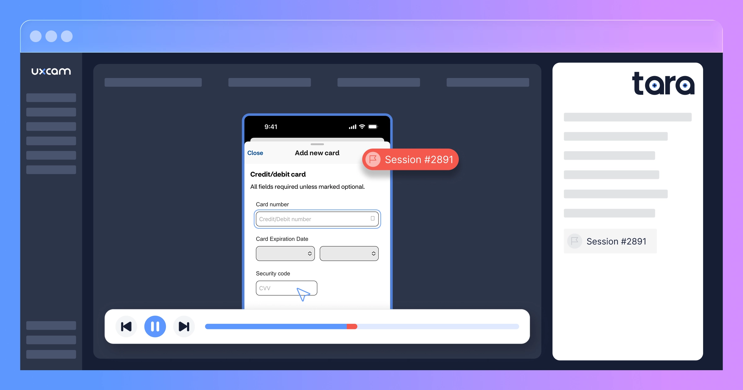
Representative sessions to review:
Session #2847: User tried 7 times over 47 seconds
Session #2891: Clear example of focus jumping to CVV field
Session #2903: Shows keyboard layout switching mid-entry
What's working fine: The shipping address fields work smoothly—users complete those with no issues. The problem is isolated to the payment card entry.
The PM immediately pulled up the three sessions Tara highlighted. Each one showed the exact same struggle pattern. It wasn't a random bug affecting a few users—it was a systematic problem with the card field itself.


To dig deeper, they asked Tara another question:
"What's different about how users interact with the payment form in successful checkouts versus abandoned ones?"
Tara pulled sessions from both groups, watched them, and came back with a comparison:


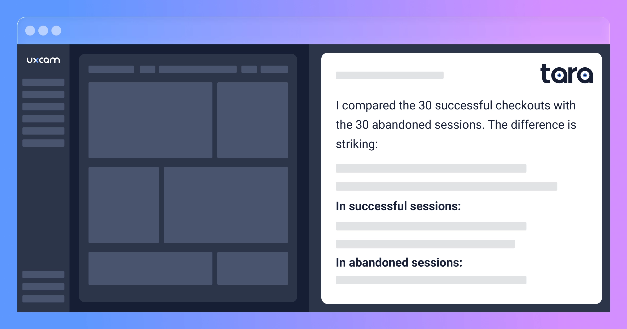
Tara's Response:
I compared the 30 successful checkouts with the 30 abandoned sessions. The difference is striking:
In successful sessions:
Users tap each field once
They move through fields in order: Card → Expiry → CVV → Submit
Total time on payment screen: 15-25 seconds
Smooth, linear progression with no backtracking
In abandoned sessions:
Users tap the card field 3-6 times on average
They jump between fields erratically: Card → CVV → back to Card → Expiry → back to Card again
Total time on payment screen: 45-70 seconds before abandoning
Lots of keyboard dismissals and reopening
Frequent backspacing and correction attempts
In successful sessions, users enter their card number in one attempt. In abandoned sessions, I can see them trying to enter it multiple times but the cursor keeps ending up in the wrong field. They're not choosing to abandon—they're giving up after the form fails to cooperate.
One user in Session #3102 even switched to the desktop site mid-session, successfully completed checkout there, then never returned to the app.
That last observation hit hard. Users wanted to complete checkout so badly that come back again quickly to complete the purchase. The issue wasn't pricing, trust, or payment options—it was purely the broken form experience.
Armed with Tara's qualitative insights and the specific session examples, the team had everything they needed: proof of the problem, clear pattern identification, and video evidence of the exact user experience.
The fix (and why it wasn't simple)
Once they knew what was broken, fixing it should have been straightforward, right?
Not quite.
The card number field was part of a third-party payment SDK they'd integrated. They couldn't just modify the code directly. They had three options:
Option 1: Wait for the SDK vendor to fix it (timeline: 6-8 weeks minimum, plus testing) Option 2: Switch to a different payment SDK (timeline: 3-4 months of integration work, plus PCI compliance re-certification) Option 3: Build a wrapper that fixed the focus and styling issues (timeline: 1-2 weeks)
They chose Option 3.
Their mobile team built a custom input wrapper that:
Prevented focus jumping by locking scroll position when keyboard appeared
Forced numeric keyboard on all devices
Styled the cursor to be visible (dark grey) on their white background
Added subtle visual feedback when the field was active (light blue border)
Two weeks later, they shipped the fix.
Before deploying to all users, they rolled it out to 10% of traffic first and watched the session replays.


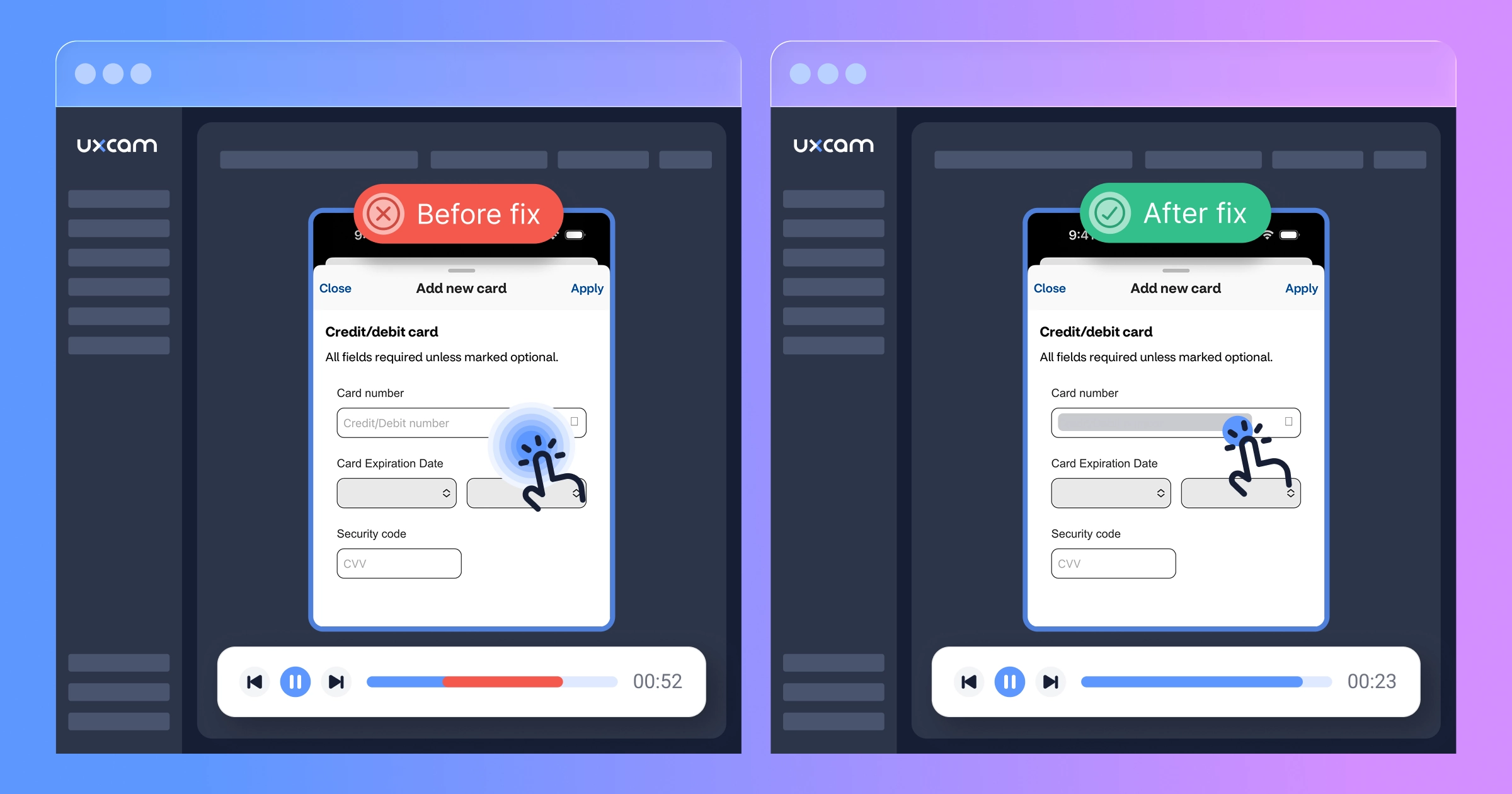
The difference was immediate and obvious. Users tapped once, entered their card number smoothly, and moved on. No confusion, no frustration, just a form that worked.
They pushed to 100% the next day.
The results
The numbers changed overnight.
Before the fix:
Checkout completion rate: 31%
Average attempts to complete card field: 2.7
Time spent on payment screen: 52 seconds
Rage taps on card field: 1,847/day
After the fix:
Checkout completion rate: 58%
Average attempts to complete card field: 1.1
Time spent on payment screen: 23 seconds
Rage taps on card field: 143/day


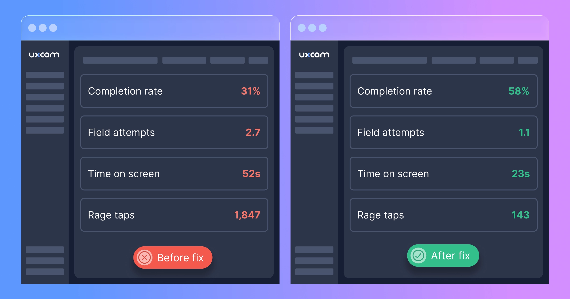
That's an 87% increase in checkout completion.
But here's the number that made their CFO cry happy tears: $1.2M in recovered monthly revenue.
Not projected. Not modeled. Actual, measurable increase in completed orders that they could trace directly to fixing that one field.
The session replays after the fix told a different story than before. Users tapped the field once, entered their card number smoothly, and completed checkout. No frustration. No confusion. Just a form that worked the way users expected it to.
They continued monitoring Tara AI, asking her weekly: "Are there any new issues on the checkout flow?" So far, the answer has been no. But if something breaks, they'll know within days instead of months.
What this means for your app
You probably don't have the exact same bug as ShopFast. But I'd bet money you have a bug like it somewhere in your conversion flow.
Maybe it's a button that doesn't respond on first tap. Maybe it's a dropdown that closes before users can select an option. Maybe it's a form that auto-scrolls at the wrong moment. Maybe it's something you haven't even imagined because you, as someone who knows the app intimately, have learned to work around it without thinking.
Here's the uncomfortable truth: traditional analytics are built to measure what works, not what's broken.
Event tracking tells you users dropped off. It doesn't tell you they tried to continue but couldn't. Crash reporting catches exceptions. It doesn't catch interactions that fail silently. A/B testing compares variations. It doesn't reveal when all variations have the same underlying problem.
This is why session replay isn't a "nice to have" anymore—it's table stakes for any app that cares about conversion. And with Tara AI watching sessions for you, you don't need a team of analysts spending weeks reviewing replays. You select the relevant sessions, ask Tara to watch them, and get qualitative insights in minutes.
How to find your $2M form field
You don't need to wait until you've lost millions. Here's exactly how ShopFast's team did it—and how you can do it today:
Step 1: Set up UXCam (10 minutes)
Install the UXCam SDK in your app and configure it to capture your critical conversion flows—checkout for e-commerce, onboarding for SaaS, account setup or first transaction for fintech.
Important setup considerations:
Enable session replay on your key screens
Configure sensitive field masking for payment/personal data (UXCam masks the actual data for PCI compliance while still capturing user interactions)
Make sure gesture and touch tracking is enabled so you can see taps, swipes, and other interactions
You can find the complete setup guide in UXCam's developer center.
Step 2: Let data collect (few days)
Don't analyze immediately. Let UXCam collect at least 500-1,000 sessions on your critical flows. This gives you enough data to identify real patterns.The bigger the website quicker to reach enough sessions to make confident analysis.
ShopFast waited 3 days and had more than 3,000 checkout sessions—plenty to work with.
Step 3: Ask Tara to watch and analyze (minutes, not weeks)
Here's where Tara AI becomes invaluable. Instead of spending weeks watching hundreds of sessions yourself, you ask Tara simple questions and she does the detective work for you.
How ShopFast did it:
They opened Tara AI and asked: "Why are users abandoning checkout?"
Tara automatically pulled relevant abandoned checkout sessions, watched them, and identified the card field pattern—what would have taken their team days of manual review.
Then they asked a follow-up question: "What's different about how users interact with the payment form in successful checkouts versus abandoned ones?"
Tara pulled sessions from both groups, compared them, and revealed the stark behavioral differences between success and failure.
Questions you can ask Tara:
"Why are users abandoning [screen name]?"
"What issues do you see with the [form/button/element] in these sessions?"
"What's different between successful and unsuccessful [flow name]?"
"What patterns do you notice in abandoned [flow] sessions?"
"Why are users struggling on [screen name]?"


Tara provides:
Specific behavioral patterns she identifies (repeated taps, erratic navigation, etc.)
Which elements or fields users struggle with
Differences between successful and struggling users
Specific sessions she highlights for you to review
Once Tara identifies the pattern and points you to representative sessions, watch those specific examples to see the issue with your own eyes. You'll spot it quickly because Tara has already done the detective work.
Step 4: Fix it and monitor (ongoing)
After you ship the fix, keep monitoring with Tara. Periodically ask her: "Do you see any issues with [your critical flow] in recent sessions?"
Make this a weekly or bi-weekly ritual. Tara will help you catch emerging problems early, before they become $2M problems.
The replays that changed everything
I asked ShopFast's PM what single session replay had the biggest impact on their team.
"There was this one user," she told me, "who tried to checkout five separate times over three days. We watched all five sessions. Each time, they'd add items to cart, get to payment, struggle with the card field for 30-60 seconds, and give up."
"On the fifth attempt, we could see them typing slower. More deliberately. Like they were really trying to make it work this time. And when it failed again, they didn't force-quit like usual. They just sat there. The session timer ran for another 22 seconds with no interaction."


"That 22 seconds haunted me. I realized we weren't just losing revenue. We were burning trust. That user wanted to give us money. They tried five times. And we kept letting them down."
Three days after they shipped the fix, that same user came back. They added items to cart. They went to checkout. They entered their card number on the first try.
And they completed the purchase.
"That," the PM said, "is when I realized session replay wasn't just an analytics tool. It's an empathy tool. It makes you care about fixing the problems because you can see the human on the other side struggling with what you built."
Your users are trying to tell you something
Every abandoned session is a story. Most of those stories end with "and then they gave up."
But some of them end differently. Some of them end with a user trying four, five, six times to complete an action because they really want what you're offering.
Those users are sending you a message. They're showing you—literally showing you, if you have session replay—exactly where your app is failing them.
The question is: are you watching?
ShopFast lost $2M (probably more) because they couldn't see what their users were experiencing. They had all the data in the world—pageviews, funnels, cohort reports—but none of it showed them the card field chaos that was destroying their conversion rate.
You might have something similar lurking in your app right now. A button that doesn't quite work. A form that's just confusing enough. A flow that makes sense to you but baffles your users.
The only way to know is to look. And with Tara AI watching sessions for you, you don't need to spend weeks in manual review—just filter the right sessions, ask Tara to analyze them, and she'll show you what's breaking.
Start finding your issues today
UXCam's session replay shows you exactly how users experience your app—including all the friction points that traditional analytics miss. Tara AI watches sessions for you and provides qualitative analysis in minutes, identifying patterns and issues you'd otherwise miss.
Start your free trial today or request a demo! Don't wait until you've lost millions. Filter your abandoned sessions, let Tara watch them, and ask: "Why are users abandoning [your critical flow]?"
What you discover in the next 30 minutes might be worth $2M.
Special thanks to the ShopFast team for sharing their story. Company name and identifying details have been changed, but the numbers, the bugs, and the $2M+ impact are all real.
AUTHOR
Carolina Soares
Customer Success Manager
Carol is a Customer Success Manager at UXCam with over 7 years of experience driving SaaS growth. Specialized in the intersection of UX insights and business strategy, she helps enterprise clients translate complex user data into measurable product adoption and long-term retention.


Related articles


Case Studies
O campo de formulário de $2M: como um app de e-commerce perdeu milhões por um único erro de UX
Um único campo de formulário de checkout causou frustração silenciosa nos usuários, abandono em massa e mais de $2 milhões em perda de receita. Veja como a Gravação de sessão expôs essa falha de...
Carolina Soares
Customer Success Manager


Case Studies
O vazamento de onboarding de US$ 1,3 milhão: Como um botão flutuante matou o crescimento de um app de fintech
Um app de fintech perdeu US$ 1,3 milhão em valor de cliente no primeiro ano porque um elemento de interface flutuante bloqueou silenciosamente o onboarding. Gravação de sessão e análise de IA expuseram o problema...
Carolina Soares
Customer Success Manager


Case Studies
The $1.3M onboarding leak: How a floating button killed a fintech app's growth
A fintech app lost $1.3M in first-year customer value because a floating UI element silently blocked onboarding. Session replay and AI analysis exposed the invisible...
Carolina Soares
Customer Success Manager