


Bad user experience (UX) can have a devastating impact on your business.
According to the 2023 State of Mobile report, 90% of users report exiting an app due to poor UX—whether it's due to poor performance, bad design, lack of responsiveness, or any other factor we’ll touch on later.
At UXCam, we provide mobile product teams with the product analytics tools they need to spot (and fix) UX issues lurking in their apps. In today’s guide, we’ll be sharing a few examples of bad UX decisions that you should avoid in your web and mobile products.
Let’s get started.
Summary - Bad UX examples
| Example | Description |
|---|---|
| Navigation Issues | Unclear labels, too many options, or inconsistent menus confuse users. Apple Music’s poor navigation highlights these frustrations. |
| Intrusive Pop-ups | Frequent, irrelevant, or hard-to-close pop-ups disrupt user flow. Effective ones should be timely, dismissible, and quick to load. |
| Annoying Auto-Features | Auto-playing media or forced actions, like Netflix’s auto-play trailers, annoy users and reduce control. |
| Poor Error Messages | Vague or technical messages confuse users. WhatsApp’s deletion note frustrates users who prefer messages to vanish entirely. |
What is bad UX design?
Bad UX (User Experience) design refers to designs that fail to meet the needs and expectations of the users, thereby creating a frustrating, confusing, or unsatisfying interaction experience.
Bad UX design examples
Bad UX design can manifest in various ways, including but not limited to:
Lack of Intuitiveness: A design is considered bad if it's not intuitive or easy to navigate. Users should be able to understand how to use a product or service without extensive instructions or trial and error.
Ignoring User Needs and Expectations: Bad UX design often occurs when the design does not take into account the actual needs, habits, and expectations of its target audience. This can result from insufficient user research or ignoring user feedback.
Complexity and Clutter: Overcomplicated designs that overwhelm users with too much information, too many choices, or a cluttered interface often lead to a bad UX. Simplicity and clarity are key principles of good UX design.
Lack of Consistency: Inconsistent designs, where similar actions have different results in different parts of a product, can confuse users and degrade their experience.
Poor Accessibility: Accessibility is a crucial component of UX design. Ignoring the needs of users with disabilities leads to a design that is not inclusive and is considered bad UX.
Slow Performance and Load Times: Products that are slow to load or respond can lead to frustration and a negative user experience.
Unresponsiveness to Feedback: Failure to evolve the design based on user feedback and data can result in an experience that becomes progressively more out of touch with user needs.
Bad UX design is detrimental not just from a user satisfaction standpoint but also impacts the overall success of a product or service. Designers must prioritize the user's needs and continually test and adapt their designs based on user feedback and behavior.
4 Examples of bad UX design
1. Navigation
Navigation is the way users find and access information on a website or application.
Poor navigation can make it difficult for users to locate what they're looking for, or even worse, make them feel lost and abandon the site or app altogether.
Some examples of poor navigation are:
Lack of clear labels: Navigation menus should use clear and descriptive labels that match the user’s expectations and vocabulary. Avoid using vague or ambiguous terms that can confuse users or make them click on the wrong option.
Too many options: Navigation menus shouldn't overwhelm users with too many options or levels of hierarchy. A good rule of thumb is to limit the number of options to seven or less, and use submenus or filters to organize information into categories.
Inconsistent or hidden navigation: Navigation menus should be consistent and visible across the website or application. Users should be able to access the main navigation from any page, and not have to guess where to find it. Avoid hiding navigation behind icons or gestures that users may not be familiar with or notice.
Ineffective search: A search bar should be easy to find and use, and return relevant results quickly. If the website or application has a large amount of content, consider using an advanced search feature with filters to help narrow down the results.
Apple Music has been criticized for its confusing navigation and unresponsive elements, which create a disorienting user experience. This includes poor autocomplete suggestions, a lack of a universal back button, non-interactive elements, and slow page transitions.


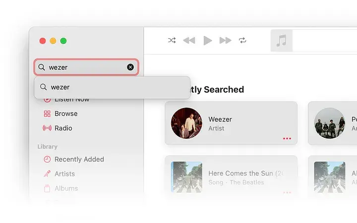
For example, a user tried to test if the app has an auto-suggest feature by intentionally misspelling the band name “Weezer” as “Wezer”. The user then compares the search result of the misspelled band name with the search result of the popular band “Queen”.


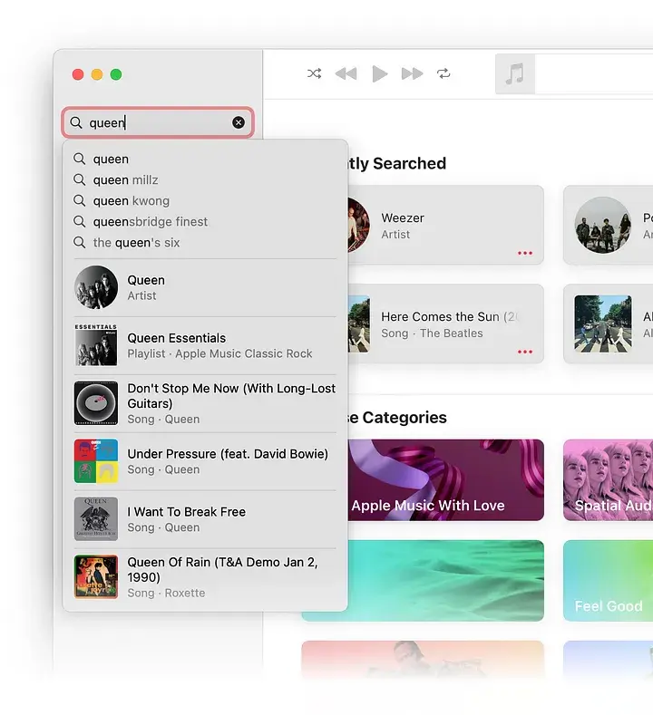
The user noticed that “Queen” has a quick-access result, while “Weezer” does not—a usability issue that might impact a user’s overall experience.
2. Pop-ups
Pop-ups are windows or messages that appear on top of the website or application content, usually to capture the user’s attention or prompt an action. While pop-ups can be useful for certain purposes, like notifying users of important information or offering discounts or deals, they can also be intrusive and annoying if not used properly.
Here are some examples of what not to do:
Overly frequent or irrelevant pop-ups: Pop-ups shouldn’t interrupt the user’s flow or distract them from their main task. Pop-ups should only appear when they're relevant and helpful to the user, and not too often or randomly. For example, a pop-up asking for feedback or a rating should only appear after the user has completed a task or achieved a goal, not before or during it.
Unavoidable pop-ups: Pop-ups shouldn’t force the user to interact with them or prevent them from accessing the website or application content. Pop-ups should have a clear and easy way to close or dismiss them, like a prominent “X” button or a “No, thanks” option. Avoid using pop-ups that cover the entire screen or require the user to scroll or fill out a form to close them.
Unresponsive or slow pop-ups: Pop-ups should not affect the performance or responsiveness of the website or application. Pop-ups should load quickly and smoothly, and not cause the website or application to freeze or crash. Avoid using pop-ups that contain heavy or complex elements, like videos, animations, or scripts, that can slow down the user’s device or browser.
3. Auto- (play, redirect, download)
Automatic functions are a major potential source of user frustration. Automatically playing sounds, redirecting to other pages or websites, or downloading files without the user’s consent can make them feel like their privacy is being violated and prevent them from enjoying their experience on the website or application.
A great example of what not to do comes from Netflix.


Netflix’s auto-play feature is designed to get users excited about homepage content. When you hover over a movie poster, the trailer automatically plays instead of needing to be clicked. Unfortunately, lots of users find this feature to be annoying.
4. Error messages
Error messages are messages that inform users of a problem or mistake that occurred while using the website or application. Error messages should help users understand and resolve the issue, not frustrate or blame them.
Here are some examples of what not to do:
Generic or vague error messages: Error messages should be specific and informative, and not use generic or vague terms that can confuse users or leave them clueless. For example, instead of saying “Something went wrong”, an error message should say “We couldn’t process your payment. Please check your card details and try again.”
Technical or jargon-filled error messages: Error messages should use plain and simple language that users can easily understand, and not use technical or jargon-filled terms that can intimidate or alienate users. For example, instead of saying “404 Not Found”, an error message should say “We can’t find the page you’re looking for. Please check the URL or go back to the homepage.”
Unfriendly or negative error messages: Error messages should be polite and positive, and not use unfriendly or negative tones that can offend or discourage users. For example, instead of saying “You entered an invalid email address”, an error message should say “Please enter a valid email address.”
WhatsApp’s delete message feature has been called out for its poor UX design. When a user deletes a message for everyone, it only hides the content and presents both sides with a note, “This message was deleted.”.


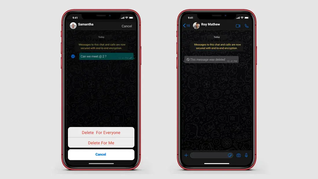
Their goal with this feature was to encourage transparency and integrity in conversations. That said, the vast majority of users aren’t using the delete message feature to deceive—they’re using it to delete a message they regret or would like to edit. They’d prefer if the message was simply removed.
What are some UX must-haves?
Usability
Usability refers to how easy it is for users to achieve their goals using a product. A good user interface can increase websites’ conversion rates by up to 200%. A bad mobile experience, on the other hand, can damage the brand's reputation and customer loyalty. For example, more than half of the users (62%) say they will not buy from the same brand again after a poor mobile experience.
To optimize for usability, you need a good product analytics tool—like UXCam.
Mobile product teams can use UXCam to track user behavior in their apps to uncover usability issues. With UXCam, you can view heatmaps that show how users interact with each page, as well as session replays that highlight user behavior in real time. This will help you identify areas for improvement so that you can create a smooth and intuitive user experience.
Accessibility
Accessibility in UX design ensures that all users, including those with disabilities, can access and use the product effectively. The World Health Organization (WHO) reports that significant disability affects about 1.3 billion people, or 16% of the world's population, as of now. This figure is projected to increase to 3.5 billion by 2050. Therefore, incorporating accessibility in UX design isn't just a nice-to-have, but a must-have.
Desirability
Desirability is about creating a design that users find attractive and appealing. According to statistics, 48% of visitors say that a website’s design is the most important factor in deciding the brand’s credibility. Plus, 94% of a website’s first impressions are due to its design.
Responsiveness
Responsiveness in UX design refers to the ability of a website, application, or interface to adapt and provide an optimal user experience across various devices and screen sizes. It encompasses how well a product performs and responds to user interactions, ensuring that users can easily navigate and interact with the interface without any hindrances.
Onboarding
Set-up and user onboarding are important for helping users get started with a product. Statistics show that about 21% of mobile apps have only been used once—often due to an onboarding experience that doesn’t effectively guide users to the value promised by the app’s marketing materials.


How to spot bad UX with UXCam
1. Utilize Session Filters: To identify bad UX, start by applying session filters in UXCam. You can filter sessions by device language, country, city, or specific user behaviors like rage taps, UI freezes, or crashes. By focusing on sessions that exhibit signs of frustration or difficulty, you can pinpoint where users are having trouble.


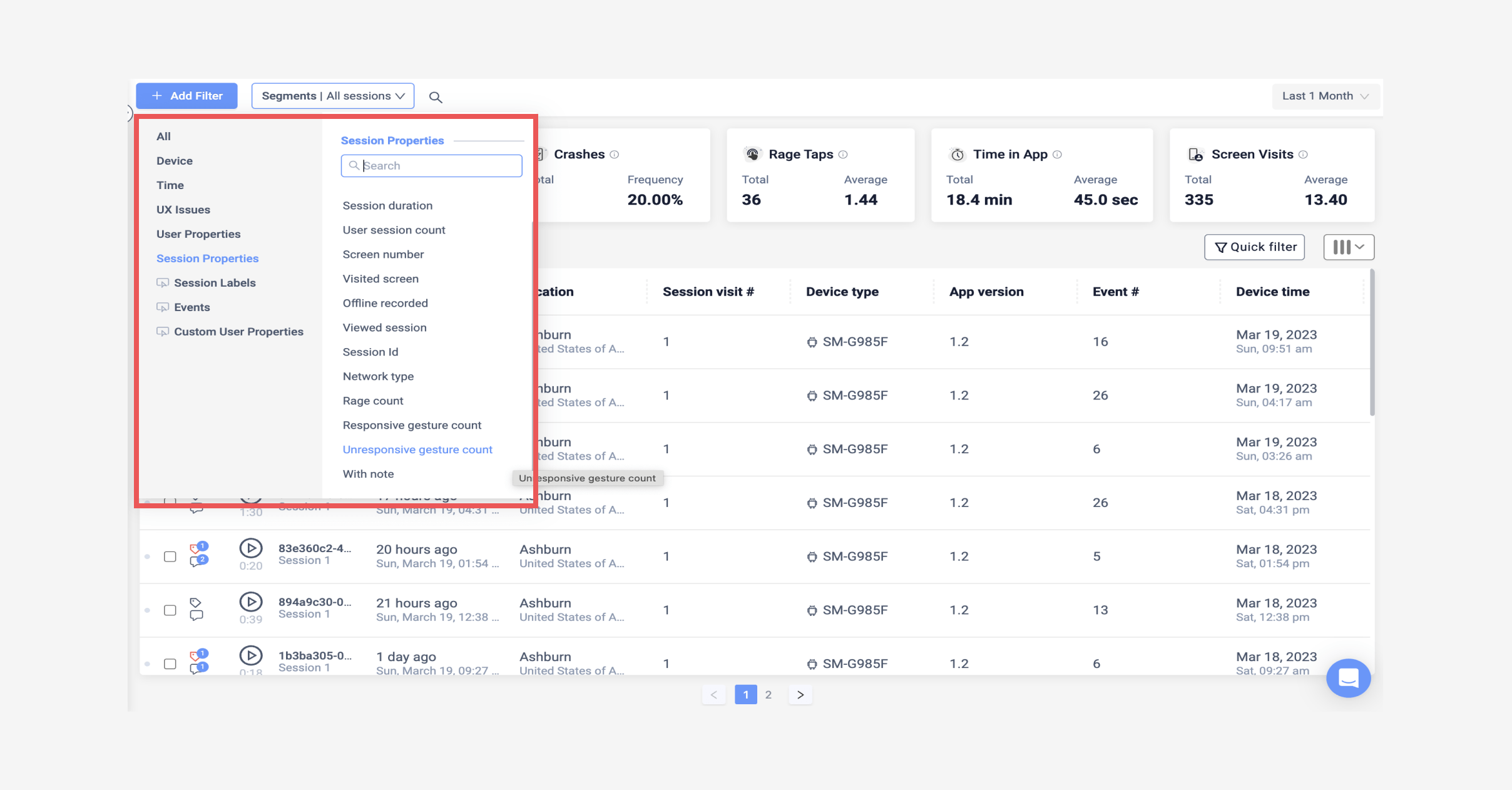
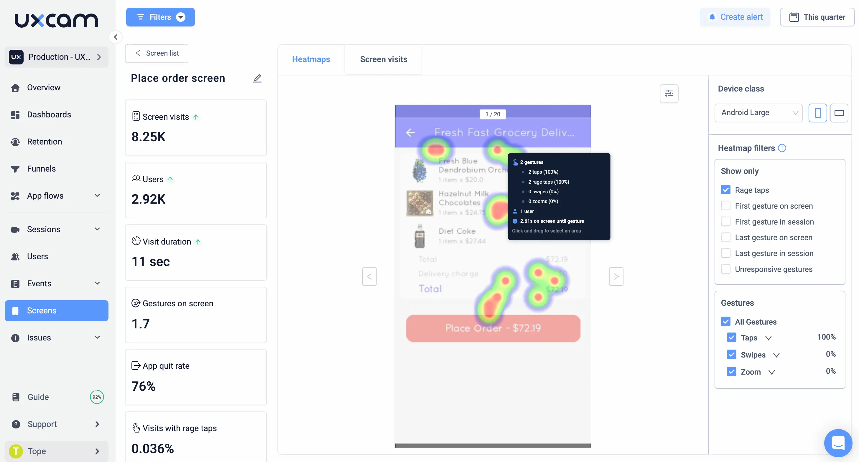
2. Analyze Heatmaps: Heatmaps are a powerful tool in UXCam that lets you see how users interact with your app's screens. By filtering heatmaps based on user, device, and session properties, you can observe patterns like which areas of a screen users interact with most and where they encounter unresponsive gestures or rage taps. This analysis helps identify elements that are causing confusion or frustration.


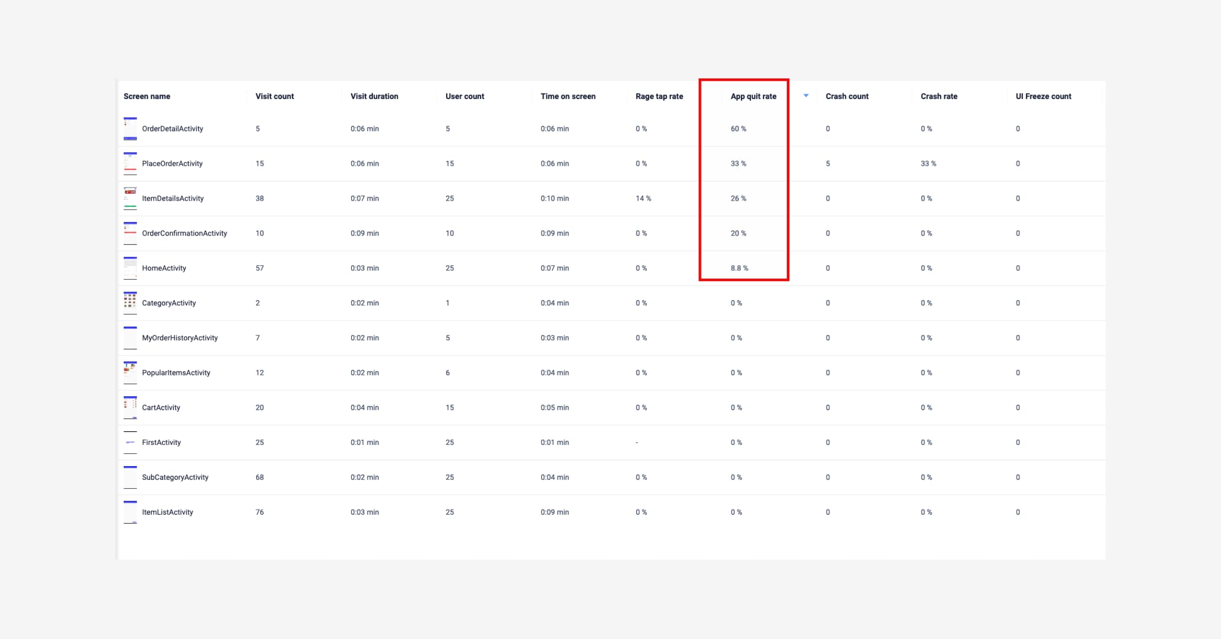
3. Monitor User Engagement and Screen Performance: Keep an eye on screens with high quit rates or low engagement. UXCam allows you to sort screens by various metrics such as engagement, visit count, and exit rate. By analyzing these, you can identify which screens are problematic or need optimization. For example, a high quit rate on a login screen indicates a barrier to entry, while low engagement on a content screen may suggest the content isn't engaging enough.


4. Detect Hidden User Frustrations: Track unresponsive interactions and rage taps. Users often express frustration through rapid taps or attempts to interact with unresponsive elements. Monitoring these interactions can reveal where your app is failing to meet user expectations or where the UI is misleading


You can also dive deeper into how to improve user experience on your mobile app
Conclusion
Bad UX examples can teach us a lot about how to design better user experiences. They can help us avoid common pitfalls, learn from mistakes, and improve usability and accessibility.
In this article, we’ve seen some of the worst UX examples from websites, apps, and products, and analyzed what makes them so frustrating and disappointing for users. We have also suggested some ways to fix them and create more positive and engaging user experiences.
If you run a mobile-first business or have a mobile app version of your product, UXCam is a powerful tool that helps you understand your users' behavior, identify usability issues, and improve your conversion rates. If you want to learn more about how UXCam helps mobile product teams uncover and fix UX issues with data, sign up for free.
You might also be interested in these;
Mobile UX design: the ultimate guide
Product management and user experience - How to collaborate effectively
6 Best user flow tools & software for mobile app UX design
UX optimization: 4 Steps to deliver a better user experience
AUTHOR
Tope Longe
Product Analytics Expert
Ardent technophile exploring the world of mobile app product management at UXCam.


Related articles


Curated List
7 Best AB Testing Tools for Mobile Apps
Learn with examples how qualitative tools like funnel analysis, heat maps, and session replays complement quantitative...


Jane Leung
Product Analytics Expert


UX design
12 UX Metrics to Measure and Enhance User Experience
Unlock product success by tracking the right UX metrics. Learn 12 essential metrics, how to measure them, avoid common pitfalls, and take action with tools like...


UX design
10 Top UX Design Best Practices & How to Implement Them
Discover 10 proven UX design best practices to improve usability, boost retention, and create user-centric products. Actionable tips for product...
Tope Longe
Product Analytics Expert