How Evernote designs its fantastic Onboarding Flow

During the last weeks I’ve published different articles about what onboarding is, how you can design it and why you should think user-centric. Now I want to take a closer look at the successfully designed onboarding flow of Evernote.
Evernote uses a combination of all three types of onboarding I’ve explained in the article “How not to lose users during app onboarding”.
__________________________
*Opening Evernote*
The Evernote icon welcomes you.
Wait, there is more! An animation with the different functionalities Evernote offers.
And a Call To Action. Designed in an eye-catching green.
*Click*
*Sign up*
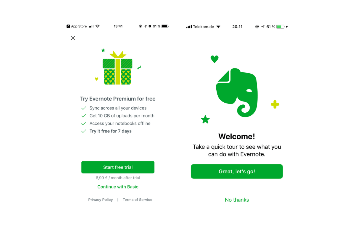

Trying Evernote Premium for free? Thank you for the nice gift but at the moment I just wanted to test the Evernote onboarding flow. I’ll get back to it when I’m convinced 😉
*Continues with a free trial*
A quick tour through the Evernote functionalities? This is exactly what I was looking for! Evernote doesn’t force the users to join the onboarding flow. They can try the app on their own too. But at this point I want to take the tour.
*Great, let’s go!*
Evernote does not just explain the functionalities, it mentions the benefits too.
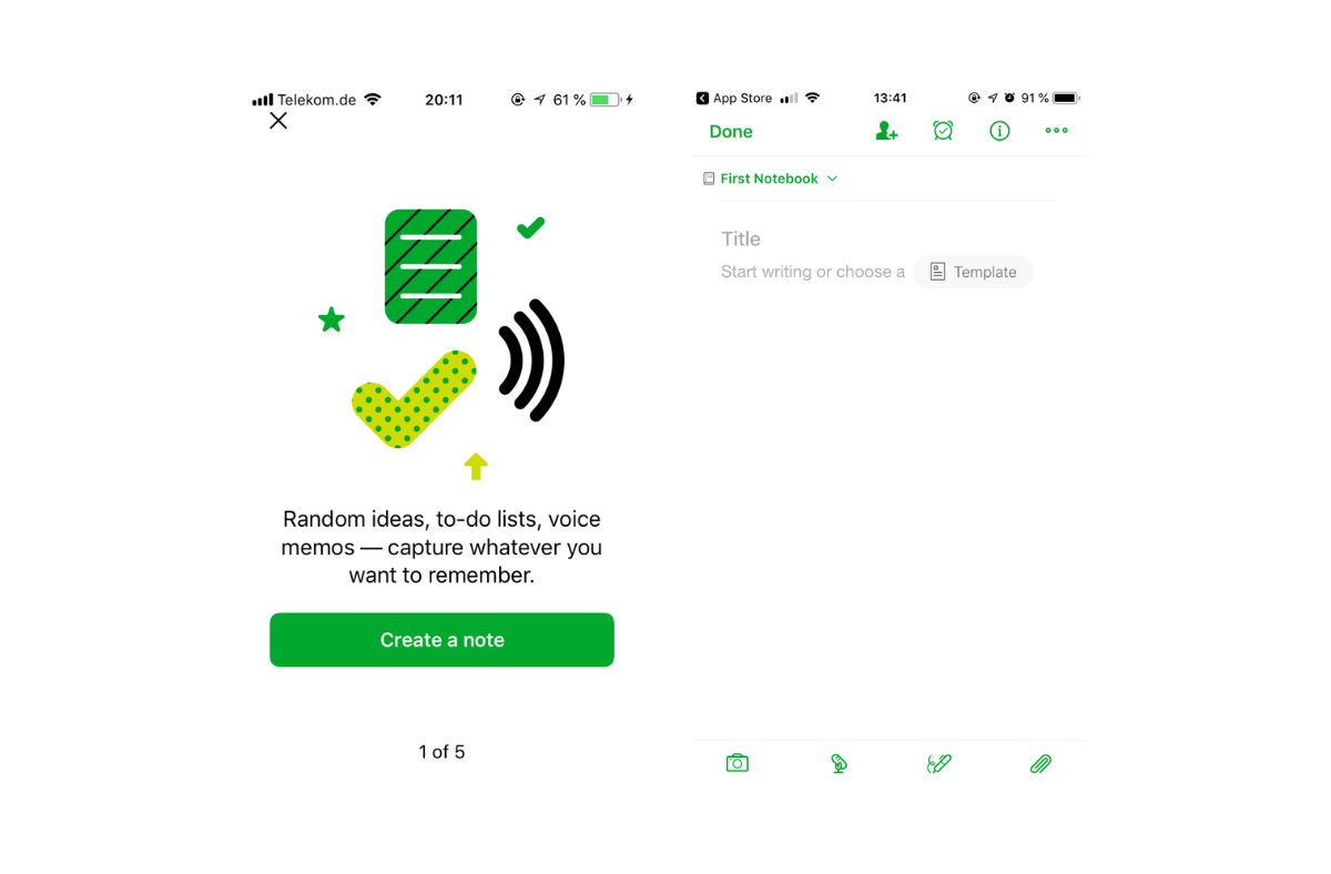

*Create a note*
By clicking through the process Evernote guides you through the different functionalities and screens.
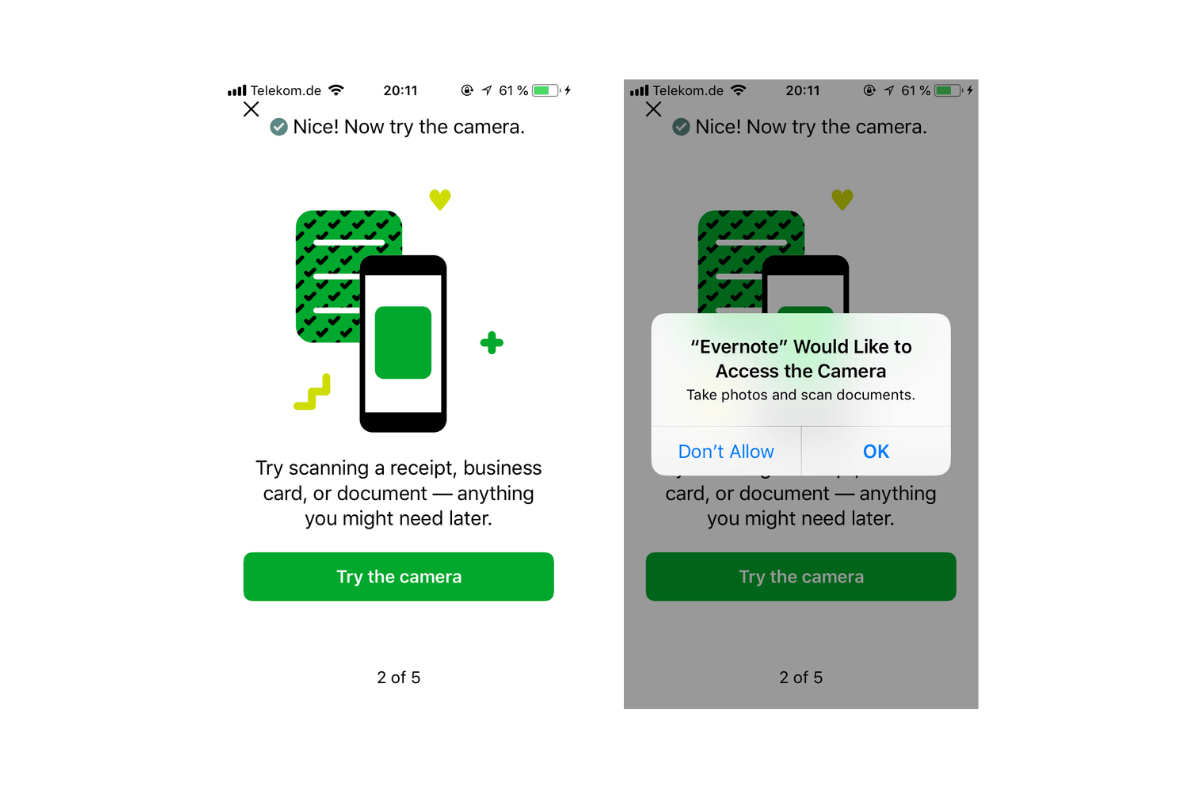

Wait! A permission request? There is a narrow ridge between asking the user for permission at the right time and annoying him at an inappropriate time.
Do I know why Evernote ask me? – Yes
Do I understand the benefits of the request? – Yes
Do I understand the importance of accepting the request? – Yes
*OK*
Well done! Evernote has mastered this narrow ridge. The request is placed at the right time and with an explanation of the importance to accept the request.
Pssst: do you want to learn more about asking the users for permission? Check this article!
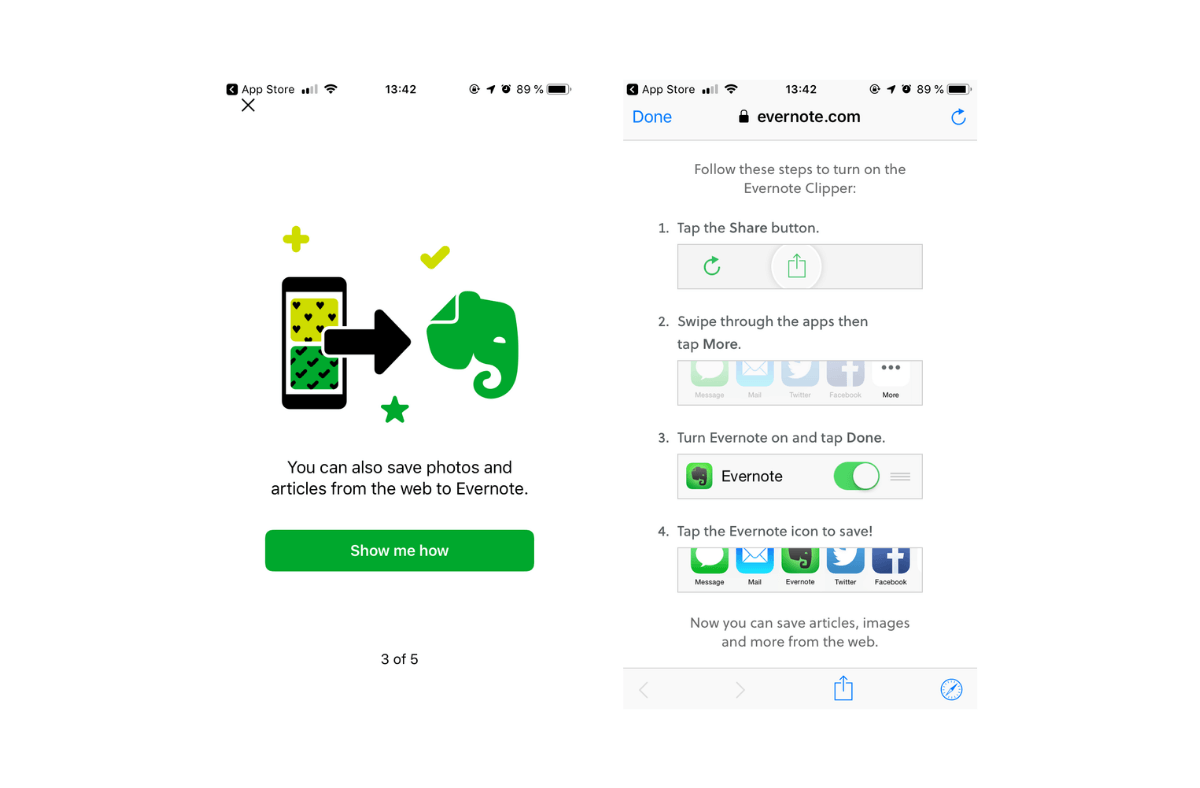

Users can connect Evernote to the web.
*Show me how*
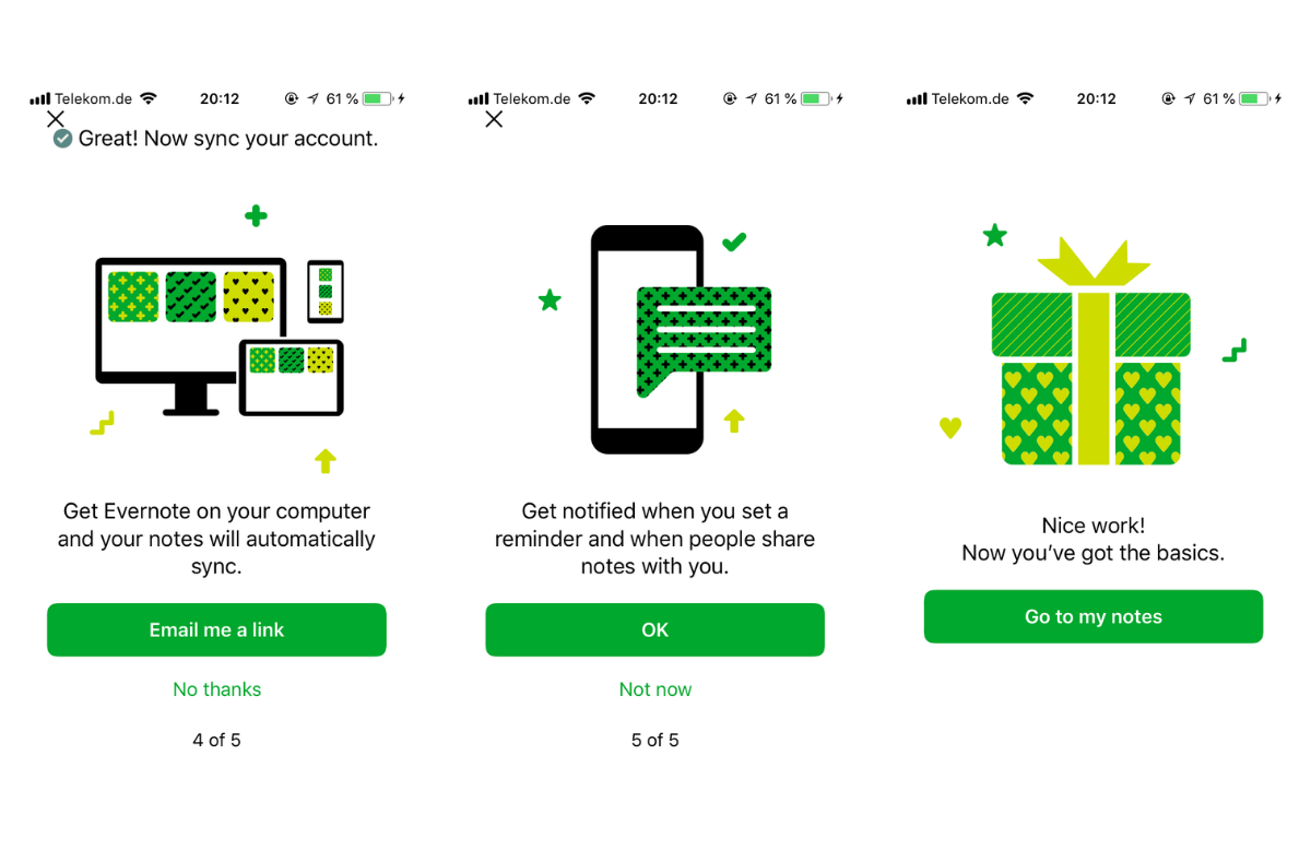

Now Evernote links to their website. A more detailed explanation.
Have I left the app? Do I have to open it again?
No.
Evernote doesn’t let the users go – at least not at this point. The website is opened in a window inside the app to keep the users inside the app. This makes it easy to continue with the Evernote onboarding flow.
*Click*
*Click*
*Click*
*Finish*
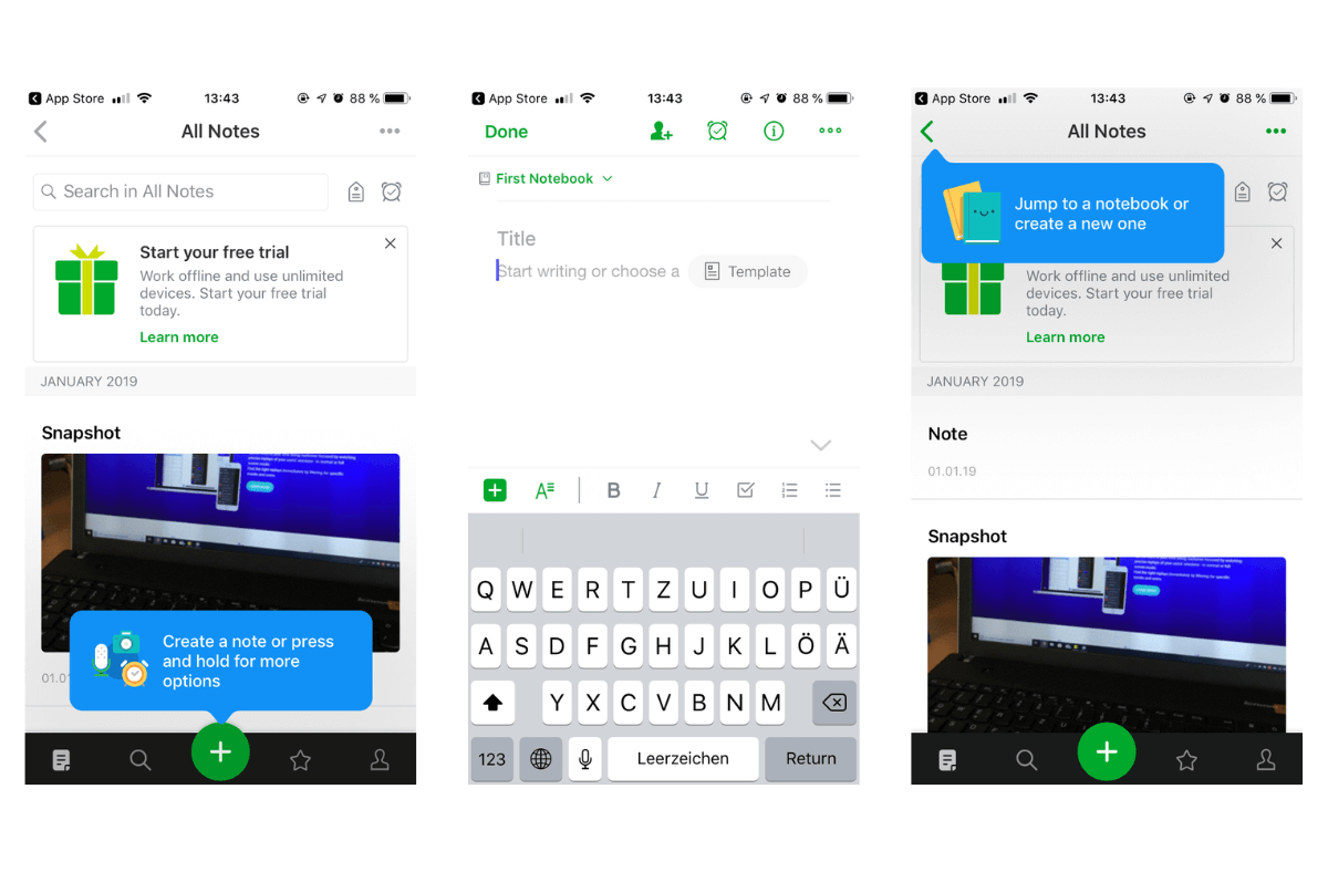

After finishing the onboarding flow Evernote opens the front page.
Where do I find the functionalities Evernote explained before? What if I’ve skipped the Evernote onboarding process? Can I use the app now or would it be too difficult?
No worries, Evernote has a quick progressive onboarding part for the users who want to have more information.
It shows where to find and how to use the most important functionalities.
Conclusion on a well-done Onboarding Flow
Even if the Evernote onboarding flow is quite long, it is well structured and informative.
Evernote focuses on two types of users.
The ones who want to have a detailed user onboarding flow, who want to know which benefits they get and which functions they can use.
And the users who want to start directly without reading every slide of the onboarding flow.
Evernote has not just managed to design a user-centric onboarding, it managed to ask users for permission in the right way, too.
Related Articles:
AUTHOR
Annemarie Bufe
Product Analytics Expert
Passionate hobby dancer. Working at UXCam.

Related articles
UI/UX Design
10 Best App Design Practices for App Development in 2026
If you're developing an app, you need to keep UX in mind if you want it to succeed. Check out these 10 best app design...

Anastasiia Lastovetska
User Onboarding
4 Actionable Tips on App Onboarding by David Jones
Why you should focus on the...

Jonas Kurzweg
Product Analytics Expert
UI/UX Design
5 UX Mistakes App Developers Unknowingly Make
We've thought of five typical UX mistakes developers make so you don't have...

Jonas Kurzweg
Product Analytics Expert
