8 low-effort high-impact fintech mobile app improvements

When it comes to app improvements, product managers are often working on large projects that are meant to make an impressionable and obvious impact on their users, like redesigning the UX or reorganizing navigation bars and tabs. But these projects take a lot of effort and resources from your design, BI, and development teams. Not to mention the time it takes to see real results from larger projects like this.
Not all app improvements have to take the same time and effort. Small changes, like the color of a ‘pay now’ button, can have the power to increase conversions more than you might expect. Plus, those little wins will make you look good in front of stakeholders when justifying future decisions with data.
By leveraging data-driven insights focused around your users, you can make more informed decisions about the changes that will have the biggest impact on user satisfaction and ultimately drive business growth. Mobile app analytics can also test and validate new features before deploying them, reducing the risk of costly development mistakes.
Below we discuss some fintech app improvements that won’t take a village to implement. You won’t need to meet with your development or design teams multiple times to align on capabilities, and you’ll be able to measure results fast.
These low-effort high-impact improvements will contribute to the overall usability of your app, and have the power to attract new users and retain existing ones. If you’re not working in the fintech space, you can tailor these to your own industry.
Adding a progress bar to onboarding
Users signing up for a financial app usually have lots of hoops to jump through, unlike gaming or e-commerce apps, more sensitive data needs to be collected before a user can start using the app.
One of the biggest reasons for churn across fintech apps is the long onboarding process, so it’s critical that apps like Chime or Robinhood optimize the onboarding journey to improve the user experience and increase the chance of retaining users.
A progress bar will show users how many screens they have left till they reach the end. Reducing the number of screens will make it seem like a quicker process to users. This helps reduce friction, giving users a sense of certainty that they’re making progress.
Remember that how you display progress in the bar itself will make a difference in how users respond. Displaying how close you are to completing from 10% to 12% is much less encouraging than jumping from 10% to 20%.
How to check the impact of simplifying onboarding
Setting up a funnel for your onboarding process will help you better understand where in the journey most users are dropping off. This will give an indication of whether a progress bar has any impact on boarding completion.
Let’s look at an example of how to do this in UXCam:


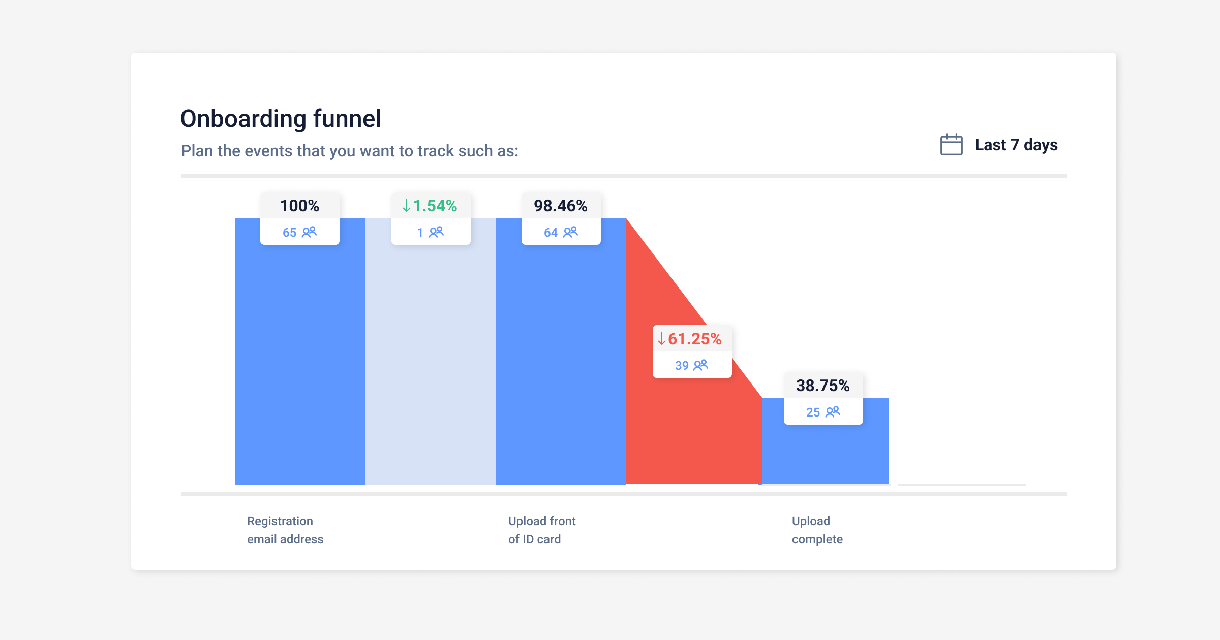
Example of an onboarding funnel in UXCam
Release the new progress bar to a segment of users over a period of time. Now it’s easy to see that users are dropping out of the onboarding funnel as the process gets longer. Once you’ve set up your funnel, you can come back to review how the drop-offs change after the progress bar has been released. Ideally, you should see a lower drop-off rate overall, with more users getting to the end of the process and completing their onboarding journey.
From funnels, you can investigate the drop-offs further by clicking through to sessions from the funnel.
Reviewing sessions allow product teams and researchers a look into how users react to the new addition of a progress bar firsthand, without the need to conduct any user interviews or the risk that users change their behaviors while being observed in person.
With sessions, you will see the specific actions taken by users once the progress bar has been implemented. For example, you may see users tapping on the progress bar to reveal how far they’ve come.


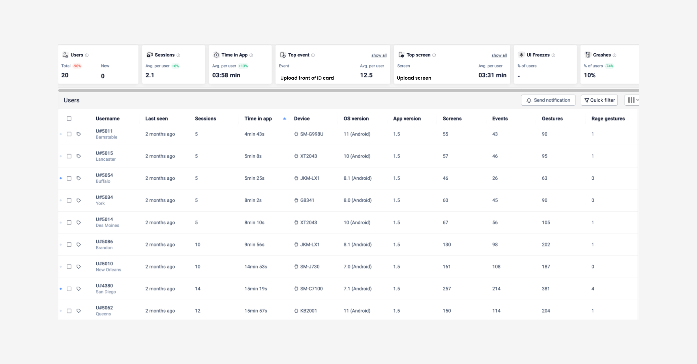
Example of sessions list for uploads in UXCam
To get even more granular, add a filter to sessions for those users who performed specific frustration signals such as:
You can now review all the sessions from the onboarding process and hypothesize the reasons for drop-offs and possible solutions, backed up by data. Save these users as a segment to make it easier when reevaluating this low-effort high-impact improvement later.
For a more detailed, specific look into improving the onboarding process, read through our article: 12 KPIs to measure and improve your fintech apps onboarding strategy
Add an onboarding screen
Try walking users through new features or updates with onboarding screens. Once a user has successfully signed up for your app and gone through the identification process, it’s time to show them how to use the app. To successfully see stronger engagement and usage metrics, it’s important to show users the value that your app has to their daily lives as soon as possible to get them to that ‘a-ha!’ moment.
This is especially true if you uncover features that are confusing or difficult for users but you don’t have the resources or time to properly tackle the ‘big picture’ fix. Implementing a walkthrough to explain how to use a feature will be much quicker than building new features or redesigning old ones.
Discover which features would benefit from walkthroughs
You may think that the features you’ve spent months working on are self-explanatory and easy to understand, but that’s probably not the case. Users are inherently impatient and easily frustrated. Leaving them to work things out for themselves, especially when talking about high-stake apps like personal finance, could increase your churn rates as users leave to use an easier competitor app.
To see where users might benefit from walkthrough screens the most, take a look into heatmaps in UXCam and filter for frustration signals like ‘visits with rage taps’.


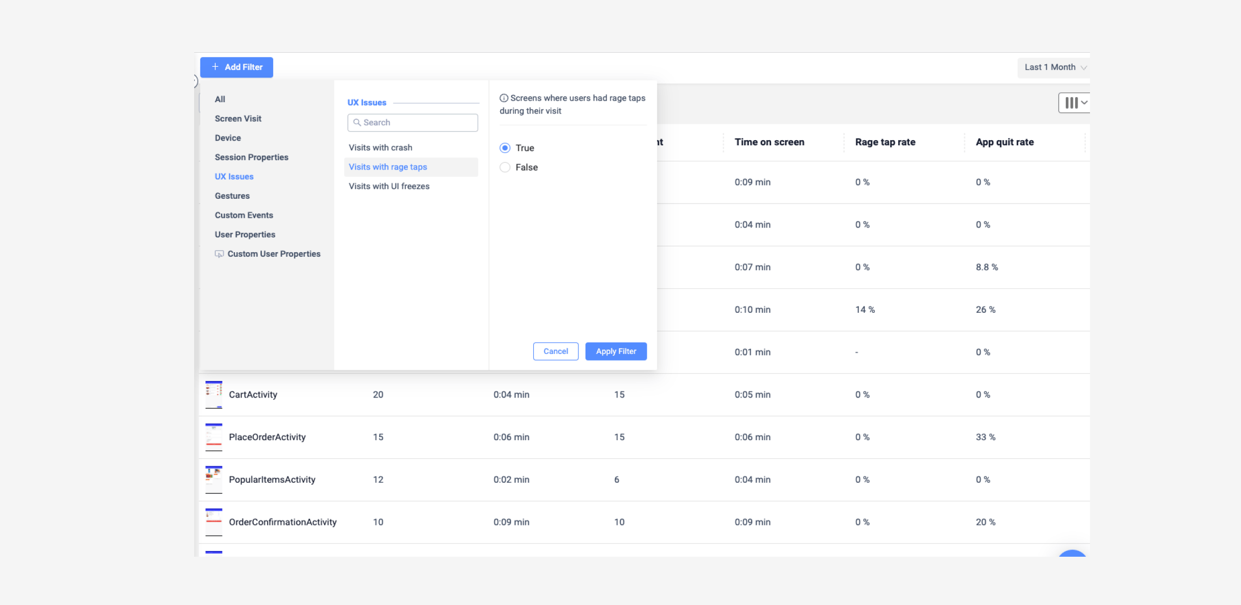
Example of UX issue filters in UXCam heatmaps list
You will then have a list of screens with sessions including rage taps. Put these in order of the highest number of rage taps first.
Let’s say you discover from this that users are performing rage taps mostly on the first screen of your ‘stocks’ feature. Click on the screen name in the list to see the corresponding heatmaps.


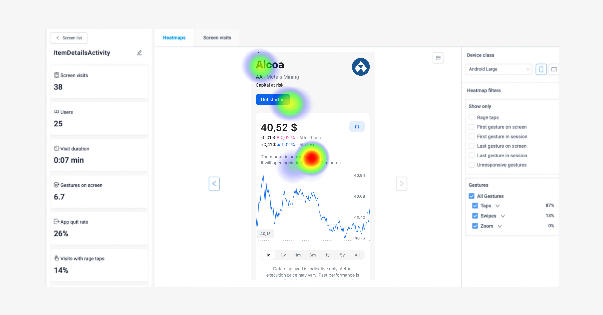
Example of heatmaps in UXCam
Now let’s say there are no broken elements, but there is a high number of rage taps. Investigate further by watching the corresponding session replay. As you watch the sessions, let’s say you start to see that most users aren’t clicking on the terms and services button you need before making a trade. Therefore the transfer button isn’t available to them and they’re continuing to tap it with no response.
From this you hypothesize that to increase engagement rates for the ‘stock’ feature you should add a walkthrough explaining the 3 steps they need to do to complete their first trade — including agreeing to terms and services.
Now you can begin designing and implementing the stock feature walkthrough for users and measure if those rage taps decrease over time by adding a report to customizable dashboards.
Provide educational pop-ups for first-time use
It’s not only important to show users how to use a feature by providing walkthroughs but to explain industry jargon so users can make informed decisions with their own money. Incorporating educational content into your fintech app will improve the level of trust your users have in your app and increase usability.
The more value you can provide a user, the stickier your product becomes. Feature discoverability is essential to promoting further engagement and driving up app stickiness in the process.
Let’s say the majority of users have limited knowledge of buying crypto currencies. If they open the crypto feature of a traditional banking app, and it gives no context as to how to trade, and the risks they are more likely to drop off that screen and go back to the homepage, possibly never returning to figure out how to buy crypto themselves.
N26 has done a great job of providing users information on buying crypto. They understood that users were used to this app being purely for personal digital banking, and so implemented some short information pop-ups when a user first lands on the crypto screen.


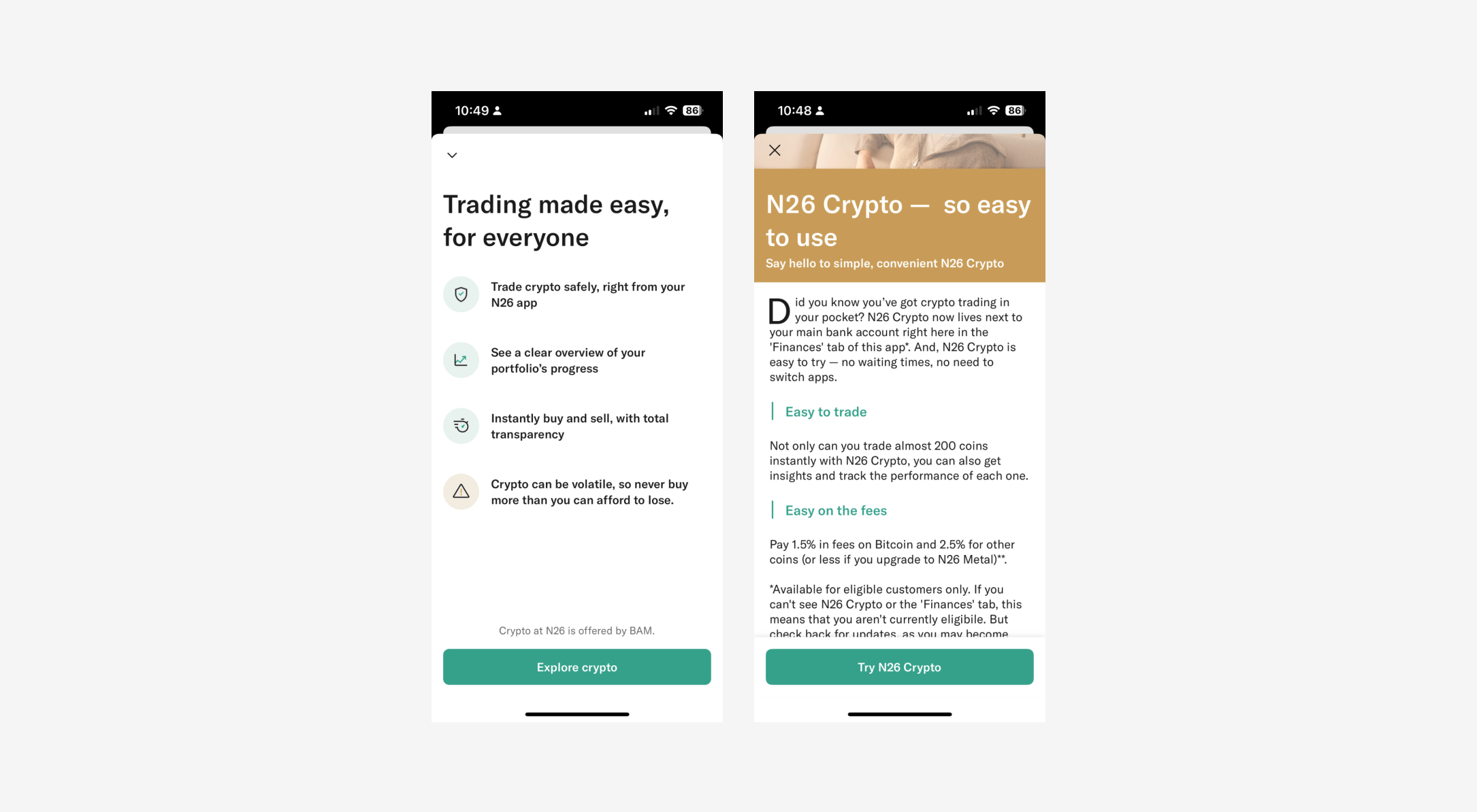
Example of good educational content on N26
There are several ways you can communicate effectively with your users about complex areas of your industry. One of the easier ways is to communicate through pop-ups. This gives the user an overview of what crypto is and why they might want to explore the feature in simple-to-understand, bite-sized chunks that are easier to process.
This sounds a little bit like using product walkthroughs like we mentioned above. The difference is that product walkthroughs aren’t normally used to explain a complex idea, or why users will find your app valuable. Product walkthroughs are best used to highlight particular areas of a feature that you’d like users to interact with. Whereas educational pop-ups are best used to describe the value of the feature to your users.
Which features will benefit from educational content?
If you’re not sure which of your features are the most popular, and which are confusing to users, you won’t know which educational content would be the most valuable to your users.
Measuring feature adoption gives product managers and UX researchers a deeper understanding of user needs.


Formula for calculating feature adoption rates
The lower your feature adoption rate, the more likely it is that users will benefit from educational content about that feature.
Let’s say you would like to measure the feature adoption of the new ‘buy’ button on a crypto app. To do this, identify the event that you would like to track, for this example we’ll use the ‘buy crypto’ button as the custom event. Then measure the number of users that successfully completed a purchase order and interacted with the ‘buy crypto’ button, divided by the total number of users over a certain time period, for this example we chose the last 30 days.


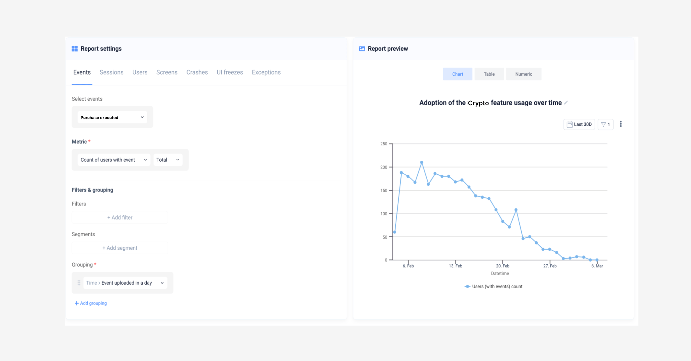
Parameters of feature adoption metrics in UXCam
Measuring feature adoption is a good way to understand which areas of your app users might need help with so you can put together some educational materials. Measuring this KPI will come in useful especially when redesigning certain elements of your features later as you’ll have a good understanding of how users are reacting to the changes for further iterations.
For more in depth KPIs to measure specifically for feature adoption, read this article.
Enable push notifications
Another high-reward app improvement is to make sure you’re communicating through push notifications with your users.
This gives you the freedom to reach out to the customer at the moments when you have something important or timely to communicate with specific sets of user groups. Some examples of practical scenarios to use push notifications for fintech apps:
Let users know of upcoming outgoing payments
When they receive or send a transfer
When their balance is low
If their stock drops below a certain price
New feature announcements or partnership deals
Here are a few real life examples of communications you can send to engage and activate your mobile customers:


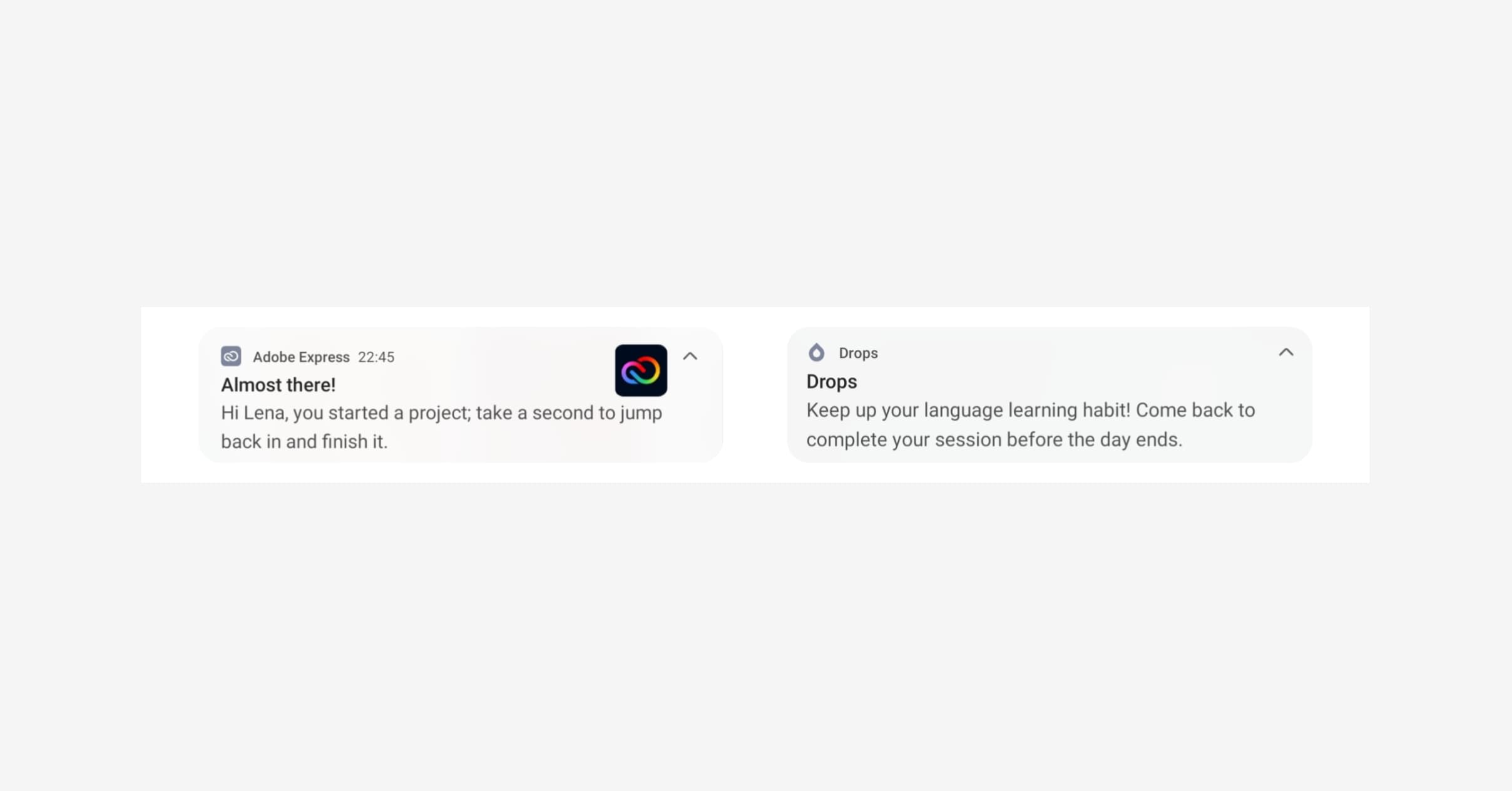
Adobe Express and Drops send push notifications to encourage users to complete the activation action
If you want to encourage unengaged users to explore a new feature on your app, track custom events to determine user sets that don’t trigger an activation event shortly. Then you can nudge them using a push notification.


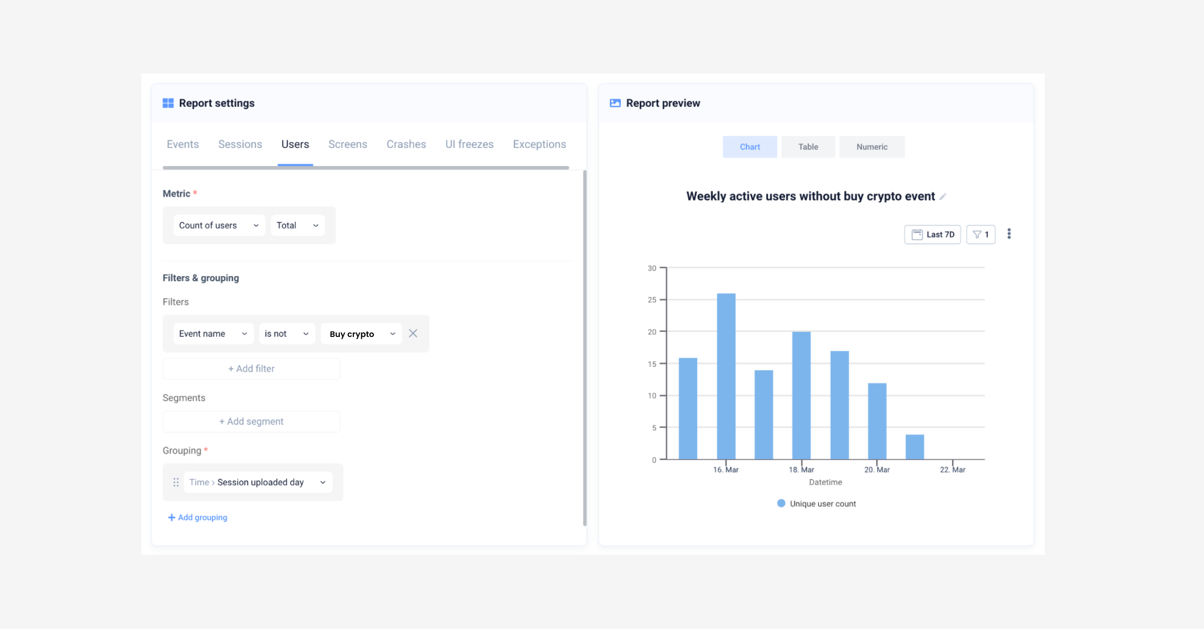
Parameters for measuring users not engaging with crypto feature
Users won’t all need the same communications,so UXCam automatically segments your users into sets of returning users, loyal users, new users, and users slipping away. So you can send more personalized messaging for each cohort and then track the results with your mobile app analytics tool.
How to track activation rates
Now you know some practical scenarios to use push notifications to engage users, how can you track the success?
Let’s take an example. You have a mobile bank and you’ve been tracking your feature adoption rates, you’ve noticed that users are not engaging with the savings feature. You hypothesize that sending a push notification to those users might remind them of the savings feature and encourage them to put some savings aside.
Now you’d like to measure how well those push notifications performed in terms of how many users it encouraged to interact with the activation event - in this example, it’s adding money to a savings space.


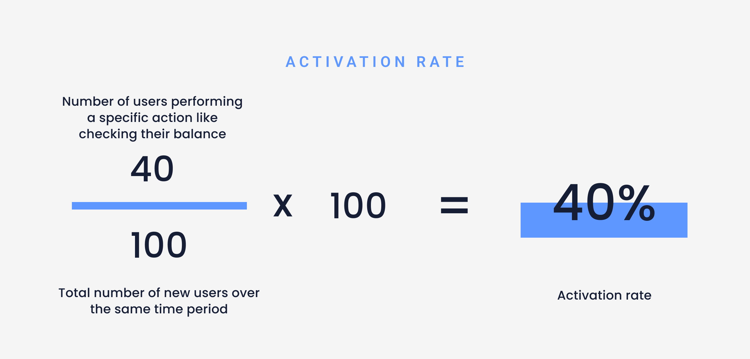
Activation rate formula
Calculating activation rate is very similar to calculating feature adoption rates, however feature adoption is a measure of how many users are routinely interacting with a feature, whereas activation rate is about measuring a single action like pressing a button.
To start, measure your total monthly active users (MAU) and add them to your customizable dashboard.


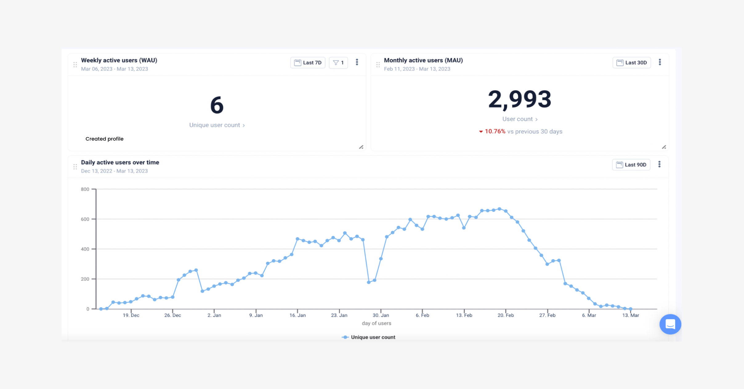
Easily track your daily and monthly active users on UXCam
Next, measure how many users reacted to the push notification and performed the action ‘add money to savings’ and divide by your total MAU. Below are the parameters to do this in UXCam, remember you’ll need to set up custom events for this.


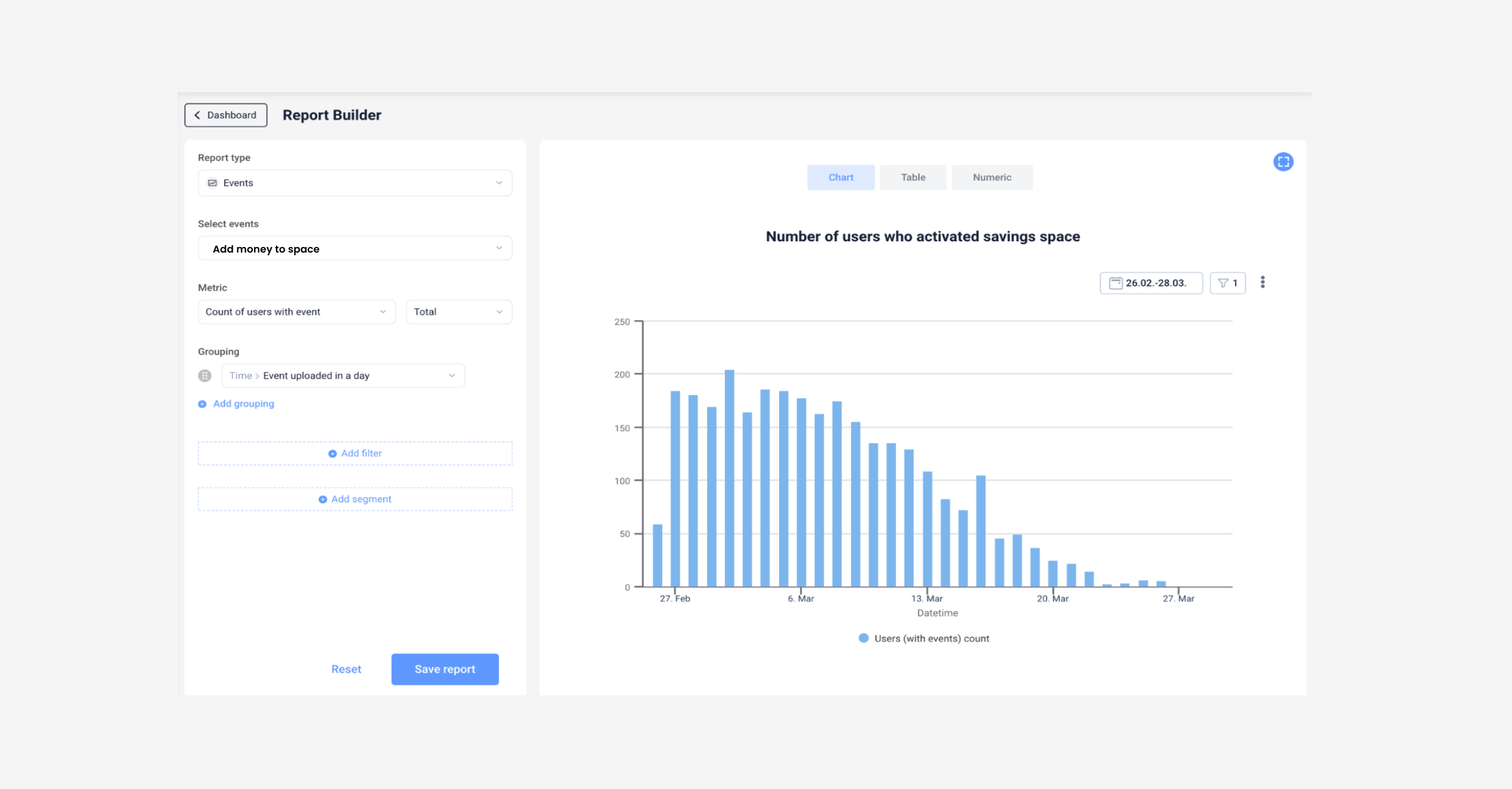
Parameters for tracking activation rates in UXCam
You can set up two reports, one before implementing any push notifications, and one after sending out the messaging so you can see what effect implementing this smaller improvement has had.
Shorten feedback loops to customer success
If you already have a customer success team, one of the easiest low-effort high-impact app improvements is providing fast and understanding support. This is especially important for any type of financial app, whether it’s budgeting, trading, or digital banking, users will be impatient for solutions and they appreciate consistent communication with their issues.
The easiest way to provide faster support is by integrating UXCam into your customer support workflow. You can link your support tickets to tools like Salesforce, Intercom, and Zendesk.
Time to resolve is one of the most crucial aspects of CS — the perceived risk is extremely high as you’re one step from a customer speaking on a public forum and giving a negative review about how issues were handled with your app. This could easily be avoided by faster time to resolve an issue.
Automating your error detection and connecting your user behavior and experience analytics directly with your customer success team will save so much time and effort.
If customer success agents have the power to replay user sessions right after the user reported an issue, they’ll have the full context of the user experience to the bottom of the issue without even having to speak to the user, the agent can already see what happened and collaborate with developers or product managers to work on a fix.
Learn about the customer support problem in finance apps and practical solutions in our latest blog post Finance apps have a customer support problem, and here's how to fix it
CS agents can also tag, comment on, and share sessions with other teams like developers so they can review the full technical log, including:
Debug
Error
Fault
Undefined
Warning
Integrating UXCam into your engineering workflow will also shorten feedback loops. By giving engineers the full context of crashes and issues, you’ll be able to directly navigate to the problem screens.
Engineers, in addition to CS, can watch session replays and replicate issues like bug crashes, UI freezes, and handled exceptions. A simple Slack integration can alert your engineering team of issues that can be resolved quickly.
Segment users to personalize communications
Personalizing your app's communications is a great way to improve your overall engagement rates. It’s easier to implement a strategy like personalization than redesigning the entire UX design of the app. Users are much more likely to engage when they’re presented with content that’s specifically tailored to them specifically.
To know which users would benefit from a ‘returning user’ communication, UXCam automatically segments users into groups of:
Loyal users
New users
Returning users
Users slipping away


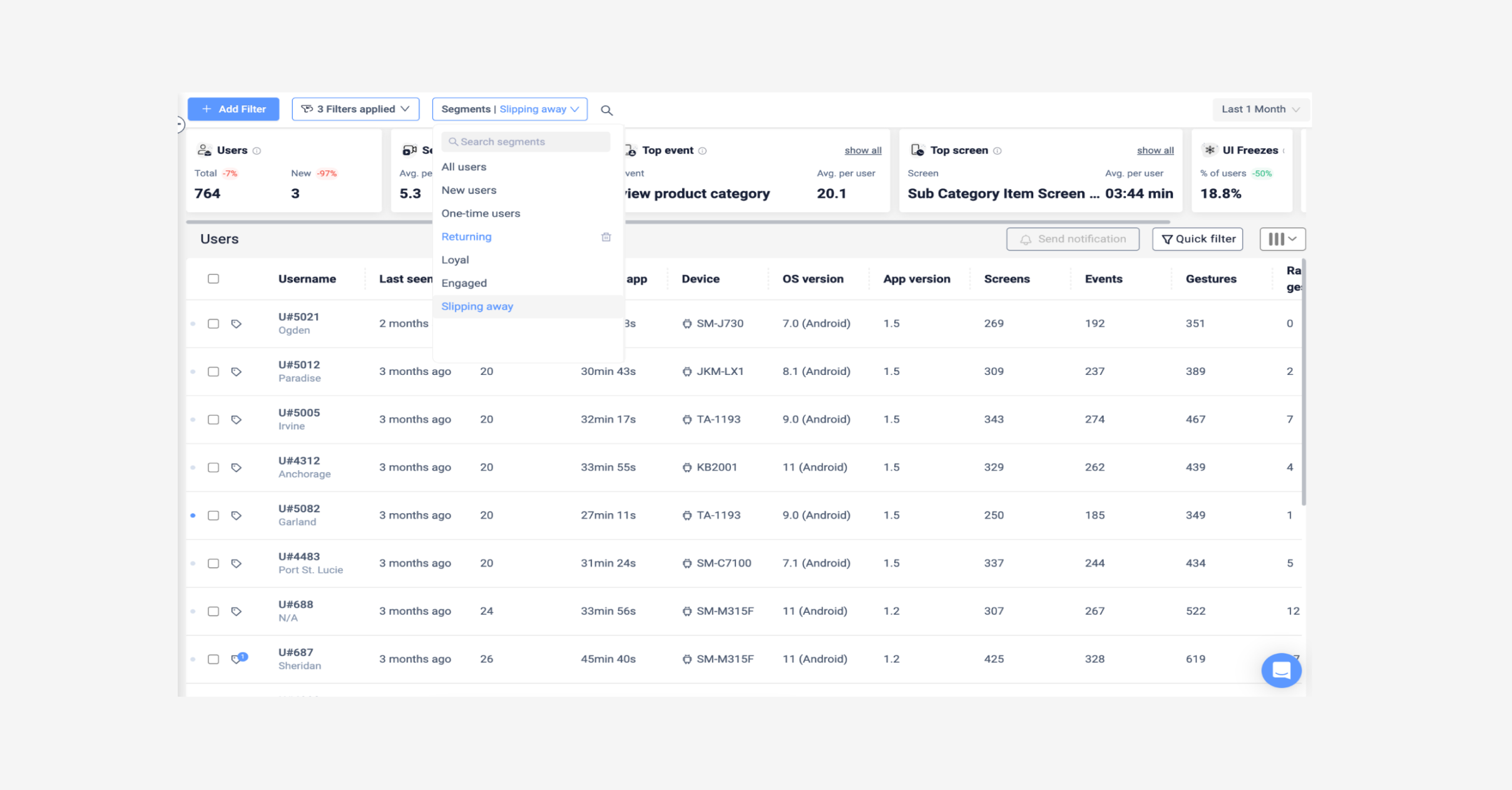
User group filter in UXCam
As an example, let’s say you want to target users who used to use your app often but are now using it less and less. With UXCam you can filter your user list to ‘slipping away’. You can then plan your personalization strategy to target those users. You can send that set of users a push notification or an email like this: “Hey Peter! Time to buy? Doggo Coin dropped 19% this week!”
This message includes a personalization (first name) and an activation event (check the stocks feature of the app).
Then when the user responds to the activation event, and opens the app you can implement a splash screen to say “Welcome back, Peter!”
Set up a report to track slipping away users to see how effective your personalization strategy is:


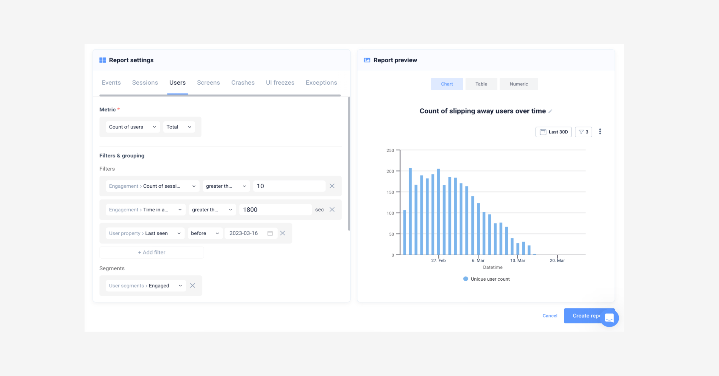
Parameters to measure slipping away users over time
Small rewards for attaining goals
UX gamification is an effective way to level up your user experience by introducing playful, game-like elements to your app.
Giving users gamified type rewards releases dopamine in the brain, which keeps them engaged. It’s simple yet powerful, which is why we are starting to see more fintech apps engage with customers in a playful way to boost loyalty.
Rewards, quests, cartoon characters, and digital badges can be a fun and effective way to motivate users to complete a task, purchase a product and keep using your app, but you don’t have to incorporate all of these to see results. In fact, just a simple animation will make a difference.
A great example of a digital banking app that uses some gamification techniques is N26. When a user performs a specific action that deserves a small celebration –like paying off a loan, or hitting a saving goal– confetti falls from the top of the screen. Users can keep hitting that ‘celebrate’ button to activate the confetti as many times as they’d like.
By using a mobile app analytics tool you’ll be able to see how users behave before and after interacting with the gamification animation. By reviewing sessions you can see which gestures users performed, for example, if users are interacting with the ‘celebrate’ event button to trigger the confetti multiple times, you could assume this high-impact app improvement is a success.


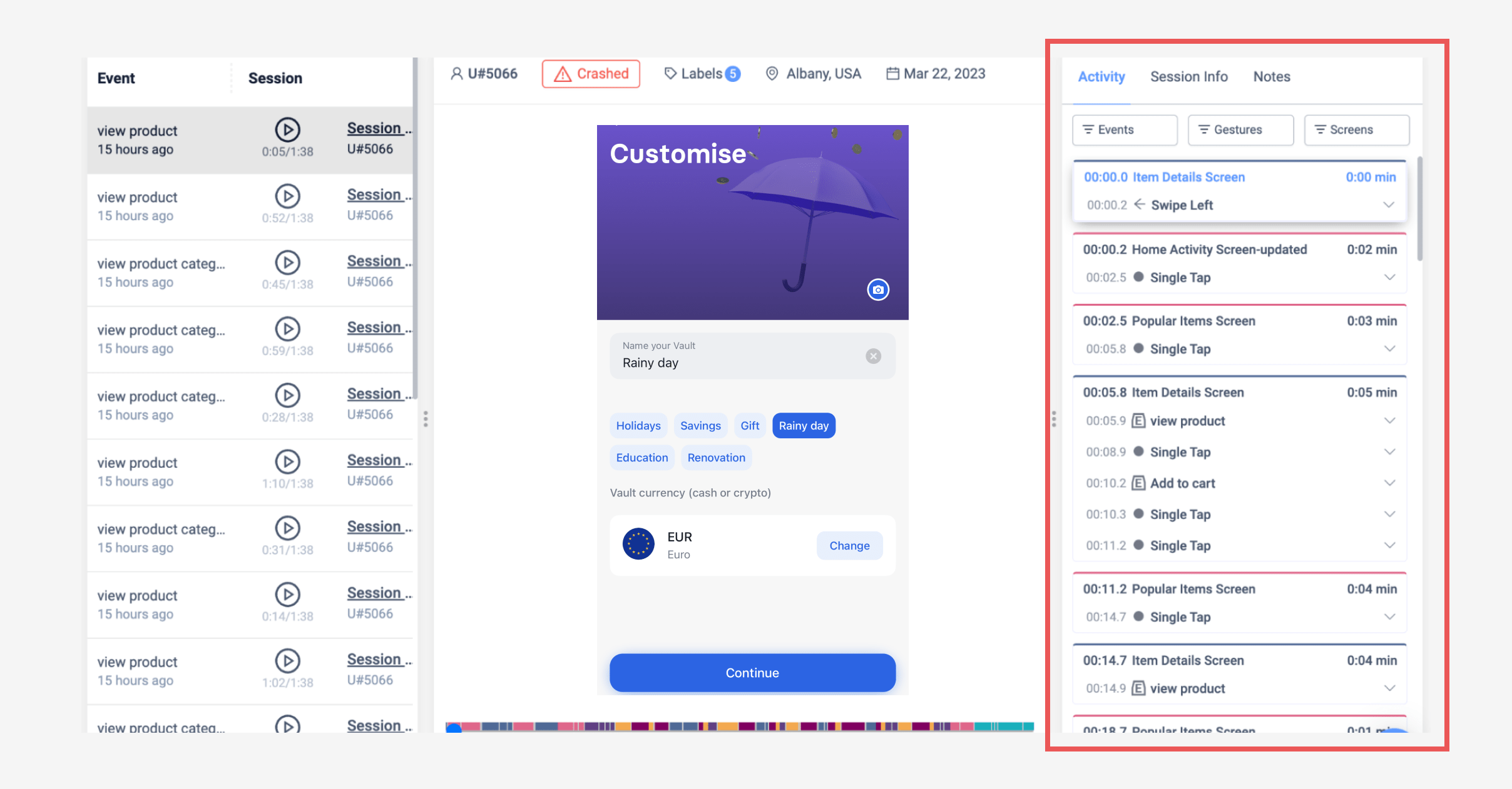
Sessions in UXCam
As well as gestures, you will also see which screens users visit after, you should notice a higher rate of users sticking around and trying out some other features after the confetti event happens.
For a more in-depth look into implementing gamification techniques into your app, read through Using UX Gamification to Drive App Engagement (with examples)
Auto-capture user behavior
UXCam is a tool that can help fintech apps implement, measure and track these strategies discussed and improve their app performance by implementing simple but effective improvements. By providing detailed insights into user behavior, product teams can better understand how users interact with new features, identify pain points, and optimize the user experience.
Auto-capturing user behavior saves product, research, engineering and customer success teams a lot of time, allowing them a look behind the curtain to see how users react to your low-effort improvements, and how their behavior changes over time without the traditional manual implementation setting up an analytics platform usually requires. With UXCam you can auto-capture:
User data such as country, city, first seen and last seen.
Device data like app version, OS version, and device name.
Behavioral data such as screen visits, unresponsive gestures and gesture count.
Including qualitative data along with the quantitative puts apps ahead of their competition as they don’t need to spend endless hours digging through numbers or reports, or interview hundreds of users to understand their user behavior or expectations– you have everything you need in front of you.
Some ways UXCam supports low-effort, high-impact app improvements:
Allows PMs to notice drop-off points with funnels to recognize the most pressing issues to solve.
Gives CS teams valuable insights through session replay to solve user issues fast, plus allows integrations with support tools.
Measures metrics like feature adoption rate and activation rate over time with customizable dashboards and reports.
Uncovers frustration signals with heatmaps.
Allows users to add custom events for more specific tracking, as well as auto capturing the basics.
Measures crashes and UI issues for engineering teams.
Allows segmenting users into sets to measure behavior before and after making small changes, or communicating more effectively and personally.
Related reading
5 KPIs to measure feature adoption
12 KPIs to measure and improve your onboarding strategy
3 tips to reduce KYC abandonment
AUTHOR
Hannah Squire
Product Analytics Expert
Hannah is working at UXCam. For the past few years, she’s been working on creating more valuable and useful content for SaaS companies and their users.


Related articles


Product best practices
12 Apps with Great User Onboarding (2026 Examples)
The 12 mobile app onboarding flows I'd study if I were designing one today, with specific callouts for what each does well, common mistakes, and the...


Silvanus Alt, PhD
Founder & CEO | UXCam


Product best practices
Why creating a data-driven culture has less to do with data than you think
Kishan Gupta, CEO, shares 5 tips and techniques for fostering a data-driven culture based on his own experiences building and leading...


Kishan Gupta
Co-Founder of UXCam


Product best practices
Finance apps have a customer support problem, here's how to fix it
Learn about the customer support problem in finance apps and practical solutions to fix it in our latest blog post, and improve user satisfaction and...


Jane Leung
Product Analytics Expert