12 KPIs to measure and improve your FinTech app onboarding strategy

How many financial apps do you have on your phone, and how often do you use them? Chances are the ones you frequently use have a simple, intuitive app onboarding process.
If you’re a financial services product manager, you’ll know that crafting an effective fintech app onboarding process is no small feat. There are challenges unique to financial services that become magnified when dealing with mobile devices. To get your onboarding process right, you need to monitor performance and adjust parts of the process to give your users a better experience.
Below are some key aspects of the fintech app onboarding process, including 12 KPIs to identify product and feature improvement opportunities.
The importance of good user onboarding
Given the variety of different fintech apps available, like banking apps, and trading platforms, convincing people to download yours is a challenge.
If your onboarding process doesn’t give a good first impression, you risk becoming one of 24% of apps that are used once and then uninstalled, losing three-quarters of your daily active users in the first week.
The faster potential users understand how valuable your app is to their lives, the more likely they are to become frequent users and, better yet, paying customers.
Effective onboarding is also necessary to set your users up to use your app successfully. You need sufficient information to identify and verify your users and keep their financial information secure.
Let’s look at some challenges of fintech app onboarding and potential solutions, before moving on to onboarding KPIs to measure.
Challenges of FinTech app onboarding
When crafting an onboarding strategy, there will be several conflicting priorities you need to balance.
1. Collecting information you need without driving your customer away\ Deloitte found that 40% of customers abandon onboarding processes in digital channels because the process takes too long or requires information that the customer isn’t willing to disclose.
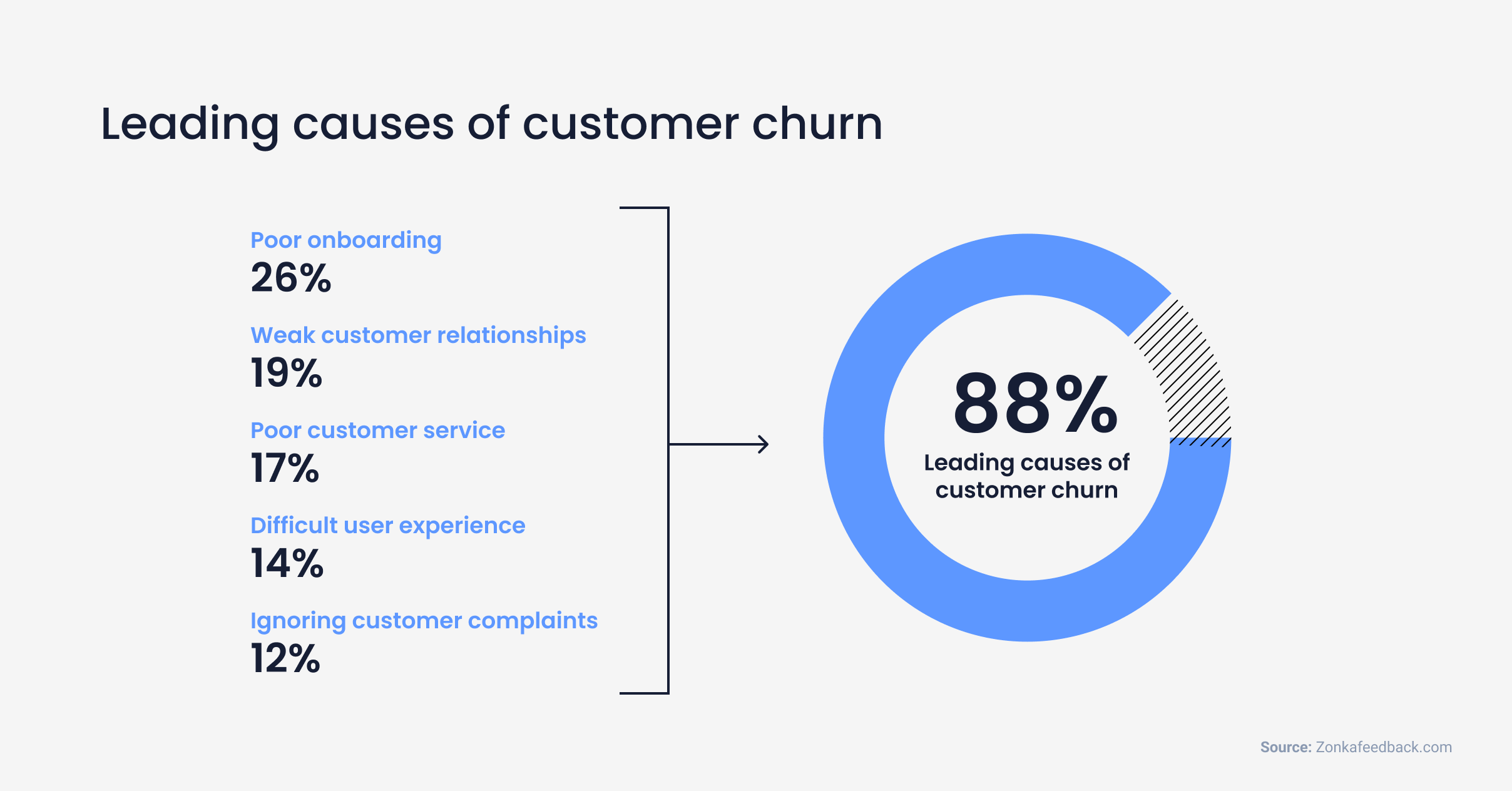

Top causes of user churn for apps in general
To meet the Know Your Customer (KYC) regulations, required to ensure a customer is who they say they are, you have to collect detailed information, as well as validate their identity. This can be done by collecting documentation like a Passport or ID card.
2. People are inherently impatient
People use fintech apps like Revolut, Chime, or N26, to avoid waiting in lines or talking to a human being. You don’t want an onboarding process that seems to take forever.
Even if you streamline your onboarding process, you also need to convince your users to trust your app with their sensitive information, especially if you’re a relatively new player in the fintech space and haven’t been able to build an established reputation.
3. Complex, time-consuming financial processes
Chances are you need to integrate with legacy banking systems, which are not always built for speed and convenience.
Your onboarding process needs to set the tone with your users so you can build trust. Perhaps in the ultimate contradiction you need to be both transparent regarding the current state of a financial transaction and private and secure with their financial data. At the very least, you need to collect all the information you need without causing your user to toss their phone out the window.
Ideally, with a great onboarding flow, when someone asks one of your customers what their favorite part of managing their finances is, they hold up their phone and say “the app I use.”
12 KPIs to measure if your FinTech app onboarding strategy is successful
To ensure that you’re always improving your onboarding process, continuously monitor its performance, and make adjustments when warranted.
You’ll want to identify a set of KPIs to monitor your onboarding process, as well as a broader set of KPIs for all aspects of your product.
Here are 12 KPIs especially relevant for monitoring and improving your fintech app onboarding process.
Free trial conversion rate A specific case of an in-app conversion rate that measures the ratio of free trial users who sign up for a subscription within a certain time period.
From an onboarding perspective, this metric gives you a sense of how well your onboarding process shows users the value of your product.
To calculate:
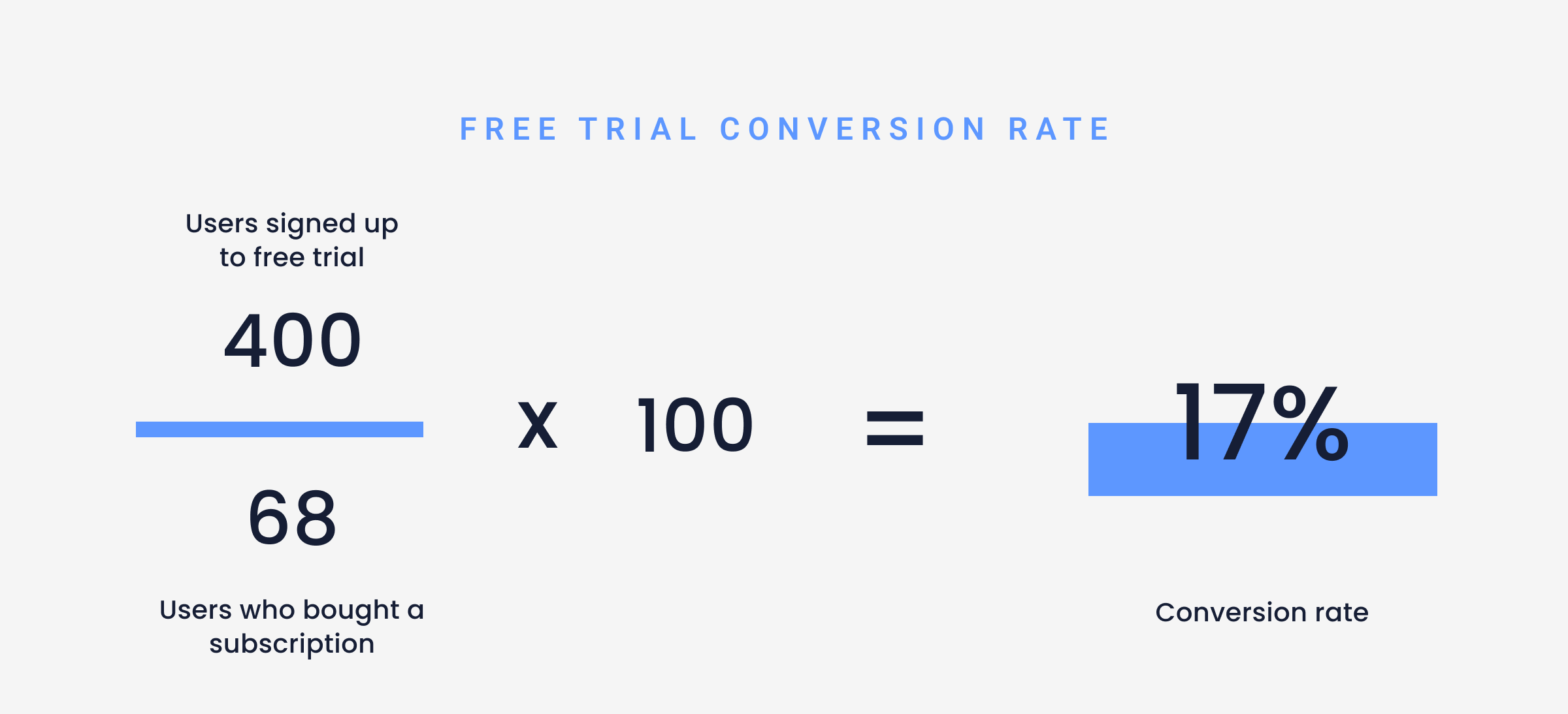

How to track free trial conversion rates in UXCam
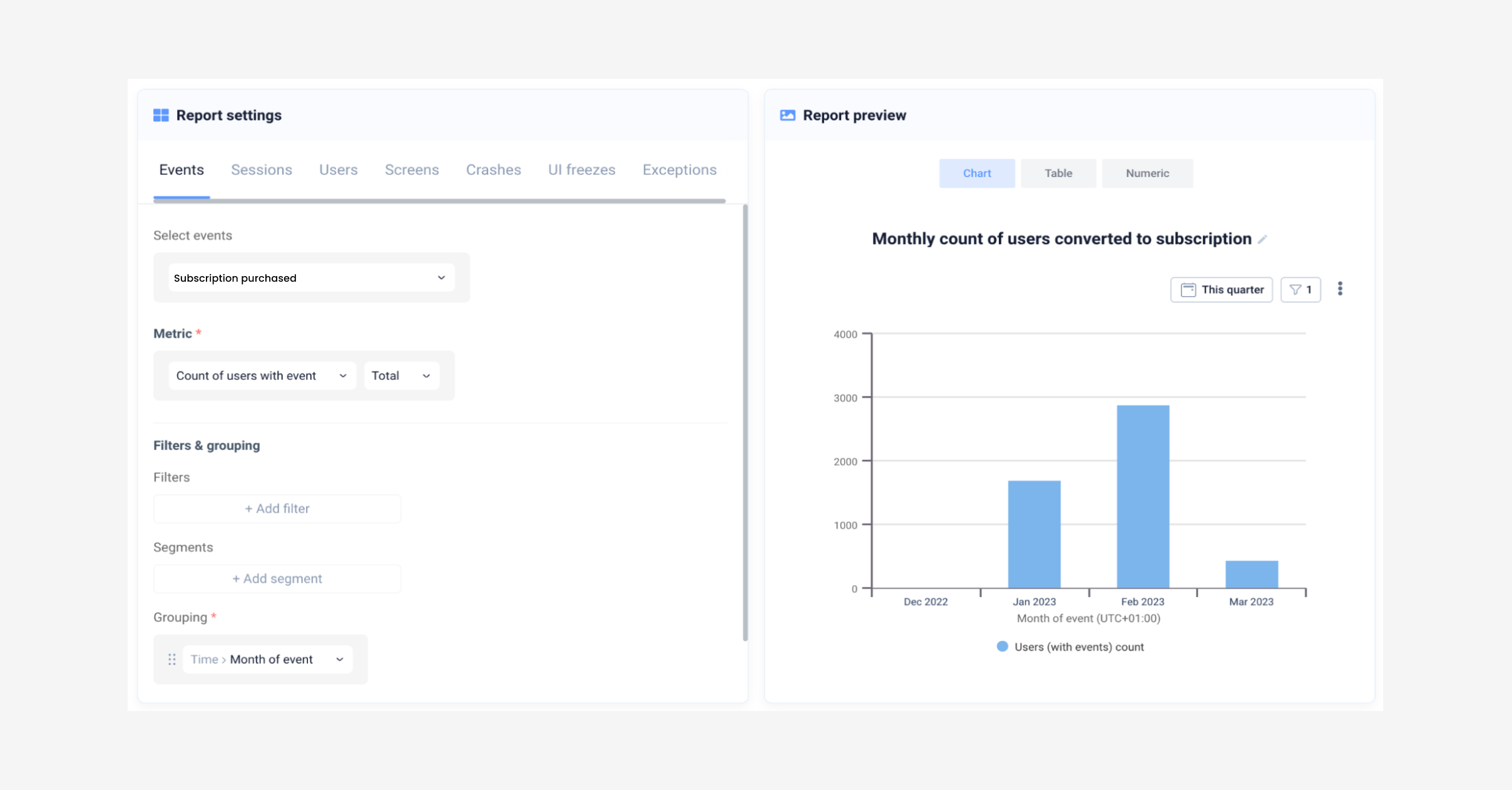

Example of parameters to use to measure free trial conversion rates
Add a report to your dashboards in UXCam to easily keep track of the number of users converting from a free trial to a subscription by using custom events. Completion rate
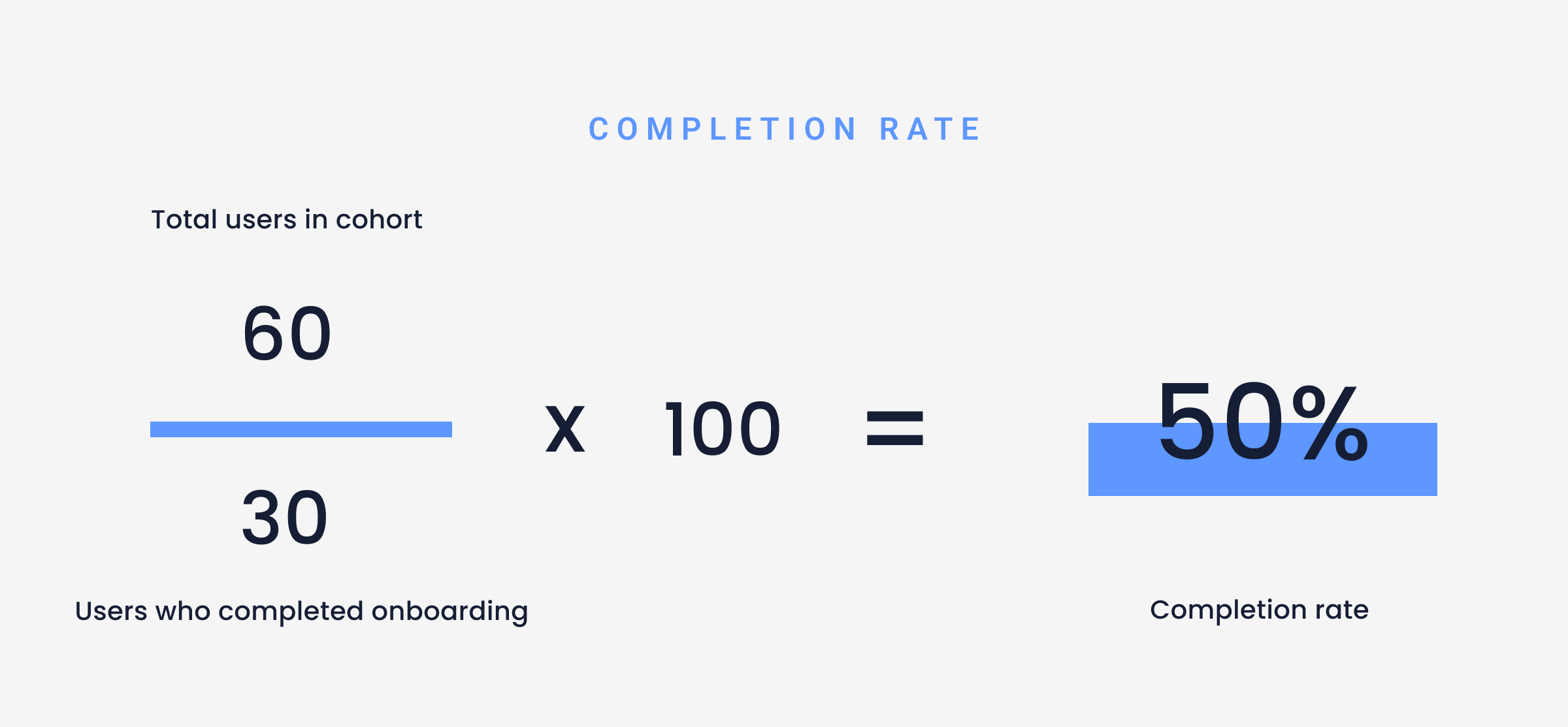
Measures the percentage of users in an onboarding cohort who completed your process. A cohort comprises the users who started the onboarding process over a week or month.
As explained above, if your completion rate is low, you can use filtering and segments to identify users in the cohort. Then you can watch session recordings for those users who did not finish, to identify potential issues.
To calculate:

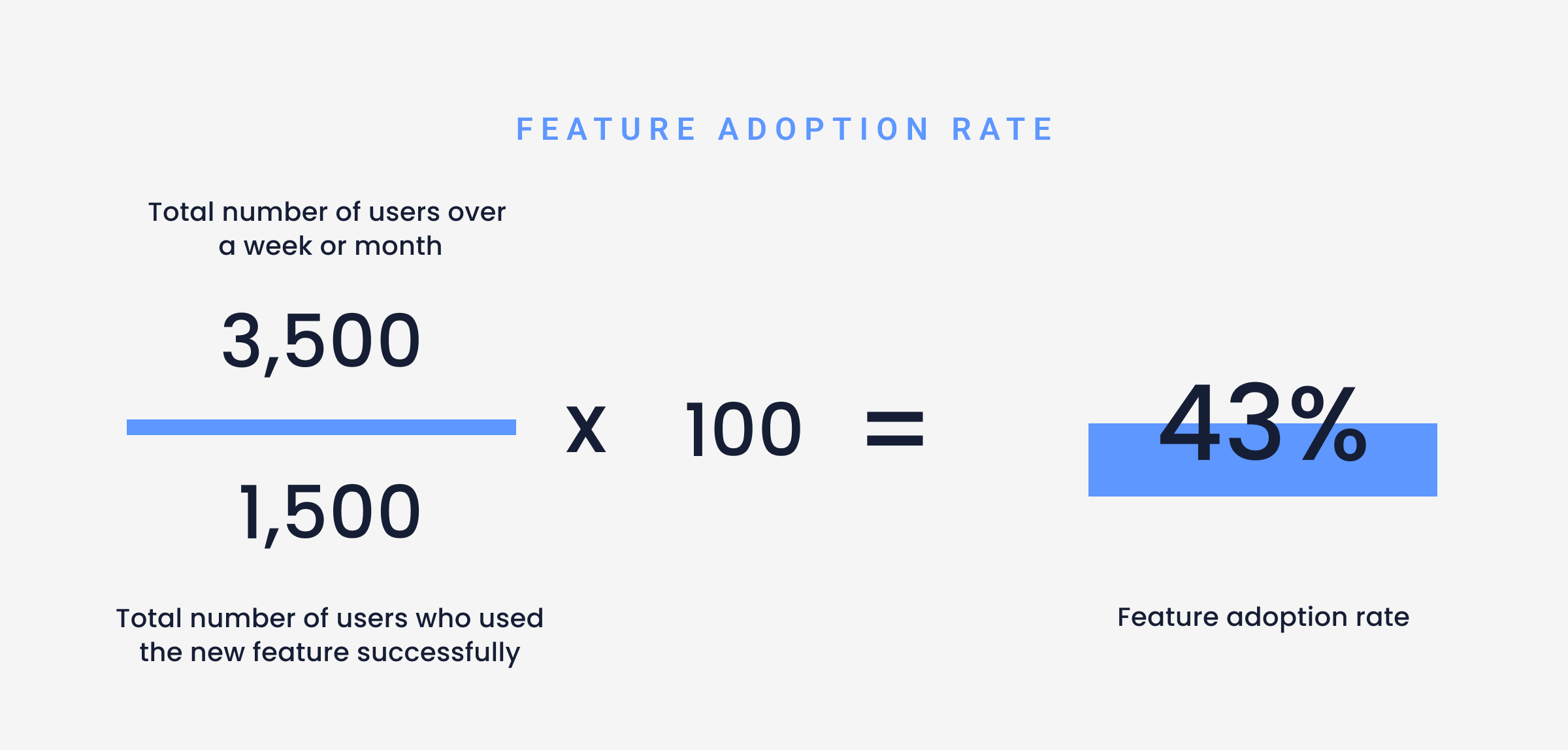
Feature adoption rate
The percentage of people in a cohort who use a particular feature a certain number of times. The number of users in that period of time forms your cohort.
When setting the minimum number of times people use a feature, consider the intended use of the feature. The minimum number should be lower if you expect users to use the feature once a month, compared to if you expect the feature to be used daily.
If the feature adoption rate is low, you can highlight the feature more in your onboarding flow. To calculate:

How to track feature adoption rate on UXCam: To easily keep a dashboard of feature adoption on UXCam, set up custom events and create a dashboard to track it. Set up events to more clearly define what feature adoption means e.g. made a transaction or created a profile.
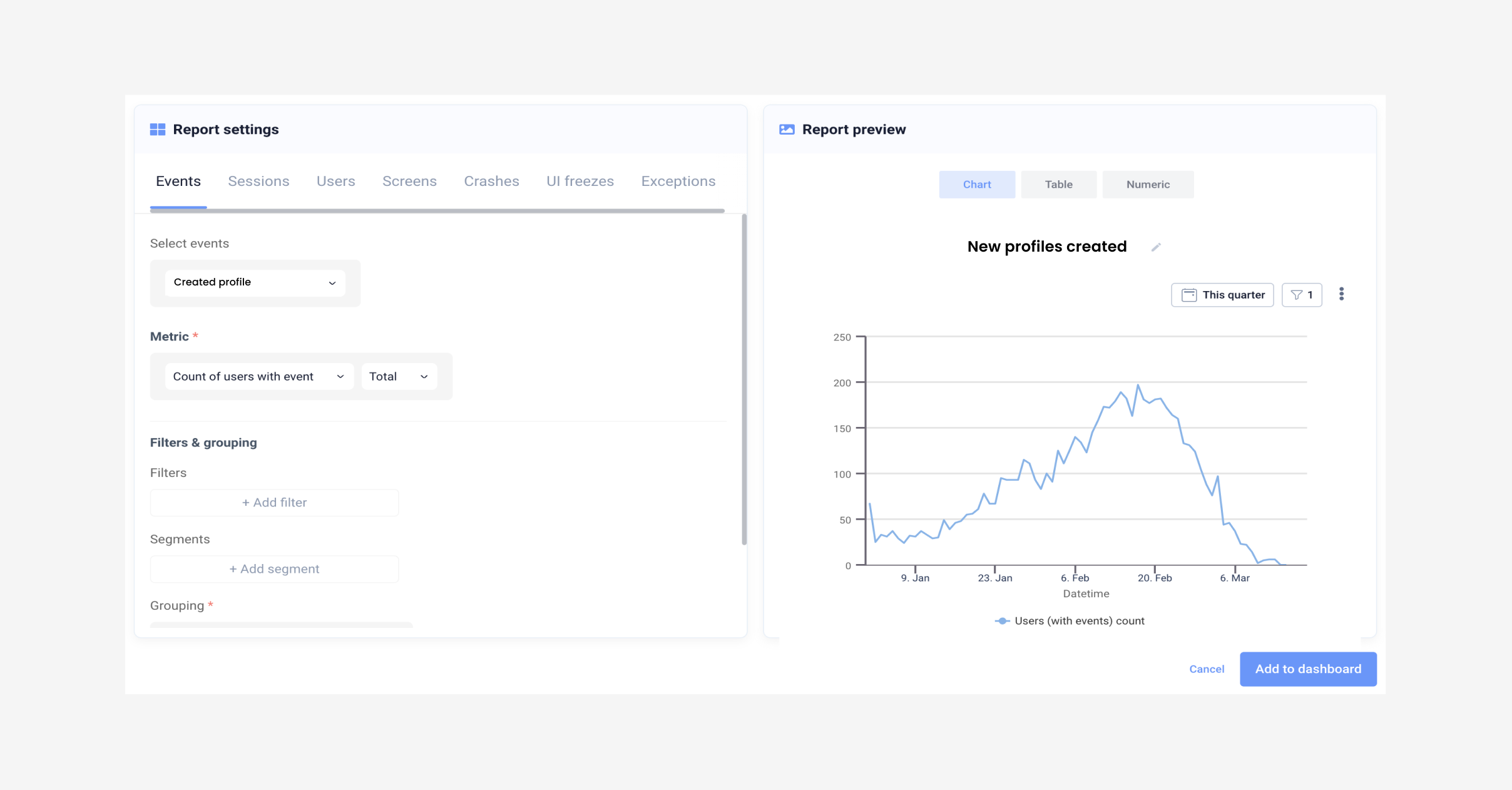

Parameters used to measure feature option
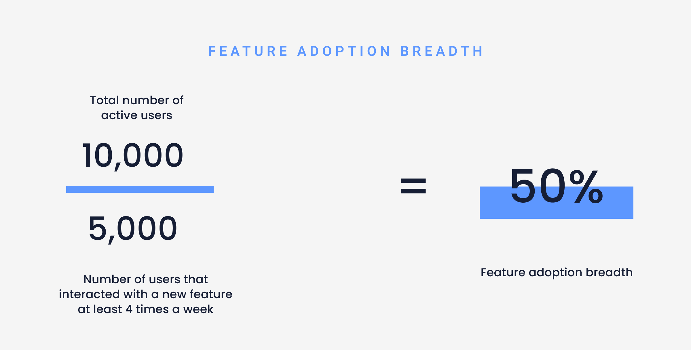
Breadth of feature adoption Measures how widely features are being adopted across the user base or user segment. By measuring this metric you will see if and what features are being used by the majority of users, or only a small percentage. Breadth of adoption shows the initial appeal of a new feature.
To calculate:

Activation rate
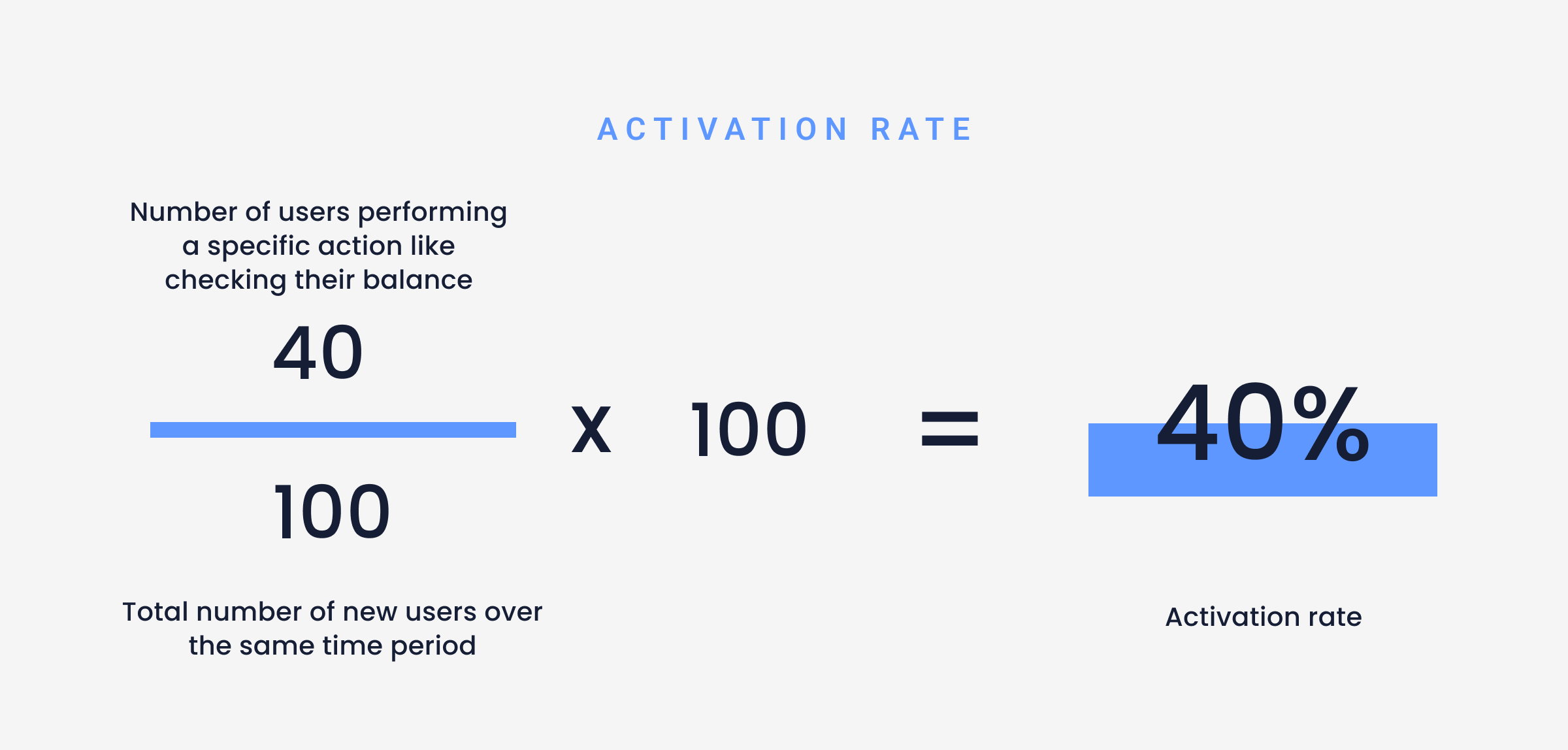
Measures the percentage of users who get to their first “aha” moment.
To collect the data to measure this KPI, you need to define what activities make up an “aha moment.” You can identify those activation points by figuring out what your most successful user cohort accomplished before they subscribed.
This measure gives you a sign of how well your onboarding process directs users to perform the activation event.

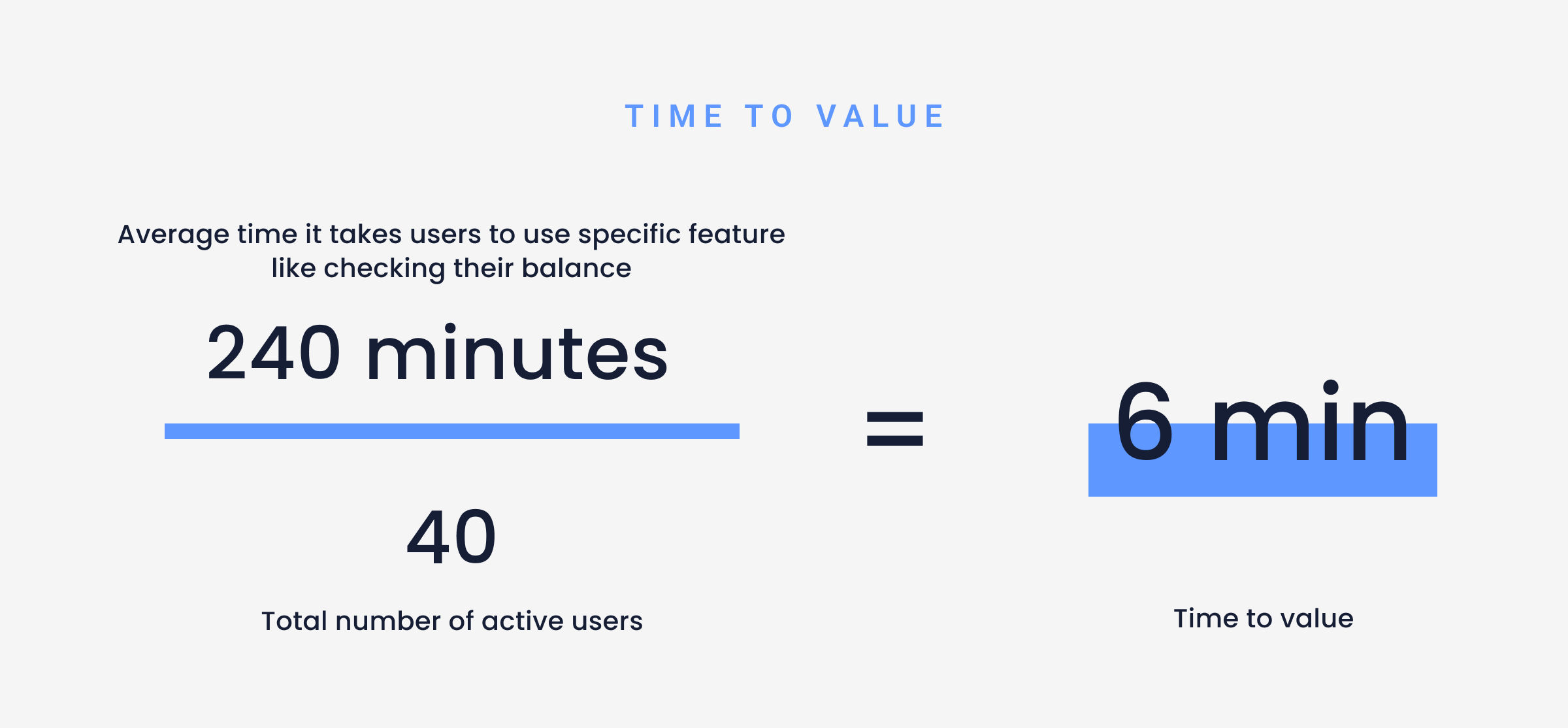
Time to value
(TTV) measures the time or number of actions it takes for a user to get to their first “aha” moment. This metric provides a different view of activation.
This measure shows how quickly your onboarding process gets your users to where they experience value from your product.
To calculate:

Average time to first transaction
The ‘average time to first transaction’ is a FinTech-specific measure of ‘time to value’. The key difference is the specific action that leads to activation is a Financial Transaction.
Turnaround time (TAT)
(TAT) measures the time your app takes to complete a specific business process. For example, how long does it take to clear checks through the Federal Reserve or how long it takes to process an electric payment.
This is another FinTech-specific measure that provides insight into some latency that your users will experience when using your app. You can use this KPI to identify places where you may need to set user expectations during your onboarding process.
For example, if you find that the average time to clear a check is increasing, you’ll want to investigate why that’s happening by investigating with qualitative research methods, like session replays as discussed above, and possibly provide some message warning your users of the extended time frame.
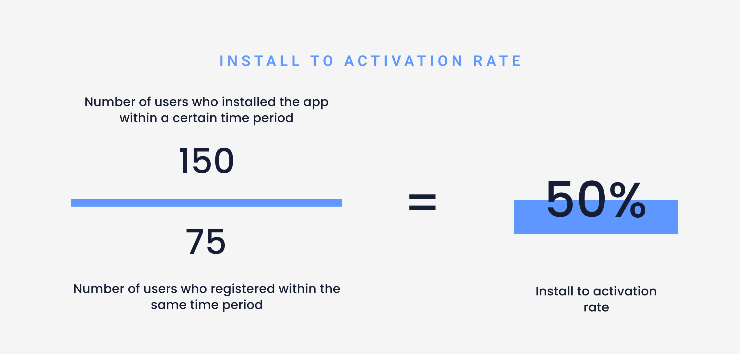
Install-to-registration rate
The install-to-registration rate measures the percentage of users who registered after installing your app. You typically track this measure over a series of time periods, such as within 24 hours, 7 days, and 14 days.
This measure gives you a sign of how successful your onboarding process is convincing people to register once they’ve downloaded your app.
To calculate:

User retention rate
The user retention rate shows the percentage of users who are still active in the period in which they signed up.
This measure provides a sign of how successful your onboarding process is in convincing users to continue using your product. To get a better picture of how onboarding effects retention and versus other factors, it’s best to use a shorter time period such as a week or month.
To calculate:


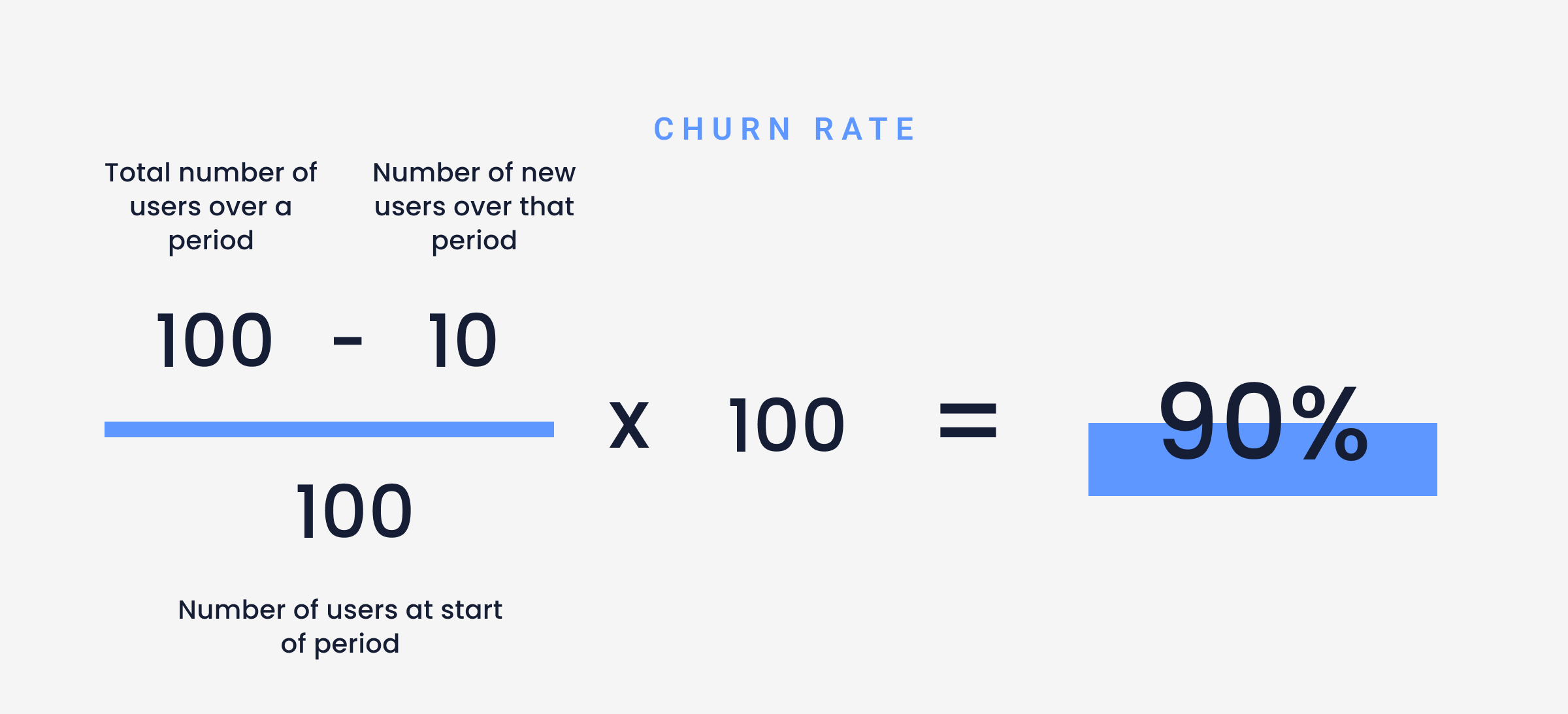
Churn rate
Churn rate measures the percentage of users who stop using your product within a given time period. A lower churn rate is a sign that your onboarding process is successful in keeping your users engaged with your product.

Need more context? Read our use case on how to analyze user churn.
Stickiness
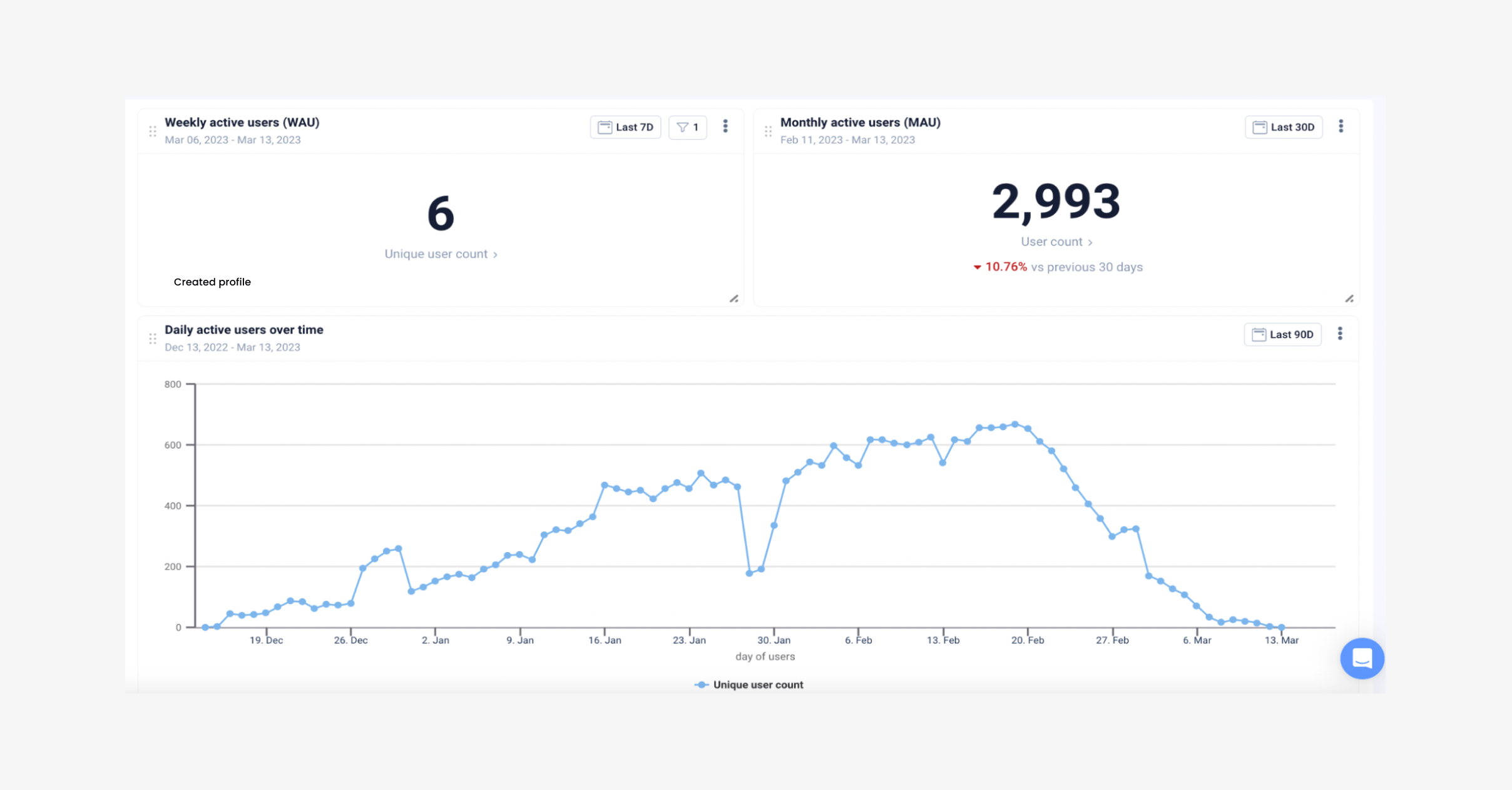
Stickiness is the ratio of Daily Active Users (DAU) to Monthly Active Users (MAU) in a month. A high value for this measure suggests that your onboarding process encourages your users to use your product regularly.


Easily track your daily and monthly active users on UXCam

Improving your FinTech app onboarding strategy
Below are some improvements you can make to your onboarding strategy that will have the most significant impact.
Simplify the Know Your Customer (KYC) process
Just because you need to collect several pieces of information to know your customer, doesn’t mean it has to be an onerous process.
The key is to make collecting information as seamless as possible. Some ways to do that include:
Using validations to prevent users from entering bad data. Don’t let your users make a mistake if you can help it. Use validations like minimum value range checks, for example only allowing users to enter their date of birth in a specific format and only from past years. This eliminates users adding their DOB in the future, or mixing up months and days.
Use ID verification technology that asks your user to upload photos of themselves with their IDs. This helps to make the verification process simpler and faster.
Use an uncluttered, clear UI. The KYC process shouldn’t remind users of the stress of visiting the physical bank, but rather like a seamless part of the registration process.
Offer users live chat or phone support during the signup process so they can get immediate help.
Use a dedicated mobile app analytics tool to identify pain points and bottlenecks in your KYC journey.
Here’s how you can measure the process
Now that you’ve simplified the process, how do you know it works?
Track each stage of the KYC process with funnels and session recordings in UXCam to identify common pain points and hypothesize the cause of onboarding abandonment.
Analyzing your onboarding screens will show you how many users are dropping off and at which stages. Set up a customizable dashboard for your KYC onboarding process to access the data easily and monitor it over time.
UXCam automatically captures screen names, making it faster for you to access data. With each KYC screen name added, for example, upload ID card, email address verification, and completed KYC process, you can begin to analyze the data as it comes in.
You can also use funnels to track error events that you’re interested in measuring, like upload errors, or ID scanning issues.
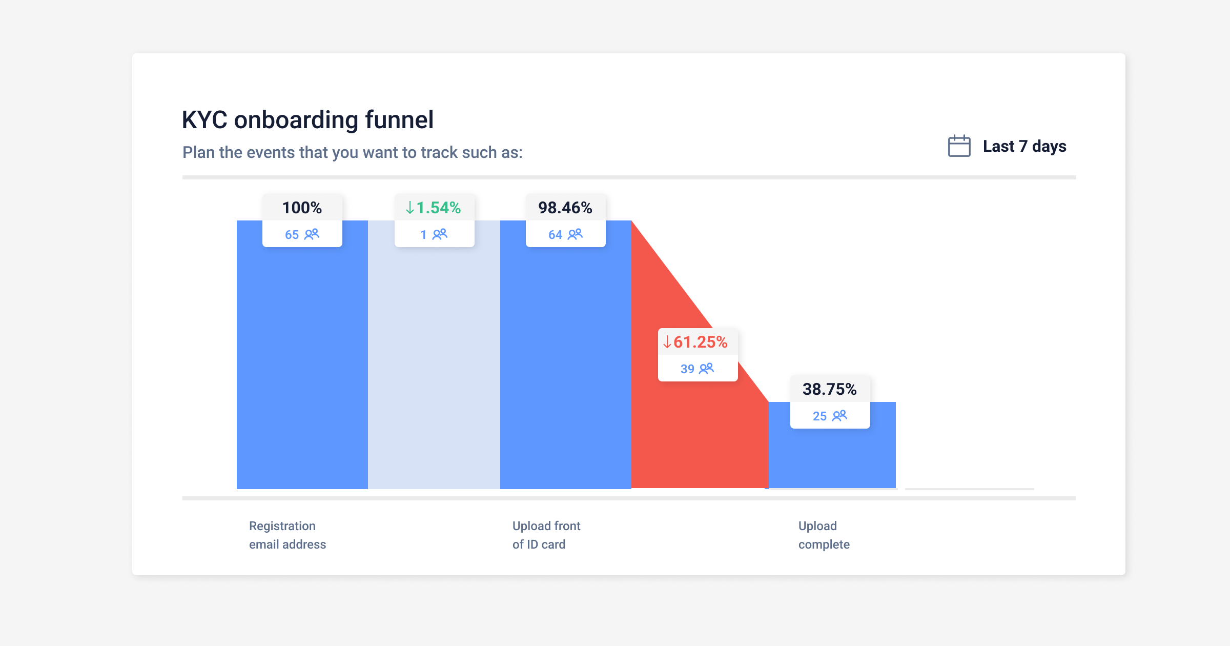

Caption: Example of an onboarding flow funnel in UXCam
By clicking through the red column of the funnel (see example above) you’ll be able to see all the sessions from those users who dropped off to analyze the behaviors and hypothesize the reasons and possible solutions.
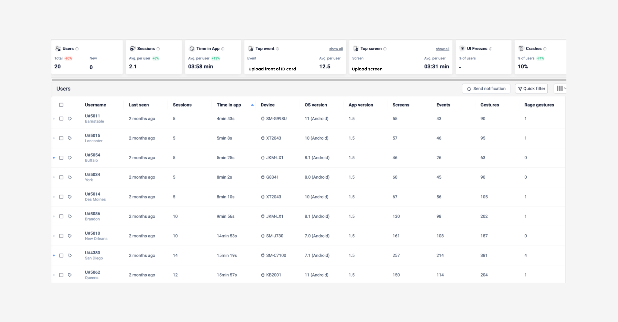

Example of sessions list for uploads in UXCam You can also filter those users who dropped off during onboarding further for sessions including interactions such as:
Sessions can also be filtered by device data so you can look from different dimensions at how your KYC process performs across different platforms:
Screen size
App version
Android or iOS
Saving these users in a segment will save time when coming back to reevaluate your KYC process later, and keep track of the progress of your updates over time.
For a more detailed, specific look into the KYC process, read through our article: Reduce KYC abandonment in 3 steps
Optimize the onboarding flow for mobile
Improving your FinTech app onboarding process heavily depends on having a well-thought-out user experience. There are some additional user experience items to consider when you’re dealing with a mobile app compared to going through an onboarding process on a desktop.
On a mobile app, you’re dealing with limited screen space so it’s important to make the best use of that space as possible. That places a big emphasis on:
The layout of your user interfaces. While it’s a good idea to break the process into steps, you need to make sure you don’t have so many. Keep to only the necessary steps and display progress visually so your users know how close they are to being done.
Clear messaging. Write your instructions using terms that your users understand and try to stay away from internal language.
UX design. Consider that mobile devices weren’t built for extensive data entry through typing. Limit the amount of typing that a user has to do by providing set options, or by using different input keyboards for numbers versus text fields.
Instructions should be concise, yet understandable. Write your instructions using terms that your users understand, and stay away from internal language.
Take advantage of the unique capabilities of mobile devices such as cameras and GPS to aid verification and data collection.
Finally, remember that mobile devices may not always have reliable connectivity. That means you need to build your onboarding process so that it accounts for dropped connections and doesn’t force your user to start their onboarding process over again in the event of a connection loss.
Measuring your optimization efforts
Measuring and tracking the changes to your onboarding process will increase the likelihood that users will reach the end of the journey because you’ll have a better understanding of their frustrations and expectations.
By taking a look at each onboarding screen in heatmaps, under Screens in UXCam, you’ll be able to measure:
Unresponsive taps, rage gestures
First and last touches
By filtering heatmaps for frustration indicators like rage taps and last touches, you’ll be able to see exactly where and what users are struggling with during the onboarding process.
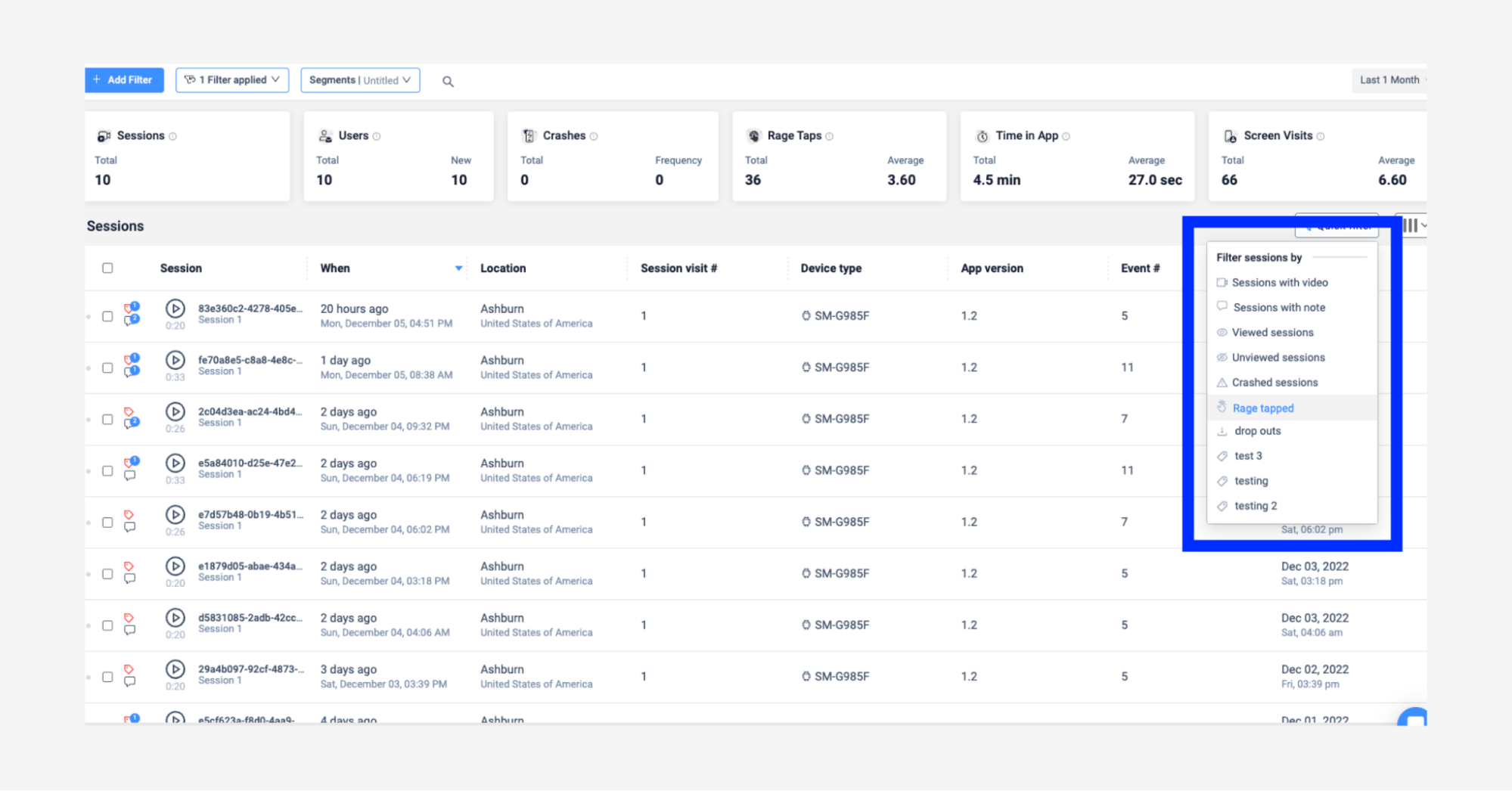

Caption: Example of session filters in UXCam
Some issues throughout your onboarding process that you can uncover with heatmaps are:
Unresponsive or broken elements
Identify user frustrations in the onboarding UI
Which screens in your onboarding process have the highest quit rate
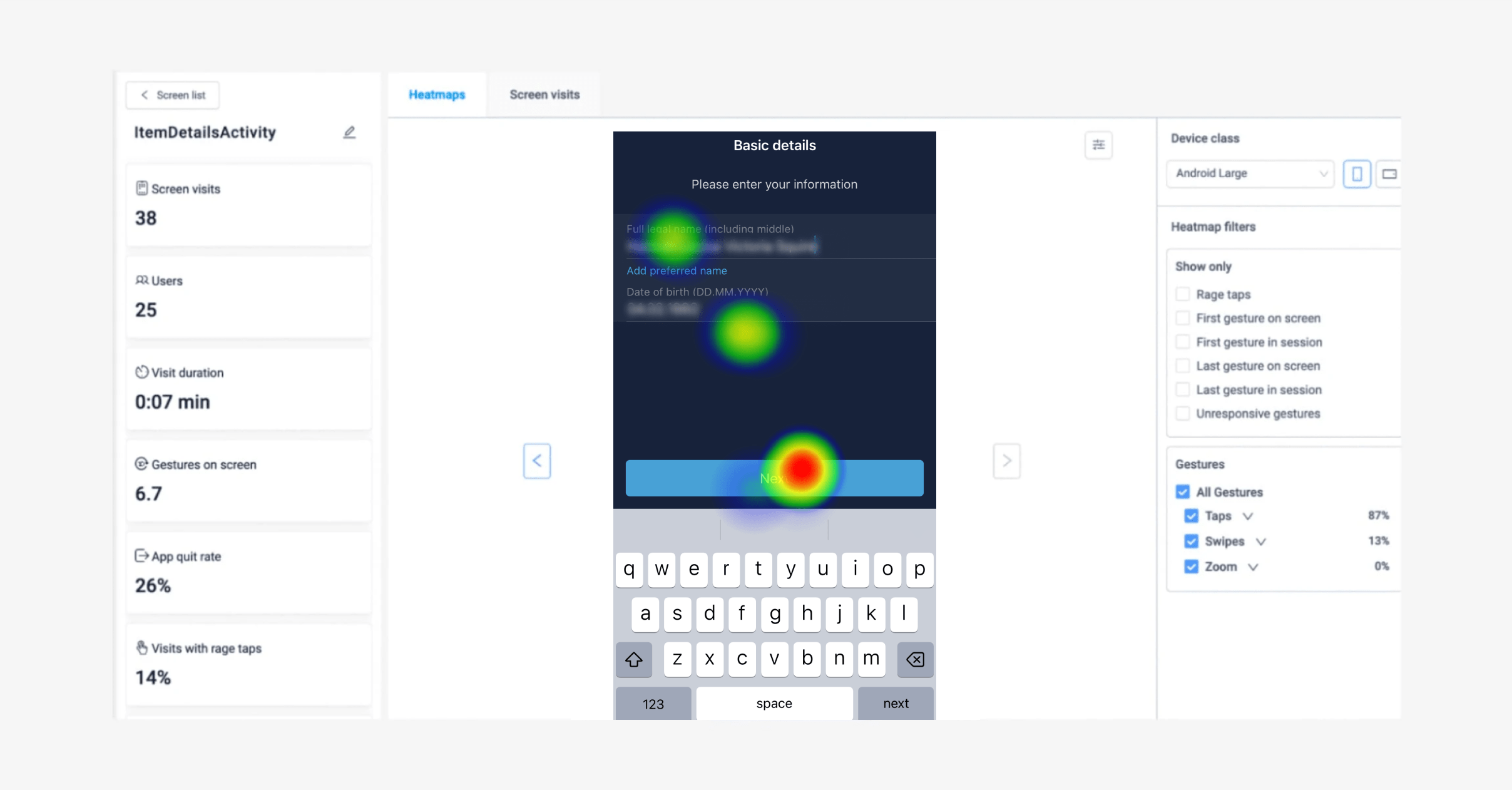

Example of heatmaps in UXCam You can save user segments with specific actions like the ones above. This will allow you a look into the habits of your users over time, from which you can take the right steps to improve your onboarding experience in a user-focused way. When analyzing data through heatmaps or session replay, take a large enough sample. We would recommend that at least 2,000 users should have created an account and started the onboarding process. Doing so will allow agile teams to make reliable judgments on user behaviors and make stronger recommendations for solutions.
Some examples of custom events to track to make up this sample size are:
Email successfully registered
Password successfully set
ID card successfully uploaded
You can also compare heatmaps across different app versions, device types, and user segments. Making use of this will give a clear overview of how your onboarding process performs, looks, and behaves across all screen sizes and different operating systems.
Here are some examples we’ve come across of great onboarding experiences. Take a look, you may find some tricks you can apply to your onboarding process. Or download our user-focused app onboarding guide.
Use UXCam to improve your FinTech app onboarding
FinTech apps face several challenges with onboarding users, primarily because of their need to handle sensitive data securely to support their complex financial transactions.
When you improve your onboarding processes to simplify the KYC process, and optimize your flow for mobile apps, you’ll see an increase in conversions and active users.
UXCam can help you do that through user experience analytics. When you use features like:
You’ll be able to see where users struggle, where they drop off, or churn. Qualitative research methods give product teams a deeper understanding of their users expectations and behaviors, so they can create a better user-centric mobile app experience. Start your free trial today.
Related articles:
Reduce KYC abandonment in 3 steps
How fintech apps can scale user research without breaking the bank
6 tips for building your app around your user
Finance apps have a customer support problem, here's how to fix it
AUTHOR
Kent McDonald
Kent writes about and practices software product management. He has product development experience in various industries, including retail, fintech, agriculture, financial services, health insurance, nonprofit, and automotive. When not writing or product managing, he's #ubersherpa for his family, listens to jazz and podcasts (but not necessarily podcasts about jazz), and collects national parks.

Related articles
Product best practices
How to Increase Mobile App Engagement: 10 Best Strategies
Ten mobile app engagement strategies ranked by real impact, with honest notes on what works, what's overrated, and how UXCam's session replay reveals...

Silvanus Alt, PhD
Founder & CEO | UXCam
Product best practices
5 best user behavioral analytics tools for mobile app teams
Behavioral analytics offers deep insights into user interaction. Learn about the best behavioral analytics tools to optimize the user experience on your mobile...

Jonas Kurzweg
Product Analytics Expert
Product best practices
Top 11 Remote Usability Testing Tools You Can Use Now
Usability testing tools that will put your mind at...

Jonas Kurzweg
Product Analytics Expert


