How to Identify User Frustration

You tap on a button and nothing happens. You try to open a new page but the loading time is frustrating slowly.
User frustration occurs when a person can’t overcome an obstacle or achieve a goal. This means that your app isn’t working as your users expect or require.
But worse, a significant proportion of users might have these problems with your app at the moment – and you lose users and money because of this. By finding and fixing these common frustration patterns you make your users satisfied and stay.
But how?
Identifying user frustration can be difficult. This article explains the most common user frustration indicators to help you satisfy your users
Indicators for User Frustration
Rage Taps
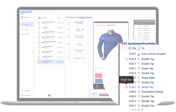

The user clicks on an element and nothing happens. Rage Taps happen when an element’s response is slow, broken or not responding. Another reason could be that a non-clickable element appears to be clickable, i.e the element is unresponsive.
Rage Scrolling
A similar behaviour to the rage tap can happen when a user is frustrated on a scrollable screen or an element that looks scrollable.
A frozen screen, confusing UI or slow response can lead a user to scroll up and down until the screen responds again or the user gives up frustratingly.
Random Scrolling
Random scrolling is not due to technical issues but due to content and design. When a user is looking for a specific functionality or information and can’t find it, he will start scrolling faster and faster and just scan instead of reading the content to find what he is looking for. If a response takes longer than expected, users get irritated and impatient.
Direct Back-tapping
While using your app the user has to trust the app’s navigation. When a user directly taps the “back” button without doing any other action, they haven’t found what he was looking for. If users do not find what they are looking for they get frustrated. To avoid this, the navigation and guiding through the app should be optimized and simplified.
Direct Uninstallation
When a user directly uninstalls an app, it means that his expectations hasn’t met the actual functionality. Direct uninstallation can be caused by wrong expectations and other problems like bad UX, performance issues or unsatisfying functionalities.
Unresponsive Gestures
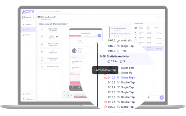

Unresponsive gestures occur when a user tries to interact with an element (tapping a button, swiping or scrolling) and nothing happens. The app doesn’t respond. If users constantly try to interact with unresponsive areas of the screen, it might be an indicator for a bad user interface.
Aborted Events
Imagine that your user puts several items in the cart, starts the purchase process, fills in the shipping and payment details and before making the purchase he aborts the event. Maybe he has changed his mind. However, it can also happen because he is frustrated with the process, with a slow loading page, a hidden “Buy now” button or other design elements.
Aborted events can occur in diverse situations and screens on the app. Analyzing these events can reveal undiscovered problems.
Solutions to Surface User Frustrations
Rage Heatmaps
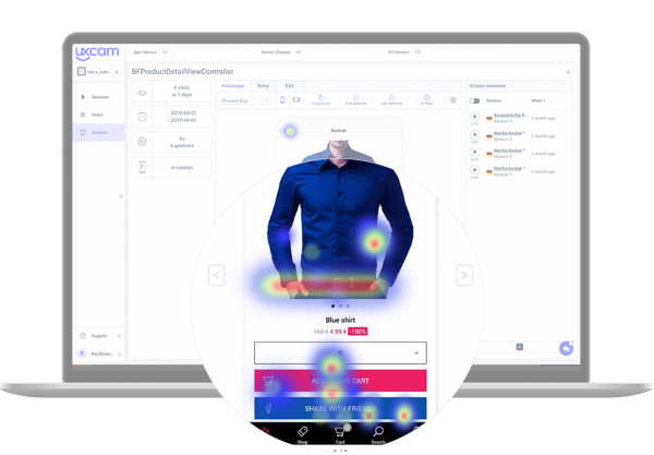

Touch heatmaps show you where most of the users are tapping on the screen and which parts they ignore. They aggregate all the data about how users interact with the app (taps, scrolls, swipes) and highlight elements and parts of the screen where most (and least) gestures are placed.
Touch heatmaps give you an answer to the questions on which screens the users spend most of the time, where they constantly make unresponsive gestures, and which patterns they use most or least.
Session Replay


Session Replays can give you important insights into how users use your app. The recordings contain mouse movements, clicks, typing, scrolling, swiping, rage clicks, gestures, etc. You can follow the path users take through your app and reveal issues a data analysis alone would be unlikely to reveal.
User Feedback
There are several ways to get direct or indirect user feedback: asking for feedback, joining social media discussions, reading reviews or staying in direct contact with users. It is important to take user feedback and reviews seriously because negative experiences lead to customers with a high probability to share that experience in a bad review.
You can dive deeper into the topic of detecting user frustrations by downloading this free whitepaper.
Related articles:
AUTHOR
Annemarie Bufe
Product Analytics Expert
Passionate hobby dancer. Working at UXCam.

Related articles
App Analytics
Top 19 Mobile App Analytics Tools in 2026
Choosing the best mobile app analytics tools and platforms for your app can be overwhelming. We did the research, so you don't have...

Jonas Kurzweg
Product Analytics Expert
App Analytics
Best Android App Analytics Tools in 2026
Discover the top 8 Android analytics including UXCam, Firebase, and Flurry Analytics. Compare features, pricing, and platforms...

Annemarie Bufe
Product Analytics Expert
Curated List
Top 19 Mobile App Analytics Tools in 2026
Discover the top mobile analytics tools in 2026. Compare features, pricing, and reviews to choose the right platform for app tracking, behavioral insights, and data-driven...

Jonas Kurzweg
Product Analytics Expert

