Let’s just put this out there: If you’re looking for a great app that works offline, The New York Times app is the best choice.
We’ve tested the product in offline and online mode and want to summarize WHY the app gives you one of the best offline experiences in the following:
Give Offline Functionality as an Option
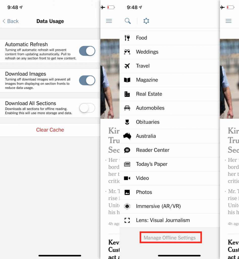
It stands out that the New York Times doesn’t force the user to take advantage of the offline usable function. You don’t want to occupy your internal storage or you don’t have enough data left? No problem, just switch offline functionality off.
Enable Customers to Tailor
The offline section allows you to manage how the app should work offline. By managing this, you decide what content is available offline for you. Having all content offline is possible.

Provide a Consistent User Experience
The user experience during online and offline connectivity is nearly the same. The app allows normal browsing through the news feed.
Clearly Indicate when Content is Updated
If you are offline for a longer time, articles or the latest news might have changed or gotten updated. During your time offline, it’s not possible to download the latest changes. The app clearly indicates when the content was last updated.


Indicate Error Messages when Features are Unavailable:
The app clearly informs us when features like commenting are not available.
Background
Here’s some technical information, these are the SDKs used by the New York Times app:
Localytics Profile
Localytics Analytics
Hockeyapp
Scorecard Research
Pubnub
Leverage Offline for Conversions
While most companies do not have an “offline strategy”, the New York Times has leveraged this opportunity to provide immense value to the subscriber, giving them control over when they engage with the app, irrespective of its connectivity.
But if you don’t have a subscription, the advantages of the offline app usage are not available for you.
Suggested improvements:
Allow Commenting Offline
When I see an article I want to comment on, I want to do it immediately before I forget what I wanted to say or write.
Remove Functionality When Features Are Not Available
If an image is not downloaded, it constantly shows “loading” when clicking on it. Here it would be better to inform the user that there is no internet connection and that the picture is not available offline.
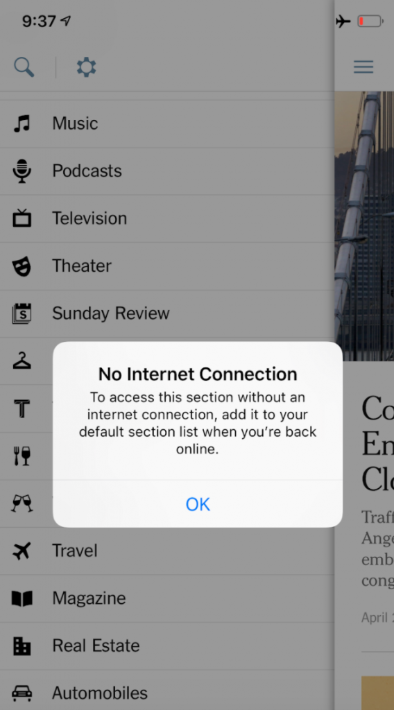

By letting the users wait, even though you know that it won’t work, you frustrate the user. The analytics solution UXCam, unlike most other tools, supports offline analytics and allows you to see how users use the app offline along with capturing what they do.
UXCam analyzes offline sessions to help you identify user frustration.
Conclusion
The New York Times app has a clear offline app strategy allowing customers to use the app even when they are offline. This is something most companies have as an afterthought.
Not being usable offline might be okay at the very beginning of an app’s life, but it is a poor decision not to think about an offline app strategy as soon as possible. Not being usable online means lost revenue and a significant negative impact on your brand. Especially when you want to reach an international market that includes developing countries, an offline strategy is important to deliver a good user experience.
The user experience of the New York Times app offline and online is consistent, but there is some space for improvement. Particularly a placeholder when images are not downloaded and the ability to write comments in offline mode (and publish them when being online again) would be great.
To analyze user behavior, the New York Times uses tools like Localytics, which are similar to UXCam. To get a full picture of what your users do, it is important to use tools that are able to record offline by efficiently caching offline data. It should have been recorded when it happened, not when the data was received. Solutions like UXCam support this and further functionalities.
AUTHOR
Annemarie Bufe
Product Analytics Expert
Passionate hobby dancer. Working at UXCam.

Related articles
Curated List
7 Best AB Testing Tools for Mobile Apps
Learn with examples how qualitative tools like funnel analysis, heat maps, and session replays complement quantitative...

Jane Leung
Product Analytics Expert
UX design
12 UX Metrics to Measure and Enhance User Experience
Unlock product success by tracking the right UX metrics. Learn 12 essential metrics, how to measure them, avoid common pitfalls, and take action with tools like...
UX design
10 Top UX Design Best Practices & How to Implement Them
Discover 10 proven UX design best practices to improve usability, boost retention, and create user-centric products. Actionable tips for product...

Tope Longe
Product Analytics Expert

