Pioneering mobile apps are intuitive, frictionless, efficient, and accessible. In other words, they offer users happy paths to streamline their journeys. But creating these paths isn’t always easy—you need to put user journeys under the microscope to see what works and what doesn’t.
This is where user flow analysis comes in.
Leading mobile app teams trust UXCam for accurate user flow analytics. We deliver the quantitative and qualitative data they need to understand user flows and create happy paths for their users. And today, we’ll be showing you how to do just that with a simple, step-by-step guide.
Ready to build an app that delights your users? Read on.
What is user flow analysis?
User flow analysis is an exhaustive examination of interactions describing ideal or typical steps needed to achieve a common task using a product.
It allows teams to make design improvements by focusing on the paths toward achieving goals and understanding the friction points contributing to poor experiences. User flows can be illustrated with artifacts like task diagrams, low-fidelity wireflows, or simple flow charts. Maps highlight crucial user actions and system responses.
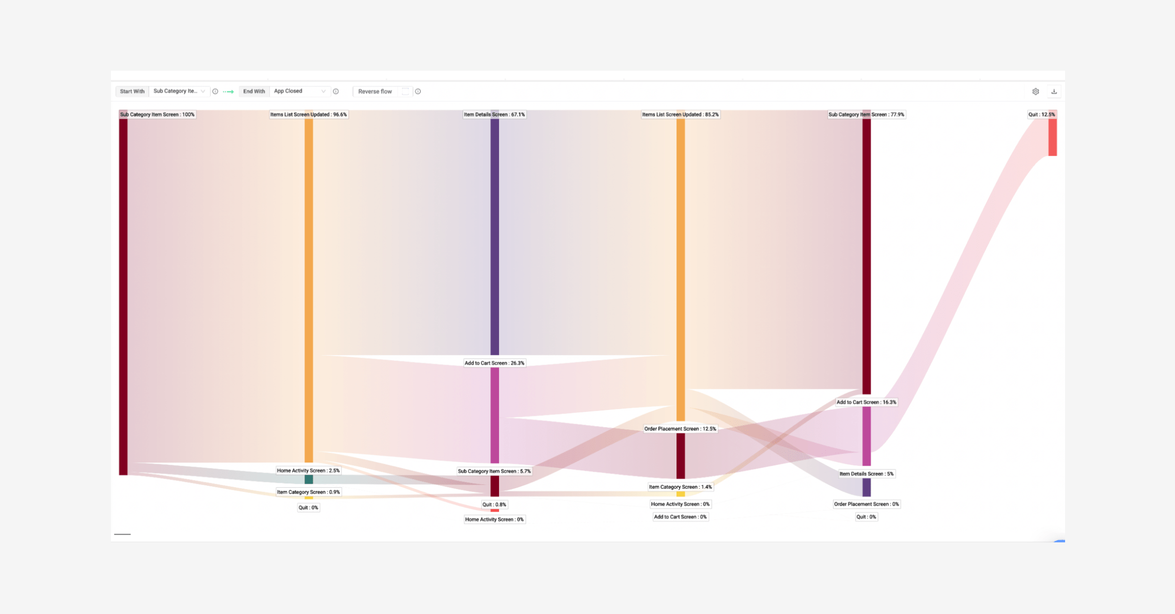
One example of a tool you can use for user flow analysis is UXCam’s Screen Flow feature.

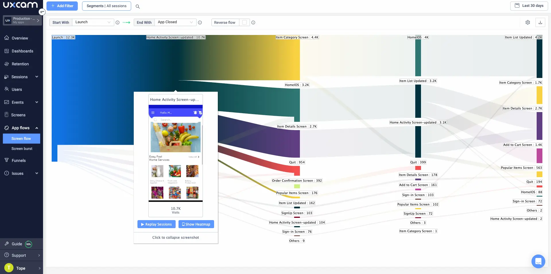
The example above displays the flow between two selected in-app events—it shows the screens visited by the user throughout the flow. You’ll have the option to view session replays and heatmaps for specific sessions to understand the user’s decision-making process and what works and what doesn’t.
Why is it important to monitor user flow?
Understand user behavior: User flow analysis allows you to dive deep into understanding interactions within single features and areas of the high-level user journey. It helps teams understand usage and determine the reasoning behind actions to back design decisions.
Visualize UX: You’ll receive a bird’s-eye view of your app and how the elements and pages work together to support or hinder your user’s navigation experience. It highlights dead ends and poorly structured paths.
Conversion optimization: It allows you to focus on the pivotal points of the user’s journey so you can focus on designs to move users further along the sales funnel and drive conversion rates.
Identify the Happy Path: UX's “Happy Path” is a frictionless, error-free user flow. User flow analysis identifies the best possible in-app journey, allowing you to examine the behaviors that get users to the desired result faster. The results will help you improve paths for more engagement and customer loyalty.
How to conduct a user flow analysis
Decide on the goal and success metrics
Map the current process
Data analysis
Streamline user flow
Prioritize areas for improvement
Continuously iterate user flow analysis
Step 1 - Decide on the goal and success metrics
First, clarify the purpose of performing a user flow analysis, such as to increase engagement or to guide users through the conversion process better. Once you have linked your “why” to a product goal (e.g., to increase revenue by 25%), decide how you will measure success.
Suppose your main goal is to increase revenue—you can look at mobile app KPIs like average revenue per user (APPU) to see how your design changes have impacted in-app purchases, subscriptions, and other in-app monetization.
Step 2 - Map the current process
Decide on a user flow for an everyday use case to visualize. For example, a team may examine the end-to-end flows of how their high-spending customers purchase skipping ropes on a sporting goods site. This would be an appropriate short-term goal because it can be achieved within minutes and take a relatively definite set of interactions.
To map your chosen flow, use a physical or virtual whiteboard or a behavior analytics tool like UXCam. Our platform highlights all the important interactions and touch points throughout user flows. We include context data like session replays and micro-interactions, including frustration signals like rage taps, for an in-depth understanding of your app’s UX.
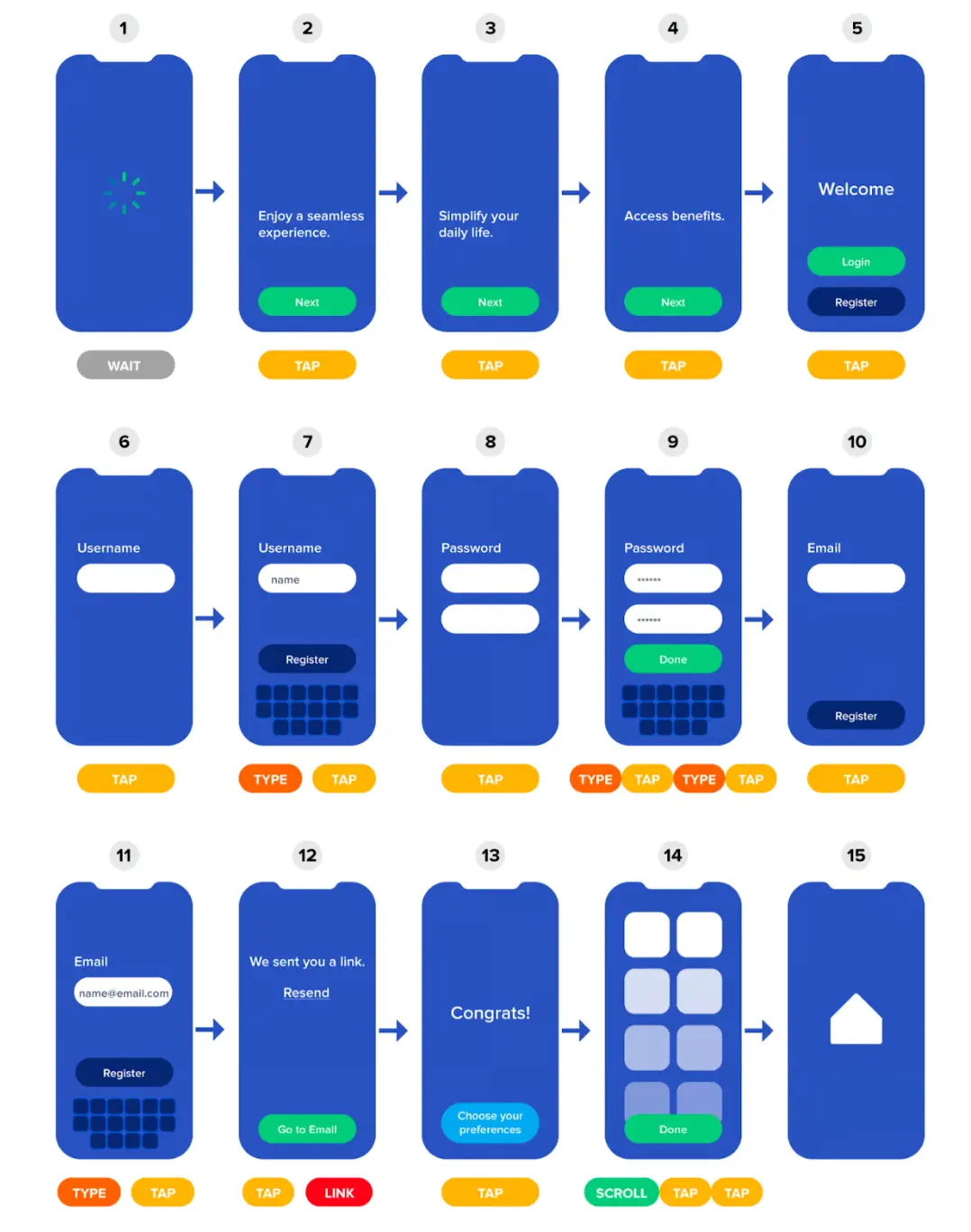
If you’re creating your user flows manually, include action labels near corresponding screens or screen representations.
For an idea of how you can present your flow, the example below is of an onboarding flow labeled with the user’s actions:
Step 3 - Data analysis
Now, it’s time to pick apart the user flow and analyze your user’s behavior by questioning everything. Consider the following for a successful user flow analysis.
Consider user expectations
Consider what the user understands about your app and their expectations. For example, does every step and screen communicate what’s expected from the user to complete their goal? Are menus and icons in conventional visual representations?
Evaluate usability heuristics
Consider the core design rules of thumb using a Heuristic evaluation. These are standards, conventions, and best practices to enhance your app’s usability. It can be used as a guideline to see how usable each user flow step or process is.
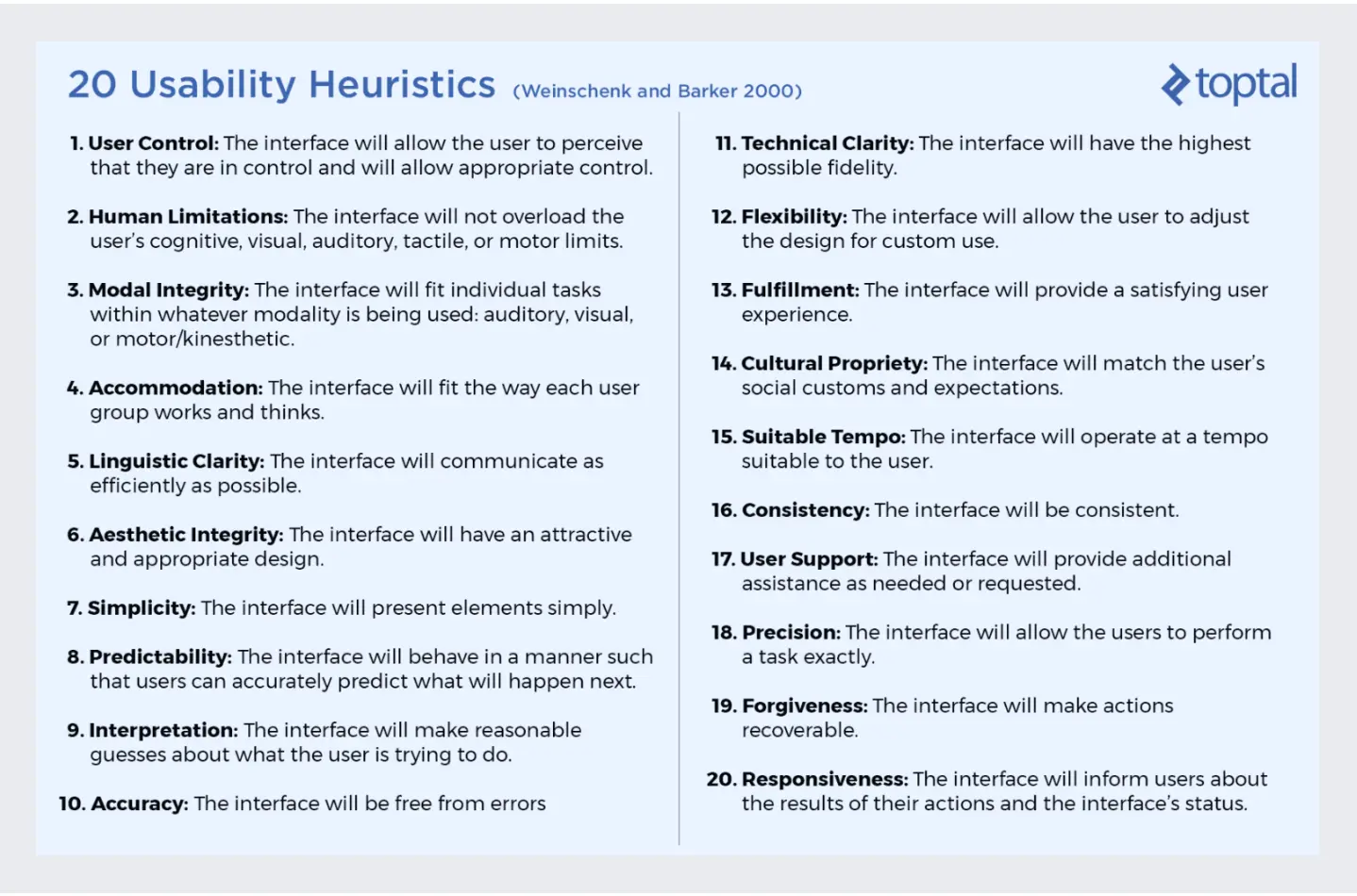
No time to go through heuristics? You could examine how long different segments take to complete the task, then determine why some groups are quicker/take longer.
Examine actions
When planning a goal, count every tap, swipe, and scroll needed. Consider mental and physical effort—even small decisions require cognitive energy. Rank actions by difficulty and frequency of use and track how often they are performed. Ensure consistency in difficulty level and effort required.
| Action | Frequency | Difficulty Rating |
|---|---|---|
| Wait | 5 | 1 |
| Scroll | 3 | 2 |
| Swipe | 1 | 3 |
| Tap | 9 | 4 |
| Type | 3 | 6 |
| Read | 6 | 8 |
Question everything. For example, does a user really need to tap six times to complete this flow? Or is there a way to bring that number down to four or even three? The change might seem insignificant, but these small changes ccan add up into a much more user-friendly experience.
Access app structure
Evaluate the feature layout and how easily switching between features is. Analysis like this is fundamental to highlight how app layout supports user’s goals.
For example, the elements a particular user group engages with the most may reside within two or more sections that require switching between, even if switching is infrequent. Consider whether users spend more time in one area and miss important information or CTAs in another.
UXCam’s Funnel Analytics delivers critical user flow analysis to learn where along the journey users drop out. This makes it easy to see which parts of your app are underperforming and need redesigning.
Step 4 - Streamline user flow
Armed with your findings, go through the user flow and, if necessary, find parts of the process where steps can be combined to decrease the number of actions. Replace more complex actions with simpler ones.
Avoid merging screens containing complex information that may overwhelm users. Simplify the design by focusing on decreasing clutter instead of screens. For example, user information fields and payment details on the same screen might be too cluttered.
Aim to remove as much friction from the flow as possible—here are the main types:
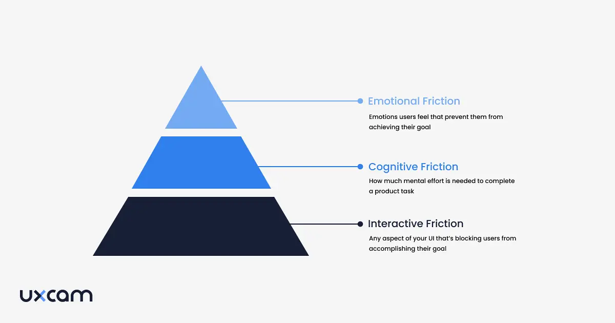
Step 5 - Prioritize areas for improvement
A user flow analysis is ideal for finding design opportunities. For example, let's say your analysis indicates drop-offs or long pauses at a particular stage of the flow—you could include more support with a contextual tooltip. Alternatively, a personalized message would be an excellent way to move users through the funnel.
Step 6 - Continuously iterate user flow analysis
Like any other type of UX review, user flow analysis must be started early in design and continuously iterated to reap the most benefits. You’ll find behavior patterns in different user segments. For example, the in-app experiences between new and returning users will differ significantly.
In the long run, the aim is to consistently increase conversions by delivering happy paths.
Design more happy paths with UXCam
User flow analysis zooms in on your user journeys to confirm the conversion paths are as frictionless and seamless as possible. This usability technique helps identify user needs, pain points, and opportunities so you can make informed design decisions to deliver satisfactory experiences.
UXCam not only maps out the user’s journey from app launch to exit, but our session replays, heatmaps, funnels, and user segment features and functionality help you understand your users on a granular level. Additionally, our tool creates reports to share to impress stakeholders with the differences in conversions.
Are you ready to discover how UXCam helps teams keep their users returning for more? Sign up today for your free trial, or reach out for a demo.
You might also be interested in these;
The Hotjar for mobile apps: UXCam How to design a better mobile app user flow
UX insights examples - Ideas to improve user retention
Product management and user experience - How to collaborate effectively
AUTHOR
Tope Longe
Product Analytics Expert
Ardent technophile exploring the world of mobile app product management at UXCam.

Related articles
Curated List
7 Best AB Testing Tools for Mobile Apps
Learn with examples how qualitative tools like funnel analysis, heat maps, and session replays complement quantitative...

Jane Leung
Product Analytics Expert
UX design
12 UX Metrics to Measure and Enhance User Experience
Unlock product success by tracking the right UX metrics. Learn 12 essential metrics, how to measure them, avoid common pitfalls, and take action with tools like...
UX design
10 Top UX Design Best Practices & How to Implement Them
Discover 10 proven UX design best practices to improve usability, boost retention, and create user-centric products. Actionable tips for product...

Tope Longe
Product Analytics Expert
