10 Best App Design Practices for App Development in 2026

The importance of user experience can’t be underestimated.
Every dollar invested in UX brings back around $100. But it is not only money we’re talking about.
You can hire the best software development company to create your app or website, but you won’t get great results if you fail to provide a great user experience.
If you want to make your app or website successful, you need to follow the best app design practices. 52% of users won’t engage with a company if that means dealing with poor mobile UX design.
With the number of users projected to reach 4.3 billion in 2023 and steady growth in the years to follow, you can’t ignore the need for good UI and UX best practices.
Sometimes, creative designers may look to push the boundaries with their design ideas and often have to filter for relevance by asking the important question, "which is a good app design practice?"
Let’s review some of the UX design best practices that you can use now and in the coming years.
Design for Everyone
Accessibility forms the basis for best app design practices. You need to design for everyone and foresee all the possible use cases in your design. Users can hold a smartphone in the left or right hand, or even with both hands.
The best app designs provide a clean layout with the most important interface elements visible and accessible no matter how users hold their smartphones.
Be very careful about placing buttons and other elements in the lower corners and at the top of the screen. These places are the hardest to reach, creating a lot of difficulties for users.


Place One Action per Screen
The smartphone screen is small compared to the desktop, which creates many difficulties for UX designers. Add a few additional items on the screen, and suddenly users feel overwhelmed.
The best decision is to divide the process into simple actions and dedicate a screen to each one of them.
For example, if you are designing an app for booking hotels, you can split the process into selecting dates for staying, selecting a location, a suitable hotel, and so on. Each action should be placed on a separate screen to make the process more user-friendly.
Create Tappable Buttons
Tapping a button and missing it is among the most frustrating things that happen when using an app. Touch controls that are too small make it impossible for users to interact with an app. UX designers might be tempted to save space and make the buttons smaller. However, it will result in harming the user experience.
If you want to follow the best app design practices, making buttons 44 x 44 pt or 48 x 48 dp is a safe bet. Still, every operating system has its own recommendations, so make sure to check them out.
Create a Clean & Uncluttered Design
Spacing and paddings should be at the center of your design. Staffing all the elements on a single screen is a sure way to failure. A cluttered design is one of the reasons why users abandon an app.
Adding white space helps create a well-structured design that is attractive to the eye. Thus, you will help users concentrate on what you want them to focus on while avoiding distractions.


Minimize Required Data Input
Some apps, like e-commerce applications, require a lot of data input. Filling out a form with multiple fields is no big deal on a computer; it’s entirely different when it comes to mobile devices.
One of the mobile UX best practices is to provide social login and sign-up with Facebook, Google or Instagram. By tapping one button, users can create an account.
All it takes is just a single button tap. Every best app design offers this option.
Add Dark Mode
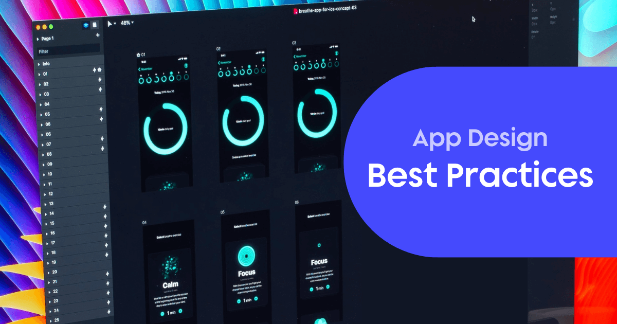
Dark mode is a design trend that will stay with us for a very long time. The popularity of dark mode is justified by the benefits it provides — the advantages include reduced eye strain, less battery power consumption, and better highlighting of important information or elements.
Today, almost every popular application on the market has the dark mode feature, and you should consider it for your application.
Create Context-Oriented Design
Personalized UX is one of the main trends of this year that will stay with us for the foreseeable future. This type of UX design entails providing users with features and content based on how they interact with your app or what problem they are trying to solve.
For example, you might provide the ability to enable or disable animations, make the font bigger or smaller, enable or disable dark mode, and so on. The main idea is to give users the freedom to control the interface.
Make a User-Friendly Tab Bar
The tab bar is a key part of every application. They serve several purposes, such as keeping all the information in front of users while not overstaffing the screen with elements.
To make the user interface neater, you may swap the names of features for icons. This option has both good and bad sides, as you can end up confusing users if you decide on unfamiliar icons. Among the best app design practices is the use of icons that are well-known and familiar to users.
As with everything else, avoid creating any possible confusion. Ridding of text in favor of icons can be a really good thing, but only if done well.


Give Feedback on User Actions
When users interact with an app, it’s advised to show them that they have successfully performed an action. It’s an impactful part of the user experience when apps provide feedback on all user actions.
Animations and transitions can be utilized to signal users that the action they made was successful. The best app designs use tactile and visual feedback. Audio feedback might be better suited for games considering that the vast majority of users keep their smartphones silenced all the time.
Follow the Ecosystem Standards
Most importantly, follow the standards of every ecosystem you are targeting your app or websites at.
For example, if you are designing for iOS, follow the Apple iOS Human Interface Guidelines, and for Android, there are the Google Material Design Guidelines.
Just because something works for one system, it doesn’t mean it will work for the other. You need to remember the differences in the placement of various on-screen elements and navigation. If you ignore the principles, it will harm the user experience and be confusing for users.
Best App Design Practices: Sum-up
The UX design sphere is steadily and actively evolving. Keeping an eye on the latest trends is essential to creating an app with a user-friendly interface.
What mobile UX best practices you follow depends on the specifics of the app you are developing — and its set of features. There is no silver bullet that will serve all purposes.
At the center of the best app designs is one thing only: the user. Don’t push UX aside when developing your app.
Related Articles:
How the Best Apps Are Using UX Gamification to Drive Engagement
Best UX Tools: 11 Tools to Make Your Life Easy
How To Do a UX Competitor Analysis for Your Mobile App (FREE Template!)
Push Notification UX: The Full Guide
8 Mobile App Onboarding Best Practices
Mobile App Security: How to Make Sure that Your App Is Safe for Users
Mobile First Design: Guidelines
App Onboarding Guide: 10 examples of Best User Onboarding Flows
AUTHOR
Anastasiia Lastovetska
Anastasiia Lastovetska is a technology writer at MLSDev, a software development company that builds web & mobile app solutions from scratch. She researches the area of technology to create great content about app development, UX/UI design, tech & business consulting.

Related articles
UI/UX Design
10 Best App Design Practices for App Development in 2026
If you're developing an app, you need to keep UX in mind if you want it to succeed. Check out these 10 best app design...

Anastasiia Lastovetska
User Onboarding
4 Actionable Tips on App Onboarding by David Jones
Why you should focus on the...

Jonas Kurzweg
Product Analytics Expert
UI/UX Design
5 UX Mistakes App Developers Unknowingly Make
We've thought of five typical UX mistakes developers make so you don't have...

Jonas Kurzweg
Product Analytics Expert

