If you’re reading this, you’re looking for great onboarding examples to get inspired by.
You’ve come to the right place; let’s dive into some delightful onboarding design examples.
LinkedIn onboarding example
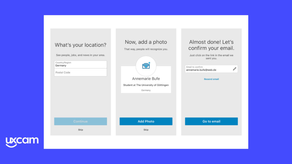
The LinkedIn app follows a progressive multistep onboarding.

Take notice:
You can skip all the steps in the LinkedIn onboarding. This helps to convert indecisive users later on, once they’re ready for the commitment.
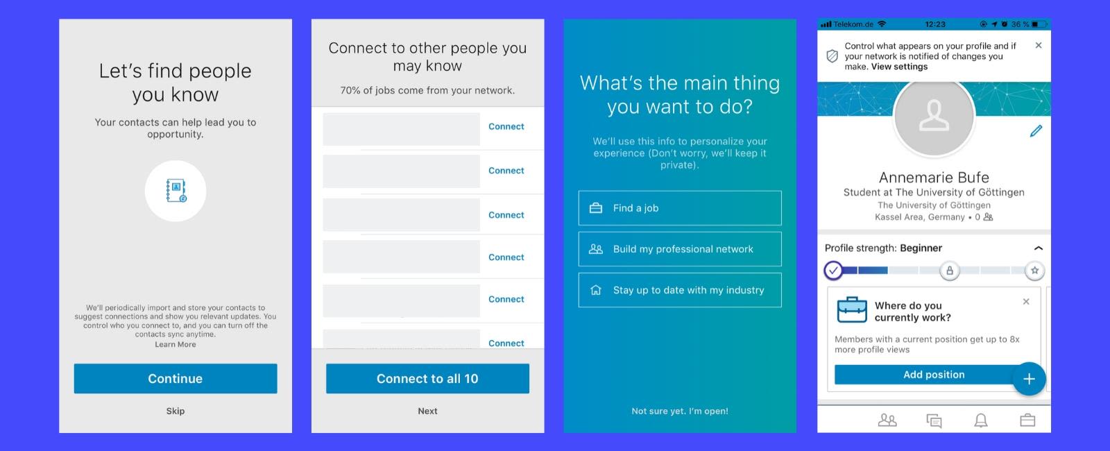

LinkedIn gives new users the option to skip all the onboarding steps.
Download FREE ebook - How to improve your mobile app UX With User-Focused Onboarding
MyFitnessPal onboarding example
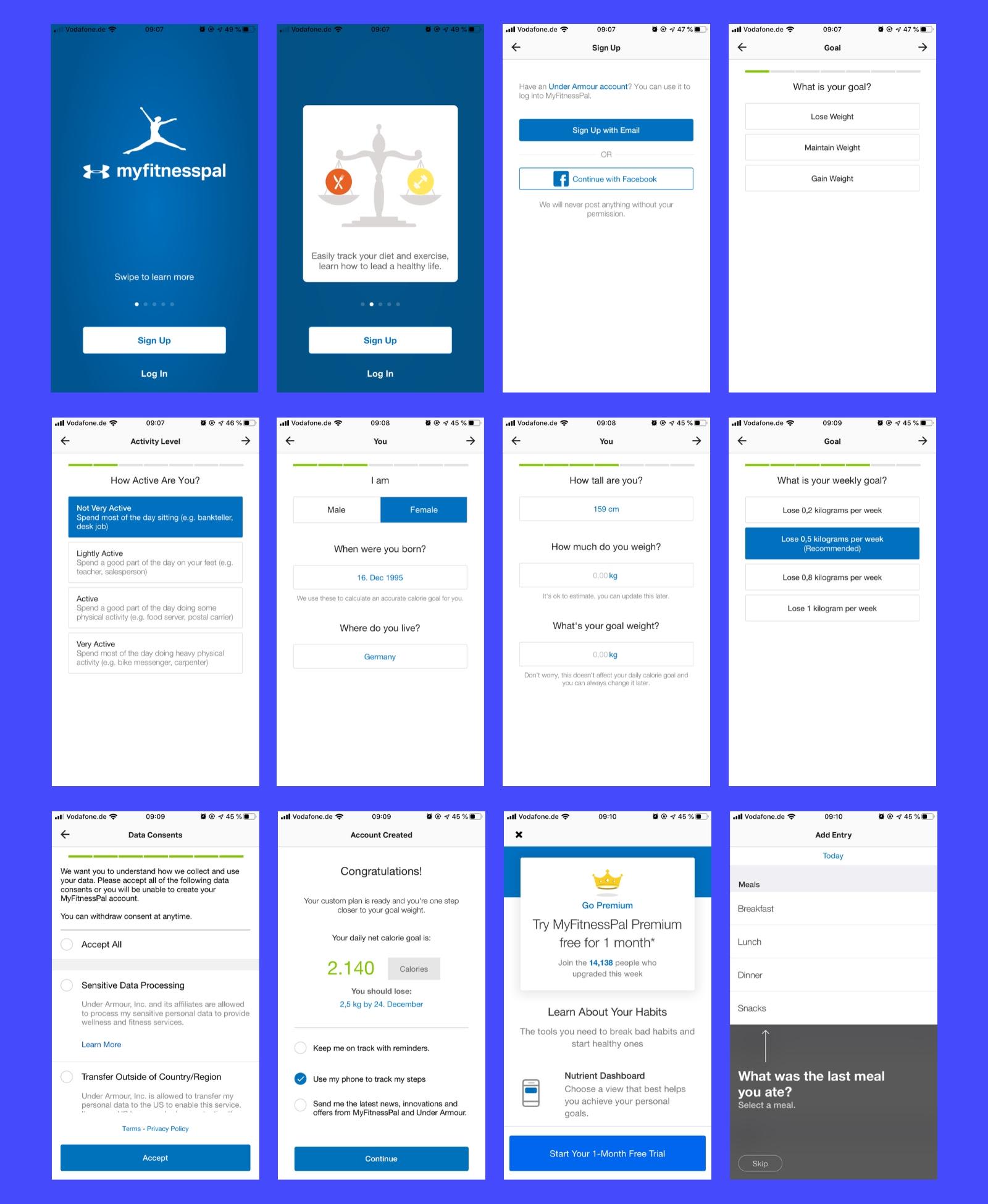
The MyFitnessPal onboarding is extremely long. That can be a bad thing — but it’s not in this case.
The long onboarding gives new users the feeling that the app and their weight loss/gain plan is customized for them.

Flipboard onboarding example
Flipboard’s onboarding follows the breadcrumb technique.
The breadcrumb technique saves intimidating asks like “What’s your email address?” for last. Instead, it starts with easy-to-answer questions first, to get the user into the habit of saying yes.
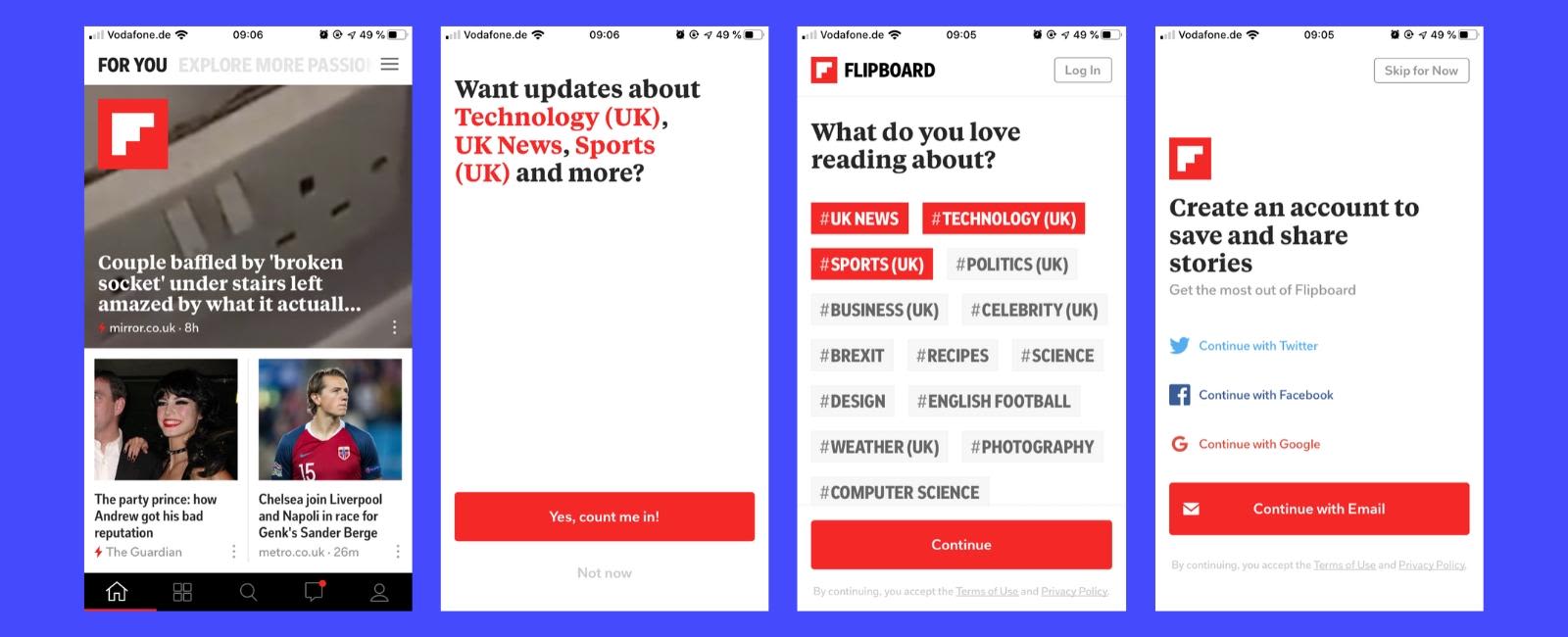

Get your new users into the habit of saying yes!
Instagram onboarding example
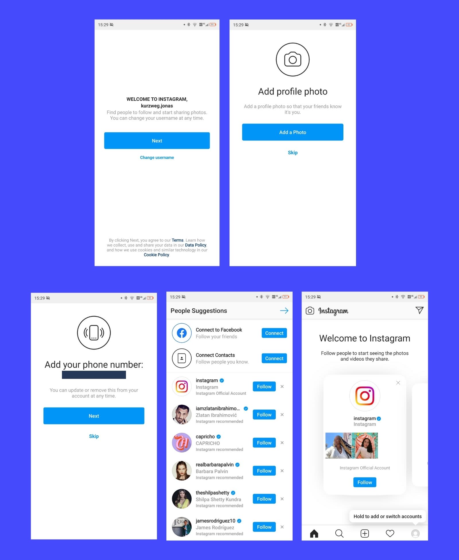
Facebook, which owns Instagram, knows how to use psychology to engage users — and the onboarding of Instagram is no different.
Instagram’s onboarding creates fear of missing out (FOMO).


If you have a Facebook account, Instagram will tell you about friends that already use Instagram. The friend names are not randomly chosen, these are friends that Facebook already sees high engagement with.
If all of your closest friends already use Instagram, you don’t want to miss out, right?
Create FOMO to keep your users invested during onboarding.
Here are the last steps of Instagram’s onboarding:

Canva onboarding example
Canva's user onboarding flow is a hands-on, step-by-step introduction to the design platform that builds users' confidence as they learn more.
As you create your first project, Canva guides you through every feature in a fun and interactive way so you don't feel overwhelmed. With clear visuals and accessible language, Canva's onboarding flow helps new users become familiar with their tools while having an enjoyable experience.
Once on the dashboard, users can also try out Canva Design School. It's a free platform that has tons of design courses and resources for you to explore. You can watch video lessons and do exercises on things like professional design, typography, design trends, and color theory.
You can go at your own speed and have fun while learning. Whether you're working on your own or with a team, Canva Design School will help you create amazing designs using Canva.
Asana onboarding example
Asana's onboarding experience not only guides you through the ropes but also customizes the journey based on your needs.
What we like best about Asana is that they hand you the keys to success with project templates. The idea is that you’ll learn to customize the tool to your needs as you use it—if they can get you 95% of the way there with a ready-to-use template, the value you get from the jump is a motivator to learn.
These templates track everything from start to finish, so you're never left in the dark. It's the perfect tool to fast-track newbies into understanding what needs to be done and where to find important information.
And just when you thought it couldn't get any better, there's the Asana onboarding checklist. This comprehensive document will take you on a journey of understanding why and how to use Asana, making sure that your team gets up to speed quickly.
Understanding onboarding personas
There are a lot of different people who could use your mobile app. You can separate them in several ways.
One way to do it is to look at how savvy they are with technical devices.
The app beginner
You can find two types of users in this category:
The users who are not comfortable with technical things in general.
The users who are not comfortable with your specific (complicated to use) app.
The onboarding process should give them an overview of the functionalities and help them understand the basic usage of your app.
Keep it simple and don’t overwhelm them.
A walkthrough could help to find and understand the features needed to use the app.
Evernote onboarding example
Evernote provides a great example of simple progressive user onboarding. It guides the users through every offered function.


Strategy to use for these users: progressive onboarding.
How to design it: Using fancy control elements is not the best idea. Explain how your app works step by step.
Just focus on what’s important and helpful. With a progressive onboarding, you simplify complex workflows.
Moreover, you point out hidden functions and gestures in your app.The users learn how to use the app correctly.
The advanced users
In this category, you find users who understand most of the common UI and app interactions and elements.
Take a look at the complexity of your app.
If your app is easy to understand and use you don’t need to explain every simple step.
Strategy to use for these users: progressive-, benefit- and function-oriented onboarding.
How to design it: You can be creative. It’s possible to play around with uncommon gestures, animations, and elements to stand out from the crowd.
The business users
You can expect that this group of users knows how to work with technical devices like smartphones.
It’s probable that they understand the common app UI, app interactions, and elements, too.
For this target group, it’s helpful to focus on the value you can offer.
Trip.com onboarding example
Another great benefit-oriented onboarding example is given by Trip.com. It clearly communicates the benefits of its app in the headlines.


Timely onboarding example
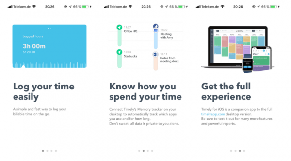
Timely gives a function-oriented onboarding process example.
The focus is on what the user can do with the app, instead of on the benefits.

Sleepzy onboarding example
Of course, a combination of both types is possible. Sleepzy uses function-oriented onboarding.
The app shows the users which function it offers.
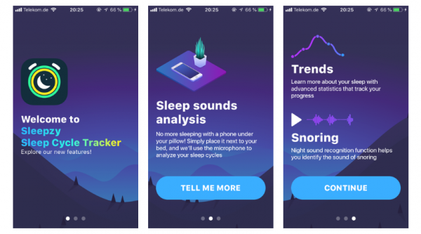

On closer inspection, it can be seen that there is benefit-oriented onboarding too.
The app describes the function of “sleep sound analysis”.
Strategy to use for these users: function- or benefit-oriented onboarding.
How to design it: Play around with swiping, moving elements or even with some fancy features during your onboarding process.
Just don’t overdo it, stay focused!
Educational words give users a more detailed explanation of the benefits they can expect.
Why Care About Target Groups During Onboarding?
Designing your onboarding process is essential for the success of your mobile app.
It’s is the first thing the users get in touch with.
The most important seconds are the first ones, in which you present yourself to your users.
If you deter them or don’t fulfill their expectations, you’ve lost them as users.
That concludes the article. Which target group does your app have?
And how do you take this knowledge into consideration for your onboarding?
To find out exactly how your users behave during your onboarding, start a free trial with UXCam!
FAQ
What’s an onboarding flow?
An onboarding flow is a series of steps that make new users familiar with an application.
What’s the best way of onboarding new users?
Although each application requires a unique approach, the aha moment should always be in the center of your onboarding flow. The aha moment is when the user experiences the value of your app for the first time.
What’s the breadcrumb technique?
The breadcrumb technique is a conversion optimization tactic that you can use to keep users engaged during your onboarding. It starts with small requests that get users into the habit of saying “yes”, and saves the hard questions, e.g. giving up personal information, for the end of the flow.
Related Articles:
10 apps with the best user onboarding flow
How does LinkedIn onboard its new users?
How Evernote designs its Onboarding Process
How to Monitor Your Mobile App Onboarding
How to make your mobile app onboarding even better
AUTHOR
Annemarie Bufe
Product Analytics Expert
Passionate hobby dancer. Working at UXCam.

Related articles
Curated List
7 Best AB Testing Tools for Mobile Apps
Learn with examples how qualitative tools like funnel analysis, heat maps, and session replays complement quantitative...

Jane Leung
Product Analytics Expert
UX design
12 UX Metrics to Measure and Enhance User Experience
Unlock product success by tracking the right UX metrics. Learn 12 essential metrics, how to measure them, avoid common pitfalls, and take action with tools like...
UX design
10 Top UX Design Best Practices & How to Implement Them
Discover 10 proven UX design best practices to improve usability, boost retention, and create user-centric products. Actionable tips for product...

Tope Longe
Product Analytics Expert

