

TABLE OF CONTENTS
- Key takeaways
- What is a customer experience dashboard?
- Five customer experience dashboard examples
- Why a customer experience dashboard matters
- 13 Patterns for Useful CX Dashboards
- Industry-specific considerations
- CX dashboard tools by category
- How to Build a CX Dashboard in 7 Steps
- CX dashboard maturity model
- 10 Common CX Dashboard Mistakes
- CX dashboards for mobile app teams
A customer experience dashboard is only useful if it changes what your team does on Monday morning. I've reviewed hundreds of CX setups across the 37,000+ products running UXCam, and the pattern I see most often is the same: teams stack every available metric into a single view, then wonder why nobody opens it. The dashboards that actually move retention and CSAT are narrower, noisier about friction, and tied to a specific decision.
This article walks through what a customer experience dashboard should contain, five real-world examples by team type, a seven-step process for building one your PMs, researchers, and support leads will actually use, plus a listicle of patterns I see separate the dashboards that ship fixes from the dashboards that collect dust.
Key takeaways
A customer experience dashboard centralizes CX signals (behavioral, operational, and voice-of-customer) into one view that triggers a decision, not just a report.
The best dashboards pair quantitative metrics like rage taps, drop-offs, and retention curves with qualitative context from session replay and heatmaps.
Different teams need different dashboards: support teams track ticket volume and CSAT, product teams track funnel conversion and friction, research teams track journey completion.
Tara AI in UXCam automatically surfaces the sessions, screens, and cohorts that need attention, so you spend less time hunting in dashboards and more time shipping fixes.
Customer outcomes prove the ROI: Recora cut support tickets by 142%, Inspire Fitness boosted time-in-app by 460%, and Housing.com doubled feature adoption from 20% to 40%.
What is a customer experience dashboard?
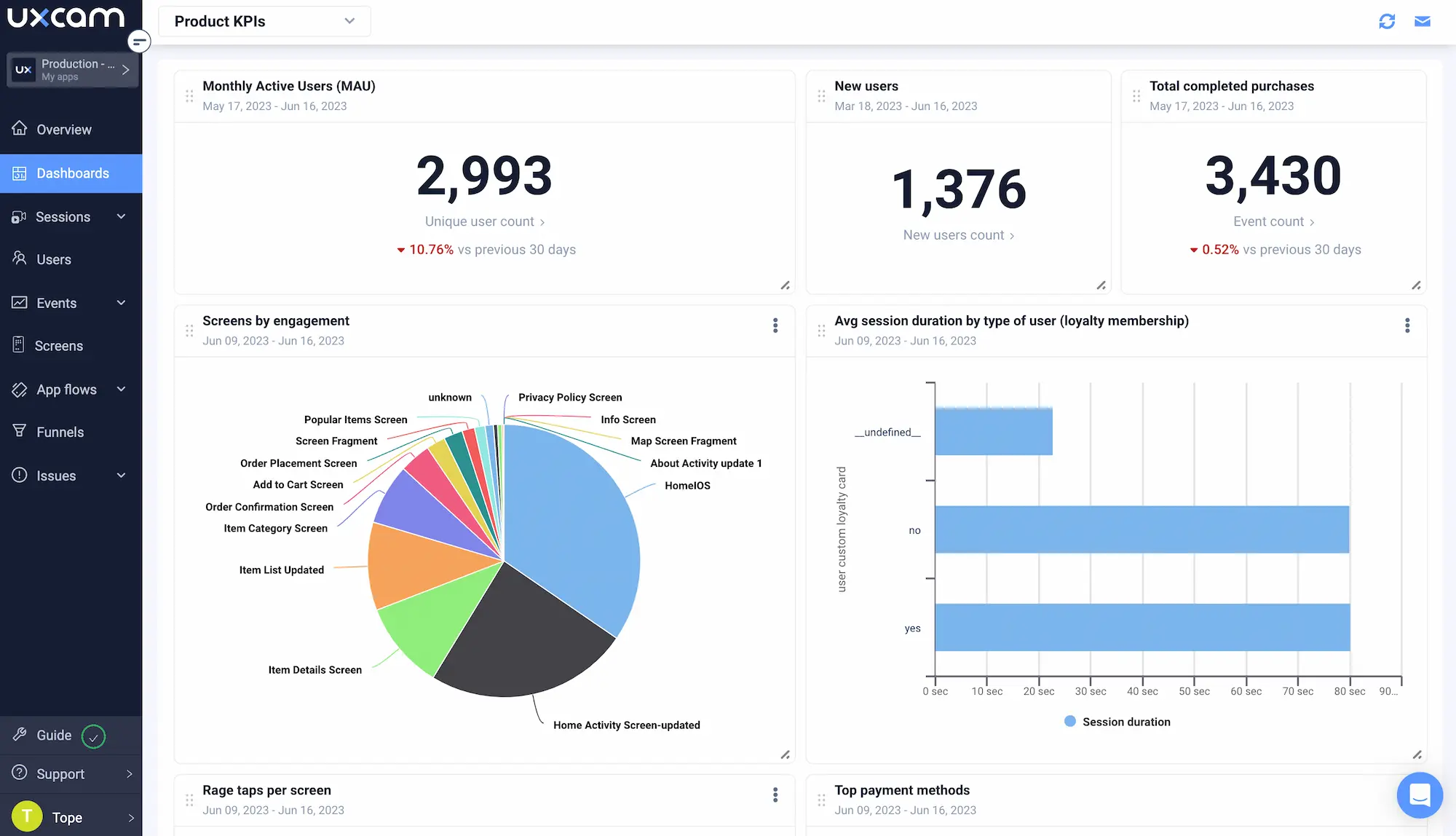
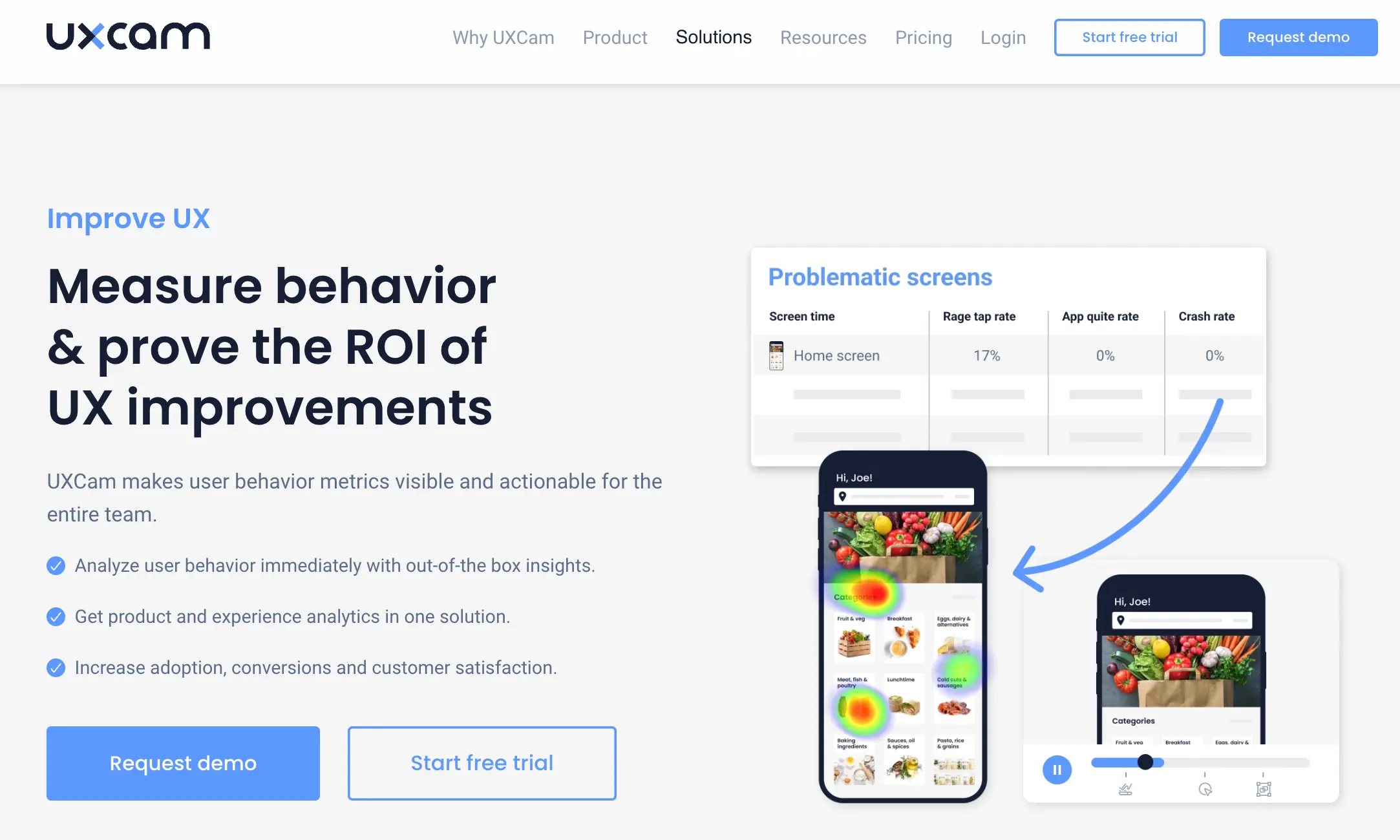
A customer experience dashboard is a single visual workspace that consolidates the behavioral, operational, and sentiment metrics describing how customers experience your product or service. It is built to help teams spot friction, measure satisfaction, and prioritize fixes, rather than to produce reports for their own sake.
The dashboard pulls from multiple sources: product analytics (events, funnels, retention), experience analytics (session replay, heatmaps, rage taps, UI freezes), support systems (ticket volume, CSAT, response time), and voice-of-customer tools (NPS, in-app surveys). The best ones do not try to show everything. They surface the two or three views that answer the question: "where is experience breaking down, and for whom?"
In UXCam, the CX dashboard lives alongside issue analytics and funnel analytics, so when a metric moves you can click through to the actual user sessions behind the number. That closed loop between signal and root cause is what separates a dashboard from a wallpaper.


Five customer experience dashboard examples
Different teams need different dashboards. Below are the five I see work best in practice, each mapped to the role that owns it.
1. Real-time customer support dashboard
Owned by support leads. Tracks open tickets, average handle time, first-response SLA, CSAT on closed tickets, and ticket-per-active-user ratios. The valuable addition most teams miss: pairing ticket spikes with in-product behavior. When Recora connected support tickets to session replays, they spotted a press-and-hold interaction that users were never completing. Fixing that single confusion drove a 142% reduction in support tickets. The dashboard has to link tickets to sessions, not just count them.
2. Live chat dashboard
Used by CX and sales teams to monitor active chats, queue length, visitor intent, and agent response time. The upgrade I recommend: overlay chat volume with the specific screens users were on when they initiated the conversation. Nine times out of ten, the busiest chat topics map to the buggiest screens. If you pipe Intercom or Zendesk events into the same dashboard where your session replays live, you stop treating chat as an isolated channel and start treating it as an early-warning signal for product friction.
3. Survey and voice-of-customer dashboard
Tracks NPS, CSAT, CES trends over time, response rates, and open-text sentiment. What makes this dashboard useful rather than decorative is segmenting survey results by user behavior: NPS from power users versus churned users tells a radically different story than a single blended score. Tie the sentiment back to the cohort's session replays and you get the "why" behind the number. Tools like Delighted and Qualtrics handle the collection side well, but the value lands when survey scores are overlaid with behavioral cohorts in your CX dashboard.
4. Core app health dashboard
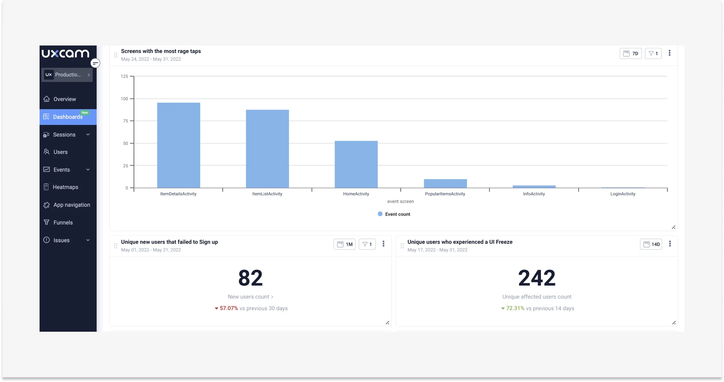
Covers crashes, ANRs, UI freezes, cold-start latency, rage taps, and dead taps. This is the dashboard engineering and product share, and it's where most CX problems actually get diagnosed. UXCam's issue analytics automatically flags rage taps and freezes per screen, so the dashboard shows you which flows are broken before support starts getting tickets about them.
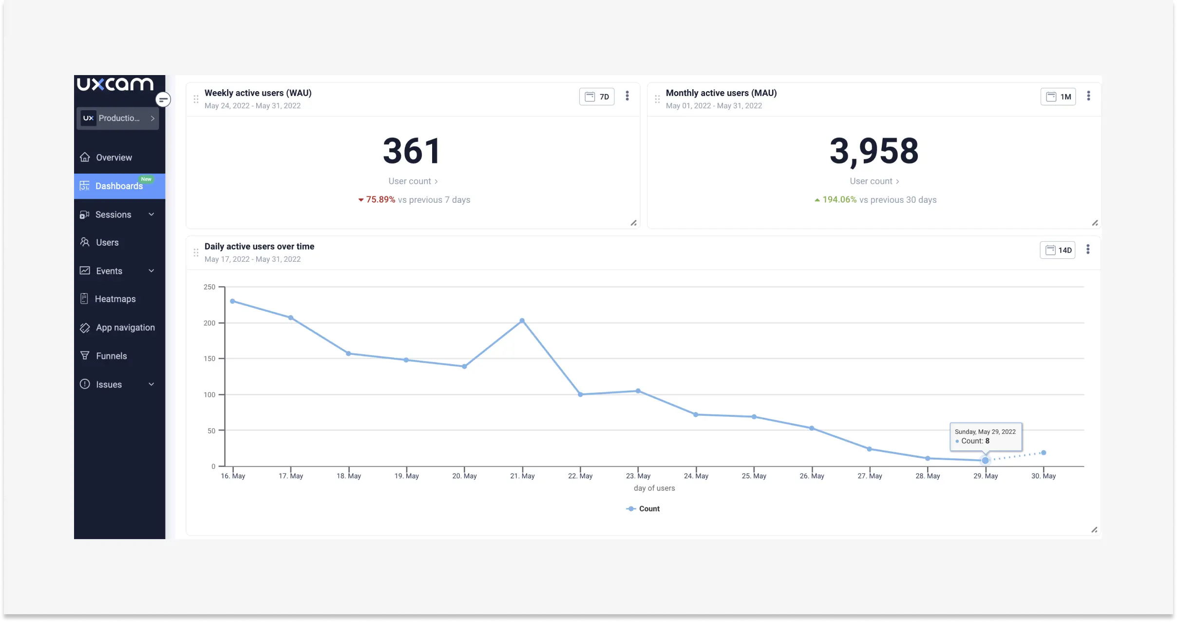
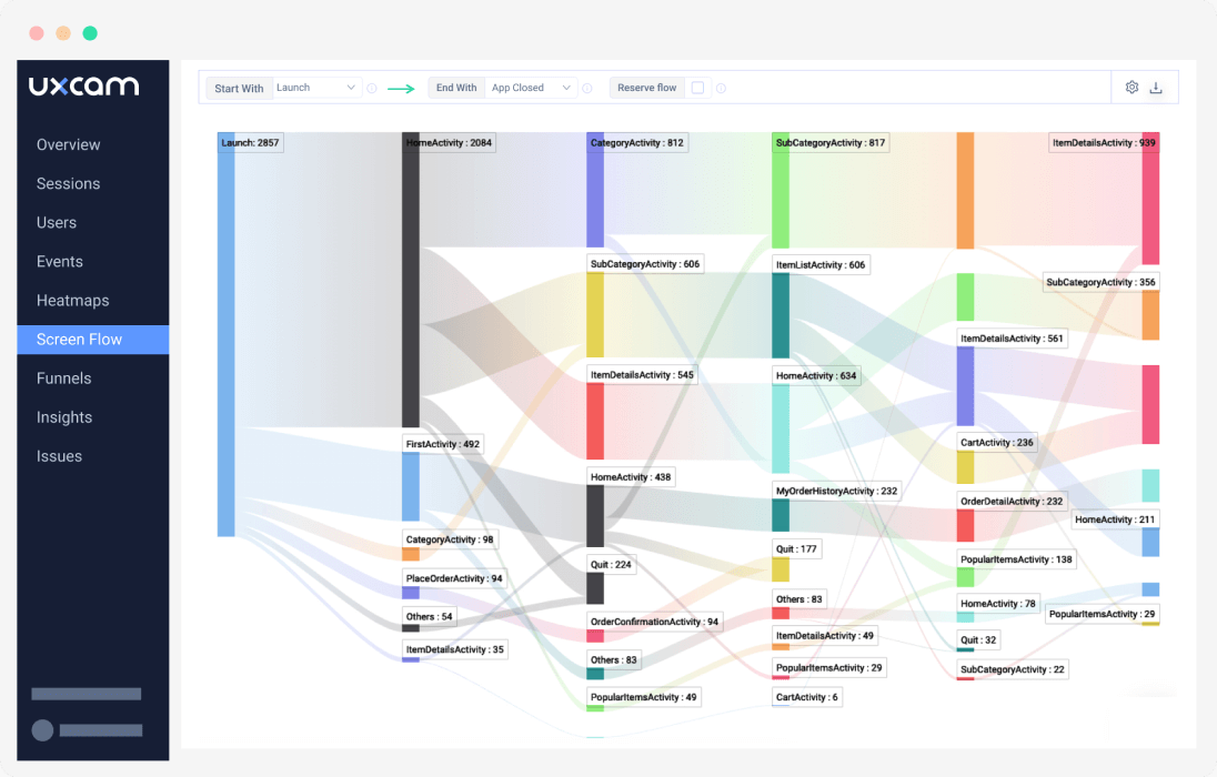
5. Customer engagement and journey dashboard
The dashboard product managers live in. Tracks funnel conversion at each step, retention curves by cohort, feature adoption, and session frequency. Inspire Fitness used UXCam to identify friction in their activation flow and boosted time-in-app by 460% while cutting rage taps 56%. Their dashboard surfaced drop-off screens, and session replays showed exactly why users were abandoning.


Why a customer experience dashboard matters
The honest answer: because your team has more data than attention. A good CX dashboard is a forcing function. It pushes three outcomes:
It surfaces opportunities you would otherwise miss. Most friction lives in the screens between your marquee flows. A dashboard that tracks rage taps per screen, not just per app, exposes where users are silently rage-quitting instead of complaining. Research from Qualtrics XM Institute has consistently shown that customers who have a bad experience rarely complain; they leave. Your dashboard is the only place that absence becomes visible.
It creates a shared language across functions. When support, product, and research are all looking at the same funnel-plus-friction view, arguments shift from "I think users hate this screen" to "36% of Android users drop at step three, here's the session replay." That clarity compresses decision cycles.
It turns reporting into action. A dashboard that auto-generates trend reports against your KPIs lets you ship weekly fixes instead of quarterly postmortems. Housing.com used this approach to grow feature adoption from 20% to 40%.


13 Patterns for Useful CX Dashboards
Every dashboard I audit falls somewhere on a spectrum from "driving weekly product decisions" to "linked once in a Notion doc and never reopened." These are the patterns that push dashboards toward the useful end.
1. Start every tile with a question, not a metric
Before you add a widget, write the question it answers. "What is our NPS" is not a question, it's a lookup. "Which onboarding cohort has NPS below 20 and what screens did they see last" is a question. If a tile doesn't map to a question a teammate actually asks on Slack, cut it.
2. Put friction above engagement in visual hierarchy
Engagement tiles (DAU, sessions) are comfortable to look at. Friction tiles (rage taps, crash rate, drop-off) are the ones that cause action. Put friction at the top. Nielsen Norman Group's research on dashboard design consistently finds that the top-left quadrant gets 60%+ of attention, so give it to the metric that should ruin your Monday, not the one that validates your quarter.
3. Show the delta, not the absolute number
"127,432 sessions this week" tells you nothing. "Sessions up 4.2% vs. last week, rage taps up 31%" tells you where to look. Every tile should show change against a rolling baseline, not a static count.
4. Segment by app version from day one
Releases break things. A dashboard that doesn't let you split by app version hides the single most common cause of metric regressions. I filter every retention and crash chart by version by default, then pin the two most recent releases side by side.
5. Link every tile to raw evidence
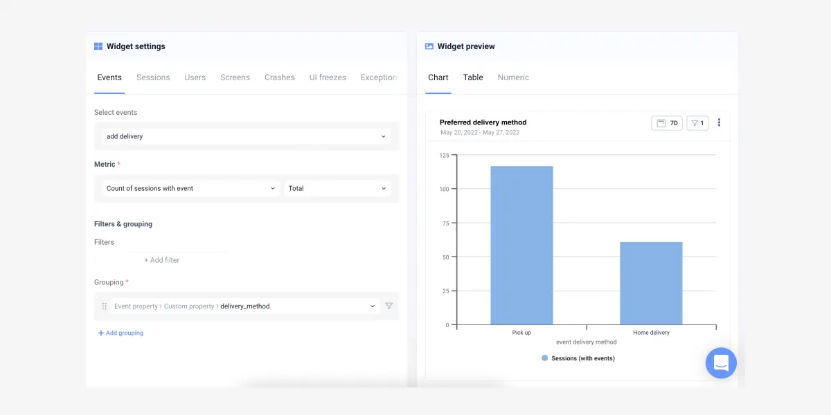
A conversion drop tile should link to the session replays of users who dropped. A rage-tap tile should link to the screens where the rage taps occurred. If clicking a number doesn't take you to evidence, the dashboard is a report, not a tool. This is the core reason I built our CX dashboards around UXCam session replay.
6. Name cohorts like humans, not like SQL queries
"cohort_fy24q3_andr_v2" is unreadable. "Android users who completed onboarding in July" is the same cohort, usable by anyone in a standup. Small thing, huge adoption difference.
7. Annotate releases on the timeline
Every chart should show vertical markers for shipped releases, feature flags toggled on, and pricing changes. Without annotation, correlation is impossible and debates get philosophical. Tools like LaunchDarkly and Statsig can push flag events directly into your dashboard timeline.
8. Watch the ratio, not the raw count
Ticket count grows with users. Tickets-per-1,000-active-users is a health metric. Sessions per user beats total sessions. Ratios normalize growth out of the signal so you see actual experience changes, not just MAU drift.
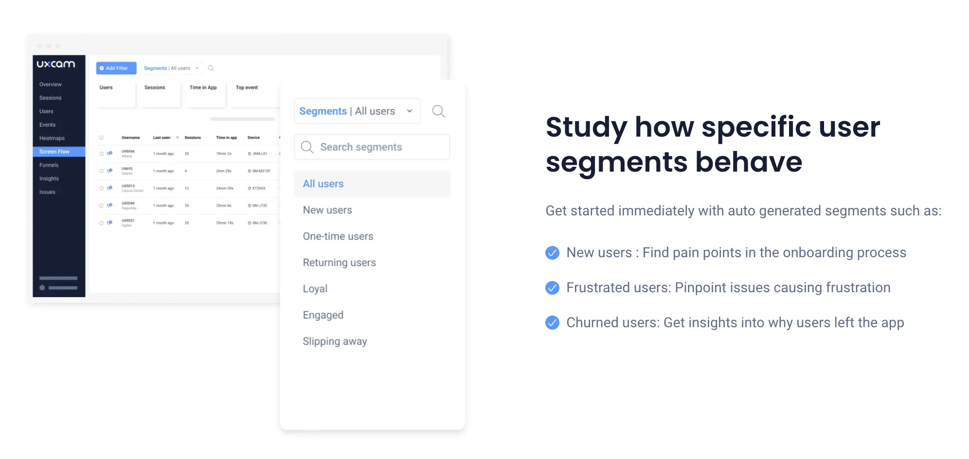
9. Segment sentiment by behavior, not the other way round
NPS from users who activated looks nothing like NPS from users who bounced. Filter sentiment through behavioral cohorts, and you'll stop averaging happy users and angry users into a meaningless middle.
10. Kill vanity tiles quarterly
Every quarter, log who opened each tile. Anything with fewer than three opens gets archived. Dashboards rot, and the cost of rot is attention. A study by ThoughtSpot found analysts spend most of their dashboard time rebuilding views that nobody uses. Prune aggressively.
11. Show percentile, not average, for anything time-based
Average session length lies. Average response time lies worse. Show p50, p90, and p99. The long tail is where the CX problems live, because a p99 of 18 seconds on a checkout screen is where users abandon.
12. Pair every quantitative tile with one qualitative artifact
Next to the funnel chart, embed three session replays of users who dropped. Next to the rage-tap tile, link the heatmap. A dashboard that only shows numbers forces every reader to do the translation work themselves, and most will skip it.
13. Build a "what changed this week" view
A dedicated tab that answers "what moved more than 10% vs. last week" beats every other dashboard in my rotation. Tara AI does this automatically in UXCam by scanning behavioral trends, flagging anomalies, and surfacing the sessions to watch, but even a manual version shipped weekly compounds fast.
Industry-specific considerations
CX dashboards differ across verticals because the events that matter differ. A fintech rage tap on a transfer screen is not the same as a retail rage tap on a product card.
Fintech and banking
Regulatory constraints change what you can capture. Screen masking on PII fields is non-negotiable, and sessions containing card numbers or balances need client-side redaction. The dashboard focus shifts toward trust signals: failed-transaction rate, biometric-auth drop-off, KYC funnel completion. UXCam's privacy controls were built with PCI and GDPR in mind for exactly this reason. Benchmarks from Forrester's banking CX research suggest a 1% improvement in mobile banking CX correlates with measurable revenue lift per customer, which makes the friction tile the single most valuable widget on a fintech dashboard.
Retail and e-commerce
Funnel conversion dominates. The dashboard needs to segment by traffic source, device, and cart value, and the checkout flow should be split into every sub-step (address, payment, review, confirm). Cart-abandonment-by-screen is the core tile. Layer in Baymard Institute's checkout benchmarks to compare your drop-off rates against the industry 69% average cart abandonment baseline.
Healthcare and telehealth
Session length is a trap metric. A longer appointment-booking flow is not better CX if users are confused. Focus on task success (did they book), error rate on clinical intake forms, and accessibility metrics (screen reader compatibility, tap target size). HIPAA compliance reshapes what data can live in the dashboard at all, so partner with a platform that offers BAAs and on-premise data residency.
Travel and hospitality
Journey spans weeks, not minutes. The dashboard has to handle long-duration cohorts: searched-but-did-not-book, booked-but-cancelled, booked-completed-returned. Time-to-book and rebooking rate matter more than session length. Calendar-picker friction is the single most underdiagnosed UX problem I see in this vertical.
SaaS and B2B products
Activation and expansion dominate. Tile one should be time-to-first-value, segmented by plan tier. Seat-adoption velocity within accounts beats individual user MAU because churn is account-level. Pair this with product-led growth benchmarks from OpenView to sanity-check activation targets.
Media and streaming
Playback quality and content discovery dominate. Rebuffer rate, time-to-first-frame, and search abandonment are the health tiles. Engagement depth (episodes per session, completion rate) beats raw session count because a 45-minute session ending in a completed episode is a success; the same length ending in rage-tapping the pause button is not.
CX dashboard tools by category
The stack usually spans four categories. Pick one primary in each, and make sure they share IDs so cohorts flow across tools.
Product and experience analytics. UXCam for mobile apps and the web, combining auto-capture, session replay, heatmaps, and issue analytics. Amplitude and Mixpanel cover event analytics but require separate tools for qualitative signal.
Voice of customer. Delighted, Qualtrics, and SurveyMonkey handle NPS/CSAT collection. For in-app surveys tied to user behavior, Sprig and UserLeap work well.
Support operations. Zendesk, Intercom, and Freshdesk are the common choices. What matters is piping ticket events into your product analytics tool so a ticket spike is overlaid with session data.
Business intelligence and visualization. Looker, Tableau, and Metabase handle custom composite views when you need to blend warehouse data with product signals. For most mobile teams, the in-platform dashboard in UXCam removes the need for a BI layer entirely.
Observability and app health. Sentry, Firebase Crashlytics, and Instabug cover crash and performance data. Feed crash events into your CX dashboard so engineering and product look at the same health score.
How to Build a CX Dashboard in 7 Steps
Step 1. Decide the decision the dashboard has to support
Before you pick a metric, decide what action the dashboard should drive. "Reduce drop-off in onboarding" is a decision. "Improve the customer experience" is not. Every widget should map to a question you can answer: which screen, which cohort, which version.
Step 2. Pick the metrics that match that decision
For mobile product teams, the core set I recommend covers five categories:
Engagement: average session length, sessions per user, retention by cohort
Conversion: funnel completion per step, time-to-value
Friction: rage taps, dead taps, UI freezes, ANR rate
Sentiment: NPS, CSAT, in-app survey scores
Support: ticket volume, tickets per 1,000 sessions
Avoid the trap of tracking every mobile app KPI you can name. A dashboard with 40 tiles is a dashboard nobody opens.


Step 3. Choose an experience analytics tool that connects quantitative and qualitative data
A dashboard that shows a drop-off without letting you watch what happened during the drop-off is half a tool. Look for a platform that ties metrics to session replays, heatmaps, and issue analytics in the same interface. UXCam covers both mobile apps and the web, auto-captures every tap and screen, and pairs the numeric dashboard with the raw behavioral evidence behind it. If you're evaluating options, our customer analytics tools guide walks through the trade-offs.


Step 4. Set up the dashboard with non-technical users in mind
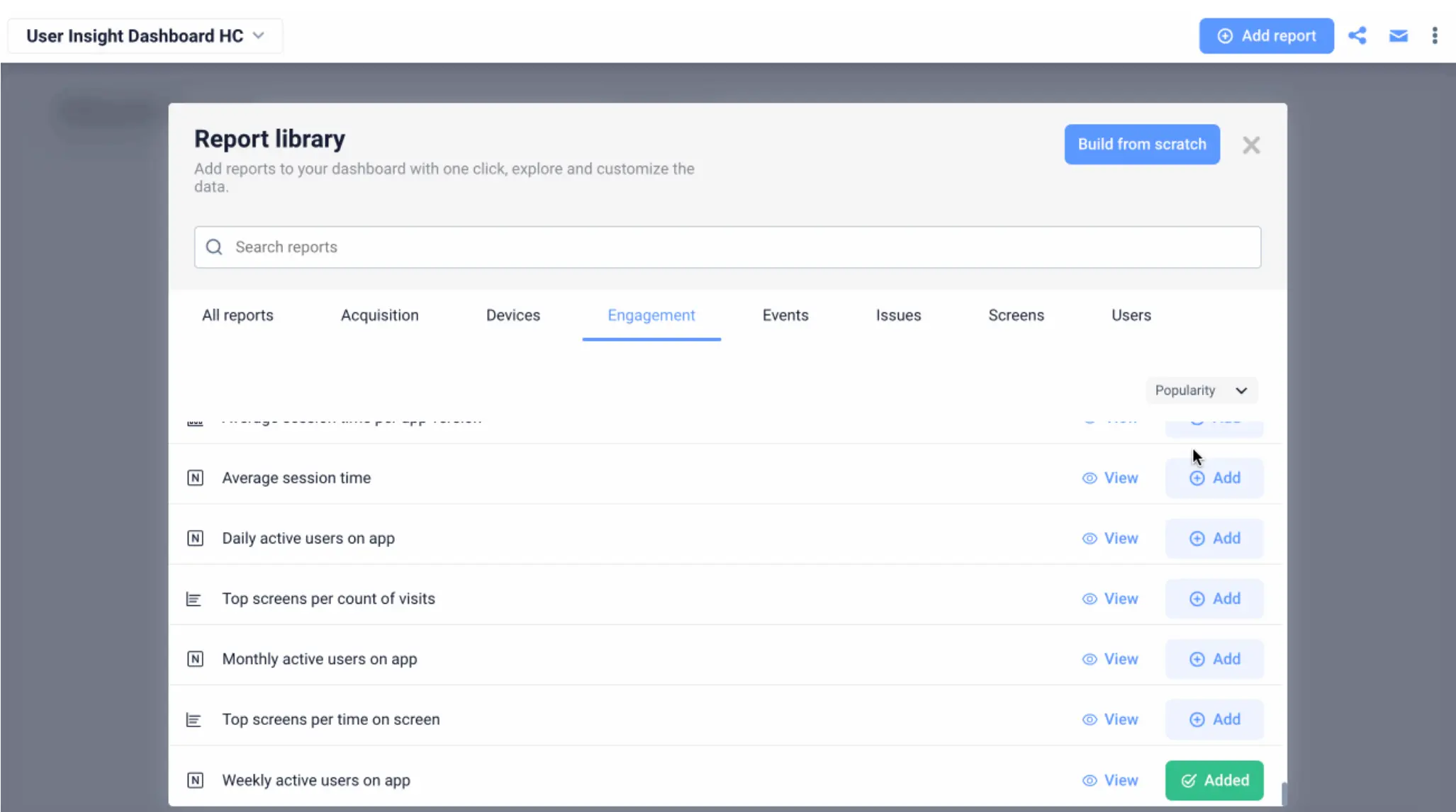
If your product marketer or support lead can't read the dashboard, it's not a dashboard, it's a data engineer's notebook. UXCam's customizable dashboard ships with templates and drag-in widgets so anyone on the team can build a view. Cloud-based access means remote researchers and overseas support leads see the same real-time data as your HQ product team.


Step 5. Monitor with a weekly rhythm
A CX dashboard only pays off if someone actually looks at it on a cadence. I recommend a 15-minute weekly review where the product team scans the top-three tiles (retention curve, rage-tap screens, funnel delta) and flags anything that moved more than 5%. This is where Tara AI, UXCam's AI analyst, saves the most time: it reads through session data and tells you what changed and which sessions to watch, so you don't have to hunt.
Step 6. Analyze, then segment
Aggregate numbers hide everything interesting. The moment a metric moves, segment by platform, app version, country, and cohort. Ask:
Which cohort is driving the change?
Which stage of the customer journey is the weakest?
How do power-user sessions differ from churned-user sessions on the same screen?


Step 7. Ship a fix, then measure it
A dashboard's last job is to close the loop. When you ship a fix, mark the release on the dashboard timeline and watch the metric. Costa Coffee raised registrations by 15% by running this loop: watch session replay, find the friction, fix, measure. The dashboard is the scoreboard, session replay is the game tape.


CX dashboard maturity model
Most teams I work with sit at level 2 and think they're at level 4. Use this as an honest audit.
Level 1: Ad hoc. Metrics live in spreadsheets, pulled manually from different tools. Reviews happen when something goes wrong. No shared definition of CX health.
Level 2: Reporting. A single dashboard exists, usually in a BI tool, reviewed monthly. Metrics are mostly engagement and business outcomes; friction data is missing or siloed. Decisions still require pulling from multiple tools.
Level 3: Operational. Weekly rhythm is in place. Dashboard includes friction and sentiment alongside engagement. Team can segment by version and cohort. Releases are annotated. Session replay is linked but not systematically used.
Level 4: Decision-driving. Every tile maps to a question and a decision. Friction is in the top-left, evidence is one click away. Support, product, and research share the view. Anomalies trigger alerts, not just observations. Fixes are measured against tagged releases within 7 and 14 days.
Level 5: AI-augmented. The dashboard is the starting point, not the endpoint. An AI layer like Tara scans sessions and cohorts continuously, surfaces anomalies proactively, and recommends which sessions to watch next. Team time shifts from hunting to shipping.
The jump from 3 to 4 is where most of the ROI lives. Going from 4 to 5 compounds the speed.
10 Common CX Dashboard Mistakes
1. Building the dashboard before defining the decision. Tools are cheap, attention is not. Without a decision, you get a pretty wall of charts nobody acts on.
2. Tracking too many metrics. Eight to twelve tiles on the primary view. Everything else belongs on secondary tabs or gets cut.
3. Averaging power users and new users together. Blended NPS is the most misleading metric in CX. Segment by lifecycle stage or don't measure it.
4. Ignoring friction metrics. Most dashboards show conversion and retention but miss rage taps, UI freezes, and dead taps. Friction is the leading indicator; retention is the lagging one.
5. No link from metric to evidence. If a reader can't click a conversion-drop tile and see the sessions behind it, they won't investigate. The dashboard becomes a status report.
6. Failing to annotate releases. Without release markers, every metric movement turns into a debate. Tag every ship.
7. Treating sentiment and behavior as separate dashboards. NPS without session context is an opinion poll. Session data without sentiment is a guess at meaning. Combine them.
8. No ownership. A dashboard with no owner rots. Assign a DRI per dashboard, not per team.
9. Skipping mobile-specific signals. For apps, rage taps, ANRs, cold-start time, and screen-load latency matter more than web-inherited metrics like bounce rate. Use tools built for the medium.
10. Forgetting to kill tiles. Dashboards accrete. Audit quarterly and delete anything with under three views per month. Pruning is a feature, not a failure.
CX dashboards for mobile app teams
Mobile is where customer experience dashboards have to do the most work, because the signals are noisier and users are less forgiving. A rage tap on a mobile checkout button loses you a sale in about eight seconds. The right dashboard surfaces that rage-tap cluster the same day it happens, links you to the replay, and lets the fix ship before the next app-store review cycle.
UXCam's dashboards for mobile apps and the web combine auto-capture analytics, session replay, heatmaps, and issue analytics in one view, with Tara AI highlighting what matters. If you want to build your first CX dashboard without spending a sprint on instrumentation, start a free UXCam trial and import the CX dashboard template.
Frequently asked questions
What is the difference between a customer experience dashboard and a customer service dashboard?
A customer service dashboard focuses on post-purchase support operations: ticket volume, handle time, SLA adherence, agent performance, and CSAT on resolved tickets. A customer experience dashboard is broader. It covers the entire lifecycle, from first-session onboarding through retention and advocacy, and blends behavioral analytics (what users do in the product) with operational support metrics and voice-of-customer signals. Think of the service dashboard as a subset of the CX dashboard, focused on one channel rather than the whole journey.
Which metrics are most important on a customer experience dashboard?
The mix depends on your product, but almost every effective CX dashboard includes four layers: engagement metrics (session length, retention, feature adoption), conversion metrics (funnel completion, activation rate), friction metrics (rage taps, UI freezes, crash rate), and sentiment metrics (NPS, CSAT, in-app survey scores). Support metrics like tickets-per-active-user tie the loop. I recommend no more than 8-12 tiles on a single view. Anything more and the dashboard becomes a place people visit to feel informed rather than to make decisions.
How is a customer experience dashboard different from a product analytics dashboard?
A product analytics dashboard typically focuses on usage and business outcomes: DAU, MAU, feature adoption, funnel conversion, and revenue metrics. A customer experience dashboard layers in the qualitative and experiential signals on top: rage taps, UI freezes, session replays, support tickets, and sentiment scores. In practice, the two overlap heavily, and platforms like UXCam combine them into one workspace so you can move from a drop-off metric to the actual user session in one click.
How often should we review our customer experience dashboard?
Set a weekly 15-minute scan for the product team and a monthly deeper review with support and research included. Daily monitoring only makes sense for high-traffic consumer apps where a release can tank a metric in hours. The weekly rhythm catches trend changes early without burning team attention. When a fix ships, tag the release on the dashboard and revisit the affected metric 7 and 14 days later to confirm the change stuck.
Can Tara AI help us work with our CX dashboard?
Yes. Tara AI is UXCam's AI analyst, and its job is to read through session data, behavioral trends, and dashboard signals so you don't have to. Instead of staring at tiles looking for anomalies, Tara surfaces the screens where users are struggling most, groups similar friction events, and recommends next actions (which sessions to watch, which cohorts to investigate). Teams using Tara cut their time-to-insight by skipping the manual hunt through dashboards and jumping straight to the decision.
How do I start building a customer experience dashboard from scratch?
Start with the decision you need to support, not with the tool. Write down the single question the dashboard has to answer every week (example: "Where are new users dropping out of activation?"). Pick 6-10 metrics across engagement, conversion, friction, and sentiment that answer it. Instrument them with a platform that pairs metrics to replays and heatmaps. Ship v1 in a week, review for a month, then prune anything nobody uses. Iteration beats perfection: the dashboard that gets opened is the dashboard that works.
Who should own the customer experience dashboard?
One named person, usually a senior PM or CX lead. Shared ownership is no ownership. The DRI is responsible for the weekly review, pruning tiles, annotating releases, and making sure evidence links still work. Cross-functional input is welcome, but one person owns the quality of the view.
How do I handle data privacy in a CX dashboard, especially for mobile?
Capture only what you need, mask PII by default, and use a platform with explicit privacy controls. UXCam supports screen masking, sensitive-field redaction, and regional data residency. For regulated industries, confirm your vendor offers a BAA (healthcare) or PCI-compliant capture (fintech) before piping events into a dashboard. Never log raw card numbers, health data, or credentials, even if your dashboard is internal.
What's a realistic timeline to build and adopt a CX dashboard?
Week 1: define the decision and the 8-12 metrics. Week 2: instrument and ship v1 with templates. Weeks 3-6: weekly reviews and prune. Month 2-3: add segmentation, release annotations, and evidence links. By month 4 the dashboard should be the default starting point for any CX conversation. Teams that try to build the perfect dashboard in month one usually ship nothing.
Should I build custom or use an out-of-the-box template?
Start with a template. Every platform worth using ships CX dashboard templates that cover 80% of the needed metrics. Customize only after a month of use, when you know which tiles get opened and which don't. Custom-first builds tend to over-engineer and under-adopt.
How do I prove ROI on a CX dashboard to leadership?
Tie dashboard-driven fixes to business outcomes and log them. Recora's 142% support ticket reduction, Inspire Fitness's 460% time-in-app gain, Housing.com's doubling of feature adoption from 20% to 40%, and Costa Coffee's 15% registration lift all came from dashboard-to-replay-to-fix loops. Keep a running log of "insight surfaced, fix shipped, metric moved" over a quarter. That document is the ROI case.
Can a CX dashboard work for both mobile apps and the web?
Yes, and it should. Users move across web and mobile, and a dashboard that only covers one surface hides half the journey. UXCam captures both, so a single CX dashboard can show web-to-app conversion, cross-platform retention, and friction on both surfaces. If your stack splits mobile and web into separate tools, invest in a shared user ID so cohorts can be stitched across surfaces.
What's the biggest predictor of whether a CX dashboard gets used?
Whether it answers a question someone is going to be asked on Monday. Dashboards that map to a recurring question (weekly retention review, monthly NPS readout, sprint-planning friction scan) get opened. Dashboards built because "we should track this" don't. Attach every dashboard to a ritual, and adoption takes care of itself.
AUTHOR
Silvanus Alt, PhD
Founder & CEO | UXCam
Silvanus Alt, PhD, is the Co-Founder & CEO of UXCam and a expert in AI-powered product intelligence. Trained at the Max Planck Institute for the Physics of Complex Systems, he built Tara, the AI Product Analyst that not only analyzes user behavior but recommends clear next steps for better products.


TABLE OF CONTENTS
- Key takeaways
- What is a customer experience dashboard?
- Five customer experience dashboard examples
- Why a customer experience dashboard matters
- 13 Patterns for Useful CX Dashboards
- Industry-specific considerations
- CX dashboard tools by category
- How to Build a CX Dashboard in 7 Steps
- CX dashboard maturity model
- 10 Common CX Dashboard Mistakes
- CX dashboards for mobile app teams


Related articles


UX design
User Experience Optimization: 10 Steps to Improve UX in 2026
User experience optimization is the iterative process of removing friction, improving clarity, and raising the conversion and retention signals on a...
Silvanus Alt, PhD
Founder & CEO | UXCam


UX design
We Reviewed the Top 19 UX Tools for 2026
The 19 best UX tools for 2026, tested across research, wireframing, prototyping, flowcharts, and handoff. Honest pros, cons, and pricing from a...
Silvanus Alt, PhD
Founder & CEO | UXCam

UX design
Customer Experience Dashboard Examples and the Metrics That Actually Matter
A customer experience dashboard turns scattered signals into one view. See examples, the metrics that matter, and how to build one that drives...
Silvanus Alt, PhD
Founder & CEO | UXCam