How to Read a Heatmap: 5 Things You Have to Know
As a mobile product manager, it's essential to understand how users are interacting with your mobile app. One way to gain insights into user behavior is by using mobile heatmaps.
Heatmaps provide a visual representation of the touch activities of users by means of color in concentrated form, making it easier to identify patterns and areas for improvement.
In this blog post, we will discuss how to read a heatmap to extract insights to improve the user experience in mobile apps.
How to read a heatmap
There are traps that can falsify the heatmap analysis. We present a list of five things to consider when reading a heatmap.
Start with a clear goal for the heatmap Analysis
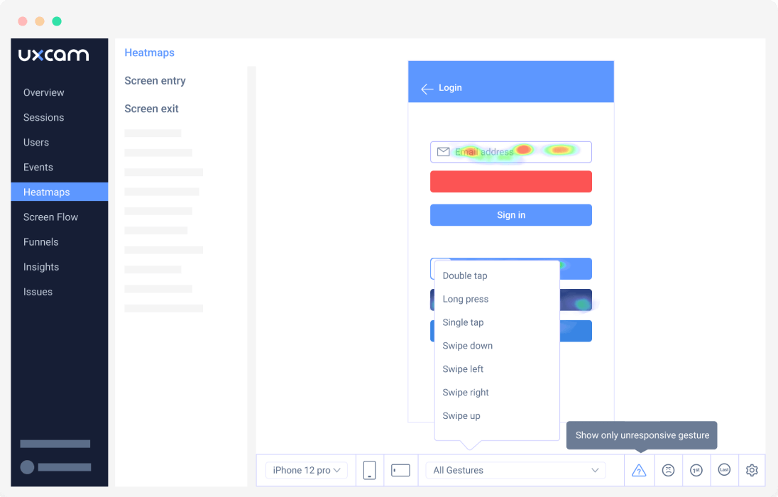

Don’t start to read heatmaps blindly.
Experienced analysts think about a goal they want to achieve with their touch heatmap analysis. This helps to approach the analysis more objectively and to work more systematically.
Overall, less time is wasted with an unnecessary and aimless analysis that comes to nothing or can even lead to misinterpretations.
This is, in spite of the brevity, one of the most important points to keep in mind before you start reading a heatmap.
Gather enough user behavior data
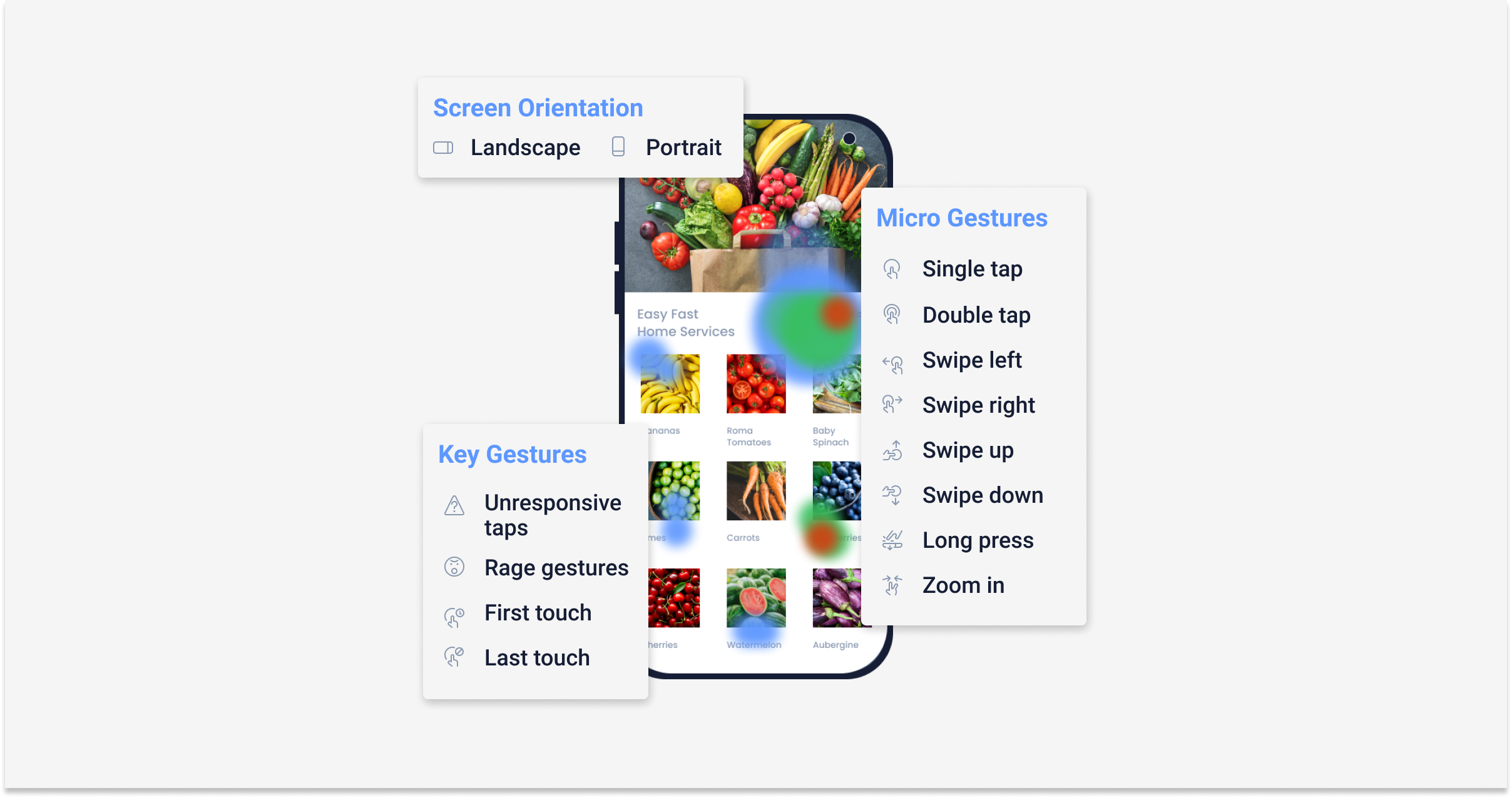

More data is always better to get a holistic overview of users. The amount of visitors you should wait for before you start your analysis depends on the traffic of your app.
However, experts say as a rule of thumb that at least 2000 users should have visited the respective screen in order to make a reliable statement about the usage behavior.
Otherwise, the analysis could be based on a few individual users that are not representative of all users. If features are adapted to these few users, the change might even be a disadvantage.
It’s better to wait a little longer than to have a poor database for your analysis.
Segment Data While Analysing

Each coin has two sides. When reading touch heatmaps, you are faced with even more options.
The ambiguity of the read of a heatmap leads to the fact that the simplest explanation might be the right one, but it can also be the opposite.
Since you weren’t sitting next to your users while they were using your app, you can never be sure what exactly caused their activity.
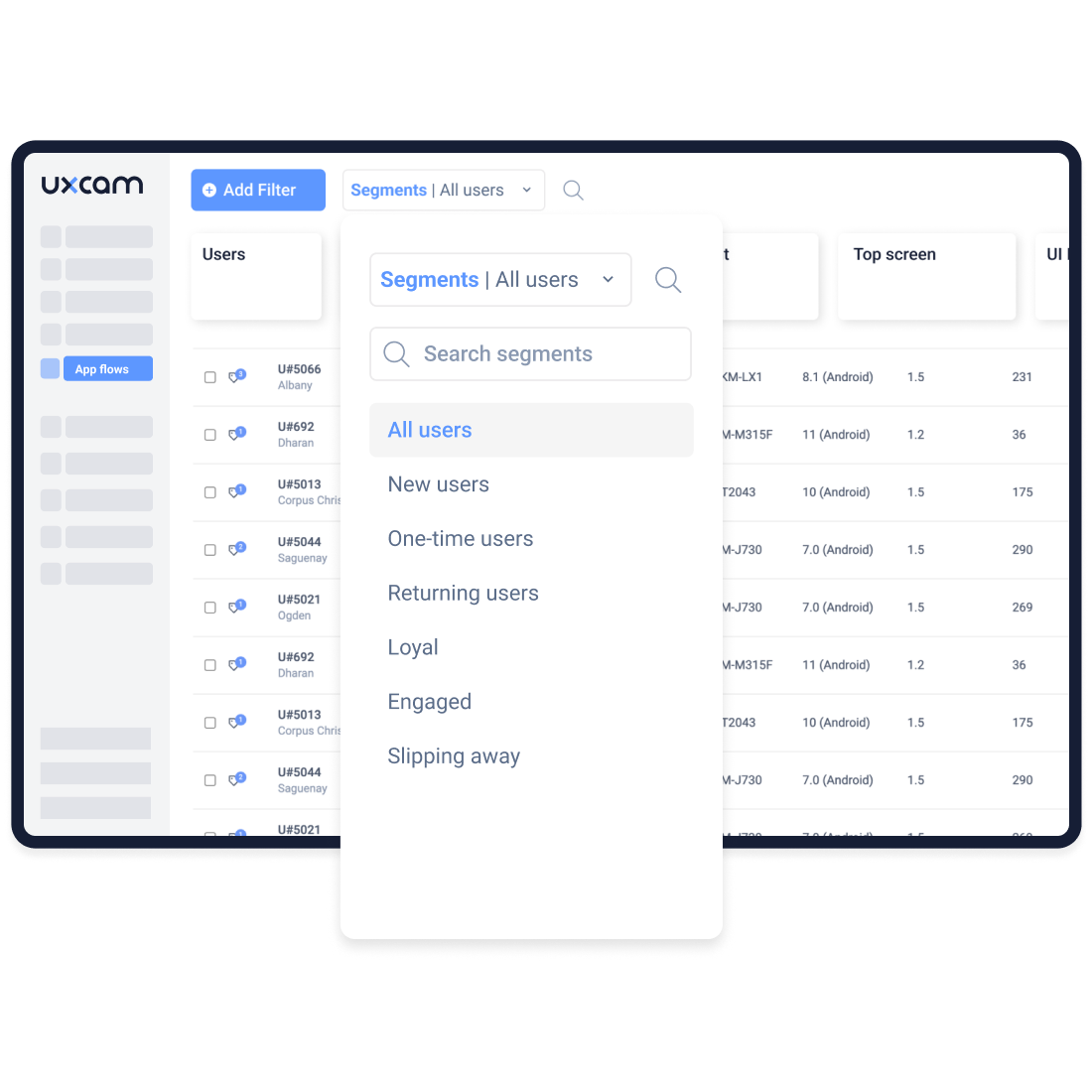
But this problem can also be mitigated a bit: Segment users and consider the circumstances of their use. Common distinctions are listed here:
First visitors of the app and returners / regular users
Whether the user session ended successfully or ended in a crash
The order of the touches (UXCam, for example, allows you to see only the first or last click)
The time of day when the app was used (e.g. day/night or weekday/weekend)
The amount of time a user has spent on the screen
See more practical filters that you can use to segment your users for a detailed heatmap analysis
This will give a deeper insight into the usage habits of your users, from which the next steps can be taken to improve your UX or mobile app.
Here, too, the effort of differentiation will pay off for everyone involved.
Use Tools That Complement Heatmaps
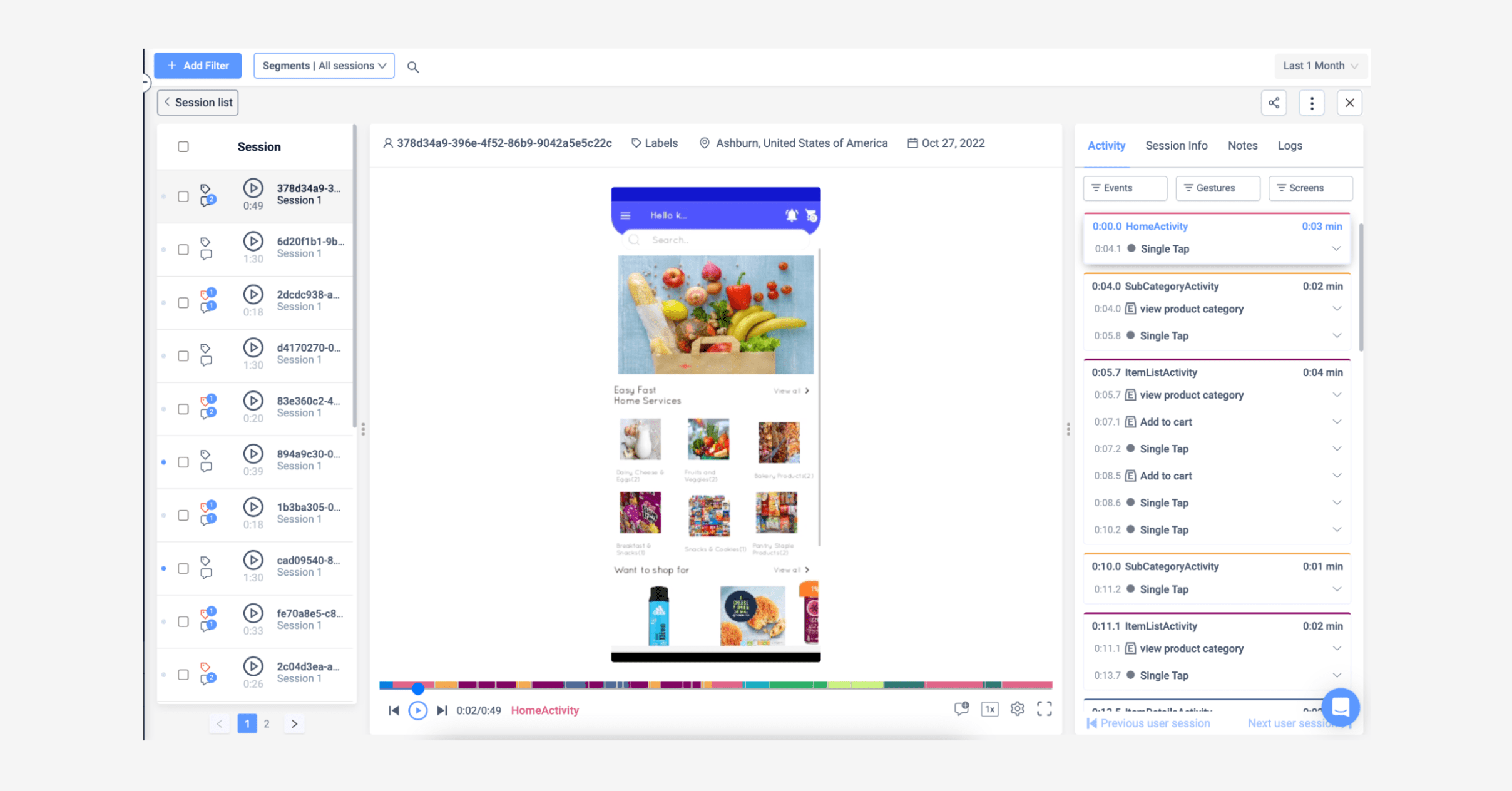

Sessions filter by UXCam
Heatmaps are just one of the many analysis tools.
Take advantage of this variety and add more tools to your analysis.
Weigh up what could bring you even more benefits in order to achieve the goal you set yourself in Point 1.
Session replays, for example, can provide additional input.
But also further statistics on the general use of your app (UXCam offers a variety of statistics on users and sessions) can be helpful here. No tool is perfect in itself, but a combination of different tools can come close.
Compare Results After Changes Were Made
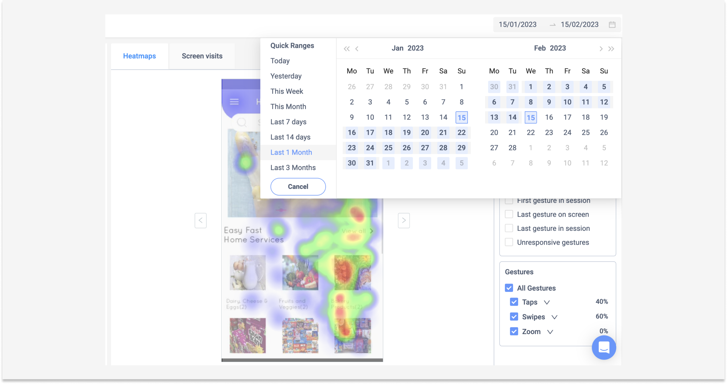

To find out if the changes you’ve made in your mobile app are doing what you had in mind, you can compare the heatmaps before and after your change.
This can be very informative and will help you to assess the value of your change. Change does not end after implementation. It has to be analyzed constantly and if necessary, improved further in order to achieve the most satisfactory overall result possible.
Improving the user experience with heatmaps
Now that you know how to read a heatmap, you can use this information to improve the user experience in your mobile app. Here are some ways heatmaps can help you make changes:
Optimize design and layout
By identifying patterns in user behavior, you can optimize your app's design and layout to make it more user-friendly. For example, if users are scrolling repeatedly in a certain area, you could move that content higher up on the screen to make it more visible.

Check out this case study of how Placemakers doubled in sales after using UXCam's heatmap and session replay to find the flaw in a new mobile app feature.
Remove or update confusing elements
Heatmaps can show where users are having trouble or getting confused, so you can remove or update those elements to make the app more intuitive. For example, if users are tapping repeatedly on an area that doesn't respond, you could add a button or a link to that area.
Test changes
After making changes based on heatmap insights, you can use A/B testing to see if the changes are effective. This way, you can make informed design decisions about which changes to implement permanently. How to read a heat map is a craft. With this list, you are well-prepared for your next analysis.
Try our mobile app heatmaps for free to get started with the analysis.
AUTHOR
Tope Longe
Product Analytics Expert
Ardent technophile exploring the world of mobile app product management at UXCam.

Related articles
App Analytics
Why Do My Apps Keep Crashing? A Complete Guide
Why do your apps keep crashing? A product analyst's guide to diagnosing crash causes, fixing memory leaks, and using session replay to find root...

Silvanus Alt, PhD
Founder & CEO | UXCam
App Analytics
Mobile App Tracking: Practical Guide and the 8 Best Tools for 2026
A practitioner's guide to mobile app tracking in 2026, covering how SDKs work, what to measure, and the 8 tools product teams actually...

Silvanus Alt, PhD
Founder & CEO | UXCam
App Analytics
App Versioning Best Practices: A Complete Guide (2026)
App versioning best practices for mobile teams in 2026. How to structure app version numbers (semantic versioning), track behavior across versions,...

Silvanus Alt, PhD
Founder & CEO | UXCam

