Website Heatmap - Ultimate Guide and Best Tools [2026]


Quick summary
This guide explains how website heatmaps work, the types you can use, and how to apply them for better UX and conversions. It also compares the best tools available, including UXCam, Hotjar, Crazy Egg, and others, to help you choose the right one for your goals.
Why do visitors ignore your call-to-action button? Why do they abandon your pricing page after three seconds? Why does your redesigned homepage convert worse than the old one?
Website heatmaps answer these questions visually. They reveal exactly where users click, how far they scroll, and what captures their attention, transforming abstract data into color-coded insights you can act on immediately.
This UXCam guide breaks down everything you need to know about website heatmap; how they work, which tools deliver the best insights, and how to turn visual data into better conversions and user experience.
Why trust us?
At UXCam, we’ve spent years helping product, marketing, and UX teams understand how real users experience their websites and apps. This guide draws directly from that hands-on experience, helping you choose the right heatmap tool and use visual analytics to build smoother, higher-performing digital experiences.
"UXCam helps us to find friction points during our order flow that could cause users not to complete an order." - Luis Bitencourt-Emilio, Chief Product Officer at Rappi.
What is a website heatmap?
A website heatmap is a tool that visually represents user interactions on your site using color-coded overlays. It highlights areas where users click, move their mouse, or scroll, with warmer colors indicating higher levels of activity.
By converting complex user data into easy-to-understand visuals, heatmaps help you see patterns that aren't obvious from numbers alone. For instance, you can quickly identify if important buttons are being ignored or if users are missing key content because they aren't scrolling far enough.
Here's what a heatmap can show you:
Click Patterns: See which elements users click on the most.
Scroll Depth: Understand how far down the page visitors go.
Mouse Movement: Track where users move their cursor, which can indicate where they're looking.
These insights allow you to make informed decisions about layout changes or content placement to enhance user engagement.
Heat mapping in web analytics
Incorporating heatmaps into your web analytics toolkit provides a more comprehensive understanding of user behavior. While traditional analytics give you numbers like page views and bounce rates, heatmaps show you why those numbers are what they are.
By combining heatmaps with other analytics data, you can:
Identify UX Issues: Spot obstacles that prevent users from converting.
Optimize Content Placement: Rearrange elements to match user attention patterns.
Enhance Navigation: Adjust menus and links based on actual user interactions.
This integrated approach ensures you're not just collecting data but also turning it into actionable insights to improve your website's performance.
Top website heatmap tools
Before you start optimizing your website, you need to choose the right heatmap tool to meet your goals and requirements.
With so many options available, each offering unique features and capabilities, selecting the best tool can feel overwhelming.
To make your decision easier, we’ve curated a list of the top website heatmap tools for 2025. These tools stand out for their functionality, ease of use, and ability to provide actionable insights.
Here’s a quick comparison of the tools:
| Tool | Best For | Platform Supported | Pricing |
|---|---|---|---|
| UXCam | Product and UX teams seeking comprehensive analytics | Web & Mobile | Free (3K sessions); custom paid plans |
| Hotjar | Marketers, UX designers | Web | Free (20K sessions); from $40/month |
| Crazy Egg | SMBs testing layouts | Web | From $29/month (5K pageviews) |
| Mouseflow | UX teams analyzing funnels/forms | Web | Free; from $25/month (5K sessions) |
| Lucky Orange | Real-time conversion tracking | Web | Free (100 sessions); from $32/month |
| FullStory | Enterprises needing deep analytics | Web & Mobile | Free tier; custom paid plans |
| Contentsquare | Large enterprises with AI analytics | Web & Mobile | Free plan; paid from ~$40/month |
| Smartlook | Teams seeking visual insights | Web & Mobile | Free; from $55/month |
1. UXCam
UXCam is a comprehensive product analytics tool that helps teams visualize how users interact with their websites through detailed heatmaps, session replays, and analytics. It reveals where visitors click, scroll, or drop off, making it easier to identify usability issues and improve site performance.


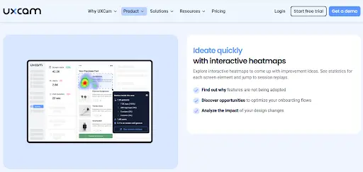
Originally known for mobile analytics, UXCam now offers web analytics, offering teams a unified view of user behavior across platforms. With tools for event tracking, frustration signals, and conversion insights, UXCam turns website interactions into clear, actionable data for smarter UX decisions.
Key features
Heatmaps: Visualize where users click, scroll, and focus most on your web pages.
Automatic event tracking: Capture every user action and interaction without manual tagging or setup.
Session replays: Watch real user sessions to see how visitors experience your site step by step.
AI insights (Tara): Get automated summaries and behavior analysis powered by our AI assistant.
User journey analysis: Understand navigation flows and identify where users drop off or get stuck.
Crash and issue tracking: Detect errors, rage clicks, and performance problems in real time.
Cross-platform analytics: Analyze behavior across web and mobile in one unified dashboard.
Pricing
We offer a free plan covering up to 3,000 monthly sessions, then custom paid plans (Starter, Growth, Enterprise) based on session volume and features. To get started, book a demo or start a free trial.
Pros
AI assistant highlights user pain points automatically.
Detects rage clicks, dead zones, and app crashes in real time.
Tracks user behavior seamlessly across web and mobile.
Groups similar screens for faster UX pattern analysis.
Defines and tracks events retroactively without pre-tagging.
Cons
Fewer customization options in the free plan.
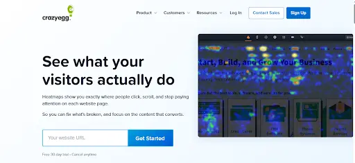
2. Hotjar
Hotjar is a popular analytics and feedback tool that offers heatmaps, session recordings, and surveys. It visualizes clicks, scrolls, and movements, revealing where visitors engage or drop off. It’s ideal for marketers, UX designers, and product teams aiming to boost conversion and usability.


Key features
Heatmaps: Visualize clicks, scrolls, and mouse movement to see which parts of a page attract or lose attention.
Session recordings: Watch user sessions to understand interactions, identify friction, and detect drop-offs.
Surveys and feedback widgets: Collect direct user input to learn the reasons behind their actions.
Funnels: Track user journeys and pinpoint where visitors abandon tasks or conversion flows.
User interviews: Recruit participants and run live interviews for qualitative insights.
Pricing
Hotjar offers a free plan that supports up to 20k sessions and access to core features. Paid plans start at $40 per month and scale based on session volume and data retention, with custom-enterprise options available.
Pros:
User-friendly interface that's easy to navigate.
Comprehensive features in one platform.
Flexible pricing plans, including a free option.
Cons:
Limited data storage on lower-tier plans.
May have a slight impact on site speed if not properly optimized.
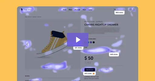
3. Crazy Egg
Crazy Egg is a website behaviour analytics tool that provides heatmaps, scrollmaps, session recordings, and A/B testing to show what visitors do on your pages. It’s well-suited for marketers, UX designers, and conversion-driven teams who want clear visual data to improve page layout, placement of CTAs, and overall user engagement.


Key features
Heatmaps and scrollmaps: See where users click, scroll, and spend the most time on your site.
Confetti and overlay reports: Break down clicks by traffic source, device type, or referral channel.
Session recordings: Watch individual user journeys to uncover friction points and usability issues.
A/B testing: Run on-page experiments to compare designs and improve conversions.
Error tracking and goals: Monitor user errors and track key actions like form submissions or purchases.
Pricing
Crazy Egg offers tiered plans starting at $29 per month for 5,000 pageviews. Higher tiers (Plus, Pro, and Enterprise) add more pageviews, A/B testing, advanced reports, and enterprise features like SAML SSO and team access.
Pros:
Simple setup and easy integration.
"Confetti" heatmaps for detailed insights.
Affordable pricing suitable for small businesses.
Cons:
Interface may feel dated compared to newer tools.
Lacks some advanced features like form analytics.
4. Mouseflow
Mouseflow is a web analytics tool that records user sessions, clicks, scrolls, and movements across your website. It helps teams identify friction points, analyze user journeys, and improve conversions through heatmaps, funnel tracking, and form analytics.


Key features
Heatmaps: Visualize user clicks, scrolls, movement, attention, and even geographic data across pages.
Session recordings: Replay actual user sessions to understand behavior and friction points.
Funnels: Track conversion paths and identify where visitors drop off in their journey.
Form analytics: See which fields users abandon, time spent per field, and completion rates.
Friction detection: Automatically flags rage clicks, dead clicks, and rapid movements signaling frustration.
Pricing
Mouseflow offers a free plan. Paid plans start at $25/month for 5,000 sessions, and scale to plans costing $109/month for 25,000 sessions or $319/month for 100,000 sessions, with custom pricing for enterprise-level usage.
Pros
Advanced analytics features for in-depth analysis.
Real-time data processing.
GDPR and CCPA compliant with strong privacy controls.
Cons
Steeper learning curve due to advanced features.
Higher costs at premium tiers.
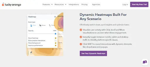
5. Lucky Orange
Lucky Orange is a conversion optimization and heatmap tool that records user sessions, clicks, and scrolls to reveal where visitors get stuck or drop off. It includes live chat, surveys, and funnels, helping marketers and UX teams improve engagement and boost conversions in real time.


Key features
Heatmaps: Visualize click, scroll, and movement data directly on your website pages.
Session recordings: Replay individual visitor journeys to identify confusion, drop-offs, or bugs.
Conversion funnels and form analytics: Track user paths and pinpoint steps or fields causing abandonment.
Live chat and visitor profiles: Chat with users in real time while viewing their on-site activity.
Advanced filtering and segmentation: Analyze behavior by device, source, cart value, or custom parameters.
Pricing
Lucky Orange offers a free plan with up to 100 monthly sessions. Paid plans begin at about $32/month annually for 3,500 sessions and scale to $839/month for 300,000 sessions, with a custom enterprise tier above that.
Pros
Combines multiple tools in one platform.
Competitive pricing options.
Easy to set up and use.
Cons
Interface may be overwhelming due to many features.
Limited integrations compared to other tools.
6. FullStory
FullStory is a digital experience analytics and session replay platform that captures every user interaction like clicks, taps, scrolls, and page transitions. Its powerful search and AI insights help teams spot friction, fix bugs, and optimize UX across web and mobile apps for better user satisfaction and conversions.


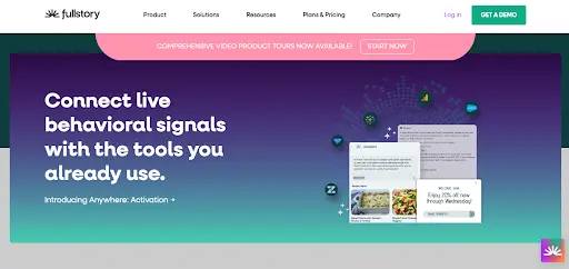
Key features
Autocapture of user interactions: Clicks, scrolls, movement and form inputs get recorded automatically.
Session replays: Watch real user sessions to see exactly how visitors navigate your site or app.
Heatmaps & scrollmaps: Visualize where users click and how far they scroll across your pages.
Funnels & conversion tracking: Map user journeys and identify where drop-offs occur.
Journey mapping: Automatically trace users’ paths across pages and sessions.
Pricing
FullStory offers a free tier with limited sessions and basic analytics. Paid plans (Business, Advanced, and Enterprise) scale by session volume, data retention, and features, with custom pricing for larger teams.
Pros:
Extremely detailed user data.
Scalable solutions for businesses of all sizes.
Strong collaboration features for teams.
Cons:
Higher price point, especially for premium features.
May offer more data than necessary for small sites.
7. Contentsquare
Contentsquare is an enterprise-level platform that delivers deep digital experience analytics. It provides heatmaps, session replays, journey analysis, and AI-driven insights to reveal how users click, scroll, and navigate. Built for product, UX, and marketing teams at scale, it helps identify friction and drive better business outcomes through real behavior data.


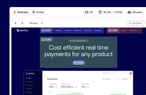
Key features
Automatic interaction capture: Record every click, scroll, tap, and form entry without manual tagging.
Heatmaps and zoning analysis: See which on-page elements attract attention and which get ignored.
Session replays: Watch full user sessions to understand navigation patterns and friction points.
Journey mapping: Visualize user paths across pages, channels, and devices to uncover drop-offs.
AI insights (Sense): Automatically detect issues, measure their impact, and suggest improvements.
Pricing
Contentsquare offers a free plan for basic analytics, with paid plans starting at $40 per month. Pro and Enterprise pricing is customized based on traffic volume and business needs.
Pros:
Highly advanced analytics capabilities.
AI-powered insights for proactive improvements.
Excellent customer support and training resources.
Cons:
Geared towards large enterprises with bigger budgets.
Requires onboarding and training to utilize fully.
8. Smartlook
Smartlook is a website analytics tool that shows how visitors interact with your site. It combines session replays, heatmaps, and event tracking to reveal user behavior. With Smartlook, you can pinpoint friction, understand engagement, and improve conversion paths with visual, data-backed insights.


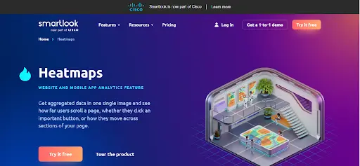
Key features
Session replays: Watch how users navigate and interact with your website in real time.
Heatmaps: See where visitors click, scroll, or hover most to identify engagement patterns.
Event tracking: Automatically capture clicks, page views, and custom events without coding.
Funnels: Visualize user paths and pinpoint where visitors drop off in the conversion process.
Error and rage-click tracking: Detect bugs, frustration signals, and usability issues instantly.
Pricing
Smartlook offers a free plan, a Pro plan starting around $55/month, and custom-Enterprise plans for high traffic and advanced features.
Pros
Retroactive heatmaps visualize user behavior even before setup.
Custom events can be defined without touching code.
Advanced filters isolate key visitor segments easily.
Funnels reveal precise drop-off points in user journeys.
Cons
Heatmaps for dynamic pages may show inconsistent data.
No built-in AI assistant for automated insights.
Types of website heatmaps
Understanding the different types of website heatmaps can help you choose the right one for your needs. Let’s explore each type and how it can provide unique insights into user behavior.
| Type of heatmap | What they show | Primary benefit |
|---|---|---|
| Click Heatmaps | User Clicks: Visual representation of where users click on your website. | Optimize conversion elements by identifying where users click most. |
| Scroll Heatmaps | Scroll Depth: How far down the page visitors scroll. | Improve content layout by understanding how far users scroll. |
| Mouse Movement Heatmaps | Cursor Movement: Tracks where users move their mouse on the screen. | Enhance UI design by observing areas that attract cursor activity. |
| Attention Heatmaps | Combined Engagement: Highlights areas where users spend the most time. | Focus on high-engagement zones to prioritize important content. |
| Eye-Tracking Heatmaps | Visual Attention: Uses specialized technology to track where users are looking on the screen. | Refine visual elements based on precise eye movement data. |
Click heatmaps
Click heatmaps show where users are clicking on your website. They highlight the most and least clicked areas, helping you identify which buttons, links, or images attract the most attention.
Benefits:
Discover popular elements that drive interactions.
Identify clickable areas that are being ignored.
Optimize button placement to increase conversions.
Use Cases:
Improving call-to-action (CTA) effectiveness.
Analyzing navigation menu usage.
Testing link placement and effectiveness.
Scroll heatmaps
Scroll heatmaps reveal how far down a page visitors are scrolling. They indicate which parts of your content are being seen and which sections are being missed.
Benefits:
Determine if important content is visible without scrolling.
Adjust content length and placement to keep users engaged.
Improve the layout to guide users through your page effectively.
Use Cases:
Assessing content engagement on long pages.
Deciding where to place important information.
Enhancing user engagement with blog posts or articles.
Mouse movement heatmaps
Mouse movement heatmaps track where users move their cursors on the screen. While not a perfect proxy for eye movement, they provide clues about what areas are drawing attention.
Benefits:
Understand areas of interest based on cursor activity.
Detect patterns in user navigation and focus areas.
Enhance user experience by aligning design with natural mouse movements.
Use Cases:
Understanding user focus areas.
Enhancing user interface (UI) design.
Improving overall user experience (UX).
Attention heatmaps
Attention heatmaps combine data from clicks, scrolls, and mouse movements to show which parts of a page hold users’ attention the longest. They provide a comprehensive view of user engagement.
Benefits:
Identify high-engagement areas that keep users interested.
Spot low-engagement sections that may need improvement.
Make informed decisions on content placement and design enhancements.
Use Cases:
Optimizing content placement.
Enhancing elements that draw user attention.
Balancing content distribution across the page.
Eye-Tracking heatmaps
Eye-tracking heatmaps use specialized technology to monitor where users are looking on your screen. They offer the most accurate insights into visual attention and user focus.
Benefits:
Gain precise data on visual attention and reading patterns.
Optimize layout based on actual eye movement data.
Enhance visual hierarchy to guide users’ eyes to key elements.
Use Cases:
Designing effective advertisements and banners.
Improving readability and content flow.
Enhancing overall visual appeal and engagement.
How website heatmaps work
Now that you know the types of heatmaps, let’s dive into how they work. Understanding the mechanics behind heatmaps ensures you can implement and interpret them effectively.
Data collection methods
Heatmaps gather data through various tracking techniques. Here’s how they collect the necessary information to visualize user behavior.
JavaScript Tracking: Most heatmap tools use JavaScript code embedded in your website to track user interactions like clicks, scrolls, and mouse movements.
Session Recording: Some tools record entire user sessions, capturing every interaction a visitor has with your site.
API Integrations: Integrate heatmap tools with other analytics platforms to collect and sync data seamlessly.
Heatmap visualization techniques
Once the data is collected, it needs to be visualized in a meaningful way. Heatmap tools use different techniques to present the data clearly.
Color Coding: Areas with high activity are typically shown in warm colors like red and orange, while less active areas use cooler colors like blue and green.
Overlay Maps: Heatmaps are overlaid on your actual website pages, allowing you to see exactly where interactions occur.
Segmented Views: Some tools offer segmented heatmaps, showing data for different user groups or devices separately.
Interactive Dashboards: Advanced heatmap tools provide interactive dashboards where you can filter and drill down into specific data points for deeper analysis.
How to implement website heatmaps
Ready to start using website heatmaps on your site? Let's walk through how to implement them effectively.
1. Set objectives for heatmap analysis
Before diving in, it's crucial to set clear objectives. Ask yourself what you aim to achieve with heatmap data. Are you looking to boost conversions, improve user experience, or identify problematic areas?
2. Define key performance indicators (KPIs)
Once your objectives are set, define the KPIs that matter most. These could include click-through rates, form submissions, or time spent on page. KPIs will help you measure success and make informed decisions.
3. Aligning heatmap data with business goals
Make sure the heatmap data aligns with your overall business goals. If increasing sales is a priority, focus on how users interact with product pages. Aligning data ensures your efforts contribute to the bigger picture.
4. Select pages for heatmap implementation
Not all pages need heatmaps. Focus on pages that will provide the most insight.
High-Traffic Pages: Start with pages that get the most visitors. Understanding these can have a significant impact on your site’s performance.
Landing Pages and Conversion Funnels: Analyze pages where conversions happen. This helps identify obstacles in the conversion process.
Mobile vs. Desktop Pages: User behavior can differ between devices. Implement heatmaps on both to get a complete picture.
5. Installing heatmap tracking code
Getting started requires adding tracking code to your site.
Integration with CMS Platforms: Most heatmap tools integrate easily with platforms like WordPress or Shopify. This usually involves installing a plugin or adding a snippet of code.
Using Tag Management Systems: If you use a tag manager like Google Tag Manager, you can deploy heatmap tracking without altering your site’s code directly.
6. Interpreting heatmap data
Collecting data is just the first step. Understanding it is where the real value lies.
Analyzing Click Patterns: Look at where users click the most. Are they engaging with your call-to-action buttons or getting distracted by less important elements?
Understanding Scroll Depth: See how far down the page users scroll. If they’re not reaching important content, you might need to reorganize your layout.
Identifying UX Issues: Heatmaps can reveal unexpected user behavior, highlighting issues you might not be aware of.
Best practices for heatmap use
To get the most out of heatmaps, keep these best practices in mind.
Regular monitoring and analysis: Don't set it and forget it. Regularly check your heatmaps to stay updated on user behavior changes.
Combining heatmaps with other analytics tools: Use heatmaps alongside tools like Google Analytics for a more comprehensive understanding.
A/B testing with heatmaps: Test different versions of a page to see which performs better. Heatmaps can provide visual evidence of what works.
By thoughtfully implementing and analyzing heatmaps, you'll gain valuable insights into your users' behaviors. This knowledge empowers you to make data-driven decisions that enhance user experience and drive business growth.
Conclusion
Understanding your website visitors is essential for optimizing performance and enhancing user experience. Website heatmaps offer invaluable insights into how users interact with your site, revealing patterns that can inform your design and content decisions.
By choosing the right heatmap tool that aligns with your specific needs, you can turn data into actionable strategies that support your business goals. Remember to start with clear objectives, and don't hesitate to experiment.
You might also be interested in these;
What is Web Analytics? Definition, Metrics & Best Practices
Web Analytics Reporting - How to Create Actionable Reports
Website Visitor Tracking - A Comprehensive Guide
Top 10 Digital Analytics Tools You Need to Know
Ultimate Website Optimization Guide: Must-Know Tactics
Website Analysis 101: How to Analyze for Peak Performance


Related articles

Website Analysis
21 Website Visitor Tracking Tools with Top-Rated User Reviews
Discover the 21 best website visitor tracking tools, featuring top-rated user reviews to help you choose the perfect solution for understanding and enhancing your site’s...


Tope Longe
Product Analytics Expert


Website Analysis
14 Website Analytics Metrics to Track for Product Teams
Discover 14 essential website analytics metrics every product manager should track to improve user experience, boost conversions, and drive product...


Website Analysis
Top 14 SaaS Product Usage Metrics and How to Improve Them
Discover the top 14 SaaS product usage metrics to track, including engagement, retention, and conversions, plus actionable strategies to optimize and drive...
Tope Longe
Product Analytics Expert