Why most teams have the wrong aha moment (and how to test yours)


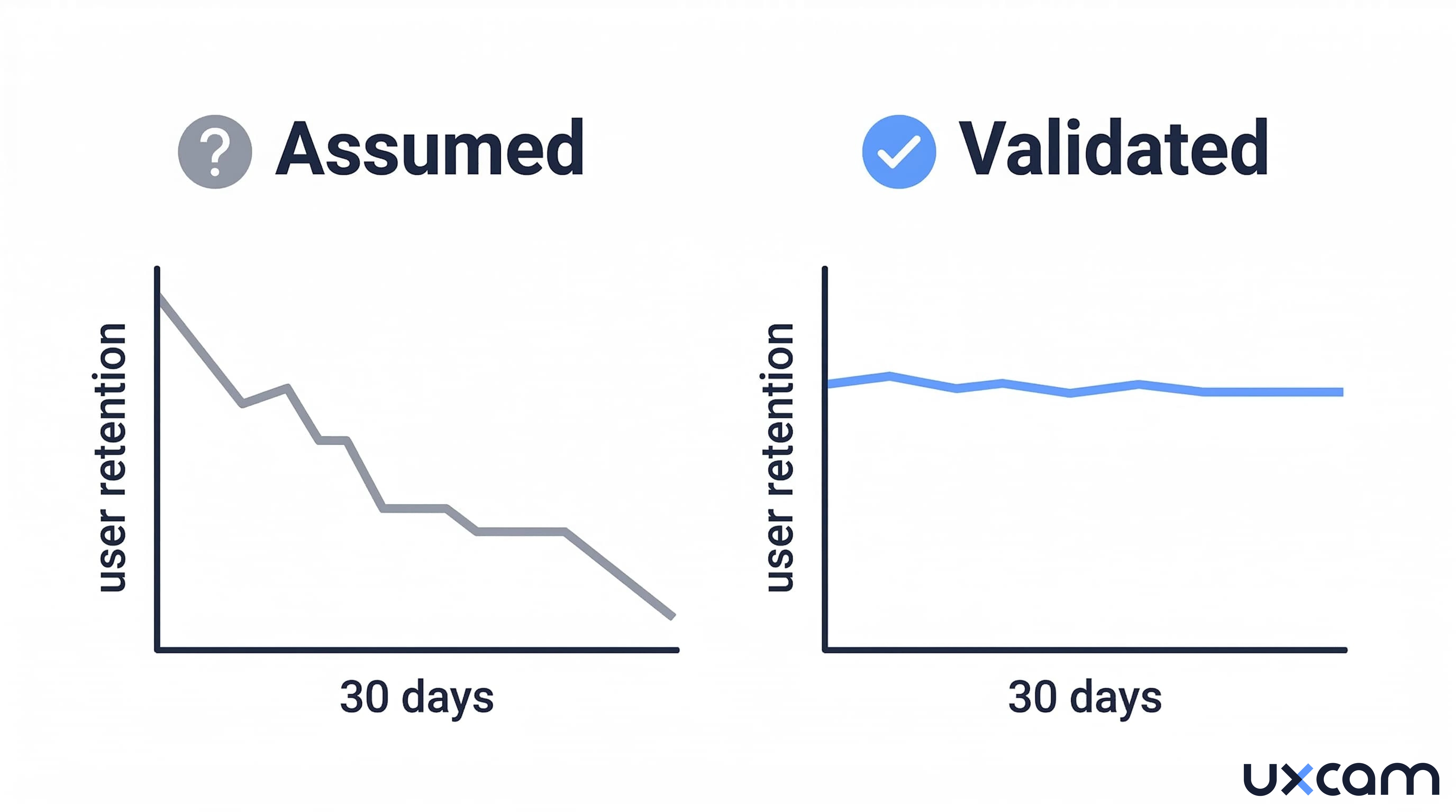
A fintech startup spent three months redesigning its onboarding flow around what the team believed was their aha moment: completing the first transaction. They shortened the path, added progress bars, sent nudge notifications. Activation rates climbed. Retention stayed flat. The metric they had optimized for was correlated with retention in their existing user base, but it was not causing it. They had built their onboarding around a coincidence.
This is not a rare mistake. According to a survey of 500+ products published by Lenny Rachitsky , the median activation rate across all product types sits at just 25%. Most teams pick an activation milestone, optimize toward it, and never test whether that milestone actually predicts long-term retention. The aha moment, as commonly practiced, is a guess dressed up as a strategy.
The problem is not that the concept is wrong. The aha moment is real. But treating it as something you intuit rather than something you validate is where most product teams go off track.


What an aha moment actually is (and what it is not)
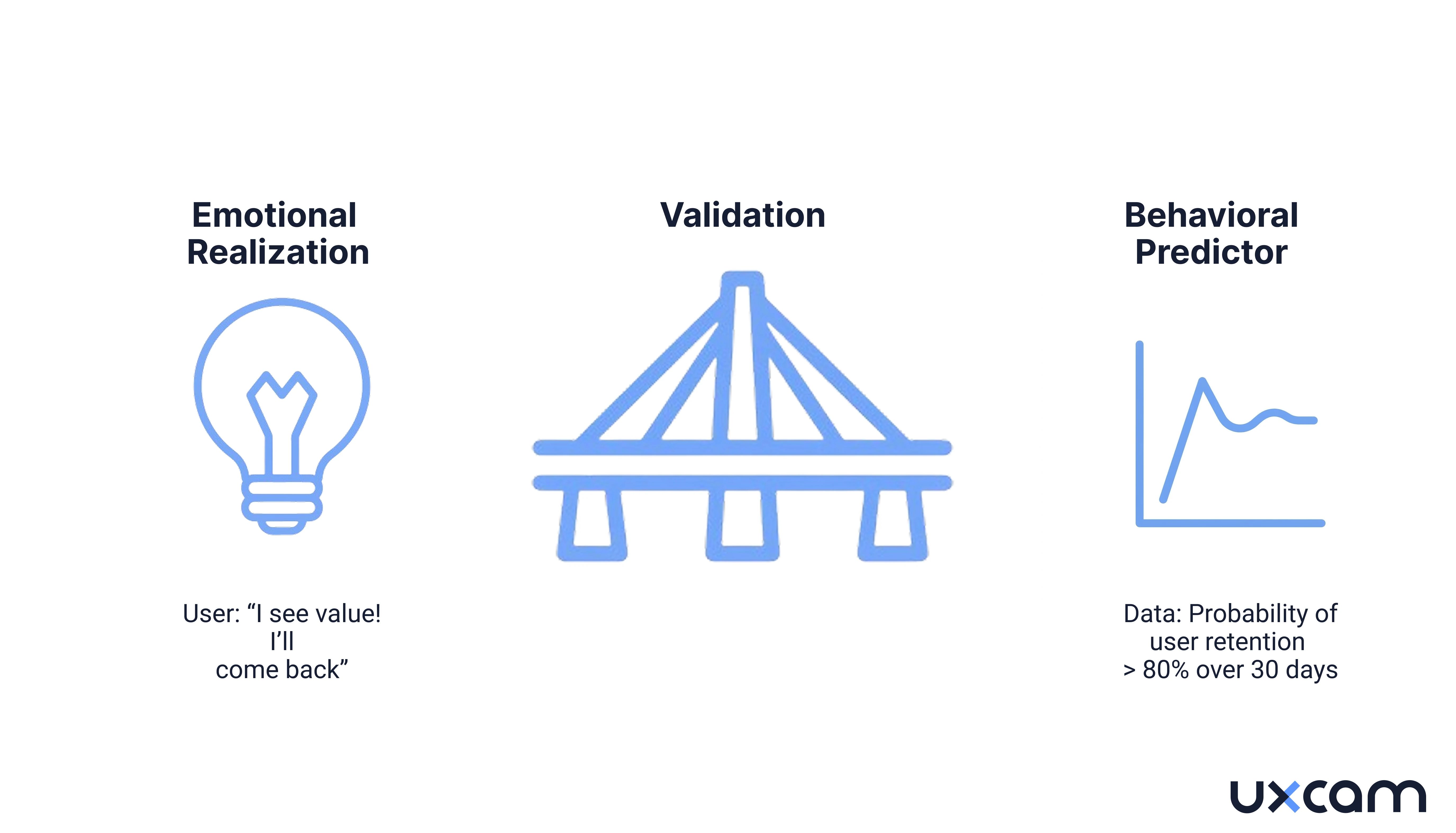
An aha moment is the earliest point in a user's experience where they recognize the product's core value. In product analytics, this translates to a specific, measurable behavior that predicts whether a user will retain over weeks or months.
That definition sounds clean. In practice, it gets messy fast.
Most teams conflate two different things; the emotional moment a user "gets it" and the behavioral signal that statistically predicts retention. These are related but not identical. A user might feel excited after connecting their first integration, but the behavior that actually predicts 90-day retention might be running their second report on day three.
Mixpanel's analysis of this phenomenon put it directly; magic numbers like Facebook's "seven friends in 10 days" are an illusion. A useful illusion, but an illusion. The actual number could have been 10 friends in 12 days or five friends in one day. Precision was never the point. The value was in having a specific, measurable target that the entire growth team could rally around.
The danger shows up when teams treat their aha moment as a scientific finding rather than a hypothesis. They pick a metric, see that retained users tend to have completed that action, and assume causation. That assumption can survive unchallenged for years.


Why the wrong aha moment survives so long
Here is a pattern that plays out across product teams: someone identifies a behavior that retained users tend to perform. The team builds onboarding around that behavior. Activation goes up. Nobody checks whether retention improved.
This happens because of three analytical traps that compound each other.
Survivorship bias in cohort selection
When you analyze your retained users to find common behaviors, you are only looking at people who stayed. You never see the users who performed the same "aha action" and left anyway. If 60% of your retained users completed onboarding step X, that sounds meaningful. But if 55% of your churned users also completed step X, the signal is noise.
Survivorship bias is the logical error of concentrating on entities that passed a selection process while overlooking those that did not. In product analytics, this means analyzing only retained cohorts will always produce flattering results for whatever behavior you test. The fix is simple but rarely done; compare both groups.
Correlation masquerading as causation
Users who add seven friends in 10 days on a social platform are more likely to retain. But is that because adding friends causes retention, or because the kind of user who adds seven friends quickly was already highly motivated? Andrew Chen noted this exact problem: the "seven friends" metric could have been any number in a reasonable range, because the correlation reflects user intent more than product mechanics.
A real aha moment metric needs to pass a causal test: if you experimentally increase the percentage of users hitting that moment, does retention actually go up? Without that experiment, you are optimizing for a proxy that may have nothing to do with value delivery.
The "wrong cohort" problem
Time-to-value analysis often uses early adopters as the baseline cohort. But early adopters are not representative of your broader market. A SaaS case study documented by WS Business Advisory found that high-churn cohorts had a median time-to-value of seven or more days, compared to four days for successful cohorts. The difference was not feature awareness. It was that the onboarding flow had been optimized for power users who already understood the problem, not for the larger audience still figuring out whether they needed the tool at all.
The common thread across all three traps; teams look at data from users who already succeeded, find patterns, and assume those patterns will work for everyone else.
How validated and assumed aha moments differ by product category
| Category | Old Activation Metric | Better Activation Metric | Why the Old Metric Fails |
|---|---|---|---|
| Fintech | First transaction completed | Second transaction within seven days | One transaction often reflects curiosity, not commitment. Top fintech products retain 19.5% at three months; median retains 4.6%. The gap correlates with repeat engagement, not first use. |
| E-commerce | First purchase | First return visit after purchase | Top e-commerce products retain 18.9% while median retains 2.8%. Purchase alone does not predict loyalty; coming back after buying does. |
| Social / community | Profile completion | Posting or reacting within 48 hours | Profile completion is passive. Active participation signals that the user found social value, not just set up an account. |
| Productivity SaaS | Completing onboarding tutorial | Creating a second project or inviting a collaborator | Tutorial completion measures compliance with your flow, not value realization. Second-project creation means the user found enough value to start again. |
| Mobile analytics | Installing the SDK | Viewing the first session replay or funnel report | Installation is a technical step. The moment value clicks is when a team member watches a real user struggle and says, “That’s why conversion dropped.” |
The pattern is consistent, assumed aha moments tend to be completion-based (the user did the thing), while validated aha moments tend to be repetition-based or depth-based (the user came back, or the user went deeper). This distinction matters. Optimizing for completions inflates activation numbers. It does not move retention.


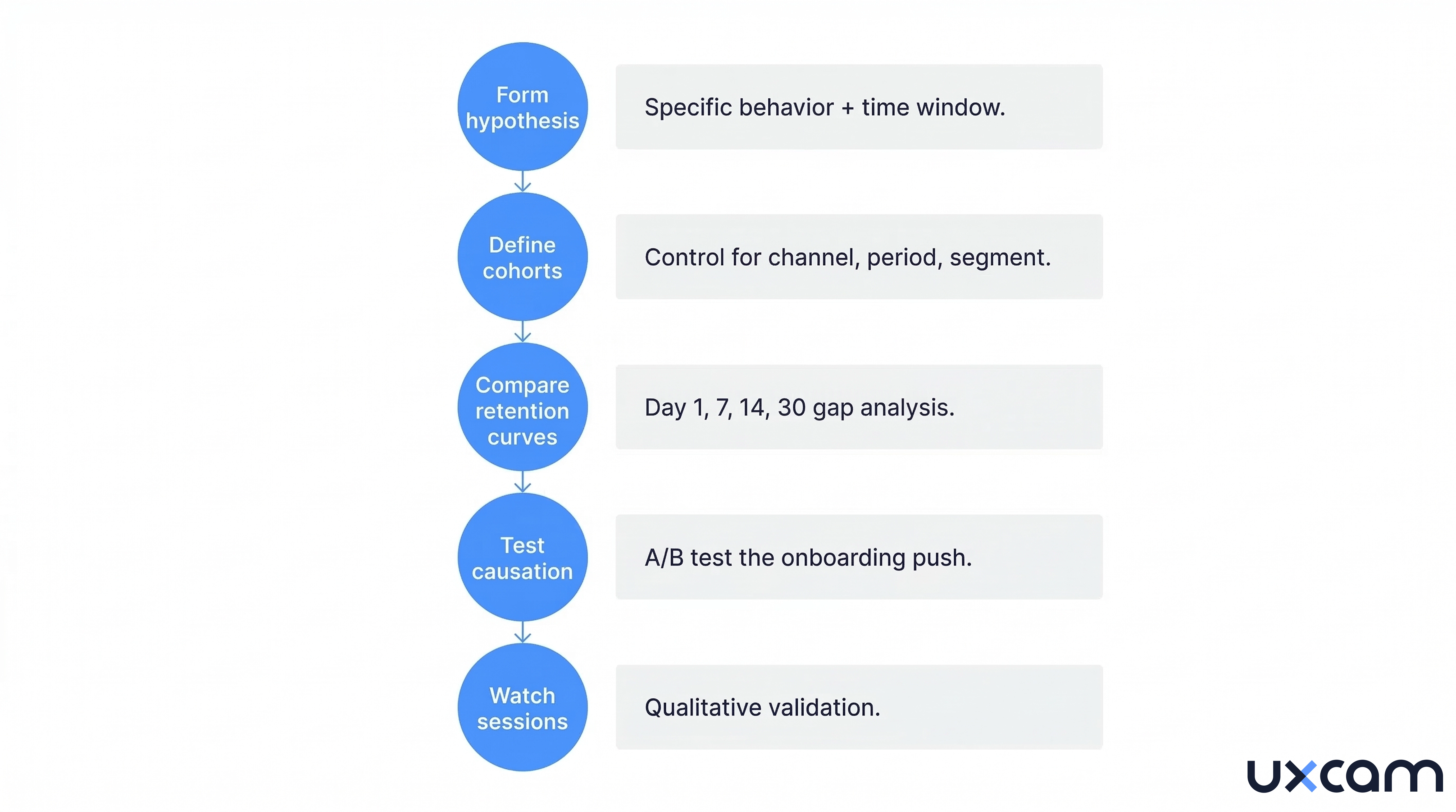
A five-step framework to validate your aha moment
This framework works whether you run a mobile app, a SaaS platform, or a marketplace. The goal is to move from "we think this is our aha moment" to "we have evidence that this behavior causes retention."
Step 1: Form a testable hypothesis
Start with a specific behavior, not a feeling. "Users who create a dashboard within 48 hours retain at 2x the rate of those who don't" is testable. "Users who understand our value proposition" is not.
Good hypotheses follow this structure: Users who perform [specific action] within [time window] retain at [measurable difference] compared to users who do not.
Pull candidates from two sources:
Behavioral data: which in-app actions correlate most strongly with 30-day and 90-day retention
Qualitative signals: what users say when asked "when did you realize this product was useful"
UXCam's funnel analytics can surface which specific steps in your onboarding flow correlate with retention. By linking funnel drop-off data to retention cohorts, you can see which completed steps actually predict who stays versus who leaves.
Step two: define clean cohorts
Split your user base into two groups: users who performed the candidate aha behavior within your time window, and users who did not. This sounds obvious, but most teams get it wrong: they use their entire historical user base instead of controlling for acquisition channel, time period, and user segment.
If you launched a referral campaign in Q3 that attracted unusually engaged users, those users will skew your cohort analysis for every quarter that includes them. Restrict your cohorts to a consistent acquisition period and channel mix.
Step three: compare retention curves
Plot retention curves for both cohorts at day one, day seven, day 14, and day 30. According to Amplitude's Product Benchmark Report, which analyzed data from over 2,600 companies, 69% of products with strong early activation (day seven) were also strong three-month retention performers.
What you are looking for is a meaningful and persistent gap between the two curves. If the curves diverge at day one and stay separated through day 30, your candidate behavior has predictive power. If they converge by day 14, the behavior predicts short-term activation but not retention. That is a false signal.
UXCam's retention analytics lets you create custom cohorts based on specific in-app behaviors and compare their retention curves side by side. You can segment by screen visited, event triggered, or any custom property, then overlay the retention charts to see exactly where the curves diverge or converge.
Step four: test for causation, not just correlation
This is where most teams stop, and it is exactly where you should not. Correlation between a behavior and retention does not mean that behavior causes retention.
The only reliable test for causation is an experiment. Design an onboarding variant that pushes more users toward the candidate aha behavior. Run it as an A/B test. Measure whether the cohort that received the push actually retains better, not just whether they completed the action at higher rates.
Userpilot's analysis of this distinction found that misinterpreting correlations leads teams to invest time and resources into features that do not address real drivers of customer behavior.
If pushing more users toward the behavior does not lift retention, the behavior is a symptom of engagement, not a cause of it. Go back to step one.
Step five: watch the sessions behind the numbers
Numbers tell you what happened. They do not tell you why. After identifying a validated aha behavior, watch session recordings of users who reached it and users who did not.
You are looking for the qualitative signal behind the quantitative pattern. What did the user see on screen right before they took the action? What confused users who abandoned? Was there a specific UI element that triggered hesitation or rage taps?
Tara, UXCam's AI product analyst, accelerates this step. Instead of manually scrubbing through hundreds of session recordings, Tara reviews sessions automatically and surfaces the specific screens and interactions where users hesitate, get confused, or give up. She identifies behavioral patterns that connect the quantitative retention signal to the qualitative user experience. Teams get a prioritized list of friction points, each backed by direct links to the sessions that prove it.
This qualitative layer is what separates a validated aha moment from a statistical artifact. You need to see the human behavior behind the number to understand what to build next.


What happens when validation fails (and what to do about it)
Not every hypothesis passes. That is the point. Here is what failure modes look like and what they tell you.
The most common failure, your candidate behavior shows a strong retention gap in historical data, but when you run the A/B test pushing more users toward it, retention does not budge. This means the behavior was a marker of already-engaged users, not a driver of engagement. The users who naturally performed that action were going to retain regardless.
The second failure mode is subtler. The retention gap exists and the A/B test shows a small lift, but the lift disappears after 30 days. This means the behavior predicts short-term stickiness but not true habit formation. Over 12 months, a 25% increase in activation has been shown to produce a 34% rise in monthly recurring revenue in SaaS contexts. But only if the activation metric actually drives lasting engagement. A short-lived lift produces a short-lived revenue boost.
The third failure mode is you cannot find any single behavior that reliably predicts retention. This usually means your aha moment is not a single action but a combination of actions, or it varies significantly by user segment. Fintech users might need to complete a transaction and check their balance. E-commerce users might need to browse, add to cart, and receive a delivery notification.
When this happens, segment your analysis. Run the framework separately for each user persona or acquisition channel. The aha moment for a user who found you through organic search may be completely different from a user who came through a paid campaign. One is already problem-aware. The other might still be evaluating whether they have a problem at all.
I should note that this framework is not quick. It requires instrumentation, patience, and a willingness to learn that your first hypothesis was wrong. Most teams want a clean answer. Validation often delivers a messy one. But a messy truth beats a clean assumption, especially when you are making onboarding decisions that affect every new user who signs up.


What changes when you actually validate your aha moment
The difference between teams that guess and teams that validate is not sophistication. It is what happens six months later.
Teams that guess build onboarding around a metric, watch activation climb, and report success. Six months in, retention is flat. They blame the market, the competition, or the product. They redesign onboarding around a different guess. The cycle repeats.
Teams that validate go slower upfront. They run the cohort analysis, find that their first hypothesis was wrong, test a second one, and sometimes a third. But when they find the behavior that actually causes retention, the onboarding changes they make stick. Activation and retention move together instead of diverging.
There is a compounding effect here that is easy to miss. Every onboarding decision built on a validated aha moment produces better retention. Better retention means longer customer lifetimes. Longer lifetimes mean higher LTV. Higher LTV means you can afford to spend more on acquisition. The entire growth model shifts because you fixed one assumption at the top of the funnel. This is why platforms like UXCam that connect retention data, funnel analytics, and session replay in one place matter: you can monitor whether each onboarding change actually moves the retention curve, and course-correct before a full quarter passes.
The fintech startup from the introduction eventually ran this process. Their validated aha moment turned out to be checking their account balance a second time within five days, not completing the first transaction. Users who came back to look at their balance had already decided the product was useful. Users who transacted once and never checked again were just trying the app out. The team rebuilt onboarding around balance visibility instead of transaction speed. Day 30 retention increased by 12 percentage points over two quarters.
That is what evidence-based validation looks like. Not a single insight that changes everything overnight, but a methodical process that replaces a guess with a fact and lets every downstream decision benefit from it.
Putting the validation framework into practice with UXCam
Running this framework manually is possible but slow. You need to identify candidate behaviors, build cohorts, compare retention curves, run experiments, and review sessions. Most teams stall around step two because their analytics stack was not built for this kind of cross-functional analysis. The tools that track funnels do not track retention. The tools that track retention do not show you what users actually experienced.
UXCam removes that gap. The entire validation workflow runs inside one platform.
| Validation Step | What You Need | How UXCam Delivers It |
|---|---|---|
| Form hypothesis | Identify which behaviors correlate with retention | Funnel analytics shows exactly where users drop off and progress. Smart events let you define new behavioral markers retroactively without redeploying your app. |
| Define cohorts | Segment users by behavior, channel, and time period | Segmentation builds cohorts from any combination of user properties, in-app events, screens visited, or acquisition source. |
| Compare retention curves | Overlay retention data for users who did vs. did not perform the behavior | Retention analytics creates side-by-side retention comparisons for any custom cohort. You see where curves diverge and by how much. |
| Test causation | Measure whether pushing users toward the behavior lifts retention | Track onboarding variant performance with funnel analytics and retention overlays showing the downstream impact of each change. |
| Watch sessions | Understand the qualitative “why” behind the numbers | Session replay and heatmaps show what users experience at each step. Tara reviews sessions automatically and surfaces the friction, hesitation, and UI issues that explain why some users reach the aha moment and others do not. |
How Tara accelerates aha moment discovery
Tara, UXCam's AI product analyst, is purpose-built for the hardest part of this process: watching real user sessions and finding the patterns humans miss.
Instead of your team spending weeks scrubbing through session recordings, Tara reviews them automatically. She identifies the screens where users hesitate, the UI elements that trigger confusion or rage taps, and the behavioral differences between users who retain and users who churn. Every finding links directly to the session that proves it, so your team can verify the insight in seconds and decide what to fix first.
For mobile apps specifically, Tara catches issues that never appear in event logs such as confusing UI states, non-responsive elements, hidden buttons, and silent failures that frustrate users before they ever reach your aha moment. These invisible friction points are often the reason a validated aha behavior has lower reach than expected.
Teams using UXCam report that the combination of quantitative analytics (funnels, retention, cohorts) and qualitative analysis (session replay, heatmaps, Tara) compresses what used to be a months-long validation project into weeks. The data lives in one place. The analysis connects automatically. And the recommendations come with the evidence attached.
Your aha moment is a hypothesis until you prove it
Most product teams treat their aha moment as settled knowledge. They picked a metric years ago, built onboarding around it, and moved on. The uncomfortable truth is that an unvalidated aha moment is just a guess with a dashboard attached.
The fix requires discipline more than complexity. Form a hypothesis. Compare cohorts. Run the experiment. Watch the sessions. Teams that actually do this often discover that their real aha moment looks nothing like the one they assumed. That discovery is uncomfortable, but it is also where growth starts.
The average mobile app loses roughly three quarters of its users within the first three days. For most of those apps, the difference between growth and stagnation sits somewhere in the gap between an assumed aha moment and a validated one.
Ready to find your real aha moment?
UXCam's free plan includes 3,500 sessions per month with funnel analytics, retention tracking, and session replay. No credit card required
Start a free trial or Request a demo
FAQ about aha moments in product analytics
FAQ
What is the difference between an aha moment and an activation metric?
The aha moment is the conceptual point where a user recognizes a product's value. The activation metric is the quantifiable proxy for that moment, the specific in-app behavior your team measures. The two should align, but often do not.
How long should it take a user to reach the aha moment?
There is no universal answer, but speed matters. Amplitude's benchmark data from 2,600+ companies shows that products where users activate within the first 48 to 72 hours see significantly stronger three-month retention. If your median time-to-value exceeds seven days, your onboarding likely needs intervention.
Can a product have more than one aha moment?
Almost certainly. A product manager might find value in a dashboard view while a developer finds it in an API integration. Running the validation framework across your entire user base without segmenting by persona will average out these differences and give you a blurry answer. UXCam's segmentation tools let you define custom cohorts based on user properties, behaviors, or acquisition channels, which makes it practical to test separate hypotheses per segment.
How do you know if your aha moment is causing retention or just correlated with it?
The only reliable method is experimentation. Run an A/B test where one cohort receives onboarding designed to push them toward the candidate aha behavior. If the pushed cohort retains better, you have causal evidence. If they hit the behavior at higher rates but retention stays flat, the behavior is a symptom of engagement, not a driver.
What is a good activation rate benchmark?
According to Lenny Rachitsky's survey of 500+ products, the median activation rate is 25% and the average is 34%. For SaaS specifically, the median rises to 30% and the average to 36%. Being at the 60th percentile is considered good; 80th percentile is great.
Why do so many teams get their aha moment wrong?
The short answer: they never test it. They find a correlation in their retained user data, assume it means something, and build onboarding around it. Survivorship bias hides the users who did the same thing and left. Correlation gets mistaken for causation. And the cohort they analyzed (early adopters) does not represent the users they are trying to convert.
How can session replay help validate an aha moment?
Quantitative data tells you which behaviors correlate with retention. Session replay tells you why. By watching recordings of users who hit the candidate aha behavior and comparing them with users who did not, you can identify the qualitative signals (confusion, hesitation, delight) that explain the number. Tara, UXCam's AI product analyst, automates this by reviewing sessions and surfacing the specific friction points and patterns that distinguish retained from churned users.
Keep reading


Related articles
Product Analytics
Why most teams have the wrong aha moment (and how to test yours)
What is a product aha moment and how do you validate it? Learn the framework for identifying behaviors that actually drive activation and...

Begüm Aykut
Growth Marketing Manager