User Recordings: The Full Guide

Let’s be honest. Here’s the truth about working in product UX/UI: “Because every person knows what he likes, every person thinks he is an expert on user interfaces.” – Paul Heckel
But that’s not how it works. Diving deep in the user’s mind and figuring out the optimal user flow is not an easy task.
That’s why User Recordings have become one of the most important concepts in qualitative app analysis. They give an insight into exactly how the user uses the app.
The user journey can be followed from beginning to end. Each tap, swipe or interaction can be tracked accurately.
What are User Recordings?
Just analyzing numbers and watching charts doesn’t give exact information about what actually happens inside the app.
Even other successful qualitative analytics methods like user testing don’t show the complete journey a user takes.
Problems are often hidden in dead angles. They appear in situations where a tester in an artificial environment would never be tested – but a user tries it in real life anyway.
Why are User Recordings important?
Why does it seem to be so difficult and hard to track user behavior comprehensively?
First: Users are complicated. They abandon apps when the smallest issue appears. They try to use gestures in unexpected ways. They try to use paths through the app a tester would never imagine.
Second: Every user is different! Sure, it’s possible to group them into clusters, user segments, and target groups. All the users in one group should behave more or less in the same expected way, but they don’t. There will always be users who do their own unexpected stuff.
Qualitative user analysis can drive you crazy!
But there are solutions that can make this analysis easy without costing a lot of time (and nerves). User recording solutions are built from the ground up to solve the problems above.
User Recording Methods
Session Replay
The most concrete way to record user behavior in an app is through session replay.
Session replays allow you to see what the user does in the app. Every tap, swipe or interaction gets recorded, from the second the user opens the app. This also includes unexpected app closures, freezes, and crashes.
The interactions are not only recorded but also chronologically documented in a list. This allows us to find specific interactions quick and easy. In doing so, frustration patterns and unexpected gestures can be found easily.
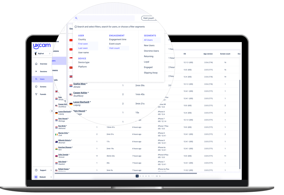

The right session can easily be found with a good filter system
Questions that can be answered with user recordings:
How do specific users interact with the app?
What does the app look like from a user’s perspective?
What does an app crash look like for the user?
User Flows
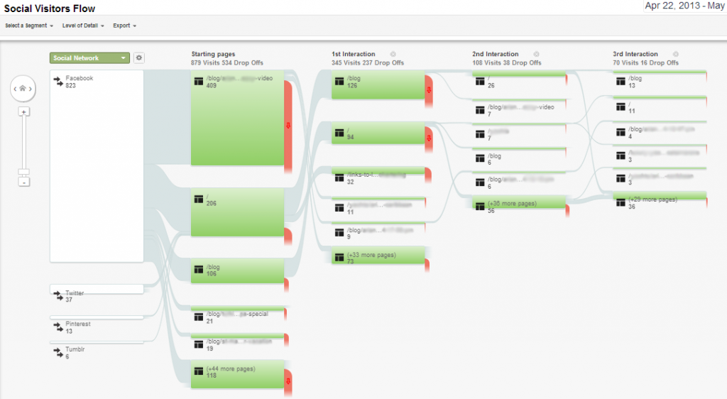

User Flow in Google Analytics. Source
Navigation Paths deliver an overview of the user’s journey through the app without the need to watch every session replay. They present an aggregation of many sessions and users.
Navigation Paths can also be a help to find the most relevant sessions to watch e.g. the ones who’ve needed several screens to find the intended screen.
Questions that can be answered:
Which screen do the users open directly after opening the app?
How many screens do the users visit before finding the intended screen?
Touch Heatmaps & Screen Analysis
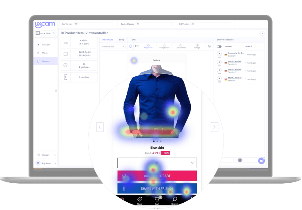

Mobile Heatmaps are a visual representation of the user’s movements and interactions. These are displayed as colored areas and placed over the actual screen or page. Touch heatmaps aggregate a large set of users.
The human brain interprets this spectrum of colors much quicker and easier than a set of numbers.
Touch heatmaps can be filtered by different parameters such as the first or last gesture on the screen. Also, situations, where users try to interact with static elements, can be found. The cause is often a misleading design. This is a major problem for user frustration.
Questions that can be answered:
What elements and parts do the majority of users focus on?
Which parts do they ignore?
Are there static elements many users are trying to interact with?
Which CTAs work best?
Funnel Analysis
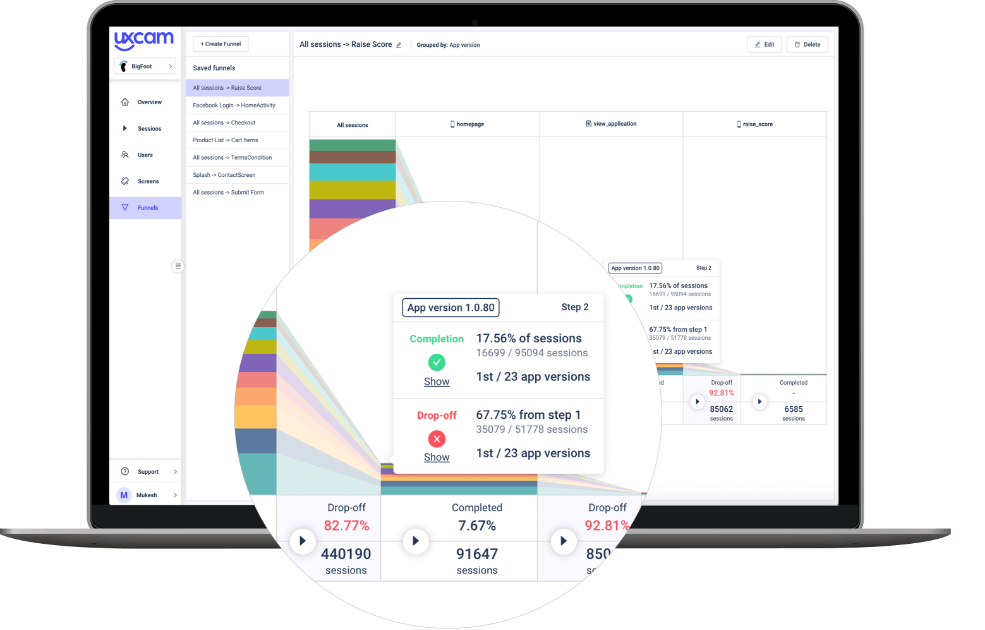

A funnel is a tool that helps to evaluate the user’s journey from the awareness stage to the action.
With an analysis of the funnel, it’s easy to find out on which stages the user drop out.
The analysis of the funnel alone already provides conclusions as to which areas of the app should be improved.
In combination with other analysis methods such as touch heat maps and user recordings, conversion rates can be significantly increased.
Questions that can be answered:
How many interested users converted?
At which stages do most users drop out?
Which stages need to be improved?
Best Tools for User Recordings
UXCam is a user recording solution for mobile apps that combines all these analysis methods.
It allows you to analyze the user under real-world conditions to optimize the user experience. Legal requirements such as the General Data Protection Regulation (GDPR) are fully complied with.
The extension of UXCam with other analysis tools helps to get an optimal picture of the user. The extension to Firebase Crashlytics, for example, also allows you to track and analyze app crashes. The integration with Google Analytics allows the qualitative analysis of UXCam to be extended by further quantitative data.
You can get started with UXCam’s user recordings here.
Related Articles:
AUTHOR
Annemarie Bufe
Product Analytics Expert
Passionate hobby dancer. Working at UXCam.

Related articles
Mobile app analytics
5 Best Session Replay Tools to Identify Mobile App UX Issues
We’ve highlighted the top picks on the market for session replay tools and dug into what they’re known for, who they’re best for, and what users say about...

Audrey Meissner
Mobile app analytics
5 Most Important Mobile App Retention Metrics to Measure
Discover the 5 crucial mobile app retention metrics every app developer must measure to boost user engagement and drive app...

Tope Longe
Product Analytics Expert
Mobile app analytics
7 must-know mobile app analytics best practices
Discover the top 7 must-know mobile app analytics best practices to help you track the right metrics and make data-driven decisions. Learn how to optimize your app's performance to drive growth and...

Jonas Kurzweg
Product Analytics Expert

