Looking to conduct a UX competitor analysis?
A UX competitor analysis is one of the best ways to gain deeper insight into your industry, product, and business. Done right, a UX competitor analysis will:
Give you a better understanding of the competitive landscape.
Provide actionable insights to guide your product strategy.
Help you come up with new ideas on how to optimize your app and keep your customers happy.
52% of users say that a bad mobile experience makes them less likely to engage with a brand. These days, users are spoilt for choice — so, you probably don’t need us to tell you that a seamless user experience is an essential part of business success. But do you know for sure how your app stacks up to the competition?
Here's a quick summary just before you jump in.
How to do a UX Competitor Analysis

Set goals and priorities
Identify your competitors
Prepare your test devices
Test key user journeys
Conduct a SWOT analysis
Share your findings
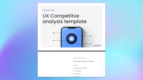
Read on to know how to perform a UX competitor analysis and grab your free copy of our UX competitive analysis template!
Summary - UX competitive analysis example
| Steps | Description | How UXCam Helps |
|---|---|---|
| Set Goals & Priorities | Define objectives (e.g., onboarding). | Provides user interaction insights and benchmarks. |
| Identify Competitors | List 3-5 competitors, including indirect ones. | Uses heatmaps and screen flows for comparison. |
| Prepare Test Devices | Install apps on various devices and networks. | Supports iOS/Android testing; detects performance issues. |
| Test User Journeys | Analyze key features and flows. | Identifies critical journeys and pain points. |
| Conduct SWOT Analysis | Outline strengths, weaknesses, opportunities, threats. | Measures engagement, retention, conversion rates. |
| Share Findings | Present to stakeholders with actionable insights. | Offers reporting and collaboration tools for decisions. |
What is a UX competitor analysis?
A UX competitor analysis gives you a complete overview of the products, features, and user journeys of your competitors.
For example, let’s say you work for an e-commerce app. You might focus on the main user workflows, like newsletter sign-ups and checkout features like easy re-order or next-day delivery, and special promotions like a free gift when you download the app and place your first order.
Ultimately, the content of the analysis depends on your needs. But the purpose remains the same. By comparing your app with others in your industry, you can identify their respective strengths and weaknesses, see who meets customer needs best and uncover gaps where you need to improve.
To stay ahead of the competition, you don’t just need to innovate; you need to understand where others excel and where they fall short. - Harvey Mackay
Why do a UX competitive analysis?
To put it bluntly, we live in a fast-paced world where new competitors pop up all the time — possibly with hot new features ready to tempt your users away. Figuring out how rival companies meet the customer needs of similar target audiences will give you a ton of insights. But there are many more reasons why it’s beneficial to perform a UX competitor analysis:
To help guide business and product strategy
To solve usability issues
To inform the design process
To understand the strengths and weaknesses of your competitors
To gain a better understanding of your industry
To recognize how to meet user needs better
To set priorities in your A/B testing and optimization strategy
Are there any limitations to a competitor analysis?
A competitive analysis is a valuable exercise, but carrying out an analysis on your own app and your competitors’ apps won’t solve all your UX and UI issues.
The main limitation is the lack of competitor data available. A UX analysis will give you a solid understanding of the design, features and overall user experience. But it won’t give you specifics like how many users your competitor has, how they engage with the app, and how often. You can speculate, of course — but you won’t have access to competitor data to know for sure.
What tools do you need to do a UX competitor analysis?
Understanding user behavior will help you ask the right questions and set the right priorities — this is where an analytics tool like UXCam comes in, which provides qualitative data instead of just basic numbers like Google Analytics.
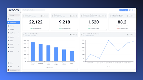

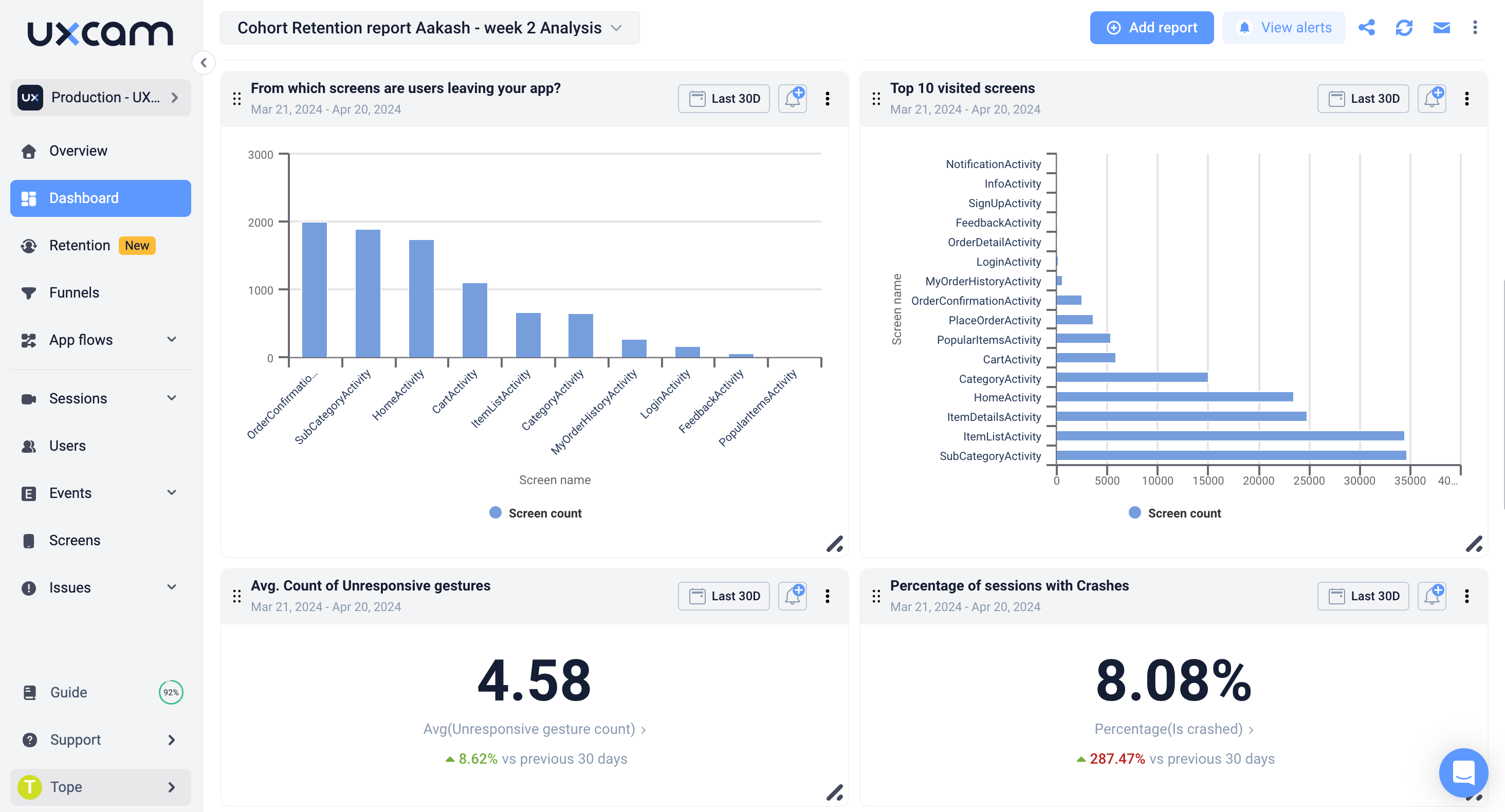
If you are using UXCam to monitor your app performance, you will already have a good idea of your own pain points and areas to be improved on. UXCam records all mobile app sessions and captures user gestures, making it possible to identify and investigate UX issues like crashed sessions, rage taps and UI freezes. This information is a helpful basis for a competitor analysis.
That said, you don’t need any specific software to test different apps and compare yourself to the competition.

How to do an app UX competitor analysis
Let’s go through the process step-by-step, so you know how to approach a UX customer analysis from start to finish.
Step 1 - Set goals and priorities
Every great analysis starts with setting the right objectives and asking the right questions. What are you hoping to achieve? What insights do you need for your overall business and product strategy? Being clear from the start will avoid any confusion later on.
For example, you may want to focus on how competitors handle onboarding, or how they structure their navigation.
UXCam can help you set goals by providing valuable insights into how users interact with your app. This helps you identify areas for improvement and see how your app compares to competitors.
Step 2 - Identify your competitors
Create a shortlist of your main competitors — three to five is enough. Avoid choosing too many. Otherwise, the analysis may become too complex and confusing to produce any concrete results. If there are not so many direct competitors in your space, you can choose indirect competitors to get inspired by their design and user journey. Alternatively, you can simply analyze a lower number of competitor apps.
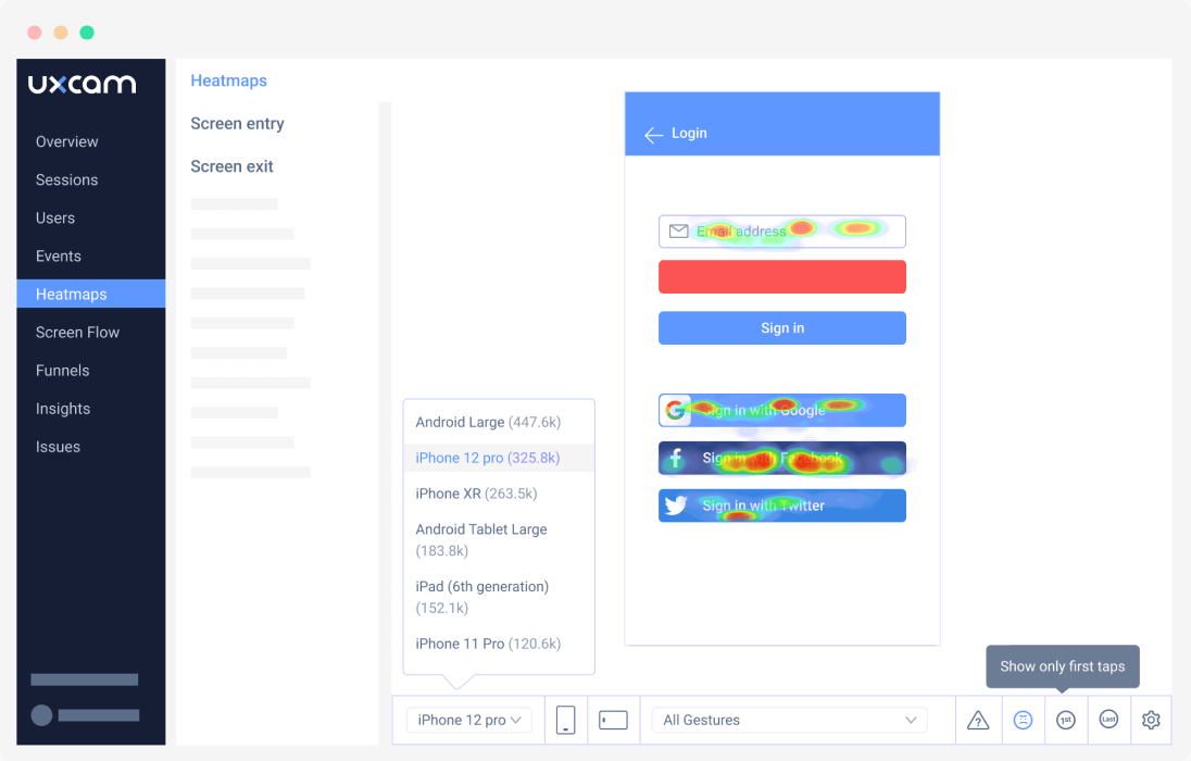
UXCam's heatmaps and screen flow features can highlight popular screens and user paths in your own app to help identify key areas to evaluate when you’re looking at competitor apps.
Step 3 - Prepare your test devices
Install the apps on your test device. To be extra thorough, you may want to test the apps on several devices, including an Apple iPhone, Android smartphone and a tablet. You might also want to check how the apps are working on Wi-Fi compared to mobile internet. Fancy graphics might be great when using a high-speed connection in your office but slow and painful when out and about.
UXCam supports both iOS and Android devices, allowing you to test your app across multiple platforms. By analyzing user sessions, you can identify performance issues and optimize your app for various network conditions.
Step 4 - Test key user journeys
What information do you want to include? Your analytical framework will make or break your analysis, so take your time with this part of the process to ensure that you collect all of the data needed. Check out our UX competitor analysis template here for an easy-to-follow guide.
Typically, a UX analysis will cover the key features and user flows of the apps, with a focus on onboarding, overall usability and relevance.
A user’s first impression has a direct impact on usage and retention. The onboarding process — or lack of one — is an important part of your analysis.
For a rideshare app, you might want to check relevant user journeys such as:
Entering your location
Permission requests to track your location
Changing the payment method
Taking the same trip again
Asking the driver a question
Use UXCam to identify the critical journeys in your own app and test the equivalent flows in competitor apps. Session recordings can reveal pain points to check for in other apps.
Moreover, by setting up specific events and funnels, you can identify areas where users may be struggling and optimize those journeys for a better user experience.
Step 5 - Conduct a SWOT analysis
Once you have gone through the individual features and processes, you need to bring it all together. Conduct a SWOT analysis covering the strengths, weaknesses, opportunities, and threats of all the apps included in your analysis.
UXCam's analytics can support the analysis for your app by quantifying user engagement, retention, and conversion rates to compare against competitor benchmarks.
Step 6 - Share your findings
Finished your analysis? Great! Now, it’s time to make sure relevant stakeholders have access to the valuable insights you have found. Put together a presentation of the findings and ensure decision-makers in the senior management, product, development, and marketing teams have access to them. At the end of the day, a UX competitor analysis will only drive business value if you make changes based on the outcome.
UXCam offers robust reporting and collaboration features, making it easy to share your findings with stakeholders across your organization.
By presenting data-driven insights, you can make a strong case for implementing changes that will improve the user experience and drive business growth.

Common UX competitor analysis pitfalls
Losing focus
Testing and optimizing your own app is a never-ending story, as there are always more hypotheses to be made and more data to be tested. This is especially true when you are auditing your own app and five others! However, do try to avoid falling down the rabbit hole. Ultimately, the goal is to produce actionable insights — so try to stay on track.
Failing to eliminate bias
If Competitor X has a really cool brand and great marketing, you may be expecting their user experience to be astounding as well. Or, you might have preconceptions based on how your app measures up to the others. Try to stay neutral and analyze all of the apps with fresh eyes, as if you were a customer using them for the first time.
All insights, no action
Have you spent hours testing competitor apps and going through the data? That’s great, but make sure the product and development teams are aligned and can start optimizing based on your findings.
Best practices for performing UX competitor analysis
Below, we'll explore the best practices for performing a UX competitor analysis
Conduct thorough app exploration
A UX competitor analysis entails thoroughly investigating and understanding competitor apps by downloading and extensively using them. This process involves navigating through all available screens, testing various features, and completing key user flows within each app. It's important to take detailed notes and screenshots to document findings accurately.
By doing so, you gain valuable insights into the strengths, weaknesses, and unique features of competing apps, which can inform your own app development or marketing strategies. This exploration aids in identifying opportunities for improvement or innovation within your own product, ultimately helping you stay competitive in the market.
Analyze user onboarding
Evaluate how your competitors manage the process of introducing and familiarizing users with their apps.
When analyzing user onboarding, consider whether the process is intuitive and easy to follow for new users. Are there any tutorials? Look for all those little things that make a UX better.
This involves examining the clarity of instructions provided at each step, ensuring that users understand what actions they need to take to proceed.
Assessing the effectiveness of tutorials or guided tours can also provide insight into how well competitors educate users about key features and functionalities. Evaluating whether these resources are engaging, informative, and tailored to the needs of the target audience can help identify areas for improvement in your own onboarding process.
Evaluate navigation and information architecture
Examine the navigation structure, menu design, and overall information architecture of competitor apps.
To begin, assess the navigation structure to determine its intuitiveness and ease of use. This includes examining how easily users can move between different sections of the app and whether the navigation flow is logical and intuitive.
Next, evaluate the design of menus within the app, considering factors such as clarity, visual hierarchy, and accessibility. Ensure that menus are well-designed and easily navigable, with clear labels and distinct visual cues to guide users.
Finally, analyze the overall information architecture of the app to assess how content is categorized and organized. Look for logical groupings of information and features, as well as quick access to key functionalities.
Assess visual design and branding
Take stock of the visual aesthetics, color schemes, typography, and overall branding of competitor apps. Consider how effectively they create a cohesive and engaging user experience.
Start by analyzing the visual aesthetics of competitor apps, paying attention to the overall look and feel. Evaluate whether the design is modern, clean, and visually appealing, or if it appears outdated or cluttered.
Next, assess the color schemes used within the app, considering factors such as color harmony, contrast, and consistency with branding. Determine whether the color palette effectively conveys the app's purpose and personality while also enhancing usability and accessibility.
Typography choices are also important to evaluate. Determine whether the fonts used are legible, appropriate for the app's content and target audience, and consistent with the overall branding.
Finally, analyze how effectively competitors establish and maintain their brand identity throughout the app. Look for consistent use of logos, brand colors, and other visual elements that reinforce brand recognition and create a cohesive user experience.
Review key features
Start by identifying the key features offered by competitors. This may include functionalities such as messaging, social networking, e-commerce capabilities, productivity tools, or any other features relevant to the app's purpose and target audience.
Once identified, assess these features based on how well they perform their intended tasks, whether they are reliable, and if they meet user expectations. Look at factors like speed, responsiveness, and the quality of the user experience.
Next, evaluate the usability of these features. Determine how easy they are to use and navigate, whether they require a steep learning curve, and if they are accessible to all users, including those with disabilities.
Examine user feedback
Read user reviews and ratings in app stores to gain insights into user opinions, pain points, and feature requests.
Look for recurring themes or patterns in the feedback. This could include common complaints or issues that users consistently mention, as well as frequently requested features or improvements.
Additionally, take note of any positive feedback or features that users particularly appreciate. This can help you understand what aspects of competitor apps resonate with users and inform your own development and marketing strategies.
UX competitive analysis template
We’ve put together a FREE template that makes it easy to get started with your analysis. Our handy template guides you through a two-step process that starts off with onboarding, usability, and relevance. Then, you can dive into the key features, and user flows for your industry — e-commerce, rideshare, food delivery, and banking are all ready to go.
Download the template now to get started with your analysis right away.
You might also be interested in these;
App Analysis: Gorillas vs. Flink
App Analysis: IKEA vs. Wayfair
Top 11 Mobile App Analytics Tools
The Ultimate Guide to Mobile App KPIs
5 Fantastic Remote Usability Testing Tools You Can Use Now
Push Notification UX: The Full Guide
Bad UX examples: Our Guide on What Not To Do
The ultimate guide to User Journey Mapping
Mobile-First Design Guidelines
Gamification Examples: Introducing Game Elements To Your App
AUTHOR
Marilyn Wilkinson
Marilyn Wilkinson is a digital marketing strategist and copywriter who works with a number of B2B tech and SaaS brands, including UXCam. She is passionate about awesome user experience, great content, hiking through the mountains and drinking too much coffee.

Related articles
Curated List
7 Best AB Testing Tools for Mobile Apps
Learn with examples how qualitative tools like funnel analysis, heat maps, and session replays complement quantitative...

Jane Leung
Product Analytics Expert
UX design
12 UX Metrics to Measure and Enhance User Experience
Unlock product success by tracking the right UX metrics. Learn 12 essential metrics, how to measure them, avoid common pitfalls, and take action with tools like...
UX design
10 Top UX Design Best Practices & How to Implement Them
Discover 10 proven UX design best practices to improve usability, boost retention, and create user-centric products. Actionable tips for product...

Tope Longe
Product Analytics Expert


