How to make and justify design decisions with data

Nobody ever warns you about the constant defense of your design decisions that come with being a product designer.
As soon as you begin designing the wireframes, you'll be questioned about your decisions. Justifying your design decisions is a process that remains constant throughout the entire product development process.
A successful product designer comes to a stakeholder meeting prepared with data representing users' needs.
Convincing the C-level and other team members who have different opinions and ideas can feel like a battle, so it’s critical to have a fundamental understanding of app analytics and data so you can speak the same language as them. Design is subjective to non-designers; they’ll prefer something else they’ve seen elsewhere, simply ‘just cuz’. If you can’t explain how your design will help the business meet desired outcomes and company-wide OKRs, implementing the change will likely not become a priority. Below we’ll discuss the impact data can have on supporting your design decisions, as well as how you can practically justify those decisions. Here's a quick summary before you get into the details.
How to make design decisions and justify them with data
Track the right metrics
Make use of design principles and style guides
Create wireframes and prototypes
Ask questions for clarification
Create Questions, Options, and Criteria (QOC)
Conduct user testing
Accept that you will not always be right
Let's dive in.
What is a design decision?
A design decision uses data to prioritize user needs over design bias. Understanding human behaviors through analytics makes it easier to create effective designs by balancing between user needs and business objectives.
What does data-driven design (DDD) mean?
DDD is defined as a design supported by data. This product design method is based on data about users' motivations, behaviors, needs, and expectations. The primary objective is the attainment of specific metrics based on:
User testing
Analytical research
Hypothesis testing
Big Data
Conducting research for your data-driven design will uncover pain points within your app. Once that discovery is apparent, the user experience can be improved, encouraging designers to make decisions based on unbiased evidence instead of only going with their intuition. Having said that, there is an essential balance between the two which we’ll discuss later.
What counts as data when justifying design decisions?
Before diving headfirst into a data-driven design, let’s make sure we understand what counts as data. There are two types:
Quantitative data
This type of data reveals what is happening (or not happening) on your mobile or web application and uncovers how users are interacting with an app. Quantitative data can be quantified, counted, measured, or given a numerical value. If you’re looking for answers to questions like “how many sessions?”, “How many visits?” or “How much are they spending at checkout?” quantitative data will give you the answer.
Some quantitative data collection methods include surveys, heatmaps, and A/B testing.


UXCam heatmap view.
Qualitative data
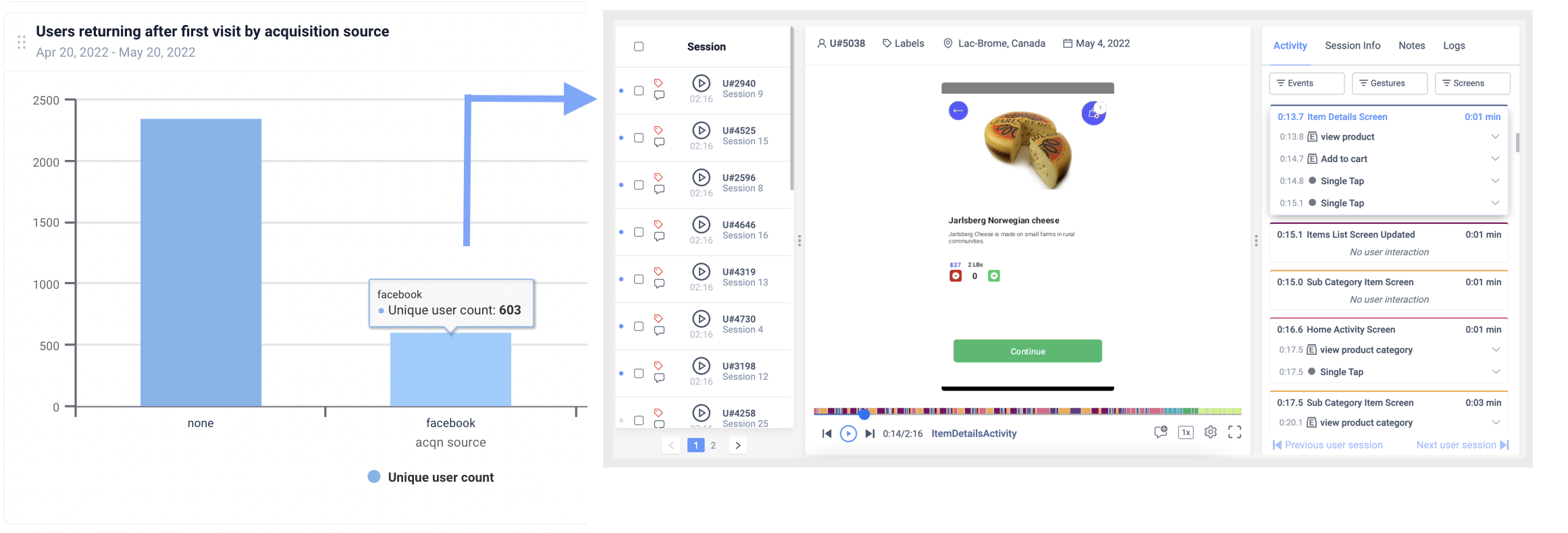
This data explains why something is happening. Unlike the above, qualitative data cannot be quantified, counted, or expressed in numerical form. Analyzing qualitative data aims to provide answers regarding the activities people perform and the factors that influence their actions. Some qualitative data collection methods include interviews, competitor analysis, user journey mapping, and session replay.
The balance between using data and trusting your intuition
Having read the advantages of data-based decision-making, you are most likely asking if it’s wise to base your entire design rationale on data. The answer is no. This was one of the mistakes I made earlier on in my career; however, I came to realize that when designers rely too much on one aspect of a strategy, they run the risk of optimizing for the wrong thing.
There must be a balance, just like everything in the real world. Keep in mind that the numbers are backed up by people, and asking users specific questions on why they chose one option over another will help you focus on fixing those specific problems. To facilitate this:
Have real face-to-face conversations and let customers lead the conversation. Analyze your current clients first.
Examine the user flow on your site, delve into audience statistics, and examine demographic information.


As designers, we have a plethora of opportunities to fundamentally rethink how we use data, how we get insights from it, and how we use it to defend our decisions. Taking advantage of this will enable us to make better design decisions, therefore bringing our users better products.
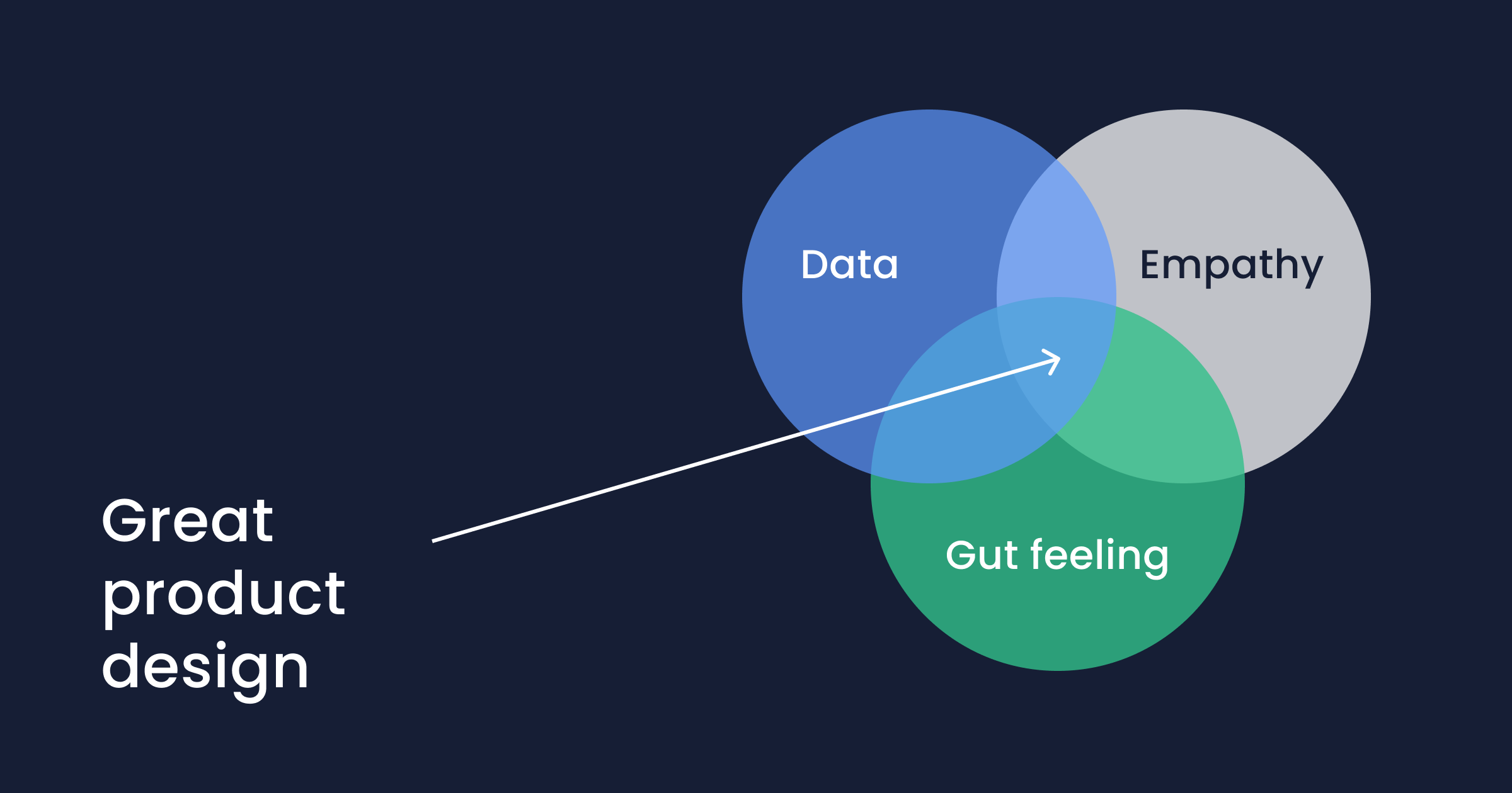
The best course of action is to adopt this evidence-based design approach whilst trusting your creative instincts. Aid stakeholders in realizing the value your suggestion may bring to the company in the digital era. If you want to build a great application, synergize between your use of data in your decision-making process, and trusting your instinct.
How to justify your design decisions with data
There are several steps you should take, highlighted below, to communicate your decisions effectively.
Track the right metrics
This is the most scientific way to show your ideas are having the desired effect, and it’s the key to gaining support from your stakeholders.
If you have analytics showing several visitors to your app or website do not complete the desired action, then the use of qualitative data from users can provide a solution that presents a very strong argument to win over your stakeholders.
When discussing your decisions, you can utilize one of two types of data:
Existing data: This is the data that is currently available and can be used to help you make decisions now.
Reflective data: Data gathered before and after redesigning an application. To capture the attention of your stakeholders, flex your research and defend your decisions with phrases starting like: "Based on analytics gathered," "Our data indicates that..." etc.
Pro Tip: Instantly Track Key Metrics
Set up dashboards in one click using UXCam's extensive recommended reports library for effortless KPI monitoring.
This streamlined setup allows you to combine quantitative and qualitative data seamlessly with an intuitive, no-formula interface.
With everything integrated, you can transition smoothly from metrics to actionable insights by accessing user sessions directly from your dashboards.

Make use of design principles and style guides
Communicating design principles to non-designers is important when defending your design rationale. It shows stakeholders in areas like product or business development that you have a clear and structured thought process.
Core principles give guidance to design decisions. Clearly proven design principles like “F-shapes and Z-patterns” can serve as your basis for pushing back on suggestions that don’t align with your overarching plan.
When you need to justify a decision, Jon Yablonski's Laws of UX is an excellent resource to use. As designers, we frequently make decisions without giving them a second thought. We don't realize some decisions aren't as obvious to others until we are asked and compelled to justify them.
For example, being able to explain that Jakob's Law states 'Users spend most of their time on other websites, this means that they prefer sites that are similar to the ones they are already familiar with, hence why you decided to create similar looking designs but with a little twist" can be used to defend a design choice if the stakeholder wants you to use unconventional design styles. Providing a defense that is backed with facts and data will make it much easier for people to agree with you.
Create wireframes and prototypes
Creating wireframes and prototypes is very effective in defending your decisions because it is often easy to convince people of an idea when you can present it visually.
Ask questions for clarification
When someone else criticizes your design, they'll often offer a solution in their feedback. Your task is to identify the key issue contained in that feedback.
Asking them why is the first step in finding the basis of the problem, which requires practice and skill. When a stakeholder or co-worker disagrees with your choice, pose questions like, "Why do you think this option is ineffective? Why do you think it's difficult to navigate this design?” These kinds of inquiries typically encourage deeper conversation and reveal any potential loopholes.
Tip ask the "why" questions to gain clarification for improvement and not with the intent to attack. Defend your project goals, not your expertise.
Create Questions, Options, and Criteria (QOC)
This method makes it possible to trace both the results of your design rationale and the standards upon which they were made. Quantitative and qualitative data are combined in QOC in a way that reflects a person's thought process.
How to use QOC
Start by asking yourself questions like, "How do I make this screen more accessible?” or "How fast or slow should the animation on this screen be?”
Offer a range of answers to these questions. It could be numerical, like the pixel size of a user interface element. It can also be qualitative, like color or shape.
Decide what you want the product to focus on. Usability, accessibility, or minimalism.
Once all the information has been compiled, analyze which options received the best ratings. Your design decisions will be influenced by these measures, and you'll be able to defend them confidently if questioned. If a stakeholder disagrees with the criteria you chose as essential, you can go back and iterate on the initial QOC.
Conduct user testing
Sometimes, even after carrying out research, reviewing the UX laws, and generating potential solutions, you might still not know what the best design path is. This is where speaking with users and conducting user testing becomes important.
Conduct A/B testing to determine which solution, for instance, has the best success rate, quickest completion time, or lowest error rates. Look at the metrics for the product, check out heatmaps and look into session replay to learn what they do when interacting with the design.
Making a case for your design decisions by demonstrating them in a usability study is particularly effective since it demonstrates how well your ideas function with real users. Instead of the impersonal sense that raw data conveys, it has a human element that gives our stakeholders a narrative into your thought process. Using real user stories instead of statistics may sometimes be more beneficial, depending on your stakeholders.
Accept that you will not always be right
Remember that there are no two designs the same. You won't always be right with your design decisions – and that’s okay! Design is subjective, and you won’t win over everyone all the time. Stakeholders are a great resource for solving unique design problems since they are most knowledgeable about their specific business and target audience. Use that knowledge to your advantage.
Examples of common design decisions
Here are 10 examples of common design decisions across various domains:
1. Choosing a color palette
Decision: Selecting primary, secondary, and accent colors for the design.
Considerations: Brand identity, emotional impact, readability, and accessibility (e.g., color contrast for visually impaired users).
2. Determining layout and composition
Decision: Structuring elements on a page or screen.
Considerations: User focus areas (e.g., F-pattern for websites), whitespace, and balance between visual elements.
3. Typography selection
Decision: Picking fonts and setting type sizes for headers, body text, and captions.
Considerations: Readability, brand consistency, and legibility across devices.
4. Interaction design
Decision: Designing how users interact with the product.
Considerations: Touch targets for mobile screens, hover states, click behaviors, and intuitive gestures.
5. Navigation structure
Decision: Creating a logical flow for users to find information.
Considerations: Flat vs. hierarchical menus, breadcrumbs, and consistency in navigation placement.
6. Visual hierarchy
Decision: Organizing content to guide users' attention.
Considerations: Size, contrast, proximity, and alignment of elements to prioritize importance.
7. Button design
Decision: Styling and positioning buttons.
Considerations:Call-to-action clarity, hover/pressed states, and adherence to usability guidelines.
8. Image and media use
Decision: Selecting and incorporating visuals like photos, illustrations, and videos.
Considerations: Relevance, resolution, loading speed, and alignment with brand voice.
9. Accessibility features
Decision: Ensuring inclusivity for all users.
Considerations: Screen reader support, keyboard navigation, and compliance with standards like WCAG.
10. Content structure
Decision: Organizing information and microcopy.
Considerations: Scannability, tone of voice, and prioritizing user tasks (e.g., FAQs, headings, tooltips).
What are the five basic types of design decisions?
1. Aesthetic decisions
Focus: The visual look and feel of the design.
Examples
Choosing color palettes, fonts, and imagery.
Deciding on the overall style (e.g., minimalist, retro, modern).
Purpose: To create an emotional connection, align with brand identity, and ensure visual appeal.
2. Functional decisions
Focus: How the design works and serves its intended purpose.
Examples:
Structuring navigation menus for usability.
Deciding on button placement for accessibility and efficiency.
Purpose: To ensure the design meets user needs and facilitates tasks.
3. Technical decisions
Focus: The implementation and technical feasibility of the design.
Examples:
Selecting platforms or frameworks (e.g., React, WordPress).
Optimizing for performance, such as choosing lightweight assets.
Purpose: To ensure the design can be built and functions effectively across devices and environments.
4. User-centered decisions
Focus: Addressing the needs, preferences, and behaviors of the target audience.
Examples:
Designing for accessibility (e.g., high-contrast text for low-vision users).
Adding tooltips or guided walkthroughs for complex interfaces.
Purpose: To create a design that is intuitive, usable, and inclusive.
5. Strategic decisions
Focus: Aligning the design with business and project goals.
Examples:
Deciding on feature prioritization based on user research.
Aligning the tone of microcopy with brand messaging.
Purpose: To balance user needs with business objectives and ensure design aligns with long-term goals.
Why is data necessary in your design decision?
Only 42% of companies use data to inform their design decisions.
Now we know what sort of data we can bring to help support our design discussions, let’s take a deeper look into why using data makes a designer's life so much easier.
Data provides designers with insight so they can create better designs for their users
Without using data from either qualitative or quantitative methods, a lot of designs would not discover or solve the core pain points of users.
Many designers assume they already know what people want without conducting any kind of user research. These designers might also tend to become fixated with their ideas when in reality they are not the end users.
Data gives designers a deeper understanding of how users behave with an app. For example, knowing which features they use or ones they might be unaware of should guide inspiration for designs.
Data is used to create efficient designs
Many organizations struggle to find the balance between their users’ needs and their business objectives. A project's success may suffer severely if data analytics are not taken into account. As author and consultant, Geoffrey Moore said:
“Without big data analytics, companies are blind and deaf, wandering out onto the web like deer on a freeway.”
Effective data use can immediately result in better business outcomes. According to a study by the MIT Center for Digital Business, "The top 3 organizations in their respective industries use data in their decision-making and were on average 5% more productive and 6% more successful than their competitors."
Data guides UX design and helps identify issues
Metrics like high bounce rate could be an indication that a page doesn't include the needed information the users were looking for, or maybe the information was too difficult to locate. Data can be utilized to get the answers to questions like, "Where do users get stuck?" Where do we have broken flows?” “What are the desired actions of users?” Consider using product analytics tools to help guide your design rationale. These tools will highlight how a page performs before and after a redesign. Metrics prove if your rationale was right or needs another iteration.
The sweet spot for successful businesses is their ability to combine data analytics with empathy and intuition. Combining these results in an adaptive strategy that solves challenges flexibly and dynamically.
To properly justify your design decisions, remember to analyze your user's behavior with solutions like UXCam, ask lots of questions to your stakeholders, and always bring a visual representation of your vision to the discussion.
Further Education: Free Product Management Course
To become a product manager who can easily justify design decisions, we recommend our free Mobile Product Management Certification.
Know which metrics to track, and how
Get 15+ frameworks and templates
2+ hours of video material
You might also be interested in:
Mobile app KPIs: Top 51 metrics to measure app performance
Why creating a data-driven culture has less to do with data than you think
Data-driven product management: achieve global app growth
13 Product management tools the best product managers use
AUTHOR
Akorede J. Ayanbisi
Akorede, is a professional product designer, with vast knowledge in building products that proffer solutions to problems facing brands and businesses. Akorede has worked on numerous applications which span across B2B, B2C, Web3 and SaaS products. He is passionate about coaching other designers to help them become accomplished designers and improve user experiences.

Related articles
Product best practices
5 best user behavioral analytics tools for mobile app teams
Behavioral analytics offers deep insights into user interaction. Learn about the best behavioral analytics tools to optimize the user experience on your mobile...

Jonas Kurzweg
Product Analytics Expert
Product best practices
Top 11 Remote Usability Testing Tools You Can Use Now
Usability testing tools that will put your mind at...

Jonas Kurzweg
Product Analytics Expert
Curated List
7 Best AB Testing Tools for Mobile Apps
Learn with examples how qualitative tools like funnel analysis, heat maps, and session replays complement quantitative...

Jane Leung
Product Analytics Expert


