Users today have a large variety of options for their mobile apps. Google Play alone has nearly 5 million apps. The Apple App Store has more than 4.3 million.
In such a competitive market, you need to know your audience and how they use your app. 88% of online users are less likely to return to your site or app if they have had a negative experience.
Mobile app heatmaps are one of the best tools for getting inside your users’ heads and understanding their behavior on your app.
Quick Summary: Everything you need to know
Here are the most important things you have to know about mobile app heatmaps:
| Question | Answer |
|---|---|
| What's the most popular tool for mobile heatmaps? | UXCam, installed in 37,000+ products |
| What types of mobile heatmaps exist? | Touch heatmaps, rage tap heatmaps, unresponsive gesture heatmaps, first & last touch heatmaps |
| What are compatible frameworks for mobile heatmaps? | Native Android, Native iOS, Flutter, React Native, NET MAUI, NativeScript |
| How to use mobile heatmaps? | Segment your heatmap data by user behavior patterns, device types, and app versions to find usability issues |
What are mobile app heatmaps?


Mobile heatmap tools visualize how users interact specifically with mobile apps, not just websites, by transforming gestures like taps, swipes, scrolls, and long-presses into color-coded maps.
Warm colors (red/orange) highlight high-engagement zones, while cool colors (blue/green) show low-activity areas.Unlike web heatmaps that only capture clicks and scroll depth, mobile heatmaps reveal mobile-specific gestures, such as:
Tap intensity
Multi-finger gestures
Rage taps
Unresponsive gestures
Orientation changes
Device-specific layout behavior
This makes mobile heatmaps crucial for teams building native iOS, Android, or hybrid apps where UI interactions are far richer than on the web.
Benefits of mobile heatmaps
Uncover friction instantly: Identify rage taps, dead zones, and unresponsive UI elements.
Optimize feature placement: See natural attention patterns on smaller screens and adjust layouts for higher engagement.
Improve onboarding flows: Spot points where users hesitate, struggle, or drop off during onboarding.
Reduce development guesswork: Understand what users actually do instead of relying on assumptions.
Improve responsiveness across devices: Compare interactions across iPhones, Android devices, tablets, and varying screen sizes.
Support continuous experimentation: Validate design changes by comparing heatmaps before and after UI updates.
How do heatmap analysis tools work?
Heatmap analysis tools automatically capture user interactions, such as taps, clicks, swipes, and scrolls, and display them as a color-coded overlay on your app or website interface. The result is an instant, visual summary of where users engage most and which areas are being overlooked.
The colors on this overlay vary, usually from cool (blue) to warm (red). By this principle, the most interacted areas of the app are highlighted in warm colors, representing 'hot' spots, while less popular regions remain in cooler shades.
Beyond just user taps and swipes, some heatmaps also monitor how long a user's finger remains on an area, providing deeper insights into user preferences and behavior.
In other words, the longer the interaction, the 'hotter' the area becomes on the heatmap. This way, app developers and designers get a clear picture of their application's user engagement patterns, allowing them to improve user experiences significantly based on these insights.
Types of heatmap analysis tools
There’s a specific heatmap that can help with every hypothesis. If you think a static graphic on your app is getting mistaken for a button, check unresponsive gestures.
Are logins dropping after the download? Rage taps might be able to tell you what’s blocking users from setting up their accounts.


Here, we cover the different types of heatmaps that can make it easier for you to understand user behavior. All of the following types of heatmaps are features of UXCam.
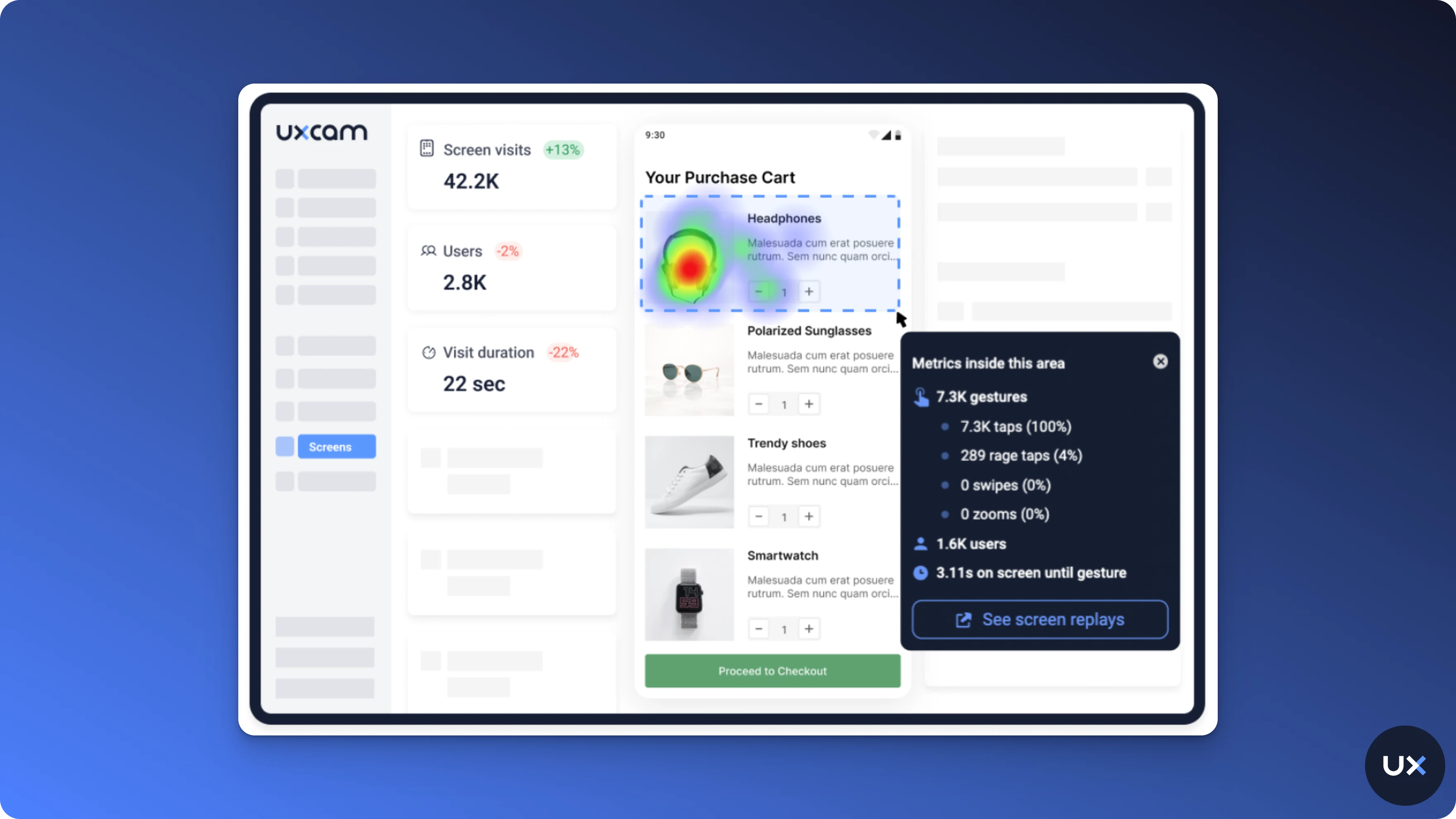
1. Rage tap & Rage click heatmaps


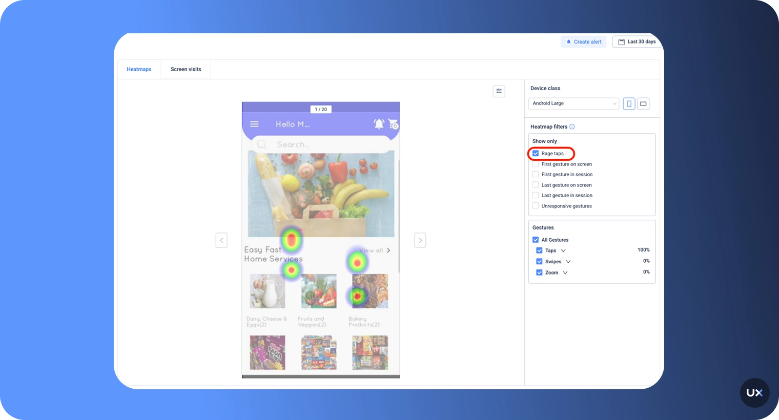
Imagine this: You use an app and try to tap on an element, but nothing happens. You try to tap on it a few times, you get frustrated, and leave the app.
UXCam calls this tapping behavior a “Rage Tap.”
A rage tap represents rapid-fire taps in frustration. It's defined by at least 3 taps within a certain radius on the screen and at most 300ms between consecutive taps.
It would show you when users are frustrated with a certain element in your app. With UXCam, you can generate heatmaps that show your rage tap elements to help you decrease user frustration.
2. Unresponsive gesture & Element heatmaps


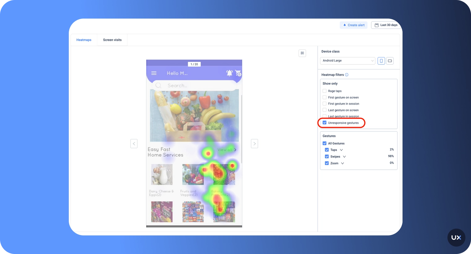
Unresponsive gestures are defined as an element that is touched, but it’s not an interactive element. Therefore, the gesture doesn’t result in any responses.
Heatmaps of unresponsive gestures can be generated to show you elements that get attention when they shouldn’t.
3. First-touch (or First-click, First gesture) heatmaps


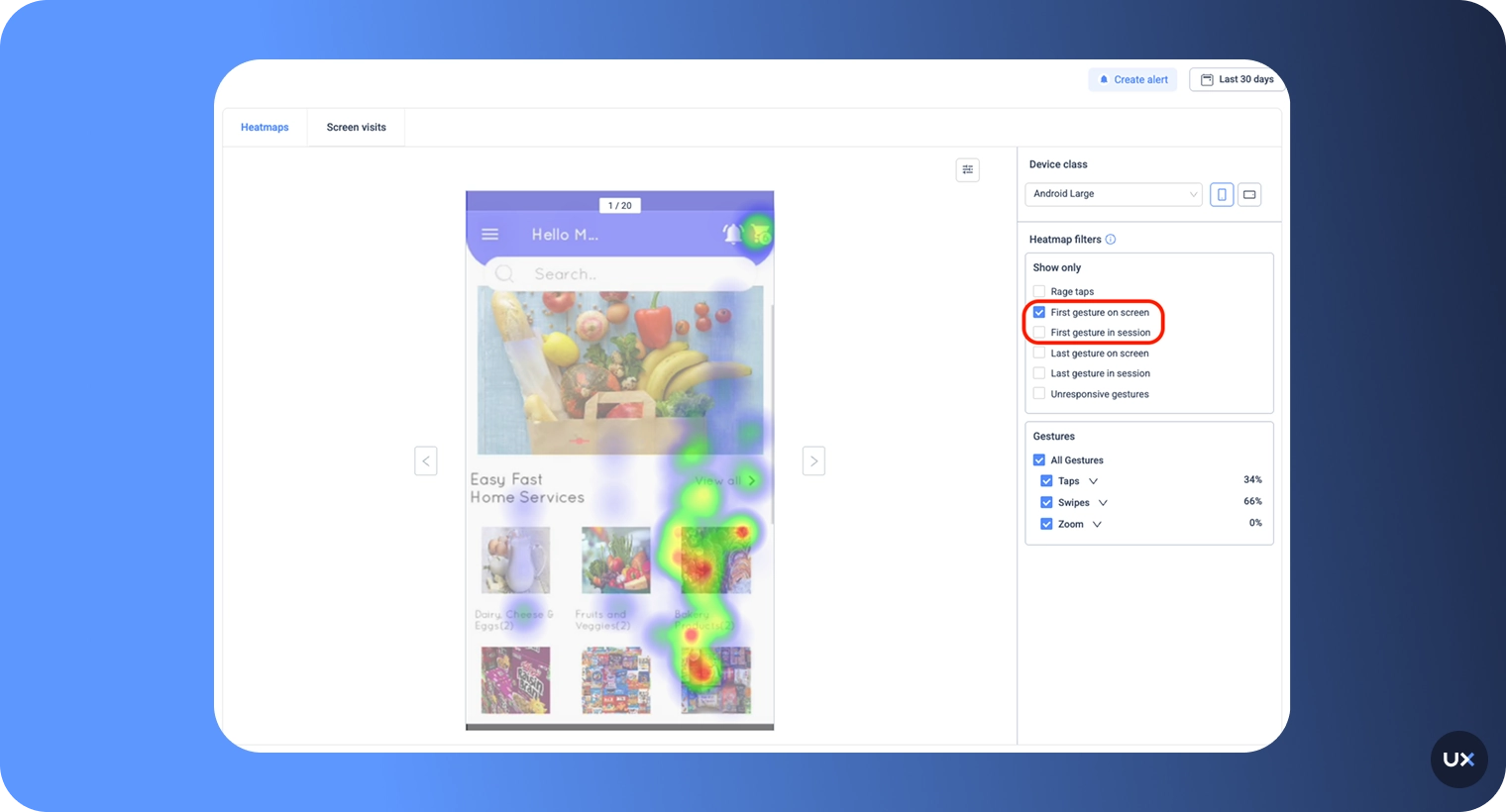
Human beings form a fast first impression. With first-touch heatmaps, you can see where users intuitively tap on when they first see a screen.
4. Last-touch (or Exit interaction, Last gesture) heatmaps


It’s insightful to know how users leave your app. Last touch heatmaps allow you to see the last touch of each screen. Understanding where users stop interacting is just as important as knowing where they start. Last-touch heatmaps visualize where users disengage or abandon a session, whether they exit a product page, close a modal, or stop scrolling in an app.
5. Device & Screen size heatmaps


Users interact differently depending on screen size or device type. When you develop a mobile app, it needs to be responsive to a wide variety of devices and device sizes. If you look at heatmaps for specific devices only, you can identify issues that are caused by or occur only on specific mobile devices.
6. Landscape and Portrait heatmaps


With users constantly switching between orientations (portrait vs. landscape) or scrolling behaviors on websites, these heatmaps highlight how engagement shifts with screen position and layout.
UXCam’s scroll and orientation heatmaps help teams ensure that critical content, like CTAs, forms, and banners, appears where users are most likely to see and interact with it.
How to analyze heatmaps
Let’s take a closer look at a scenario from UXCam.


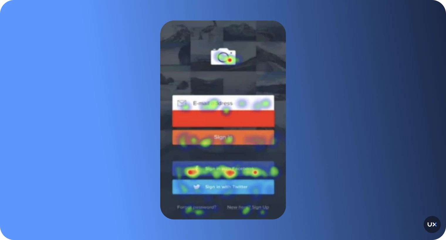
A company that uses UXCam, let’s call them Photos Inc., uses heatmaps to understand user behavior.
The result is the following:
We can see that the login page of Photo Inc. is okay, but perhaps not ideal for its users. Heatmaps show us that most users log in with a Facebook account instead of an email address.
To increase user login and improve the user experience, Photo Inc. has to move its Facebook login button to the top of the list of options.
By doing this, the Facebook sign-in becomes more prominent and moves the email sign-in to second on the list. The users' first impression is related to design in 94% of the cases.
Just that little change could spiral into major improvements for Photo Inc. What improvements could you make to your app?
Heatmaps enable us to take in a lot of information in a small amount of time. However, some traps can falsify the heatmap analysis.
Here are four things to consider when reading a heatmap.
Prepare the heatmap analysis Set a goal before looking at your heatmap. What do you want to achieve with this analysis?
If you have a hypothesis before you look at the data, it will help you approach the analysis objectively and systematically. Without a goal, you’ll waste time with an aimless analysis that can even lead to misinterpretations. This is one of the most important points to keep in mind before you start analyzing a heatmap. To see if users are spending more time on specific screens, check the average engagement per screen.
Take your time If you want to truly understand your users, you can't just rely on a handful of visits. To get a comprehensive view of their behavior, you need more data. But when should you start analyzing that data? Well, it all depends on how much traffic your app is getting. If you only see a trickle of users, you might need to wait a while before you can confidently draw any conclusions. On the other hand, if you're attracting hordes of visitors, you might be able to start analyzing data much sooner. Ultimately, the more data you have, the better you'll be able to make informed decisions about your app's user experience.

Did you know that to accurately gauge user behavior on a screen, you would need at least 2,000 visitors to have visited it? That's right! Any less and the date might be too unreliable to make any firm conclusions.
It's important to gather data from a diverse pool of users before making any changes to a product's features. Otherwise, you may end up catering to a small group that doesn't accurately represent the majority of users. Adapting features based solely on feedback from a few users could potentially hurt the overall user experience. Make sure to cast a wide net when collecting data to ensure that changes benefit the majority of users.
Segment data
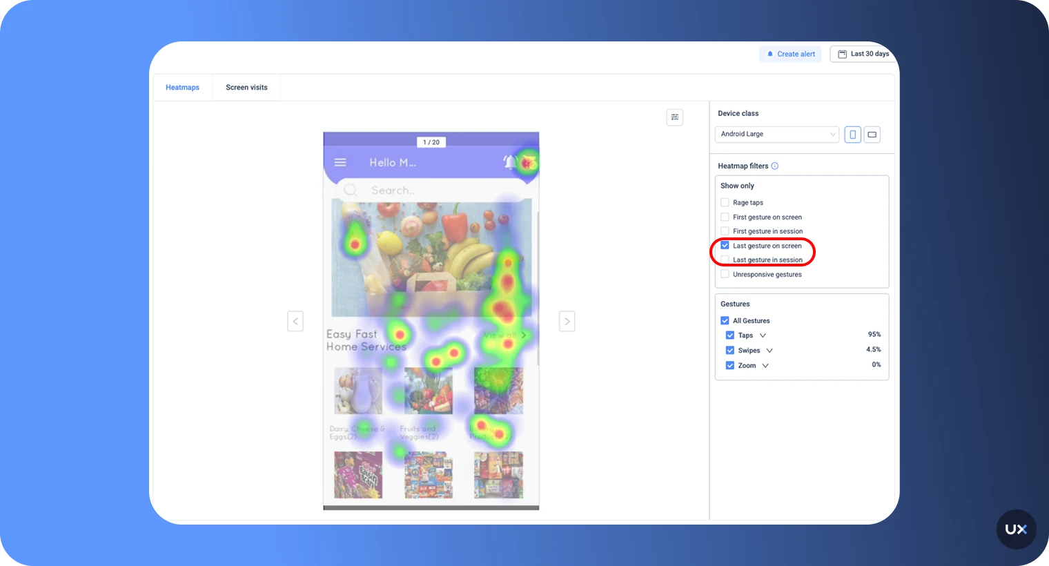
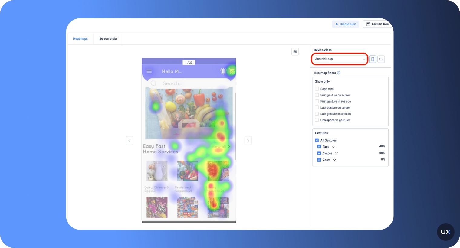
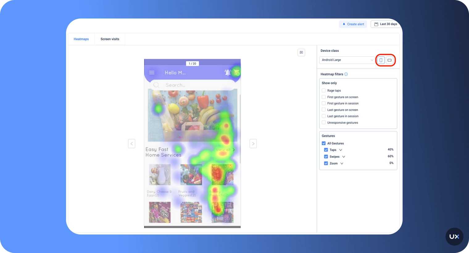
The ambiguity of analyzing a heatmap leads to the fact that the simplest explanation might be the right one, but it can also be the opposite. When it comes to understanding user activity on your app, it can be a bit tricky if you aren't sitting right next to them while they are using it. Lucky for you, there are ways to mitigate this problem. By segmenting data and considering the circumstances in which they are using your app, you can gain valuable insights into what is driving their behavior. With a little bit of effort and analysis, you can unlock the secrets to improving user experience and making your app even more successful. Common distinctions are listed here:
Gesture Type
App Version
Device Class
OS Version
First Tap
Last Tap
Gain valuable insight into your users' behavior with this tool. By examining their usage habits, you can make informed decisions on how to enhance your mobile app. With a little bit of effort and differentiation, both you and your users will benefit from a better app experience.
Compare results
Do you want to know if the changes you've made to your mobile app are hitting the mark? Comparing heatmaps before and after changes can give you the insight you need. This allows you to see if your changes are creating the desired impact and adding value. Change isn't a one-and-done deal; it's a continual process. As such, it requires constant analysis and improvements to attain optimal results.
How to optimize your UI with heatmaps
Optimizing a mobile app design using heatmaps is a process that involves a blend of strategic analysis and responsive action based on the insights obtained. Here's a step-by-step guide on how you can leverage heatmaps for app optimization:
Understand user interactions Firstly, use heatmaps to understand how users interact with your app, identifying frequent touchpoints and less-visited areas. These heat signatures reveal what elements of your app are garnering the most attention.
Identify areas for improvement Red zones on the heatmap indicate areas where users are most active. If these zones do not align with important buttons or features, it may signal a poor layout. Similarly, important features left cold or unvisited suggest changes are necessary to make these features more apparent.
Declutter the interface Mobile apps often suffer from an overcrowded interface. Heatmaps can reveal which elements are frequently interacted with and which are usually ignored. Remove, minimize, or relocate ignored elements to create a cleaner and more intuitive user interface.
Optimize call-to-actions (CTAs) If your CTAs aren't in your app's hot zones, your conversion rates may suffer. By repositioning CTAs based on heatmap data, you can increase their visibility and effectiveness, facilitating better user engagement.
Testing and iterating Use the insights from heatmaps to back up your hypothesis testing for redesigns. Iterate on the design, test it, and use negative feedback loops like 'rage taps' or 'unresponsive gesture' heatmaps to verify if the changes lead to a better user experience.
Remember, optimizing an app is a continuous process. It requires consistent monitoring, testing, and refining based on the latest heatmap data to meet the evolving needs of your app's user base.
Features you can combine with heatmaps
Session recording
Session recordings work best with heatmaps to provide more context to the analyst. Session replay gives an insight into how users are interacting and navigating around your mobile app, acting as a guide for you to make decisions on design, features, or prioritization.
In UXCam, you can find session recordings together with heatmaps. Just go to the Heatmaps tab and click on the screen you would like to analyze. Learn more about session replay in our guide about mobile session recording.
Funnel analytics
Funnels allow us to analyze the success of each step towards a conversion. Maybe there are bottlenecks that you’re unaware of that are blocking completion.
With UXCam's funnel analytics solution, you can create funnels, like a sign-up funnel or a check-out funnel, to identify if there are any high drop rates on a specific screen to understand user behavior.
Once you have funnels set up, and you can see a high drop rate on a specific page, you can go to the heatmap of that page and analyze where those users are getting frustrated.
Screen flow
Screen flow is similar to funnels, but gives a broader overview. Understand the bigger picture of your app in a single view.
Screen flow is great for identifying bottlenecks and seeing different user paths throughout the journey - conversions, drop-offs, entries, and exits.
Just like with funnels, when you notice some interesting data, you can take note of the page and look at the heatmaps for that page for more insights.
How to choose the right heatmap analysis tool
Here’s a quick guide to help you decide:
Define your primary use case Start by identifying what you want to learn:
Are you trying to improve app onboarding or feature adoption?
Do you need to increase web conversions or reduce drop-offs on key pages?
Or do you want a single platform to understand user behavior across both?
Check for cross-platform support Not all heatmap tools work seamlessly across devices. Choose one that supports iOS, Android, and web, so you can track users consistently across their journey. If you have both app and web users, opt for UXCam, which integrates mobile and web analytics into one dashboard.
Evaluate the depth of insights Look beyond surface-level visuals. The best heatmap tools offer a blend of:
Session replays for contextual understanding. Learn more about how to analyze session recordings.
Funnel analytics for drop-off tracking.
AI insights (like UXCam’s Tara) for faster interpretation. This combination ensures you get both qualitative and quantitative value from your data.
Prioritize ease of implementation The setup process should be simple and scalable. Tools that require heavy manual tagging can slow your team down. UXCam offers autocapture, meaning every tap and gesture is tracked automatically, no code changes needed.
Assess data privacy and compliance With data protection laws tightening worldwide, ensure your chosen tool complies with standards like GDPR, CCPA, and HIPAA (if applicable).
Consider scalability and support If you plan to grow your product or team, look for a tool that scales easily with your data volume and offers reliable support. You want a tool that provides dedicated onboarding and customer success support, making it easier for large teams to get immediate value. Pro Tip: Pick a heatmap analysis tool that fits your workflow, not just your budget. The right choice bridges data with action, letting your team see what users do, understand why they do it, and continuously improve the experience across every platform.
Understand user behavior better with UXCam
Choosing the right heatmap analysis tool can transform how your team understands and improves user experience. The best tools don’t just show where users click or scroll; they reveal why users behave a certain way and how you can design around it.
UXCam combines heatmaps, session replays, and product analytics in one platform, giving you a complete view of user interactions across mobile and web. With gesture-based insights, autocapture, and AI-driven analysis, UXCam helps you spot friction points and optimize every screen faster.
See what your users see, and act on it instantly. Start your free trial with UXCam today and discover how easy it is to turn behavioral data into better user experiences.
FAQ
How do heatmap analysis tools improve UX design?
Heatmaps reveal user intent in a visual way, helping teams understand what’s working and what’s not. By showing where users hesitate, ignore elements, or get stuck, designers can simplify layouts, refine navigation, and make data-driven UX improvements that enhance engagement and retention.
How do you read heatmaps?
Focus on the colors: warm tones (red, orange) show high user activity, while cool tones (blue, green) show low engagement. Use these patterns to identify what draws attention and what needs improvement.
What types of heatmaps are most useful?
The most common types include:
- Click/Tap heatmaps: Show where users interact the most.
- Scroll heatmaps: Reveal how far users scroll down a page or screen.
- Rage tap/Click heatmaps: Highlight frustration points where users repeatedly tap or click.
- First- and last-touch heatmaps: Show where users first and last interact before leaving.
- Device-based heatmaps: Compare engagement across different screens and devices.
What makes UXCam different from other heatmap tools?
Unlike most tools that focus only on web interactions, UXCam captures cross-platform behavior across mobile apps, websites, and hybrid environments. It combines heatmaps, session replay, AI insights (Tara), and autocapture to help teams analyze user behavior without extra code or manual tagging.
Are heatmap analysis tools safe and privacy-compliant?
Yes, reputable platforms like UXCam are fully GDPR, CCPA, and HIPAA compliant. They anonymize user data and ensure sensitive information (like passwords or personal details) is never recorded. Privacy-first design means you get accurate insights without compromising security.
You might also be interested in these articles;
The heatmap tool for React Native apps: UXCam
The Flutter mobile app heatmap tool: UXCam
Best heatmap software for Mobile Apps
Tried and Tested Heatmap Tools for Web and Mobile
Mobile App Session Replay: Ultimate Guide
Top Mobile app KPI dashboards: How to use them (with EXAMPLES)


Related articles


Curated List
Best 15 Heatmap Analysis Tool for Web and Mobile Apps in 2026
Discover the best heatmap analysis tools and how these platforms help teams visualize user behavior and improve UX across mobile, web, and hybrid...


Begüm Aykut
Growth Marketing Manager


Heatmaps
Mobile App Heatmaps: Ultimate Guide 2026
Get a complete guide to mobile heatmaps, how they work, the gestures they track, and how to analyze them to improve...

Jonas Kurzweg
Product Analytics Expert


Heatmaps
Examples of Heat Maps and What the Data Means
Learn how to interpret mobile app heat maps, understand key patterns, and what the data reveals about user interactions and...


Tope Longe
Product Analytics Expert