A Practical Guide to Mobile App Product Management

The role of a mobile product manager is still relatively new, and it’s rapidly evolving due to the increased adoption of mobile devices. In the second quarter of 2022, mobile devices (excluding tablets) generated nearly 60% of global website traffic. In 2023, more web-based businesses will be opting to develop mobile apps to build a loyal customer base, uncover more valuable user insights, and facilitate a more seamless user journey.
The fundamentals of traditional product management are mostly the same for mobile app Product Management, but there are a few key differences between the tasks.
The most obvious differences are when it comes to prioritizing features to improve product quality, however, mobile devices and related client scenarios lead to changes in the attributes of the product manager's role, which we'll discuss below.
Mobile App Product Management Certification
If you are reading this blog post, you want to improve your mobile app PM skills. We have created a course to help you do just that:
Follow a step-by-step guide, with 15+ templates and frameworks
The certification is completely free
The course content is based on expert interviews
Get a certification document for your resume and LinkedIn profile
The course is divided into four modules. The modules build on each other and follow the typical product management cycle.
Module 1 - Plan: Introduction to the North Star Framework
Module 2 - Discover: Exploration of the Opportunity Tree, Decision Matrix, and Shape Up Methodology
Module 3 - Deliver: Implementation of the "2 to 98" Framework for Delivering Updates
Module 4 - Measure: Analysis of KPIs and Their Tracking Methods
Become a certified mobile app product manager for free here.
Screen size and usability
When creating an app, screen size dictates everything. You have to focus on smaller dimensions when creating your customer journey maps and remember that usability is key.
In the world of mobile product management, interfaces are particularly prone to changes and redesign. This occurs not only because of new trends in user interface design but also for practical reasons as the technology itself evolves.
Below are a few notable trends in mobile design before we move on.
Layered interfaces
As we touched on above, the main difference between desktop and mobile devices is the physical size of the display. The lack of screen space has long been one of the reasons why mobile app interfaces have remained extremely simple, if not primitive, compared to PC programs.
Today this difference is partially compensated in mobile app product management by the use of layered interfaces in app menus that resemble a software stack, or more simply a stack of papers. This approach provides the user with one functional window at a time, while still maintaining quick access to all other windows.
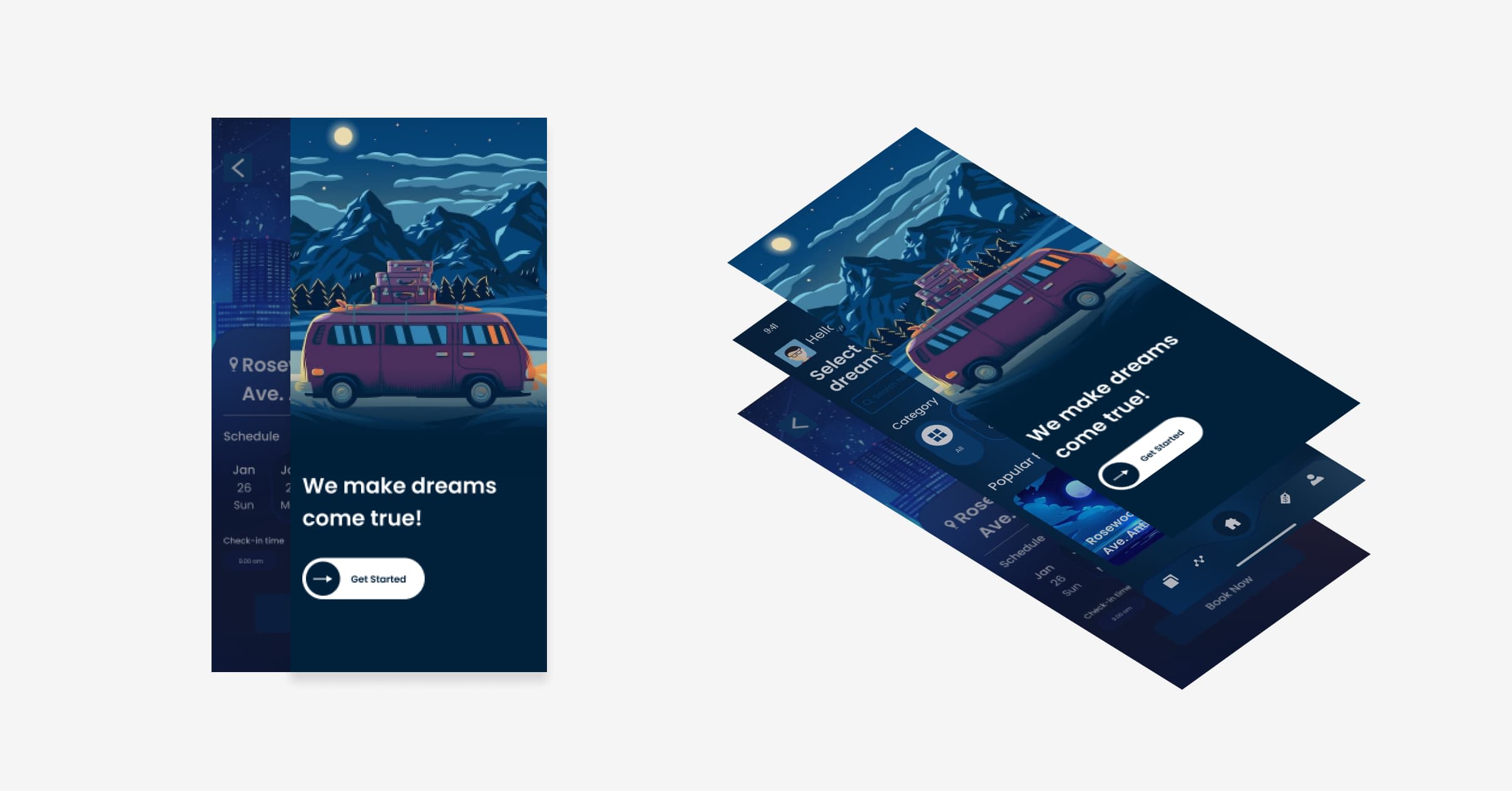

Example of layered interfaces
Examples of app menus:
Tabbed Panels: Used to pack a large amount of information into a single interface element usually at the top or bottom of the app screen. When using tabs, a good principle is ‘one tab = one window.’
Drop-down lists: Usually, drop-down list menus are large and nearly fill the screen. They contain a set of options that can be categorized as combo boxes, a sort of cascading approach.
Fixed menus: These are sets of the most frequently used and necessary functions within the app. The purpose of such a menu is to always remain visible on the screen to guarantee fast access to the most important buttons.
Modal windows: Used to overlap all other windows attracting all the attention of the user, sometimes called pop-up windows.
To enhance the visual difference between the interface layers, designers often use the effects of darkening. This means the active layer is visible, while all the others are hidden by the imposition of a semi-transparent mask.
Card layout
The card layout trend is relatively new in UX design (popularized by Facebook and Twitter) but has already won many supporters. Once a popular characteristic of the web, it’s now fully adapted to mobile. As card layouts are organized in blocks of a fixed size it allows designers to easily adapt to different screen resolutions by resizing the blocks based on the available workspace.
Function priorities
Another big change when moving from desktop to mobile is the need to restructure page functions, some examples include purchase and registration pages.
Functionality is determined based on a specific business task. For example, an insurance software app would differ from its web version because the app probably won’t include big coverage descriptions - it’s too complex. However, it might still hold information on some narrow claims or policy issues. The app should contain exactly the number of functions required for the customer on their way to the target action (purchase, order, booking).
An app with insufficient functionality will not solve the audience's needs, which means it will not be in demand. Unnecessary options will only confuse users, which will lead to a slump in conversion metrics even if it increases the average duration of customer sessions.
Setting up conversion funnels can give you a good idea of how users are using your functions and navigating through your pages.
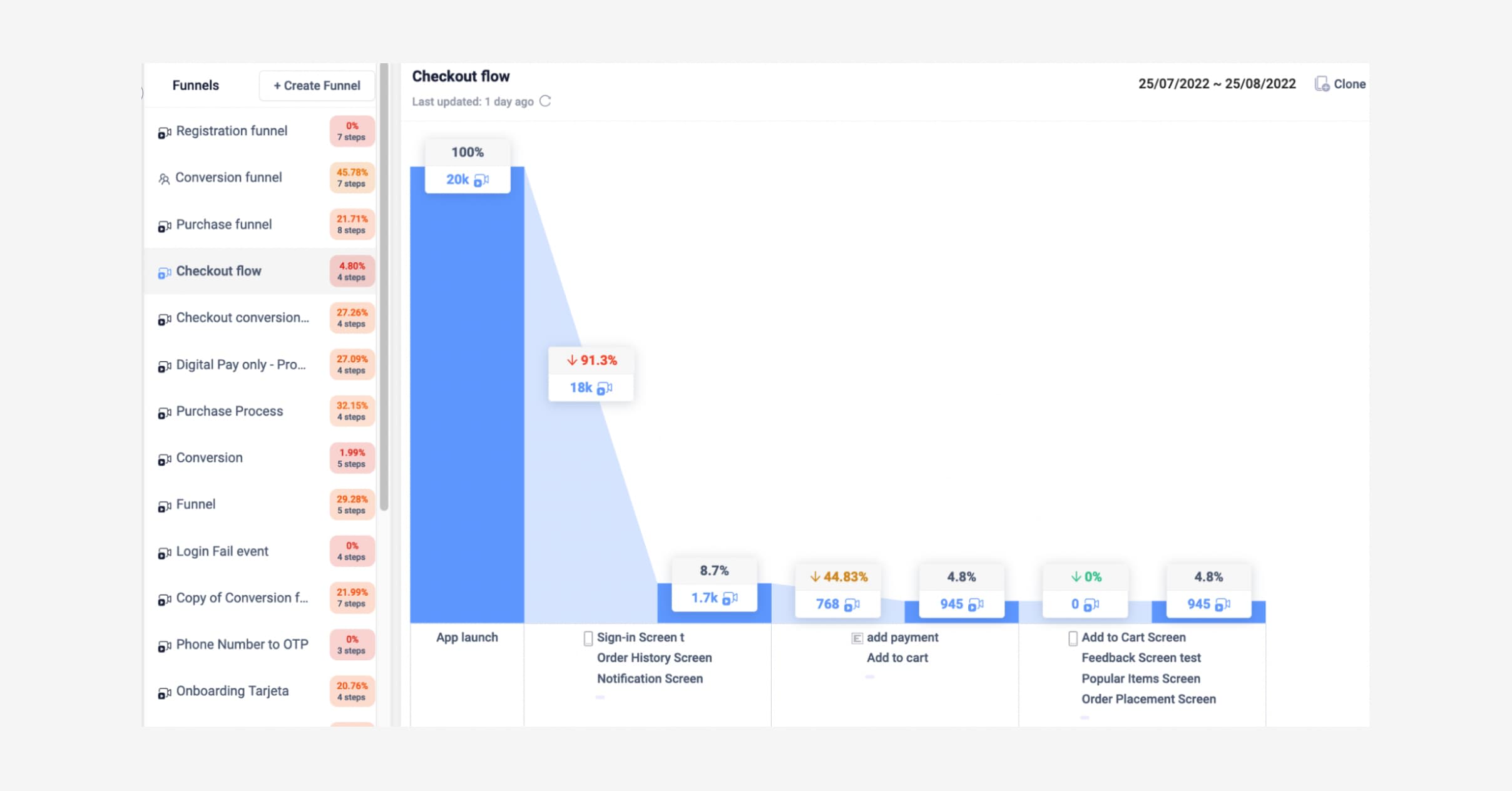

UXCam funnel showing the checkout flow of an e-commerce app. You can use an app analytics tool to send events and properties to gather more insights about your users' behavior. It will help you to:
Create more granular funnels thanks to the combination of events and screens
Follow your user journey closely by analyzing all the relevant steps
Easily identify errors in your user journey or conversion process
Track each step of your registration process to easily identify drop-offs
Measure and analyze the adoption of new features
Storyboard over documents
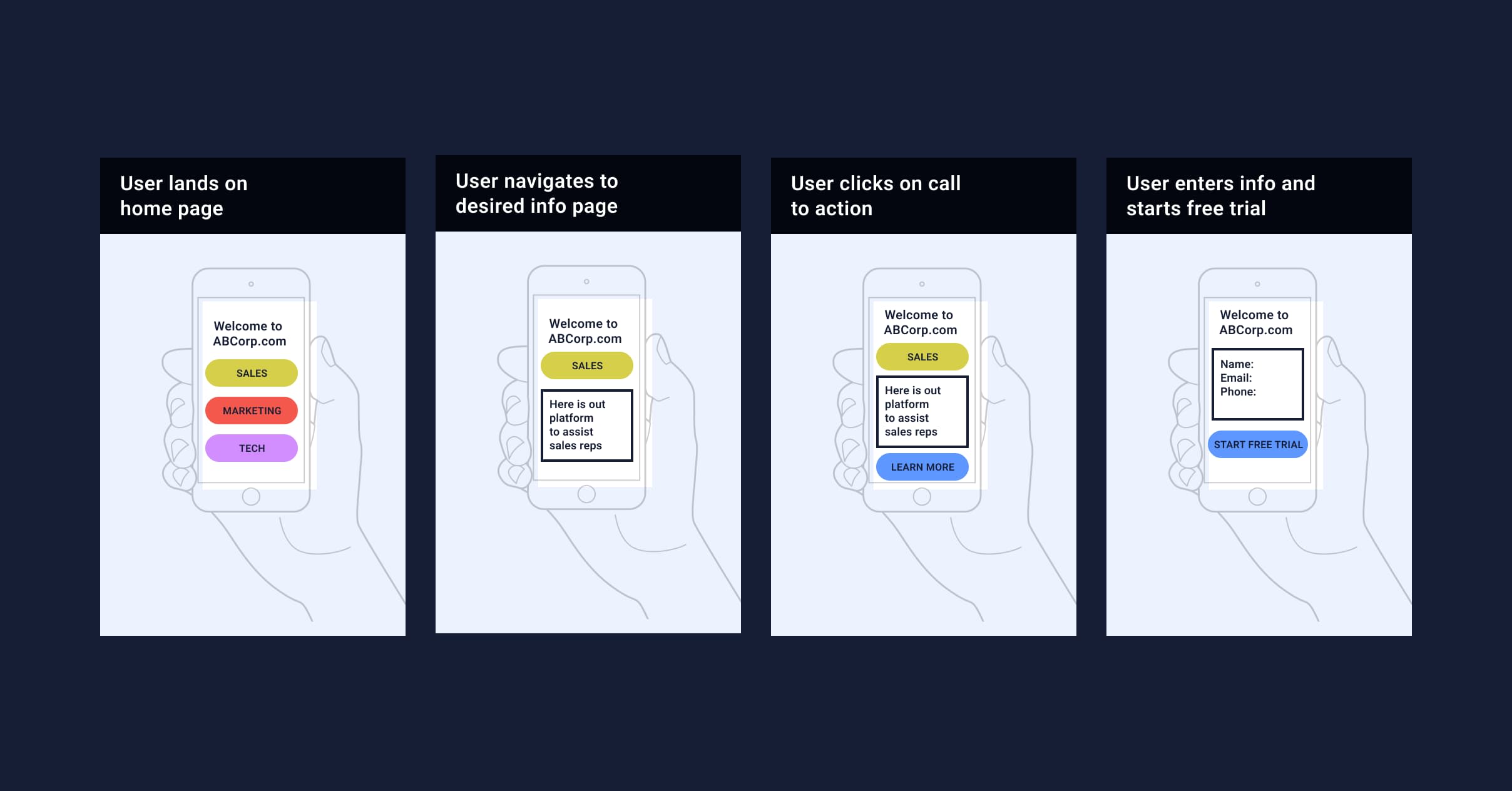

Example of mobile app storyboarding
Storyboards are a way to tell a product story using screenshots of mobile devices, they facilitate the creation of user-centered UX design. Screenshots follow one another in chronological order and convey the main events of the story and elements of the user journey.
In traditional product management, the storyboard is an informal document that illustrates the sequence of steps visually. However, in mobile product management, it often becomes a technical specification and requires meticulous elaboration.
Storyboarding is a useful document for mobile product managers and UX/ UI designers to reflect user experience in screenshots of mobile devices.
Understanding differences in user expectations
Another main difference between using a mobile device and a desktop is the principles of manipulation.
For example, we often use the Uber app while on the go with little time or patience for a complex scenario. Understanding the usability of mobile products is the key to success as a mobile product manager. The better you understand what users expect, the more effective in product market fit you will be.
The main criteria for successful usability in mobile app development:
Ease of learning: How easy is it for users to perform basic tasks when they first encounter the design?
Efficiency: How quickly and intuitively can users navigate the UI?
Memorability: How easy it is for users to navigate the product interface if they haven't used it for a while?
Errors: How many mistakes do users make, how critical are those mistakes, and how easy is it to fix them?
Satisfaction: How pleasant is it to use the design?
Ideally, the mobile product development team should simplify the user experience without losing functionality.
Two types of orientation in mobile technology
Screen orientation – portrait and landscape – is another important topic. The job of a mobile product manager is to decide whether the product will support both views for functionality and accessibility, or just focus on one.
There are four basic models for designing orientation.
Fluid: This interface simply adapts to the size of the screen. Think Skype on mobile. Advanced: This interface not only adjusts to screen size but also adds or subtracts components or changes the placement according to the chosen orientation mode.
Optional: In this model, changing the orientation brings up an auxiliary screen with relevant information. An example would be a financial app that displays data in portrait mode by default but shows a visual graph when you change orientation.
Continuous: Like YouTube, continuous design allows the user to access an additional interface by simply rotating the device.


The difference between web and mobile orientations
Through functional usability testing of a mobile application, you’ll better understand what to include in your orientations.
Browsers vs OS
The technical expertise of the differences and limitations of OS allows mobile app product managers to better define the scope of work and avoid gross mistakes when releasing a mobile product.
Mobile OS design has evolved from desktop OS, through embedded OS, to the products we see in smartphones today. During this process, the architecture of OS changed from complex to simple and stopped somewhere in the middle. The evolution itself was driven by technological advances in hardware, software, and internet services.
In terms of consumption patterns, all of today's mobile OS (such as Apple iOS, Google Android, and Microsoft Windows) have more similarities than differences:
They all have documented SDKs with APIs that allow developers to build apps for these OS.
All of them have online application directories where developers publish their applications and users download them.
Each have multitasking and 3D graphics support, with extensive use of sensors and touchscreens.
All systems place great emphasis on responsiveness in their interaction with the user.
Internet usage has moved far from static pages, with HTML5 becoming the default platform for Web applications.
All operating systems support mobile payment systems.
All systems are focused on optimizing power consumption.
Technical background in mobile app development really helps to be successful in a mobile product manager role, but it is not a necessity. One can still learn enough about it through research to build a correct UX design in mobile ecosystems and through the right tools that automate data capture and facilitate analysis.
New app review time
Mobile app stores require some time for reviewing new apps, while web products can be released immediately. Mobile product managers need to consider the review time or they will face serious implications affecting their product roadmap.
The main categories by which apps are moderated in the App Store:
Performance: The app must be in working order, with mandatory testing for bugs. The App Store does not accept applications with bugs that can unexpectedly "crash" and run extremely slowly.
Described correctly: The application must be accompanied by a correct description of the functionality and work in accordance with it. Hidden features are not allowed. If some of the functionality will only be available after the purchase, this must be disclosed.
Use of private API: Calling internal iOS system functions, and downloading new codes and viruses are prohibited.
Applications should be meaningful to users and have full functionality.
Legal: No violation of laws in countries where the application is available for download.
Copyright: The application should not infringe copyright on the content that will be available to the user throughout.
In the App Store, moderation usually takes a few days. Note that the Apple team always indicates the reason if the app is denied placement.
Google Play follows similar rules but has a significant difference from the App Store. Each developer can post their application and it will be moderated after some time. Until then, the product will be available for download.
After you upload an .apk file and publish the application, it will appear in the store in just a few hours. Initial moderation is automated in which the robot determines whether the app uses images that have already been posted online, blocking the application if detected. In general, Google is more loyal to developers and the content of applications.
You might also be interested in learning specifically about UXCam’s SDK and why it's the best.
Device-dependent factors
Mobile app product managers should consider all the benefits that mobile devices can provide them. Access to the phone’s hardware and functions can significantly enhance the mobile app experience.
Camera: Being able to access the camera from the mobile app is an obvious benefit. Not only can the phone camera take pictures and videos but also gives users access to AR and scan features. The Ikea app uses AR for customers who aren’t sure about furniture dimensions. This feature is designed to give mobile app users the wow effect.
GPS: Accessing a phone’s GPS via the mobile app gives opportunities to connect digital products with the physical location of the user. Taxi apps are a clear example, but GPS features are also commonly used in the e-commerce industry which aims at attracting the user to the nearest store with a good deal. Push notifications: Push notifications are a great way to nudge the user to the app when they’re not using it through a banner notification. Push notifications, when done tastefully, can inform users about new services, products, or features, as well as serve as reminders about abandoned carts.
Mobile gestures
You can’t track mouse clicks on mobile like you can on web, but you can track gestures instead. Heatmaps can detect gestures to support mobile product managers and gain a deeper understanding of your users’ behavior.
For example, if you see users rage-tapping consistently on one area of a screen, you can work on adapting the UX design of that particular screen or button to make it clearer for the user where they can click. You can then complete A/B testing on a group of segmented users to see the effect of your changes.
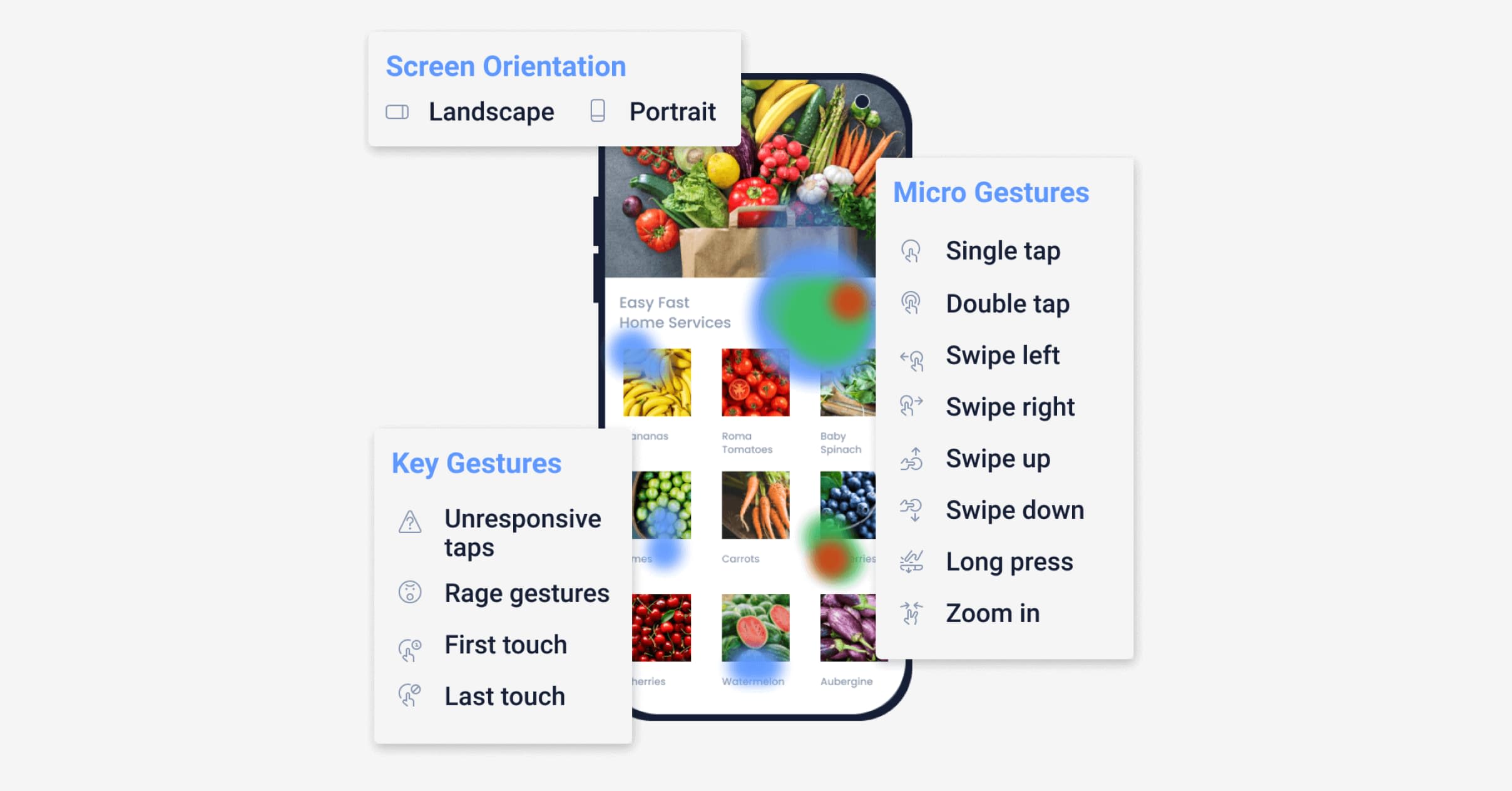

Example of viewing user gestures in heatmaps
Mobile app metrics
Mobile app analytics differ from web apps in the set of metrics and their prioritization. I will prioritize mobile app KPIs based on my personal experience in fintech apps but they may differ depending on the product:
Daily Sessions per DAU
Cost per acquisition (CPA) or Cost per install (CPI)
ARPU
ROI
Learn how Costa Coffee uses customizable dashboards to keep all its app metrics in one place.
There are many differences between web and mobile applications. The role of the mobile product manager can be complex and challenging in a world that is becoming increasingly dependent on mobile devices.
Knowing the physical differences and limitations between web and mobile devices is a great starting point. However, knowing what your users expect, while consistently developing better designs and easier functionalities in alignment with those expectations will support in truly succeeding as a mobile product manager.
You might also be interested in:
Mobile app metrics: essential metrics to track in your job role
Best AB testing tools for mobile apps: choosing the right option
AUTHOR
Gregory Volis
Gregory is a product manager at TD Bank (Canada). For the past 10 years he’s been working on creating products including mobile products in financial domain - banking, insurance, fintechs and marketplaces.

Related articles
Product Management
Say hello to new funnels: Analyzing app conversion rates just got easier
UXCam's updated funnels make analyzing conversions easier than ever with new conversion criteria and funnel...

Jane Leung
Product Analytics Expert
Product Management
5 Free Online Product Management Courses [2026]
Enhance your product management skills with these 5 free online courses and unlock new opportunities to stay ahead in the competitive job...

Tope Longe
Product Analytics Expert
Product Management
13 Best Product Management Tools 2026 & When to Use Them
Find out the top tools that the best product managers use daily to perform better at...

Jane Leung
Product Analytics Expert

