User-Centered Design: Definition, Principles, Process, and Methods

TABLE OF CONTENTS
- Key takeaways
- What is user-centered design?
- Why User-Centered Design Matters
- The 8 principles of user-centered design
- The user-centered design process, stage by stage
- 13 UCD Patterns and Pitfalls
- Industry-Specific UCD Considerations
- User-centered design tools by category
- How to measure user-centered design outcomes
- Common mistakes that derail user-centered design
- A practical UCD maturity model
- How UXCam Supports UCD in Practice
- Related reading
- How AI Is Changing UCD Validation
User-centered design is not a single tool or method. It is a posture: the team's commitment to anchor every design decision in real evidence about real users instead of in opinion or precedent. The teams that ship genuinely user-centered products run a research-and-validation loop continuously, treat replay evidence as a primary input, and resist the temptation to "design forward" without checking whether the design actually serves the user. UCD is one of those ideas everyone quotes and only some teams practice.
Here's what the practice looks like in 2026:
The clear definition, principles, and the four-stage UCD process
Concrete UCD methods for research, ideation, prototyping, and validation
13 patterns and pitfalls worth knowing
User-centered design (UCD) is a design framework that prioritizes users' needs, behaviors, and context at every stage of the product process, from research through validation. It is the discipline that anchors design decisions in evidence rather than assumption — and the AI session analysis layer that has emerged in the last two years is making UCD's validation step run continuously rather than quarterly.
Key takeaways
User-centered design (UCD) is both a philosophy and a process: every design decision starts from documented user needs and ends with measured user outcomes.
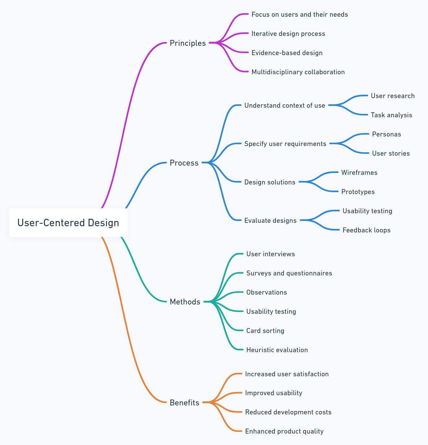
The ISO 9241-210 standard formalizes UCD as an iterative cycle of context research, requirements, design, and evaluation, repeated until user goals are met.
Eight principles hold the framework together: vision, user understanding, prioritization, outcome-based measurement, collaboration, hypotheses, validation, and data-driven iteration.
Measure success with the HEART framework (Happiness, Engagement, Adoption, Retention, Task Success), not feature counts.
Behavioral analytics tools like UXCam close the loop between design intent and actual user behavior. Teams like Recora cut support tickets by 142% after spotting a single press-and-hold confusion in session replays.
UCD is never "done." It's a continuous cycle of observation, hypothesis, release, and measurement.
What is user-centered design?
User-centered design is a product development approach where every decision, from initial research to post-launch iteration, is grounded in evidence about real users rather than internal opinion. It's sometimes called user-centric design or human-centered design, and the Interaction Design Foundation treats the terms as largely interchangeable in practice.
The discipline was formalized by cognitive scientist Don Norman in his 1986 work and later codified in ISO 9241-210, the international standard for human-centred design for interactive systems. Both sources converge on the same idea: users should not have to change their behavior to accommodate your product. Your product adapts to them.
In the teams I've worked with, UCD usually shows up in three concrete habits:
Research before scoping. Nobody writes a PRD without first reviewing session recordings, support tickets, and interview notes for the problem area.
Hypotheses, not feature requests. Backlog items are framed as "we believe users will do X because Y," with a success metric attached.
Behavioral validation post-launch. Every release has a defined window where the team watches session replays, heatmaps, and funnel data to confirm the hypothesis held.
That third habit is where most teams fall short. Shipping is easy. Watching how real users encounter your work is uncomfortable, which is exactly why it matters.


Why User-Centered Design Matters
UCD is not a nice-to-have. The business case is measurable.
A Forrester study commissioned by Adobe found that experience-driven businesses see roughly 1.6x higher brand awareness, 1.5x higher customer retention, and 1.9x higher average order value compared to peers.
McKinsey's design research shows companies that lead on design outperform industry benchmarks on revenue growth by as much as 2x.
On the usability side, Nielsen Norman Group reports that spending 10% of a development budget on usability doubles desired quality metrics.
PwC's Future of Customer Experience survey found that 32% of customers will walk away from a brand they love after a single bad experience.
I've seen this play out in UXCam customer data. Inspire Fitness boosted time-in-app by 460% and cut rage taps by 56% after using session replay to redesign friction points around their workout flows. Housing.com grew feature adoption from 20% to 40% by reworking onboarding based on observed drop-off. Costa Coffee raised registrations by 15% by fixing a signup form nobody on the internal team had flagged as a problem.
The common thread: none of those wins came from brainstorming in a conference room. They came from watching users.
The 8 principles of user-centered design
These principles aren't abstract philosophy. They're the operating rules I look for when auditing whether a team is genuinely practicing UCD or just putting "user-centered" in a slide title.
1. Anchor to a product vision
Before you design a single screen, the team needs a defensible answer to: what problem do we solve, for whom, and why us? Without that anchor, every research finding becomes a potential feature, and the backlog sprawls. Marty Cagan's Inspired calls this the product vision document, and I've found that teams without one spend twice as long debating priorities.
2. Understand your customers with mixed methods
Qualitative and quantitative data together. Interviews tell you why; analytics tell you what and how often. Surveys, contextual inquiry, user analytics platforms like UXCam, and support ticket mining should all feed into your user understanding. Pick one method and you get a partial picture.
3. Prioritize by impact, not by volume
Most backlogs have hundreds of items. UCD forces you to rank by expected user and business impact, then synthesize the top opportunities into design challenges. Frameworks like RICE or opportunity scoring help here, but the input must be behavioral evidence, not internal enthusiasm.
4. Measure outcomes, not outputs
Shipping 12 features in a quarter means nothing if user task success rate didn't move. I push teams to attach every major initiative to a behavior change target: reduce time-to-first-value, increase funnel completion, lift retention in week 2. Outputs are activity. Outcomes are results.
5. Collaborate across disciplines
UCD dies in silos. Designers, PMs, engineers, researchers, and support leads need to share raw observations. The best teams I've seen run a weekly 30-minute session where someone walks through three real user recordings and the room discusses what they saw.
6. Work from hypotheses, not assumptions
"Users will complete signup 20% faster with a single-page form because the multi-step flow creates exit points at each transition." That's a hypothesis. It's testable. "Users hate long forms" is an assumption, and assumptions are how teams ship confidently wrong designs.
7. Test and validate continuously
Usability testing is not a pre-launch gate. It's ongoing: moderated sessions for big flows, unmoderated tools for iteration, and behavioral analytics for everything already in production. Heatmaps and issue analytics turn every session into a passive usability test.
8. Iterate from real behavioral data
Release, measure, adjust. The teams with the best retention curves are the ones who treat launch as the middle of the process, not the end. When Recora's team watched replays after their launch, they spotted users trying to press-and-hold a button that was designed for single taps. One UI fix, 142% reduction in related support tickets. That's iteration with evidence.
The user-centered design process, stage by stage

The UCD process is a loop, not a line. ISO 9241-210 describes four core activities; in practice most product teams expand this into six or seven concrete stages.
Stage 1: Generative research
Before framing any solution, spend time with users. Conduct 5-8 semi-structured interviews per persona, review support tickets, and watch 20+ session replays in the problem area. The goal is to understand context: what is the user trying to accomplish, what tools do they already use, where do they get stuck? Synthesize into personas and jobs-to-be-done statements.
Stage 2: Ideation and problem framing
With research in hand, the team brainstorms solution directions. This is a divergent stage: go wide, capture everything, then converge on 2-3 concepts that best address the prioritized opportunity. Frame each as a design challenge: "How might we help first-time users complete their first workout within 48 hours?"
Stage 3: Define requirements
Translate the chosen direction into explicit business and user requirements. What must the solution do? What constraints apply (accessibility, platform, regulatory)? What success metrics will you track?
Stage 4: Conceptualization and prototyping
Move from paper sketches to low-fidelity wireframes to interactive prototypes in tools like Figma or ProtoPie. Fidelity increases as confidence grows. Resist the urge to jump straight to high-fidelity; cheap prototypes surface flaws faster.
Stage 5: Usability testing
Put the prototype in front of real users. Five to eight moderated sessions per round will catch roughly 85% of usability issues, per Jakob Nielsen's research. Watch for hesitation, confusion, and unexpected paths. Record everything.
Stage 6: Iterate
Feedback goes back into the design. Some issues are cosmetic; others force a rethink of the core flow. Repeat stages 4-5 until the prototype holds up under testing.
Stage 7: Launch and measure
Ship it, then watch. Define a 2-4 week observation window. Use funnel analytics, retention analytics, session replay, and issue analytics to confirm your hypothesis held. If it didn't, you're back to stage 2 for that feature, which is a normal, healthy outcome.
13 UCD Patterns and Pitfalls
Over time, certain tactical patterns separate teams practicing real UCD from those performing it. Here are the ones worth stealing or avoiding.
1. Ride-alongs beat interviews for context
Scheduled interviews capture what users say. Contextual inquiry, sitting with a user while they use your product in their real environment, captures what they actually do. Steve Portigal's Interviewing Users is the best field guide I've found, and his "observation beats recall" principle has saved me from at least a dozen bad design calls.
2. The five-second test for first impressions
Before any deep usability work, show a screenshot of a new screen for five seconds and ask users what they remember. UsabilityHub's five-second test surfaces clarity problems faster than any other method I've used. If they can't tell you the purpose of the screen, nothing else matters.
3. Jobs-to-be-done framing over personas
Personas describe demographics; JTBD describes motivation. Tony Ulwick's outcome-driven innovation work reframes features as progress users are trying to make. I now open every discovery doc with "When I [situation], I want to [motivation], so I can [outcome]" instead of a persona avatar.
4. Cognitive load audits
Count the decisions a user has to make per screen. Hick's Law predicts that decision time grows with options. When I audit onboarding flows, I often find screens with 6+ decisions that should have 2.
5. Accessibility as a UCD requirement, not a QA pass
Accessibility is user-centered design, full stop. WCAG 2.2 guidelines cover contrast, focus order, and touch target sizing that affect every user, not just those with disabilities. Large touch targets help people on bumpy trains as much as people with tremors.
6. The "show, don't tell" review format
Replace status updates with a 10-minute session replay walkthrough. The first time I did this, a VP who had been skeptical of an onboarding investment watched three users quit the signup flow in under 30 seconds. The budget landed the next week.
7. Kill your darlings with funnel data
Features you love that users don't use should be sunsetted. Intercom's product principles argue that every retained feature has a maintenance cost in complexity. Run a quarterly review of feature adoption in your product analytics and be honest.
8. Progressive disclosure over feature dumping
Show users only what they need for the current step. Nielsen Norman's progressive disclosure guidance is the antidote to "dashboard disease," where every possible action crowds the primary screen.
9. Watch the 5% tail, not just the average
Averages hide long tails of frustrated users. Filter session replays to sessions with rage taps, UI freezes, or drop-offs, and you will find the edge cases that aggregate dashboards miss. This is where Recora's press-and-hold insight came from.
10. Support tickets are free usability research
Every ticket is a usability test result. Tag them by screen and flow, and you get a heatmap of where your product is failing in the wild. I ask every team to spend 30 minutes a week in the support queue regardless of role.
11. The usability-ego tradeoff
Designers sometimes resist simplification because it feels like diminishing the craft. I've learned to separate the portfolio artifact (rich, expressive) from the shipped artifact (simple, legible). Users do not care about your Dribbble shot.
12. Pre-mortems before launch
Gary Klein's pre-mortem technique asks the team to imagine the feature failed and explain why. I run this 30 minutes before every major release. It usually surfaces one or two concerns worth addressing before shipping, not after.
13. Post-launch "silent weeks"
For two weeks after a release, do not add new features to the release. Just watch, measure, and fix. The teams that skip this almost always ship patches for issues they could have caught by observing their own launch.
14. Design for interruption, not focus
Users are rarely fully attentive. They check your app on a train, between meetings, while a kettle boils. Luke Wroblewski's for mobile apps and the web writing argues that every screen should be resumable within 3 seconds of return. Save state aggressively, avoid modal dead-ends, and assume every session can be interrupted at any step.
15. Default to the boring option
When you have two design directions and one is novel while the other follows an established pattern, pick the established pattern unless the novel version is measurably better in testing. Jakob's Law reminds us that users spend most of their time on other products, so familiarity is an asset, not a failure of imagination.
Industry-Specific UCD Considerations
UCD principles are universal, but application varies by vertical. The mistakes I see in fintech rarely appear in consumer fitness, and vice versa.
Fintech and banking
Trust, clarity, and regulatory language dominate. Users abandon at any hint of uncertainty about money. Plaid's developer UX research shows that authentication friction accounts for a significant share of drop-off. Use session replay to spot hesitation on confirmation screens, and run usability tests with both financially confident and anxious users; the difference is enormous. Regulatory disclosures are a particular trap: legal teams want long text, but users skim. The compromise is layered disclosure with plain-language summaries above the legal fine print.
Healthcare and telehealth
Privacy, accessibility, and emotional state are the differentiators. A user booking a specialist appointment is often stressed, distracted, or in pain. HIPAA compliance constrains what you can capture in analytics, so tools with built-in masking of PII (including UXCam's automatic sensitive-data redaction) are essential. Recora's work with post-cardiac rehab users is a good case study in designing for users with cognitive load from their condition. Also plan for caregivers and family members accessing the app on behalf of a patient, which is a distinct persona with different permissions and UI needs.
E-commerce and retail
Speed, confidence, and discovery dominate. Baymard Institute's checkout research consistently shows that 17% of users abandon due to a too-long or complicated checkout. Heatmaps on product detail pages and funnel analytics on checkout are the baseline. Costa Coffee's 15% registration lift came from removing a single redundant field. Cross-device continuity is a specific e-commerce concern: users browse on mobile, buy on desktop, or vice versa, so session stitching across devices matters for understanding the true path to purchase.
SaaS and B2B tools
Activation and time-to-value are the core metrics. B2B users have less tolerance for learning curves than consumer users because their time is being measured. Wes Bush's Product-Led Growth framework pairs well with UCD: design onboarding so the user hits their "aha" moment in the first session. A quirk of B2B UCD is that the buyer and the end user are often different people, so research has to cover both. Admin UX is typically under-invested in because admins are a small audience, but they have outsized influence on renewal decisions.
Fitness, wellness, and habit products
Retention is the whole game. A brilliant onboarding means nothing if users quit in week 3. Nir Eyal's Hooked model lays out the trigger-action-reward-investment loop that keeps users coming back. Inspire Fitness's 460% time-in-app improvement came from redesigning friction specifically in returning-user flows, not first-timer flows. Notification design is critical and often overlooked: a poorly timed reminder drives uninstalls, while a well-timed one drives the habit loop.
Media and content apps
Attention and session depth are the KPIs. Users satisfy quickly, so the real UCD question is: what do they do next? Heatmaps on content pages and funnel analytics on "second action" flows (share, save, subscribe) tell you whether your app is a destination or a pit stop. Content recommendation UI has its own UCD pitfalls: dark patterns that maximize short-term engagement often tank long-term retention, and that tradeoff only shows up in cohort analysis, not weekly dashboards.
User-centered design tools by category
No single tool does UCD end-to-end. A functional stack covers research, synthesis, design, testing, and behavioral measurement.
Generative research and interviews. Dovetail and Notably for research repositories, Lookback and User Interviews for recruiting and moderated sessions, Grain for interview transcription and clipping, Condens for qualitative analysis at scale.
Surveys and quantitative research. Typeform, Sprig, and Qualtrics for in-product and longitudinal surveys. Maze for unmoderated usability studies on prototypes. Hotjar Surveys for lightweight on-page feedback.
Design and prototyping. Figma dominates for collaborative design. ProtoPie for advanced interaction prototyping. Framer for high-fidelity web prototypes that behave like real products. Sketch remains a solid macOS alternative for teams who prefer local files.
Usability testing. UserTesting for broad panels, UserZoom for enterprise-scale testing, Maze for rapid iteration on Figma prototypes, PlaybookUX for international recruiting.
Behavioral analytics on mobile and web. UXCam is installed in over 37,000 products and provides session replay, heatmaps, funnels, retention analytics, and issue analytics, with Tara AI as the analyst layer that surfaces patterns across thousands of sessions. Complementary tools include Amplitude and Mixpanel for event-based product analytics.
Accessibility auditing. axe DevTools, WAVE, and Stark for catching WCAG issues before they ship. Accessibility Insights from Microsoft is another strong option for automated checks.
Research operations. Great Question and Ethnio for managing participant panels, scheduling, and incentive distribution across many research rounds.
The best stacks I've seen pair a research repository, a prototyping tool, and a behavioral analytics platform so every stage of the UCD cycle has appropriate evidence.
How to measure user-centered design outcomes
The measurement question is where I see most UCD initiatives lose credibility. Teams do great research and great design, then report on output: "we shipped the redesign." Leadership nods, but nobody knows if it worked.
The HEART framework
Google's HEART framework, developed by Kerry Rodden's team, is the most practical UX measurement model I've used.
| Dimension | What it measures | Example metric |
|---|---|---|
| Happiness | User satisfaction and attitudes | NPS, CSAT, app store rating |
| Engagement | Depth of interaction | Sessions per user, time in key flows |
| Adoption | New users of a feature | % of active users trying a feature in first 30 days |
| Retention | Users returning over time | Day 7, 30, 90 retention cohorts |
| Task Success | Efficiency and effectiveness | Funnel completion rate, time on task, error rate |
Pick 1-2 metrics per dimension that matter for your product. Don't try to track all five equally; most products have a dominant dimension.
Connecting design changes to business metrics
Alongside HEART, track the business KPIs the feature is meant to influence: conversion rate, revenue per user, support ticket volume, churn. The full list of mobile app KPIs worth tracking gives a fuller menu.
Behavioral validation with session data
Numbers tell you something changed. They don't tell you why. For the why, you need qualitative behavioral data:
Session replay to watch the actual user experience.
Heatmaps to see where attention and frustration cluster.
Rage taps and UI freeze detection to surface friction the user didn't report.
Tara AI, UXCam's AI analyst, to surface patterns across thousands of sessions without manually watching each one.
UXCam is installed in over 37,000 products and serves mobile apps and the web with full web support. The combination of quantitative funnels and qualitative replay is what lets teams answer "did our user-centered design actually work?" with evidence rather than opinion.
Common mistakes that derail user-centered design
From my audits, the same failure modes show up repeatedly. If two or more of these apply to your team, you have a UCD credibility problem, not a tooling problem.
Research theater. Interviews are conducted but findings never make it into product decisions. Research becomes a ritual instead of an input.
Persona fossilization. Personas created three years ago are still treated as ground truth. User bases evolve; personas should too.
Testing with the wrong users. Internal testing with colleagues is not usability testing. Get people who match your actual audience.
Skipping post-launch measurement. The team celebrates the release and moves on. Whether the change improved outcomes becomes folklore.
Confusing aesthetics with usability. A clean redesign that tanks task completion is a failure, regardless of how it looks in the portfolio.
Overweighting the loudest voice in the room. Usually an exec or senior designer. UCD means the user's behavior outweighs any internal opinion, including the CEO's.
Treating accessibility as a phase-two concern. Retrofitting accessibility costs three to five times more than designing for it from the start.
Shipping without a hypothesis. If you can't state what you expect to change and by how much, you cannot learn from the launch.
Over-testing with the same users. Recruit fresh participants each round. Users who have seen earlier iterations develop unnatural familiarity.
Confusing A/B test wins with UCD. A variant that wins by 2% might still be broken for 30% of users. Always pair experimentation with session replay review.
A practical UCD maturity model
When I audit a product team, I place them on a five-stage maturity curve. Use this to diagnose where you are and plan the next investment.
Stage 1: Opinion-driven
Decisions are made by the loudest voice. No formal research, no post-launch measurement, personas are anecdotal. Typical symptom: the backlog is a list of executive requests.
Stage 2: Ad-hoc research
Research happens when a big launch is coming. Personas exist but are rarely referenced. Analytics are installed but few people look at them. Typical symptom: research reports that nobody reads.
Stage 3: Structured UCD
The team runs discovery before major initiatives, prototypes are tested with 5-8 users, and launches have defined success metrics. Behavioral analytics are part of the review cadence. Typical symptom: wins are measurable, but the process still feels effortful.
Stage 4: Continuous discovery
Teresa Torres's continuous discovery habits are embedded: weekly user interviews, an opportunity solution tree, assumption tests before big investments. Post-launch measurement is automatic. Typical symptom: the team is calm because the process catches problems early.
Stage 5: Outcome-native
UCD is invisible because it is the default. Every team member can pull session replays, read funnel data, and articulate the current top user problems. Tara AI or equivalent surfaces new friction patterns automatically, so discovery is proactive rather than reactive. Typical symptom: leadership discusses user outcomes, not feature ship dates.
How to move up a stage
Pick one ritual from the next stage up and institutionalize it for a quarter. Stage 1 to 2: a weekly session replay review. Stage 2 to 3: a mandatory success metric on every PRD. Stage 3 to 4: a rolling cadence of 3 user interviews per week. Stage 4 to 5: automated friction detection with alerts on rage taps and drop-off spikes. Maturity is the result of habit, not intention.
How UXCam Supports UCD in Practice
Most of the UCD process depends on evidence about real user behavior, and that's what UXCam is built to provide. Teams use it across the full cycle:
Generative research. Watch recent sessions in the problem area to surface real friction before interviews.
Prioritization. Use issue analytics to quantify how many users hit a given problem, so prioritization is based on actual impact.
Post-launch validation. Compare funnel completion and retention before and after the release; pull replays of users who dropped off to understand why.
Continuous discovery. Tara AI flags new friction patterns as they emerge, so the team catches regressions before they show up in churn.
Brands including Costa Coffee, Housing.com, Inspire Fitness, and Recora all use this loop to ground design decisions in behavior rather than opinion.
If you want to see how this looks for your product, start a free UXCam trial or book a demo.
Related reading
How AI Is Changing UCD Validation
UCD's validation loop used to depend on small-sample moderated studies and the team's intuition about what would work. Both still matter, but the volume of evidence available has changed: a single product with 100,000 daily users generates millions of behavioral signals weekly.
Tara AI inside UXCam reads sessions, clusters friction by impact, and returns prioritized recommendations in plain language. UCD validation stops being a quarterly study and becomes a continuous loop. The team still owns the design judgment; the AI removes the grunt work that previously prevented the loop from running often enough to matter.
For teams designing across mobile and web, the unified analyst layer is the difference between one cross-surface validation queue and two reconciled studies.
Frequently asked questions
What is the difference between user-centered design and human-centered design?
In most practical contexts, the terms are used interchangeably, and both the Interaction Design Foundation and ISO 9241-210 treat them as overlapping. The subtle distinction some practitioners draw is scope: user-centered design focuses specifically on the person using a product, while human-centered design, as popularized by IDEO, broadens the frame to include all stakeholders affected by a system, including non-users. For product teams working on an app or website, the working methods are effectively identical: research real people, design for their actual needs, validate with behavioral evidence.
How is user-centered design different from design thinking?
Design thinking is a broader innovation methodology that typically includes five stages: empathize, define, ideate, prototype, and test. User-centered design is narrower and more operational, focused specifically on embedding user understanding into the ongoing product development cycle. You can think of design thinking as a mindset for approaching ambiguous problems and UCD as a discipline for executing on them. Most mature product teams use both: design thinking to frame the problem space, UCD principles to deliver and iterate on solutions with continuous user validation.
What are the main stages of the user-centered design process?
Following ISO 9241-210, the UCD process has four core activities that repeat as a loop: understand the context of use, specify user and business requirements, produce design solutions, and evaluate the designs against requirements. In practice, most product teams expand this into six to seven stages: generative research, ideation, requirements definition, prototyping, usability testing, iteration, and post-launch measurement. The critical point is that the process is iterative, not linear. Evaluation results feed back into earlier stages until user goals are consistently met.
How do you measure whether user-centered design is working?
Use the HEART framework from Google, which tracks Happiness, Engagement, Adoption, Retention, and Task Success. Pair these with business KPIs like conversion rate, revenue per user, and support ticket volume. To connect design changes to behavior, you need qualitative evidence alongside metrics: session replays, heatmaps, and rage tap detection show what users actually experienced, not just what the numbers say. UXCam customers like Recora cut support tickets by 142% and Housing.com doubled feature adoption from 20% to 40% specifically because they combined quantitative and behavioral measurement.
What tools are commonly used for user-centered design?
Research and testing tools include Maze and UserTesting for unmoderated studies, Dovetail for research synthesis, and Lookback for moderated sessions. Design and prototyping happens in Figma or Sketch. For behavioral analytics and post-launch validation on mobile and web, UXCam provides session replay, heatmaps, funnels, retention analysis, and issue analytics with Tara AI to surface patterns automatically. The best stacks combine generative research tools, prototyping software, and behavioral analytics so every stage of the UCD cycle has appropriate evidence.
Is user-centered design only for consumer apps, or does it apply to B2B and enterprise software?
UCD applies everywhere humans use software, and the stakes are often higher in B2B and enterprise contexts because poor usability directly costs productive work hours. Enterprise users tolerate less friction than consumer users assume, partly because their tasks are more repetitive and partly because switching costs create resentment rather than loyalty. The methods are identical: research actual end users (not just buyers), prototype, test with real users in their real workflows, measure task success and adoption post-launch. The main adaptation is that research access is often harder, so behavioral analytics becomes even more important for filling the gap.
How many users do I need for usability testing to be statistically useful?
For qualitative usability testing, Jakob Nielsen's research shows that 5 users catch approximately 85% of usability issues in a given flow. Beyond 8-10, you hit diminishing returns. For quantitative testing where you want statistical significance on task completion rates, you need 20-30 users per variant. The right answer depends on the question: exploratory usability work is qualitative and cheap; benchmark comparisons require larger samples.
How long does a typical UCD cycle take?
A full cycle from research to launch-and-measure runs anywhere from 3 to 12 weeks depending on scope. Small improvements to an existing flow can run in 2-3 week sprints. Major new features typically need 6-10 weeks end-to-end, including at least two rounds of usability testing. Continuous discovery teams run multiple cycles in parallel at different stages so the pipeline never stalls.
Can small teams or solo founders practice UCD, or does it require a dedicated researcher?
UCD scales down well. A solo founder can run 5 customer interviews a week, watch 10 session replays, and run unmoderated usability tests with Maze for under $100 a month. The research function does not require a full-time researcher; it requires a habit. The first dedicated researcher usually makes sense around 30-50 product employees, when the volume of discovery exceeds what designers and PMs can absorb alongside delivery.
How does UCD fit with Agile and Scrum?
UCD fits naturally into dual-track Agile: a discovery track runs in parallel with a delivery track, so research and validation feed backlogged items before they enter sprints. Jeff Patton's writing on dual-track development is the canonical reference. The common failure is running Agile as a delivery machine with no discovery track, which produces fast shipping of unvalidated features.
What's the fastest way to start practicing UCD if my team has never done it?
Install behavioral analytics on your most important flow, hold a weekly 30-minute session where the team watches three real user recordings, and add a success metric and observation window to every release. Those three habits, done consistently for a quarter, move most teams from opinion-driven to structured UCD. Everything else builds on that foundation.
How do I convince leadership to invest in UCD when roadmap pressure is high?
Lead with evidence, not philosophy. Pull three specific examples from your own product: a feature that underperformed, a support ticket cluster, a funnel with an unexplained drop-off. Show how 30 minutes of session replay review surfaces the likely cause. Then point to outcomes: Housing.com's doubling of feature adoption, Inspire Fitness's 460% increase in time-in-app, Recora's 142% drop in support tickets. UCD is not an ask for budget; it is an ask to make existing budget produce better outcomes.
What role does AI play in modern UCD?
AI is accelerating the analyst layer of UCD. Tools like UXCam's Tara AI scan thousands of sessions to surface friction patterns that would take a human days to find manually. Research synthesis tools like Dovetail use AI to cluster interview themes. The principle does not change: users and their real behavior remain the source of truth. AI makes it faster to hear what users are already telling you through their actions.
How should UCD teams handle conflicts between user feedback and business goals?
The two are rarely as opposed as they first seem. When they conflict, the discipline is to separate short-term revenue tactics (dark patterns, forced upsell) from long-term user value (retention, referral, LTV). A tactic that lifts quarterly conversion but tanks 90-day retention is a net loss, and cohort analytics will show that clearly. Frame the conversation in terms of lifetime outcomes rather than campaign-level metrics, and most apparent conflicts resolve into a longer time horizon.
What's the difference between UX research and user-centered design?
UX research is a set of methods for learning about users: interviews, surveys, usability tests, analytics review. User-centered design is the broader operating approach that uses those methods as inputs to every product decision. Research is an activity; UCD is a philosophy about how research should drive design and measurement. A team can have excellent researchers and still fail at UCD if the findings never change what ships.
How do I handle UCD in a regulated industry where users can't be easily recruited?
Lean harder on behavioral analytics, support ticket analysis, and proxy recruiting. If you cannot interview end users directly (common in healthcare, defense, and some financial verticals), session replay with appropriate PII masking becomes your primary research instrument. Proxy recruiting through professional associations or customer success teams can fill the interview gap. Document your constraints and build a research plan around them rather than using regulation as an excuse to skip research entirely.
AUTHOR
Silvanus Alt, PhD
Founder & CEO | UXCam
Silvanus Alt, PhD, is the Co-Founder & CEO of UXCam and a expert in AI-powered product intelligence. Trained at the Max Planck Institute for the Physics of Complex Systems, he built Tara, the AI Product Analyst that not only analyzes user behavior but recommends clear next steps for better products.


TABLE OF CONTENTS
- Key takeaways
- What is user-centered design?
- Why User-Centered Design Matters
- The 8 principles of user-centered design
- The user-centered design process, stage by stage
- 13 UCD Patterns and Pitfalls
- Industry-Specific UCD Considerations
- User-centered design tools by category
- How to measure user-centered design outcomes
- Common mistakes that derail user-centered design
- A practical UCD maturity model
- How UXCam Supports UCD in Practice
- Related reading
- How AI Is Changing UCD Validation


Related articles


Product best practices
12 Apps with Great User Onboarding (2026 Examples)
The 12 mobile app onboarding flows I'd study if I were designing one today, with specific callouts for what each does well, common mistakes, and the...
Silvanus Alt, PhD
Founder & CEO | UXCam


Product best practices
Why creating a data-driven culture has less to do with data than you think
Kishan Gupta, CEO, shares 5 tips and techniques for fostering a data-driven culture based on his own experiences building and leading...


Kishan Gupta
Co-Founder of UXCam


Product best practices
Finance apps have a customer support problem, here's how to fix it
Learn about the customer support problem in finance apps and practical solutions to fix it in our latest blog post, and improve user satisfaction and...


Jane Leung
Product Analytics Expert