User Journey Map Guide with Examples & FREE Templates
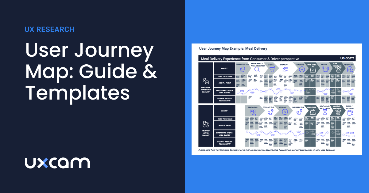
Wondering how to get started with user journey mapping? The user journey map, also known as customer journey map or user experience journey map is a way to visually structure your knowledge of potential users and how they experience a service.
Customer journey mapping is also a popular workshop task to align user understanding within teams. If backed up by user data and research, they can be a high-level inventory that helps discover strategic oversights, knowledge gaps, and future opportunities.
Yet, if you ask two different people, you will likely get at least three different opinions as to what a user journey looks like and whether it is worth the hassle. Read on if you want to understand whether a UX journey map is what you currently need and how to create one.
You can get the templates here:
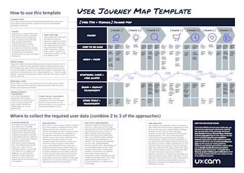

Click here to download a high-resolution PDF of the user journey map template.
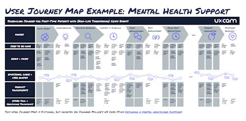

Click here to download a high-resolution PDF of this template.
Summary - User journey map
| Question | Answer |
|---|---|
| What is a user journey map? | A user journey map is a visual representation of user steps, needs, emotions, and pain points in achieving a specific goal. |
| Why are user journey maps important? | They help understand users, identify improvements, align teams, and enhance user experience. |
| What are the key components of a user journey map? | User persona, scenarios, interaction phases, actions, emotions, and improvement opportunities are essential. |
| How do you create a user journey map? | Research user data, define personas, map journey steps, and identify pain points and opportunities. |
| What are common challenges in creating user journey maps? | Challenges include assumptions without data, overcomplication, and lack of collaboration across teams. |
| How can user journey maps be utilized effectively? | Improve design, inform development, align teams, and prioritize features based on user insights. |
| What's the best tool for mapping user journey for mobile apps? | UXCam is a leading tool for mapping user journeys and analyzing behavior in mobile apps effectively. |
What is user journey mapping?
Imagine your product is a supermarket and your user is the person wanting to refill their fridge. They need to:
Decide what to buy, and in what supermarket will they be able to find and afford it
Remember to bring their coupons
Get there
Park there
Find everything
Pay
Pack it up
Get home
Unpack
Save the new coupons for the next shopping trip
Dive Deeper: Mobile Product Management Certification
If you want to learn more about how to optimize your user journeys, we recommend enrolling in our course "Mastering Mobile App Product Management" for free.
Unlock the secrets of user-centric design with our course
Gain practical skills in identifying user needs and crafting engaging, intuitive UX designs
Get 15+ templates and frameworks
Our modules, including "How to Map Out Your Discovery" and "User Research for Mobile Apps," ensure you create visually stunning and highly functional user experiences.
3 ways to understand user journey maps
Now, there are at least three ways to look at the customer journey.
1. Workflow maps for usability optimization
Some imagine a user journey map as a wireframe or detailed analysis of specific flows in their app. This could be, for example, a sign-up flow or the flow for inviting others to a document. In our supermarket example, it’s a closer look at what they do inside your supermarket, maybe even only in the frozen section. Or you could define what you want them to do in the frozen aisle.
The focus here is on getting the details of the execution right, not how it fits into the bigger picture of what the user needs.
It is more or less a wireframe from a user perspective. Such a product-focused understanding is not what we want to discuss in this article, though many examples for the best user journey maps you might come across are exactly this. There are good reasons to do such an analysis as well, since it helps you smooth out usability for the people who have already found their way into your supermarket because of your excellent ice cream selection. Workflow maps won’t help you notice that your lack of parking spots is one of the reasons why you are missing out on potential customers in the first place. By only looking at what they do inside the supermarket, you might also miss out on an opportunity for user retention: You could help them get their ice cream home before it melts.
2. Holistic user journey maps for strategic insights
With a more holistic view of what people experience when trying to achieve a goal, product makers gain strategic insights on how their product fits into the big picture and what could be in the future. Because this journey document covers so much ground, it is usually a linear simplification of what all the steps would look like if they were completed. Going back to our supermarket example, it would start from the moment the person starts planning to fill the fridge and ends when the fridge is full again — even if the supermarket building is only relevant in a few phases of this journey. Creating this version of a user journey map requires quite some time and research effort. But it can be an invaluable tool for product and business strategy. It is an inventory of user needs that can help you discover knowledge gaps and future opportunities. Service blueprints are the most comprehensive version of a user journey map since they also lay out the behind-the-scenes of a service, usually called backstage. In our supermarket example, that could be:
the advertising efforts
logistics required to keep all shelves stocked
protocols the staffers follow when communicating with customers
3. Journey mapping workshops as an alignment method
In a user journey mapping workshop, stakeholders and team members share their knowledge and assumptions about the users. Some of these assumptions might need to be challenged — which is part of the process. The goal is not the perfect output, but rather to get everyone into one room and work out a common understanding of the users they are building products for. It forces everyone to organize their thoughts, spell out what they know and assumed was common knowledge — and ideally meet real users as part of the workshop. If done right, this establishes a more comprehensive understanding of what users go through and helps overcome the very superficial ideas one might have about the lives and needs of people outside their own social bubble.
Hence, such a workshop helps create aha moments and gives the consequences of great and poor product decisions a face. So at the end of the day, it is one of many methods to evangelize user-centricity in an organization.
What are the benefits of user experience (UX) mapping?
We already discussed the benefits and shortcomings of workflow maps, but what are the reasons you should consider a UX journey map and/or a journey mapping workshop?
1. Switching perspectives
Empathy: Like any other UX method and user research output, user journey maps are supposed to foster empathy and help product makers put themselves into the shoes of a user. Awareness: It creates awareness of why users do all the things they do. And it challenges product makers to resist the temptation of building something because it’s feasible, not because it’s needed that way.
2. Aligned understanding
Given the team is involved in creating the user experience map (either as a workshop, in expert interviews, observing the user research, or at least as a results presentation), it forces a conversation and offers a shared mental model and terminology — the foundation for a shared vision.
3. Seeing the big picture
Imagine the vastly different perceptions Sales reps, Customer Support teams, C-level, and backend engineers might have since they all meet very different segments at very different stages of their journey. Day-to-day, it makes sense to be an expert in the stages of a user journey you are responsible for. A journey map helps to step back from this and see the bigger picture, where your work fits in, and where assumptions about the majority of users were wrong. It might even help define KPIs across teams that don’t cancel each other out.
4. Uncovering blind spots and opportunities
A user journey map gives you a structured and comprehensive overview of which user needs are already tackled by your product and which ones are either underserved or solved with other tools and touchpoints. Which moments of truth do not get enough attention yet? These are the opportunities and blind spots you can work on in the future.
When is customer journey mapping just a waste of time?
In all honesty, there are also moments when creating a user journey map or running a journey mapping workshop is destined to fail and should better be put on hold. It’s a lot of work, so don’t let this energy go to waste. User journey maps only make sense when there is an intention to collaboratively work on and with them. Here are some of the scenarios and indicators that it’s the wrong moment for a journey map:
No buy-in for the workshop: The requirements of a successful journey workshop are not met, e.g., there is not enough time (60 minutes over lunch won’t do the trick), only a few team members are willing to attend, and/or key stakeholders refuse to have their assumptions challenged.
Isolated creation: The whole creation process of the user journey map happens isolated from the team, e.g., it is outsourced to an agency or an intern. Nobody from the team observes or runs the user research, or is consulted for input or feedback on the first drafts. There is no event or presentation planned that walks the team through the output. Finally, a very detailed, 10-foot-long poster appears in a hallway, and none of the team members ever find time to read, process, or discuss it with each other.
UX theater: For one reason or another, there is no time/resources allocated to user research or reviewing existing insights whilst creating the map (usability tests with non-users do not count in this case, though). Such an approach, also known as, can do more harm than good since the resulting user journey may only reinforce wrong assumptions and wishful thinking about your users.
Unclear objectives: The user journey map is only created because it is on your UX design checklist, but the purpose is unclear. If you are unsure what you or your stakeholders want to achieve with this journey map, clarify expectations and desired output before investing more energy into this. E.g., there is a chance you were only meant to do a usability review of a bumpy app workflow.
Lack of follow-through: Creating a user journey map is just the start. Without a plan to implement changes based on insights gathered, the map is merely a paper exercise. This lack of action can result from limited resources, lack of authority, or inertia. It's vital to establish a process for turning insights from the map into design improvements or strategy adjustments. This includes assigning tasks, setting deadlines, and defining success metrics to ensure the map drives real change and doesn't end up forgotten.
Overcomplication: Sometimes, to capture every nuance and detail of the user experience, teams can create an overly complex user journey map. This can make the map difficult to understand and use, particularly for team members who weren't involved in its creation. A good user journey map should balance detail and clarity, providing insightful and actionable information without overwhelming its users.
Failure to update: User expectations, behaviors, and the digital landscape constantly evolve. A user journey map that remains static will quickly become outdated. Regular reviews and updates are necessary to ensure that the map reflects the current state of user experiences. This requires a commitment to ongoing user research and a willingness to adjust your understanding of the user's path as new information becomes available.
The good news is: UX maturity in an organization can change rapidly, so even if you run into one of the obstacles above, it is worth revisiting the idea in the future. Once you’re good to go, you can get started with the user journey map examples and templates below.
User journey mapping: examples, templates & tools
There is more than one way to do it right and design a great user journey map. Every organization and industry has its own templates, tools and approaches to what elements are most important to them. The following examples and template will give you an idea of what a user journey map can look like if you decide to create one yourself. Make it your own, and change up the sections and design so they make sense for your product and use cases.
User journey map template and checklist
To give you a first orientation, you can use this user journey template and check the two fictional examples below to see how you could adapt it for two very different industries: instant meal delivery and healthcare.


Click here to download a high-resolution PDF of the user journey map template.
While there is no official standard, most other user journey maps contain the following elements or variations of them:
1. Phases
Key phases (or ‘stages’) start when users become aware of a problem they need to solve or a goal they want to achieve and may end when they evaluate whether they achieved their goal or enter a maintenance phase. E.g., user journeys for e-commerce could be structured along the classic funnel of:
Awareness
Consideration
Purchase
Delivery & use
Loyalty & advocacy
2. Jobs to be done
Whilst some other user journey templates might call this section ‘steps’ or ‘tasks’, it can be very beneficial to structure the stages into ‘jobs to be done’ (JTBD) instead. This framework helps you distinguish better between the actual goal of a user vs. the tasks required to get there. For example, safe online payments are never a goal of a user, this is just one of many jobs on the long way to get new sneakers on their feet. Ideally, users ‘hire’ your product/service to assist them with some of the JTBD on their journey. Phrase your JTBD as verb + object + context. Examples:
Install app on phone
Tip delivery driver
Buy new shoes
Naturally, the stages closest to your current (and future) solution require a more detailed understanding, so you might want to investigate and document deeper what JTBDs happen there.
3. Needs and pains
Users have needs and pains every step along the journey. Use this section to collect the most important needs and potential pains, even if not all apply in all cases. Ask:
What are the repeating themes, even the ones you are (currently) not able to solve with your product?
Phrase pains and needs as I- or me-statements from the user perspective, e.g., ‘I forgot my login details, ‘I am afraid to embarrass myself’ or ‘My day is too busy to wait for a delivery.’
Which are the pains and needs that are so severe that, if not solved, they can become real deal-breakers for your product or service?
On the last point, such deal-breaker and dealmaker situations, or ‘moments of truth’, require particular attention in your product decisions and could be visually highlighted in your journey. In a meal delivery, the taste and temperature of the food are such a moment of truth that can spoil the whole experience with your otherwise fantastic service.
4. Emotional curve
An emotional curve visualizes how happy or frustrated users are at certain stages of their journey. Emojis are commonly used to make it easy to understand and empathize with the emotional state of the user across the whole journey. It can be a surprising realization that users are not delighted with your witty microcopy, but you already did a great job by not annoying them. It is also a good reminder that what might personally excite you is perceived as stressful or overwhelming by most other users. Strong user quotes can be used for illustration.
5. Brand and product touchpoints
Here, you can list current and planned touchpoints with your brand and product, as well as. Whilst the touchpoints when using your product might be obvious, others early and late in the journey are probably less obvious to you but critical for the user experience and decision to use or return to your product. This is why it is worthwhile to include them in your map. Make sure your journey does not get outdated too soon, and don’t list one-off marketing campaigns or very detailed aspects of current workflows — just what you got in general so there is no major revision needed for a couple of years.
6. Opportunities for improvement
As you map out your user journey, it is important to not only identify the current touchpoints and experiences but also opportunities for improvement. This could include potential areas where users may become frustrated or confused, as well as areas where they may be delighted or pleasantly surprised.
By identifying these opportunities, you can prioritize making meaningful improvements to the user experience and ultimately creating a more positive, long-lasting relationship with your users.
7. Other tools and touchpoints
This may seem the least interesting aspect of your journey or a user interview, but it can tell you a lot about blind spots in your service or potential partnerships or APIs to extend your service. E.g., Google Maps or WhatsApp are common workaround tools for missing or poor in-app solutions.
User journey map example 1: health industry
The following example is for a fictional platform listing therapists for people in need of mental health support, helping them find, contact, schedule, and pay for therapy sessions. As you can see, the very long journey with recurring steps (repeated therapy sessions) is cut short to avoid repetition.
At the same time, it generalizes very individual mental health experiences into a tangible summary. While it is fair to assume that the key phases happen in this chronological order, JTBD, timing, and the number of sessions are kept open so that it works for different types of patients.
You can also see how the journey covers several phases when the platform is not in active use. Yet, these phases are milestones in the patient’s road to recovery. Looking at a journey like this, you could, for example, realize that a ‘graduation’ feature could be beneficial for your users, even if it means they will stop using your platform because they are feeling better.


Click here to download a high-resolution PDF of this template.
This user journey map is fictional but oriented on Johanne Miller’s UX case study Designing a mental healthcare platform.
User journey map example 2: delivery services
What the example above does not cover is the role of the therapist on the platform — most likely they are a second user type that has very different needs for the way they use the platform. This is why the second example shows the two parallel journeys of two different user roles and how they interact with each other.
Nowadays, internal staff such as delivery drivers have dedicated apps and ideally have a designated UX team looking out for their needs, too. Creating a frictionless and respectful user experience for ‘internal users’ is just as critical for the success of a business as it is to please customers.
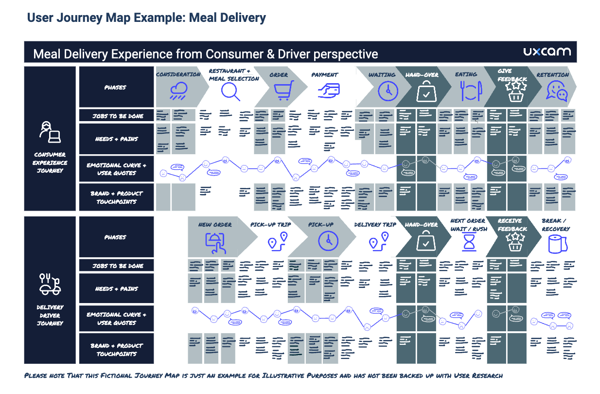

User journey map example: meal delivery. Please note that this fictional journey map is just an example for illustrative purposes and has not been backed up with user research.
For more inspiration, you can find collections with more real-life user journey examples and customer journey maps on UXeria, eleken.co & userinterviews.com, or check out free templates provided by the design tools listed below.
Free UX journey mapping tools with templates
No matter whether you’re a design buff or feel more comfortable in spreadsheets, there are many templates available for free(mium) tools you might be already using.
For example, there are good templates and tutorials available for Canva, Miro and even Google Sheets. If you are more comfortable with regular design software, you can use the templates available for Sketch or one of these two from the Figma (template 1, template 2) community. There are also several dedicated journey map tools with free licenses or free trials, e.g., FlowMapp, Lucidchart and UXPressia, just to name a few.
Be aware that the first draft will require a lot of rearrangement and fiddling until you get to the final version. So it might help to pick where this feels easy for you.
How do I collect data for my app user journey?
User journey maps need to be rooted in reality and based on what users really need and do (not what we wish they did) to add value to the product and business strategy. Hence, user insights are an inevitable step in the creation process.
However, it’s a huge pile of information that needs to be puzzled together and usually, one source of information is not enough to cover the whole experience — every research method has its own blind spots. But if you combine at least two or three of the approaches below, you can create a solid app user journey.
1. In-house expertise
The people working for and with your users are an incredible source of knowledge to start and finalize the journey. Whilst there might be a few overly optimistic or biased assumptions you need to set straight with your additional research, a user journey mapping workshop and/or expert interviews involving colleagues from very different (user-facing) teams such as:
sales
customer service
business intelligence
customer insights
marketing
logistics
UX
will help you collect a lot of insights and feedback. You can use these methods to build a preliminary skeleton for your journey but also to finalize the journey with their input and feedback.
2. Desk research
Next to this, it is fair to assume there is already a ton of preexisting documented knowledge about the users simply floating around in your company. Your UX research repository and even industry reports you can buy or find with a bit of googling will help. Go through them and pick the cherries that are relevant for your user journey. Almost anything can be interesting:
Old research reports and not-yet-analyzed context interviews from earlier user interviews
NPS scores & user satisfaction surveys
App store feedback
Customer support tickets
Product reviews written by journalists
Competitor user journeys in publicly available UX case studies
Ask your in-house experts if they know of additional resources you could check. And find out if there’s already a long-forgotten old journey map from a few years ago that you can use as a starting point (most organizations have those somewhere).
3. Qualitative user research
Qualitative research methods are your best shot to learn about all the things users experience, think, and desire before and after they touch your product. In-depth interviews and focus groups explore who they are and what drives them. You could show them a skeleton user journey for feedback or co-creation.
This could also be embedded into your user journey mapping workshop with the team. Alternatively, you can follow their actual journey in diary studies, in-home visits or shadowing. However, in all these cases it is important that you talk to real users of your product or competitors to learn more about the real scenarios. This is why usability testing with non-users or fictional scenarios won’t help much for the user journey map.
4. Quantitative research
Once you know the rough cornerstones of your user journey map, surveys could be used to let users rate what needs and pains really matter to them. And what their mood is at certain phases of the journey. You can learn how they became aware of your product and ask them which of the motives you identified are common or exotic edge cases. Implementing micro-surveys such as NPS surveys, CES, and CSAT embedded into your product experience can give additional insights.
5. Customer satisfaction (CSAT) survey
Customer satisfaction surveys (or CSATs for short) are important tools that measure your customers' satisfaction with your product or service. It is usually measured through surveys or feedback forms, asking customers to rate their experience on a scale from 1 to 5. This metric can give valuable insights into the overall satisfaction of your customers and can help identify areas of improvement for your product.
CSAT surveys can be conducted at different customer journey stages, such as after purchase or using a specific feature. This allows you to gather feedback on different aspects of your product and make necessary changes to improve overall satisfaction.
The benefit of CSAT lies in understanding how satisfied customers are with your product and why. By including open-ended questions in the surveys, you can gather qualitative insights into what aspects of your product work well and what needs improvement.
5. User analytics
User analytics is a beautiful source of information, even if it has its limits. Depending on what tools you are using (e.g., Google Analytics, Firebase, Hubspot, UXCam), you can follow the digital footprints of your users before and when they were using the product. This may include acquisition channels (input for brand touchpoints and early journey phases), search terms that brought them to your product (input for needs and pains), and how they navigate your product.
Unlike a usability test, you can use screen flows and heatmaps to understand how your users behave naturally when they follow their own agenda at their own pace — and how often they are so frustrated that they just quit. Knowing this gives you pointers to negative user emotions at certain journey steps and even helps identify your product’s moments of truth. Whilst you cannot ask the users if your interpretations are correct, checking analytics already helps you prepare good questions and talking points for user interviews or surveys.
Curious to know how heatmaps will look in your app? Try UXCam for free — with 100,000 monthly sessions and unlimited features.
How can I utilize UXCam to collect App User Journey data?
If you have UXCam set up in your mobile app, you can use it to support your user journey research. You can find many of the previously mentioned user analytics features (screen flows and heatmaps, including rage taps) here as well.
UXCam can also be an invaluable asset for your qualitative research. Especially for niche products and B2B apps that normally have a lot of trouble recruiting real users via the usual user testing platforms.
UXCam’s detailed segmentation options allow you to identify exactly the users you want to interview about their journey — and reach out to them via either email or UXCam push notifications, which can include invitation links for your study, a survey or an additional screener.
Additionally, UXCam's session replay feature allows you to watch recordings of user sessions, providing valuable insights into how users interact with your app and where they may face challenges.
Where can I learn more about user journey map?
Don’t feel ready to get started? Here are a few additional resources that can help you dive deeper into user journey mapping and create the version that is best for your project.
Creating user journey maps & service blueprints:
Planning and running user journey mapping workshops:
Jobs to be done:
Moments of truth in customer journeys:
FAQ
What is a user journey map?
A user journey map is a visual representation of the process that a user goes through to accomplish a goal with your product, service, or app.
What is a user journey?
A user journey refers to the series of steps a user takes to accomplish a specific goal within a product, service, or website. It represents the user's experience from their point of view as they interact with the product or service, starting from the initial contact or discovery, moving through various touchpoints, and leading to a final outcome or goal.
How do I use a user journey map in UX?
User journey maps are an essential tool in the UX design process, used to understand and address the user's needs and pain points.
Related Articles
Best behavioral analytics tools to optimize mobile app UX
20+ powerful UX statistics to impress stakeholders
Mobile UX design: The complete expert guide
5 Best User Journey Mapping Tools
App user journey: Mapping from download to daily use
AUTHOR
Alice Ruddigkeit
Senior UX Researcher

Related articles
Product best practices
5 best user behavioral analytics tools for mobile app teams
Behavioral analytics offers deep insights into user interaction. Learn about the best behavioral analytics tools to optimize the user experience on your mobile...

Jonas Kurzweg
Product Analytics Expert
Product best practices
Top 11 Remote Usability Testing Tools You Can Use Now
Usability testing tools that will put your mind at...

Jonas Kurzweg
Product Analytics Expert
Curated List
7 Best AB Testing Tools for Mobile Apps
Learn with examples how qualitative tools like funnel analysis, heat maps, and session replays complement quantitative...

Jane Leung
Product Analytics Expert


