Reduce KYC abandonment in 3 steps
Know Your Customer (KYC) in mobile app banking is designed to protect financial businesses against crimes like fraud and money laundering. On the user's side, it’s a process where they need to verify their identity, address, and purpose of using the app.
Despite being a vital safety and security tool, KYC failure is a significant headache for fintech apps. Based on a survey of mobile banking users, there are a few reasons why potential customers abandon this much-needed part of the application process on mobile:
Too complicated. Nearly a third of respondents said that they found the application process “complicated”.
Short attention span. The average time that a consumer would typically abandon an online application for a financial product was 18 minutes and 53 seconds.
The time to apply. For 21% of respondents, the amount of personal information required and changing their minds are the main reasons applications are abandoned.
Don’t have the right docs: 38% of respondents report abandoning an application for a financial product because they did not have the right identity credentials, such as a passport or digital identity.
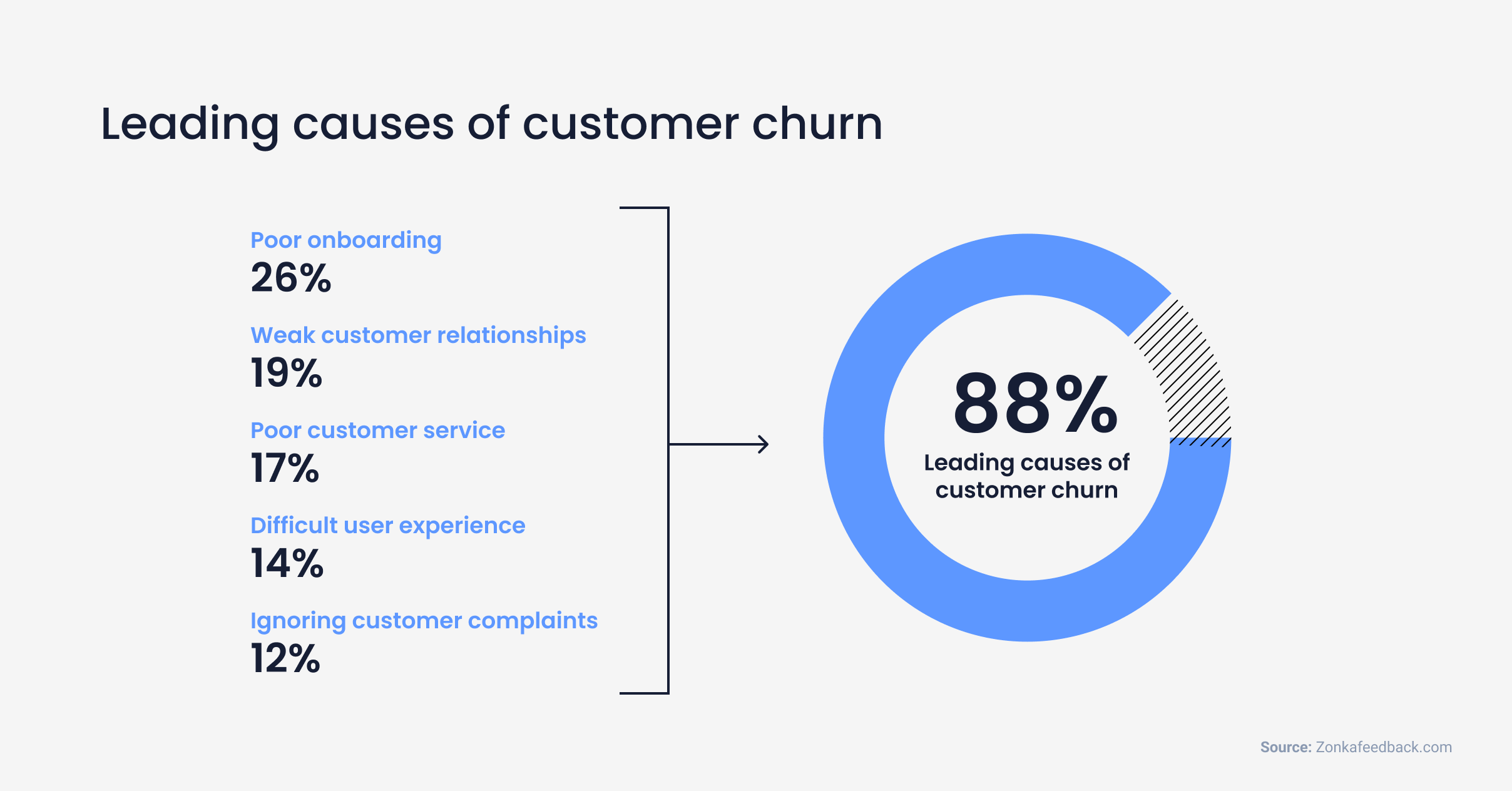

Top reasons for user churn across apps in general
Due to the nature of mobile — no matter what the service —customers want an easy B2C experience. Whether they are opening a new bank, trading account, or mobile wallet on their phone, onboarding should feel like an intuitive, natural part of registration.
As a mobile app analytics company, we see a lot of onboarding bottlenecks — including KYC failures, and we wanted to share three steps that can help reduce abandonment in this step.
Step 1: Provide clear instructions
The first step to reducing KYC failure is to make it clear how to prepare for this process. Customers may abandon the process if they don’t understand what’s required of them right away.
Provide a pre-checklist of requirements: One common failure of a KYC process is that customers don’t have their documents with them when they are trying to complete the process.
We noticed in our analysis of our own mobile payment customers that users usually need more than one session to finish their KYC. This could mean that they left to find their ID or were distracted.
Provide customers with a “Before you start” checklist of the documents and information required for the KYC process before they even begin (passport, good lighting, a quiet space, driver’s license, pin number). This will increase the chances of them completing their onboarding.
2. Provide options: Now that you have the checklist, also provide the alternatives to what’s required. Not everyone may have the exact IDs that are required. Define what identification is considered acceptable. In Germany for example, a driver’s license is not an accepted form of government ID, but in Canada it is.
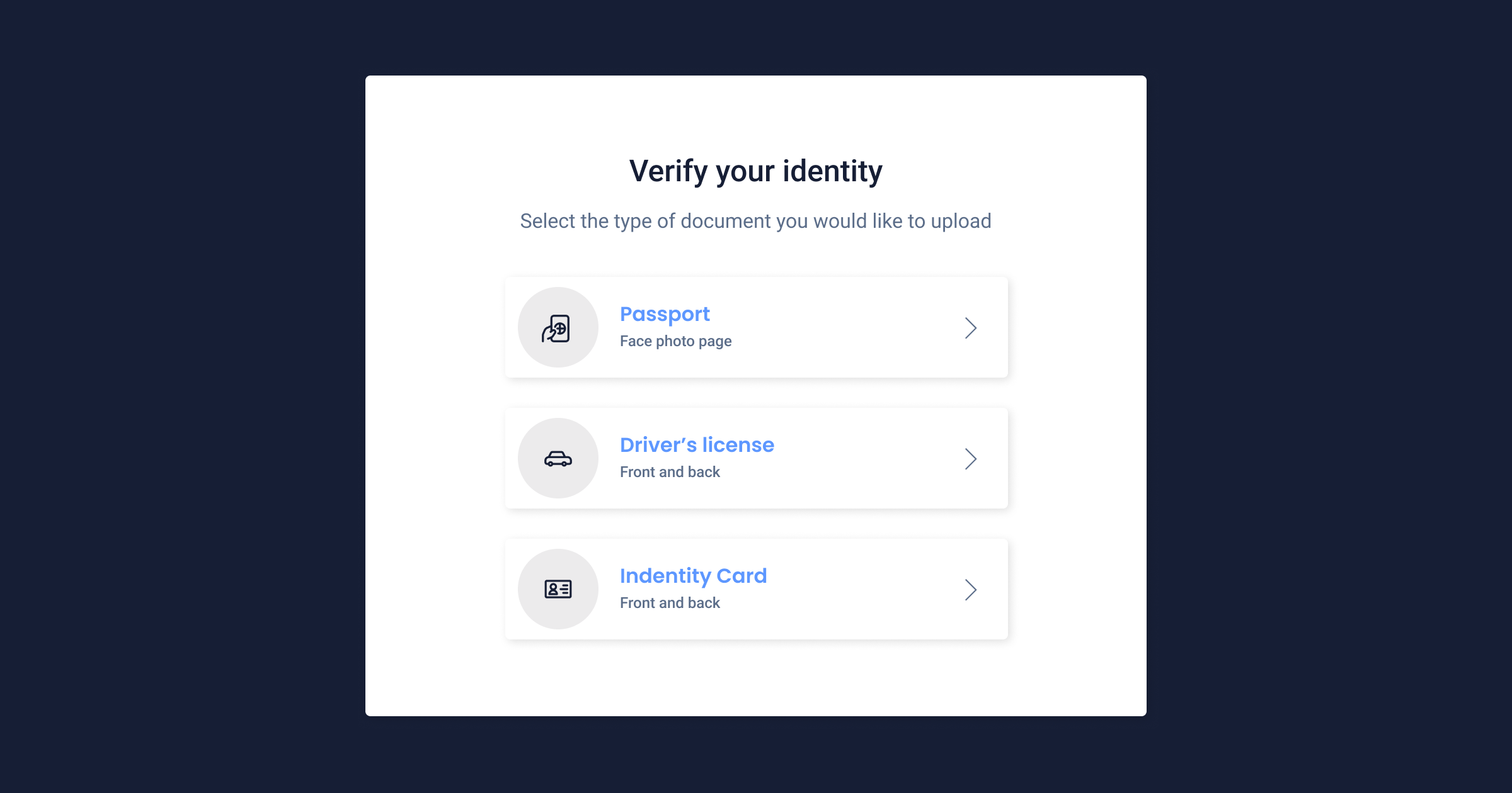

Example of how you can provide ID verification options in a user-friendly way.
Keep instructions short: Provide customers with step-by-step instructions for completing the KYC process. This can help customers understand what is required at each stage and reduce the likelihood of errors.
Make support easily accessible. On the screen where you’re asking for identity verification make help accessible, whether it be a chatbot, a live chat, or a phone number.
By providing clear instructions, apps can reduce the likelihood of customers abandoning the KYC process due to confusion or uncertainty.
How to check if your instructions are clear
The easiest and fastest way to check if your KYC steps are clear is by tracking the success rate of your KYC process and watching session replays of users who failed at different stages of the KYC process.
With the steps that you have in your KYC onboarding flow, identify what ‘conversions’ are and create a funnel. A successful conversion could be the completion of the entire KYC process, or simply uploading a single document.
Plan the events that you want to track such as:
Successful registration of email address
Successful verification of email address
Successful upload front of identification card
Successful upload back of identification card
Successful upload of user picture
Successful upload of the front of the passport
Successful upload of the passport signature
Confirmation screen that you have to take a photo of yourself
Completion of KYC process
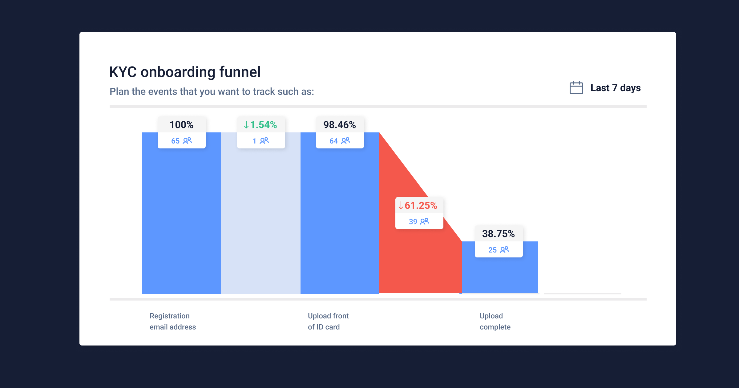

KYC onboarding funnel is simplified for exemplary purposes. 1. Plan the error events that you want to track such as:
Email validation error
ID card upload error
Image verification error
Passport scan error
Failure to complete KYC process
2. Set up a KYC funnel with the custom events that you’ve set up
3. Analyze your KYC funnel as user behavior data rolls in
4. Identify drops in the funnel and view the corresponding list of users who are failing that step
5. From the list of users, filter ones with high:
6. Watch session replays to better understand how users are reacting to errors without having to worry about compliance.
Many regulated mobile banking businesses use third-party integrations to handle their identity verification. Mobile apps outsource their KYC if they don't want to build their own screening process software or create a KYC department.
For privacy reasons, the third-party verification footage won’t be visible in UXCam session recordings, but you can still see how users are interacting with the rest of the screen during the process. With session replay, you’ll be able to see that:
ID cards are or aren’t valid and how users react
Error messages that users receive and their reactions
Users trying again after receiving error messages
When users try again to make their uploads
At this point, you’ll be able to understand how users are reacting to the instructions given during the KYC process.
7. Share the problem videos with your customer success and engineering team. Tag and comment on the videos with team members where you have hypothesized potential solutions to a user’s issues with completing the process.
There are many more errors you’ll be able to identify with session replay. With this information, you can improve the guidelines given to the user on the UI of your app.
To resolve issues specific to the KYC process as they arise, integrate UXCam with support tools like Intercom and Zendesk. This will shorten the feedback loop to your customer support teams, reducing the chance of abandonment. To learn more about how to empower your CS team with a tool like UXCam, check out our article: Finance apps have a customer support problem, and here’s how to fix it.
Step 2: Simplify the KYC Process
Like all processes on mobile, short and simple is best. Remember, users chose a mobile product because they thought it was easier than going in person, they probably wanted to avoid talking to a human. But, a KYC procedure can also be overwhelming, especially for first-time customers. So to make it easy, on the user interface try to:
Use clear and simple language: Avoid technical jargon or legal terms that may confuse customers. Use plain language that is easy to understand.
Instead of: “Place proof of identity on a flat surface within parameters indicated”
Try: “Lay your identification flat so it fits within the green square”
2. The UI should be uncluttered and clear: The KYC process shouldn’t remind users of the stress of a real printed form, but rather like a seamless part of the registration process.
Make your KYC process multi-step. Too much information and fields on one page can be overwhelming.
Make the sequence feel natural. What information feels natural together? Name, then address, then date of birth, and so on. Group steps together that are logical in the mind of the customer.
Automate the format. Rather than showing an error in the month day year format, pre-set the format for the user so they don’t get frustrated by an error message.
How to continuously improve your KYC onboarding flow
At UXCam, we’ve seen the customers of mobile payment clients struggle with their KYC process. The biggest challenge we identified by watching session replays was that users were rushing through the steps without looking at the guidelines.
Our customers noticed that users don’t realize what they are doing wrong. They need support on what they need to change in their approach. For a selfie upload, for example, they may need help to understand that they need to:
Look up
Move their head to the side
Use more light
Not stand in the shadow
Show their entire face, without a cap or sunglasses
If users aren’t reading guidelines, a hypothesis to resolve this was to put less writing in the instructions and add more visual ones e.g. rather than just saying, ‘Make sure your ID fits within the frame’, our client decided to make a very visual bright green box that the user had to fit their ID through in the camera.
We saw an increase in approved document uploads after changing the UI guidelines to be more visual for busy users who wanted to complete their process as fast as possible.
Step 3: Cut the time to activation
Now that you’ve got a flow for your KYC process, step back and see what steps you can chop. How can you minimize the time required to complete the process?
Customers have no problem abandoning this arduous process for a competitor that takes much less time. To cut down the time required to complete the steps, try:
Shorter, multi-step forms: Break your forms up into multiple parts that take seconds to answer. This can eliminate the stress and move the process along quicker. This way, you can also collect the most valuable information first like their name and email - so if they do drop off, you can contact them to remind them to complete the steps.
Make the process cross-device: Maybe a user started their process on mobile but realized they need to go on a desktop to copy and paste a long address, or for mobility purposes, they need to have a bigger screen. Restarting the process could lead to abandonment. Make it possible for the user to save their info and access it again on different devices.
Provide options: To be accessible to all users, provide customers with options for completing the KYC process, such as in-person, online, or mobile options. This can help customers choose the option that is most convenient for them.
By minimizing the time required to complete the KYC process, product teams can reduce the likelihood of customers abandoning the process due to competing priorities or perceived inconvenience.
Related articles:
App onboarding guide: 10 best onboarding flow examples
6 Best user flow tools & software for mobile app UX design
Finance apps have a customer support problem, here's how to fix it
AUTHOR
Jane Leung
Product Analytics Expert
Jane is the director of content at UXCam. She's been helping businesses drive value to their customers through content for the past 10 years. The former content manager, copywriter, and journalist specializes in researching content that helps customers better understand their painpoints and solutions.

Related articles
Product best practices
5 best user behavioral analytics tools for mobile app teams
Behavioral analytics offers deep insights into user interaction. Learn about the best behavioral analytics tools to optimize the user experience on your mobile...

Jonas Kurzweg
Product Analytics Expert
Product best practices
Top 11 Remote Usability Testing Tools You Can Use Now
Usability testing tools that will put your mind at...

Jonas Kurzweg
Product Analytics Expert
Curated List
7 Best AB Testing Tools for Mobile Apps
Learn with examples how qualitative tools like funnel analysis, heat maps, and session replays complement quantitative...

Jane Leung
Product Analytics Expert


